Logos that belong to big companies need to be updated from time to time in order to keep getting attention towards them. If we consider the oil company Shell, you will see that you will be quite familiar with its image because it is similar to what we learned maybe in biology classes. Still, the Shell logo is quite popular and has remained a focal point for the company in the last years.
This global oil leader has its headquarters in the Netherlands and the registered office in the Shell Centre in London UK. It is the number two largest energy company in the world according to Forbes Magazine list in 2011 and also in that edition it was number five in the top of the largest companies in the world.
You can consider it being active in all areas of oil and gas industries together with exploration and production, refining, and distribution. On top of that Shell is also focusing now more and more on renewable energy activities like hydrogen, solar, and wind power.
It was launched in the early 20th century and since then the Shell logo really went through a lot of changes and looks different today from its first version. Today it has a sophisticated and elegant touch that represents the brand in the entire world with no problems.
The Shell name

Maybe you are wondering what the origin of this organization name is and who owns Shell. What we know is that the name can be traced back to Marcus Samuel senior that imported seashells from the Far East in the 19th century. His son, Marcus junior together with his father needed a name for the kerosene that they were sent to Asia, so they chose Shell.
Because this type of business came to dominate the business world, the name was used for the import-export company that was set up in the year of 1897, the Shell Transport and Trading company being its full name.
Another minor change for the shell sign and name also happened in 1907 when the company was merged with Royal Duch. What happened was that a new group was formed, and the business just becomes quickly known as Shell.
The history behind the Shell logo

Choosing the logo did not come as a surprise even more because the tankers that were taken to the Far East had been named from a seashell. For sure it was not a simple shape to reproduce but they managed to do it.
Some rumors say that actually the Shell logo was suggested to Samuel and his son by another man. His name was Graham and he imported the kerosene that Samuel made into India and sold it himself as Graham’s Oil.
He actually became the director of the company and played an important role in it. The well-known shell gas logo that combines yellow and red is easy to recognize and has helped in the development of the brand.
The design is easy, and people can remember it for a long period of time. This kind of logo helps the company interacting with its customers without coming in touch with them all the time.
Shell Logo Design Elements
The Shape

Although the Shell logo has been redesigned the main part, its crown hasn’t suffered any changes. The shape represents the outer case of a mollusk shell. Indeed, the logo shows the popularity of the company and it has used it since it was first made in order to keep a position in the corporate world.
The Color
The main colors that are being used are red and yellow because they offer a powerful look for the logo. The shell design also took advantage of these colors in order to bring a balance between elegance and professionalism. For sure you can see that the yellow is the dominant color because it can be easily visible, and it gives a better look at the red.
The Font

The designers used a simple bold font for the letters SHELL. The main idea behind this was to make the company show its high standard and qualities. Besides that, a bold font is also easier to be remembered by people when they see it.
The Evolution of The Shell Logo

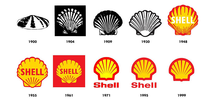
It is quite fun to have a look at the way the company logo evolved in more than one hundred tears. It shows that the Shell sign did a great job and is still popular among people. In its first years, it had an unimpressive design for its evolution but as time passed and the advancements of technology were made the Shell logo transformed a lot and took a more pleasant design.
1900 and 1930
In the present, the Shell logo can be spotted easily in the entire world because of its unique design. However, in the early 1900s, it was a poor drawing of a mussel shell. Indeed, a shell isn’t really an impressive shape but if it is designed in a bad way for sure the logo is going to look bad as well. The angle in which it was made didn’t really make any improvement for the shape.
In 1915 a change was made, and some color appeared because Shell launched its first service stations in California. The red and the yellow helped a lot the Shell design and what few people know is actually that many Californian settlers were born in Spain.
The colors that could be spotted in the yellow were also in the flag of Spain and displaying them maybe created an emotional bond towards the brand.
1930s Logo Takes Symmetrical Shape
The next redesign step was done in 1930. This time the art style was added to the Shell logo and it made its main shape to be symmetrical and impressive. The Shell sign got a crown in the logo because the company wanted to show itself as the king of this business field.
1948 to 1971
Before the launch of the internet, a lot of logos had subtle details that were blurred. But from 1950 the icon became more and more simplified and they focused on recognition and memorability because in the end this might be the ultimate goal of any logo design.
1971 Radical Changes
In the year of 1971 Shell started to make some big changes to their logo. The new version had simple lines that went through yellow strips and made a crown shape. Adding also the red outline made the logo very powerful and look fresh.
It was an impressive design and Shell continued to use this design almost in the exact shape since 1971 with just some minor changes. So, from a simple Shell Gas station logo, it is transformed into a really great looking design.
1995 onwards
In this period the organization chooses a new design by adding some friendly shades of red and yellow. They made the nuances lighter and decreased the brightness so that people will not feel offended by them. The design basically remained the same the only change is in the color scheme.
We can really say that Shell did a great job with their logo because sometimes we even see it being used without the brand name.
For sure the Shell logo is a unique and elegant one. The company has a rich history and they managed to keep a similar vibe with their origins. Every time they made changes to it, they made it look better and we expect them to do the same also in the future.
Any company wants to create something recognizable and we consider that Shell did this because of their brand values and focus of their long-term mission as an organization that evolved so much.
If you enjoyed reading this article on the Shell logo, you should read these as well:
- Superhero logos: The symbols of the comic book universe
- Learn About The Apple Logo: The Tech Giant’s Branding
- The Disney logo: All there is to know about the Walt Disney brand
The post The Shell logo evolution and how it ended up looking like this appeared first on Design your way.
Source: https://ift.tt/2ZNfMF6

No comments:
Post a Comment