We all know that one of the most important aspects of a brand is its own logo. Many of us can spot a logo very easy especially if it belongs to a brand that we like. The BMW logo is known for its black and blue colors.
BMW is a German car and is on the best cars that you can get. The company was founded in 1916 and it was based in Munich. The BMW company also is in charge of the Mini and the Rolls-Royce car brands. BMW stands for Bayerische Motoren Werke Aktiengesellschaft. Translated sounds like Bavarian Motor Works. Not that many car logos are easy to recognize as the BMW.
BMW is for sure a car that is well-known and that you can find pretty much all the time articles, magazines, and in the news. It has a long and rich history as a global brand so let’s explore more about it.
The BMW Logo
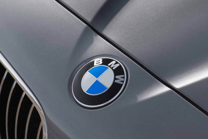
Although BMW has long history many fans might not know exactly how the BMW logo was created. What does it stand for? Let’s have a look at Bayerische Motoren Werke AG so we can discover where did they got their inspiration from and what does the BMW logo really means.
The BMW Logo Controversy:
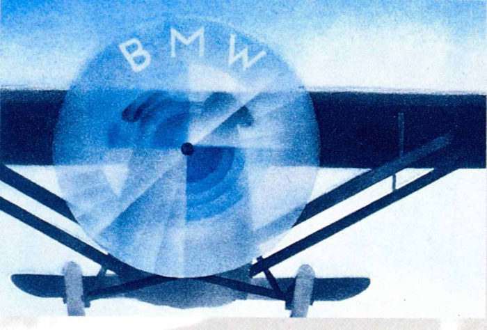
A version of the well-known BMW emblem is that the design was inspired by the propellers that were used by BMW engineers. Another one refers to the logo that is connected to Bavaria because that is the place where the products were manufactured and the national colors of Bavaria are blue and white.
The aircraft engine is the origin of the myth. People really do think that is behind the BMW logo is a rotating airscrew. The origin of this idea is from the cover of a BMW aircraft magazine that was launched some time ago.
The actual truth behind the story is that the logo was never inspired by any kind of blades on a clear sky. Actually, it was created in order to distance themselves from the airline industry because before BMW took this name the company was known as Motorenwerke, an aircraft engine manufacturer.
The logo that we know today was inspired by its predecessor and t was created in October the year of 1913.
BMW Logo Design Elements
The design elements that are used in the BMW logo are circles, white triangles, and the name that goes inside. These are the tangible parts of the logo but there are also some meta-design elements that we are going to explore. If you are still wondering what BMW means you will soon find out. In any logo the most important aspects are always the shape, the color, and the font that is used.
The Shape
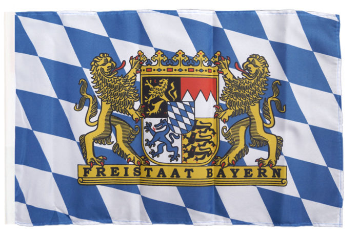
It is very similar to the rhombuses that can be seen in the Bavarian flag and it represents more or less how the logo would look if it was in a circle. The rest of the logo shows the company name in black.
The Color
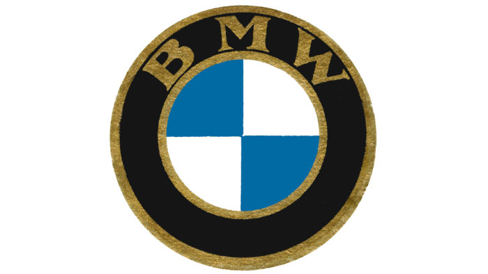
The BMW symbol contains the classic gold that shows prosperity, wealth, and glamour. Because the company started to make their vehicle for mass markets in time this color was lost. The ones that remained however are black, white, and blue. The white part stands for purity, the black for excellence and elegance and the blue color shows the strength that BMW cars have.
The Font
We can’t really say too many things about the BMW logo font. The one that is used in the present is inspired from the Helvetica typeface. Besides the inspiration there also some differences that can be seen easily.
Actually, the font part is the one that went through the most changes over the years. No matter this, the font really becomes associated with the professionalism that BMW has and it looks like they are going to keep in the future as well.
The BMW Logo History:
In October 1917 POPP registered one trademark that would pass the test of time, the use of the circular logo, and the bordering text ties. As you have already figured it out the blue and white represent the colors of the Bavarian flag. The colors are reversed because it was illegal to trademark symbols of the state and you couldn’t really do anything about it.
The BMW logo that was initially launched was pretty much identical to the one that we can see today on their latest models. The colors were less chrome-y but other than that they look very similar.
The period of the gold color lasted from 1916 until 1936. The font also lost its first design and got changed in 1954. Since then, the logo has gone through different minor changes adapting to the modern design criteria.
The proportions of the BMW symbol were changed a few times as well together with the shade of it. Besides the color changes, the company also used some white and silver letters for a small period of time.
1923

If you didn’t know the BMW logo was also on the bikes that they used to do. On the R32 model the BMW sign had bolder letters and it felt heavier.
1936

In 1930 all the models that BMW made were delayed because they had to incorporate another logo with the shades of blue and the lettering in white. That was quite a big change from the design point of view.
Evolution emblem after 1950
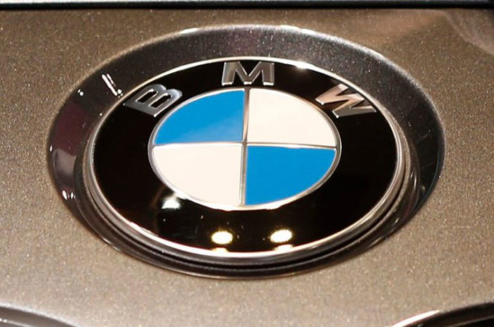
In the 1950s the carmaker tried to standardize its logo by using white letters in advertisements while the logo symbol that was put on their cars and motorcycles had silver lettering. Until 1966 the company’s designers eliminated the serif font.
1970
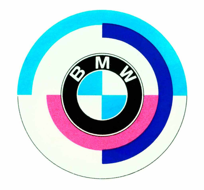
Another change took place in the 1960s when the serif font was replaced with the sans-serif one. They also played around in the mid-1970s with an ‘Engine Sports Roundel’ that had the standard logo encompassed by BMW Motorsport hues.
2012 – present
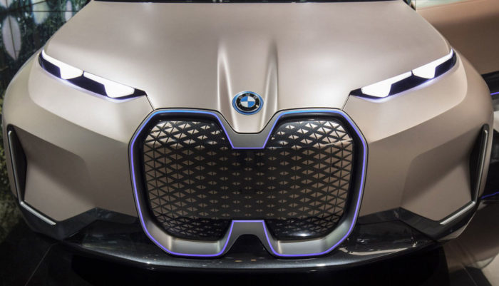
The BMW logo that has the rounded 3-d frame that you see today was made in 1917 and is one of the most known in the world. For sure the brand did evolve over the years but the changes made were minimal.
In conclusion the BMW logo has a rich history and we can really say that this brand did a really great job of keeping their mission and brand alive.
If you enjoyed reading this article about the BMW logo, you should read these as well:
- What is a logo and why you need one
- What Is Creativity And The Importance Of Creative Thinking
- Logo Design Cost: A look at the logo design prices
- Logo colors and why they’re important
The post The BMW logo meaning and how it was slightly changed over the years appeared first on Design your way.
Source: https://ift.tt/2ATPVAL

No comments:
Post a Comment