Cross-browser compatibility testing is the practice of developing the website in a way that the website functions correctly across all the web browsers on a computer system. One of the responsibilities of the website developer is to develop the website in such a way that the website is functional for all the users.
As a website application developer, the following points should be taken care of:
- You should take care of the CSS elements you use across all the internet browsers. There is a chance that the latest CSS and JavaScript elements don’t work on those old web browsers.
- The user can be using a mobile, a tablet, a desktop, or laptop with older or obsolete versions of the browsers. Eventually, all the care must be taken by the website developer to make the website that is compatible on all such devices and web browsers.
- There are many disabled people who use assistive facilities to access the Internet. Then there are technocrats who use just the keyboard to access the Internet and don’t use a mouse. Hence, the website should be access-friendly to all the users.
When the term “Cross Browsing” is used, we need to look at certain aspects of it. So, the user experience of the website should be almost similar as far as the accessibility of the website is concerned. It is still acceptable if the website doesn’t provide identical results across various browsers. The core functions of the websites work effectively.
There may be an element that looks animated and visually attractive on the latest browsers but may look a flat image-like graphic on obsolete browsers. This is still acceptable if it still manages to serve the purpose of the element. But it is not acceptable that a visually impaired user is unable to get the screen reader to read aloud the contents of the website.
We say that “developing for acceptable browsers”, it doesn’t mean that you test the website across all browsers. However, you should target the basic browsers that are used by the website owner, as well as the targeted crowd. But, you should implement the website programming in a way that every browser gets a chance to have access to your content.
Reasons behind the difficulties regarding the cross browser compatibilities:
There are so many reasons why certain websites don’t work correctly on specific platforms.
- The website elements may behave a certain way on some browsers because of the browser version.
- The device user is using and also at the browsing preferences of the user may vary. These differences can result into websites not working correctly.
- Before handling cross browsing issues, you should debug the code and fix all the errors in the code, which shows up before hosting the website across the Internet.
- There are chances that the browser implementation has bugs. Earlier, back in the 90s, in the era of Netscape Navigator and Internet Explorer, the web development was a lot more difficult because the browser-programmers developed browsers in such a way that the website elements rendered differently in different versions of the browsers. These browser companies deliberately followed such conventions to gain a competitive advantage over the other competing companies. Hence, it became a worse situation for developers and made Internet browsing hell for the users as well. These days, browser companies follow development standards making the experience much better for developers and users.
- Some browsers support technologies differently. A developer can use the latest website development coding and syntax to get the best out of a website, but it all is meaningless when the user is using an old version of the browser. Hence, an old browser fails to render the website the way the developer has orchestrated. If you support the older version of the browsers as well, you have to convert the code into old fashioned syntax while using some kind of cross compiler.
- The biggest issue in today’s era is, the user browsing Internet through various devices. If the website is not developed to work across all the possible devices, then it may malfunction on specific devices. For example, the website designed only for a desktop computer screen, may look spic and span on the desktop screen, but it may look a hotchpotch on a mobile device or a tablet.
- There are chances that the loading time may also change how a website looks on the screens. If the user is browsing your website through a high-end fast device, the website may function correctly as opposed to the user browsing the same website on a different yet obsolete device.
Understanding the importance of a web application to work almost in a similar fashion and implementing the same are two different things, and both of them are difficult tasks to succeed. Yet, there are ways to ensure that the website usually functions and offers consistent user experience irrelevant of the web browser. Let us take a look at them:
1. Simplify your Code:

A simple code can do wonders for your web application. And it’s always quality over quantity. You should not write 20 lines of code where 10 lines of code can work just correctly. The reason behind this is, all the browsers can run the simplified code smoothl. They work more efficiently than very complex code. Also, it would be easier for the developer to debug the code, track the errors and fix them while it is easy to maintain the code as well.
2. Frameworks:

A CSS framework, like Bootstrap and Foundation, provides web developers with the style code. They offer cross browser compatibility up to a certain extent. You need to invest some time to get the hang of how the features work; you can build responsive web applications that function just fine across almost all the browsers.
Most popular web frameworks are developed from ground level and have been upgraded to latest technology to make the website work with as many browsers as possible. And, the above mentioned frameworks are supposed to be compatible with almost all the browsers. It also helps to develop the website that renders ideally across all the device screens, including the mobile screens.
But you as a developer should check the documentation before implementing the framework. The document talks all about the compatibility of the framework with the browsers and you can find the cross-browser compatibility details in the documentation.
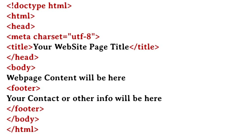
3. Definition of valid Doctype:

A Doctype is the declaration of the markup language to the web browser. The Doctype is not an HTML tag or an element of HTML; it is just an instruction to the browser about the version of the markup language that has been used for the named website.
If you don’t define the markup language in Doctype, the browser generally makes a guess. So, when it comes to addressing the cross browsing compatibility issues, then you need to define the Doctype correctly, else the browser guesses the Doctype, and this can lead to bugs and errors in the website rendering as well as the functioning. Hence, these bugs and inconsistencies are the issues we want to avoid.
4. Resetting the CSS:

A CSS reset is the resetting of all the styling elements of HTML to a consistent value. The CSS elements look different across all the web browsers. These elements are designed to make the website look more legible and accessible. For instance, the “Submit” button may render differently on one browser and may appear differently on another.
Another aspect of this is, the browsers tend to add a certain amount of padding to the CSS elements; for instance, make the unvisited links blue coloured by default and visited links turn to purple. Another example is the application of correct font sizes to the titles and uses H1, H2 tags according to the hierarchy of the titles. Hence, such changes create bottlenecks for the website developers to write their code. So, to remove these issues, the CSS reset should be used to force every browser to have all the styles at the null value, which avoids cross browsing difficulties.
5. Validate:

There are applications like CSS Validator and HTML Validator that check for the syntax that you employed for the development of a website. Syntax errors like unclosed tags, forgotten quotation marks, and other factors can make a website look tremendously different from what the developer has visualized. It may not even render correctly across different web browsers. Manually verifying and correcting the HTML and CSS syntax is intimidating as well as a huge task. Hence, the use of Validators is critical when it comes to checking the CSS and HTML syntax for errors.
6. Conditional Comments:

When a website is designed and developed, it becomes imperative to use different rules to make the website work across almost all the considered web browsers. This can fix almost all the errors that crop up with the usage of the website across different browser versions. Hence, using Microsoft-introduced mechanism called Conditional Comments lets you apply different CSS Styles and scripts depending upon the browser. Implementing this can remove the cross browser compatibility issues to a greater extent.
7. Going through the differences:

Addressing all the errors and issues still doesn’t guarantees that the website would perform the way you want it to. No matter how hard you try, certain elements are bound to misbehave, and parameters are likely to vary as the browser and the devices browsing the website, change.
Hence, the focus should not be the appearance of the website to be identical on every platform. The focus should be on the functionality and accessibility of the website. The elements of the website may look misplaced over the screen over different versions of browsers. However, if they function nicely and serve the desired purpose, then the appearance should not be a big concern. It should not prevent the user from accessing certain functions even if they are using the website from an obsolete device or browser or both.
8. Cross Browser Testing:

Apart from following the tips as mentioned above, testing the web application across the different platform is also imperative. No matter what you try and avoid, it is easy for you to write individual code that functions well on your browser. However, it may malfunction on another browser or even a differing version of the browser.
Hence, the website should be tested on different platforms before being delivered to the owner of the website. For this, there are different tools available to test the developed website across so many web browsing platforms. They give you an insight into how the website seems to function.
The biggest problem a website developer encounters while testing a website for cross browser compatibility is, that there are so many browsers available in the market. But to cover the basic browsers is the key to successful testing. As a website developer, you should test your website across following 5 browsers:
- Google Chrome
- Safari
- Firefox
- UC Browser
Microsoft Edge didn’t make it to the above list because its market share is very small. But it would be a good convention to still test on Microsoft Edge to make sure the website functions desirably.
Installing different browsers and testing your website on each of them can be a tedious job. That’s the reason, there are so many online tools that help you conduct Cross Browsing Testing online.
The above steps are the necessary steps that we can look at while developing a functional website. With the latest advent of technology, it is difficult but not impossible to achieve cross browser compatibility. With browsers adhering to specific W3C standards, addressing the cross browser compatibility issues is easier than ever.
But that does not mean that the developer should undermine the importance of addressing the cross-browser compatibility issues. Sometimes, the issues are significant, it defeats the entire purpose of having the website in the first place because it just backfires the way it works on specific browsers.
Conclusion:
This article offers you a peek into what cross-browser compatibility issues look like and how those issues can be addressed. People use different web browsers across the globe. So, it becomes a difficult task to make the website function correctly across all the web browsing platforms. If a website is developed using high-end, latest scripts, then the older version browsers accessing the website should have the code downgraded gracefully. This will allow the browser to render the website visible and functional. Hence, if the website is developed well, it should function with stability across all the platforms.
via https://ift.tt/3g499UF

No comments:
Post a Comment