The field of digital marketing has seen radical changes since the last few years and has defined strategies to increase sales, thereby increasing the ROI of any business. Among all the marketing jargon, the most common term used by any marketing team is Call to Action. What is it? A “Call to Action” is a term used to define or to invoke an action from the customer who is visiting your website. For instance, if your website sells books online, an example of a Call to Action would be “Click to buy the titles now at 50% off” or “Buy now. Only limited stock left.” A Call to Action calls for an immediate purchase decision from a customer.
We all have been to YouTube at some point in time in our lives. The people who run their YouTube channels, always say “Click the subscribe button now” or “click the bell icon”. It is a very subtle Call to Action that compels a user to take the decision of clicking the subscribe or notifications button.
Apart from digital marketing, people use Call to Action regularly in other channels of marketing as well. They use all to Action in brochures, flyers, during campaigning, and at so many other places. Whenever we visit an exhibition, we are often hoarded by salesmen to buy their product just because they are offering the product at a discounted rate. That is a prominent Call to Action strategy to lure the customers into buying their product, although at a lesser price than usual.
Call to Action is directing customers “what” to do and “why” to do something; the marketers follow the former but forget the latter. Hence, it doesn’t attract potential customers and turn them into a loyal customer base of your company.
Length of Call-To-Action:
The length of Call to Action can be a word long, or it can be as long as a phrase. It all depends upon your requirements about what your Action compels the user to do. But, in general, a short length of Call to Action is the most effective marketing tool. There can be a long Call to Action, but a direct and specific Call to Action holds value.
Importance of Call-To-Action:
A Call to Action is the most crucial part of any website. A visitor gets a clear direction through a Call to Action, to accomplish a goal whether it comes to signing up, filling a form, or reading a blog post.
An active Call to Action can drive a visitor into a customer, thereby increasing sales, profit and business revenue. It also expands your customer base. Call to Action can be used across all the online platforms from websites to social media platforms because of the versatility of usage. Business owners use Call to Action to speak for themselves, along with achieving profitable outcomes.
A successful Call to Action is when a visitor clicks the link and commits the stated Action. For instance, if “sign up here” is the Call to Action of your website, a successful Call to Action means the visitor signed up on your website and converted from visitor to customer.
Let us look at various active Call To Action designs that help a business grow.
1. Facebook Ad – Purple Mattresses:
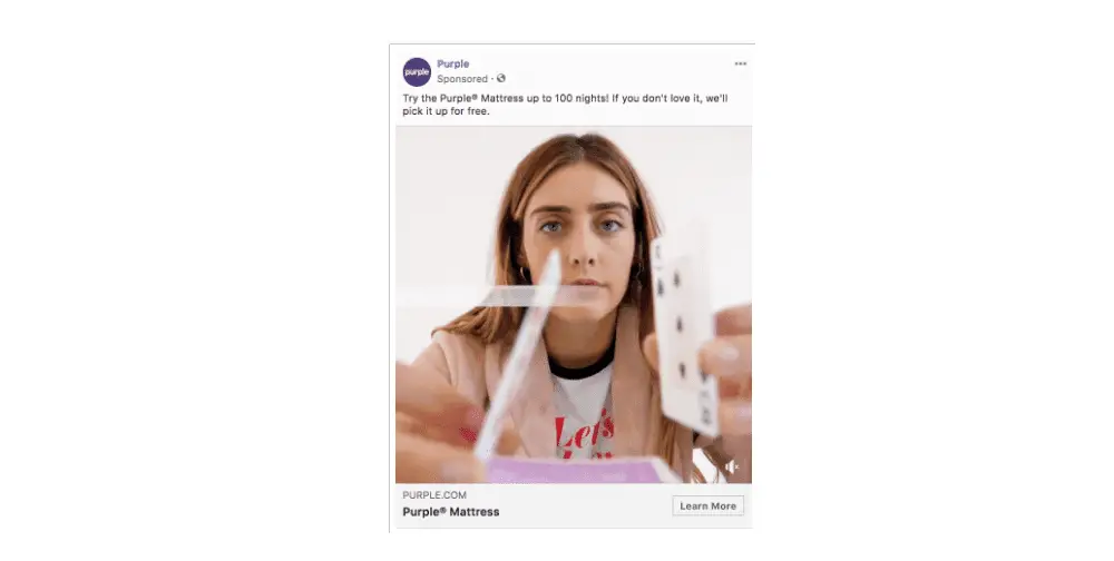
This Ad has a simple Call to Action button “Learn More” but has a unique selling point: “You won’t disturb your partner”. The “Learn More” button is not a unique example of Call to Action, but the eye-catching video of the mattress attracts the focus of the human eye immediately. Purple’s offer allows the user to try their mattress for free for 100 nights, and the user can also ask to pick up the mattress if they don’t approve of the product. Hence, this simple combination of a “Learn more” button and video lures the customer in. And who would not want a free mattress for 100 nights to sleep?
2. Animoto:
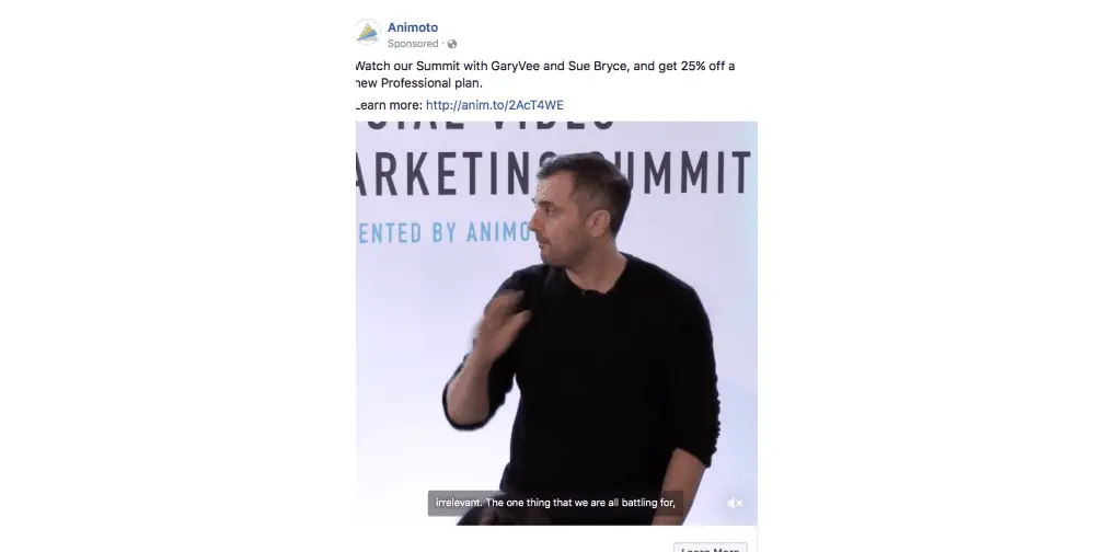
Animoto took up the point that Facebook doesn’t allow a big space area to advertise your brand or product. Hence, they came up with the small add and only one-sentenced Call to Action. And their Call to Action is concise and direct. It says: “Watch our summit with GaryVee and Sue Bryce and get 25% off a new professional plan. “Learn more about this here” which means that the viewer is rewarded with a certain amount of discount.
Hence, this Call to Action is pretty direct, clear, and drives the point home.
3. CanvasPop:
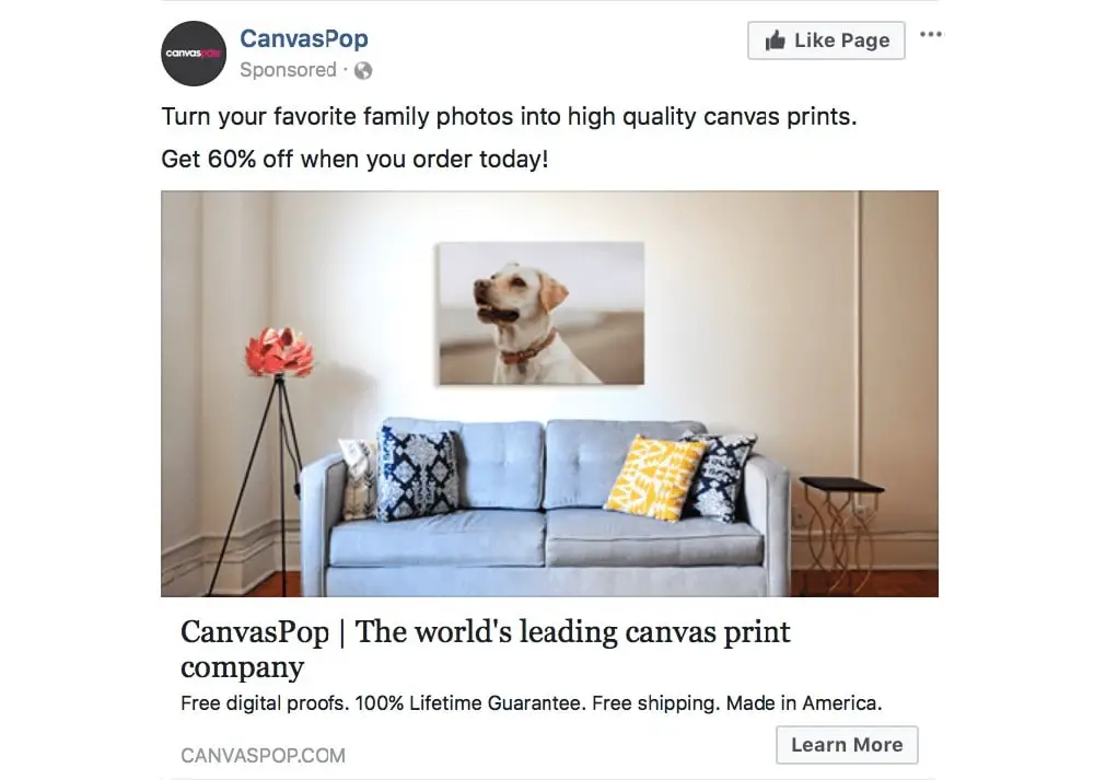
“Get 60% off when you order today” is the eye-catching statement that drives a user to Call to Action. The most significant point here is, it is placed above the picture and has the potential to grab a person’s focus.
They also have a sentence before the Call to Action to explain what they do. They have taken complete advantage of the small space to display their advertisement. Moreover, they have put the Call to Action above the advertisement, instead of putting it beneath the image.
4. Shopify:
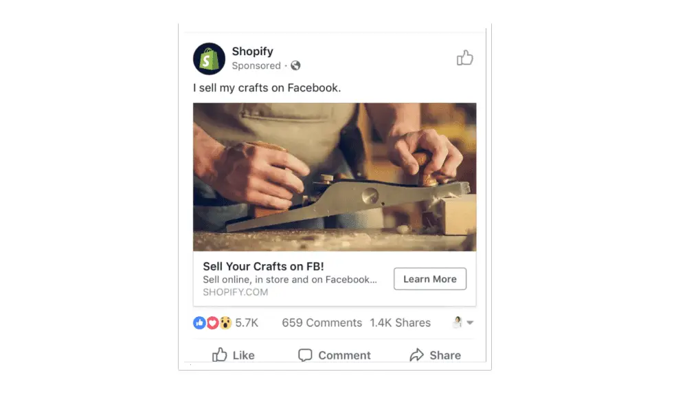
With limited advertisement on mobile screens, a minimal and direct Call to Action is generally the key. Shopify has used this factor in their Facebook Ad. It says “Sell your craft on FB! Sell online, in-store, and on Facebook…” Every Call to Action is brief and direct enough to compel the viewer to take action.
Moreover, they have placed the Learn More button exactly beside the ellipsis following “Facebook” that takes you to a clickable Call to Action button.
5. Brandless:
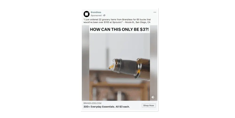
This company has posted a video that builds up brand awareness. It states that you can buy any essential item for $3 only. They also mentioned at the bottom of the advertisement that they have 300+ essential products that Brandless have priced at $3 and they put the “Shop Now” button just beside it. They have placed the user review at the top of the ad so that it is the first thing for a user to see which gives a gentle nudge to a user for clicking the Call to Action button.
6. Lyft:
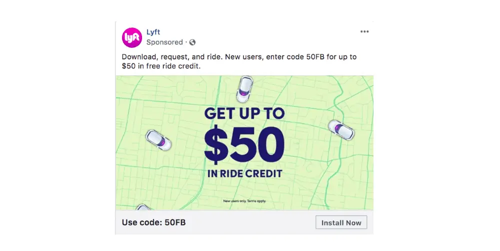
The ride-hailing app almost tripled its customers over two years with their advertisement. Their advertisement states the new users can get $50 ride credit when they use the code 50FB (meaning the ad on Facebook and the users that came to Lyft through Facebook). Hence, the “Install Now” button becomes compelling for the users to click because who doesn’t want to claim a $50 ride credit.
7. Airbnb:
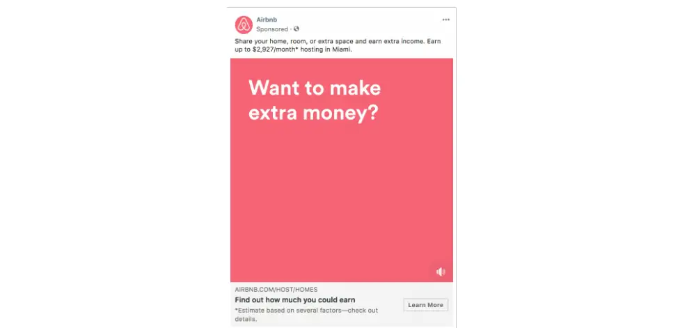
Airbnb hit the goal when it added the statement in their advertisement video “Who wants to make extra money?” The title of the advertisement talks about sharing your space in AirBnB.
Further, it also targets a specific location-based audience of Miami, when it says “Earn up to $2927/month* hosting in Miami”. And then, on the bottom of the advertisement, it has a clickable “Learn More” button beside the statement “Find out how much you could earn”, thereby calling a potential customer to click the Call to Action button to see how much money can they make.
8. Yeti:
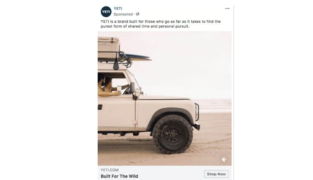
The brand selling premium coolers and drinkware have a simple Call to Action advertisement that communicates directly to the adventure-loving audience. Yeti knows its audience; hence, a simple yet effective Call to Action “Shop now” would seal the deal. But, they have run a fast cut to show how their product fits the outdoor and active lifestyle. Hence, this Call to Action is more than enough to make Yeti customers tap and buy their products through a series of images that display their products which would address the nature-loving and adventurous audience.
9. Hulu:
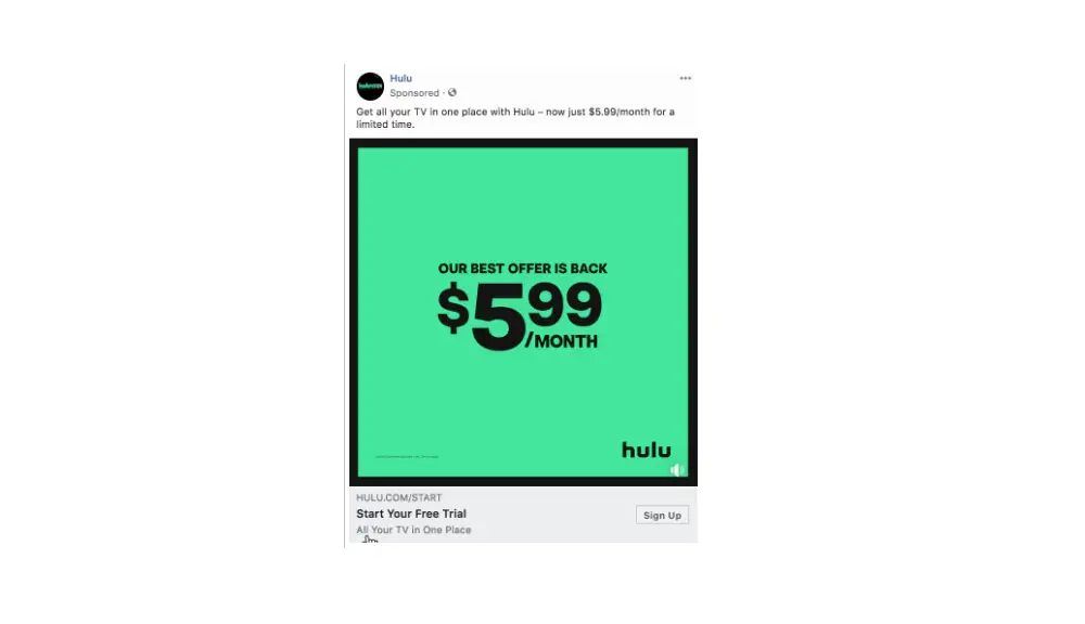
Hulu is a popular online streaming service that has a beneficial ad with a Call to Action. The moving images use different colours like they have used a light colour to highlight the lower rate of the subscription service.
With the changing colours where the dark colour is used to highlight the higher rate, their compelling and effective Call to Action is the “Sign Up” button that comes after the sentence “Start your free trial” finishes. The changing colours are strategically chosen and played so fast in the imagery; it creates urgency in the customers that the offer is only for a limited period.
10. Instagram:
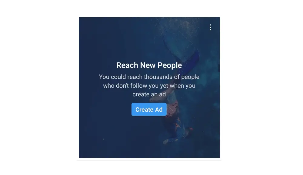
The popular social media platform that is based merely on photographs and video sharing makes use of a very compelling Call to Action to draw in new advertisers.
In this ad, Instagram uses an old picture of the user as a watermarked image as a background and has the text “Reach new people” written on it. Beneath that, besides the “Create Ad” button, they have written, “You could reach thousands of people who don’t follow you yet when you create an ad”. It lures in the marketers to target new customers and more extensive audience base through the effective Call to Action button “Create Ad”.
11. Starbucks:
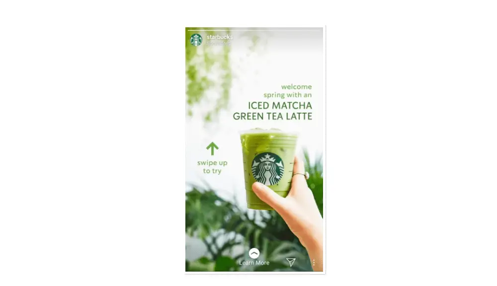
Starbucks is known for its very tactical and practical Call to Actions to nudge the customers to visit their stores for a hot cup of coffee through their various advertisements on various online and offline platforms. In this advertisement, they have used nature-centric colours and backdrops to usher in the spring season with their Iced Matcha Green Tea Latte. They have “Swipe Up to Try” Call to Action that encourages Instagram users to try their new flavour of the season.
12. MegFitzCooks:
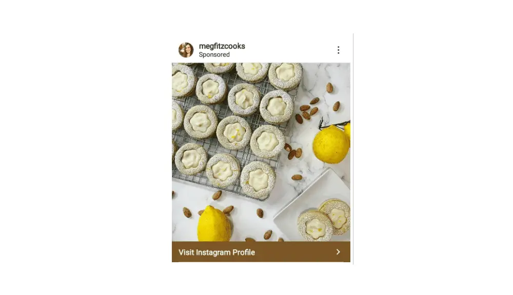
MegFitzCooks is a home cook that has used Call to Action in a very unconventional way. In the advertisement, she used “Visit Instagram Profile” as a effective Call to action button to merely let users go through her Instagram feed to explore her products and the kind of food she makes. They have a very active Call to Action tactic because visiting someone’s Instagram profile is always free, and the visitor has nothing to lose.
13. Spotify:
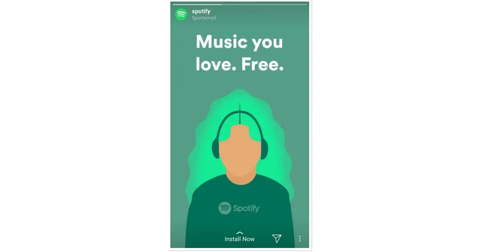
Spotify is the most extensive collection of music from all over the world. Just like Netflix has a massive collection of online streaming of movies and web series, Spotify a vast collection of music.
Here, Spotify has two active Call to action strategies employed. For mobile users, in their advertisement, they have written “Music you love. Free” and have the Call to Action “Install now” at the bottom of the advertisement. They offer installation and exploring music for free after installation of the Spotify application on the mobile. There is nothing to lose for the users when they are offering music for free.
The second advertisement is for desktop or laptop users. When the Call to Action “Open Web Player” is clicked, it straightaway takes the user to the Spotify website and starts playing the music with just one click. It is a very effective strategy to use the services without signing up or creation of account.
14. Dollar Shave Marketing:
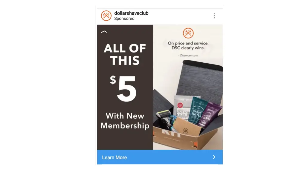
Dollar Shave marketing is known for its effective marketing strategies. One of the examples is that it has a blue effective Call to Action “Learn More” in the blue background that contrasts the images in the advertisement. It is designed in such a way that the eyes focus straight on the Call to Action.
They have written “All of this with $5 with new membership” where it shows that you get all the products in the image for only $5, a very enticing advertisement for targeting the male audience.
15. De Beers:
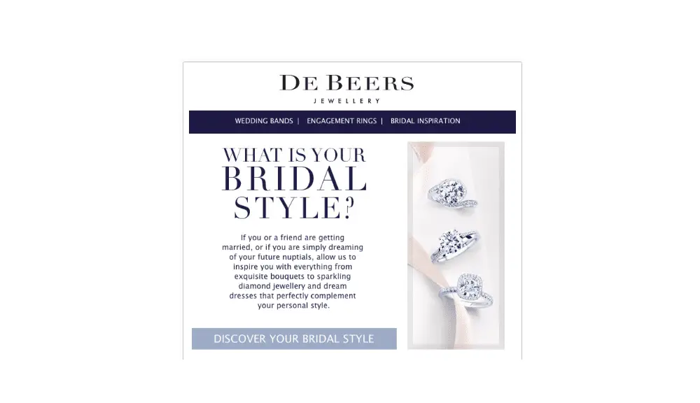
De Beers is a diamond empire that has used a practical and tactical Call to Action in their advertisement for their bridal ring collection. They highlighted the Call to Action in two ways. First, the colour of the Call to Action button is light blue against the white background that attracts the human eyes easily. And secondly, they have written “Discover your bridal style” that entices female audiences to click the button and look for their designs.
16. Monster:
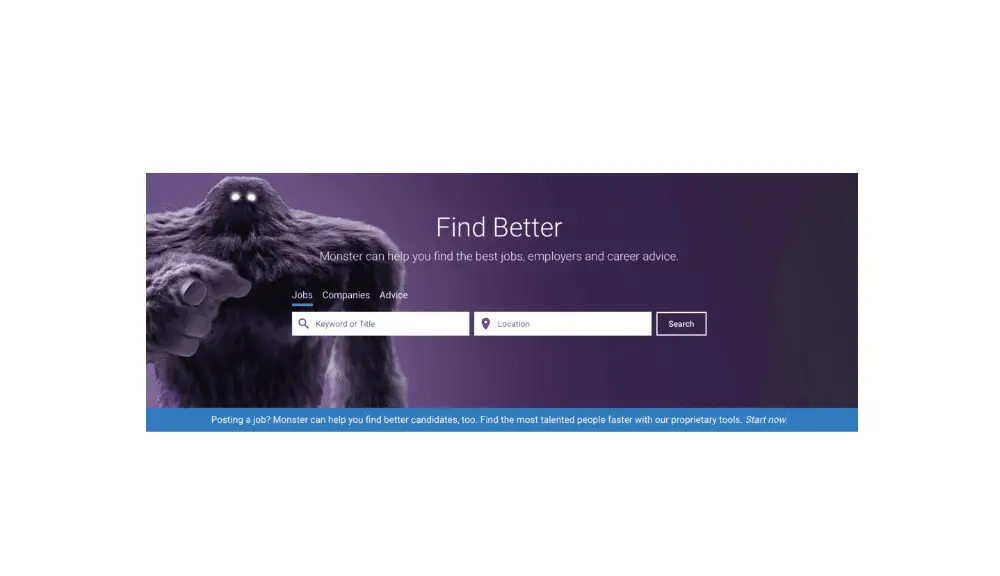
Often, short statements are more powerful than longer ones. And, Monster’s find better is a perfect example. They have used “Find Better”, just two compelling words to target a job seeker’s attention who have been frustrated with seeking jobs online on multiple job portals. Beneath those two words, they have written “Monster can help find the best jobs, employers and career advice” that explains the services they can offer to job seekers.
And if you are an employer, they have a Call to Action at the bottom of the advertisement in a blue background.
All the Call to Actions mentioned above are all well written and well-targeted Call to Actions that help a business expand its reach as well as increase their customers when they click their Call to Actions. It concludes that a well-written Call to Action can take your business to new heights and a poorly written Call to Action can drown your ship. Hence, Call to Actions should be used wherever there is a possibility of using them.
The post 16 Awesome and Effective Call to Action Designs appeared first on Web Design Blog | Magazine for Designers.
via https://ift.tt/3fpzqfP

No comments:
Post a Comment