It happens to all of us that our attention to a text is finite. If we do not have an incentive to continue reading, we will simply discard the content. Designers must try to make readers fall in love so that they continue reading. One way is through the proper use of fonts, such as Gotham. However, if we decide to use it, we need to get some Gotham font pairing with which to complement our design.
And we refer specifically to this typeface because it has become one of the favorite choices among designers as far as Sans-Serif letters are concerned.
The firm H&FJ launched Gotham in the year 2000. Its creator, Tobias Frere – Jones, was inspired by the architectural designs of New York City in the middle of the last century, so its style perfectly emulates the American landscape.
As it has up to eight different thicknesses, it easily adapts to multiple purposes. It has even been seen in the Obama presidential campaign in 2008. In the case of such a versatile letter, it is common to have it in our collection, but we cannot leave it without a good companion.
In the following list, you will see some good font pairings that look excellent with Gotham.
Gotham font pairing options
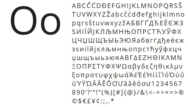
Open Sans
Organic and humanist Sans-Serif letters are not so common, since usually, the geometric shapes are the dominant ones in this section. However, from time to time some jewels like Open Sans appear that demonstrate that open characters and neutral shapes also work to achieve a formal appearance.
Open Sans is a Gotham font pairing that includes 897 glyphs, among which are ISO Latin 1, CE Latin, Greek, and Cyrillic, so we can write anything we can think of.
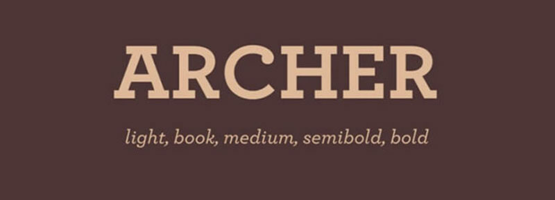
Archer
Tobias Frere-Jones, this time in conjunction with Jonathan Hoefler, were responsible for carrying out this commission for Martha Stewart Living magazine. At the design level, this is inspired by other Sans-Serif geometric fonts such as Rockwell, maintaining a dignified appearance of the twentieth century.
Unlike the Gotham family, Archer adopts a more European tone, which makes these letters less heavy for reading. Some interesting aesthetic details were also added, such as unique endings in the “C” and “G” letters.
Its cursive alternative is one of the most striking of the entire list, being a true calligraphic work.
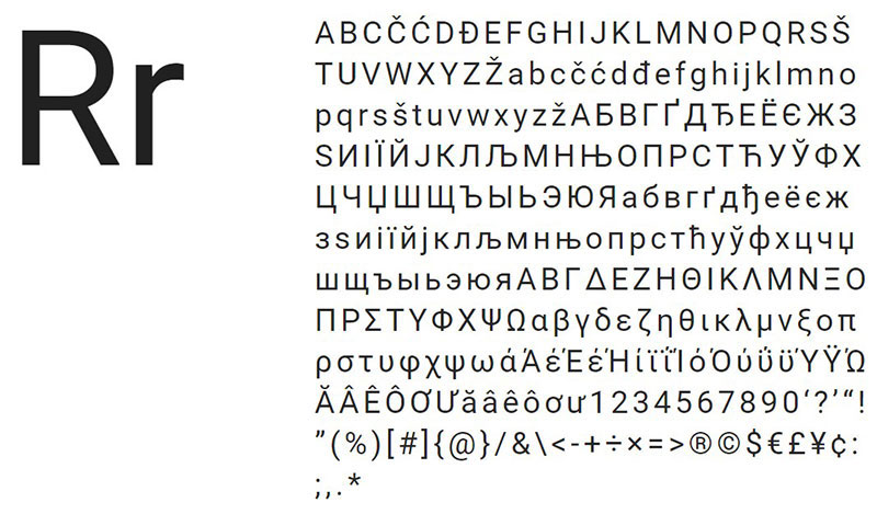
Roboto
The Roboto font is a representation of modern mechanized letters. These, despite having a strongly geometric framework, are complemented by some subtle curves in key places.
Additionally, Roboto is a very fluid typeface despite its mechanical concept. The letters do not close together, but these are open and with pleasing widths for the sight, which makes the words feel more natural for the reader.
Times New Roman
When it comes to printed works, there is nothing that surpasses Times New Roman. This Sans-Serif typeface was born as a commission for The Times newspaper in 1931.
Interestingly, the British newspaper no longer uses it, but that did not prevent this typography from becoming one of the most iconic in the world, being the standard in professorship and informative impressions for its elegance and legibility.
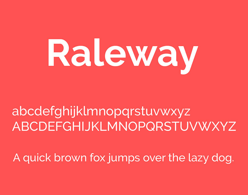
Raleway
Raleway is another alternative that tries to maintain a typical geometric style of the Sans-Serif letters while offering a standard variant inspired by the neo-grotesque style. It is possible to download this font with up to nine different thicknesses thanks to an update it received in 2012.
Bitter
Thanks to the nature of the pixels, the best letters are those that remain constant throughout their design. Bitter is an insipid letter of wide thickness, whose standard version is already larger than other typefaces.
Bitter is a perfect letter for printing thanks to its size, besides that when it was designed, it was done thinking about the shape of the pixels, so the square strokes, as well as the small details on the edges, are crisp.
Whitney
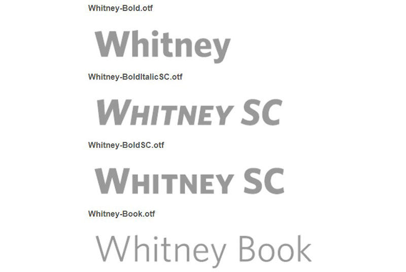
Another Tobias Frere-Jones’ work, and that match very well as a Gotham font pairing. Whitney is a commission made to the museum of the same name in New York, so it has an institutional and formal style.
The font had to be versatile while maintaining the general style that was already present in the museum, which resulted in thick strokes, subtle curves, and clean ends.
Antenna
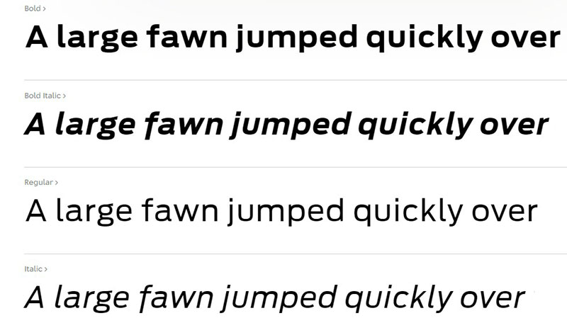
Designed by Cyrus Highsmith and published in 2007, Antenna is a wide spacing typeface, which thanks to its large number of alternative weights (7 in total, with 4 thicknesses each and their corresponding italics) is postulated as a font that adapts to many situations.
Futura
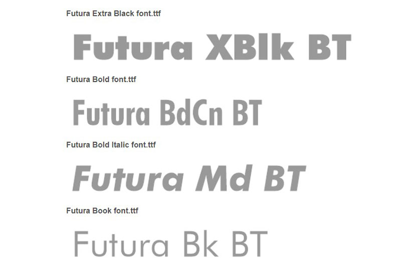
Futura is an excellent Gotham font pairing since they share many features, such as thick strokes, shape geometry, or uniformity in letters. Paul Renner designed it in 1927, and since then it has become one of the most famous letters in the world.
It can be found on many websites, but we can list some famous examples, such as the Volkswagen brand, who have used this letter for marketing since 1960.
Sentinel
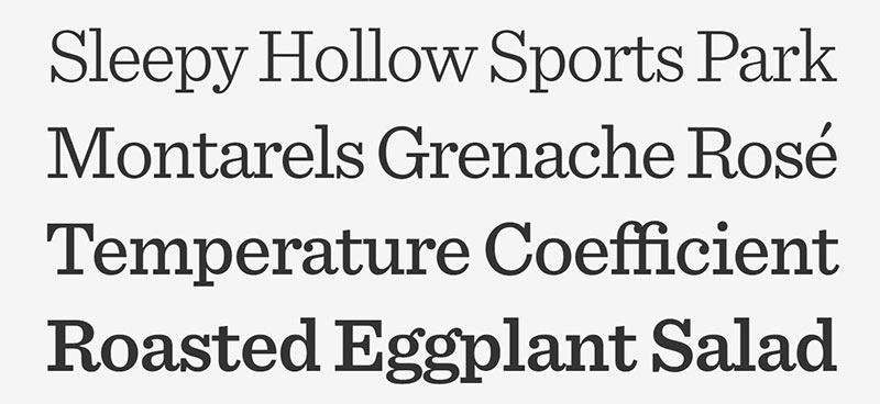
Another collaboration between Tobias Frere-Jones and Jonathan Hoefler that resulted in the birth of this typography that sought to refresh the classic Sans-Serif letters like Clarendon, since these did not include sufficient variants for the current market.
Sentinel solves this problem by including six weights with its italics, so it does not matter if it is a headline or the body of the text, we can use it without problems.
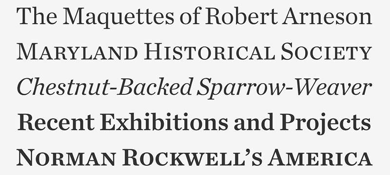
Mercury
The collaborations between Tobias Frere-Jones and Jonathan Hoefler do not stop in the world of typography. In this case, it is a letter that was specially designed for newspapers. Mercury does not alter the thickness of the letters at any time, but that does not prevent it from having four unique variants since each one has a different hue, which allows us to control the amount of ink used by the texts.
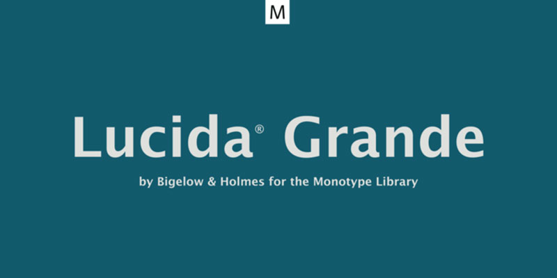
Lucida Grande
User interfaces must be understandable and simple, so it is necessary to have a typography like Lucida Grande. It was originally used for Mac OS X systems since 1999, although Apple devices currently use another typeface. However, Lucida Grande can still be obtained, even on Windows, where it is called Lucida Sans Unicode.
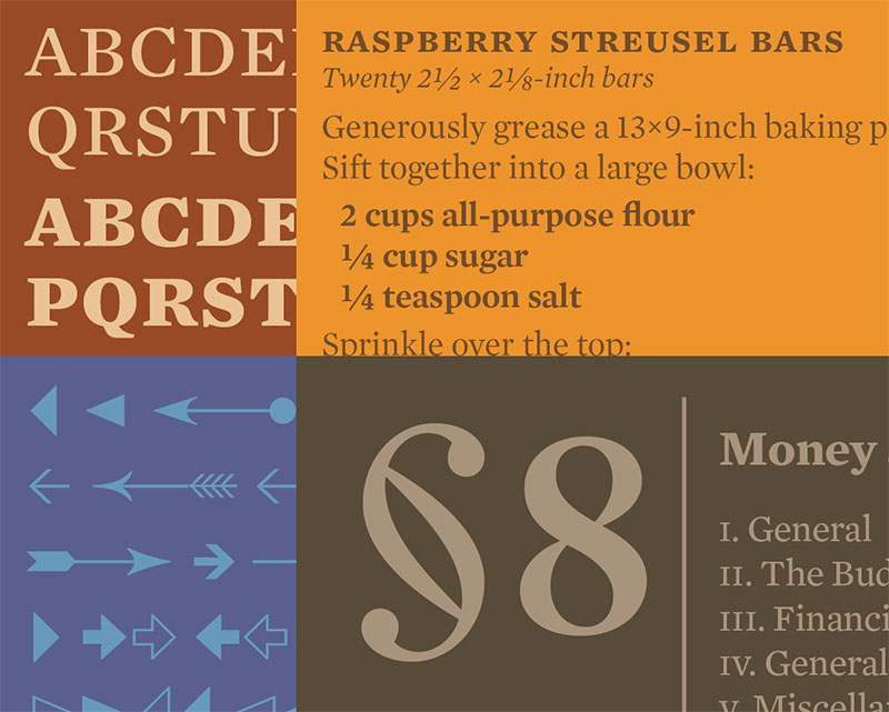
Chronicle Text
This modern edition of the typography was launched in 2002, but its origins date back to the end of the 18th century in Scotland. If we want a special Gotham pairing for printed texts, Chronicle Text is the best option. If instead, we look for a typography for monitors, we can opt for the variant called Chronicle Display.
Grifo
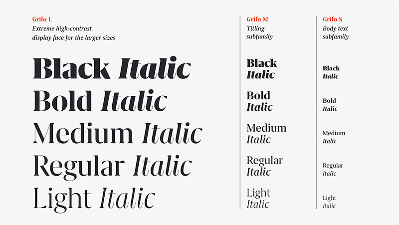
Of Portuguese origin, Grifo is a font that adds sharp details with triangle shapes to each of its glyphs, which makes them look like claws.
Its designer, Rui Abreu, was responsible for creating three different sizes to be able to use them both in the body of the texts and headlines, and each of the sizes has five different weights with their corresponding italics, so it is extremely adaptable.
If you enjoyed reading this article about Gotham font pairing options, you should read these as well:
- Baseball font examples that you can download for your project
- Check out this chalkboard font collection with cool options
- Fonts similar to Times New Roman
The post Gotham font pairing options that you must know appeared first on Design your way.
Source: https://ift.tt/2WpAvg2



No comments:
Post a Comment