The logo stands for the brand identity behind a company. It is not just a simple symbol that you push out. Like other car manufacturers, the Mazda logo has a long history that shows how the company has transformed in the last 100 years.
The company is based in Hiroshima and the Japanese automaker is well-known especially in Europe. Jujiro Matsuda was the founder of the company and he named it Toyo Cork Kogyo Co Ltd in 1920. The company first started by producing machine tools and then it switched to the automobile production back in 1931. The first vehicle that they made was the Mazda-go.
Where Did Mazda Get Its Name?
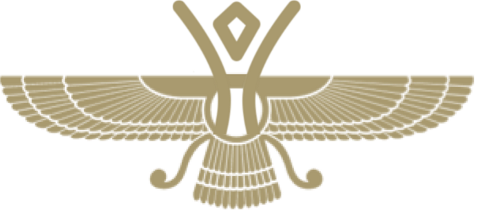
Many experts claim that Mazda comes from a combination of two names: “Ahura-Mazda” the Zoroastrian deity that was known for its wisdom and Jujiro Matsuda the Westernized pronunciation of the Mazda company that has the founder name. Matsuda was a very spiritual man and he honors the company because they kept the name for almost 100 years now.
The Mazda logo

The Mazda logo that we see today is a simple “M” that has arms raised similar with wings and it symbolizes the brand mission of fighting towards the future.
The shape of the Mazda Symbol
The Mazda logo represents the stylized letter of the brand and it is shaped widely as a 3D-model of wings. They are placed together in an oval and some people say the Mazda symbol also looks like an owl but this doesn’t really have something with the company’s symbolism.
The Color of the Mazda logo
The Mazda logo is done using several hues of silver color and it features also some black shades. The inscription that you can see below the logo is made in a trademark blue color that you can see for sure standing out.
The meaning of the Mazda Logo

The new Mazda logo has a lot of meaning behind that makes it very popular. It captures the spirit of Mazda by using the stylized “M” together with the idea of wings that are in flight and it symbolizes the road towards the future. Together with its simplicity, the logo brings a powerful message.
The “V” that you can see in the center of the “M” spreads out similarly with an opening fan and it represents creativity, vitality, flexibility, and passion that you can find in all the cars made by Mazda.
The Mazda logo does a great job of expressing the solid feeling that they are bringing in all of their products. The dynamic circle shows the readiness that the brand has into spreading out its wings in the 21st century.
A brief Mazda Logo history and evolution
If we compare the old Mazda logo with the new one, we will see how big the evolution has been in the years that have passed. The Mazda emblem has become one of the easiest to recognize symbols that we can see in the automotive industry.
There are different interpretations of thy symbol meaning.
1934

Is the year in which the first Mazda logo was launched in 1934 when they launched the three-wheel truck? It was just a simple letter that represented the company name.
1936
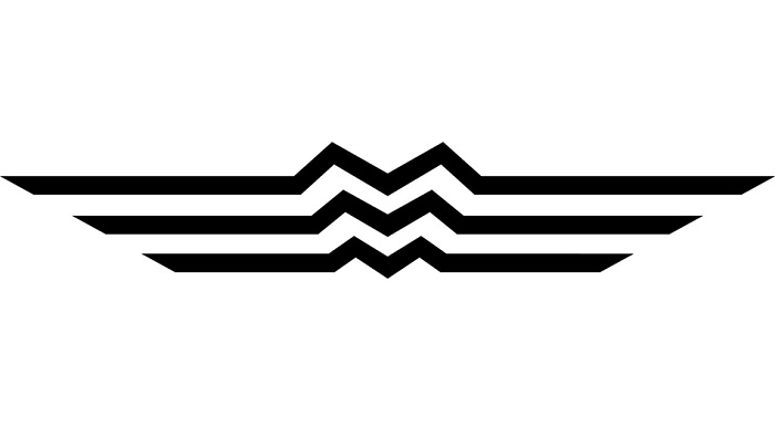
They brought the flow of the river from Mazda hometown, Hiroshima. The extensions represent the wings that show agility and speed. This is actually the first recorded corporate Mazda logo that they made. It was registered as a trademark for Mazda at the beginning of their three-wheel trucks.
The corporate and the brand logos were brought in the same time so that people that saw it on the company’s product will know immediately that the Mazda’s roots are found in Hiroshima.
1959

The next Mazda logo that they made was around for 16 years and it focused on the letter “M”. It effaced the wings and showed the resemblance to Hiroshima being released in the same year when they launched the passenger cars.
1975

From 1975 till the next decades they didn’t have any official logo. What they did was to introduce a stylized version of the brand’s name, Mazda on all of its products and any other official purposes.
1991
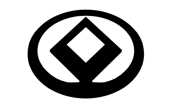
In 1991 Mazda did release a logo and they brought back symbols that were in the initial versions. The Mazda symbol had a diamond-like shape that showed the sun, wings and a light circle.
1992

The previous logo that we just showed you lasted just for a year because it resembled the Renault logo that also had a similar diamond shape so Mazda decided to bring a new version where the edges of the diamond were smoother. It kept the sun and the light circle together with the dimension of wings. This Mazda logo was the foundation of their current one.
1997
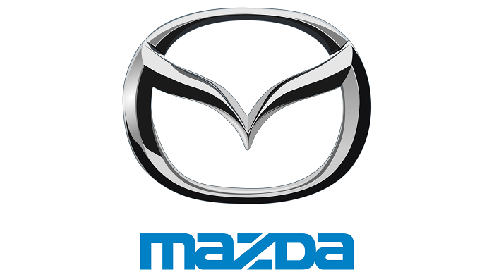
The brand logo that they adopted in 1997 had a V shape wing inside and it stands for determination shown by the pair of wings that you could see shaped in there.
The V-shaped wings also show the flexibility that the brand has especially due to its creativity, vitality, kindness and resilience. The brand stayed up against challenges and against all odds in order to pursue its dream.
Mazda for sure is committed to creating cars that have great quality and believe that new technology will be the game-changer for future generations. The spirit of Mazda does live in its logo.
2008

In 2008 Mazda introduced a new global visual identity without changing its symbol and it appears in all their communication. The new visual identity shows a new wing and some lettering that shows movement and boldness.
Celebrating their 40th Anniversary in the US in 2010 Mazda has almost 900 dealers that are in the States and it looks like numbers will increase.
2015 – Current
The last changes that took place were done in 2015. Mazda wanted to show their precision and reliability as a car company and what they did was to align the top and the bottom lines of its corporate mark.
The new Mazda logo for sure looks great and shows that the brand is driven by excellence and innovation. People will know more and more about this brand and slowly but surely it might reach the rest of the world because they make great cars and people will always appreciate a good product.
If you enjoyed reading this article about the Mazda logo, you should read these as well:
- The Adidas logo: What makes it so special
- Try these pretty fonts for fun and sweet projects
- The Amazon logo: Its meaning and the history behind it
The post How the Mazda logo symbol evolved throughout history appeared first on Design your way.
Source: https://ift.tt/2L5EmrZ

No comments:
Post a Comment