Design your way

Tuesday, August 30, 2022

Over the past few years, the use of illustrations in user interface design has become increasingly popular, and it’s a UI design trend today. You might be wondering why illustration is now among the core visual elements of UI design, especially for mobile applications and websites.

Before we go into the different illustration trends for UI design that you should consider trying in 2023, there are some reasons why you should include illustrations to user interface design.

Why should you use illustrations for UI design

Illustration Builds a Good Foundation of Artistic Harmony and Originality

With the right type of graphics, you can add creativity and style to user interface, branded stuff, and printed items. This is a vital recipe for designs to stand out, especially considering the fact that we live in a world of tight competition. Without this, people will not even want to view your products, let alone understand the benefits it offers.

Illustrations Create the Right Visuals to Pass the Desired Message

Studies show that people perceive images a lot faster than words. This implies that it’s best for designers to include visual content in mobile and web layouts so that more people can interact with their creations. A key thing to have in mind is that people generally find it easier to perceive visual marks, proceed and recognize data, especially when transformed into images.

Illustrations Offer Effective Support to any Copy Applied to Mobile or Web Interface

Another vital point to always remember is that images generally work as a communication tool, unlike just a copy. People perceive illustrations faster when they are included in any message. They will only need to double-read the message if they don’t get a proper understanding from the illustration. The perception speed that illustrations offer is a vital point for user interface design and overall experience.

Illustrations are Perfect for Creative Storytelling

Storytelling is an effective tool that most people use, especially when they want to unite different information. The aim is to create a story that has a strong connection and is memorable. Marketers are the ones that commonly use this approach in their marketing campaigns. If you want to make your storytelling to be a lot more creative, then you should consider including illustrations in the story. This would enhance the flow and also increase perception.

Illustrations are Vital for Creating an Emotional Appeal

One thing to always have in mind is the fact that we are all emotional creatures. With that in mind, it’s worth noting that everything that has to do with illustrations can significantly ignite emotions. This includes dynamics of curves, facial expressions, colors, shapes, and lines. Basically, illustrations make it possible for designers to be able to connect emotionally with their users and create interaction within seconds.

There are so many other benefits of using illustrations in your UI design, and this is just to mention some of these benefits. With that, we can now proceed with the different illustration trends for UI design that you should know.

5 Illustration Trends in UI Design

If you want to apply illustrations in UI design, here are some of the trends that you should know:

1.         Flat Illustration

This is a minimalistic but modern design style that is now widely applied in graphic design and also in UI design. It basically comprises minimum elements that do not include complex colors, highlights, and gradients. The use of flat illustrations is also without including shadowed, textured or shiny effects.

i1-1 UI design inspiration: Top 5 illustrations trends in 2023 designers should know

Source: illustAC

One thing to note about flat illustration or flat design is the fact that it is the exact opposite of rich design and skeuomorphism. However, even though flat illustration may appear simple, you’ll be surprised to find that it’s actually not as simple as it may seem. In some cases, it may also include some of the elements of skeuomorphism.

One of the reasons why flat illustrations are trending in UI design is because of how it helps in increasing focus on content by reducing distractions on visual effects. With flat illustrations, it’s a lot easier to emphasize on simple elements to increase interaction on UI design.

2.         3D Illustration

Before now, illustrations were mostly presented as 2D flat designs. However, it was only a matter of time for that to change, and this is all thanks to the continuously developing nature of modern design technology.

Today, illustrations are now presented with higher weight and volume. This is also now widely applied in UI design, and in many cases, it is now paired with geometric elements. Today, 3D illustrations now offer newer possibilities in UI design. If you check many popular applications today, you’ll find that 3D illustrations are already being applied in these applications. It’s even more common in gaming products today.
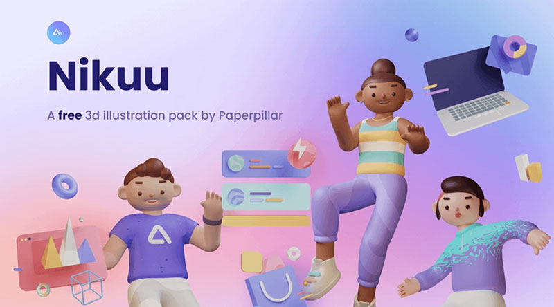
i2 UI design inspiration: Top 5 illustrations trends in 2023 designers should know

Source: Nikuu

3.         Abstract

This is used in describing designs that don’t accurately represent visual reality. It’s basically a form of communication through gestural marks, forms, colours, shapes and lines. Designers mostly use different techniques in creating works, and it’s mostly done by creating different experimental ideas.
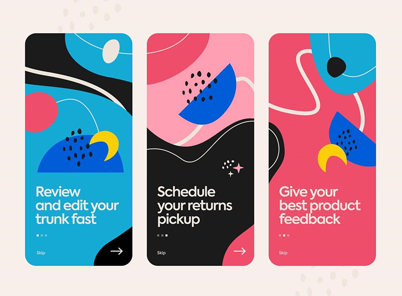
i3 UI design inspiration: Top 5 illustrations trends in 2023 designers should know

Source: Ania Chebysheva on Dribble

Abstract illustrations are now widely used in UI design today, and this is because of how it has evolved over the past few years. 3D surrealism and animations are some of the common ways by which abstract is applied in UI design today.

4.         Geometry

You have definitely come across so many beautiful designs today and might have observed that the beauty of each of these designs mostly comes from the point where art and pure mathematics intersect. Geometric elements and illustrations are the product of this point of intersection, and they are now widely applied in UI design. Today, there are many geometric elements that designers apply in UI design, and among these elements include geometric shapes and patterns, all of which are pleasing to the eye.
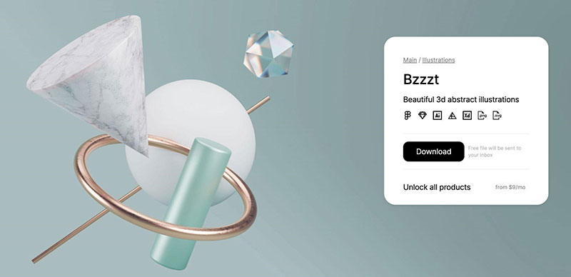
i4 UI design inspiration: Top 5 illustrations trends in 2023 designers should know

Source: Bzzzt

If you are looking for ways to improve the visual appeal of your apps or your UI design, one of the key things you should consider using is geometric illustrations or elements. What’s certain is that these designs will undoubtedly fit any designs, and it all depends on how you’re able to capitalize on these illustrations.

5.         Line Art

The last UI design trend that we’ll look at is line art, which is an expressive design style that is mostly bare in composition. When properly used in UI design, it makes it a lot easier to express any message. Line art is one of the simplest forms of illustrations that you’ll come across, and this is because it mostly appears clean and delivers a very elegant appeal to any type of design.
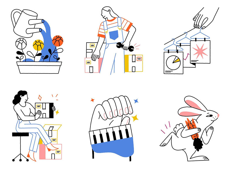
i5 UI design inspiration: Top 5 illustrations trends in 2023 designers should know

Source: Loomis-Pay on Behance

In recent times, a lot of designers are becoming increasingly drawn to minimalist designs, even in UI designs, and a keyway to get inclined to these trends is via the use of line art on any of your designs. Another impressive thing to note about line art is the fact that it remains one of the most affordable forms of design today.

UI design inspiration and resources

The internet remains the most diverse and versatile resource where you can find anything you’re looking for. Whether you are a UI/UX designer, typography artist, illustrator, graphic designer, or in other creative professions, you’ll always be in search of networks and sites where you can find amazing works from different networks and sites.

Interestingly, most of the places where you can find all the inspirations that you need are only a google search away. You only need to be able to find sites where you can always turn to whenever you need any type of design inspiration. Continue reading because we have put together some of the places where you can find all the inspirations for illustrations in UI design.

Behance

This is one of the most popular and largest creative networks in the world today that displaces different creative works for people to discover. The site is owned by Google, and it’s one of the best places where you can find all the inspirations for illustrations in UI design.

What you should note about Behance is that all the inspirations that you’ll find on the site are actually from the works of different designers located in different parts of the world. On Behance, you can easily find the works of a desire you like and emulate this work in your own UI design.

Dribbble

This is another really popular platform that shares a lot of similarities with Behance. Dribble is basically a creative social network where designers go to in search of all the inspiration that they can use in their design.
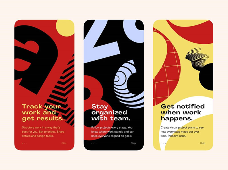
i6 UI design inspiration: Top 5 illustrations trends in 2023 designers should know

Source: Dribbble

Creatives from different parts of the world use the platform to post all their beautiful works for others to see. Doing this makes it easier for them to get comments on their work and possibly get a good paying gig that they can work on. If you’re a designer that is constantly looking for inspiration for illustrations in UI design, then you should consider including Dribble on your bookmark list without hesitation.

Pinterest

This is widely known as a visual discovery engine, and it’s also one of the most popular platforms that people from across the world use when finding ideas for home, style, and recipe inspiration. Today, it’s an option that is now explored by people who are looking for inspiration for illustrations in UI design.

The amazing thing about Pinterest is that it’s a more search-friendly platform to use than even Instagram. Regardless of the type of inspiration that you are looking for, you can rest assured that you’ll find it on Pinterest.

Illustration Stock Websites

Another nice place where you can get all the inspiration you need for UI design is from illustration stock websites. The interesting thing about this option is that you have multiple options to try. This is because today, there are so many illustration stock websites that people use. Some of these sites are available for free, while others require that you pay before you can use them.

Some of the most common illustration stock websites that you’ll find people using today include Freepik, Vecteezy, Shutterstock, Adobe Stock, and illustAC.

Conclusion

Are you a UI designer? We have taken the extra time to provide all the useful information you need about the use of illustrations in user interface design. From the different illustration trends, you should consider trying different places where you can find inspiration for illustration in user interface design.

For emphasis, the illustration trends we included are flat illustration, 3D illustration, abstract, geometry, and line art. On the other hand, the places where you can check for inspiration are Behance, Dribble, Pinterest, and Illustration stock websites. While there are different illustration stock websites, we recommend using illustAC.

The post UI design inspiration: Top 5 illustrations trends in 2023 designers should know appeared first on Design your way.


Source: https://ift.tt/fq8h9oF
Design your way

In this post, we will discuss all the different aspects of designing great blog content. We will look into the tips and tricks that will make it worthwhile for you.

Make your blog a learning center

If you have been creating content for years there’s a good probability you have created varying types of content on your site.

Content marketing trends tell us that videos and whitepapers are really popular these days.

Most company blogs would dedicate particular pages to particular content types. Videos might find a place in the B2B marketing video library, articles on blogs, whitepapers inside a resource center, and so on.

This organizes everything neatly for the user. But the user may not like the sectioning off of content.

If you’re the user who wants information on a certain topic how would you access the content on the site? Would you navigate to different areas on the site to check what’s available or would you want to see everything on the topic ranging from video to downloadable ebooks all in one particular section?

I suppose you would prefer the latter. That’s why you need content inside a learning center.

A learning center builds up the possibility that a user will spend more time on the site. Aside from the ease of finding everything in one place, cumulative learning will result in the user spending more time on your site. This will result in an increase in pages visited per session that Google uses to rank your site. The lower the bounce rate, the better your rankings.

Give options to readers to filter topics by personas, subjects, or content types. Have a search bar in place to do a keyword search of blog posts.

In addition to regular blog posts, create high-quality, in-depth pillar content that act as comprehensive information hot spots on particular topics.

With these strategies leading your content efforts, you’re getting your readers to access to the most relevant content and this approach may be better than most things you might do to get engagement from readers.

Add quick summary boxes

To rank for competitive keywords and get traffic to your site, most people create long-form content. I am one of them.

Make it an objective of workplace mentoring and drill it into your content team to add small summary boxes.

My articles are routinely 2000 words or longer. Creating content that long attracts search traffic. But, there are plenty of readers who may not want to stick around for that long. For them, you may want to offer answer boxes that supply them with brief information summarizing the content.

Most search results lead you to comprehensive guides that may be around 4000 words or longer. But plowing through the entire article is often tedious. That’s where summary boxes can be of great help.

The boxes provide short answers to questions the article explains in greater detail.

This makes it easier for users to find the information what they want, quickly. Plus it also magnifies your odds of appearing on featured snippets for the target terms.

This gives you additional clicks to your article. Such a box isn’t a necessary addition on blog articles and may not always result in featured snippets.

But you can see if your article starts ranking with this particular tactic or not. In addition, if you’re in the habit of listing FAQs do this- add small sections of value-packed information.

If yours is a SaaS business, there will be a section related to SaaS subscription management along with relevant information that customers find useful.

A blog card layout

Most businesses running a blog know that keeping their blogs fresh with lots of content is the key to traffic and conversions. Depending on how many posts you publish, you may accrue between 200 to 500 articles annually. With these many articles do you suspect your readers are being hit with too much information?

One of the best ways to solve this is through card design for the blog layout. You may have seen baseball cards. Turns out, a card-based display is one of the smartest ways to organize and display information.

Their architecture makes information recall and recognition easy.

Card design is seen everywhere now. Be it Pinterest, Twitter, or Google.

Similar to the examples from these sites, keep your blog cards simple. Simplicity wins.

Use a consistent, repeated structure. However vary images, and font sizes to present the information correctly to anyone who wants access.

Add the following elements:

  • Featured image
  • Blog title
  • Post date
  • Category
  • Blog excerpt
  • Social share links

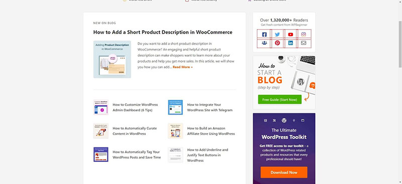
For example, WPBeginner posts a featured image for each and every one of their 900 blog posts. It’s easy to get sidelined after some time.

1-3 How to Design Great Blog Content

They didn’t. On top of adding featured images and other details add social proof with the help of a tool like TrustPulse that shows how many readers read a blog post or purchased a product.

The featured image and title are most prominent in card-based design. You can also include excerpts.

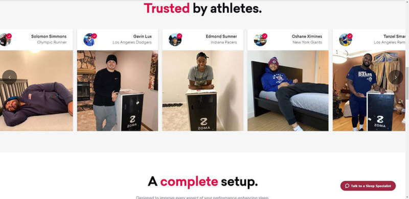
Use large, quality images

As blogging becomes a prominent vocation one of the chief differentiators you can have on your sites is making them more visual. Use non-stock photography.

Adding images and visual cues helps users easily recognize where the article begins and puts emphasis on the topic at hand.

Zomasleep goes a step ahead and uses images of real people buying and using their products.

2-3-800x390 How to Design Great Blog Content

Play around with your layout. Sometimes you can include article titles inside featured images or use a hero image entirely above the fold. Or you can balance the hero image and the title making it easy for users to start reading and scrolling through.

Use legible typography

On the web when people want to read your content, don’t make readers strain. They don’t want to read a 12pt font. It causes eye strain, especially when accessing something online.

You want the font sizes to be apt and not something people have to complain about. Somewhere between 17 px to 20 px is the sweet spot.

For headings, the font sizes should be larger.

Make use of descriptive subheadings

When people come to a blog post they rarely want to read it all. Most people are skimmers and skip to sections that interest them. If you are writing an article about say spend management software, dedicate different sections of the article to different features of the software.

Your headings should support this goal. Make them specific and descriptive.

You need headings that talk to readers and explain to them succinctly what the next paragraph is about.

Make social sharing for all devices

Social sharing buttons allow people to easily repost your article to their social media profiles. You’re encouraging readers to distribute your content for free. But you must make sure that this experience is possible on tablets, phones and other devices.

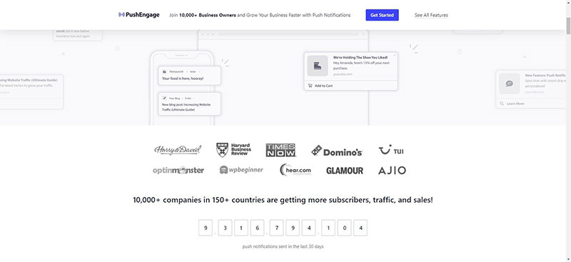
A Pew research discovered that 85% of adults in the U.S. get their news on mobile devices. Lastly, make it easy for readers to get updates on new blog posts by using Pushengage that updates readers whenever a new post goes live.

3-2 How to Design Great Blog Content

Conclusion

Designing great blog content often boils down to the tools you can use—both free and paid. You can find more such tools listed on this page at Awesomemotive.

The post How to Design Great Blog Content appeared first on Design your way.


Source: https://ift.tt/DuFg4bB

Design your way

Monday, August 29, 2022

Almost every marketer I know says that we need better calls to action.

Let’s start with the why.

Why you need a good call to action

When you tweak CTAs, it can bring a significant lift in your conversions thus improving your sales. The best marketing books would give you the same advice.

HubSpot was able to boost its conversions by 30% by just changing its CTA a bit. Imagine all that you can do with 30% more customers, email subscribers, and conversions.

Here are five ways to optimize your call to action.

Five ways to optimize your call to action

Let’s discuss how to make CTAs stand out in further detail.

1. Make your CTA stand out from other site elements

Your CTA should effectively stand out from the rest of the page. It should be easy to recognize and understand. Visitors should easily make sense of what visitors want and what it represents and why it is on your page. Sometimes a good website builder is all that you need to create great CTAs.

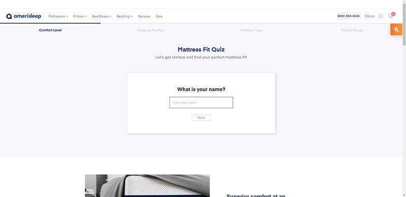
Whenever you design a CTA for a page, think about where you want the visitor’s eyes to go. If you want to highlight the logo make use of whitespace. If you want people to pay attention to the call to action below, add color below and direct their eyes to that particular CTA.

1-2 Five Ways to Create a Better Call to Action

For example, the first thing you notice on this mattress quiz page from Amerisleep is the blank space that asks for your NAME. The page makes effective use of whitespace to draw your attention to the quiz.

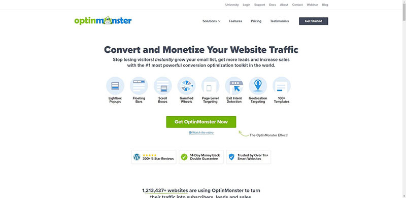
The CTA is designed with a little touch of the site’s original branding and colors. For example, OptinMonster uses an actionable CTA on its page. The CTA stands out from the rest of the page with its bold green color. Notice the little arrow on the side. All of these elements work toward the benefit of the CTA.

2-2 Five Ways to Create a Better Call to Action

The color contrasts with the rest of the background, the negative space highlights the elements and the CTA button.

2. Create urgency to entice visitors to click your CTA

When creating your CTA button, use action-oriented words. Action-oriented copy encourages visitors to click and read further.

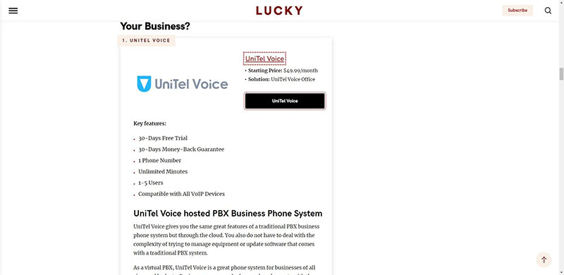
For example, one of the services highlighted in this review of LuckyMag covering ten different hosted PBX platforms is UniTel voice. Notice how the word UniTel Voice is different from the rest of the section with a black background.

3-1 Five Ways to Create a Better Call to Action

It can be a simple phrase like “Get started”. This tells us to click and also informs us there’s more to come if we click. The surrounding copy should also be action-oriented.

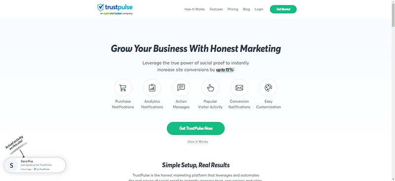
TrustPulse leverages urgency by asking us to check out the power of social proof. Social proof can increase conversions by 15%. Who doesn’t want that, especially when it’s free to sign up?

4-1 Five Ways to Create a Better Call to Action

The visitor is on your page for only a few seconds. Make use of time wisely with your copy.

The statements are all actionable and empower the user to take an action. They give a taste of what the user can miss out on if they fail to click the CTA button.

3. Consider different design elements to make your CTA clickable

In addition to the CTA itself, you have surrounding design elements to pay attention to. Think of elements like text, images, and the site design in itself.

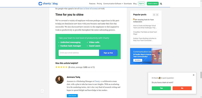
Here in this example, the blue color makes the CTA lift out from the page. It matches the site’s branding, it’s the logo and the site is full of information that points to the CTA button too.

The surrounding text compliments nicely with the content of the blog post which is on welcome to the team kit for new employees.

5-1 Five Ways to Create a Better Call to Action

The heading and the copy talk about the experience you will get with the platform. These are all positive statements that retell the brand’s story and set it up more concretely. This provides you with more information.

In addition, the image on the right stands out and doesn’t take away the effectiveness of the CTA button. The image is spaced well and is made up of colors that contrast. To make the CTA and the rest of the copy resonate well with the customer, customer journey mapping can be of great help.

4. Personalize Your CTA to get Most conversions

Your business may consist of many audience groups who visit your site for many reasons. It makes sense to use different CTAs to target these different audience groups.

If you have different audiences also think of the reasons why they visit your site. There’s a clear distinction between products for men and women with different CTA buttons inviting clicks and separating the products.

You can also use different CTAs to differentiate experts and amateurs if you are selling different courses. This helps you generate a higher conversion rate than a generalized CTA button. You should always ask for feedback from your website visitors on what you can do to improve conversions from your CTA.

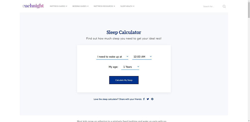
Here’s another example. Each Night has a sleep calculator page where you can enter your time of waking up to calculate the amount of sleep you need for the night. Each person’s answer is unique and Each Night is able to personalize the page in a simple way.

6-1 Five Ways to Create a Better Call to Action

5. Optimize your CTA for mobile viewing

Today 50% of traffic to your sites comes from mobile. Align your CTAs for mobile traffic so that you don’t miss on conversions. Data from Statista points this out.

Even search engines like Google want to give mobile visitors a better experience with the creation of Google AMP pages that are optimized for mobile viewing and load quickly.

Slack has a clear CTA that’s clearly viewable on mobile devices just as it does on webpages.

Open your site on different mobile devices with different screen sizes. You can also go for device selection within WordPress or within the page builder’s front end.

Conduct the Google’s Mobile-Friendly Test:

There’s more in the form of tablets, and other devices. They come in a range of screen sizes.

Tweak your CVTA for mobile viewing.

6. Use whitespace effectively

White space is also called negative space and is the area between design elements. Most aren’t fully aware of its role but designers love it.

Whitespace isn’t simply empty space. It’s a powerful tool that when applied the right way can make your elements shine. If there are multiple visual components on the screen, it’s easy for a CTA button to lose itself on the page or the screen. The right amount of whitespace can draw the users’ attention and make it more noticeable without too much effort.

Whitespace forges a connection between different UI elements. The less whitespace between components the more in touch they look.

Tip 7. Add Some Extra Information

The CTA message should be short. That’s not enough information for a user to make a decision. However, you can help this by providing additional contextual information. It can be a line explaining the next stages. Or reassuring the visitor that the sign is complete in under a minute.

Or that the registration is free. This helps allay click fear and propel them to take action.


Create better CTAs today

Ensuring you have a good call to action can improve your conversions. When creating your CYA it’s important to understand how it gels with your page and adds to its design.

In this post, we outlined several steps to improve and optimize your CTA buttons. To recap.

  1. Make the CTA button stand out from the rest of the site elements.
  2. Create urgency to entice visitors to click on the CTA button
  3. Consider multiple design elements to make the CTA clickable
  4. Personalize the CTA for different audiences.
  5. Optimize the CTA for mobile viewing

The next question is to learn how the CTAs stack up against the existing design. You can do that with Google Analytics and set up even tracking or UTM parameters to see how your CTAs are performing.

Keep User Flow in Mind

Big size buttons and bright colors often are good ways to catch attention. However, placing CTAs the right way can get them more attention. User flow is the journey a user takes and the path someone follows to complete a certain task. Users’ flow helps create a UX in a manner that they can go step by step to get the goal they want to get to.

Keep the journey in mind to effectively place the button right when they are most like to click. If the signup button is placed after they read information about the offer on hand, that makes them primed to convert.

The post Five Ways to Create a Better Call to Action appeared first on Design your way.


Source: https://ift.tt/A7LnZPX

Design your way

Backlinks are part of any well-designed SEO strategy and are one of the top search ranking factors for Google. That’s because backlinks show Google that your content is valued by others in your niche. Plus, it’s so interesting and informative that people are willing to direct part of their audience your way.

However, there’s one trick with backlinks – you can’t force them. For your website to grow and develop, you need organic backlinks from high-quality websites. Since we know this part of the equation often confuses website owners and content creators, here are a few tips to help you grow your backlinks without running the risk of a ban.

1. Define Your Target Audience

Do you know what kind of people you want to attract to your page? You need accurate and detailed data, such as your ideal user’s profile and the sort of search intent you want leading to your website (among others).

This work requires research and SEO knowledge that many web designers and business owners don’t have. Therefore, most self-made marketing campaigns target a general audience, which is why the level of progress is stagnant (at best).

To get the ball rolling, it’s best to work with a professional agency that knows how to do SEO to attract the right kind of traffic. Plus, once the collaboration ends, you will be left with an accurate profile of your ideal customer, which will be useful for other campaigns.

When you know who you need to address in order to get more high-quality traffic, it’s easier to set goals and design a path that will take you to them.

2. Enchant your Viewers from the First Moment

It only takes a couple of seconds for viewers landing on your site to decide if they want to stay and browse or leave in a hurry. And Google doesn’t like it when viewers don’t hang around (that’s why the bounce rate is such a scary indicator in the SEO world!).

One way to pique their interest is through your page’s design. You (or your design team) have access to a series of tools (such as colors, lines, shapes, text, and other visual elements) that help create a positive user experience.

Use these tools and elements to entice everyone who lands on your page and make them want to stick around (for a bit of inspiration, check out these astonishing landing page designs). Also, pay attention to your users’ behavior and identify the point(s) where they leave your pages. It helps to know the exit points as well.

3. Build Share-able Content

In the world of SEO, keywords, meta descriptions, titles, headers, and other similar elements help organize and structure the page. However, if you’re looking to attract users in an organic manner, you also need high-quality content that’s worth sharing and linking to.

For instance, a blog post called “Top 10 website design ideas for absolute beginners” created by a web design company has all the chances of reaching the first page of SERP because it brings value to a lot of people. Plus, websites and blogs that talk about SEO and web design will happily link to it.

In short, the secret to high-quality backlinks is good content (regardless of format). When you offer accurate and actionable details, people actually use your tips. And, if they are successful, they’ll talk about your content, which also creates social media engagement.

Wrap Up

Good content, a positive user experience, and knowing your target audience are some of the most powerful tools of a solid SEO campaign that’s focused on bringing high-quality backlinks. So don’t be afraid to put your best content out there – it will bring amazing results!

The post Growth Hacking SEO – Generate Organic Backlinks & Traffic Effortlessly appeared first on Design your way.


Source: https://ift.tt/adGweRK

Design your way

Friday, August 26, 2022

What is App Store Optimization (ASO)?

As most of us are aware, the full form of ASO is App Store Optimization, and you could say that it is similar to SEO but primarily for mobile apps. It is a method that is used to increase the visibility of mobile apps of different platforms such as an Android, iPhone, iPad, BlackBerry, or Windows that are present in app stores such as App Store for iOS, Google Play store for Android, Windows Store for Windows Phone, or BlackBerry World for BlackBerry apps. This process is quite similar to search engine optimization (SEO).

Why do you need App Store Optimization (ASO)?

The Google Play Store for Android apps and the Apple App Store for iOS apps are the two most popular app stores for finding new and installing apps. The fact that they host around 4 – 5 million apps is evidence of the strong competition that exists in any field of the mobile industry. It is highly possible that your app will end up a victim of such competition if solid setups and clear strategies are not implemented– and your most efficient option is ASO.

Experts Weigh In: 15 Practical and Effective App Store Optimization (ASO) Tips

We have selected and compiled the best ASO hacks from industry professionals in order to help you in improving the effectiveness of your optimization for the Apple App Store and the Google Play Store. Find out how you can boost your search ranking by selecting additional keywords for the app’s semantic core, preparing the app metadata in the appropriate way, and more.

Here are some App Store Optimization (ASO) tips from industry experts:

  1. Evaluate Feedback from Beta Testers
  2. Include Visuals such as Quality Screenshots & App Preview Videos
  3. Focus on Positive Reviews & Ratings
  4. Research the Best Keywords
  5. Don’t Forget the Importance of App Icon
  6. Choose the Best-Fit App Name
  7. Forge a Rock-Solid First Impression
  8. Clear and Informative App Description
  9. Always Track Your Analytics
  10. Run Apple Search Ads.
  11. Execute A/B Tests
  12. Use Commas instead of Spaces
  13. Research your Competitors
  14. Settle Down the Pricing of your App
  15. Focus on Maximizing Downloads

Evaluate Feedback from Beta Testers

If you want to improve your app, you should get lots of feedback from beta testers and request specific suggestions as they are testing your App. Try experimenting with different combinations of metadata, such as keywords, app descriptions, icons, and so on, to discover which ones impact your search ranking the most. You should think about localization because it provides the opportunity to expand your customer base and the fact that many customers download apps locally.

After they have downloaded your app, it is important that you maintain open lines of communication with your customers. A good percentage of people who buy an app will be happy to tell their friends about it because you give them value by downloading this App without knowing it in advance.

– Tia Campbell, Director of Marketing at Practice Reasoning Tests

Include Visuals such as Quality Screenshots & App Preview Videos

When a customer visits the page of your app, it is your goal to convince and persuade them to download it. Screenshots are a valid kind of visual storytelling that can be used to illustrate app functionality, provide users with a sneak peek, and tell a compelling narrative. Since first impressions are important to half of the people, these pictures need to stand out and must be prominent. As a result, you need to pay very close attention to the specifics, such as the requirements for the layout and the dimensions. Screenshots rank second in terms of influencing someone to download an app after app ratings. As a result, screenshots are very important for conversion optimization, which is an important part of ASO. Your screenshots and videos, however, have no effect on app ratings.

Using the following screenshots, you can increase your app store visibility:

  • Descriptive Captions
  • Display the Brand
  • Showcase your App’s UX Design
  • Combined screenshots

– Alex Popa, Founder & CEO of Whizcase

Mobile devices now account for more than half of all internet video views in the United States. Therefore, adding a video to the app’s page in the app store can boost downloads and revenue. Use a video to show off the app’s features or give users a taste of the gameplay, but keep it short (a 30-second video is ideal for app previews).

– Lachlan de Crespigny, Co-Founder and Co-CEO of Revelo

Focus on Positive Reviews & Ratings

For ASO to be successful, ratings and reviews are crucial. The feedback and reviews provided by customers are taken into consideration by both Google Play and Apple. The higher an app appears in the rankings, the more relevant it appears to be, and the higher the rating it receives. Reviews are a very important ranking factor for apps in the App Store. Both the quantity and quality of positive ratings and reviews have an impact on ASO. When evaluating an app, the vast majority of users place a premium on star ratings. Many people check the app’s star rating and user reviews before deciding to download it, so I would recommend focusing on the positive reviews of your app.

– Adam Fard, Founder & Head of Design at Adam Fard UX Agency

Research the Best Keywords

When it comes to ASO, keywords are just as crucial as they are in SEO. They make it easier for people to find your app on app marketplaces where it is available. Check to see if there are any specific keyword phrases or words that are currently popular in relation to your app. Utilize those that are listed at the top of search engine results pages (SERPs).

The goal is to generate a list of keywords for you to consider using to improve the optimization of your app store listing. ASO is influenced by each and every component of an app’s listing in the relevant app store. A search engine’s ranking for an app can be improved by 80-100 spots and 10-20 positions, respectively, if relevant keywords are included in the title and description. Consider the following keywords when conducting keyword research:

  • Keywords that describe the Main Features of your App
  • Synonyms of your Keywords or LSI Keywords
  • Keywords that Indicate your App’s Classification

– Matthew Smith, Digital Marketing Director at Right Hook Studio

Don’t Forget the Importance of App Icon

The app’s icon should be both aesthetically pleasing and interesting. Pick a color palette, a size, and a geometry that helps communicate what the app does and creates an immediate positive impression. This will distinguish your app from the millions of others that are already available on the market. However, you should make sure that the icon of your app is identifiable from that of other apps. When it comes to the layout of mobile applications, each app store adheres to its own unique set of guidelines.

The minimal size for iOS is 1024X1024 pixels. Depending on the function of the symbol, its dimensions are as follows: app icons are 180×180 pixels, navigation icons are 66×66 pixels, and tab bar icons are 75×75 pixels. As a result, you should ensure that the image looks good even when reduced in size. The minimum size needed for Android is 512X512 pixels. Google has outlined different requirements that you should adhere to.

– Aimi Davis, Chief Editor at Online Mediums

Choose the Best-Fit App Name

You should focus on optimizing your app’s title if you want to increase downloads in the PlayStore and Apple AppStore. Having a “duo” of your brand’s name and the app description is the best structure. Therefore, using your brand name in the app’s title will undoubtedly increase downloads if it is already well-known. As an entrepreneur, apps have been crucial in facilitating efficient workdays, and when deciding which apps to download, I pay close attention to the app’s title. And if the brand name is there, it’s already a big plus in my book since it seems more authentic and reliable.

One of the key elements that will impact how frequently your app is downloaded from the app store is choosing an appropriate name for it. The name of your app will always be the first thing a user will notice when they scroll down. Therefore, you should make sure that any user can tell what your app is all about with just a brief look.

For instance, you can’t name your app “XYZ: Editor” if it’s solely a photo collage app because users could think it’s a video editor. Instead, you should choose words that are aligned with the real work it does. You can either call it “XYZ: Collage your photo” or just “XYZ: Photo Collage” to make it clear what it does.

– Brian Case, Director of eCommerce & Retail at Selkirk

Forge a Rock-Solid First Impression

Make sure to forge a rock-solid first impression from the users. The moment a user lands on your app page, make sure to convince them to download it within seven seconds. Therefore you must aim to create a positive first impression. And the key here is to include high-resolution screenshots on your app page. These screenshots should focus on an exceptional feature that will let users have a glance at what the app is all about. Every time I stumbled on an app, half of my decision on whether to download it or not is based on my first impression. And when I see lots of visual content like high-resolution photos, I know that the app is worth downloading right away.

Your end goal should always be to let the users understand what your app is all about. You need to feed them with what it can do for them in order to easily integrate it into their daily life. When they truly grasp what’s in it for them once they download your app, your app store optimization efforts will surely pay off.

– Gerrid Smith, Chief Marketing Officer at Joy Organics

Clear and Informative App Description

You are only allowed to use 4000 characters for this crucial component of an app’s metadata. Users have access to the app’s main functions and information. Use smooth, conversational language to attract and encourage users to download your app. Above all, it must be understandable and instructional. If you list the following responses in bullet points, it will be simpler to recall them:

  • What is the purpose of the app?
  • What problem is it supposed to solve?
  • How will it improve the user’s quality of life?
  • How much does it cost?

The description of an app is taken into consideration by the algorithms used by app stores to determine rankings. The keywords you enter here will be used by the Google Play Store to index your app. On the other hand, keywords in Apple App Store descriptions are less beneficial for app store keyword optimization.

– Mike Owens, Digital Marketing & Growth Director at Web Hosting Advices

Always Track your Analytics

It’s extremely important to track your app analytics, just like you would for your website. With the use of mobile SDKs, you can implement services like Google Analytics for your app to keep track of important KPIs. You can also maximize your ASO efforts with SDK services for analytics, marketing, and more. It is vital to keep in mind that ASO also offers business benefits; the more users you have, the more in-app advertisements and purchases you can use and generate. This is why it is so important to focus on growing your user base. If you track and measure the effectiveness of your app using analytics, it will get more downloads, and increase the user base, and funds that it deserves.

– Alex Savy, Co-Founder, and Editor-in-Chief at ComfyNorth

Run Apple Search Ads

Speaking of Apple Search Ads, in 2022, running Apple Search Ads campaigns is vital if you want to stay afloat. It may be the only option to gain users’ agreement because no other platform will provide app install advertising to consumers. Apple Search Ads is a treasure trove of opportunity if you use it properly. Here are some best practices to run apple search ads:

  • Chase branded keywords of your competitors to take some of their search traffic. Protect your branded keywords from competitors by running Apple Search Ads for them.
  • This free tool for improving images, app previews, and keyword choices are available in the Apple Search Ads dashboard. That said, Creatives Sets have some limitations compared to a full-fledged A/B testing tool.

– Joe Troyer, CEO & Head of Growth at Digital Triggers

Execute A/B Tests

Both your app and your ASO need to be updated at all times because the mobile market and the Google Play Store are both constantly evolving. The best practice is to regularly check the most important KPIs, such as the number of organic and non-organic installs, keyword rankings, overall top charts by category, etc., ratings, and reviews. Update your keywords and remove any that aren’t converting, experiment more with the graphic elements, and keep running A/B tests until you identify the greatest possible combination of the elements for your Google Play Store listing. Provide the best experience you can, look out for your customers, and keep an eye on user reviews. Users can interact with Google Play, provide comments on their ratings, and even turn negative reviews around. A significant feature that benefits both searches are a high level of favorable user sentiment. Users are persuaded by the excellent quality of the app the conversion rate of your listing and Google’s preference for apps with more and better ratings.

In-app names that combine a brand name and a brief app description perform well in app stores and increase conversion rates. This tactic is used by even very large corporations, so we advise you to try it out with other apps available in the app store to see if you can achieve your goals. To broaden the possibilities for your organic growth, test this concept first with app store A/B testing before making any changes.

– Martin Lassen, Founder, and CEO at GrammarHow

Use Commas Instead of Spaces

This is a very common mistake that App marketers commit. Some developers use spaces and commas to separate terms, knowing that the App Store can read all of their keywords as one large incomprehensible keyword. Because spaces are regarded as characters, this is needless and lowers the number of keywords you can use. As separators, the App Store algorithm reads both spaces and commas. So, instead of writing “magic, amazing, to, do, list” in the Keywords field, write them as “magic,amazing,to,do,list” as suggested by iTunes Connect.

–  Matt Weidle, Business Development Manager of Buyer’s Guide

Research your Competitors

It is important to both attract and drive traffic to your app if you want to achieve the maximum level of optimization for app downloads in the Play Store and the App Store. Conduct research on your competitors and look through the comment area. Then, sift through the user reviews and pick out relevant keywords. This will tell you what features users want and don’t want. Make use of these keywords as well as additional keywords that are similarly related in order to increase your visibility in search results. Including videos and visually appealing screenshots in the description is another great strategy that works really well. One of the most common types of app optimization is promoting your app on other websites and generating traffic.

–  Robert Warner, Head of Marketing at VirtualValley

Settle Down the Pricing of your App

Creating a survey that asks respondents how much they would be willing to pay for the app in question is a great way to get a better understanding of how to price the app. If you are unsure of the appropriate price of your app, you can find out if users are willing to pay extra for it after they have already downloaded it by asking them if they are willing to pay more. If the answer is yes, set a price greater than what they are willing to pay in order to make money from this activity.

–  Derek Bruce, Operations Director at Manchester First Aid Courses

Focus on Maximizing Downloads

Keep a focus on increasing the downloads as it will escalate the visibility of your app. To maintain the visibility of your app on the app store, you need to work on the volume of the downloads on a continuous basis. App Store Optimization is a continuous process that needs to be monitored over a period of time. When your app is optimized accurately, it will show up results by driving traffic to your app. By following the tips of App Store Optimization, which can make your app visible on both of the app stores.

Making your app free to the public at the initial stage will drastically increase your chances of getting more downloads by boosting your visibility from day one. If your app is free but offers in-app purchases, make it completely free for a little while. This will encourage people to use your app more.

–  Abdul Saboor, Full Stack Developer at The Stock Dork

In Conclusion: Some Tips for Optimizing Your App Store Experience

In this post, we have shared with you 15 key ASO strategies that every marketer and developer should be familiar with in order to maximize the total number of downloads. After reading this post, you should immediately set some goals for yourself and get started on a plan to achieve them. Never forget that success can only be attained by persistence, smart planning, and an excellent product.

The post 15 App Store Optimization (ASO) Strategies Every App Marketer Needs to Know appeared first on Design your way.


Source: https://ift.tt/rDPcvzh

Design your way

Most companies, especially those with an exclusively online business model, make sales, process transactions, market their wares, and do so much more through their websites. Thus, a good website can play an essential role in increasing the profit and reputation of a business. This is why web designing has become one of the most demanding skills in the market today.

Since website designing is a complex job, web designers often look for tools that can give them maximum freedom and efficiency. Webflow is one of the most popular web development tools that can be used to make attractive websites efficiently. Because of its user-friendly features and benefits, Webflow is gaining popularity, especially among web designers.

So if you’re a web designer or just a business owner who would like to build a website on your own, check out these tips that will help you design a great website using Webflow.

1. Define Your Website’s Identity

If you’re a new Webflow developer, it is one of the most important tips that can help you make an attractive website. It’s extremely important to understand what is the purpose of the website you’re working on and how it can reach the target.

With the designing tools of Webflow, it’s quite easier to give the website a proper look. But you need to have a good idea of the goals and objectives of that website.

If you’re designing for an e-commerce website, you have to make an attractive website that can attract customers and help them purchase their desired products from the website. But if you’re building a portfolio website, you have to make an alluring design and showcase achievements, and highlight key points in an eye-catching manner. In this way, it can generate more visitors to the website.

Besides, it’s also important to keep the interest of the viewers on the website for as long as possible. For that, you need to think about the entire visual and user experience of the website. You have to make the layouts easier to access and navigate so that the viewers can spend a good amount of time on the website.

2. Prepare Content

After figuring out the website’s identity, the next step is to make a structure of the content that you want to add to the website. The main purpose of adding content is to keep the viewers engaged and hooked. First, you have to look at the other competitors and similar websites. You need to observe and analyze what content they have added to their website and how. Then you can make a content plan based on your own ideas and an analysis of what’s already out there.

To make your content more attractive and eye-catching, you can use some great tools of Webflow that will immensely help you to bring out your creativity. Webflow can provide you with some amazing design elements and content organization plans. Take inspiration from these designs and bring out your best design.

While planning content, you need to make sure that the content is suitable for your target audience. For instance, for an e-commerce website, you have to include content that’ll support product pages and increase traffic. There are several types of content like videos, blogs, downloadable content, audio files, and so on. Choose the types of content that will create more interest in among your target market.

3. Use the Right Color Schemes

Color schemes are one of the most important factors in making a good website. It’s crucial to put the right colors on the website that goes with your brand and creates a positive impression on the viewers.

As Webflow offers a wide range of color schemes, it can get a bit overwhelming to choose the right color pattern for the website. Putting too many colors can often hamper the aesthetic side of the website. So you have to be clever while choosing the color palette.

When it comes to choosing the desired color palette, think about what kind of emotions you want people to associate with your website. For instance, if you want to create a sense of trust and reliability in your website, choose colors like deep blue or navy blue. But if your target market is young and you want your website to look fun, you can go for colors like yellow, orange, etc. On the other hand, you can use green color to represent sustainability and environment-friendly features.

4. Put the Best Quality Images

Images can often create a major impact in the minds of the viewers. The first thing they view on the website is the photos. Poor quality and unrelated images will create a sense of annoyance among the viewers. An irrelevant picture can also damage the brilliance of the website. So you should be careful while putting pictures on the website.

To improve the overall quality of the website, you can include high-quality images first. There are a variety of stock photos out there but choose only those that are relevant to the website. Besides, you have to crop and edit the pictures to fit into the layout of your website design.

While choosing pictures for the content, remember to put an image that suits the context of the content. When inserting pictures and photos on the website, be sure to check the format. Picture formats can make a huge difference in loading and viewing your website – whether your website is adequately mobile-friendly or not and things like that.

5. Keep a Consistent Typography

Typography is an important aspect in terms of the readability of your website content. If the fonts and the letter are not easy on the eyes, it will be very difficult to engage visitors with your site beyond a certain point.

From instructions to hyperlinks, you have to use many texts while designing a website. But all those texts need to be consistent. That’s why you must put all texts in your profile in the same size and format. Headers, links, or body text, all these items should have the same style. In this way, you get to keep the readers engaged with consistent typography.

When choosing fonts, you have to analyze which one would be preferable to the target customers of the website. Fonts can improve the look and feel of a website. While choosing typography, think about how the text alignments and spacing will look to a new viewer. This will help you make the right decision in choosing fonts and other text-related items.

6. Improve the SEO

Since marketing has gotten more competitive than ever, businesses are focusing on improving the SEO of their websites. SEO influences how well a website appears on the search engine. Every website owner wants the highest amount of traffic to their website. The importance of SEO in web design is also increasing day by day. So you need to have elements that will improve the Search Engine Optimization (SEO) of the website.

There are several ways to boost your website’s SEO. Webflow has a dedicated SEO tool that will help your website reach the top of the search list. You can also use SEO-friendly header tags, titles,  and meta descriptions in your website content. Keywords play an important part in SEO so make sure to use SEO-friendly keywords in your content.

7. Make Responsive Designs

Previously, people used to view websites only through computers. But now, the scenario has changed drastically. Because of technological advancements, most people spend a lot of their time on smartphones and tablets. So there is a high possibility that your designed website will be viewed from many different kinds of devices. So you need to make sure your website is optimized for all kinds of devices, especially smartphones.

Most smartphones have different screen sizes and capabilities. So you have to offer a similar experience for your website across all devices. For a better view of mobile devices, you need to improve your UX and UI.

Most people won’t visit websites that take a long time to load. So reducing the loading time of your website is also important to have more traffic. Besides, many animations and illustrations might not be accessible or visible on mobile devices. You can resize those or take measures to make them visible on all platforms.

8. User Testing and Feedback

It’s a major part of designing a website. Users and viewers are the main judges of how good a website is. No matter how good a website looks from a designer’s perspective, viewers’ opinions should always matter the most. That’s why before publishing the website, you need to conduct user testing.

You can make a draft of your website and ask random people or friends, given that they fit the demographic profile of your target audience, for feedback. In this way, you can get the viewer’s take on the overall look and feel of the website. Then you’ll have the opportunity to make adjustments. You can also check the loading time of the website and see if any correction is needed.

Conclusion

A great website is a representation of a designer’s skills and abilities. The tips you just learned can help you design amazing and creative websites with efficiency. With Webflow’s various designer-friendly tools, you can reach your full potential as a designer and deliver exceptional websites that please the eyes and drive quantifiable results.

The post Want to Design a Website Using Webflow? These 8 Tips Will Help appeared first on Design your way.


Source: https://ift.tt/TwNduCx

10 Best Website Builders For 2022

Thursday, August 25, 2022

The most cost-effective, easiest, and fastest way to establish a high-quality website for yourself or your client is to choose only the best website builders to work with. Building websites that are responsive, mobile-friendly, SEO optimized, and all-around great-looking, are key elements in providing a great user experience. The online website-building editors listed here will help you achieve these important website elements.

Gone are the days when having a website was a good thing; now, having a good website is a must.

Short on time? If you’re short on time, please bookmark this page to come back later and read all the details we’ve included. However, here’s a quick list of the top 3 options:

Top 3 Website Builders

#1 – WiX.com: Trusted by over 200 Million users, without a doubt WiX can help you achieve your desired website-building goals in any industry or sector and you can start for Free!

  • Best website builder for beginners

#2 – WebFlow.com: Becoming one of the most popular builders today, WebFlow accommodates both professionals and beginners with a high-tech. Free to start!

  • Best builder if you want the ability to customize or code

#3 – BigCommerce.com: A solid provider of all things eCommerce. With BigCommerce you can easily choose a template, upload products, and launch your store. Free trial available!

  • Best for building eCommerce websites

Introduction

Businesses that do not have a robust online presence will find it challenging to compete in today’s economy. The growing dominance of websites can be attributed to many factors. First, the proliferation of internet-enabled devices has made it easier than ever for people to access the internet.

Second, new technologies, such as easy-to-use website-building editors, have made it so that anyone can create and maintain user-friendly, modern, and engaging websites that look amazing. It used to be difficult to build a website and only professional designers had the capability. That’s not the case anymore.

What Is a Website Builder?

Website builders (also known as page builders) are online apps, or software, that can enable practically anyone to create and launch a website without writing any code or hiring a web developer. Most of the popular builders today are easy to use and employ a drag-and-drop, WYSIWYG (what you see is what you get) editor program.

With a website builder, you can select from various themed templates and designs to create a vast multi-page website or a simple landing page.

Website builders are often used by small businesses and individuals who want to create a simple yet professional-looking website quickly, efficiently, and for free or very little cost.

The 10 Best Website Builders

The Internet is now flooded with website builders that claim to be the best. While some of them are genuinely good, a few can be disappointing. To avoid disappointment, let’s get started with our collated list of the best 10 website builders that you can use in 2022.

1. WiX – Best Website Builder For Beginners

www.wix.com

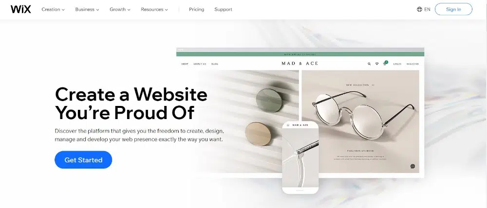
Wix is an online website builder that lets you create a website quickly and easily. It holds the advantage of being one of the first major players in this sector and serves over 200 million users. With Wix, you can choose from over 500 templates, add your content, and get online in minutes. Plus, Wix is free to use! So whether you’re creating a website for your business or just for fun, Wix is the perfect platform for anyone who wants to create a beautiful website without spending a lot of time and money. 

Top 5 reasons to choose Wix:

  1. Websites built with Wix look professional and sleek and easily stand out from the crowd
  2. Wix is an easy-to-use platform that teaches you on the go
  3. You can create a website for free with Wix. It charges only when you want to publish the website on your own domain
  4. Wix has highly functional and visually appealing template options for all types of business sectors 
  5. Wix provides an array of digital marketing tools that can be easily integrated with the website to boost your business

G2 Rating & Review:

★★★★✩ 4.2 out of 5 Stars Read more
Best Website Builders For 2022: Wix

2. Webflow – Best For Customizing & Coding

www.webflow.com

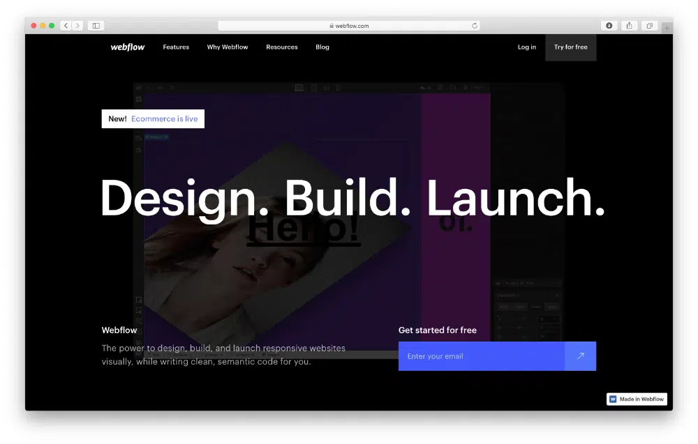
Webflow is an online website builder that helps you create responsive websites without code. With Webflow, you can design and build your site using a visual editor and then export the code on a traditional web platform. You can also use Webflow to host your site, making it easy to get started and avoid the hassle of setting up hosting yourself. It claims that more than 3,500,000 designers use Webflow to create and maintain their websites.

Top 5 reasons to choose Webflow:

  1. Websites created with Webflow are responsive and look great on all devices.
  2. With Webflow, you have complete control over the design of your website.
  3. Webflow allows you to export your code which can be helpful if you plan to switch or add more customization.
  4. Websites created with Webflow load fast, are SEO-friendly and can be easily scaled up when needed.
  5. You can build your website for free, taking as much time as you want, as Webflow charges only when you want to publish the website.

G2 Rating & Review:

★★★★✩ 4.4 out of 5 Stars Read more
Best Website Builders For 2022: Webflow

3. BigCommerce – Best eCommerce Website Builder

www.bigcommerce.com

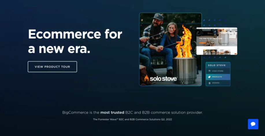
BigCommerce is a famous website builder that allows users to create and design beautiful eCommerce websites quickly. Websites created with BigCommerce are modern, clean, and responsive – perfect for businesses of all sizes. Plus, BigCommerce makes it easy to add eCommerce functionality to your website so you can start selling products and services online quickly. So whether you’re a small business owner, artist, photographer, or writer, BigCommerce can help you build the perfect online home for your brand. 

With customizable templates, powerful eCommerce features, and 24/7 customer support, BigCommerce is the ideal platform for anyone looking to create a stunning website.

Top 5 reasons to choose BigCommerce:

  1. The platform is highly user-friendly, even for those with no prior experience in website design or coding.
  2. BigCommerce offers a wide range of templates and features, so you can create a website that is truly unique to your business.
  3. BigCommerce websites are responsive as they adjust to looking great on any device, from smartphones to laptops to tablets.
  4. Its focus on eCommerce and related integrations is beneficial if you plan to set up an online shop. You can easily load products and collect payments for sales.
  5. The most significant benefit of using BigCommerce is that you can try it out for free! There is no risk in giving it a go-to to see if it suits your needs.

G2 Rating & Review:

★★★★✩ 4.2 out of 5 Stars Read more
Best Website Builders For 2022: BigCommerce

4. Elementor – Best For Building WordPress Websites

www.elementor.com

Elementor is one of the most popular online website builders for WordPress.org websites. It is used by millions of people worldwide to create beautiful websites. Elementor is easy to use and has many features that make it an excellent choice for those who want to create professional-looking websites. It also provides plenty of video tutorials and documentation to help you get started. With its plan starting from $99/year, it is one of the most cost-effective website builders.

Top 5 reasons to choose Elementor:

  1. The drag-and-drop editor is very intuitive and easy to use for all types of people
  2. It provides 300+ designer templates and 100+ widgets to enhance the visual feel and functionality of the website
  3. Elementor has a very active community of users and developers, so you can always find help and support if you need it. 
  4. Websites created through Elementor, like the other site builders, are super fast and SEO optimized to rank well.
  5. Elementor’s 24×7 chat premium support is beneficial for troubleshooting 

G2 Rating & Review:

★★★★✩ 4.6 out of 5 Stars Read more
Best Website Builders For 2022: Elementor

5. Divi – Best For High Visual Designs on WordPress

https://ift.tt/tgkc2zD

Divi is part of the ElegantThemes family of products and one of the most popular online website builders. It allows you to easily create and edit your website without learning to code or hiring a web designer. Divi is perfect for businesses of all sizes, from small to large corporations. And, it’s easy to use, even if you’re not a tech-savvy person. So, if you’re looking for an easy-to-use, powerful and versatile website builder, then Divi is the perfect choice for you.

Top 5 reasons to choose Divi:

  1. Divi offers one of the most advanced visual builder technology that provides excellent control of website designing.
  2. Its 40+ website elements make sure you have all the designing options you need
  3. Websites made with Divi are responsive and look great on all devices.
  4. With Divi’s lifetime access offer, you can make unlimited websites on the Divi platform, making it very cost-effective.  
  5. Divi offers excellent customer support and is constantly updating its features to ensure it remains the best website builder on the market.

G2 Rating & Review:

★★★★✩ 4.7 out of 5 Stars Read more
Best Website Builders For 2022: Divi

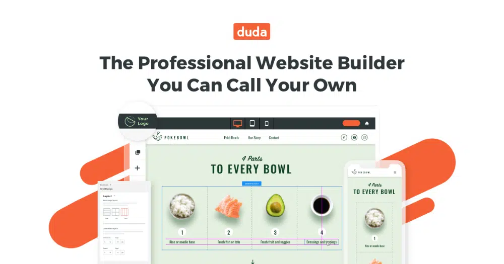
6. Duda – Best For Agencies & Team Website Building

www.duda.co

Duda is a website builder that allows you to quickly create and launch beautiful, responsive websites. It offers everything you need to get started, including templates, drag-and-drop tools, and customizable themes. Plus, it’s easy to use to create a professional-looking website in no time. With Duda, you can create a website for your business, personal blog, or online store. And because it’s responsive, your site will look great on all devices.

Top 5 reasons to choose Duda:

  1. Websites built with Duda are responsive and look great on all devices.
  2. Duda offers a wide range of features and integrations, making it a powerful website builder.
  3. Building a website with Duda is easy and intuitive, even for beginners without any coding knowledge
  4. Duda provides excellent customer support, so you can always get help when you need it.
  5. Duda’s pricing is very competitive, especially considering the quality of the platform.

G2 Rating & Review:

★★★★✩ 4.6 out of 5 Stars Read more
Best Website Builders For 2022: Duda

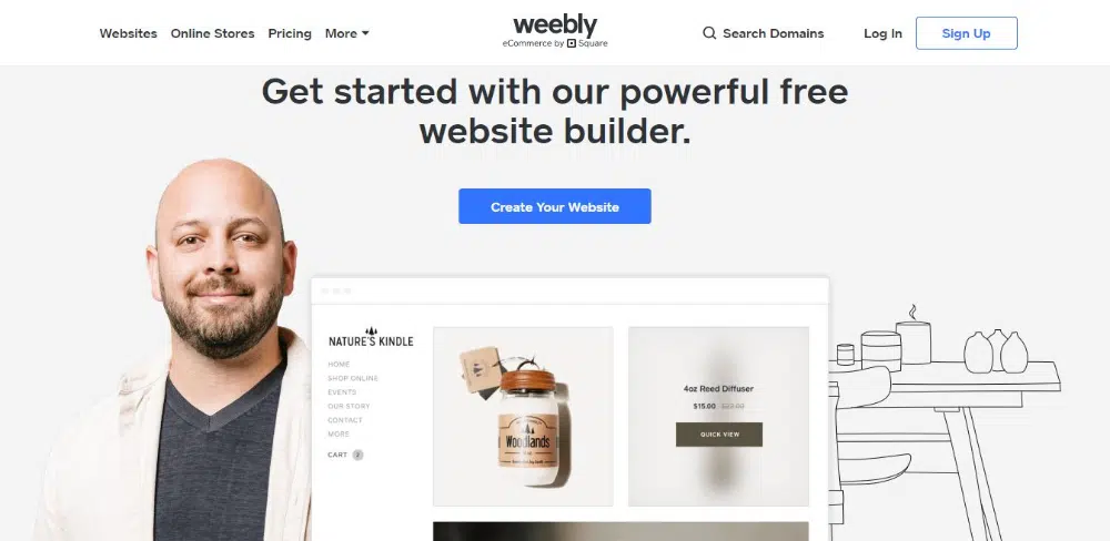
7. Weebly – Best Low-Cost Website Builder

www.weebly.com

Weebly is a site builder owned by the reputable point of sale company, Square. They offer a wide range of features and templates, making it an excellent option for those looking to create a professional website without any prior experience. Weebly also has several eCommerce features, making it a good choice for businesses looking to sell online. Overall, Weebly is a versatile and user-friendly website builder that can be used to create Websites of all types.

Top 5 reasons to choose Weebly:

  1. Websites built with Weebly are straightforward to use and edit. Even if you’re not a tech-savvy person, you’ll be able to create a beautiful website with Weebly.
  2. Weebly offers a wide variety of features and templates, so you’ll be able to create a perfect website for your needs.
  3. Even the basic plan of Weebly comes with SSL security and SEO settings.
  4. Weebly offers advanced integrations for the online marketplace.
  5. Weebly is committed to providing excellent customer service. If you have any problems using Weebly, you can contact their customer support team for help.

G2 Rating & Review:

★★★★✩ 4.2 out of 5 Stars Read more
Best Website Builders For 2022: Weebly

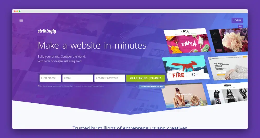
8. Strikingly – Best For Freelancers & Solopreneurs

www.strikingly.com

Strikingly is an online website builder that makes it easy to create beautiful, mobile-friendly websites. With Strikingly, you can create a website in minutes, even if you have no technical experience. Just choose from one of our gorgeous templates and add your content. You can also use Strikingly to create a professional portfolio or an online store. This way, it can cater to almost all types of website requirements.

Top 5 reasons to choose Strikingly:

  1. Websites built with Strikingly are incredibly fast in loading on all devices.
  2. The platform is straightforward to use, even for beginners.
  3. Strikingly websites are optimized for search engines, so you can be sure that your site will rank high on Google and other search engines.
  4. Strikingly also provides other features like analytics, social feed, forms, and more.
  5. The customer support team is outstanding and always willing to help, no matter your problem.

G2 Rating & Review:

★★★★✩ 4 out of 5 Stars Read more
Best Website Builders For 2022: Strikingly
Learn About Strikingly Now

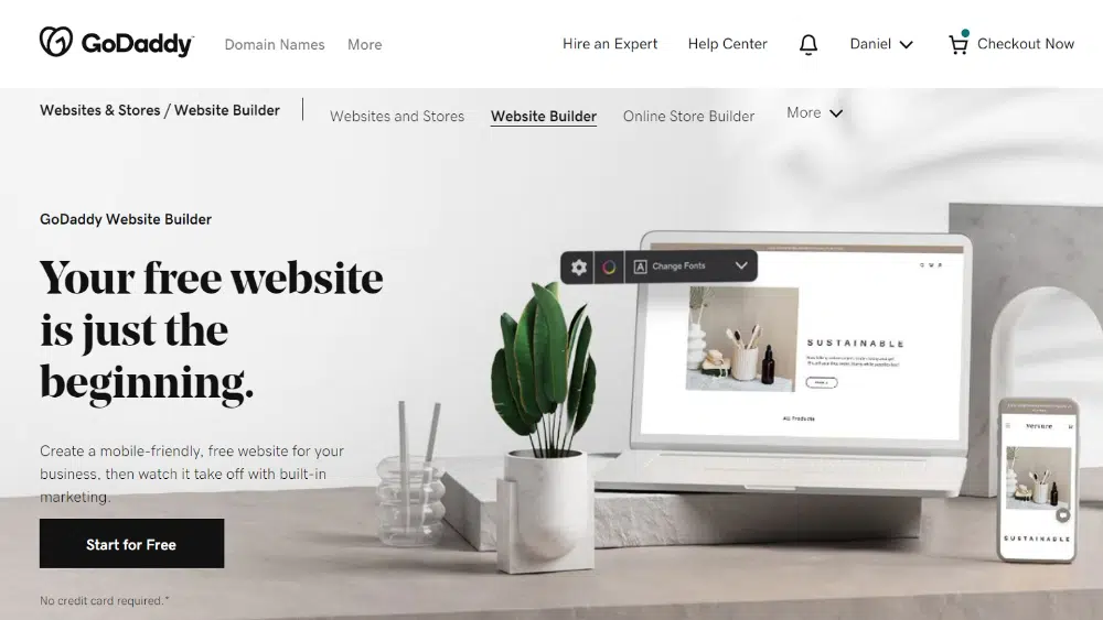
9. GoDaddy – Best For A Basic Personal Website

www.godaddy.com

GoDaddy is more known for its domain name registration. In recent years they have become a popular website builder for those looking to build non-complicated, personal websites. GoDaddy makes it easy to build a website, even if you have no previous experience. With GoDaddy, you can create a website in just a few simple steps. First, you’ll choose a template from their wide selection of designs. Then, you’ll add your content and images. Finally, you’ll publish your site and start attracting visitors!

Top 5 reasons to choose GoDaddy:

  1. GoDaddy Website Builder includes many features and tools to create a truly unique website, such as eCommerce functionality, social media integration, and more.
  2. Websites created with GoDaddy Website Builder are hosted on Go Daddy’s secure servers, ensuring your website is always accessible to visitors.
  3. GoDaddy allows you to start creating the website for free and only charges when you want to go live.
  4. In its premium plan, you can access advanced SEO options, the integration of payment services, manage orders, and more. 
  5. GoDaddy has rich experience in hosting and domain sale and provides superb customer support.

G2 Rating & Review:

★★★✩ 3.9 out of 5 Stars Read more
Best Website Builders For 2022: GoDaddy

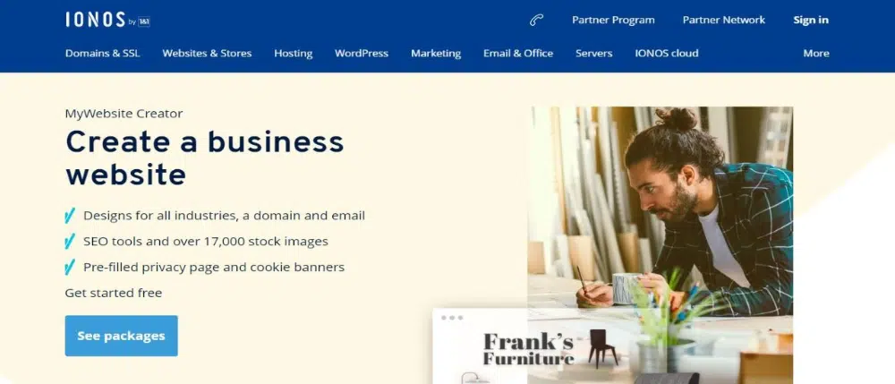
10. IONOS – Best For European Sites

www.ionos.com

IONOS is one of the leading providers of online website builders with a large European market share. Their platform is simple and offers a wide range of features, making it an ideal choice for those looking to create a professional website. Websites created with IONOS are responsive and look great on all devices, making them perfect for businesses. In addition, IONOS offers a wide range of support options, so you can always get help when you need it.

Top 5 reasons to choose IONOS:

  1. IONOS online website builder is very affordable. You can get started for as little as $1 per month.
  2. They offer various site-building features like creating an online store, a blog, or a forum.
  3. IONOS is very reliable in terms of designing and also in terms of hosting as it has very minimal downtime
  4. For all major sectors, IONOS has various design templates that you can choose from 
  5. The tailored support offered by IONOS makes sure you have a personal consultant helping you throughout your website designing journey. 

G2 Rating & Review:

★★★★✩ 4 out of 5 Stars Read more
Best Website Builders For 2022: IONOS

What Advantage Do Website Builders Provide?

Website builders operate as a platform that helps people without coding knowledge create their websites. Using a drag-and-drop interface allows for creating complex website pages quickly and efficiently. A major advantage right off the bat is that you can avoid a learning curve that consists of years of learning code as a web developer.

The following are some advantages of using a website builder:

1. More Responsive and Loads Faster:

Websites built with online website Builders are usually more responsive and faster loading than those made with traditional coding methods.

2. No Coding or Design Knowledge Needed:

Website builders allow you to create a website without prior coding or design experience. This means that anyone can create a professional-looking website without expensive software or designers.

3. Better SEO Optimization Design:

There may be some debate over this one, but generally, websites built with online Website Builders are often more search engine friendly than those built with traditional methods. This is because the code is typically cleaner and more well-organized by dedicated teams of web developers. After all, these website builders want happy customers who see results.

4. Visually Appealing Design:

Online Website Builders typically offer a wide range of templates and designs to choose from, making it easy to create a unique and stylish website. In addition, these templates are well-researched and guaranteed to provide a good user experience.

5. Option to Test Drive With Free Trials:

Many online Website Builders offer free plans or free trials, so you can try out the service before committing to a paid plan. This is a great way to see if an online Website Builder is right for you and your website.

What To Consider Before Choosing a Website Builder

Online website builders can be an excellent option for building a website without any prior experience or technical knowledge. However, there are some things you need to consider before choosing an online website builder. Here are six things to keep in mind:

1. Ease of Use

One of the most important factors to consider when choosing an online website builder is the ease of use. You want to choose a platform that is easy to use and navigate so you can build your website quickly and easily.

2. Available Features

Another critical factor to consider is the features offered by the platform. Make sure the platform you choose offers the features you need to build the website you want. Otherwise, you may end up facing challenges finishing your website design.

3. Cost

Cost is always an essential factor in any project you take up. Therefore, you will want to choose an affordable platform that gives you the features you need without breaking the bank. Most website builders have multiple plans based on features, so make sure you choose the one that suits your needs.

4. Flexibility

Another essential factor to consider is flexibility. You want to choose a flexible platform so you can easily make changes to your website as needed. Even after publishing the website, you may want to make design changes to improve the user experience. 

5. Customer Support

A sound customer support system will ensure that you get the right help whenever you need it. You want to choose a platform that offers excellent customer support if you have any questions or issues while building your website. Try to go for a builder with a 24×7 help option and a good track record.

6. Reputation

Finally, you will want to consider the reputation of the online website builder you are considering. Make sure you choose a platform with a good reputation so you can be confident in its ability to help you build a great website. If it has worked for thousands of other developers, it will work well for you.

Conclusion

Choosing the right website builder is an important decision that you need to make right at the start, as it will decide the rest of your website designing journey. The majority of website builders here are free to use or offer a free trial so it’s a good idea to check out their features first before making a long-term commitment.

Also, the choice you make will depend on the type of website you want to create and the budget you have. No matter what, any of the site builders we’ve listed here will help you create a stunning, modern-looking website that will look like a web developer made it.

Here’s a recap of the best website builders for 2022:

  1. Wix – Best Website Builder For Beginners
  2. Webflow – Best For Customizing & Coding
  3. BigCommerce – Best eCommerce Website Builder
  4. Elementor – Best For Building WordPress Websites
  5. Divi – Best For High Visual Designs on WordPress
  6. Duda – Best For Agencies & Team Website Building
  7. Weebly – Best Low-Cost Website Builder
  8. Strikingly – Best For Freelancers & Solopreneurs
  9. GoDaddy – Best For A Basic Personal Website
  10. IONOS – Best For European Sites

The post 10 Best Website Builders For 2022 appeared first on Web Design Dev.


via https://ift.tt/1Bwm72e
 

The Cash Box Blueprint

Most Reading