Line25 Sites of the Week for August 1st 2014

Thursday, July 31, 2014

Line25 Sites of the Week is a weekly roundup of the most outstanding website designs that I stumble across during my every day browsing. In this week’s collection, we have designs from WILD, TOWA, M·Power Yoga, Cognitect and Readymag.


WILD


WILD


View the website


TOWA


TOWA


View the website


M·Power Yoga


M-Power Yoga


View the website


Cognitect


Cognitect


View the website


Readymag


Readymag


View the website


The post Line25 Sites of the Week for August 1st 2014 appeared first on Line25.


Source: http://ift.tt/UPqOE8

How to Put Your Image in List Item with CSS

Lists are useful when you want to list your text in a number or bullet style. But you don’t always want to use the default, boring list style. What would look even better is if you use your own image or style instead. Follow the steps provided in this tutorial to put your own image in list item using CSS.


Steps to put your image in list item with CSS


1. First of all, create an html file. You may use any IDE like notepad or notepad ++ or Adobe Dreamweaver to create an html file. In this tutorial, we are using plain notepad that is available on any Windows PC. Open notepad any type following code:


<html>

<head>

<title>CSS tutorial – 6</title>

<link rel=”stylesheet” type=”text/css” href=”css/style.css” />

</head>

<body>

<h3>Fruits:</h3>

<ul>

<li>Apples</li>

<li>Bananas</li>

<li>Oranges</li>

</ul>

</body>

</html>


And then save the file as .html (eg: tut6.html).

Here,

<link rel=”stylesheet” type=”text/css” href=”css/style.css” /> will link the stylesheet that we are going to create.


The <ul> tag creates an unordered list whereas <ol> tag creates ordered list.


step-1-create-html-image-list


2. Next, put the small image (usually less than 20px width and 20px height) in the same folder where your html file is.


step-2-save-image-list step-3-create-css-image-list step-4-type-css-image-list


3. Next, in the same directory (folder), create another folder named css and create a new css file named style.css. To do that, open notepad and save it as style.css


step-3-create-css-image-list


4. Next, type the following code in the css file we have created in step-2 i.e. style.css


ul{

margin-left: 15px;

list-style-image:url(‘../img1.gif’);

}


Here,


margin-left will add the margin to the left and list-style-image will add an image as a list item instead of a default oval list.


step-4-type-css-image-list


This completes our tutorial on how to put your image in list item with CSS. If you’ve found this CSS tutorial helpful, please leave a comment below!


The post How to Put Your Image in List Item with CSS appeared first on Web Design Blog | Magazine for Designers.


via http://ift.tt/1oSx8ad

Design your way

There is much controversial debate among web designers about the icon which is often referred to as the “hamburger” icon, the three lines icon indicating a link to a menu or further navigation through the site.


Using the hamburger icon has many advantages for designers, since it is easy to scale it to a suitable size and fit it cleanly into the pixel grid. Its original use was as a list icon, but, over time, designers used it to indicate a menu. Still, is it correct to use a list icon in this way? After all, a menu simply lists options.


Hamburger

Image source


Issues with the icon


Many web designers question whether the hamburger menu icon has any credible value. Research evidence gives conflicting results as to whether the hamburger icon indicates a menu to all internet users.


Some web designers believe that younger internet users recognize that the icon means a menu. However, the largest growth in internet use in most countries is among older people, the so-called silver surfers, who may not previously have used computers or smartphones and may not recognize that the icon represents a menu. These inconclusive findings only add to the controversy surrounding the use of the hamburger icon.


The only universal finding is that no users will think that the icon is a unique link, the three bars or lines say clearly that whatever the button means, it is plural rather than singular.


Time

Image source


Many designers put a border around the hamburger icon or put it against a contrasting background drawing attention to the icon and making it look more like a button. Designers who do this report that doing so encourages more users to click on the icon than would do so if it were left plain.


Making the icon more distinctive then results in more clicks. It is also important to note that the hamburger icon is often put in the extreme left hand corner at the top of the screen, very difficult to reach for people using a mobile telephone to access the site.


However, many app designers continue to use the hamburger icon because they can easily put many functions into the application. Designers trying to formulate former web applications for mobile device use are often tempted to use the hamburger, however, in reality they cause many more problems than they solve.


It creates confusion


The context in which the hamburger icon is used sometimes changes what exactly it might mean. Even when users know that the hamburger icon indicates a menu, it is not always apparent exactly what type of menu it might be.


wild


The look of the icon too could confuse users, three lines or bars could indicate several meanings, it could mean a list or it could indicate text. In other areas, it has other meanings.


Its original use to indicate a menu originates from the fact that a menu is usually a few lines of text. When the menu is in the form of a grid then the menu button itself may look like a grid too. The Google menu used to be a horizontal menu bar at the top of the page, but now it is shown as a grid menu.


The hamburger button’s use to indicate a menu emerged to help designers hide the traditional top menu bar because the smaller screens on mobile computing devices do not have room for the traditional screen top menu.


Look at it from a different perspective


Designers should look at the hamburger icon as though they were coming across it for the first time and consider what it might mean to such an inexperienced internet user.


The mere fact that designers call it the hamburger icon indicates that its visual appearance alone does not convey to all web users that it holds a navigation menu behind it. A magnifying glass ably conveys to all users that you click on that button to find, or search for, something. A line picture of a house ably indicates that users must click there to go home.


Both icons graphically indicate their actions without ambiguity. Many users do not understand what the hamburger icon indicates and it may only be chance that they actually find the navigation menu behind it.


Should we test it? Someone already did


Two studies tested conversion rates using different means to hide navigation menus. James Foster discovered that the most clicks resulted when a button clearly labeled with the word MENU was surrounded by a border.
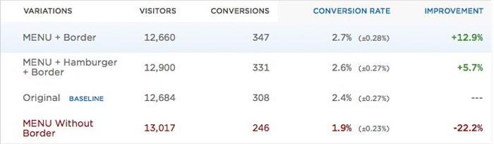

Menu eats hamburger

Image source


He also used the hamburger icon clearly labeled with the word MENU and surrounded by a border and it received the second highest number of clicks. It is clear from these study results that users understand that a button clearly labeled MENU leads to navigation links rather better than any other indicators.


The hamburger icon, universal menu icon? Nope


Nope


It is not as though web designers always use the hamburger icon to represent hidden navigation menus. Some designers use the grid and plus sign, other designers may use any one of several icons to mean a navigation menu.


Taking the example of Google again, it is rather confusing, since it uses the hamburger icon to mean a menu in its search engine and yet uses the grid display in its Gmail and Google plus services and both present a menu when clicked on by users.


Google Plus


Although the grid icon shows a navigation menu in the form of a grid and the hamburger icon displays a list type menu. Arguably, they perform the same operation and isn’t really fair to expect internet user to learn several different icons; they do not actually care what type of menu is displayed, they only want to know how to navigate quickly and easily through any web site.


An alternative to the hamburger icon in mobile apps


The tab bar holds a row of buttons, which are constantly visible, and opens the various parts of an application. Some devices have this bar at the top of the screen while others at the bottom.


tabs


Why hide navigation options away? Why not put them where users can readily see them and access them easily with a single click? Doing it this way allows users to switch between the different features without spending time returning to the applications home page each time. In addition, designers can use each tab to display notifications.


Designers have many ways to make the tab bar disappear when it is not being used. For example home screens which are scrolling feeds can be designed in such a way that when the user scrolls up to reveal new content, the tab bar disappears and is shown again when the user scrolls down to return to the top.


Where the interface is like a map and space is at a premium, designers can make tab bars disappear when the user either taps or drags content. It is not ideal in all situations but in most cases the information is more easily available to users by using these means.


Ending thoughts


Using a button clearly labeled “MENU” takes up very little more space than the hamburger icon. On a mobile device this could be important. However, for desktop browsers space is not crucial and as the research shows a clearly labeled “MENU” button is more easily understood by users. After all, designers make websites for users.


Hover menu

Image source


Source: http://ift.tt/1rLdhc9

How to Add More Than One Background Image with CSS

Wednesday, July 30, 2014

Sometimes, you may want to use more than one background in your page. For example, you may want one background for one paragraph and another background for another paragraph. Follow the steps provided in this tutorial to add more than one background image with CSS.


Steps to add more than one background image with CSS


1. First of all, create an html file. You may use any IDE like notepad or notepad ++ or Adobe Dreamweaver to create an html file. In this tutorial, we are using plain notepad that is available in any Windows PC. Open notepad and type the following code:


<html>

<head>

<title>CSS tutorial – 4</title>

<link rel=”stylesheet” type=”text/css” href=”css/style.css” />

</head>

<body>

<p>

Lorem Ipsum is simply dummy text of the printing and typesetting industry. Lorem Ipsum has been the industry’s standard dummy text ever since the 1500s, when an unknown printer took a galley of type and scrambled it to make a type specimen book.

Lorem Ipsum is simply dummy text of the printing and typesetting industry. Lorem Ipsum has been the industry’s standard dummy text ever since the 1500s, when an unknown printer took a galley of type and scrambled it to make a type specimen book. It has survived not only five centuries, but also the leap into electronic typesetting, remaining essentially unchanged. </p>

</body>

</html>


And then save the file as .html (eg: tut4.html).

Here, <link rel=”stylesheet” type=”text/css” href=”css/style.css” /> will link the stylesheet that we are going to create. Also, you can use any text inside those p tags.


step-1-create-html-multiplebg


2. Next, in the same directory (folder), create another folder named css and create new css file named style.css. To do that, open notepad and save it as style.css


step-2-create-css-multiplebg


3. Next, prepare two different background images. Make sure you save those images in the same folder where your HTML file is situated and then open the css file that you have created in step 2 of this tutorial.


step-3-prepare-bg-multiplebg


4. Type the following code in the same css file (in your style.css or whatever you named it as)


body{

background-image: url(‘../mainbg.png’);

}


p{

background-image: url(‘../bg1.jpg’);

}


Here,


body{

background-image: url(‘../mainbg.png’);

}

will insert a background image in the whole body.


p{

background-image: url(‘../bg1.jpg’);

}

will insert a background image on a paragraph only.


step-4-type-css-multiplebg


This completes our tutorial on how to add more than one background image with CSS. If you’ve found it helpful, please do leave a comment below.


The post How to Add More Than One Background Image with CSS appeared first on Web Design Blog | Magazine for Designers.


via http://ift.tt/1oMTvxU

Design your way

A user interface needs to be clear, comfortable to use, and to deliver the information a user needs in the most efficient way possible. The task of any interface designer is to ensure that the user interfaces they create meet these standards. This core mission must always be kept in mind, especially when experimenting with novel methods and technologies.


In as far as is possible, the user should be able to “pick up and play” with any new interface. It should be easy for them to navigate the controls; there should be an intuitive flow that guides the user to the right controls and procedures.


A good UI design can incorporate a wide range of features. While it may be useful to look at new ways to streamline the user experience, it is typically more efficient to re-purpose tried-and-tested designs.


Designs can be inspiring in a number of different ways. Great designs can create a hunger to develop something as good. Designs that are poor can fill the viewer with a need to remedy its shortcomings.


It’s often rather more difficult to modify an existing interface design than it is to create a new interface from the ground up. Some designers, however, have risen to that challenge of user interface redesign. These designers have found satisfaction in app redesigns, reworking applications that they found interesting but problematic.


Google+ App iOS


Google+ App iOS


Gmail Redesign


Gmail Redesign


Facebook iOS 7 News Feed


Facebook iOS 7 News Feed


Twitter Profile Design


Twitter Profile Design


Twitter iOS7


Twitter iOS7


Skype Concept


Skype Concept


Skype for phone


Skype for phone


Gmail – UI Redesign


Gmail - UI Redesign


Instagram redesign


Instagram redesign


Instagram Redesign Concept


Instagram Redesign Concept


Shazam redesign


Shazam redesign


Another Shazam Redesign


Shazam Redesign 2


Viber Redesign – Messages


Viber Redesign - Messages


A More VIBRANT Viber


A More VIBRANT Viber


Viber iPhone iOS 7 Concept


Viber iPhone iOS 7 Concept


Simple. Updated for iOS 7


Simple. Updated for iOS 7


Spotify iOS Redesign


Spotify iOS Redesign


WhatsApp iOS 7 Redesign


WhatsApp iOS 7 Redesign


WhatsApp iOS 7 Style Design


WhatsApp iOS 7 Style Design


Source: http://ift.tt/1s2w708
 

The Cash Box Blueprint

Most Reading