A landing page is one of your pages where you send traffic in order to prompt a certain action or result. Everyone knows that. The problem is that not all people know how to create a landing page that converts and delivers the desired results.
I’ve had partnerships with advertisers for over 5 years and I’ve seen in this time frame all sorts of marketers. The ones that are from big companies take advertising seriously and they have really beautiful and effective landing pages, almost making you say “shut up an take my money”. Others, however, especially from small companies with people who haven’t got experience in online marketing and user experience are using landing pages that have so many wrong doings in them that I’m surprised they make money. Most of the times, they don’t.
I learned to appreciate landing pages after I saw a lot of small companies going bankrupt over the years just because they paid an insane amount of money for advertising and just a few dimes to a designer for creating a landing page.
But why should we use a landing page?
Most websites are filled with information and there are a lot of distractions to the visitors. Entering a website who has a lot of buttons, titles, links and pictures will confuse the visitors and they could click on a button that isn’t the call to action one, which will lead to paying for visits to your site, not for customers and that is really stupid.
Usually, a visitor spends roughly 5 seconds on a page before making the decision of closing the page or reading further. The best way to pass over these critical five seconds is by using a clear and concise headline that is related to your ad message. This way the visitor will have the feeling that he has made a good choice of clicking the banner and will stick around to see what the page is all about.
A lot of companies have made their homepage look like a landing page for this very reason mentioned above. There’s no point in distracting the visitors from what they are looking for.
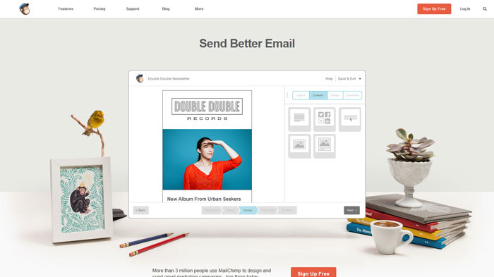
Look at mailchimp homepage, for example. They removed all the unnecessary items on the page and they only kept what the customer might want. A title which satisfies the curiosity that made them click the advertising banner, a visual explanation of how their service works and a call to action button which is easy to notice and is also placed in two locations to increase convertibility.
Focus on call to action
Call to action is often given less importance and that hurts the results that a page could return. A good call to action button will make the visitors do what you want them to do, and that is to sign up, add to cart, contact us etc.
The message of the call to action should be clear and simple so avoid putting any unnecessary information near it because it might distract the visitors’ attention. To avoid repetition, I’ll just summarize the content of the article about well designed call to action buttons.
Make sure you know about these tips before designing the call to action button:
- Good copy increases conversions
- Position it well within the page
- Use contrasting colors
- Size is good, but it could backfire
- Be careful when using secondary alternative actions
- Make the action seem simple and easy
Creating a good landing page
Creating a good landing page isn’t easy if you don’t know what you are doing, but at the same time, it can be a piece of cake if you take into consideration certain factors or information like the one presented in this article.
Don’t complicate the layout with graphical elements that you think are cool. The visitors are most likely of different ages and different backgrounds which means that, most likely, they don’t have the same taste for graphical elements like you do. Besides this, everything that could be a distraction must be removed from the page.
The visitors should only see the information about the product and the call to action button. Other links which would offer more information that is not equally important to the call to action should not be made ostentatious.
Don’t limit the visitors’ experience. I’ve seen landing pages that have popups and I don’t know if I waited for that third second until I closed the page. Using popups is the fastest way to lose customers on any page.
Keep it simple, stupid. There’s a lot of information which you should avoid putting in a landing page. You will have to make sure that everything you put on the page is relevant to the visitors and is exactly what they want to know about your product or service.
Keep everything transparent for the visitors. Putting yourself in the shoes of your visitors is the easiest way to improve your conversion rate. Think of what they would want to know about the product or service that you are selling, what features and benefits it has, what they would be interested in and why they should give their money for it.
Pay attention to your headline. Use simple language and be concise about your message. People want to understand quickly what it is about.
Add social proof. Social proof, which is also called informational social influence, is the concept that people will follow the actions of others under the assumption that those actions are considered the correct behavior. A more simple way to describe what this does is that it adds a third party credibility to what you are offering on your landing page.
You could provide social proof by adding testimonials, retweets from people who bought your product, companies that are using your product or the number of customers that you have.
Social media
I’ve read a few articles about including social media in your landing page. While the idea behind this is interesting and you might think that besides buying your product, the visitors will also share your page, the reality is different than this utopian conception.
Social media buttons are call to action buttons. They ask the visitor to retweet, like or share, which is distracting the visitor from what you want him to do, and that is to buy your product, to register, to give you his email etc. You can’t have both. Adding social media buttons to your landing page will kill it. If a person buys your product and likes it then he will talk about it and share it online.
It is true that the implications of social media are huge and besides the visitors that you could get from a retweet on Twitter or like on Facebook, you could also rank higher in SERP, but you should focus on what’s most important, and that is your call to action.
Conclusion
The landing page experience is what a person’s user experience is when getting on your landing page. There are many things that can affect it so the best way to avoid the lack of conversions is to stay documented and follow the instructions that you are learning.
After reading a few articles, ebooks or even books about landing pages and user experience, you might get information from one source that contradicts the other. To avoid following a bad advice you should always test your landing page before launching. In this way, you will see if the user experience is the one that you want and the one that gets you results.
In the last part of the article, you will see examples of good landing pages which were designed properly and followed the general guidelines of creating a landing page.
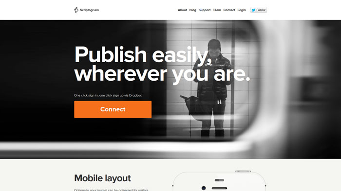
scriptogr.am
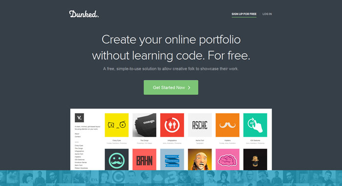
dunked.com
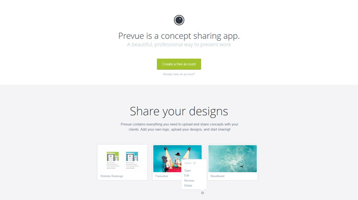
prevue.it
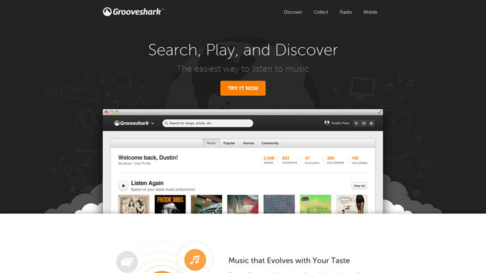
grooveshark.com
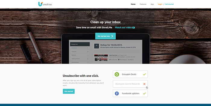
unroll.me
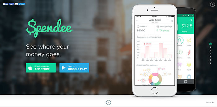
spendeeapp.com
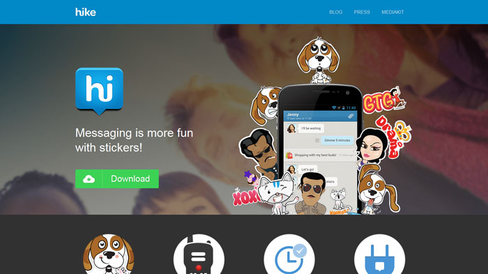
get.hike.in
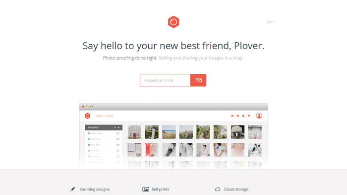
plover.co
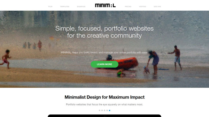
madebyminimal.com
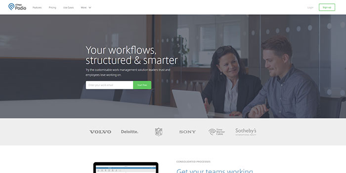
podio.com
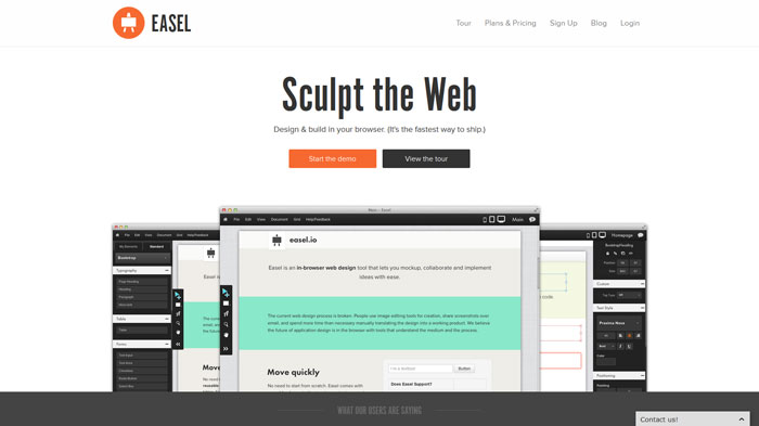
easel.io
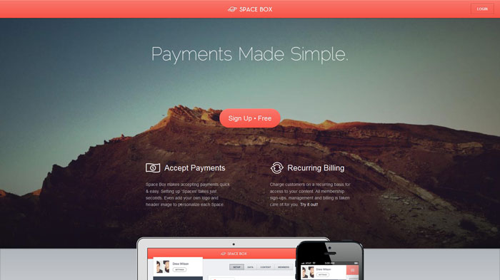
spacebox.io
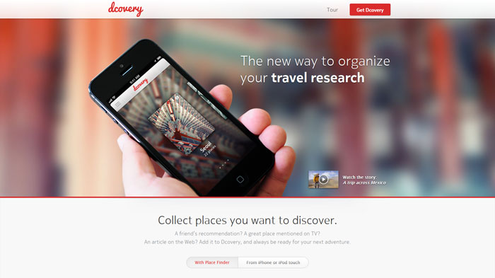
dcovery.com
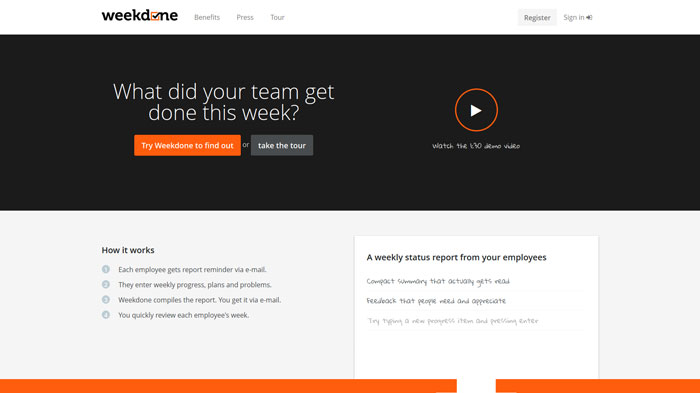
weekdone.com
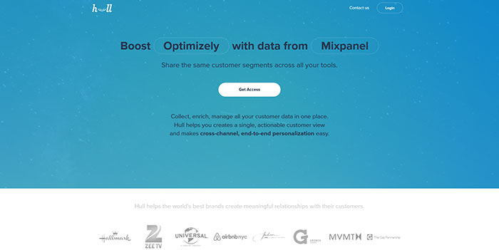
hull.io
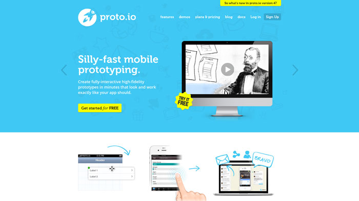
proto.io
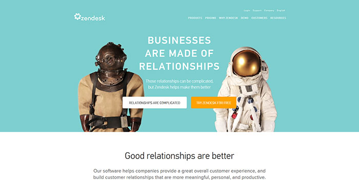
zendesk.com
touristeye.com

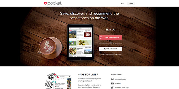
getpocket.com
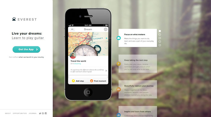
evr.st
.

Source: http://feedproxy.google.com/~r/DesignResourceBox/~3/EUy69C01qjA/