10 Tips to Design Perfect Website Backgrounds

Monday, August 31, 2020

We all know that backgrounds on any website play a vital role in how the site comes across to us. Backgrounds have an immense effect on how well or how badly the visitors and their users perceive the website. Before, websites didn’t have backgrounds; the content was put on a plain white background. But as time passed, graphic designers and web designers came up with the plan to introduce backgrounds on websites. It has become a trend to set background colors or images for a perfect website background.

In this blog, we are going to take a look at the tips that you need to keep in mind to design a perfect website background. These tips can make you create a website that gives your visitors an experience that is worth their time. Let us take a look at each tip.

1. Geometric Elements:

Geometric Elements

There are so many things that you can consider while designing the background for your website. These include animated backgrounds that go well with certain types of website themes. Moreover, it gives your site a touch of the dynamic layout. This kind of design attracts a lot of users to your website, which increases traffic.

Another way to introduce amazing geometric elements is to add static geometric shapes. These geometric shapes include shapes with angles along with a minimalist color theme that suits the design accurately. This way, it offers your website a contemporary background and makes it visually stunning.

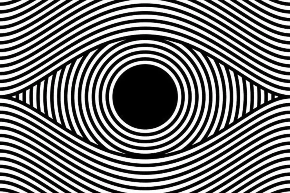
You can also introduce three-dimensional geometric components that have been in the trend in recent times. Moreover, a three-dimensional design wins over any other design because it expresses more than any different design. Also, polygons form in the design when there are geometric lines, and the design resembles sci-fi movies. You can integrate these elements to give your website a high-tech appearance. This makes for perfect website backgrounds especially for a fan fiction website.

2. Background colors:

Background colors

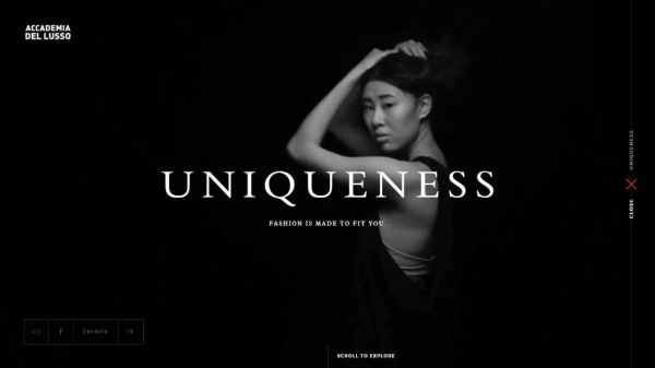
When it comes to using colors, some artists prefer using plain colors like black and white. Certain websites take up some dynamic color patterns that appear exciting and unique, which manages to gain interest among its visitors. Gradually, people have turned to dark website themes that offer a lot of creativity and elegance to the website’s web pages. Most designers have managed to create a passionate design by using light-colored fonts against the dark-colored theme. There are many examples where the site has a black and white color theme, and the designers have successfully managed the website designs.

Moreover, watercolor backgrounds have also been a rage recently, and so many websites are implementing and embracing it. The watercolor backgrounds introduce a sense of depth and creativity in the backgrounds of the website. Such designs can be used when the site is related to arts and creative fields.

3. Gradient colors:

Gradient Colors

The design trend in 2019 has been the one where the websites and graphics consisted of gradient colors. Gradient colors are the colors where one color gradually and seamlessly blends into another color. In these types of schemes, you cannot find the border between the two colors. You cannot pinpoint the ending of one color and the beginning of the second color. This is how you define the gradient colors. With website backgrounds, you can either use gradient colors as background or overlay the gradient. This overlay can be implemented on the video, image, or other media elements. You can easily create a dynamic gradient background while using the front end tools.

These days, web designers create interesting 404 error pages on the website. These pages not only show the error, but it also shows the user the navigation through the website smartly. This contributes to the improvisation of the overall user experience of the website.

If you want your website to look modern, you should use a red and black color theme that offers your website a trendy appearance. Moreover, a simple gradient color theme also makes a lot of difference in the website’s overall appearance. Using gradients in backgrounds can help you achieve perfect website backgrounds.

4. Using lines:

Using lines

If a designer understands his creativity well, then he can transform a simple line into an object of elegance and beauty, when it comes to designing a background for the website. Particular designers and artists are known for using lines to represent their creativity.

As a designer, you should ask yourself this question. Are you capable enough to work with the lines and create a design out of it that represents creativity? Can you create a website design that comprises of only lines? If you are creative enough, you should create a design that talks only about lines.

5. Using animations:

Using animations

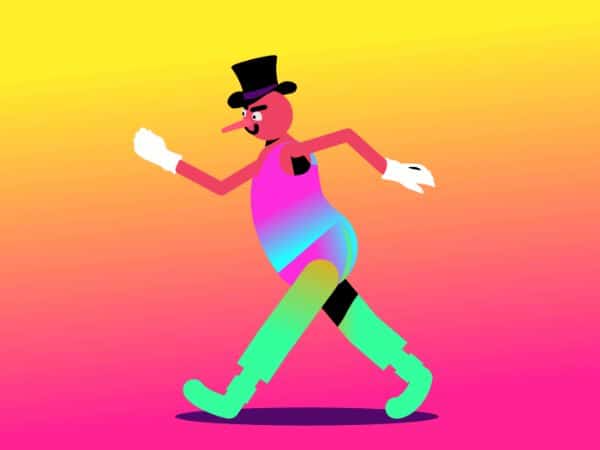
God has given us eyes that are sensitive towards the objects that move in a certain rhythm. The design team is responsible for creating a prototype tool that provides a platform for online collaboration. Certain websites use animation as a background to talk about their products and services. A dynamic background reveals the dynamic nature of the website that you want to target. Designers have an idea in their mind that adding animation to the site as a background can create a better conversion rate of the visitors visiting their website.

Moreover, you can use animation to depict the functions and operations of the company. Animation also can help you represent the services and products your company deals with. You can target the animation as a background to demonstrate so many things about your company.

6. Using Images as background:

Using images as background

Using images as a background to your website has been in trend for a while now. Initially, web designers used simple photographs or watermarked images as a website background. But now, things have changed. These days, web designers use large, high-resolution photos to use them as a background. Moreover, travel websites use large scenic images of landscapes to depict the places where they offer a trip to the client. The travel industry has never grown so fast until recently, and more and more people are coming up with travel websites. Designers are known to use real-life images of landscapes to use them as backgrounds of such sites.

Moreover, you can also use a carousel to depict pictures of beautiful locations and scenic places to engage the user. You can also use liquid effects as far as the travel website is concerned. These liquid effects can work wonders when you use this method effectively to target the user’s attention. It animates the changing places of travel from various places that can engage a user. And hence work as a perfect website background.

7. Applying a textured background:

Applying textured background

You can use textures for website design to keep and maintain the visitor’s attention. You can use hand-painted textures, geometric textures, and more to design your website’s backdrop. When it comes to surfaces, there are so many textures that you can use according to the appearance you require and the theme you want to target. Textures can help you achieve the perfect website background.

8. Layering content and body background:

Layering content and body background

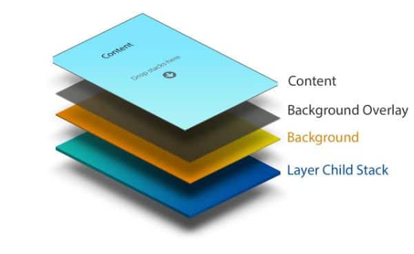
This is a structure where you can have many layers of background. You get to choose a body background, which is layered on the top of the content background. This is one of the many options that target the option of layering. The background can have an image, and you can layer the content on the top of the picture.

With the essential and core background, you can have a solid background, but the headers can have semi-opaque backgrounds. In a design layout, you can have content elements that are separate from each other. A preferred layered structure is where the wrapper and the content have an assigned width background where the bottom layer is spotted easily.

9. Use the graphics in the content area:

Use graphics in the content area

When you target a seamless layout with an illustrated wrapper, you should place the graphics beneath the content element. But you can let some of the graphics leak into the content area. This way, you target a design that offers a modern look, as well as something that users find attractive and visually appealing and creates a perfect website background. Hence, as a web designer, you should study certain websites that are perfect examples of such representations.

10. Address the psychology behind the colors:

Address the psychology behind the colors

Now that we have seen everything about how a background decides the fate of the website let us see how colors can make or break a website. The colors that we see in our everyday life impact us knowingly or unknowingly. And hence, there is a psychological idea attached to using colors in a certain way and a specific setting. Let us see how each color can affect the designs and how we can use them to gain an impetus:

1. Red:

Red

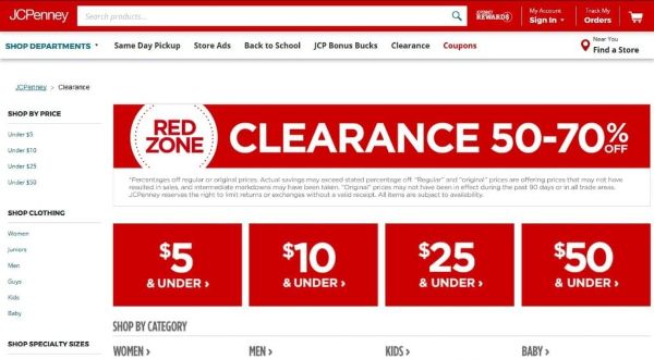
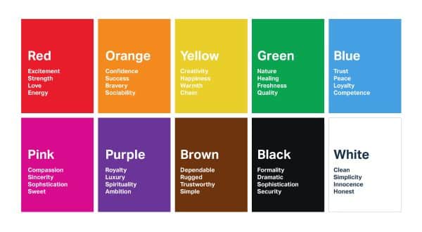
When we use red, we signify urgency and emergency. If you are targeting to achieve maximum footfalls during a clearance sale that you’re planning, use red. This color can immediately catch the attention of the onlookers when used in the right way in ads. It makes the onlooker eager and pushes him to take some action or do something about it. Moreover, red also puts out the fear of missing out on a customer when he hasn’t done anything about it. Red defines urgency, yet it also talks about jealousy, power, violence, and danger. Hence, it is wise to use the red color in moderation to convey the message along with its purpose.

2. Blue:

Blue

When we talk about blue, we indirectly imply dependability, wit, safety, and security. Hence, it is the most used color when there is business talk, or you have to be present in a professional way, especially when the finance section is concerned. The blue color also soothes and relaxes you, hence it is used in the banking, insurance, and cybersecurity sites. This is because blue offers a sense of trust at the highest level. You should also pay close attention while using blue because it also represents sadness and mourning. Soft blue tends to relax your users, hence use it to increase your credibility.

3. White:

White

White represents peace, purity, and virtue. Moreover, white represents hygiene and a clean environment, which is why it is a perfect website background color for the healthcare sector. White also signifies order, values, and tradition. You can use white to display honesty, and content in black fonts against white backdrop stand out. This can result in a lot of conversions. Certain websites also use black and white themes where they stress heavily on white to give it the air of a newspaper.

4. Black:

Black

Black represents darkness and death in certain cultures around the world. Yet, black is also associated with elegance and glamour. It also symbolizes power; hence so many luxury products are designed with black outer packing or black colored stuff. Therefore, it is reasonable to use black so that the feel of the product is exceptional. This makes the customer want to be a part of it. Using black can lift the other elements of your web page. The sharp contrast of black with different colors can play well for your website and its conversion rate.

5. Green:

Green

When we see green, we associate it with nature, trees, and leaves. It talks about the summer and activities that we carry out in the outdoors. Green also depicts healthy food items and wellness. Hence, the websites that deal with environmental issues often use green to send their message across the audience. When you use both green and blue, it defines relaxation because it appears soothing to the human eyes. If you want to put your visitors at ease, use green moderately to justify the purpose. Green is also another term for satisfaction, liveliness, and health, so you can use this color to communicate that your product/service is always going to be better.

Conclusion:

If you have analyzed well, individual designs and colors invoke a specific kind of emotion through which a user establishes a connection. And that connection can be anything ranging from your product, service, or your website. Therefore, it is vital to understand what kind of design is required according to the type of service or product that you offer to your audience. This blog talks about all the aspects that you should consider while designing the perfect website background of your website; hence, referring these aspects can help you understand things accurately. And this can lead you to create a website that serves its purpose right.

The post 10 Tips to Design Perfect Website Backgrounds appeared first on Line25.


Source: https://ift.tt/2DisKlm

Understanding Psychedelic Design

Friday, August 28, 2020

The word psychedelic comes from ”Psyche” and ”Delos,” which means “soul manifesting” or “mind-manifesting.” Psychedelic design gained its popularity back in the era of 1960s. The 1960s were a great period for hazy yet brilliant time for artistic fluorescence. We see psychedelic design often used even today for commercial work. However, the psychedelic design concept seems to be losing its original history that most people are forgetting about.

The history of psychedelic design is vast and widespread throughout the globe and time. It crossed thousands of borders and even dominated graphic arts for a decade between the 1960s and 1970s. You can say that the story of Psychedelic design goes back to 80 years ago. Let us have a look at the history of psychedelic design –

There are some striking characteristics of psychedelic design and art: amazing subject matter, spiral patterns, bright colors, kaleidoscopic and extreme details with groovy typography. All of these elements are present in several art movements that precede the Psychedelic Design like Art Nouveau, Vienna Secession as well as Surrealism. There is no coincidence to this; these moments were highly influential when the psychedelic generation studied art.

1. Pyschelic Design and Art Nouveau:

1. What is Art Nouveau?

Psychedelic Design - what is art nouveau

During the late 1800s, new technology in terms of electrical power, telephones, and cars revolutionized the way the world works and how it looks. Some people, especially artists, living through this technological revolution, were not necessarily fond of all these new developments. This led to a conflict that led to the emergence of a new global artistic movement referred to as Art Nouveau. Art Nouveau is a French term that literally means “new art.” The idea and inspiration behind this movement were to make art that would reflect city life’s vibrancy. To do so, they started using flat, decorative patterns, organic and plant motifs, and feminine figures. It would often be stylized with fluid abstract forms. The movement created a visual language that would then be used almost everywhere – from architecture to paintings, textiles, and many other fields.

The ideology of Art Nouveau dictated that aesthetics and utility should go hand in hand. They also believed that no object was too mundane to be designed as beautiful. Even advertisements for something as basic as biscuits and champagne would be illustrated beautifully. The idea was to create advertisements as beautiful as possible while also making them informative.

2. Contrast and similarity of Art Nouveau and Psychedelic Design:

Contrast and similarity of Art Nouveau and Psychedelic Design

If we come back to the psychedelic era of the 1960s, it was also a time of cultural upheaval like the 1800s that inspired Art Nouveau. If we talk about the United States, the epicenter of this change was San Francisco. Hundreds and thousands of youngsters descended to San Francisco descended to the city for protests in forms of drum circles and concerts. There were many concerts back in the 1960s. Most of them would be dance concerts that would feature psychedelic bands like Jefferson Airplane and Grateful Dead. Also, there was one sure way of getting more people to come to your concert – creating a good poster. Back in the 1960s, these iconic bands were just starting out by playing back to back shows at important venues like the Avalon and Fillmore.

Hence, to advertise this new generation of hippie bands, venues were quick to understand that plain typeface and using grayscale photos weren’t going to be enough. Hence, venues started commissioning work from small group artists. These small group artists came up with a brand new formula for their concert posters. It had influences from various art movements like surrealism, comics, and Art Nouveau.

3. What did Psychedelic Design pick up on from Art Nouveau?

Psychedelic Design - what did psychedelic design pick up

When the Art Nouveau movement reached the mid-1960s, it started facing some resurgence. Especially in textiles, dynamic floral designs seemed to be a natural fit that suited the hippie aesthetic. Based on the art pieces of Art Nouveau, some modern-day artists of the 1960s took some of the Art Nouveau samples that resonated with them and turned the dial upon them. Art Nouveau gained popularity for its feminine figures, most often nude and flowing hair and other such characteristics.

This was a style that resonated with the psychedelic designers, and they picked on it. Most of the psychedelic posters are designed in a way to be covered edge to edge with intrinsic detailed two-dimensional illustrations. You could see a lot of flowers and abstract curves in psychedelic design. Some of the psychedelic designers also used images pulled directly out of an Art Nouveau poster. However, they made radical changes to their color palette. As the music of Sans Francisco spread across the world, so did their aesthetics. The artists behind such psychedelic designs got their share of fame. The posters they made with the vibrating colors and winding lines captured the energy of the 1960s.

4. Characteristics of Psychedelic Design:

characteristics of psychedelic design

  1. The color palette: Art Nouveau designers used soft pastels, whereas Psychedelic artists preferred high-contrast and intense colors. It was said that these colors could make the viewer’s eye ”vibrate”, which is a term to define an LSD tripper’s visual experiences.
  2. Typography: Psychedelic Design has the most abrupt and innovative use of typography for its design. It makes use of fonts that are cloudy, curly, and barely legible. This concept of using such fonts started first on a 1902 poster designed by the Australian designer Alfred Roller. In the 60s, artists adapted this bold, dynamic typeface and pushed it to a new extreme. They would soften the lines and obscure its edges, which made it almost illegible. This design trend wanted the typography to be almost illegible on purpose. The purpose was to grab the audience’s attention long enough to figure out what the entire poster was trying to say.

2. Op Art and Pop Art Movement’s Influence:

1. Op Art:

Psychedelic Design - op art

Op art is short for Optical Art. It is a style of abstraction that depends on geometric lines, shapes, and color juxtapositions that help create optical illusions for the viewers. This art movement also gained decent popularity during the 1960s. Such art usually featured grids, patterns, and effects like diminishing or curved objects. This movement was led by artists who were interested in understanding various perpetual effects.

Pop was a term that was an earlier associate with popular culture, rather than art. The objective of Pop art was to blur boundaries between high and low popular cultures. It was one of the major artistic movements for the United States of the 20th century. The term was first tossed in Britain during 1955. However, the Americans took the consumerist cause with far superior conviction and effect. Hence they have deemed the pioneers of the movement. Pop art and pop culture talk about mass media products that were evolving during the late 1950s and 1960s. It was an attempt to break down the barrier between traditional and contemporary culture.

2. Pop art:

Psychedelic Design - pop art

Pop art also highlighted some of the popular culture elements as a protest against elitist art culture and the general seriousness around it. This marked the return of sharp paintwork and representational art. This led to the glorification of underappreciated objects and ordinary businesses. This was done to make art more relevant and meaningful for everyday people and increase the target audience’s potential pool. Both these movements naturally went hand in hand with psychedelic design, adding more visual elements to it.

Let us breakdown one of the most iconic psychedelic poster to better understand the psychedelic elements of this psychedelic design poster:

3. The Breakdown -The Man with Spiral Glasses:

The Man with Spiral Glasses

Victor Moscoso designed this poster. If you notice the above poster, it has certain clear elements from op and pop movement and other design elements that we have discussed so far that are unique to psychedelic designs. This image has circles with spirals inside those circles as background. There is a border around the image which also has text inside it. It also features a man with a top hat and long hair. There is also text on the man’s chest and shoulders. Such a poster can be used to reflect a dance concert. Moscoso mostly wanted the man to have a perception that he is someone who loves having fun.

He paired this fun-loving man with a bright background, which helps this poster stand out and appeal to the right target audience.

  1. Whitespace: He also kept whitespace between the circles on the outside of the background and the borders. This could be to keep the theme of circle geometry and further enhance the design by using illusions created by the spiral circles.
  2. Clustering: He has also used clustering to cluster the background, the man, and the text on the man in layers on top of each other and placed them in the center of the artwork. If you cluster these elements together, the poster seems busier when using a more overpowering image, true to true psychedelic design principles.
  3. Overlapping: Another important design element used in this poster is overlapping. The man is at the front of the background, and the text is on top of the man. The eyes can be looked at as spiral glasses that are meant to align perfectly with the patterned circles used in the background. This creates a visual illusion effect. The text on the man’s chest has important information regarding the concert. Hence Moscoso made it clear to keep it on the topmost layer of all other layers.
  4. Negative Space: If you notice, the space between circles of the background is filled with the same red color used in the circles. This is to make the image look busy and bright, enhancing the psychedelic design.
  5. Tone: This poster also uses very bright and vibrant red and blue colors. This helps the poster stand out from other posters. It is one of the most prominent design aspects of a psychedelic design.

Overall, Moscoso’s poster is a fantastic representation of what psychedelic visual design looks like. Especially the idea of creating an optical illusion through a background in more than one layer is a fantastic touch. It serves the purpose and looks enticing enough for anyone looking at the poster to want to do for a dance concert.

Conclusion:

This was the history and relevance of psychedelic design and everything it has to offer. Psychedelic design is generally considered an art style used by people who like being high on drugs and have a distorted sense of the world. This misconception is highly incorrect. It was a movement based on other important art movements like Art Nouveau, Surrealism, and others. It was for a cause and a form of protest against the industrial and technological age of the 1960s, to keep real art alive. You can incorporate psychedelic designs for your music posters, wall graffiti, and website design to make full use of the benefits of psychedelic design.


via https://ift.tt/32wp6gl

9 Things Not to Do While Designing a Landing Page

Thursday, August 27, 2020

Successful digital marketing is when all the aspects of your website and your online presence are correctly aligned. Your PPC ads, if you choose to use them, are effective, and your SEO is on point. But, if you don’t have a well-crafted landing page, then you are in for failure. And eventually, your business can suffer. You are required to have a flawless landing page in all the possible perspectives and aspects. A useful landing page is enough to keep your users and visitors engaged and convert them. Here, we have made a list of things that you should not do while designing landing page. Let us take a look at each of them.

1. Not creating a mobile version:

designing landing page - Not creating a mobile version

Mobile is a large portion of running marketing strategies and campaigns successfully. No one should overlook the significance of creating a mobile version of their landing page or website. Yet, sometimes, the landing pages are either wholly missed or are not designed perfectly enough to catch the user’s attention and keep them engaged. The designers find the perfect parallax scrolling or the right theme for the landing page. This landing page looks good on the desktop, but what about the landing page’s mobile version?

You realize that when you check the mobile version of the same page, the parallax scrolling doesn’t function well or is not an available tool to use because of the small screen. It may or may not take a lot of time to load, which also hurts your website’s reputation. There is a misnomer that desktop is where the customers place an online order. People these days, especially independent youngsters, place on order through a mobile phone. They want the world at their fingertips on their mobile phone. Hence, it is crucial to understand that if it doesn’t work on mobiles, then having an immaculate desktop version is useless. Designing landing page requires you to take mobile versions into serious consideration.

2. More load time:

More Load time

We all know how irritating it can get when dealing with a landing page that doesn’t open up on time. The load time of any web page can impact the business’s performance on digital platforms. Around 70% of the people leave the page because it took a lot of time to load. The time taken by a webpage to open up entirely so that the user can interact with its UI elements is called Load time. And when the users find that the page takes up a lot of time to open up, they leave the page instantly. This is called the bounce rate.

Ideally, your landing page should open in not more than 4 seconds. You lose a lot of potential traffic when your landing page is slow to load than your rival websites. Yes, the layout and the content of the page can take up some time to show up. But you should always make sure that the load time of your web page is the least. Therefore, it is of no use that you expect a lot of traffic when your landing page takes a lot of time to load on all the devices.

3. Absence of a clean design:

designing landing page - Absence of a clean design

Nobody likes a landing page where there is a lot of clutter, and you don’t know how to go about the page and find a specific thing you are looking for. An ideal landing page is enough to provide information about your business. Moreover, it is sufficient to keep its visitors engaged and encourage other visitors. This is the only purpose of a landing page. Hence, there should not be anything more on the landing page that serves something that does not align with its mission. If you don’t want to overwhelm your web page visitors, keep the information less. In addition to that, you should also keep the UI elements clutter-free.

The navigation of the website should also be precise and immaculate and easy to understand and work with. You are not supposed to put long-form content on the landing page. Instead, the pointers should serve the purpose effectively in guiding the visitors through the funnel. The information that you put in the user’s first line of vision can either make or break your business. Moreover, a lot of content can be placed at the bottom of the landing page, where a user can scroll and read. You can keep the content to a minimum by using pointers, images, or videos to guide a user. A word of caution here should be that video should not make the page slow, and the video should be clickable. Don’t make it mandatory for the visitor to watch the video else the user is bound to bounce off your landing page.

4. Poorly defined headlines:

Poorly defined headlines

Ideally, a useful landing page should have an energetic and engaging header or a headline that would interest a user in reading and browsing further. It should be able to explain why the website provides value to the user and in what possible ways. The user should be able to understand why he should invest his time and money on the site. These all factors decide the success of the landing page, and eventually your business. So many landing pages use a strong headline and then explain that with a subheader. This gives your visitor a chance to understand whatever message is, that you want to convey. According to a study, you get eight or fewer seconds to convey or convince the user why they should invest their time and money in your business.

Moreover, if your headline is not up to the mark, the user won’t make an effort to read further or browse it. And you should consider the headline on the webpage, similar to the headlines in the newspaper. It should be catchy and should encourage a user to dig further. Moreover, the headline should be sharp and attention-striking to engage the user with your landing page and eventually, your website. From an SEO point of view, the headline should have practical terms that the crawlers can index. Hence it is better to write “we deal in IT services” rather than “welcome to our landing page.” Therefore, craft catchy yet meaningful headlines that would not hurt SEO rating as well as your landing page traffic.

5. Using pointless content on the page:

designing landing page - Using pointless content on the page

The biggest mistake you can make while designing landing page is to have content that does not align with your landing page’s purpose. We all have been to the landing pages with some images or sponsored content that does not serve any purpose, not even the basic one on the landing page. Moreover, the user gets distracted with such content and may also feel useless to browse the landing page if the content is meaningless.

The landing page should be such that it should the user should feel a connection with the page. And the irrelevant content fails to do this for your user. Hence, instead of using meaningless content, you should use images, videos, or text that explains your business. This can engage your user and is bound to create more of the user traffic for your website.

6. Not paying attention to the layout:

Not paying attention to the layout

A great layout is one of the key factors behind the success of a website. We all understand that an excellent looking website always gains the attention of a user. But a landing page with a bad layout, turns off a user, no matter how fast it loads or how good your site is. The layout of a web page includes its UI components and the content’s arrangement on the page. As we previously saw that a cluttered design is of no use, when you are working for designing landing page, this holds the same here too.

You can have meaningful content along with a lousy layout. But what’s the point of it? Hence, you should always make sure that the page layout is well designed to arrange your content. The content could be anything, including images, videos, or inbound links. But the way you present the content on the landing page, in the form of its layout, decides how the landing page appears to the users. Based on that, the user may choose to delve further or bounce off the page.

7. Target Specificity:

designing landing page - Target Specificity

When you are working with designing a landing page, you should only have one point in mind – to convert your users and visitors into loyal customers. This can happen only when you have the information on the landing page that is to the point. Moreover, a compelling call to action should be your target for the landing page. You should know which CTAs you should include on the landing page that can turn your visitors to customers.

If you put up a lot of CTAs on the landing page, the users and the visitors tend to get confused and turn your user off. This can lead to a high bounce rate with the passage of time and can hurt your SEO ratings on the Search Engine Results Page. Hence, you should have your users focus only on one CTA that drives your users to turn them into customers. This can increase your landing page’s conversion rate. Don’t put information on the landing page that is for general purpose. Instead, be specific when it comes to handling your landing page. The specificity increases page engagement with your users and visitors.

8. Not being attentive to the forms:

Not being attentive to the forms

Web forms are the point of interaction of a customer with your business and your brand. Your website should contain web forms where you can collect the customer’s information or let them interact with you through the web forms. Hence, it is an essential part of your landing page. To make your customers fill up the forms, you should have a stunningly designed web form. Initially, the web forms were plainly in black and white themes, and the users did not bother with that kind of design. But with time, users have started looking for visually appealing web forms.

Therefore, you should have a web form that has an appealing design. In addition to this, you should only collect the information that is required. You should not have too many fields for the customer to fill-up the form. The other thing that you should always remember is, stay away from creating complicated web forms. An intricate web form is one where the user doesn’t understand a particular part of the form. Hence, he ends up filling the wrong information in the form. So, the bottom line is, you should have a web form that has a good design, along with the simplicity of it.

9. No readability with the content:

designing landing page - No readability with the content

There have been so many websites that purely focus on the content and the layout of the website. But the designers often forget to pay attention to the readability of the content on the landing page. The designers pay so much attention to having a clean design of the page that the readability of the textual content is ignored. When designing landing page, the text has to be legible. When a user lands on your landing page, he tends to read the textual content you put up on the page. But, the text is readable if the font color and the background color work in tandem. Anyone can read black fonts on the white background, and hence the readability here is more. But if you put an orange background and the fonts in red, I don’t need to tell you that the readability factor is eradicated. And when such an issue is encountered, the user doesn’t even bother reading the content. He simply goes to another website and bounces off your landing page.

The same thing happens when you have an image as a background that has more opacity, and then the text becomes difficult to read. This can cause a lot of readability issues. Using images in the background is in the trend right now, but it is pointless if it doesn’t enhance readability in any way. Hence, readability always comes first when you are putting the textual content on the landing page.

Conclusion:

A landing page is the most critical part of any website, and it decides whether the people visiting it, convert successfully. So, a poorly designed landing page can hurt your business reputation online as well as in real. Hence, if you follow the above-given points when designing landing page, you should be able to create a successful landing page. A successful landing page is one that converts the visitor to a customer without any hassles.

The post 9 Things Not to Do While Designing a Landing Page appeared first on Line25.


Source: https://ift.tt/3lrF5EO

3dcart eCommerce Platform – REVIEW

Wednesday, August 26, 2020

Today, we will be looking at 3dcart, one of the longest-running eCommerce platforms in the industry. Since its launch in 2000, businesses of all sizes have powered their online stores with this software. It now comes bundled with dozens of essential or otherwise invaluable tools for building and optimizing a shopping site. Let’s look over some of the many features that 3dcart provides and see why it is such a popular and excellent solution.

Flexible Site Editor

Among the most important qualities an eCommerce platform can have is exceptional customization. 3dcart’s templates are not rigid, and their premade layouts are not “take it or leave it.” The site editor, refined over a span of twenty years, offers unprecedented freedom. Almost every single aspect can be toggled, moved, removed, or adjusted to match the vision of the store owner.

Secure Hosting

High-level security is a must for online shopping. Every eCommerce transaction requires the exchange of sensitive data, which hackers are always targeting. To eliminate the threat of identity theft, every 3dcart plan comes with Level 1 PCI Compliant security. The software also provides security seals, which users can add to the site so visitors can know they are protected.

Also included with each plan is top-of-the-line hosting, which goes beyond receiving their own tag-free domain name. The company guarantees 99.94% uptime, daily back-ups, and defenses against DDoS attacks.

Mobile Responsive Themes

Online shoppers are increasingly doing their browsing and buying on mobile devices. However, many online stores do not have a version of the site designed specifically for smartphones. This mistake makes navigation more difficult and inconvenient for people on the go.

In recognition of this trend, all of 3dcart’s 100-plus themes come with responsive design. This feature automatically alters page layouts based on the configuration of the screen. Websites with responsive themes will look and function just as well on vertical-oriented phone screens as they do on more horizontal computer windows.

Real-Time Shipping and Tax Calculations

As people add items to their cart, the cost of shipping and taxes may increase accordingly. Some stores only account for these additional charges at the end of the checkout process. This deceptive practice is ideal for turning potential customers away right at the finish line. Recent eCommerce statistics cite it as the most common reason for cart abandonment.

With real-time shipping and tax calculations, two features available with every 3dcart plan, customers do not need to be surprised. With each change to the cart, the software automatically adjusts the final price. Shoppers can see the total cost of their current order just by clicking on the cart. One convenient measure can decimate the site’s cart abandonment rate.

Analytics Software

Google Analytics is a must-have for eCommerce users interested in building the best possible version of their store. The tool comes built into the 3dcart platform. People can use it to track customer behavior, conduct tests, and see the results of changes to their store. The program also shows rates for conversions, site traffic, cart abandonment, bouncing, product sales, navigation, and more. All this information can give store owners a better idea of how they can optimize their site.

Omnichannel Connections

When an entrepreneur decides to start an eCommerce business, they do not need to stick with just one point of sale (POS). 3dcart’s omnichannel software can connect multiple POS to the same inventory. Store owners have the freedom to set up shop at popular online marketplaces, such as Facebook, Amazon, and eBay. It can even connect to mobile POS and brick-and-mortar locations.

The links between all these channels can save time and effort for store owners. For example, when an item’s stock increases with new supplies or decreases with sales, the actual inventory number automatically changes on every POS.

Payment Processors

Many eCommerce platforms offer a small selection of payment gateways. 3dcart does not limit itself to PayPal, Square, Stripe, and the like. Its list of compatible processors extends to over 100 options, blowing every other platform out of the water. The line-up includes gateways that only work in certain parts of the world.

Store owners can accept many different credit card issuers and international currencies, potentially expanding their audience in the process. They can also look for smaller companies that take small percentages from each transaction than the bigger ones. The enormous selection is just one more way that 3dcart enables businesses to customize their shopping experience.

Automation Rules

3dcart customers can create automation rules — programs that perform specific actions on certain conditions. Of course, software can only do so much without human minds at the helm. With that said, this feature is tailored to accomplishing repetitive tasks that may otherwise consume a great deal of time. Good examples include completed order emails and inventory management. Store owners save time and effort on tedious activities, and they can expend their energy on more creative roles.

24/7 Customer Support Hotline

3dcart gives users multiple sources of customer support, including online forums and an in-depth Knowledgebase. Their live chat and phone line are notable for being available at any time of the day. On top of that, the schedule is not limited to Monday through Friday. Unlike many platforms, 3dcart users can reach an expert on weekends and even holidays. Any time a business owner encounters an error or has a question, someone at 3dcart can listen, guide, and resolve.

Pricing Plans

Among 3dcart’s most admirable qualities is their commitment to helping companies of any size find eCommerce success. The smallest businesses can start at the cheapest payment plan if they want. Even then, they would still have access to many of the most important features that online stores need to survive and thrive. Better still, 3dcart runs frequent campaigns that offer significant discounts to new users for months at a time.

Outside of these campaigns, the costs for the five pricing tiers are as follows:

  • Startup Store: $19/mo for monthly plans, $17.10/mo for yearly plans
  • Basic Store: $29/mo for monthly plans, $26.10/mo for yearly plans
  • Plus Store: $79/mo for monthly plans, $76.10/mo for yearly plans
  • Power Store: $129/mo for monthly plans, $116.10/mo for yearly plans
  • Pro Store: $229/mo for monthly plans, $206.10/mo for yearly plans

Naturally, the number of features and benefits a user receives ramps up with each ascending tier. Regardless, every plan offers unlimited products, categories, bandwidth, and orders. Not one requires transaction fees.

If you are interested in 3dcart’s software, you can test it before making any choices. The company offers a 15-day free trial, which people can use to check out all their features and create their own online store. They do not even ask for your credit card information. At the end of the run, you can decide for yourself if 3dcart is the ideal platform for your eCommerce business.


via https://ift.tt/2YzL40P
 

The Cash Box Blueprint

Most Reading