Design your way

Saturday, August 31, 2019

You have probably seen some of the movie fonts that we will present below on your nearest movie billboard.

The personality of the film can be reflected very well with a unique font. Horror movies constantly use fonts that look like blood stains or claws, while the genre of comedy is characterized by having movie fonts of different sizes with more jovial shapes.

We can know what genre a movie is exclusively for its font. The blockbusters always have a unique finish, as seen in Jurassic Park or Star Wars. How many times we have not seen the letter of the great work of George Lucas appear in space works.

If you do not want to use typography that is already repeated to satiety, you can always use movie poster fonts as guides for your projects.

Movie fonts that deserve a test

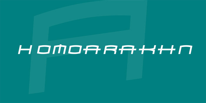
Homoarakhn Font – An arachnid movie font

homoarakhn Awesome movie fonts to create posters and movie titles

This font is based on the one used for SpiderMan movies. Its stylized design with defined curves gives it a soft highlight that is already known throughout the world.

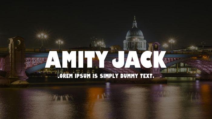
Amity Jack – A classic of the sea

Amity-Jack Awesome movie fonts to create posters and movie titles

Have you seen shark movies? They always use red fonts to simulate blood, and Amity Jack highlights this more thanks to its thick letters.

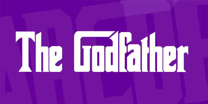
The Godfather Font – Mafia Reborn

Godfather Awesome movie fonts to create posters and movie titles

GodFather style is refined, showing once again that the mafia dresses in silk. These profiled letters are ideal for many elegant occasions.

Transformers Movie Font – A robotic design

transformers Awesome movie fonts to create posters and movie titles

A letter that almost eliminates curves to achieve a more mechanical design. Robot movies would not be the same without this font.

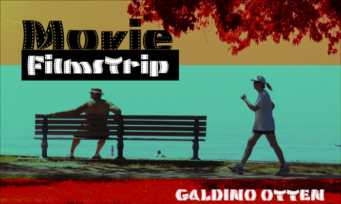
Movie Filmstrip – The general cinema option

MOvie-Filmstrip Awesome movie fonts to create posters and movie titles

This source is not special to any movie, but its film tape design is characteristic of cinema. Also, it has uppercase, lowercase, and special characters of all kinds.

Terminator Real NFI font family – The era of the machine

Terminator-real-nfi Awesome movie fonts to create posters and movie titles

Another letter with straight features with few curves. The font used for Terminator stands out for being thinner and smaller than others.

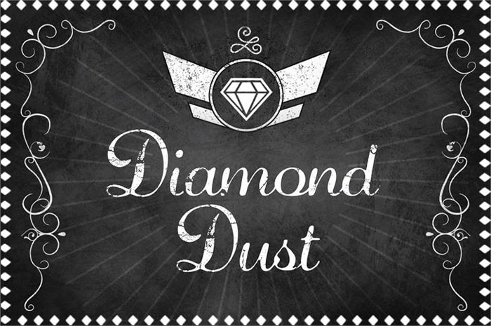
Diamond Dust Font – Remembering the classics

Diamond-dust Awesome movie fonts to create posters and movie titles

Silent cinema was a period where the writings were very important in the form of subtitles. This old movie font will allow you to remember those moments without sound.

Zreaks NFI font family – Let the blood drip

Zreaks-NFI Awesome movie fonts to create posters and movie titles

Speaking of movie fonts with bloody aspects, we have this alternative that offers a cartoonish terror choice. It is a complete package in sizes and characters.

007 GOLDENEYE – The best spy in the cinema

007 Awesome movie fonts to create posters and movie titles

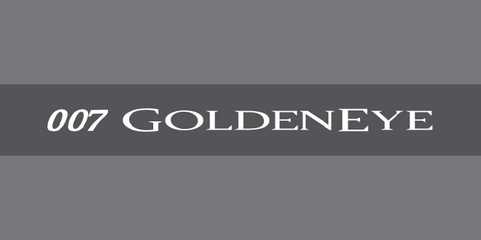
The font used in the films of Agent 007 implies the gallant and refined work of James Bond. If you are a spy fan, it cannot be missing in your gallery.

Under World Font – A simple line design

Underworld Awesome movie fonts to create posters and movie titles

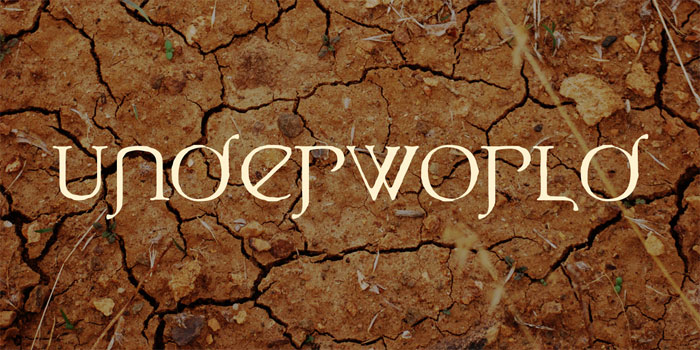
The glyphs seen in the movie have served as an inspiration to create a complete font package with uppercase, lowercase and special characters.

The package includes nine different types of formats.

CrossFit – When you need boldness

Crossfit Awesome movie fonts to create posters and movie titles

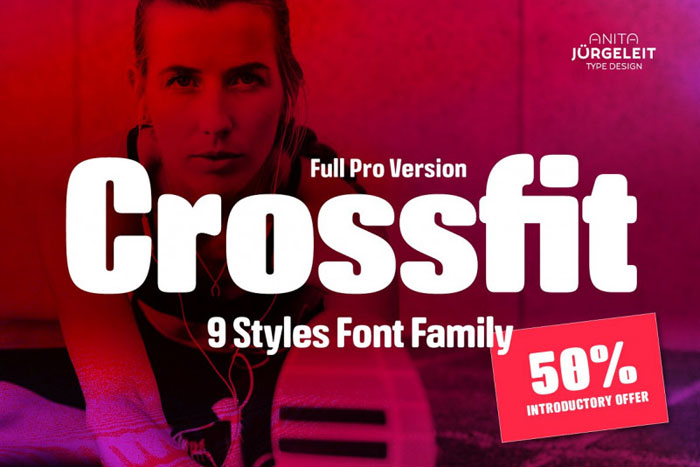
If we are looking for lyrics that inspire adventure, then the size that CrossFit offers is perfect. Especially useful for posters with themes of adventure, sports or challenges.

Harry P – The most famous wizard of all

Harry-Potter Awesome movie fonts to create posters and movie titles

You can’t know about movies if you don’t know who Harry Potter is. The little wizard was accompanied in each of his appearances by a font that simulates the scar on his forehead.

The dividing line gives a unique 3D effect to its marked vertices.

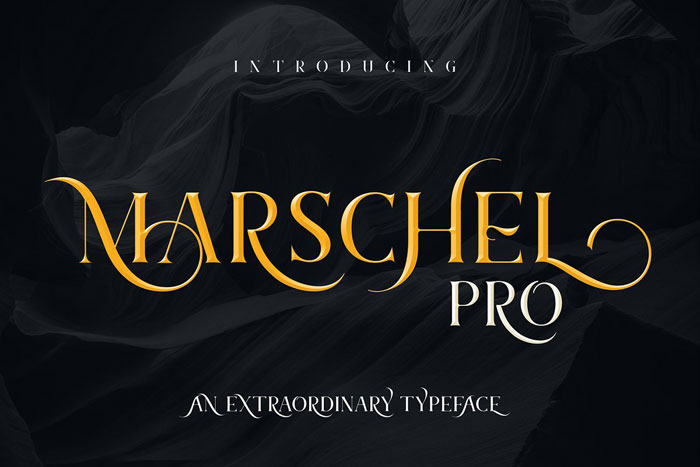
Marschel Pro – Elegance beyond the movies

Marschel Awesome movie fonts to create posters and movie titles

Marschel Pro is so stylized and subtle that it can be used for multiple options, such as invitations, letters, logos, among other things. The package that highlights wonderful cursive letters has more than 400 characters.

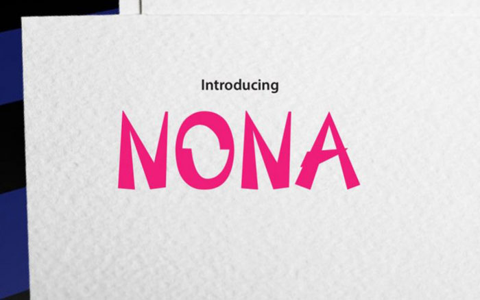
Nona Typeface – Forming letters with basic shapes

Nona Awesome movie fonts to create posters and movie titles

Nona allows us to create large promotional signs thanks to the use of triangles for its design. This Asian style looks modern without losing elegance.

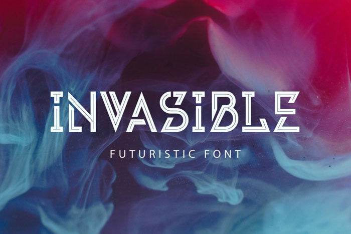
Invasible Font – A trip to the future

Invasible Awesome movie fonts to create posters and movie titles

Based on the space film, Invasible is a film font that gives us a good amount of customization options thanks to its different designs of capital letters.

The lines seek to create loops when trying to join, while the internal delineation creates an admirable neon effect of cyberpunk style.

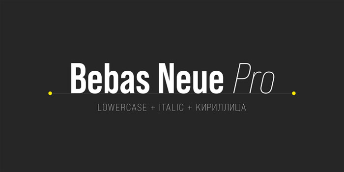
BebasNeue Pro – A celebrity among the fonts

Bebas Awesome movie fonts to create posters and movie titles

We are facing one of the most popular fonts in the world in general, not just for movies. It is impressive that this font that only included capital letters until recently was so used in projects of the last 10 years.

The good thing is that its demand has served to include even special characters.

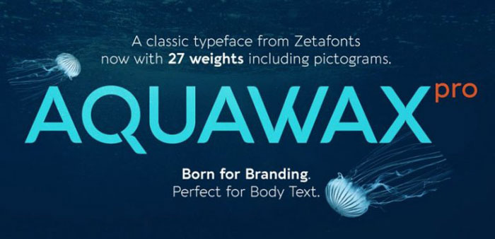
Aquawax Pro Font Family – Immerse yourself in the depths

Aquawax Awesome movie fonts to create posters and movie titles

This letter, used by Warner Bros for the Aquaman movie, is perfect when it comes to clarity.

The letters are clear, each one has a sufficient distinction from each other, so they are fully readable in logos. Even the smallest sizes are perfectly visible, as seen in the examples.

Equinox Typeface – The glow of the stars

Equionx Awesome movie fonts to create posters and movie titles

This bright and minimalist style will captivate equinox users.

Although its basic bet is that of capital letters, it also includes alternative options and special characters, ideal for any type of advertising poster looking for a futuristic or spatial design.

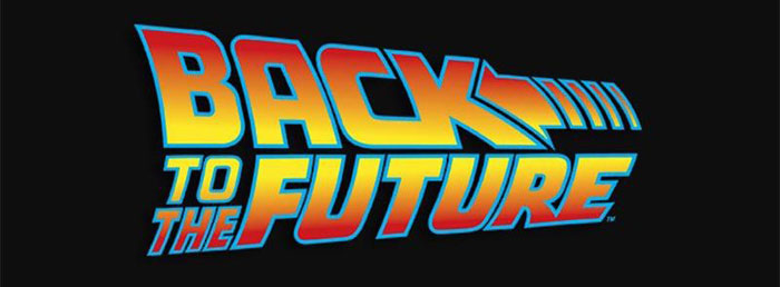
Back to the Future – A journey through time

Back-to-the-future Awesome movie fonts to create posters and movie titles

Few movie fonts are as popular as those in the Back to the Future trilogy. A retro design that seems to follow a trajectory at a speed of vertigo makes us remember the moment when a DeLorean changed the future.

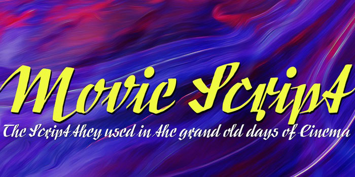
Movie Script – Of German Origin

Movie-script Awesome movie fonts to create posters and movie titles

German cinemas used booklets full of images of the films they were broadcasting as an advertising mechanism. These 4-fold brochures possessed this retro letter.

Its popularity was such that they came to be used on some posters in movie theater tickets. The source has separate and italic strokes that blend perfectly to be easily used in current advertising.

Sickle Blade Typeface – Heartbreaking Profiles

Sickle-blade Awesome movie fonts to create posters and movie titles

Very similar to the 3D effect used in the profiles of the Harry Potter font, Sickle Blade Typeface delves a little deeper into the terror with these sharp letters.

Moreover, in some letters we can see how a sickle is drawn on the path, hence its name.

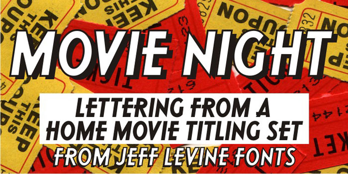
Movie Night – The 50s are alive

Movie-Night Awesome movie fonts to create posters and movie titles

If you are from the old school, you probably know the ceramic kits that were used to title movies in the 50s and 60s.

This font is inspired by those letters that were located on a white background, and that we could see in all the homemade movies of the time.

Also, in case we use them on a light-colored background, it has a strong shading that allows it to stand out.

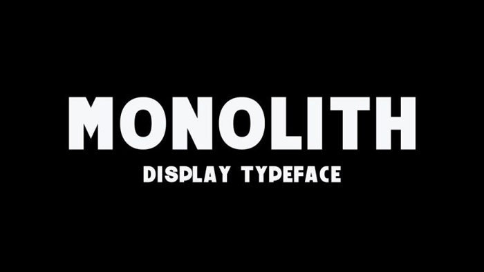
Monolith Free Typeface – Clarity is the most important element

Monolith Awesome movie fonts to create posters and movie titles

Sometimes we need the letters to be as clear as possible. Monolith comes to meet this need with a bold letter that differs by being very direct in its bet.

Although it does not have lowercase letters, it has special characters, so it is ideal for titles.

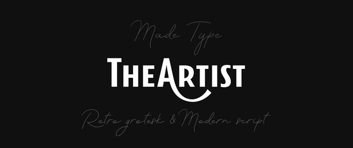
MADE TheArtist – An elegant and bold combination

Artist Awesome movie fonts to create posters and movie titles

The MADE TheArtist package includes a letter similar to the one we get in hand-stylized signatures, and another one thicker with more solid details.

If we want to highlight certain parts of our text, but we don’t want to download multiple fonts, this is a perfect alternative.

Star Jedi Font – May the force be with you

Star-Jedi Awesome movie fonts to create posters and movie titles

We could not ignore the font used in Star Wars. It perfectly emulates the fonts of the films in its logo. Some letters have links between them that give it a unique touch.

All the letters are capital, which works very well in its thick design with corner curves.

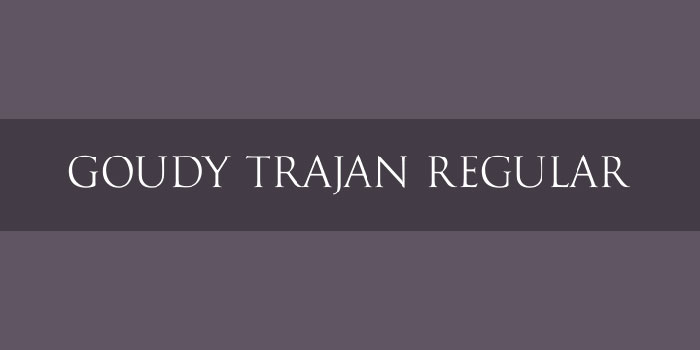
Trajan – Another slender and elegant alternative

Goudy Awesome movie fonts to create posters and movie titles

This letter marked a whole generation since it was used in the Titanic. It is very common for hopeless romantics to use it to create traditional posters that stand out for their elegance.

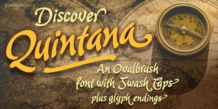
Quintana – It’s time for an adventure

Quintana Awesome movie fonts to create posters and movie titles

Quintana reminds us of the letter used for postcards sent from some paradise island. Each letter has a unique stroke style, which, despite simulating italics, remain well defined.

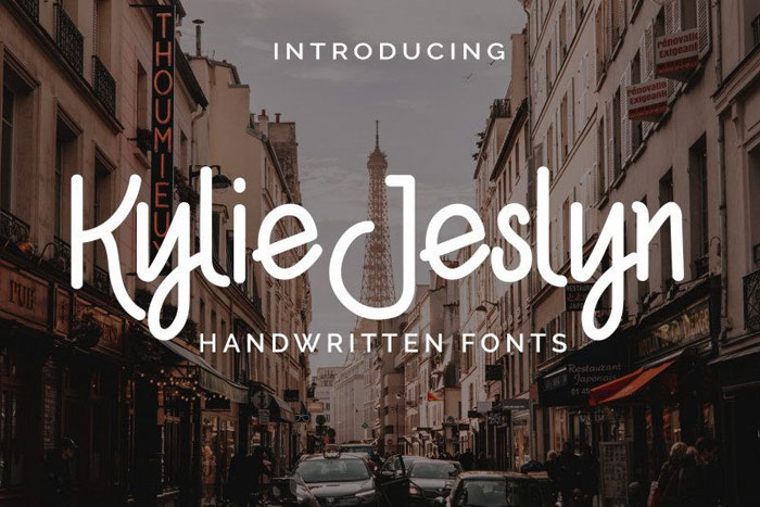
Kylie Jeslyn Script Font – A calligraphy by hand

Kyle-Jesylin Awesome movie fonts to create posters and movie titles

This handwritten font is perfect not only as a movie poster but also for cards where we want to highlight with handwriting.

The font includes both uppercase and lowercase letters, and they have been vectorized to create clean strokes.

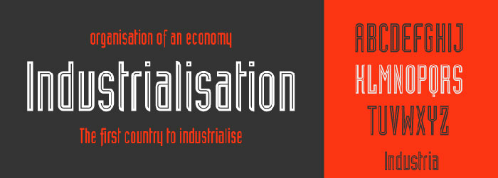
Industria Lt Font – Creating a simple intrigue effect

Industria-LT Awesome movie fonts to create posters and movie titles

This font of defined strokes creates a suspenseful atmosphere that has been used multiple times, such as games or movies. Simple lines do not saturate the design without need.

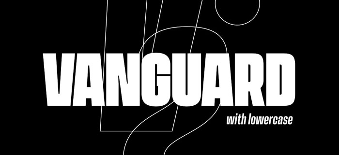
Vanguard CF: brilliant & bold sans – Don’t settle for less

Vanguard Awesome movie fonts to create posters and movie titles

The Vanguard package has letters for all types of situations. It offers extremely thick characters with different finishes that get the attention of the audience.

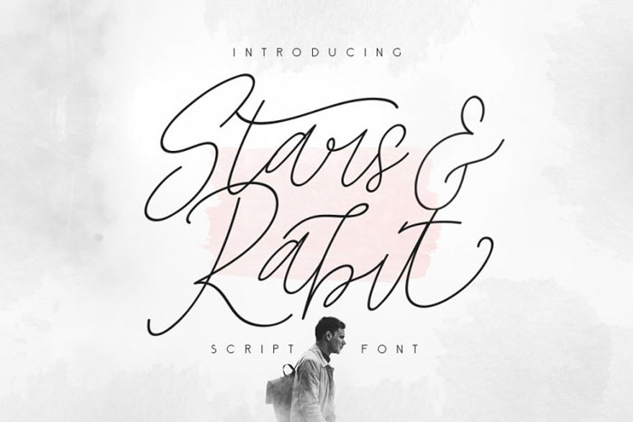
Stars &Rabit Script – Lose yourself in the beauty of calligraphy

Stars-and-rabit Awesome movie fonts to create posters and movie titles

Our latest movie fonts recommendation is this fine beauty with pen strokes that make every card and poster we make elegant.

Don’t worry about never having had a beautiful letter, since with this option you can have it without learning to write again.

If you enjoyed reading this article about movie fonts, you should read these as well:

The post Awesome movie fonts to create posters and movie titles appeared first on Design your way.


Source: https://ift.tt/2zF9EAl
11 Steps for Creating the Perfect Web Design Proposal
Friday, August 30, 2019

In today’s world, where the competition is high, it becomes essential that you get your web design proposal right. Proposals present you the opportunity of expressing your design skills, experience, and your process to the customer. At the same time, they are instrumental in bringing excellent clarity in terms of deliverables and timelines. They help in managing the expectations of the client. Drafting a well-designed proposal goes a long way in winning over the client’s trust and getting the web or graphic design project you are interested in. Here are 11 essential steps in creating the best web design proposal, which you can use to win potential clients over:

1. ANALYSE YOUR COMPETITORS:

It can be your first proposal or last proposal; the research behind it remains the same. Hundreds like you would be doing the same work in the same field and would be performing better than you. This is the time when you can look for inspiration from others and include it in your proposal. It is necessary to conduct thorough research and find out exactly what your competitors are providing in the market or what practices are prevalent in the market, to convert the prospective leads into actual paying clients. First of all, you need to do some homework before you start onto the competitor’s research part. You will need to make a list of what all things you are already aware of and what all things are lacking in your current proposal. You need to list your strengths and weaknesses clearly to save time and effort. This will help you focus on your weaknesses as well as sharpen your strengths. If you do not do this pre-ground level work before starting on your research, then you would be clueless as to what to focus on and what should be your priority in the entire process. One more aim behind the research should be to understand the tonality of other people’s proposals and work and develop your tonality at the end of the process. Also, you should decide the timeline for making this proposal and distribute the timeline into these 11 main steps. This research part should take the maximum of your time and effort, i.e., you can allot 30% time and effort to this part, to simplify the process and make it effective. In case you skip this step, you will miss out on the current web design proposal styles and must-include list, which would give you a tough time later.

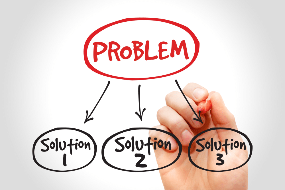
2. HIGHLIGHT THE PROBLEMS:

This is where we all lack. This step is often skipped in real-time, and all we jump on to is letting the client know more about your expertise, instead of understanding what he or she is trying to say. You may have solved a huge problem for your last client, but the present client won’t like to hear about it, while he is explaining to you his problems. When you approach a lead, your first duty is practicing patience and enhancing your listening skills. Listen to every word carefully while the lead is explaining his side of perspective about the website and make handwritten or digital notes. This will prepare you for asking the right questions at the time of pitching. This will clear your doubts and would allow you to work on the solutions quickly. In case, the client is not aware of his problems and is entirely dependent on you for this work, and then it is like a bonus bonanza for you to showcase your skills and take over. Invest time in analyzing the problem in the current system and provide a detailed version of the same to the client in a well-designed format. Here, your presentation skills would matter. Try to brainstorm as many problems as possible through different perspectives and if needed, take the help of your seniors and peers to understand it better. If this goes well, the pitch will work in your favor.

3. WORK A LITTLE MORE ON POSSIBLE SOLUTIONS

This section would depend on the first two steps. If the first two steps are done correctly, you would know about how exactly to go for the solutions. The solution part is what the client is looking for. It is advisable to jot down a rough draft of the possible solutions while listing down the problem statement. It will lower down your efforts and save a huge slot of your time. Try to keep the solution as crisp as possible to avoid drifting from the primary concern. Also, please use a business tone even if you are working as a freelancer. It would add a professional touch to your work and would give you space for charging your desired rates.

4. CREATE A PLAN B

Having a plan B always helps in case, plan A turns out to be a failure. The chances are less if the first three steps are followed correctly, but it is better to have a prudent plan. You can create a small list of alternative solutions of the first draft in opposition to the idea – if plan A doesn’t work. It will create a great first impression on your client and would develop trust in his or her mind; as to you are prepared even for the worst situations. This will work as an add-on to the proposal.

5. PRESENT THE QUOTATION CLEARLY

This is where the undivided attention of your client is. Money is something which makes everyone uncomfortable when it comes to the concluding stage. It is necessary to state the fee structure very clearly, as to what you would like to charge in return for your services. It is advisable to customize your prices for each leads as per their needs, in order to avoid price fluctuation issues. For instance, you cannot charge $100 if the client wants entire website tracking for one year instead of your standard offer of 6 months or you cannot charge $200 if the client wants tracking plus SEO services along with website construction. Also, the prices should be customized based on the client’s turnover and image in the market. If the client has a budget of $2000 and you end up charging him $700, then it would be a loss for you. Instead, you can charge from high net worth clients and settle for new start-up clients to create a balance in your income.

6. LIST YOUR PREVIOUS WORK

Your previous work works as your bio-data for the new client. It gives them an idea regarding your typography, design, and presentation preferences. It would also provide them with an idea as to what information needs to provide in the first meeting, by looking at your work. Your previous work portfolio is the first point of contact with the client for deciding upon your work. It would give them a clear idea of how and why you work the way you work, and what makes you stand out from others.

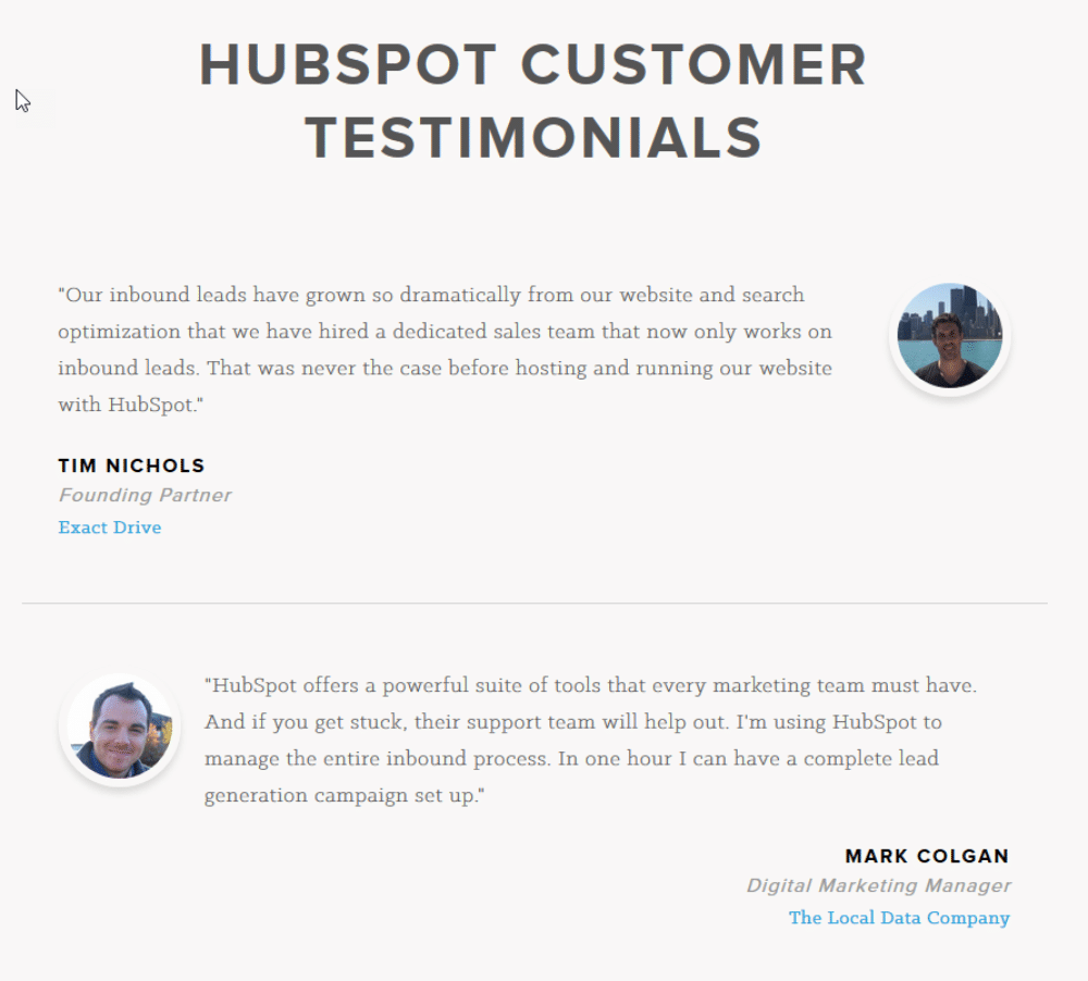
7. FLAUNT YOUR TESTIMONIALS

Testimonials are the rewards of your excellent work. It is the appreciation you receive from clients after you deliver them their desired projects. The comments and appreciation of happy clients would work as a base for your next lead. It gives them an idea regarding your work ethics and builds a strong level of trust at the beginning itself, giving you an edge over others. In case, the previous client turns out to be a friend or relative of the lead; it will be a cherry on the cake. It would make the conversion easy as they would be able to review your work based on their previous fellow experiences. It is advisable to mention 5 to 6 testimonials if possible, but in case you are a beginner, you can go ahead with the reviews of your friends, family, and university.

8. MENTION YOUR REFERENCES

It is an add-on to the package. It is not a necessary step, but if followed, it can give you some benefit of trust in a later stage. It is advisable to provide a reference for your professor or previous employee in the case; you are a beginner. However, if it is your 4th or 5th project, then it would be good to provide the reference of your best client. It would not only give surety about your professional work but would also provide a surety about your behavior and lifestyle, which is very necessary for developing a long-term relationship with the client.

9. CREATE A DRAFT OF THEIR WEBSITE

This is a new feature which you can add to your proposal. Many professionals do not practice it right now due to fear of stealing their work by the lead and getting it done through others in the same field with fewer prices. However, the times have changed, and no one would be able to copy or work in the same way you do. It is a good practice to showcase your work freely and take advice from others before you deliver your end product. Here, you are required to create a rough draft of the work which you are going to provide as a finished product. It would give a clear idea to the lead as to what he or she is looking for and if you would be able to do justice to the project. This will give a chance to your lead to pinpoint your mistakes, and you can rectify it once it is finalized. By providing this, you have almost converted your lead around 70%, and the rest 30% would be done if your pricing pitch goes well. It will also work as strong support for your high pricing structure.

10. LIST THE ENTIRE PROCESS AND TIMELINE

This step is critical for an experienced designer as well as a beginner. It is necessary to list the entire process as to what all activities would be covered while working on the live project. It is also advisable to mention the timeline for each activity as it will give a clear idea to the client and can plan out other related activities accordingly. For instance, you can mention the name of your work – Website creation and mention a timeline beside it like seven days or say 70 hours. This will give you as well as your client space regarding the working process and can negotiate in case they need it earlier than the mentioned timelines, giving you an idea for prioritizing your work. One very important advice from our end is to always keep 5 to 6 hours of spare time while mentioning your timeline, as sometimes some work would not go as per your imagination and would end up taking more of your time. If the suggested timeline already includes those spare hours, then it would help you deliver the project on time and would not disappoint the client.

11. PROVIDE EARLY BIRD DISCOUNTS

After everything is done and finalized, it is time to work on offers. It is well and good if the client agrees on the mentioned prices, but if you are not sure of the same, it is advisable to provide some discounts and offers to attract the lead and convert it into the client as fast as possible. You can fix a timeline for a decision by providing an early bird discount. This can prove to be a good attraction for the clients and also give you relaxation from taking back to back updates in real-time.

We are telling you to walk the extra mile at every stage to make you stand out from your competitors. A little more effort would always make a bit more noise while succeeding. If you follow the first five steps, then it would be a good proposal, but if you go for all 11 steps, it will turn out to be an excellent lead converting web design proposal that could possibly even get you hundred percent conversion ratio.

The post 11 Steps for Creating the Perfect Web Design Proposal appeared first on Web Design Blog | Magazine for Designers.


via https://ift.tt/2NMbLLb

20 School Website Design Examples for Learning Institutions

Thursday, August 29, 2019

Having a website for any business is very crucial for the online presence of the company. When it comes to having a school website, the site must be made in such a way that it can convince the visitors. Your website visitors will either be parents, students, or alumni. Your website is a digital asset for your school or institute, so make sure your website is user-friendly and provide aesthetic usability, interactivity, and creativity.

A school website should also have Appealing CTA’s, clear navigation, be mobile-friendly, have a news section, welcoming quotes, videos, images, adequate information regarding the school, an About Us page, and a part of information about current and past events of the school. A responsive school website design can bring more applicants and visitors to your site as your website creates the first impression of your school. So if you want a good impression of your school, then your site must have all those elements which are mentioned above. Here are some examples of fantastic school website design. The following school websites will definitely inspire you, and you can use these design as inspiration when designing a school website:

1. The Children’s Centre of Austin:

The Children’s Centre is a pre-school website. The website design is vibrant and juvenile. The quotes are inspiring. On the homepage, big and bold images are there that are shown using a slideshow. The site is straightforward. Once you open the site, all the essential information regarding the school is given, on the homepage itself. The site feels comfortable and suitable for any pre-school website. The color theme is beautiful, and so it enhances the site look. You can go to other links attached to the site like “Take a Tour” or any other link. For further information like the events, activities, other primary pages are also there. Overall, the site is responsive and mobile-friendly.

2. Little Dolphins:

Little Dolphins website has done amazing work on their site. From aesthetic site design to the illustrative work, everything is done correctly. The site consists of many sections. Still, it’s not looking cluttered at all. On the homepage, images of different events have been shown through multi-media slideshow. The use of images is done creatively. The site look is vibrant and playful. The site has parallax scrolling, which is enhancing the look of the website. Plenty of information is featured on different sections of the site regarding the events and curricular activities, so one can quickly get all the information on the homepage itself. The CTA’s are big and bold. The site has a drop-down menu in the header section so one can quickly get whatever information they want. Overall, the site has correctly done many things. The site is engaging and attractive. Colors are playing an essential role in enhancing the site look.

3. Rochester Institute of Technology:

The website of Rochester institute has an intense look. The color theme is bold and eye-catchy. The site has a slideshow on the homepage which tells you why you should choose them. They have given all the necessary information. Also, the CTA on the top right side is big and bold so that visitors can quickly get in touch with them. The site consists of the drop-down menu so that visitors can get detailed information about the institute and classroom and regarding other things. One can easily find the contact details at the end so that visitors can connect with them easily. Overall, the site is simple.

4. Rhode Island:

Rhode Island is a school of design. As it’s the school of design, the site design has to be attractive and visually appealing. The site has a black theme which makes the site look dark and intense. The images used are colorful and complementing the black color scheme of the website. The CTA’s are placed at the center so the visitors can not ignore them. The images are playing a significant role in the site as it is enhancing the site look. A different section of the site consists of important information regarding upcoming events, exhibitions, and portfolios. Other primary pages are also attached for detail information.

5. Scad:

The Scad website has a creative background image on its homepage. The CTA’s are big and bold and are placed on the header section of the homepage. The site has a drop-down menu to give detail information about the university. The homepage has different sections where information regarding the upcoming events is provided. Overall, the site design is simple yet classy.

6. University of Coimbra:

The award-winning website has an aesthetic design. One thing which makes this site different is the virtual structure of the university shown, and the point of interest of the tourists is shown on the homepage. On the top left side, the site has featured its achievements that makes a good impression of its university. A link is also attached to the right side of “play video” to have a look at the entire university. Visitors can have a virtual tour of the locations which is being shown in the header section of the homepage. Beautiful images are being featured on the site. The color theme is complementing the font style.

7. Our House:

Our house is a pre-school website. The site design is juvenile and vibrant. The site has parallax scrolling, which is enhancing the look of the site. The font style is big and bold. The entire site has images of children. The different section of the site gives information about the school and testimonial section is also there to build the trust of the visitors. The site consists of other primary pages like contact, online payment, etc.

8. DE LA SALLE High School:

DE LA SALLE’s website has featured so many things on their site. The website design is excellent. The site has given information about the different activities of the school through multi-media slideshow. The content is good. Plenty of information is provided on the site. They also have a news section. One can quickly get to know about the mission and other detail information regarding the school. On the top right side of the site, the quick links option is there to get important details quickly. The site consists of other primary pages. The images used are big, bold, and high-quality.

9. Georgia Tech:

Georgia Tech’s site design is subtle and classy. The images are featured with the attached links. With just one click, visitors can get detail information about the institute. The site has a drop-down menu, which makes it easier for visitors to get information about different categories quickly. CTA’s are there on every section of the website. The news section is also there on the site’s homepage. The color theme is attractive. Overall, the site is designed simple yet effective. The navigation was correctly placed.

10. Stanford:

Stanford is an institute of art the homepage has a slow-motion silent video of an art piece. The video is attractive. On the homepage, the links are attached to the images of the different exhibitions held at the campus and links of many other topics related to art is also being attached to the photos. The #MadeAtStanfort page is excellent, and the page theme gives the site a dark and intense look. Moreover, the entire page consists of many pictures and videos. The other primary pages there for the students, faculty, and visitors. The search option is there on the top right side so that visitors can directly type and search for the information they want.

11. Austin’s Children’s Academy:

Austin Children’s Academy’s website design is lively and exciting. The site is very engaging. The navigation is clear. The color theme is enhancing the site look. The CTA’s are appealing and are placed on almost every section of the site. The design of the logo is going with the site theme. The site has used large and attractive images on its homepage. There is a blog, video gallery, and photo gallery section on the website to get more information regarding the activities and events happening in the school. The footer consists of four categories that show about their programs, Sign-up CTA for Newsletter and about the contact details.

12. Biola:

Biola university’s website is designed well. The site has made good use of images. The CTA’s are appealing and are placed on almost every section of the website. The site has parallax scrolling in it, which makes the site look decent. The images are playing a significant role on the website. The color theme is bright and attractive. The color theme and font style are complementing each other. It allows visitors to have a virtual tour of their campus. In the footer, all the links are present including about us, tuitions, News & events, and many more things attached for detailed information.

13. Hilliard Davidson High School:

Hilliard Davidson School’s website has plenty of information on its website from Quick links to Upcoming events. Everything is given on the site. The site has a lot of content. A blog section is also there on the homepage. The good thing is they have a Daily Announcement section on the left side to keep their visitors updated. For more information, other primary pages are also there. CTA’s are placed on every part of the site.

14. Chapel Hill:

Chapel Hill is a children’s school. It’s a one-page responsive website. The website is straightforward. All the quick-links are attached on the homepage. Brief information is given about the school. The site design is joyful. And the images are shown through multi-media slideshow. The color theme is vibrant and delighted. The navigation is easy to use. For detail information, other primary pages are also there.

15. Queen Anne’s:

Queen Anne’s is a school for girls only. The site has a stunning design. Large images are shown through a slide show. The photos used are of high quality. The CTA’s are alluring and are placed on almost every section of the site. The images are playing a significant role in enhancing the site look. All the information about the school and its curricular activities is there on the home page itself. Videos are also placed to show the activities done. The News and Events section is also there on the homepage.

16. Matter De High School:

Mater Dei school’s website design is marvelous. The large images are featured on the homepage through a slide show. The site theme is lively and exciting. The color theme is enhancing the site look. The CTA’s are big and bold and are placed on every section of the site. On the homepage, there is a section where the number of students at their school is mentioned. Overall, the site is engaging and user-friendly.

17. Black Spine Circle School:

Black spine school’s website has done many things in the right manner. The site design is descent. The images are big and bold. The site has an adequate amount of information about the school. The has parallax scrolling, which enhances the site look. The CTA’s are big and bold. The testimonials are shown through videos. The site has given all the information about how they work and why one should choose them. Overall, the site is engaging and has an excellent user experience. The color theme is classy.

18. Westfield High School:

The Westfield school’s website has plenty of information on its site. The theme is bold and beautiful. The site design is going with the theme. All the other links are attached to the header section of the homepage. Site navigation is clear.

19. The Bush School:

The bush school has a silent video on its website, which gives information about the curricular activities and other academics information about the school. For more information, the inks are attached for the information about summer programs, lunchtime, and many other things. The color theme is calm and pleasant.

20. New Hampton School:

New Hampton School has featured many videos on its site for giving information about the school. The site design is astonishing. The site has a drop-down menu so that anyone can easily find the detail information.

Having a good design for a school website is very important as it will bring more applicants to your school and will build your school image. So take inspiration from these examples and create your unique school website.

The post 20 School Website Design Examples for Learning Institutions appeared first on Line25.


Source: https://ift.tt/2LgiHgv

Design your way

SEO Website Design – How SEO and Design Must Intertwine

Wednesday, August 28, 2019

We all have simple goals for our business. We can define those simple goals as sales. We try to do every possible thing in our hands to reach that one right customer in our surroundings. Back in the day, we used to go to every house and try to sell our products. Some decades later, we started to advertise in newspapers and billboards to reach that one perfect customer.

But in today’s age, we use digital platforms to reach our target customer. Therefore, even after knowing the ABC of the digital platforms, we still would need to dive in deep at the time of execution. This is where SEO comes to our rescue. It helps us reach our perfect customer in the best possible way. It is a no brainer that our website design plays a huge and essential role in gluing the audience to our website.

Beneath, we will discuss how an SEO-friendly website can prove to be more useful compared to a website that is not SEO optimized, and how two digital aspects like SEO and Graphic and Web Design can intertwine with each other and help us reach our target audience in real-time.

Generally, search engines like Google and Bing have web crawlers, who go through our web pages to analyze and sort our content. They understand our content through keywords as the users type in. They surely have limitations of language and jargon, but it does a fair enough job.

We, as a layman user, do not consider SEO too high in the form of conversion, due to a lack of technical understandings and other web-related issues. However, as a service provider, we understand SEO, as a medium between users and we, providers, who help us, identify the user queries to provide them with the best possible solutions. It helps generate leads through the website, which in turn helps us in earning more profits. An SEO-friendly website is carefully designed, keeping in mind the needs of the users as well as web crawlers. The language and tonality of content along with its interface, is taken care of. It is designed in such a way, that it is easily understandable by the web crawlers, as it would make it easy for them to index and show the required results. Every component on the website plays a substantial role in defining the services. It should reflect our offline services well, as it is considered as an online office build for our online audience. It gets equally essential to develop an online website as it is essential to have the right interior office representing our services in the best possible manner. Following are the few points the designer needs to consider to enhance the SEO of the website:

1. Domain name

Your domain name should be crisp and clear. It can be funky but not extreme. It should define your purpose as well as services. It is not necessary to include all your keywords in the domain name itself. Leave the keywords for content and use precise words that are needed. For example, Survey monkey website for conducting online surveys. The name itself defines its service as well as gives a funky and funny touch to it.

2. Hosting

A lot of people are fooled these days by cheaper rates of the server and end up with a slow website. First of all, you need to know your business in and out before jumping to take up a website. This will help you understand your requirements while purchasing the hosting plans. If you are providing E-commerce services and you end up making a plan which does not support E-commerce integration, then it would turn wrong. It is essential to design a website following the requirements and then host it on a platform that supports it technically without any harm.

The design of your website matters as much as the quality of the content you put on display. When you have to choose between content and the UI of your website, it is a sensible decision to go for valuable and in-depth content — but also taking a micro look at the design scenario. When you compare your website with your competitors, you will notice how the presentation of the same content makes a difference for them. And hence, it is safe to say that the way you present your content to your audience makes you stand out on the market. Depending on the type of your website, you need to figure out the hosting that you need. The server space, the bandwidth, and other server parameters play an important role in how your website will function.

3. User Interface v/s User Experience

Many of the significant SEO metrics are directly affected by the structure and overall experience of the user on your web page. If the navigational structure is well segregated and concise, the user won’t have to hassle through multiple web pages. Instead, it would help them invest their time on your content in a better way and make good use of it. As opposed to the scenario, when the website has unfortunate navigation scenarios and undefined sitemap, the user is frustrated in the first few seconds and ends up hitting alt+F4.

We definitely won’t like it to happen after such a hard word. It is necessary to make a smooth and user-friendly interface to give your users a shaven user experience while surfing your website. The website should be designed following the requirements of your target audience as well as web crawlers to justify their time on your platform.

The following parameters can be considered while designing the web page:

• Limit the number of objects on the first page.
• Keep the home page or landing page aesthetically pleasing
• Limit the number of redirects on the website
• Keep the main menu visible and comfortable to access
• Add a search bar to help the user find the relevant information
• Make sure that the URLs are clear and concise for each page
• Instead of displaying the https links, try using a descriptive text
• Hyperlink the web pages on your website.
• Create websites that are user-friendly and intuitive.

4. Redirection


When a prospect visits your website and finds a broken link, there are 100 percent chances of him or her not returning to your website again. It is one significant factor to be considered while maintaining the website. This ignorance leads to dismissing of the prospective customer from becoming a regular customer. Ensure that all the web pages are correctly working; all the navigations lead to the correct page and all the audience land up to similar pages. In case of broken links, make it a priority to fix them immediately and redirect the user to another page. The following parameters have to be considered for redirection purposes:

• Avoid using generic designed pages for your website
• Be creative and design your own 404 page that is interesting enough and works as an attention grabber.
• You can also add another search bar on the 404 pages, giving your users another opportunity to go through your website.
• List down the critical pages on 404-page display, to encourage the visitor to have a look at them before leaving the website.

5. Images, Image Size, and Alternative Text

It is essential to showcase a vital message through an image format. The image should be high resolution for clarity purpose but should also be compressed, keeping in mind the loading speed of the web page. A small image with proper resolution works the best in most scenarios. In the case of audio and video media, it is advisable to use an appropriate media compressor that reduces the size of the file without losing the quality of the data. Here, are some of the essential things that you should consider for web page images:

• Instead of giving a generic name to images, use relevant keywords as the nomenclature of the images. Crawlers also pay attention to the keywords that are used for the images.
• You can also use an alternative description for the image that includes the keyword. This trick will help the keywords to get listed in the results even when the user searches for images only.
• Reduce server load as much as possible by using compressing software.

6. Loading Speed


When we put a high-resolution media on a slow server, our website will naturally take longer time to load. This encourages the user to move on to the next. The ideal time for loading a website is one second. Following points can help you decrease the loading time:

• Minimize your CSS and JavaScript files.
• Trim down unnecessary files and codes.
• Always use the best web hosting providers that have a high in-built server.
• Try to use a high cache solution
• Reduce the number of redirect links on the page
• Lower down HTTP requests.
• Make good use of CDN
• Use compressed images that are smaller in size but have a proper resolution

7. Pop-Ups:


As a user, we know how annoying the pop-ups can be at times. The pop-ups appear either as soon as the user lands on the page or within a few seconds from then. The first impression is the last. You can lose credibility when the pop-ups and ads show even before your user has read your title. It is necessary to give them time to understand your purpose and services. If the pop-up appears too frequently, the user might find it irritating and would leave your website out of sheer frustration. Here are some essential things to consider:

• Minimize the pop-ups.
• You can use the exit intent pop-up. The pop-up evokes when the user is about to quit the website.
Place your pop-ups in such a way that it interests the user to click and know more about your product.

8. On-Page Experience:

Google analyses your website based on the number of visits and the amount of time spent by the user on your website. An excellent way to attract more users to spend time on your website is by putting out great content and appealing designs. It increases the chances of getting high ranks on search engines. For ranking, it is essential to use correct keywords with all the relevant information required by the user. It is also crucial to place the backlinks wisely as there are high chances that the customer would follow the backlinks and land up to the desired page, thus helping you earing the crawl budget for your website.

All these practices seem dumb at first, but if practiced regularly, it helps in achieving our ultimate goal of appearing on the very first page of search engines. Also, giving your users a clean and delightful web experience is equally important to bring them and turn them into a loyal customer. Here are some essential tips to consider while creating a seamless reading experience for your user:

• Choosing a light background makes it easier for the reader to read your content.
• Do not overcrowd your page.
• Make good use of white space
• Make use of Heading tags and Title tags.
• Do not write long paragraphs; instead, divide the entire content into sections.
• Add several sub-headings, bullet points, and images whenever necessary.
• Try to convert your text to videos and infographics as visual effects appeal more than words.

In the digital era, your website works as your digital identity. As per the research, about 92% of search queries run on Google, and a good chunk of organic traffic also comes through” Google Search Engine.

Now, you know the reason behind such a massive buzz for getting the SEO done? As per Google Search Insight Report, there are more than 60 trillion web pages on the portal. What are the chances of your website being in the results list? Here comes the meaty part of the content — the Keywords. Keywords help Google’s algorithm to identify the relevance of your content. Once the content part is sorted, the next important thing which comes up is the design factor. As said earlier, content is not everything. You have put up a well-researched content. But how will your potential user reach your website? And if landed, how will you attract the user to stay on your website for a longer period to explore tour services?

The UX/UI part of the website is everything. If the content is the heart of the website, UX/UI is the face and personality of the website. This is the factor that allows the user to enter and stay on your website to make use of your content. This is how the design and SEO work together. They are not just intertwined but go hand in hand. The user won’t land until the design is appealing and would quickly quit of the content is not informational enough. SEO would let the user land on the correct web page and loading speed while the user experience would give the users that comfort to relax and make use of the information in real-time. If one of them is not followed correctly, then it can either make or break your online business. It is advisable to follow specific SEO guidelines, if not all while designing your website. The results would be mesmerizing and optimum.

The post SEO Website Design – How SEO and Design Must Intertwine appeared first on Web Design Blog | Magazine for Designers.


via https://ift.tt/2ZuPDet
 

The Cash Box Blueprint

Most Reading