Design your way

Sunday, May 31, 2020

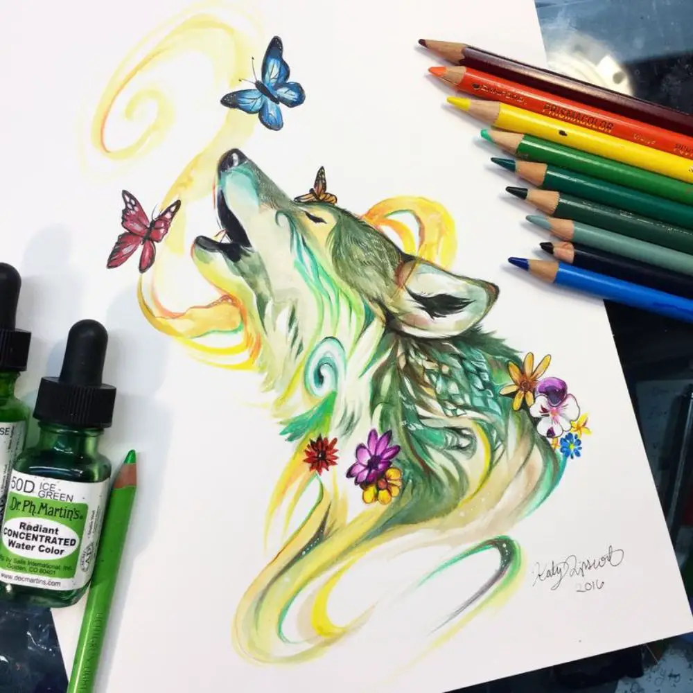
Smoke is a heterogeneous element that complements other natural effects, such as a fire. It disappears as quickly as it is generated, leaving behind a trail of what once was. As fleeting as the smoke is, it is an important element for artists, who use it to give character to designs. Although it is difficult to draw realistic smoke, you can start from a solid foundation thanks to the Photoshop smoke brushes in this list.

Photoshop, as a design tool, is one of the most complexes on the market. It offers all kinds of options to create wonderful canvases from scratch. However, part of its appeal is that it speeds up design work.

Some of these tools are Photoshop brushes. Although it is a basic option, it has many customization possibilities that allow modifying simple strokes into complex textures.

Using the right brush will make creating smoke of any kind an easy task. These will be responsible for configuring the shape, opacity, and colors you need to obtain unique trails and vapors.

However, Photoshop by default does not include any brush that meets the criteria for drawing smoke, so you will have to search for it on the internet.

Consider that you can draw smoke in Photoshop using manual methods, but they are time-consuming, which is ineffective to work with. It is also not effective to be looking for a brush for hours among the many options available on the internet, so today we bring you a list with the best Photoshop smoke brushes that you can find.

Photoshop smoke brushes

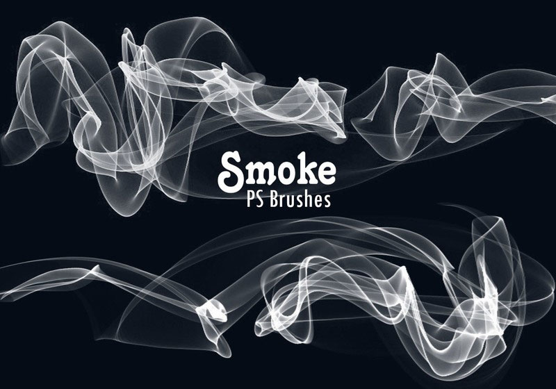
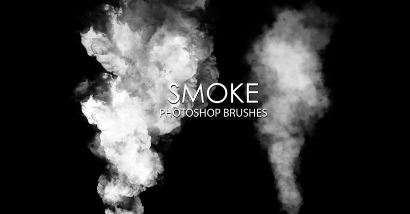
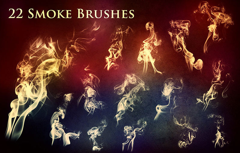
Free Smoke Photoshop Brush Set – Defined lines

Free-Smoke-Photoshop-Brush-Set-Defined-lines Photoshop smoke brushes you can download right now

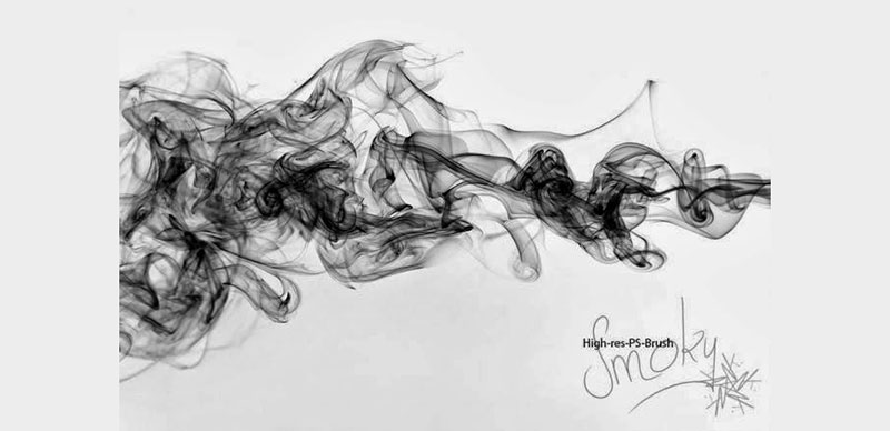
If you are fascinated by the smoke details, then you will enjoy this collection of 16 brushes. Thanks to their 2,500 x 2,500px resolution, you will be able to appreciate each line in them without problems. Also, the author offers them free of charge for any use.

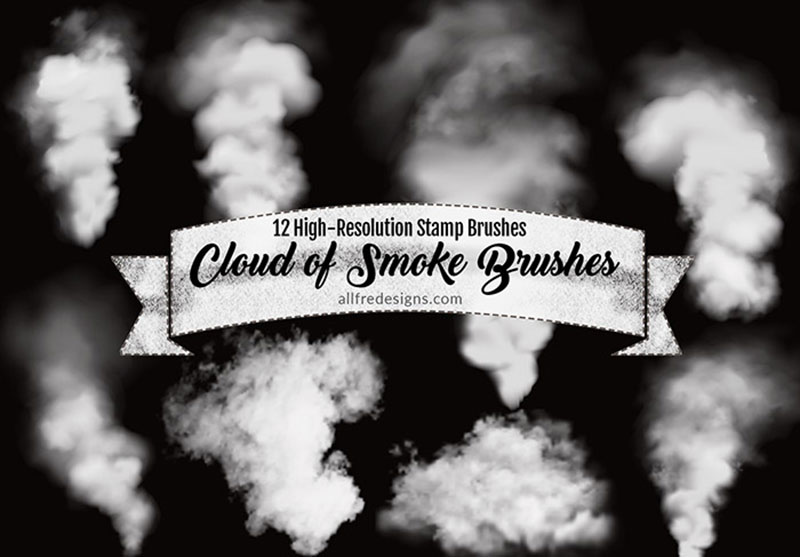
Thick Smoke Background Photoshop Brushes – Thick finishes

Thick-Smoke-Background-Photoshop-Brushes-Thick-finishes Photoshop smoke brushes you can download right now

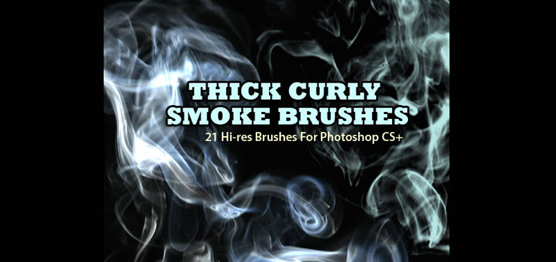
The following list of free brushes for Photoshop includes several thick smoke designs with which you can create dense natural shades that retain a degree of transparency.

Fractal Free Smoke Brush Pack – Linear designs

Fractal-Free-Smoke-Brush-Pack-Linear-designs Photoshop smoke brushes you can download right now

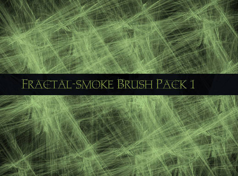
Although you cannot use this package for commercial purposes, it is worth downloading for its five fascinating fractal designs, which can gracefully decorate your personal projects.

Thin Smoke Background Brushes – A fine trail

Thin-Smoke-Background-Brushes-A-fine-trail Photoshop smoke brushes you can download right now

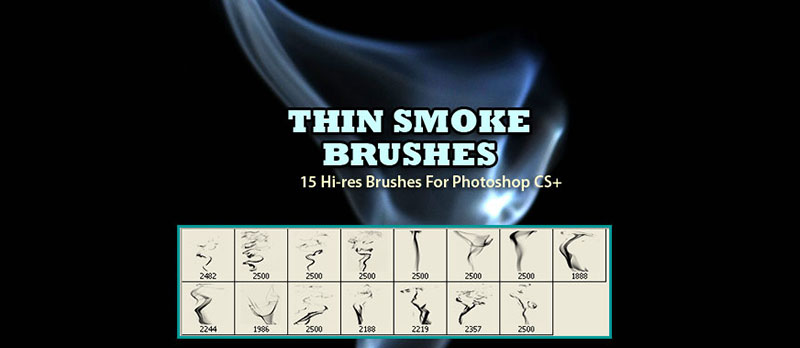
After you blow out a candle, you get a fine smoke trace that draws ripples in the air as the rest of the material is consumed. You can digitally simulate this effect on your backgrounds using any of the 15 smoke brushes in this set. To achieve a better result, we recommend the use of contrasting colors.

Thin Smoke Brushes – Set 1 – The ultimate package

Thin-Smoke-Brushes-Set-1-The-ultimate-package Photoshop smoke brushes you can download right now

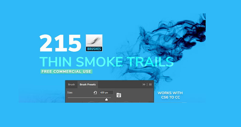
Do you feel that you are missing brushes in your collection? Then look no further and download this set that includes the absurd number of 215 brushes. Although its main use is to draw smoke, the set has so many options that you can use it for practically anything.

20 Smoke PS Brushes abr. Vol.10 – Effects full of energy

20-Smoke-PS-Brushes-abr.-Vol.10-Effects-full-of-energy Photoshop smoke brushes you can download right now

When you want to give dynamism to your designs, you need brushes with a vibrant and unbridled appearance. Overflow energy using the 20 brushes with 2,500px resolutions of this set.

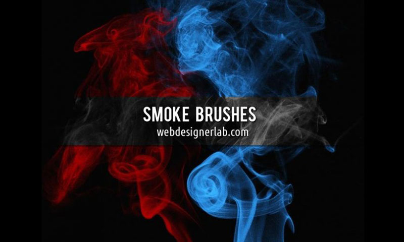
55 Smoke backgrounds Photoshop Brushes – Industrial environment

55-Smoke-backgrounds-Photoshop-Brushes-Industrial-environment Photoshop smoke brushes you can download right now

No fireplace is complete without a smoke trail coming out of it. In this set, you will find a good amount of dense smoke clouds that will complement chimneys and fires.

65 Free Ink Splatter Brushes & Smoke – Smoke stains

65-Free-Ink-Splatter-Brushes-Smoke-Smoke-stains Photoshop smoke brushes you can download right now

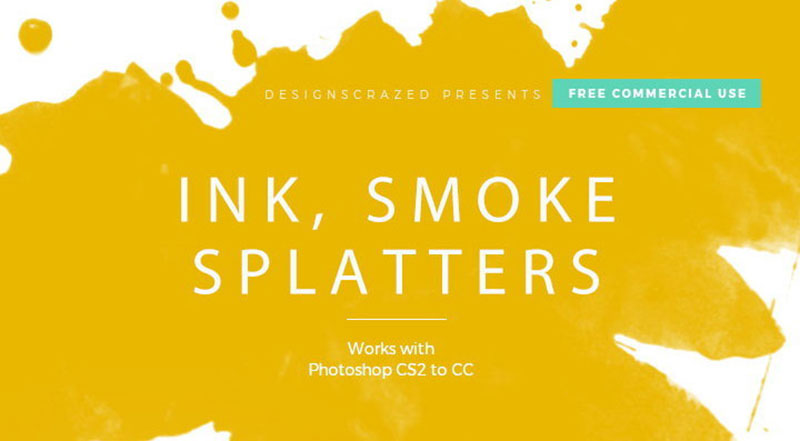
This is a bold alteration to classic realistic smoke. With these free brushes for Photoshop you will achieve a cartoonish effect since, instead of using semi-transparent wavy lines, it opts for sharp stains.

Free Smoke Photoshop Brushes – For large jobs

Free-Smoke-Photoshop-Brushes-For-large-jobs Photoshop smoke brushes you can download right now

If you need a smoke cloud that looks huge, then you should use one of the 15 smoke brushes in this set. Their size and resolution are perfect for decorating concert stages.

Free Realistic Smoke Photoshop Brushes – You just need a couple of options

Free-Realistic-Smoke-Photoshop-Brushes-You-just-need-a-couple-of-options Photoshop smoke brushes you can download right now

Although it only has four options, these free Photoshop brushes are all you need to create realistic smoke effects. You can use them as strokes or simply by placing individual spots.

Alternatively, you can download this high-resolution package using this link.

Smoke Brushes Set 2 – Psychedelic effects created with smoke

Smoke-Brushes-Set-2-Psychedelic-effects-created-with-smoke Photoshop smoke brushes you can download right now

Photoshop CS users can enjoy these brushes that blend multiple fine strokes with smudges to create realistic and calm smoke. To use them, you just have to credit the author.

Free Thick Photoshop Smoke Brushes – Smoke clouds your vision

Free-Thick-Photoshop-Smoke-Brushes-Smoke-clouds-your-vision Photoshop smoke brushes you can download right now

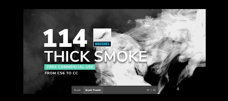
The 114 Photoshop smoke brushes included in this set feature strong opacity, making it difficult to see through them. It includes some great quality fractal designs, and they can all be used for free.

Real Smoke Photoshop Brushes – Increase your collection

Real-Smoke-Photoshop-Brushes-Increase-your-collection Photoshop smoke brushes you can download right now

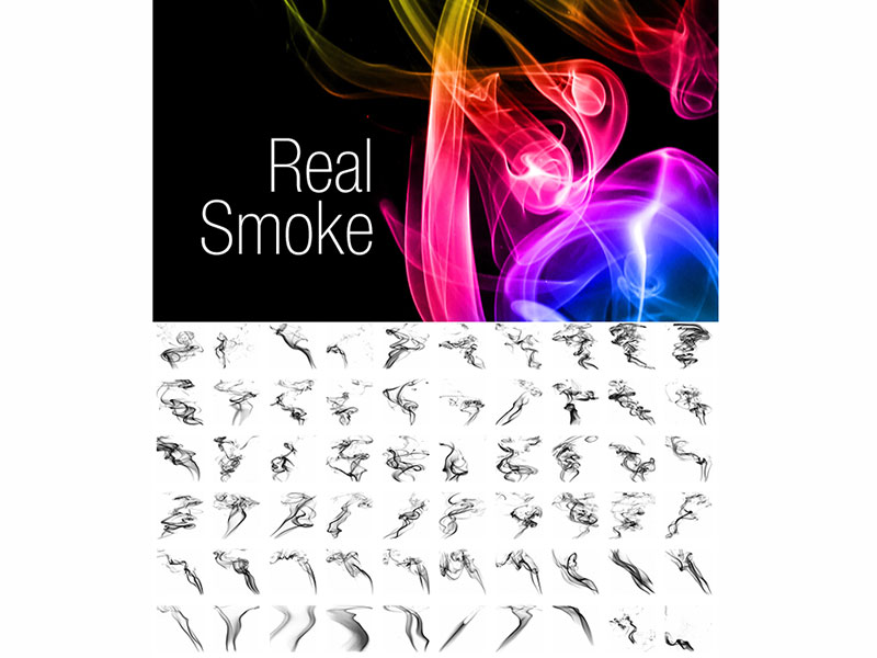
Wavy, complex, simple, transparent, thick, and much more. The 108 PS brushes that you will find in this gallery will help you create varied and unique works.

You can also download this set from the following alternative link.

Particle Smoke by Photoshop Tutorials – An original technique

Particle-Smoke-by-Photoshop-Tutorials-An-original-technique Photoshop smoke brushes you can download right now

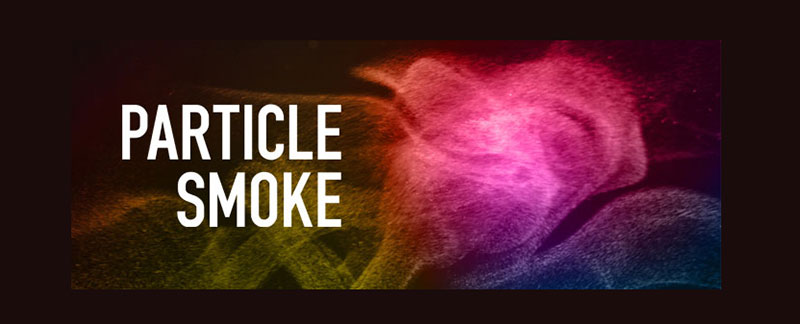
In this link, you will learn how to create your own smoke effects using multiple stacked points. The included brushes will make this job simple and fun. Includes files with dimensions ranging from 1,250 to 2,500px.

You can also download this abstract set of 148 brushes from the following link.

Smoke Brushes Collection – Silky curtain

Smoke-Brushes-Collection-Silky-curtain Photoshop smoke brushes you can download right now

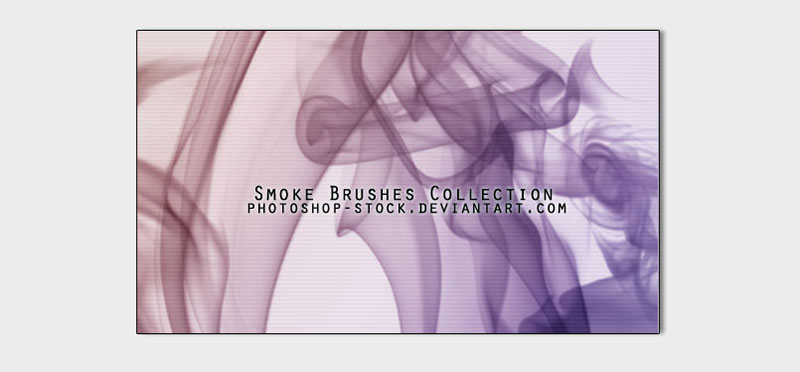
Just by looking at these Photoshop smoke brushes, you will immediately think of a curtain that blocks your sight, but instead of fabric, it is made with smoke.

High Resolution Photoshop Smoke Brush Set – Smoke seen from the water

High-Resolution-Photoshop- Photoshop smoke brushes you can download right now

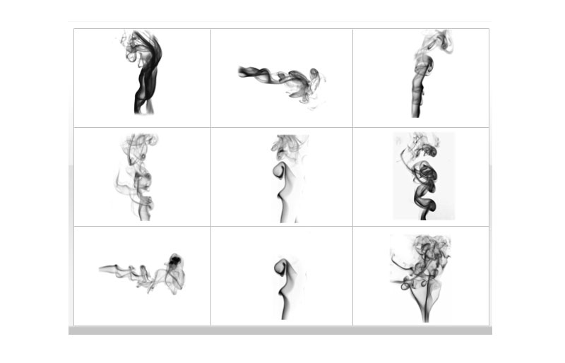
If you’ve ever seen an effervescent object melt in water, it will most likely remind you of one of the nine Photoshop brushes in this set. Despite being a lightweight file, these are high-resolution brushes.

22 Free Smoke and Fire Brushes (Includes PNGs!) – To solve compatibility issues

22-Free-Smoke-and-Fire-Brushes-Includes-PNGs-To-solve-compatibility-issues Photoshop smoke brushes you can download right now

The advantage of downloading a file that includes the original PNG images is that you can create your brushes regardless of the program you are using. If these 22 brushes fascinated you, you should know that the author invites you to see more of his work in the Creative Market.

Revnart Smoke Brushes – Neon effect

Revnart-Smoke-Brushes-Neon-effect Photoshop smoke brushes you can download right now

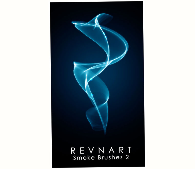
The brushes offered by this DeviantArt user have a clean finish and perfect lines, so you will not find stains that could damage the quality of the images. With the right colors, you can even make them look like bright liquids instead of smoke.

Free Smoke PS Brushes abr. Vol.4 – Beautiful smoke

Free-Smoke-PS-Brushes-abr.-Vol.4-Beautiful-smoke Photoshop smoke brushes you can download right now

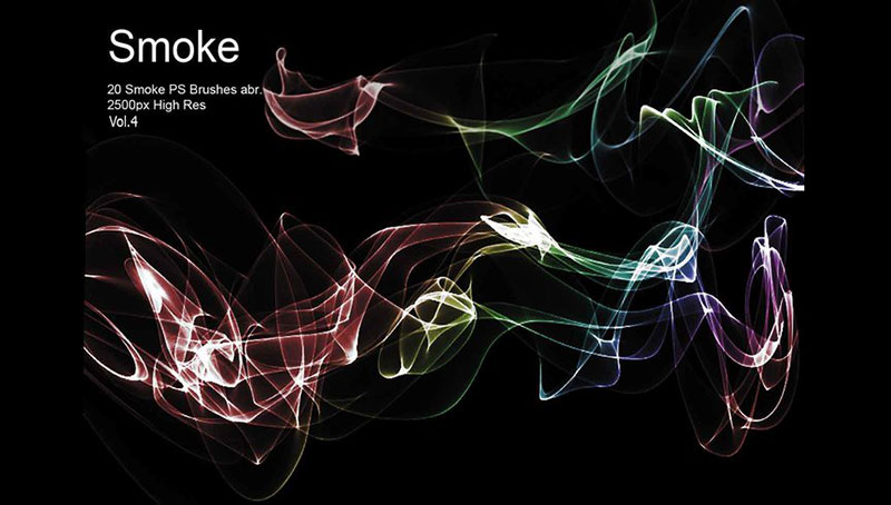
No matter what you are designing, with this set of 20 Photoshop smoke brushes, you can quickly add fascinating details to your projects. The brushes have very fine lines combined with thick and transparent strokes.

Free Smoke Photoshop Brushes – Flaming Duality

Free-Smoke-Photoshop-Brushes-Flaming-Duality Photoshop smoke brushes you can download right now

We finish the list of Photoshop smoke brushes with this alternative that includes medium-sized brushes, which have an abstract design but retain a homogeneous style.

Now it’s time for you to use the new brushes you downloaded. As previously mentioned, some brushes can be used even for other non-smoke designs as they feature high-quality textures that can function as general-purpose brushes.

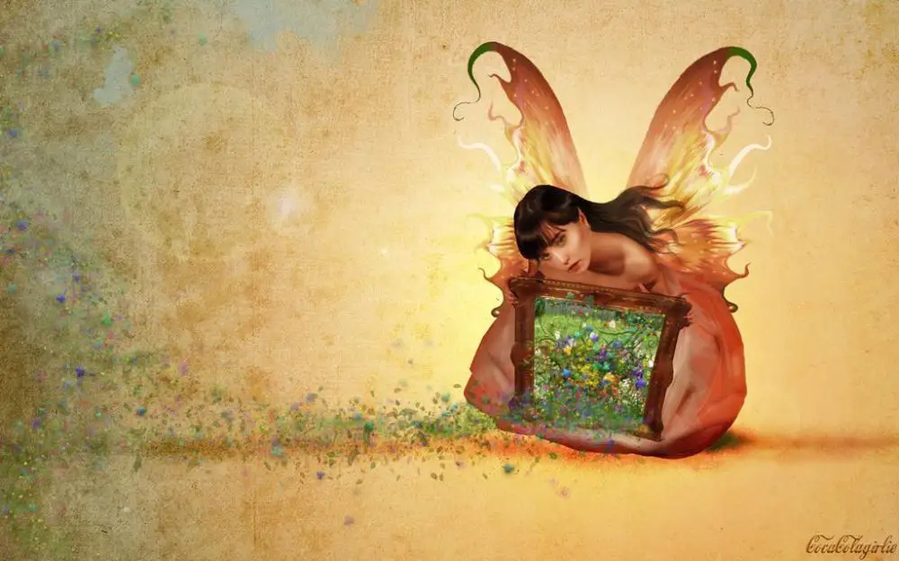
Smoke can also be used as a complement in your projects, being a decorative element that easily adds character.

If you enjoyed reading this article about Photoshop smoke brushes, you should read these as well:

The post Photoshop smoke brushes you can download right now appeared first on Design your way.


Source: https://ift.tt/2ZWS3Cj

20 Beautiful Free Spring Season Backgrounds

Friday, May 29, 2020

Earth has been gifted the beautiful phenomenon of seasons all around the year, and it is no doubt, a glorious process. We are lucky to benefit from the four distinct seasons. Every country has its cycle, but what remains constant is the transition from one season to another. The feeling of nature returning to its fresh start after winter after a long period of color is just one of the beautiful transitions. Spring comes with tons of warmth, a smile on everyone’s face and an inspiration to every artist’s mind.

It is true that spring is the season of revival. It gives fresh feelings, a health boost as well as an overall content emotion. Everyone loves spring, as it marks the descent of numbness and cold, and rise of love and light, through the wonders of nature.

Numerous elements signify the outbreak of spring. Not only do these elements make us relive the season, but they also attract us with a positive vibe. For all those who love spring, but are always stuck at work and cannot enjoy it, here are a set of few spring season backgrounds for your desktops that can help you relive the season indoor.

This way, you can easily enjoy the season even in front of your computer at work and keep reminding yourself time and again how beautiful our nature can be! Sometimes, things that are right before our eyes go unappreciated. So it was refreshing to value those things and transitions while we can.

Spring season backgrounds are essential as they come with underlying psychology as well. It is an excellent way to relax your mind by looking at nature and taking a slight off from your daily routine. It can surprise you with its healing properties – even if you’re just looking at a picture.

Blossoming flowers are often a refreshing symbol of spring. Every country and state have their own set of spring treats from nature comprising of flowers, birds, lakes, scenic views and a lot more. It is always a pleasure looking at these gorgeous images and escaping the reality for a moment. For all those moments that you wished you were outdoor, enjoying a cup of tea in your garden instead of a strong coffee before your computer, here are some beautiful images which could help you keep calm.

Download these visuals and set them as your desktop wallpapers for a refreshing experience amidst all the work!

1. Colorful Flowers:

Colorful Flowers

This free HD background is super chic and colorful. The water beyond the flowers, along with the beautiful reflection of a calm sky makes the image create a certain mood. You can imagine sitting on a wooden bench beside the flowers and staring into the water until a gorgeous sunset while enjoying the evening breeze.

The tinier yellow flowers at the bottom of the flower bed give that extra pop of color which you would crave for at your desk even at work. Just to make things more springy, try setting up a beautiful vase beside your desktop.

2. Little Bird:

Spring season is also marked by the chirping of birds around the gardens, collecting and drinking nectar off of blooming flowers. It is a gorgeous sight to watch colorful birds hop from a flower to another, looking for the sweet treats hidden within. While this is something you can still witness through a mysterious window beyond your desk, why not set a wallpaper that can easily give you an HD visual of the same!

Here is a cherry blossom twig branch with a lovely contrasting green little bird perched on it. Not only is the visual balanced in terms of colors, but also bring about a wave of freshness. The colors are super springy, and add value to your desktop in terms of mood.

3. 3D Text:

3D Text

A little more towards the literal view of the word spring, here is a 3D rendered textual image that talks about spring in the most direct way. Standing tall against a blue sky, wrapped up in daisies and butterflies, spring is here! The colors are a beautiful amalgam of cold and warm, along with a 3D typographic Spring that gives an illusion of expanding outwards into the frame.

The play of light and shadow denotes that the sun is playing tricks on the text, and finally, after a long dark winter, there is hope for new things again! Isn’t it all very inspirational?

4. Garden:

Garden

This is one of the most eloquent sceneries concerning spring. What could be more enticing than a gorgeous green garden filled with flowers and trees, demarcated by a calm stream of water and a bridge over it? You would want to take a stroll around the garden, or wet your feet in the stream; maybe collect some striking flowers and make garlands for a pass-time. Some would imagine reading a book by the lawn, or maybe popping the ‘big question’ right in the centre of this scenic bridge!

While so much is possible through just an image, why wouldn’t you want to set it as your wallpaper? You could let your imagination run wild, just sitting at your office desk and staring into this picture for as long as you wish. The happy notions would prove it to be a good break!

5. Floral Girl and Butterflies:

Floral Girl and Butterlies

For those who love a touch of fantasy to their gadgets, this wallpaper is the best amalgam of graphical spring elements and an underlying fantasy. The flower girl is a beautiful graphic full of flowers and greens. More than the character, it is impressive how each element has been placed thoughtfully into that apparel, hence, creating the character itself. The butterflies flying around are another great use of a spring element, to add up to the drama. The tiny graphical elements flying around pose to be petals which give an illusion that petals are materialising into the flower girl.

6. Spring Day:

Spring Day

When you’re stuck indoors, the most important thing for your imagination becomes the outside world. This image completely embodies the beautiful scenic nature that is out there, and you cannot enjoy due to your work or any other reason. So why not sit at home and take pleasure in imagining a place as serene and heavenly as this!

The perfect combination of blue skies with cotton clouds sprung around, along with lush green mountains and a small town at the foot of the hill just near the river. You could almost jump into the image and want to live a life where springs last forever!

7. Sunny Spring:

Spring Day

This visual is just a reminder of the times when you felt ice-cold and desperately missed the sun. This image can instantly make you feel warmth, just by looking at it for a while. The colors are perfectly blended to project a sunny spring season – with the lush green lawn, clear blue skies and scorching sun overhead. Take a hint from the simple three-element picture – less is always more! And in this case, less can make you feel a lot more too!

8. Life:

Life

‘Life – It goes on’, is a beautiful conceptual wallpaper which denotes spring in a very indirect connotation. While you can see that the alphabets that consist LIFE are filled with spring elements- like green grass, flowers and also cotton. The image is smartly balanced with a neutral water-like blue background which balances the colors and makes the subject of the frame stand out.

9. I Bring Spring:

I bring spring

Once again, this is a fantasy-oriented wallpaper. Suitable for little girls who believe in fairies, this image is a beautiful combination of colors and concept. You can find that spring is dripping off the painting that the fairy is holding, justifying the name of the image, and hence, a beautiful concept too.

10. Spring Wallpaper:

Spring Wallpaper

Just as any soul would love to run wild into the fields on a beautiful spring morning, this image tries to capture that feeling in a nutshell. The fences are a strong element that holds the fields, and the wild yellow flowers only break out the arrival of springs. Once again, we see a super dramatic sky that would help you clear out your thoughts and make you feel calm.

11. Spring Celebration:

Spring Celebrations

A slightly different approach than the other wallpapers so far, Spring Meadow is a beautiful concept. The celebration of spring is quite evident in the beautiful shot capturing spring dusk. The colors as well as elements of the frame, calm the nerves and give a serene feeling – the one you get from hearing a classic piano tune!

12. Spring Flowers:

spring flower

Another gorgeous wallpaper with flowers as the main subject, this particular image has every bit of spring filled in it! Focusing on a small bunch of flowers in the middle of a field, the lavender and yellow just makes it pop up and catches your breath!

13. Spring Wolf:

SpringWolf

This gorgeous illustration is a definite wallpaper for those who love illustrations. Beautifully drawn in a spring palette, along with a flat lay kind of angle, this wallpaper would look stunning on gadgets such as iPads as well as mobile phones. The tiny flowers and butterflies in the wolf’s mane add the perfect amount of spring element, along with the lovely colors that it has been painted in.

14. Bright Spring:

Bright Spring

The main subject of this wallpaper is the little ladybug in the foreground of the image. A direct portrayal of spring and summer, this visual has a perfect balance in the colors – the blues, greens, yellows and the right accent – a red and black ladybug.

15. Mountain Green Wallpaper:

Mountain Green

Though there might not be anything too springy about this image, the mere concept of lush green mountains with clear skies is enticing enough to hold your attention. Imagine taking a nice vacation to these mountains of Machu Picchu, Peru!

16. Nice Spring:

Nice Spring

This animated background is a gorgeous portrayal of spring in a tiny little village along the water body. The gazebo instantly makes you feel like taking some time off work and enjoying a cup of freshly brewed coffee along the waters!

17. Spring Text:

Spring Text

Though this wallpaper may come off as a little overcrowded, it gives the perfect amount of ‘Spring’ that is needed! Presented in a simple collage format, every element of spring makes up for this wallpaper, and you can use it across all the horizontal display gadgets like desktops and iPads/Tablets.

18. Spring Journey:

Spring Journey

This image is an acrylic on canvas painting. Inspired from the Impressionist period, it has close resemblances to Monet’s painting style. What is stunning about this image as wallpaper is the journey that the little boat and it’s owner are embarking upon. It is a soothing image, and the color schemes unquestionably depict the breakthrough of a spring season.

19. Spring Sonata:

Spring Sonata

Another one of the fantasy/digital art wallpaper, the Spring Sonata creates a serene mood. With the girl playing a beautiful floral harp and at the same time, looking into the meadows further away, this visual is more dreamy, yet realistic. You can almost hear the strings of the harp play themselves, and an overall calm spread through your body.

20. Spring Garden:

Spring Garden

Last but not least, this image is the most romantic spring garden. While many people associate love with spring as well, this visual is only befitting for those who are in love. With gorgeous flowers spread across the garden and the beautiful stone laid staircase, it is almost like a memory from a dream!

So these were a few of the most beautiful Spring Season Backgrounds that we loved! Relive the season indoors, and do not forget to feel blessed!


via https://ift.tt/2ZQK0Hk

Design your way

Logos that belong to big companies need to be updated from time to time in order to keep getting attention towards them. If we consider the oil company Shell, you will see that you will be quite familiar with its image because it is similar to what we learned maybe in biology classes. Still, the Shell logo is quite popular and has remained a focal point for the company in the last years.

This global oil leader has its headquarters in the Netherlands and the registered office in the Shell Centre in London UK. It is the number two largest energy company in the world according to Forbes Magazine list in 2011 and also in that edition it was number five in the top of the largest companies in the world.

You can consider it being active in all areas of oil and gas industries together with exploration and production, refining, and distribution. On top of that Shell is also focusing now more and more on renewable energy activities like hydrogen, solar, and wind power.

It was launched in the early 20th century and since then the Shell logo really went through a lot of changes and looks different today from its first version. Today it has a sophisticated and elegant touch that represents the brand in the entire world with no problems.

The Shell name

s2-7 The Shell logo evolution and how it ended up looking like this

Maybe you are wondering what the origin of this organization name is and who owns Shell. What we know is that the name can be traced back to Marcus Samuel senior that imported seashells from the Far East in the 19th century. His son, Marcus junior together with his father needed a name for the kerosene that they were sent to Asia, so they chose Shell.

Because this type of business came to dominate the business world, the name was used for the import-export company that was set up in the year of 1897, the Shell Transport and Trading company being its full name.

Another minor change for the shell sign and name also happened in 1907 when the company was merged with Royal Duch. What happened was that a new group was formed, and the business just becomes quickly known as Shell.

The history behind the Shell logo

s1-8-1 The Shell logo evolution and how it ended up looking like this

Choosing the logo did not come as a surprise even more because the tankers that were taken to the Far East had been named from a seashell. For sure it was not a simple shape to reproduce but they managed to do it.

Some rumors say that actually the Shell logo was suggested to Samuel and his son by another man. His name was Graham and he imported the kerosene that Samuel made into India and sold it himself as Graham’s Oil.

He actually became the director of the company and played an important role in it. The well-known shell gas logo that combines yellow and red is easy to recognize and has helped in the development of the brand.

The design is easy, and people can remember it for a long period of time. This kind of logo helps the company interacting with its customers without coming in touch with them all the time.

Shell Logo Design Elements

The Shape

s5-1 The Shell logo evolution and how it ended up looking like this

Although the Shell logo has been redesigned the main part, its crown hasn’t suffered any changes. The shape represents the outer case of a mollusk shell. Indeed, the logo shows the popularity of the company and it has used it since it was first made in order to keep a position in the corporate world.

The Color

The main colors that are being used are red and yellow because they offer a powerful look for the logo. The shell design also took advantage of these colors in order to bring a balance between elegance and professionalism. For sure you can see that the yellow is the dominant color because it can be easily visible, and it gives a better look at the red.

The Font

s5-3 The Shell logo evolution and how it ended up looking like this

The designers used a simple bold font for the letters SHELL. The main idea behind this was to make the company show its high standard and qualities. Besides that, a bold font is also easier to be remembered by people when they see it.

The Evolution of The Shell Logo


history-of-the-pecten-graphic The Shell logo evolution and how it ended up looking like this

It is quite fun to have a look at the way the company logo evolved in more than one hundred tears. It shows that the Shell sign did a great job and is still popular among people. In its first years, it had an unimpressive design for its evolution but as time passed and the advancements of technology were made the Shell logo transformed a lot and took a more pleasant design.

1900 and 1930

In the present, the Shell logo can be spotted easily in the entire world because of its unique design. However, in the early 1900s, it was a poor drawing of a mussel shell. Indeed, a shell isn’t really an impressive shape but if it is designed in a bad way for sure the logo is going to look bad as well. The angle in which it was made didn’t really make any improvement for the shape.

In 1915 a change was made, and some color appeared because Shell launched its first service stations in California. The red and the yellow helped a lot the Shell design and what few people know is actually that many Californian settlers were born in Spain.

The colors that could be spotted in the yellow were also in the flag of Spain and displaying them maybe created an emotional bond towards the brand.

1930s Logo Takes Symmetrical Shape

The next redesign step was done in 1930. This time the art style was added to the Shell logo and it made its main shape to be symmetrical and impressive. The Shell sign got a crown in the logo because the company wanted to show itself as the king of this business field.

1948 to 1971

Before the launch of the internet, a lot of logos had subtle details that were blurred. But from 1950 the icon became more and more simplified and they focused on recognition and memorability because in the end this might be the ultimate goal of any logo design.

1971 Radical Changes

In the year of 1971 Shell started to make some big changes to their logo. The new version had simple lines that went through yellow strips and made a crown shape. Adding also the red outline made the logo very powerful and look fresh.

It was an impressive design and Shell continued to use this design almost in the exact shape since 1971 with just some minor changes. So, from a simple Shell Gas station logo, it is transformed into a really great looking design.

1995 onwards

In this period the organization chooses a new design by adding some friendly shades of red and yellow. They made the nuances lighter and decreased the brightness so that people will not feel offended by them. The design basically remained the same the only change is in the color scheme.

We can really say that Shell did a great job with their logo because sometimes we even see it being used without the brand name.

For sure the Shell logo is a unique and elegant one. The company has a rich history and they managed to keep a similar vibe with their origins. Every time they made changes to it, they made it look better and we expect them to do the same also in the future.

Any company wants to create something recognizable and we consider that Shell did this because of their brand values and focus of their long-term mission as an organization that evolved so much.

If you enjoyed reading this article on the Shell logo, you should read these as well:

The post The Shell logo evolution and how it ended up looking like this appeared first on Design your way.


Source: https://ift.tt/2ZNfMF6

Tips to Design the Best Tattoo in Photoshop

Thursday, May 28, 2020

Tattoos have existed in all cultures for centuries. Before, they were used to mark religious symbols, but as we progressed into the millennial world, tattoos are a fashion statement as well. ‘Getting Inked’ is a famous phrase which is used extensively on social media platforms when someone is getting a tattoo.

While most of the time tattoo artists customize designs according to your needs, it is always a plus point to know that you could do it yourself as well. Designing a tattoo is super-easy if you have access to Photoshop and Illustrator. And it’s always an additional benefit if you can create illustrations. However, even if you don’t illustrate, there are ways to design your tattoos using existing stock images.

When it comes to designing tattoos, one must keep in mind that the entire struggle relates to the kind of effect and editing you chose for the image. You can go for a shaded look for black and white line drawings, or merge a couple of images to acquire the desired effect.

In this blog, we shall learn how to design a tattoo in Photoshop and how can a tattoo be added over an image using Photoshop. While both these processes are elementary, one can also choose to make complicated designs after viewing these few points.

1. How to Design a Tattoo in Photoshop:

Designing a tattoo in Photoshop is hands-down one of the most straightforward task. Most of the job revolves around choosing the perfect blend mode and making the coverage of images look realistic. Following this video tutorial by Anrijs Straume Tattoo on Youtube, we can understand how to create a tattoo that is realistic and ready to print and use immediately. Let us take a close look at the steps that are involved in the process:

Step 1 – Selection of Images:

Tattoo Design - Selection of Images

It is always convenient to select images which have a similar color story going on. For example, in this tutorial, the creator has selected a skull, a machine equivalent and an explosive hole. Now what is peculiar about these images is that all of them follow a similar dull color palette with greys in focus. However, do not worry if your images are of a different palette – we can always color tone them in Photoshop once your tattoo is ready.

Step 2 – Placement of the Elements:

Tattoo Design - Placement of Elements

To begin with, open a blank A4 size canvas in Photoshop (A4 is ideal for giving a better quality image). Place the required base image. You can simply select the Eraser tool and erase the unwanted part of the image.

Now place the second image (Machine parts in this case) on top and follow the same process of eliminating the unnecessary parts using the Eraser tool. You can play with opacity and the sizes to achieve the most likely position placement of the elements.

Step 3 – Creating an Illusion:

Creating an Illusion

Most of the times, an illusion makes the tattoo look more 3D. By adding the right shadow effects, you can create the illusions. In this case, the creator wanted to show that the machines are coming out of the skull. In order to do so, he incorporated an additional element – the cracked up hole.

So place your illusion-creating image and again, eliminate the parts which you don’t want with an Eraser tool. To give an effect that the hole is actually in the skull, you can play with the blend mode. For this tutorial, the creator chose the Multiply mode, keeping the colors in mind. However, you can select and try out all the different modes for maximum effect.

Step 4 – Finalizing the Tattoo:

Finalising the Tattoo

Now, as all the elements are in place, try to resize different images to make sure everything is in proportion. For example, the hole and the machines need to be in perfect proportion to the skull in order to look believable. Make sure that all elements are orderly placed on top of each other. Also, check opacity or other effects that you have applied.

Once you have made through this step and are satisfied with your design, you can choose to flatten the layers in order to reduce the size as well as just rasterizing the image as one. However, this step is optional if you wish to make further changes in your file.

Step 5- Final Effect:

Tattoo Design - Final Effect

Most of the times, it may happen so that the images are all of a different color scheme. While sometimes it looks perfectly vibrant and colorful, usually it may come off as a bit off-tune. To avoid this issue, you can choose from various filters and effects that Photoshop provides – like Sketch tool, Blur tool, and many more under Filters.

However, for this tutorial, the creator has simply turned the image into greyscale and plays with the levels to show various tones of greyscale. Again, this step is optional in case you think that your design fits in perfectly.

So in this way, you can design your tattoos on Photoshop and easily give them to your tattoo artist to replicate and get inked. What’s more, this is the exact process followed by tattoo artists. Hence, you can even cut down on individual costs by designing your tattoo on Photoshop and giving it to them already.

2. How to Place a Tattoo in Photoshop:

Unlike the first tutorial, this part of the blog is more concerned with the use of Photoshop to edit tattoos on images. Herein, we would see a couple of ways to make the Photoshop-ed tattoos look more realistic and at the same time, easily changeable.

Method 1 – Erica Larson Method:

Step 1:

erica larson method step 1

Open the image in Photoshop along with the tattoo composite that you wish to engrave on the body of the model. Place the tattoo in the required position and reduce the opacity to make it meld onto the shoulder. You can play with the Blend Mode – Larson chose to settle on Multiple.

Step 2:

erica larson method step 2

Secondly, create a layer mask by clicking the tiny icon at the bottom of the Layers panel. She painted the off shoulder areas using a Brush tool.  In this process, you define the edges of the tattoo, and this is the step that mainly composes how your design would look when it is either half-hidden or in the dark.

Step 3:

erica larson method step 3

This step concerns the adjustment of lighting in the frame. It is a given that some areas of the tattoo would be highlights, while some could be in the dark. So to accomplish that effect, Larson chose to use the Brush tool with a lower opacity in the color black to highlight specific areas which could potentially have direct light exposure.

Step 4:

erica larson method step 4

The tattoo won’t look natural unless it fits the contours of the model’s body frame. In order to do so, first, unlink the tattoo image from the mask layer. Now select the original tattoo thumbnail independent of the masked layer and press Control+T. You can also find the Transform function under Edit on the top menu bar. Press on Warp under Transform and drag the grid lines and edges in order to fit the curves of the body perfectly. You can warp the tattoo according to the body frame.

Step 5:

erica larson method step 5

To make the tattoo look like it is closer to and on the skin, Larson chooses to blur the tattoo. For this, go to Filter and select the Blur tool, under which you can go for Gaussian Blur. Select the radius based on how blur you would want the tattoo to be. Remember to only apply this effect to the tattoo layer, and not the masked layer.

Voila! Your tattoo art is ready! You can experiment with this method to see how a tattoo can look on your skin or your client’s skin. This method is super-easy and shall not take more than 5-10 mins of your time once you are sure of the effect that you wish to foresee in the tattoo.

Method 2 – Various Effects to Keep in Mind:

This method primarily talks about the various effects that can be kept in mind while designing a tattoo and placing it on the model image to see if it works or not. With this particular tutorial, you can quickly learn how to make use of Filters, to give more natural effects to the tattoos. Design new and creative tattoos by implementing this as well.

Step 1- Hand-Made Look :

various effects to keep in mind - hand made look

Most of the times, the lines and edges of stock images are too perfect for some given illustrations. To make it look a little uneven and give it that hand-drawn effect, here are a few ways techniques. Make sure you select a high-quality image so that the effects are correctly visible even when you scale down the image to any particular size.

Place the selected graphic on a plain white background. Use the Marquee tool to make a square around the graphic and just fill the square with white. Create a new layer under this tattoo image and merge these layers with Ctrl+E.

Begin the filter selection after the graphic has been placed on a white background.  Select the Filter section on the top menu bar, go to Distort>Glass. There are various options like Smoothness, Scaling, Distort. Keep the smoothness filter to a high enough value in order to smooth out the edges and give them more natural-looking curves. You can then adjust the Distort and Scaling parameters to give a variant to the edges as per your image needs. You can redo this process with the Glass filter couple of times to achieve different variants. Once you are happy with the inference, you would see that the tattoo begins to appear more naturally hand-drawn than digitally illustrated.

STEP 2 – Channel Selection:

various effects to keep in mind - channel selection

Once you are happy with the Filter, you need to cut the design from the white background. Fortunately, you can do this easily with the Channels option. Simple, you can go to the Channels setting above the Layers panel, select Blue Channel and click on the icon there using Alt or Option (For MAC). This shall easily select all the lighter areas in the image. Then simply inverse the selected area – by either Control+I or Select and Inverse. This shall convert all the light areas to the dark ones.

Now create a new layer. You would see that the Channel selection is active over this new layer at the top of the layer stack. Simply fill in the selection with black, and the tattoo design shall reappear. You can then use the Layer Mask to remove excess areas that could’ve been selected during the Channels step.

STEP 3 – Placing Tattoo on Skin:

various effects to keep in mind - placing tattoo on skin

This step is similar to the earlier tutorial. However, once you place the tattoo on the skin, we shall follow a different series of commands. You can simply use the Smudge tool and Liquify tool. This would allow you to push the design in the areas which require the design to be spread across. Additionally, the Smudge tool gives the illusion that the design is absorbed in the skin. Liquify shall help make changes in the direction and make the tattoo look like a part of the skin.

You can also add Bevel and Emboss layer style to the tattoo layer. Make sure you match the light direction first and then make the changes accordingly. As we saw in the previous tutorial, adding Gaussian blur also makes the tattoo look like it has been sitting on the skin for a while. You can select a suitable radius according to your design.

Rest of the steps can be followed according to the previous tutorial. You can also explore more effects within the Filters tab in order to give more hand-drawn effects. These are a few tips to remember while designing tattoos in Photoshop.

The post Tips to Design the Best Tattoo in Photoshop appeared first on Line25.


Source: https://ift.tt/3gqzRqF
 

The Cash Box Blueprint

Most Reading