It is said that a picture is worth a thousand words, but the truth is that there is something in the letters that makes us want to continue reading. No image is complete without writing that gives it value, but not all letter formats work for this. The first thing is to have a general idea of what we want. Strong contrast fonts are perfect for advertising purposes, such as Abril Fatface. However, once we use it, we need an Abril Fatface font pairing that allows us to complement our site.
Selecting a set of letters to use can be somewhat complicated. There are many options, and not all work well together. Abril Fatface, for example, is a heavy font in contrast, very similar to Bodoni, but somewhat more renewed. It retains fine lines and small curvatures but gives it its own style.
What fonts could be combined with Abril Fatface? You should consider that there is no general rule for matching letters. This selection process is more a bit of intuition and experience, in addition to the corresponding trial and error.
However, with the list that we bring you below, you can skip the discard process and simply use the best options available, just having to select the one that best suits your site or project.
Abril Fatface font pairing examples
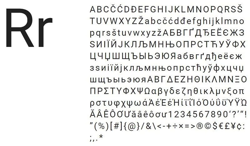
NunitoSans
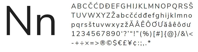
Thanks to the Abril fatface font base contrast, it can be perfectly combined with another letter that has lower contrast, which guarantees the readability of both. Nunito Sans perfectly covers this field, in addition to that, we can use it individually thanks to the 14 unique styles that it includes.
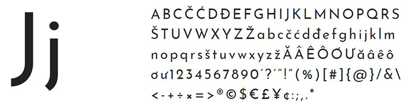
Merriweather Sans
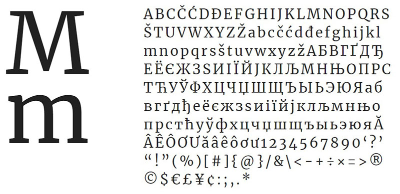
Once we have written the most striking with Abril fatface, we can write the rest of the paragraphs using something simpler, like Merriweather Sans. As the thickness of the lines is somewhat greater, we can use it with smaller sizes without losing legibility.
Lato
A fantastic Abril fatface font pairing idea is to use a more modern letter in the set. Lato is one of the most common examples since both are from Google and can be easily obtained.
While nineteenth-century British letters inspire Abril fatface, Lato has a more contemporary origin. Because of this, it is easy to use them for messages on social networks that seek to attract the attention of the public.
Droid Sans
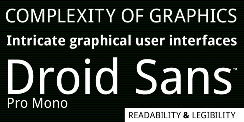
If we want a font for application programming, or we are targeting our projects to phones, then we need to have Droid Sans as a font. Its elongated vertical design, its neutral shapes without details at the ends, and its standard thickness make it easy to read on vertical screens.
Roboto
The font name makes us understand that we are facing a mechanical letter. However, Roboto adds light but subtle curves, which have wide diameters that allow it to be pleasant enough for our eyesight.
JosefinSans
What differentiates Josefin Sans from the rest of the fonts on the list is that it has a somewhat unusual proportion, since it only has half the normal size in the X-direction. This deformation does not make it less pleasant, but the opposite; it allows it to preserve the original style of which it is inspired, which are the geometric patterns of the Sans Serif letters of the 20s.
URW Franklin Gothic Font
In 1902, Morris Fuller Benton designed the Franklin Gothic typography. Since then, the pattern of the lines has been preserved, being a very readable font and with a variety of format options.
The one on this list is the modern version digitized by URW, which has been used in many famous designs. Lady Gaga’s second album uses it, and the Museum of Modern Art in New York adopted it for each of its exhibitions. Moreover, since we are celebrating the recent Star Wars movie, it is good to remember that this typeface was used for some subtitles in it.
Anonymous
This Abril fatface font pairing dates back to the 1990s when Susan Lesch and David Lamkins designed an alternative to the typography used in Macintosh equipment. Thanks to its fixed-width quality, it is especially useful for coding work.
Montserrat
This typography of geometric patterns is a tribute to a certain Buenos Aires’ neighborhood of the same name. The signage found through the streets of this district served as the basis for creating more polished letters that look good in almost any context.
Many people compare Montserrat with Proxima Nova and Gotham, but this is completely unmarked from them by having clear variations of letters of constant use in Spanish, as well as notable differences between lowercase and uppercase characters.
AktivGrotesk
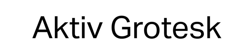
It seems that the creators of AktivGrotesk had something against Helvetica’s simplicity, and decided to create their typography; ironic enough, the same Helvetica was the inspiration for it.
Eliminating some peculiarities of Helvetica, and covering it with subtle details of Univers font, this Abril fatface font pairing will give you a little more dynamism than if you used a more traditional letter.
Brandon Grotesque
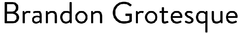
Although it doesn’t seem like hard work, being a type designer is complicated. Not everyone can create something unique and attractive that can be used in many situations. In this case, Brandon Grotesque is a creation of the German designer Hannes von Döhren, who sought to make a geometric pattern perfect for titles that used the Erbar font of the 20s as a reference.
We can use it in up to six different thicknesses, each with its corresponding italic. Additionally, if we like this style, we can also download a version designed for the body of the text.
FF Spinoza
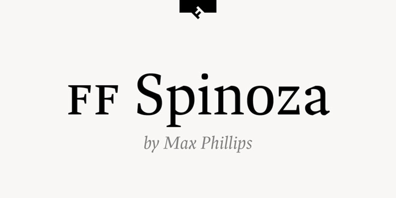
This low contrast letter, with reduced proportions, and irregular strokes, is an example of elegance in each writing. The most curious thing about this Abril fatface font pairing option is the choice of the name, which is a tribute to the philosopher Baruch Spinoza, who was dedicated to grinding lenses to improve people’s eyesight.
Although the tribute does not only remain in the name, since this letter is extremely readable in small dimensions, so we can use it for both web pages and printed materials.
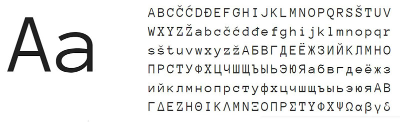
Sofia

Launched in 2008 and updated in 2012, Sofia is a traditional Sans Serif typeface that has unique language support, as well as being compatible with OpenType. Despite being based on geometric design, it is not heavy for the eyes thanks to some looser strokes.
Caslon
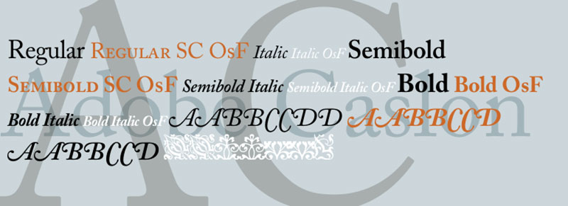
If you have seen the declaration of independence, then you will recognize this typeface. Caslon was created in 1722 by William Caslon and was a standard used in typewriters and documents of great importance. Today it is still a very original way to accompany our sites thanks to modern versions of the font.
If you enjoyed reading this article about Abril Fatface font pairing, you should read these as well:
- The best 90s fonts to create retro nostalgia designs
- The best sticker mockup templates you’ll find online
- The Porsche logo, what it means and how the logo evolved
The post Check out these Abril Fatface font pairing examples appeared first on Design your way.
Source: https://ift.tt/2WeGNim


No comments:
Post a Comment