Design your way

Tuesday, November 30, 2021

There has been a lot of emphasis on good UX designs. Businesses are spending more time and money on that to impress their customers. And, why do you think it is important? A very well-user experience must blend into the background without being noticeable. Only if it is so wonderfully designed that you actively think, “Wow, this is a delight to use!” This is why UX design matters.

Due to the evolving and improved technology, now you can see creative, fast, and consumer-oriented designs. When it comes to developing apps, though, the competition is severe. Even if ten applications do the same function, the one that offers the best user experience should be the most successful.

Why does UX design matter?

User experience refers to how effortlessly and enjoyably an app allows the user to do what they desire. UX designers must consider a variety of elements while creating a great application or website.

Intuitive Experience

The time taken by a customer to master an application is directly proportional to the efficacy of the user experience design. The UX has served its purpose if they can rapidly start using an application without a lot of help or having to read instructions.

A user’s intuitive use of an application will be influenced by their interactions with similar technologies in the real world. Using genuine conventions to create virtual interactions more intuitive include swiping the display to turn the page and hitting a 2D box that looks like a 3D button.

Some of this intuition can be honed by previous app usage and users’ anticipation of comparable experiences.

Coherence & Continuity

Established User Experience Design norms can emerge through a process of natural selection. Though successful designs are copied and bad designs are not. Platform manufacturing criteria can also help them.

User expectations play a role in design conventions. A design feature may prove to be more efficient, but if it deviates from standards, a user may become upset. This depicts why UX design matters to the users.

Platform Specifics

Because interface approaches differ in minor and major ways, the platform you’re designing for might have a big impact on UX. Although the difference between the two Smartphone models could be little, the interface of a cell phone and a tablet might differ significantly.

HID guidelines, for example, might differ dramatically from one platform to the next, and even within brands. App developers are supposed to follow very specific and tight criteria set forth by some businesses. Others have more loose standards that allow for the new, more efficient ideas to emerge without jeopardizing design consistency.

The Deciding Factor

UX design is a complex science that is influenced by a variety of elements. However, getting it correctly is crucial to an app’s success. Except for a few niche apps, the fundamental coding is likely to be constant throughout the competition.

The ability of that code to transfer into an attractive user experience is why UX design matters to most consumers when picking which app to use. So, make sure that you invest in the right design to attract your clients or customers.

The post Why has user experience design become so important? appeared first on Design your way.


Source: https://ift.tt/3d0HJhR

18 Free Strong Fonts for Designing Website Headers

Monday, November 29, 2021

Fonts play a vital role in making the website visually more appealing. Sadly they are underestimated, and hence we keep seeing the same type of fonts across websites. While not all types of fonts can be used on websites, there are thousands of good options available out there that can accentuate the design of your website. As a designer, one has to find the right font and use it creatively. This effort will pay off in terms of a highly visually appealing website. 

While choosing fonts for any website, we always recommend that you go for solid fonts when designing the website headers. This makes the header stand out nicely, and also the text will be easily readable. At the same time, you should also try to avoid the standard fonts used for headers. Rather go for creative options that can help make your website stand out. This blog collates some of the most interesting fonts that you can use for website headers. The good part is that all of them are free.

1. Asterone

Free Strong Fonts for Website Headers: Asterone

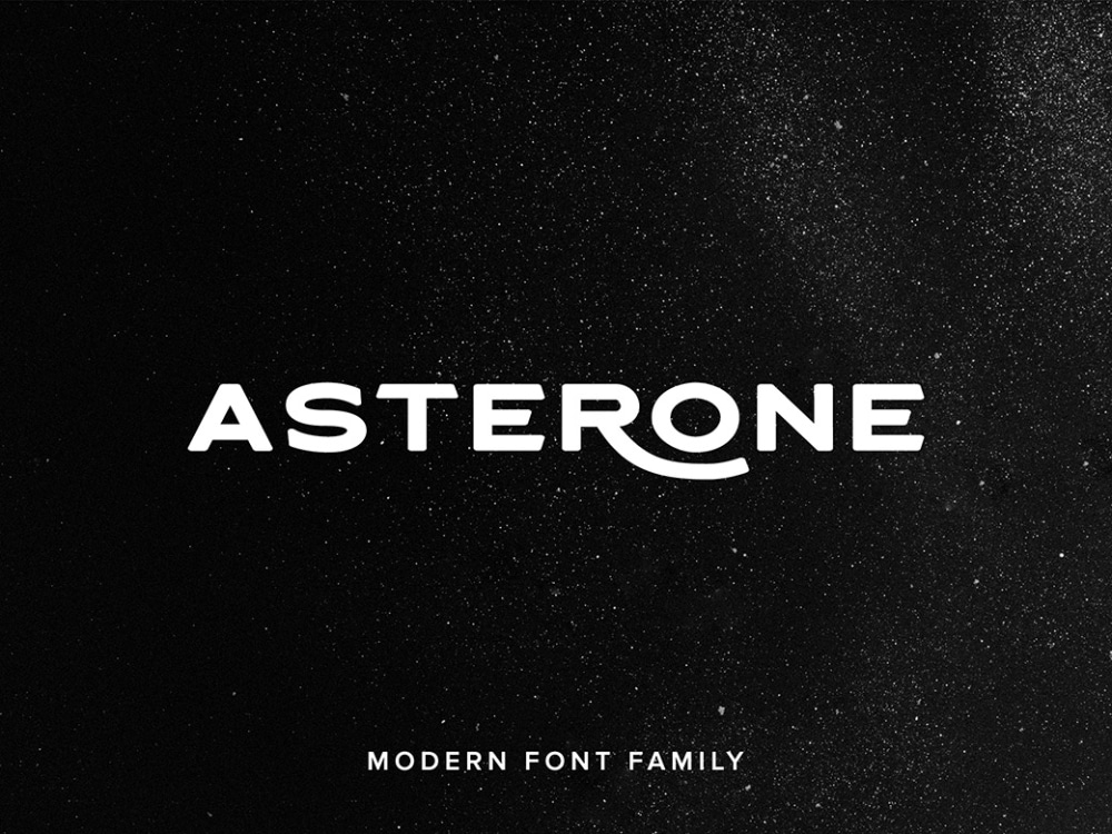
As the name hints, Asterone is a font style inspired by space. While most of the letters in this font are designed to look modern, strong, and neat, some the fonts like R and others have an extended tail which gives this font style its unique character. The font family comes with many variations, and this makes it easy for designers to use them in a combination. Also, uppercase, lowercase, punctuations, symbols, numbers, and all are covered, and this makes the life of designers all the easier. It can be easily used for branding and even packaging. But for website headers, its few variations can strike a creative chord. 

2. Senilità

Free Strong Fonts for Website Headers: Senilità

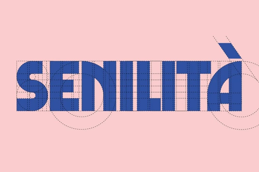
Senilità is a very useful free retro display font. This font seems to be inspired by classic Italian films and even gets its name from it. You can also find shades of mid-century art decoration themes in this font. This is a very good mix of straight lines and curves. Some letters in the font style stay straight while some characters are given special attention, and their curves are done with precision. The good part is that the font style seems condensed and is also strong. This makes it easy to use for designing website headers, and because it is bold, the text is easily readable. 

3. Rubie

Free Strong Fonts for Website Headers: Rubie

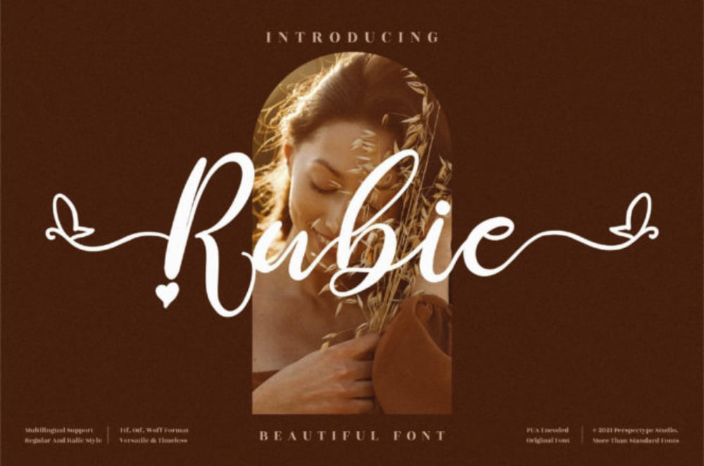
We have the Rubie font style, which is free to download, moving from strong condensed fonts to elegant cursive fonts. We can see that the font is neatly created, and it looks beautiful as it is detailed in a very good manner. Even though it is cursive, it is easily readable and bold enough to draw everyone’s attention. One good part about Rubie is that it is PUA encoded. This means that designers can access all of its glyphs and swashes and customize them according to the need of the website design. 

4. Cold Daylight

Free Strong Fonts for Website Headers: Cold Daylight

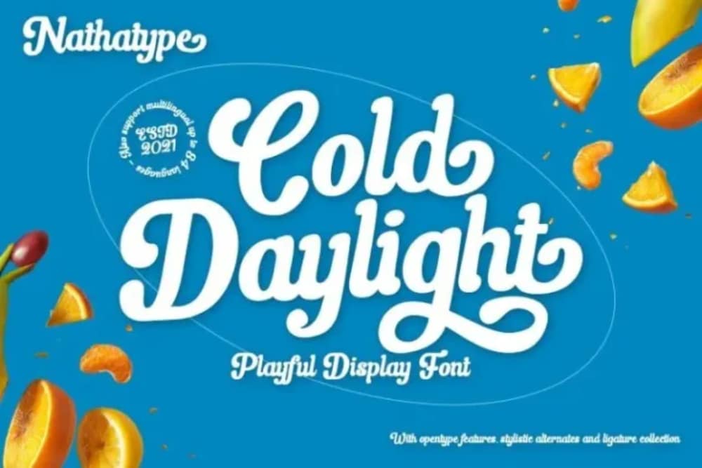
Cold Daylight is a strong script font that has a good vintage effect to it. Because it is strong and still has a fun element, this font has the potential to completely change the website design. It is ideal for books, magazines, quotes, packaging, and even social media posts. For websites, it can be used in sliders to convey the brand message in a strong and bold manner. The curves of the letters are set in the right manner so as to give the font a creative effect. This can be seen in the way letters such as g and y are designed. 

5. The Night Watch

Free Strong Fonts for Website Headers: The Night Watch

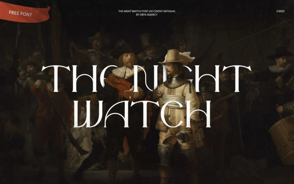
If you are looking for a new font style that is refreshing and at the same time can take you centuries back, then the Night Watch is the font style for you. Exquisitely crafted in the serif style font, the delicate rounded forms on the characters make this font unique and stylish. The creator claims that this font style is inspired by the famous painting by the same name. The good part is that the font includes uppercase letters, numbers, and even punctuation marks. You can use these fonts for websites related to arts, museums, or other creative platforms. 

6. Bahamas

Free Strong Fonts for Website Headers: Bahamas

This font style will remind everyone of beach and surfing. Inspired by the surf posters on the beachside, the font style is raw but still quite creative. Through the curves, the designers have ensured a good wavy feel to the font style. The fonts are bold enough to grab everyone’s attention. The other good part is that because the curves and edges are so detailed, the font can also be used for negative space design. While its best applied on posters, social media posts, and other loud mediums, it can also be used for designing good website headers. 

7. Camar Vintage Font

Free Strong Fonts for Website Headers: Camar Vintage Font

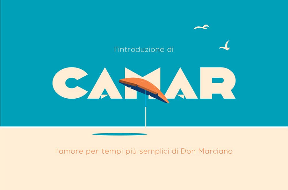
A strong and fat font style, Camar Vintage font comes across as the perfect font style for postcards and invitations. The letters created are thick, and at the same time, there is a good amount of creativity that can be seen in some of the letters. Overall the font has a good modern feel and a calm rhythm to it. The good part is that the OTF files for this font include over 180 glyphs that designers can customize further. In addition, its strong nature can get your one-word message across in a very affirmative manner. 

8. Lovelo

Free Strong Fonts for Website Headers: Lovelo

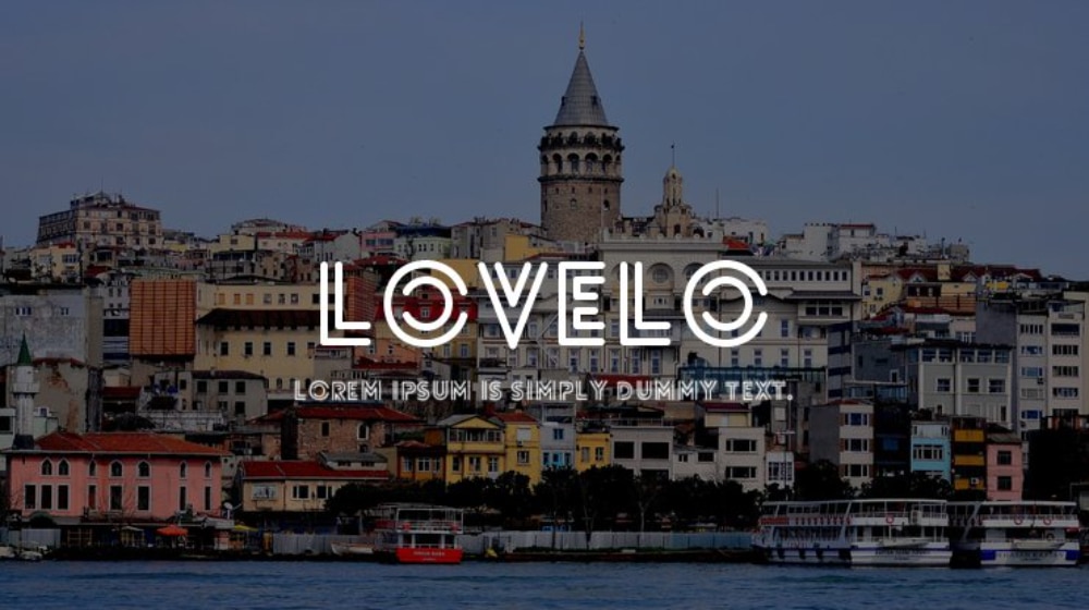
Time and again, designers have to use a very special font to make their designs stand out. One such font that can be very useful is Lovelo. It is not exactly the routine strong font that you come across, but at the same time, because it is an online-based font, the font still comes out as strong. It comes in a family of fonts, so that provides all the designers good enough options to use for designing. When using the fonts, you can always put up an overlay on the image or graphic behind and use this font on top of it. 

9. Monkstead

Free Strong Fonts for Website Headers: Monkstead

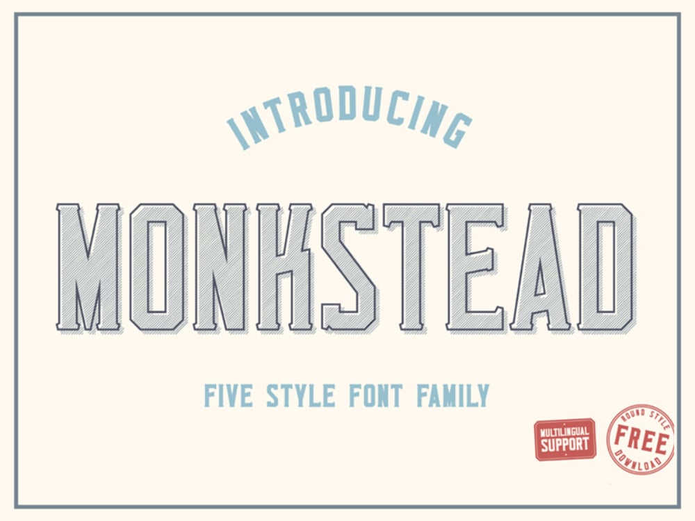
Monkstead is not a regular run-off-the-mill strong font. It is rather a well-crafted font style that mixes a bit of retro, vintage and gives the classic westerner feel. The font style comes with five different font styles. This includes a hatch, vintage, and outline style as well. Such options help the designer create a variety of options. The logos are serif style and can be used to design logos, headlines, posters, and websites that can impress viewers. Because it is free to download and use, the designers should add this to their collection.

10. Salma

Free Strong Fonts for Website Headers: Salma

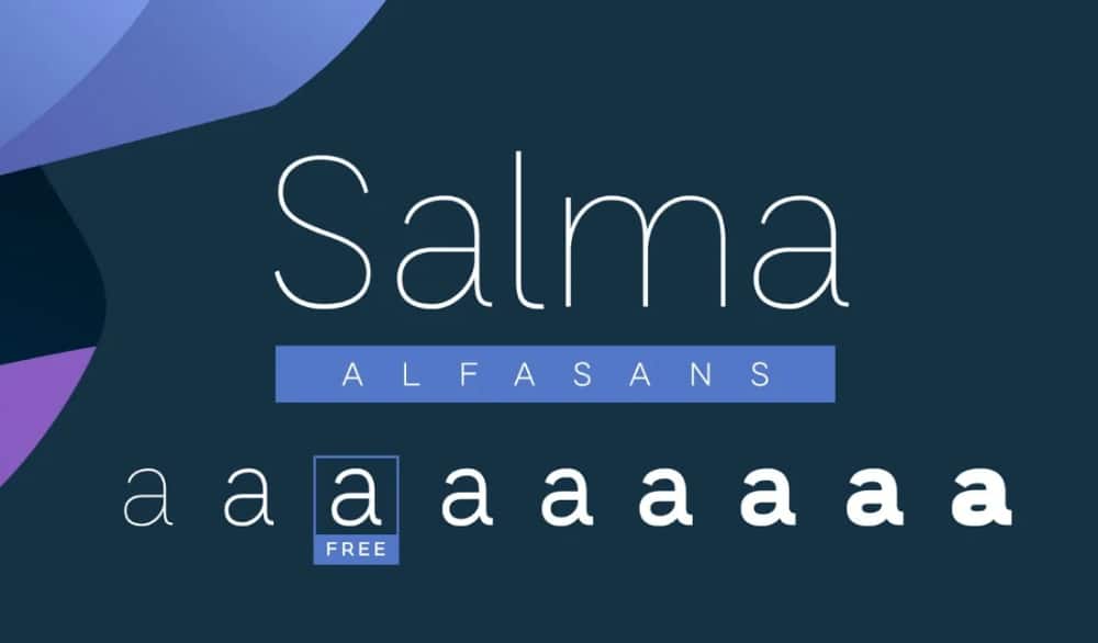
A free san serif font style that is borderline simple, Salma font looks neat and can be used for almost any purpose. The font style combines the use of modern geometry along with a bold and finished look that makes the font easy to use. The entire font family comes with a variety of options, and this makes the font style more usable. The good part about this typeface is that the strong fonts can be mixed with the light ones to create the necessary contract effect. Salma font style is good for corporate or minimal websites where the fonts needed are simple but elegant.

11. Rocket Clouds

Free Strong Fonts for Website Headers: Rocket Clouds

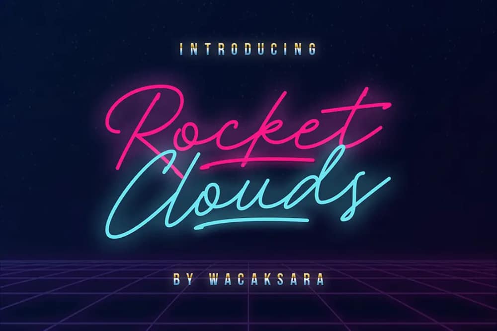
Taking us miles away from simple fonts is Rocket Clouds typeface. It is a script-based font created with much delicate detailing. The cursive style gives it a good recall value. One of the easy applications of this font is using it in neon colors to give it a much classic retro look. The letters are kept simple, and hence this font is used for routine websites as well. Inspired by the music of the 1980s through its nostalgic effect, it can provide a contemporary retro look to the design. It can be used for digital marketing, posters, invitations, and even packaging. 

12. Better Hobby

Free Strong Fonts for Website Headers: Better Hobby

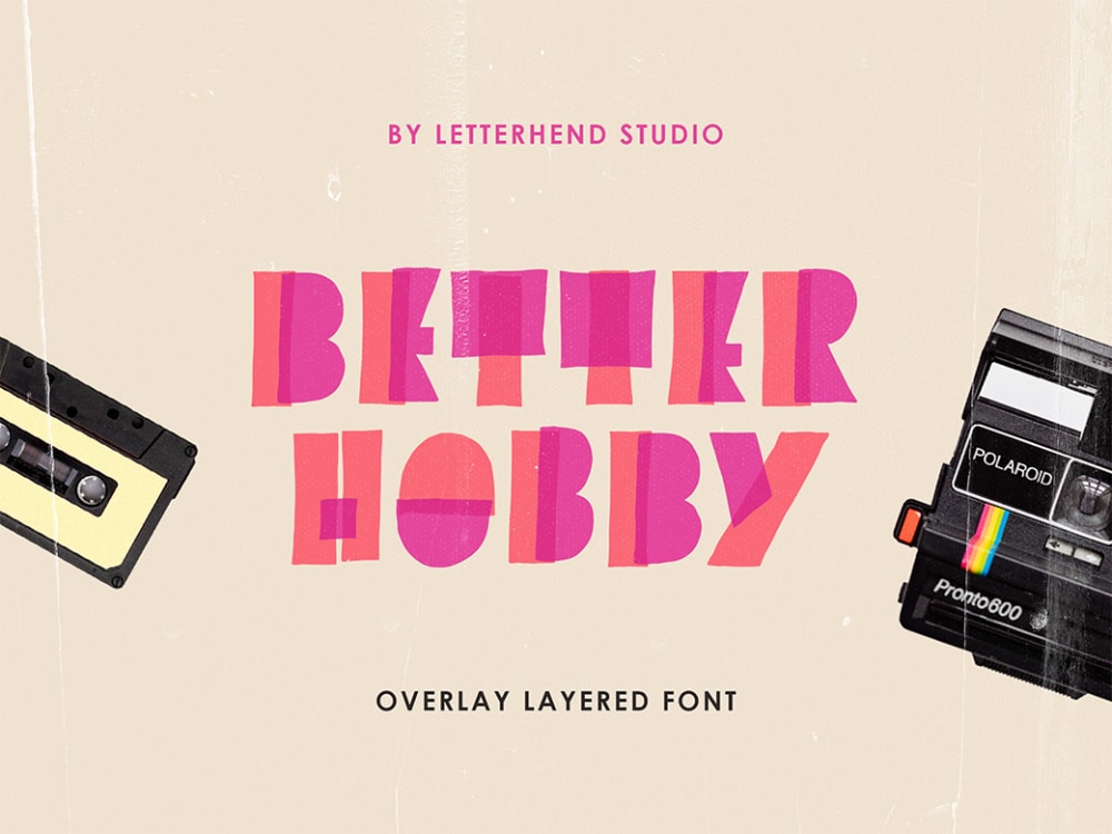
If you are looking for a comic font style that is really loud, grabs users’ attention, and still looks creative and cool, then you should try Better Hobby font. This font is available for free download. On first look, it seems that colorful highlighter markers are used to create this font using overlay strokes. But the creators have taken care to ensure that each of the letters is legible. Its unique shape gives it a playful design and hence can be used anywhere that needs cool, hippie, or quirky design fonts. For websites, it can be used for music or event websites to draw viewers’ attention. 

13. Redwing

Free Strong Fonts for Website Headers: Redwing

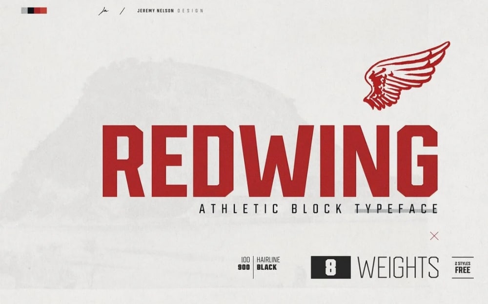
Redwing is a block display typeface that leans towards a combination of western and athletic feel. It can also be used as an industrial font, given its strong shape. Inspired by the blue-collar roots of Redwing in Minnesota, this font is a fine tribute to the industries there. You can use it for logos, social media posts, posters, and even magazines in terms of application. The free version includes light and medium font styles. Hence you can use the combination of these two to create visually stunning and strong website headers. 

14. Made Canvas

Free Strong Fonts for Website Headers: Made Canvas

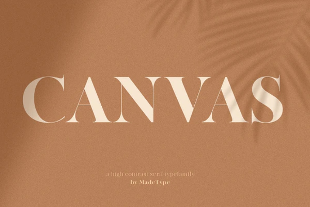
A modern style Didoni typeface, Made Canvas consists of a family of contrasting fonts. The edges of all the letters is crafted thin and delicate, giving the font an elegant feel. Because it’s a serif font, it can be nicely used for logos, invitations, posters and can be a good hit in the fashion industry. Made Canvas is recommended to be used only in larger applications as the light version may seem really thin if used in a very small font-weight. However, it can give the right creative appeal when used in combination with other fonts for website headers. 

15. Vikeys Font


Free Strong Fonts for Website Headers: Vikeys Font

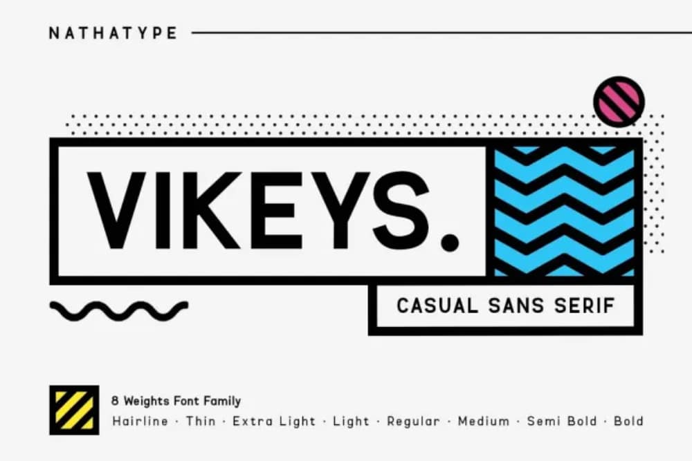
The Vikeys font is a very good combination of strength and elegance. It sets its foundation on san serif fonts and mixes them well with other fonts based on the equal-width system. Because it offers a family of fonts, you can get a lot of options to better your design. Vikeys font offers both lowercase and uppercase characters. Because of its versatility can be easily used for website headers, menus, and typography across the website. The fine mix of style, fun, and modern quirkiness makes this font a must-have for all designers. 

16. Nexa

Free Strong Fonts for Website Headers: Nexa

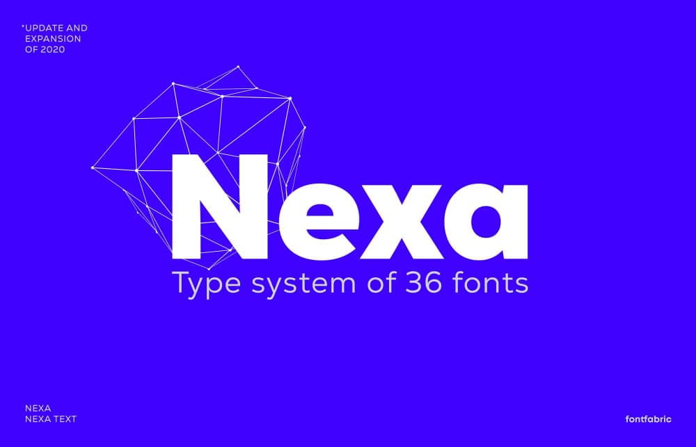
You rarely come across a font family that is so perfect that you keep using it all the time. Nexa font falls in this category. The designers love having this free font in their collection because the entire family comes with so many variations, be it the font-weight or italics. Look wise, the font seems very simple, and that is the main strength of the font as it gives it a lot of versatility. You can use it for various branding options like logo taglines, packaging, or other digital formats. For a website, you can use the heavy style for headers, the regular ones for paragraph text, and the thin ones for separating special text.

17. Mont

Free Strong Fonts for Website Headers: Mont

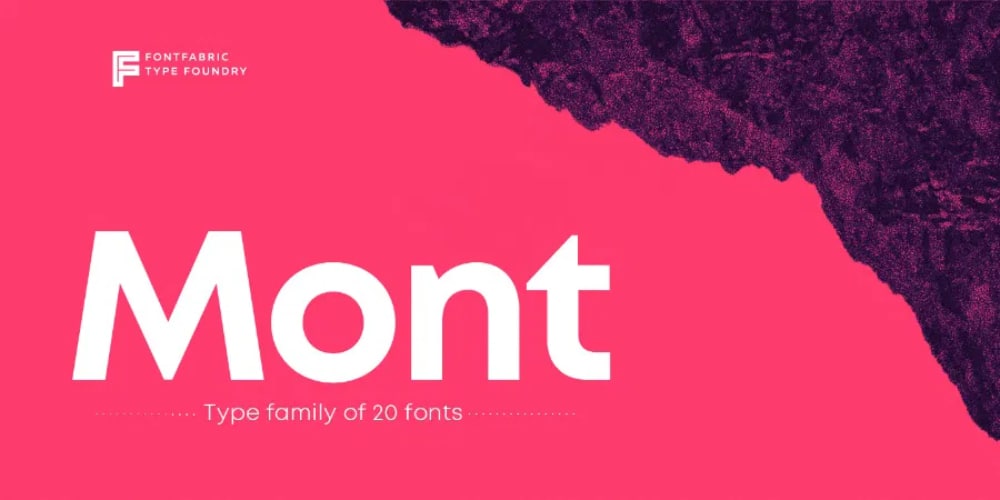
The Mont font style is a font family of 10 weights starting from hairline to real strong black version. It also offers an italic version. This style is similar in terms of use and popularity to Nexa. But from a design point of view, it is slightly stylish as a few of its characters have nice cuts. It supports Latin, Greek, and more than 130 languages, making this font a must-have for all designers. Also, with the OpenType file download, the designers can get access to its structure and play around with it to meet their needs. The font style is highly versatile and hence can be used across a wide range of digital media. 

18. Forestion

Free Strong Fonts for Website Headers: Forestion

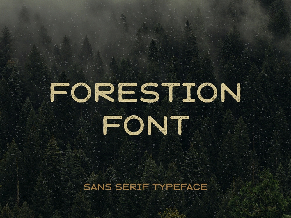
Shifting away from modern digital fonts, Forestion is a unique handcrafted font inspired by nature that evokes a feeling of nostalgia with its vintage-style design. It comes in two variations: rough and aged, and the download pack includes uppercase, symbols, and numbers. The font strikes the right balance between being a handwritten font and a stencil-drawn font. The sans serif style helps the font look neat and clean despite the scratches on the letters. This font can be used in travel-based websites as header fonts to make them visually attractive. 

Finding the right font to use for a website is never an easy task. The above collection of free strong fonts for website headers will make your work easy whenever you search for a good font. While most of them come from a family, you can always test them out with different combinations of fonts to see how they look. When it comes to website header designs, always for strong ones that are easily legible and at the same time look creative and unique. 

The post 18 Free Strong Fonts for Designing Website Headers first appeared on Web Design Dev.


via https://ift.tt/31b6Z2N

Design your way

We are only too happy to help you. Since we’ve covered this event for many years, we know what to expect. We have plenty of tips to share with you with respect to what some of the top business and website products on the market are offering in terms of promotions or discounts.

Trafft

image1-1 10 Massive Cyber Monday Deals 2021 (up to 98% off!)

Trafft is a new software booking application that features a robust scheduling system designed to streamline a business’s appointment booking operation.

  • Trafft provides an ideal solution for appointment-driven businesses such as salons, gyms, medical centers, consultants, photo studios, training centers, and the like
  • Trafft can manage employee schedules, unlimited appointments, and track key performance indicators on its administrative dashboard and manages both individual and group bookings.
  • Features include online payments (Stripe and PayPal), group bookings, store and forward email protocol (STMP), SMS messaging, and the ability to service multiple locations

Trafft offers Free, Basic, Pro, and Expert plans. Pick one that is a best fit for your business. Basic, Pro, And Expert plans offer free trials.

Total WordPress Theme

image2-1 10 Massive Cyber Monday Deals 2021 (up to 98% off!)

Total is a powerful developer-friendly WordPress theme that is packed full of the features that both novice and professional designers need to make web design easy.

  • Total’s NEW 90+ section templates, 75+ pre-styled post entry cards, and 45+ quick import sample demos combine to make page and website building a quick and smooth process
  • 500+ live customizer settings, a font manager, and a WPBakery add-on page layout manager
  • Allows page building without having to deal with restrictions or limitations and have selections of built-in hooks and filters, snippets, and custom add-ons

Take advantage of Total’s 50% Cyber Monday discount. (Discount automatically applied. Offer valid November 23,2021 at 5am UTC through December 1, 2021 12:59pm UTC.)

Amelia WordPress Booking Plugin

image3-1 10 Massive Cyber Monday Deals 2021 (up to 98% off!)

Amelia provides businesses with a sleek, professional booking experience. This plugin gives business owners easy access to a friendly UI and user-friendly booking forms that are managed directly from the business’s WordPress website platform.

  • Unlimited appointment bookings and multiple employee assignments and work schedules can be managed at a single or at several locations from a single platform
  • Amelia can also be used to schedule and book events, so clients and customers can schedule appointments online 24/7
  • Amelia eliminates the errors and disruptions that are often experienced in manual systems and can be a source of stress and displeasure for both the business and its customers.

Both yearly and lifetime subscriptions are available at a 30% Cyber Monday discount.

wpDataTables

image4-1 10 Massive Cyber Monday Deals 2021 (up to 98% off!)

Take advantage of a 30% discount on the #1 WordPress table and chart-building plugin on the market. wpDataTables offers –

  • customized, editable, and maintainable tables and charts together with conditional formatting
  • the ability to manage massive amounts of data in multiple formats while providing multiple database engine support and sorting and filtering techniques that significantly add to the ease in creating tables from complex data
  • a chart creating wizard and the ability to follow table filtering in charts.

TheGem – Creative Multipurpose & WooCommerce WordPress Theme

image5-1 10 Massive Cyber Monday Deals 2021 (up to 98% off!)

In TheGem’s ultimate multi-purpose toolbox you’ll find:

  • Cool selections of premium pre-built multi-page and one-page websites
  • Elementor and WPBakery premium page builders and top performance with WP Rocket plugin, bundled with TheGem
  • Demos, layouts, and page sections you can mix and match to create your own unique look
  • TheGem Blocks: an ultimate tool for building awesome webpages while speeding up your workflow

Mobirise Website Builder

image6-1 10 Massive Cyber Monday Deals 2021 (up to 98% off!)

Mobirise brings to the table the many advantages of being an offline website builder.  Additional features include –

  • Drag and drop page building (no coding necessary) and the use of more than 4700 awesome website templates
  • eCommerce capability, including a shopping cart, sliders, galleries, popups, forms, and Icons galore

Slider Revolution

image7-1 10 Massive Cyber Monday Deals 2021 (up to 98% off!)

Slider Revolution has something to offer to anyone who wishes to spice up a website so that it stands out from the competition – WOW effects, which are:

  • Advanced animations and special effects designed to capture visitors’ attention
  • Cutting edge templates and addons do their part to take a website to the next level

Take advantage of Cyber Monday’s whopping 33% discount on ALL licenses.

8bio – Linktree Alternative

image8-1 10 Massive Cyber Monday Deals 2021 (up to 98% off!)

Have you ever thought about creating a link to your website in Instagram or TikTok? It involves nothing more than entering your social username in Bio and the link will be automagically created. Just mention CM8BIO to get your Cyber Monday discount. You can add –

  • Beautiful skins or catchy animated backgrounds and as many links and buttons as you want
  • Posts, contact, and subscribe sections

Litho – Multipurpose Elementor WordPress Theme

image9-1 10 Massive Cyber Monday Deals 2021 (up to 98% off!)

Litho is a modern, creative, and highly customizable multipurpose Elementor WordPress theme that can be used for any type of website. Litho’s many website-building features include

  • The popular Slider Revolution plugin and large selections of home pages, templates, creative elements, and custom widgets
  • Excellent website loading speeds and strong SEO results and WordPress customizer compatibility for added flexibility

Portfoliobox

image10-1 10 Massive Cyber Monday Deals 2021 (up to 98% off!)

To optimally display your professional creativity to the world, nothing less than a top-of-the-line portfolio website builder should do. Portfoliobox is one of the best portfolio website-building tools on the market, which gives you

  • Private client galleries and light-room integration
  • A built-in eCommerce capability
  • Mix and match templates that provide the flexibility to achieve a unique design

***** 

It’s the biggest online retail holiday of the year, and we’ve been working hard to get a jump start on our awesome Cyber Monday deals coverage.

The post 10 Massive Cyber Monday Deals 2021 (up to 98% off!) appeared first on Design your way.


Source: https://ift.tt/3ps9KoH

Design your way

WordPress is a popular, free, and easy-to-use website. On top of these benefits, there are some unforeseen risks that come with them. Since it is open-source software, WordPress acts as an attraction for hackers looking to exploit your website.

No one wants to experience the bad feeling of having a hacked account that sends horrible emails. Sometimes you may even get suspended for hosting and sending malware due to hacked account.

The hacked account can lead to tremendous damage to your reputation. This can be worse than the cost to fix the situation and restore your portal to a safe and secure level. It may take an extended period before you can regain your customer’s trust again. And most significantly, your search ranking can get a tremendous turn. Read on and get detailed information on the reasons why WordPress sites get hacked.

Failure to Keep Your Site Updated

One of the primary WordPress security issues and how to improve website security is keeping your site updated all the time. The security updates for WordPress are built to occur automatically. But some WordPress users incapacitate this functionality. Most WordPress users who do not update their portals consistently tend to give excuses.

One of the common excuses that they give is that they are to make the updates on time. Also, they claim that they are afraid of interfering with the website’s performance. They feel that updating their portals might lower the performance or cause some errors.

Failure to Use an SSL Certificate

It is crucial to consider using an SSL certificate on your website to avoid being attacked by hackers. An auditor can stop the data transfer between the server and the browser. The simplest way of stopping this from occurring is to switch to secure HTTP from the insecure HTTP by installing the SSL certificate.

This will build a safe ciphered link between the browser and the server. Aside from offering extra security, HTTP also assists in improving search engine rankings. Using SSL not only provides you with great SERP rankings but also offers better security.

Failure to Have a Strong Password Policy

It is not advisable to use the same password on every portal you are visiting. You must avoid doing that at all costs if you are looking to stay safe. Another vital thing to keep in mind is being secretive about where you are storing your credentials. For instance, avoid using Google sheets in saving your password.

It will help if you use the vastly available WordPress plugins in enforcing strong passwords across your portals for the entire user.

The Use of Insecure Web Hosting

It’s apparent that you will only reap what you sow. It is best to note that the quality you get is associated with your hosting price. Know that hosts that are in a position of hiring more professionals are bound to have higher rates compared to others.

Besides, serious WordPress security issues and how to improve website security cannot be delayed or ignored. It is crucial to consider ensuring that your web hosting operator can offer you security and quality services while providing you with a reasonable budget. Hopefully, this article will enable you to improve the security of WordPress.

The post Reasons Why WordPress Sites Get Hacked appeared first on Design your way.


Source: https://ift.tt/3pcNu1G

Design your way

Friday, November 26, 2021

The task of every online store is sales.  So how can UX design help us with this?

UX is not only the correct structure of the site, it is the ability to make the site simple and convenient, which, thanks to the usability and visual beauty of the UI, will be able to enable users to fulfill their goals in just a few clicks.  Today we are going to take a look at the main UI design trends.

 What is e-commerce?

To begin with, let’s remember in a few words what E-Commerce is – it is a solution that helps you buy goods / services on the Internet.

The main, but far from the only, plus of e-commerce in the absence of geographic restrictions.  Collaboration with logistics companies will help reach an audience on a global scale.  This is how e-commerce giants such as AliExpress, Alibaba, eBay, Amazon, Zappos, iTunes operate.

 How is UX applied in e-commerce?

First and foremost – remember that User Experience is used not only for websites, but also for products or software.

User experience is a concept related to the impressions and emotions obtained as a result of using a particular product.

Basically, we are doing research on how the website meets the needs of the customers.

 Why is this so important?

Mainly due to such reasons:

A good User experience brings more money to the business and sales grow: therefore, if a happy user is a happy user, so is the business owner.

And also UX brings more traffic: and this is very important, since it is directly related to user experience (user interaction with the site).

Several best practices for user experience UX design in e-commerce.

Now you can see why, without a well thought out ecommerce UX part, almost any website can be ineffective.  And the most important thing is to determine what exactly influences and determines the good or bad UX for your particular online store.

By understanding how users move around your site or web application, we can go over and familiarize ourselves with the basic UX design practices for ecommerce.

Position your brand clearly

The first thing most important for e-commerce is proper brand positioning.  Every detail of your online store should be consistent with your brand concept, and the site should be user-centric.  This is influenced by many aspects of design, from choosing the right colors, typography, to creating an easy way to navigate your site.

Develop intuitive navigation

Intuitive and / or user-friendly navigation is what helps users navigate through all stages of the sales funnel.  Currently, due to the fact that there are a large number of sites that already bring millions and billions of sales, do not hesitate and you can just copy the ready-made UX patterns, slightly redoing and decorating it in accordance with your brand book.

Provide full search and filter capabilities

As soon as a user visits your site, first of all, you need to make sure that the client instantly understands the sections, products, where and how to search for them, how to sort and filter.

Based on this, the advice was born that the search field should be accessible from anywhere and clearly visible on your site / application.  If you have a popular online store that has dozens or hundreds of new products every day, then you cannot do without a search with a convenient filter, as they will help you navigate your assortment even faster and with greater accuracy.

Add featured products

As I said before, a good and well thought out UI / UX can help drive more visitors to your site and drive them through the sales funnel.  Therefore, adding a Featured Products section to your site is very important.

Call the user to action

CTA is what motivates the user to take some action, be it a purchase or registration, and also helps to lead users to the next stage, namely the sale.  But do not overuse the CTA on the site, as it is not a good idea and can, on the contrary, worsen sales.

With these tips, you can easily make your website one of the best and most practical.

The post Best Practices to Design a User-Friendly Website appeared first on Design your way.


Source: https://ift.tt/3FQZf4y

Design your way

Thursday, November 25, 2021

With the holiday season being right around the corner, it is that time of the year when people go to great lengths to have a good time. If you look closely, you will witness a resurgence in the tourism industry as people look for ways to get out of the hassle of cities and spend the final week of the year in blissful solace.

Inevitably, this increases the organic traffic of innumerable websites belonging to the travel niche. However, unless the SEO of the site is effective and streamlined, it will have a hard time attracting all the valuable traffic.

If an individual is looking for travel websites on a search engine like Google, even though he or she will be bombarded with thousands of suggestions, the true focus would fall to the highest-ranked ones.

This is a problem that can only be tackled by either paid marketing techniques or relentless SEO. If the latter is followed, any improvements in the ranking of the website will tend to be sustainable, unlike the former alternative in which the ranking drops as soon as the payment is halted.

Thus, it is clear which method is ideal to reach and remain among the high ranks. This article mentions some of the best tips that you can follow for achieving full-fledged SEO on travel websites.

Clicks Marketing Keyword Clustering Method

Arguably, the best way to start optimizing a website is with the help of professional organizations like Clicks Marketing. Companies like these specialize in achieving top-notch SEO standards on a website by determining all the necessary parameters that need tweaking and acting accordingly.

One of the most effective methods adopted by Clicks Marketing to attain proper SEO is the use of keyword clusters. Users do not visit travel websites for the beauty of the pages or the overall structuring of the domain.

The only reason they do visit is to read the content and learn the necessary information they would be looking for in particular. Thus, having relevant keywords in the content is mandatory if you want people to visit the website.

Clicks Marketing implements renowned tools like Ahrefs and SEMrush during the process of identifying the right keyword clusters belonging to the top 5 ranked pages based on a particular keyword.

Further filtering is done to determine the perfect keyword cluster and finally craft the content based on the findings of comprehensive keyword research. The main aim of Clicks Marketing is to create content that is considered “least imperfect” in the eyes of Googleor any other search engine for that matter.

Apart from contacting them directly through their official website, you can also seek them out and get their services through their social media platform Clicks Internet Marketing. This is a great way for potential clients to connect with them and get hands-on services without having to go through any significant hassle.

Clicks Marketing Online Reputation Management

The overall goodwill and reputation of a business are of paramount importance when it comes to attracting customersregardless of how high the quality of products are. That is because no sales would take place if no customers visit the store (or website) in the first place. Gone are the days of consumers having to utilize personal services to determine the quality of products.

Nowadays, all they need is an Internet connection and they can easily find all the analytics regarding the credibility and reputation of a website. Maintaining reliability and prestige is harder than ever, and Clicks Marketing excels in just that.

Online Reputation Management is the deliberate maintenance of the standards of a company’s reputation by carefully influencing the general perception of potential clients and outsiders. You will be amazed at how crucial a clean name and reputation is these days to have your brand accepted by the masses. However, this isn’t rocket science, although it does take time to sway public opinion. Getting the help of media outlets and online marketing platforms is an effective way of dealing with such ordeals. It is astonishing how quickly goodwill can crumble compared to the amount of time it took to build it.

How Does Clicks Marketing Help?

As mentioned above, Clicks Marketing specializes in dealing with almost all the necessary SEO techniques that help in improving the rank of a website. Online reputation management is a crucial part. Let us take a brief look into the many issues handled by Clicks Marketing.

  • They figure out the specific search results that display the company pages and try to determine if there is anything that is affecting its reputation. Like having inappropriate content advertised near your page links.
  • They dig out past content that is hindering the goodwill of the company and essentially gets rid of them.
  • They find out the potential presence of similarly named organizations that have low standards when it comes to reputation and likability. If consumers are mistaking them for you, you could be losing valuable clients in the long run.
  • They even try to identify any associated companies that have a record of corruption and criminal acts and sever the tie with them right away.

Clicks Scalable Content Marketing

We have already discussed keyword clustering earlier in this article. Now, let us dig a little deeper into the realms of scalable content marketing. First things first: Know that content marketing is not promotional but is educational.

Such marketing methods aim to establish an information source for the user, rather than building an annoying page full of pesky ads. In formal terms, content marketing is the production, publication, and sharing of information-rich digital content for a specific audience within a niche.

One of the key targets of content marketing is to reduce the usage of spam content. Think of it as the polar opposite of content marketing.

Spamming is the method of continuously force-entering keywords within the content to tilt the focus of search engines toward them. While this was once a useful technique, it is not anymore, due to upgrades in search algorithms. Nowadays, spam is considered a nuisance and quite rightfully so. Readability is greatly reduced if such methods are adopted, which in turn, decreases the rank of the website.

The following sections focus on some of the benefits of hiring Clicks Marketing when it comes to dealing with content marketing fundamentals and techniques.

They Create Content Based on the Specific Niche and Profuse Keyword Research

Relevance is key if you want your content to rank. Clicks Marketing tries to figure out the criteria to stay within the niche and develop specific content only. If this methodology is not followed, chances are, the page will not be of any relevance to the search engine.

As mentioned above, Clicks Marketing utilizes several professional tools to find these keywords. Project coordinators and content writers combine to make a comprehensive plan before going ahead and initiating the content writing procedure.

They Publish on the Client’s Behalf

Unless the content is published and given some time to generate an online presence, you will not notice any significant difference in the ranking. There are a multitude of problems associated with publishing content on the web. Ranging from knowing what is relevant to identifying the criteria based on which search engines accept content, you have to know it all. Clicks Marketing takes the wheel under such circumstances and produces top-quality content that is trusted by search engines, as that is what truly matters at the end of the day.

Clicks Marketing Makes Websites Responsive

These days, a majority of the global web traffic comes from mobile phones and other similar platforms. Thus, to achieve complete SEO, it is crucial to make your website responsive so that it can properly be loaded into a mobile gadget.

When it comes to travellers, it is obvious that they would be using mobile devices while on the go. Having your website set up to respond well in smaller screen sizes would mean people in need would be able to access your website and get help from iteffectively increasing traffic in the process.

Clicks Marketing helps the customers in need of such services by making their sites mobile responsive. This enables search engines to consider the website whenever searches are being made through a mobile device. Users do not face any page loading or alignment issues anymore, which contributes to reputation and goodwill as well.

Final Thoughts

Hiring a digital marketing agency like Clicks Marketing brings more benefits than drawbacks, as explained in this article. There is a wide array of metrics, parameters, and methodologies that need to be considered while trying to improve the rank of a page.

Although going solo is certainly possible, the amount of time it might require would make it prohibitive. Hire professional services and see the difference for yourself.

The post Clicks Marketing: Ways To Improve SEO For Travel Websites appeared first on Design your way.


Source: https://ift.tt/3DUU5nD

Design your way

Tuesday, November 23, 2021

The more efficient your company becomes, the more productive your employees will be and the higher quality of work they’ll produce. Here are some tips for streamlining business processes to increase efficiency!

Time Tracking Tools

If you don’t know how much time is being spent on different tasks every day, then odds are you’re wasting some amount of money because employees may be spending too long on one task or taking shortcuts on other projects that should require more attention. Do you know how much time it takes to onboard new staff members? Or perhaps you’re not sure how much time is being spent on client meetings every day. By using a time tracking tool, you’ll know exactly where your money is going and be able to cut down on any wasted time.

Email Templates

By creating email templates for different types of communication (such as questions about clients, invoices sent to clients, etc.), employees will have guidelines they can follow when sending out quick replies that are already filled in with the most common responses. Not only does this save time, but it also improves consistency throughout your company’s email communications!

Document and Organize

If you’re not documenting the processes your employees follow every day, then odds are nothing will ever get done consistently. If a new employee has to be hired or an old one leaves, everything they do is likely to go with them because nobody else knows exactly what they were doing or how it was being done. Documenting all of your business’ procedures for how things should be done will save everyone time and ensure that customers receive consistent products and services every time!

Visual Communications

Traditionally, employees would keep their documents on shared drives or send emails back and forth during meetings. This method does not promote collaboration between employees at all times of the day. With cloud-based file-sharing systems, however, this becomes more streamlined. For example, using Google Drive, employees are always able to see what’s changed in a document during a meeting – no matter where they are! These types of tools don’t just increase production but can also create more efficient customer interactions.

Task Management Tools

One error in a big project can lead to huge losses for your company. Reducing the number of errors that go into these projects is essential, but you must also know that it takes time and money to eliminate every single possible error.

For example, imagine a project that involves multiple departments. Each department must provide data to the next department for it to be accurate, and this means someone from one team has to constantly communicate with someone from another team making sure everything is being done correctly. Instead of doing things manually, use an online task management tool that allows you to assign different tasks to different people on your team. When a new task is assigned, these tools send an email notification about what needs to be done and who needs to do it.

This makes communication easier, while also reducing the possibility of errors going unnoticed until they’re too big to fix!

Outsourcing Tasks

Even when you try your best, there are always certain projects or specific types of work that fall under the ‘not my job’ category. If you have a specific project that just isn’t in your team’s scope of work, then consider outsourcing it to a professional who specializes in this type of thing. Just make sure you find a reliable company to outsource to – there are many companies out there that provide this kind of service, but not all of them deliver the same quality nor do they charge an affordable rate for their services.

Outsourcing to a reliable company allows you to work more efficiently and focus on the tasks that are within your job description.

Employee Accountability Tracking Software

If you’re looking into options for improving your business processes, then look no further than employee accountability tracking software. This type of software makes it far easier to monitor productivity through recording time worked at the office and the type of work that’s being done. With so many tools available for this purpose, it can be hard to choose which one is best for your business.

bb2 Useful Tips That Can Help You Streamline Business Processes

Now that you’ve seen how these tools will help streamline your business processes, it’s time to take action. Take some time today and evaluate the types of tasks in which your team is spending its most valuable resources. From there, find a tool or two from this list that aligns with those priorities and get started! You’ll be more efficient tomorrow than you are today – but remember: It takes hard work to maintain high levels of production across all departments every day!

The post Useful Tips That Can Help You Streamline Business Processes appeared first on Design your way.


Source: https://ift.tt/32mRcOx

How Design Teams at Top Websites Create Sticky Visitor Experiences

Web design trends move at a lightning-fast rate, and there’s always something new on the scene. It’s easy for designers to get carried away by the latest trends, regardless of how effective they might or might not actually be. As a whole, the web is a massive sample from which we can draw conclusions about what users like, rather than trying to guess or change the rules. Within that sample, web designers have a lot to gain by looking at the designs of especially successful web properties and reverse engineering their success.


The top ranking websites all have huge teams of highly qualified and well-paid designers behind them, with the goal of making visitors stay on the site, interact with it and come back often. It makes sense for any designer working on a smaller project to pay attention to what the goliaths are doing. 


The goal is to create a sticky website visitor experience. You want users to stick around on your website as long as possible, which increases the chances they will view advertisements or make purchases. This maximizes the income per visit and is especially important when paid traffic sources are being used to create a return on investment.


Key Metrics

There are three key metrics that you can use to evaluate how sticky a site is:


  • Bounce: Have you ever clicked on a website then immediately pressed the “back” button as you realize it’s not what you wanted? That’s called bouncing. Your bounce rate is the percentage of visits to your website that involve only one page view. You want this rate to be as low as possible, as this indicates that people are finding value from clicking around multiple pages on your site.


  • Time on site: Once someone has decided to stick around, the next focus is how to keep them there as long as possible. A site like Netflix is a good example of a website that will have a very high time on site, as people will tend to use it for watching long form video content. Conversely, people may often go to Twitter whilst waiting for public transport, so the sessions there may be relatively short.


  • Pages visited: This statistic gives context to the time on site. Are users actively browsing on the site or more passively staying to one page once they’ve found what they wanted? Generally, you’ll want a higher number of pages visited, as it indicates the user is interacting and interested in a wide variety of content on your site.


Even amongst the top websites, some truly stand out for incredible numbers. There’s a reason everyone knows about YouTube – the average visitor spends on average 21 minutes on the site and views 11 pages. DuckDuckGo has a remarkably low bounce rate of just 12.78%. Of course, the top sites do span across several categories, but looking at them as a whole, there are definitely some key tips any designer would do well to implement.


Front And Center

Sometimes designers try so hard to be different that they ignore a simple law which all top websites follow – they capture the attention of the visitor instantly with something bold at the top of the page. 


This keeps people on the page for those vital few seconds that can make the difference between bouncing and not bouncing. About 57% of viewing time is spent above the fold, so it makes sense to always place your most compelling content in this area.


Top websites use a variety of design elements to accomplish this. News sites put the most viewed stories or breaking news at the top. You can see above that the BBC has chosen to put the main story as a soccer game featuring Manchester United. It’s clearly not the most important news story, but it is something that many visitors are interested in. If they click on the story, they are then more likely to click through to another page. The imagery is bold and of high quality.


Other sites like social media platforms rely on algorithms to suggest the most interesting post for the particular user. This is especially true for repeat visitors, where they have some idea of the demographics and habits of the visitor. The content feed is designed in a way that clearly highlights what’s most likely to be of interest and keep users engaged. 


Show Recommendations

Another common feature that many top sites share is recommended content to the side of whatever content the visitor is currently consuming. YouTube is perhaps the best known master of this method, whereby every time you watch a video there are several similar videos in your eye line at all times. 


This is why people often complain of disappearing down a YouTube black hole because they come for one video but then watch another 10! In fact, 70% of YouTube traffic is driven by recommendations. It’s exactly how they are able to maintain such a high number of page views per visitor.


This design tactic isn’t just for content-based sites, though. You can use the same strategy if you have a sales-based website, simply showing related products, for example. Amazon in particular does this well, and what’s clever is they do it just above the reviews. 


So let’s say a user thinks they might buy something but after reading the reviews they decide against it. Instead of searching again in Google, they can instead browse the carousel of similar products which keeps them on Amazon and means it’s more likely the visitor’s money will be going to Amazon’s bank account.


Drive With Community

It’s no surprise that the sites with the highest average page views are social media-based. As humans, we have a basic need for community, and websites that can provide this can keep users on their websites for longer. 


People love to scan topics of user-generated content in contexts where they don’t feel like they are being sold to or advertised to as much, as you can see in the success of Reddit, where people gather around topic niches and share content according to common interests.


You don’t need to actually build a social network to take advantage of the power of community. Many sites will include review sections or highlight posts from their audience on their homepages. What’s great about sharing user-generated content is that the work for the business itself is limited. 


You don’t need to worry about whether or not it can be maintained as it’s up to the marketing team to encourage user engagement. It gives an extra reason to stay on a site to see if anything has been recently updated.


Mobile First

Experienced designers can sometimes be stuck in the old paradigm of desktop-first when in reality, we are using our phones more than ever before. In 2021, 79% of all purchases will be on mobile. It makes sense for designers to prioritize this. That proportion, mind you, mirrors the Pareto principle, which tells us to focus on what drives 80% of the results. 


If one had to make a hard choice, it’s better to allow the desktop design to have flaws than the mobile version.


Even if a top website has its own mobile app, they still invest heavily in ensuring the mobile web experience is good too. You can see this clearly in the above screenshots from eBay, which has a beautifully simple UI that doesn’t feel cluttered but still allows visitors to do everything they need to do with ease.


This isn’t the desktop site squashed down to fit a smaller screen. It is specifically designed to maximize stickiness for a different type of experience. Make sure you’re giving the mobile design the attention it deserves and evangelize to any dissenting voices about the value by pointing to the numbers.


Don’t Reinvent The Wheel

Finally, browse the top ranking sites and realize how familiar they all feel. None of them are extraordinarily unique. Many fall back on solid interactivity design principles that have been around for decades. When your primary aim is usability then this isn’t surprising, and there’s a way most users prefer to act. 


Take a look at Google and Baidu – it makes sense for them both to focus heavily on their own logo and the search bar, because that’s overwhelmingly why people come to their sites.


This isn’t laziness; it’s intelligence from the designers. Audience members get accustomed to common navigation patterns and will look in the same areas of different sites to find what they want. If they can’t find it where they expect it, they could get frustrated and go to another website instead. This is exactly what you don’t want. You want to do everything to keep them on the site and keep them happy to derive the benefits of the sticky user / visitor experience. By using similar designs, you’re exploiting the mere exposure effect, where we like things more when they seem familiar.


For example, you know the privacy policy will always be at the bottom of the page. You know the logo will be in the top bar, and clicking on it is likely to lead you to the homepage. You know if you click the hamburger button on a mobile site, you’re likely to open a longer menu. This all makes it easier for you to navigate, which makes your experience more pleasurable and keeps you where the site wants you.


Wrap Up

On your next design project, when storyboarding and coming up with potential ideas for how you want the website to look, make sure you compare with the top ranking websites, not just what bloggers recommend. It’s critical to make sure you’re paying attention to what is actually working rather than just the latest darling of the design community bubble.


These sites have very sticky visitor experiences which can lead you to higher engagement and more sales and advertising revenue. If it’s for your own business, it directly affects your bottom line, and if it’s for your client, then it’s a great way to keep them happy and prove yourself a good return on investment.


Source of top image: https://unsplash.com/photos/N8Pnhrcr73o

The post How Design Teams at Top Websites Create Sticky Visitor Experiences first appeared on Web Design Dev.


via https://ift.tt/3DLS90R
 

The Cash Box Blueprint

Most Reading