In the age of digital marketing, the importance of logos has grown multifold. Now, the logos are used in different forms, with different variations. For this, the logos must be designed in such a way that they can be used easily.
Apart from designing, what is also important is that these logos are delivered to the clients in the right format. More often than, it happens that the logos are not provided in the right image format or in the right color format. This can result in huge problems each time the client uses the logo. Initially, designers were very professional about how to submit the final logo files. But today, some self-proclaimed designers are popping up almost every other day. All they need is a decent internet connection and a basic skill set for the design applications. But what they do not have is the work ethic and understanding about designing. As a result, the way they submit the final logo files is very erratic. This has resulted in overall confusion. To help mitigate this confusion, we have created an ultimate logo checklist that you need to follow before submitting your logo to a client:
1. Does the Logo Resonate with the Brand?
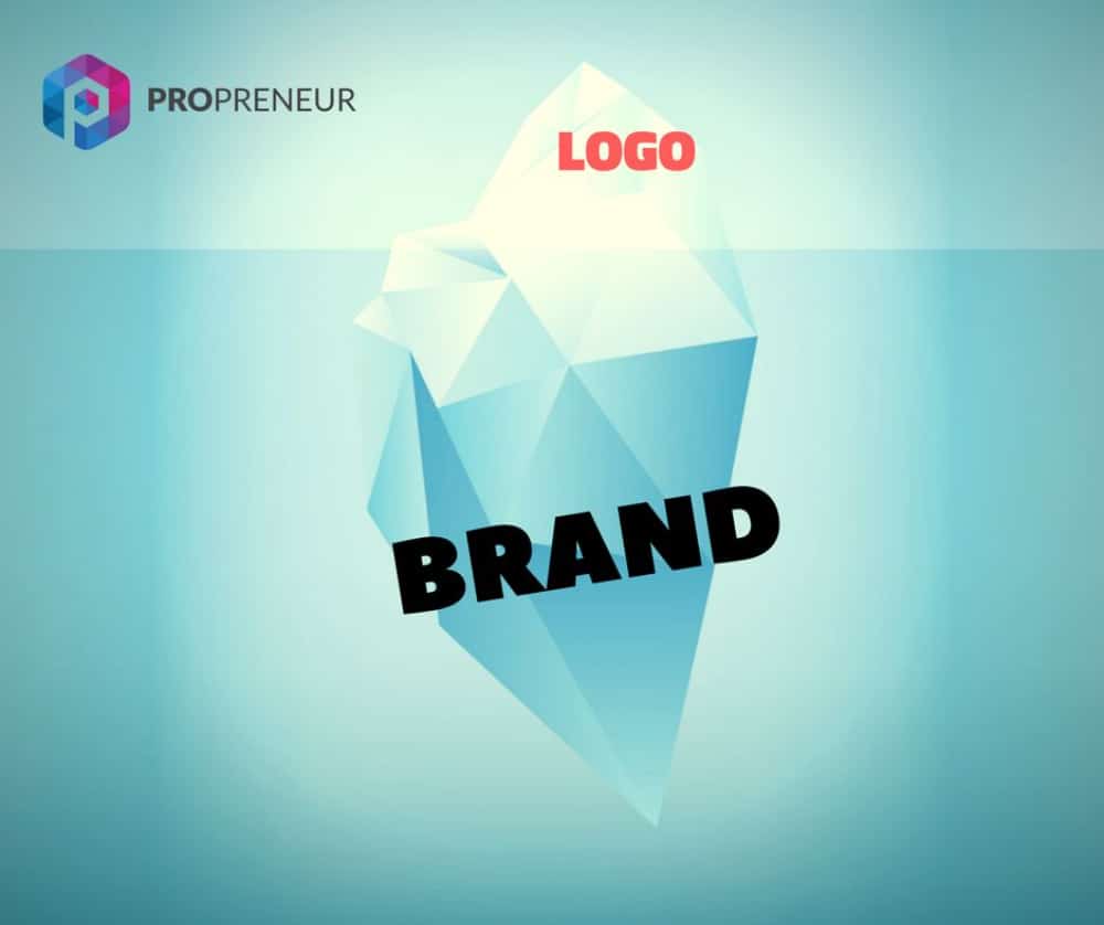
The logo is the brand’s visual identity, and hence it needs to resemble the brand in every possible way. Obviously, as a designer, you would have started with the right research about this and planned the logo accordingly. But at times during the entire process, you may get a lot of new ideas, changes from clients, or other inspirations, and you may end up creating a logo that is distant from the initial plan. Hence once you are done with the designing part, you need to cross-check if that logo is the right fit for the brand again, more importantly as per the brief that you had got. Make sure the logo represents the values, products/services, or brands by using the right visual elements like colors, fonts, and images.
2. Is the Logo Adaptable?
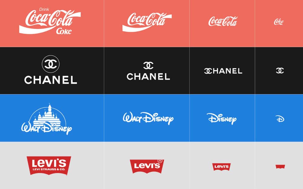
Gone are the days when the logo was used in a single format in the form of print or other media. Today, logos are used extensively and that too in different formats across various mediums. As a designer, you need to ensure that the logo you have made is adaptable for all formats. Check the scalability of the logo to see how it will look when used in a large application. At the same time, also check how it will be used in a very small application. If need be, revisit the intricate designs you have made in the logo, as these will not be visible when the logo is used in a very small size. The same goes for font style, as a very thin font may not be legible. Finally, check the overall composition of the logo and whether it will look good on the website or social media.
3. Is the Logo Very Similar to Another Logo?
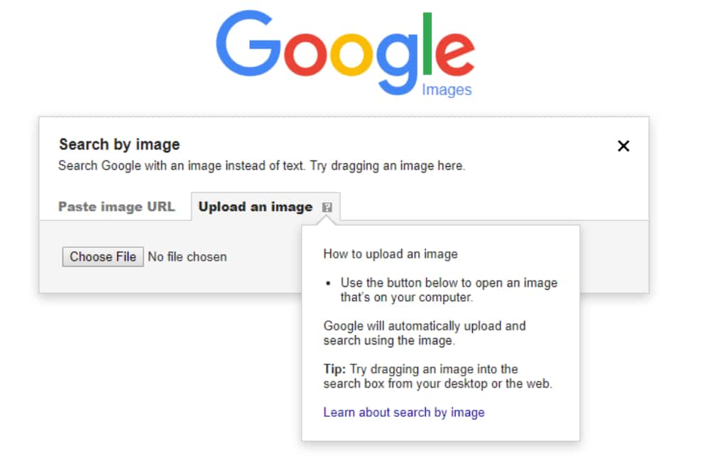
It goes without saying that no client would like a copied logo. Unfortunately, amateur designers, these days have polluted the overall logo designing process by copying or getting inspired by existing logos. They take a good existing design, tweak it a bit and present it as if it’s a brand new design. On the other hand, sometimes we take subconscious inspiration from good creatives that we have come across. As a result, you may design something that is similar to an existing design. This may not even be intentional, but the client will still be displeased. Hence whenever you are submitting a logo, make sure to do a reverse image search of the logo on Google. You will get the nearby results. If you see there are other visually similar logos, then it is advisable that you revisit the logo to make it as unique as possible.
4. Can this Logo be Controversial?
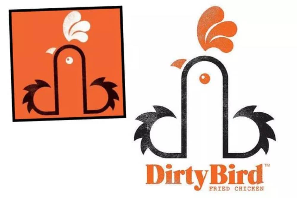
It takes brands years of hard work and persistence to be formed. But it takes only one moment to break its reputation. History has been full of cases where brands have come up with a new branding style or logo and received intense backlash instantly. The overall tolerance of people is decreasing, and with social media, it is easy to create a hate campaign against you. To avoid this, you need to take a moment and analyze the logo to see if it is inclusive enough and will not hurt anyone’s sentiments. Furthermore, you need to ensure that the logo’s message does not discriminate against any race, sex, gender, or culture. For this, you can also run the logo amongst your colleagues or friends to see their reactions. If there is even the slightest hint of discrimination, then it is recommended that you quickly reassess the design and make the needed changes to mitigate it.
5. Does this Logo have a Good Story to Tell?

The core to good branding is good storytelling. Your story should be honest enough and clearly communicated so that all the users connect to it. This is also true for the logo. The logo is not just a combination of a few shapes; it is a visual representation of the brand. Hence it is important to have a good story for the logo. When you submit the logo, you need to provide the client with an explanation for the logo and the thought process that went behind it. The success of the logo is largely dependent on this story and how well it is communicated. Be it the smile and arrow of Amazon or handshake of Hyundai or the number 31 in Baskin Robbins, each of these elements had deep-rooted meaning, and that made the logo more special. Hence, you need to have such a strong element in the logo, and if you can’t incorporate one, you need to weave a convincing story associated with the logo.
6. Am I Using the Right Mockups?
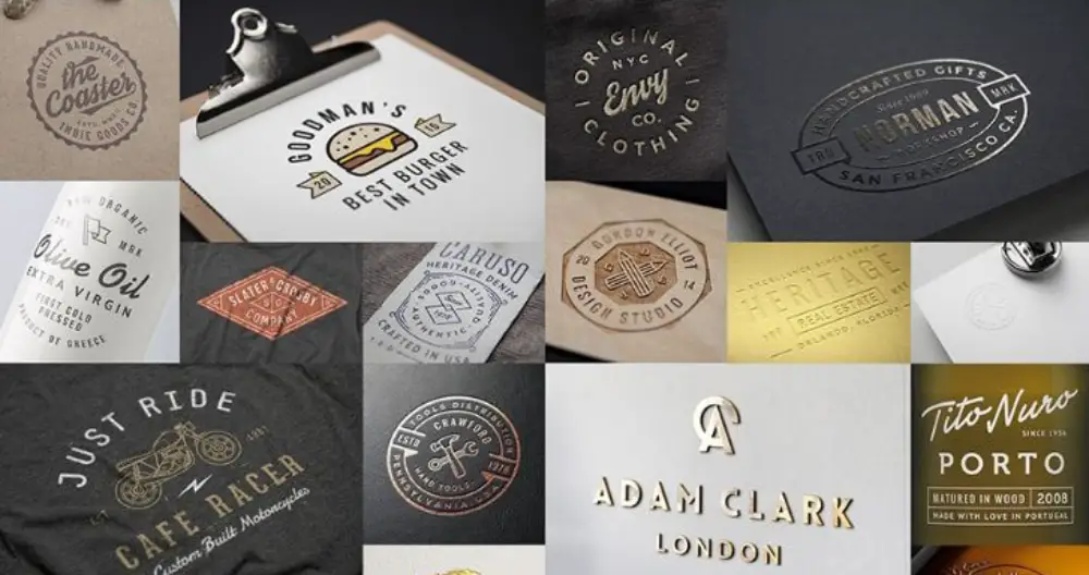
As a designer, if you are not providing mockups of the logo and the logo, you are doing a half-baked job. Mockups are imperative to give the client a visual idea about how the logo will look when used in different applications. It also provides very good feedback to the designers as they now know how the logo will behave in different environments. But it is also important to use the right type of mockups depending on the brand. You should go for a mixed bag of mockups, from standard business stationery to hoardings, visiting cards, websites, and social media. If it is a B2C company, then you should also provide mockups that depict the packaging and labeling of the brand. Often, not using the right mockups can take away the thunder from the logo and provide incorrect feedback.
7. Providing the Logo in Right Structures:

The logo will not be just a simple image that you can send to the client. Once you have finalized the logo, you will need to create separate structures for it. This will include the following:
- Full Lookup: This is the complete logo that would have been approved by the client and will include all the graphic elements, brand name, and also the tagline.
- Vertical / Horizontal Logo: Often, the client will need to use the logo in a different orientation, so you need to tweak the final logo accordingly. For example, the vertical orientation logo will look well on social media posts, but on the website header, the client will have to use a horizontal orientation logo.
- Logomark: This is just the icon or the vector or the imagery of the logo. More than often, this is used on a standalone basis as the brand element on various mediums.
- Wordmark: This is just the company/brand name in the text. The font styling is the same as that of the logo. The client may use this on applications where visual representation is restrained.
- Favicon: This is the small icon that we see in the browser tab. This may or may not be the same as the logomark.
8. Providing the Right Color Variations:

Just like you need to provide the logo in different orientation formats, you also need to provide variations in terms of colors. This is important as the client can use these variations depending on applications. This will include the following:
- Full Color: This will be the base logo that has been approved by the client and the one that will be used the most.
- Inverse: There will be times when the logo will have to be used on a darker background, and a few colors of the logo may not come out well in this background. Hence you need to provide an inverse logo option that can be used for darker or colorful backgrounds.
- Black: While the client would want that the logo to be used in full color most of the time, but there will be certain applications, especially in print media, where only one color is possible. Hence you need to provide the logo in full black option.
- White: The complete opposite of the above option, the all-white logo option can be used on dark or colorful backgrounds.
9. Providing the Right File Formats:
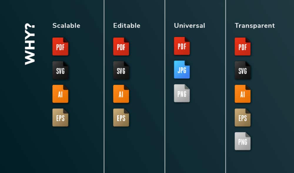
This point is what marks the difference between amateur designers and professional designers. As good designers, you should provide all the open files to the client so that they can use them as deemed fit. Editable file formats will include:
- SVG – This file format can be easily edited with Inkscape, Illustrator, CorelDraw, or any other vector graphics application, hence the most preferred option.
- AI – This is the most used file format as most logos are created in Illustrator. This is also needed by the client to send to the printers as they generally work in this format.
- EPS – This is another vector-based editable format and can work in Illustrator and even CorelDraw.
- PDF – Another good editable file that works well if the client does not have to alter the logo much. The good part is that PDF is easy to view and use even for nondesign fraternity.
- PSD – This format is for a layered Photoshop file, and it is a good idea to provide this file format as well in case the client wants to further use the layers.
Apart from the above editable formats, it is vital that you provide the JPEG and PNG versions of the logo. The latter should be a transparent background.
10. Providing Extensive Logo Usage Guidelines:
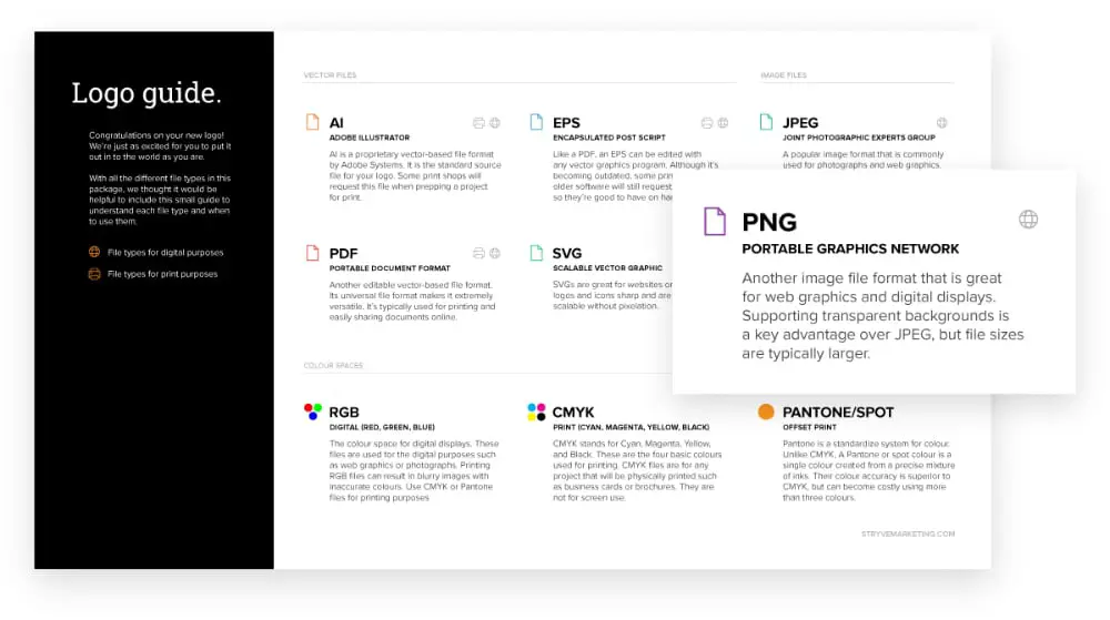
All the above effort you put in will go to waste if it is not supported with a well-drafted document that assists the client with what to do with the logo files. Hence providing the logo usage guidelines along with the logo is a must. You should explain each of the above logo formats and files in it and go a step extra and provide a list of do’s and do not’s for the logo. This will include how to use the logo visually. You should include the mockups in this document as well as they will support your case of explaining the logo usage along with the story and process of the logo making. Another recommended addition will be the font style that you have added. You can also add a mood board to this document and extend it from a logo guide to overall visual brand guidelines.
If you think your job was over the moment you got your logo approved, then you now need to rethink it. Sometimes, all your logo design efforts can go to waste if you miss out on any of the above critical points. For example, you may have designed the logo keeping a particular application in mind, while the client may end up using the logo differently, making it look really bad. Hence as a designer, you should bookmark this ultimate logo checklist and follow it before submitting your logo to a client.
The post Ultimate Logo Checklist to Follow For Logo Submission first appeared on Web Design Dev.
via https://ift.tt/3wFmmM1

No comments:
Post a Comment