In 1903 the world was changed by the well-known Henry Ford that began his own automotive company in Dearborn, Michigan. Today it has more than 100 manufacturing facilities in more than 30 countries and all people spot easily the Ford logo.
If you really know anything about the automotive industry for sure you know the models that Ford has brought over the years. It is one of the biggest automakers in the world and has been in the game for more than years. Drivers really appreciate the superior quality and reliability that Ford has always had.
Logos help us to spot a brand and its product or service. This is the same case for Ford and its logo. Since its launch, the logo had some changes in the years but most of them were done in the last decades.
The well-known Blue Oval Logo shows the superiority and creative style that Ford has. It has become known as one of the most powerful symbols in the automotive industry so it is always interesting to check more details and understand what makes it so interesting.
The Ford history
The Ford Motor Company was launched back in 1903 in Detroit, Michigan. It was a project launched by Henry ford and 11 more investors that he had. The company kept growing decade by decade and slowly it turned into one of the biggest car manufacturers in the world.
Today, Ford is the second automaker in the US behind General motors. And if we compare it on a global scale, the Ford Motor Company is on position number five having sales of six million vehicles worldwide in 2018.
The Ford Logo
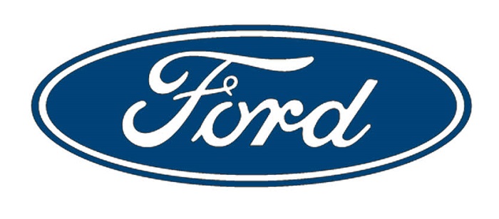
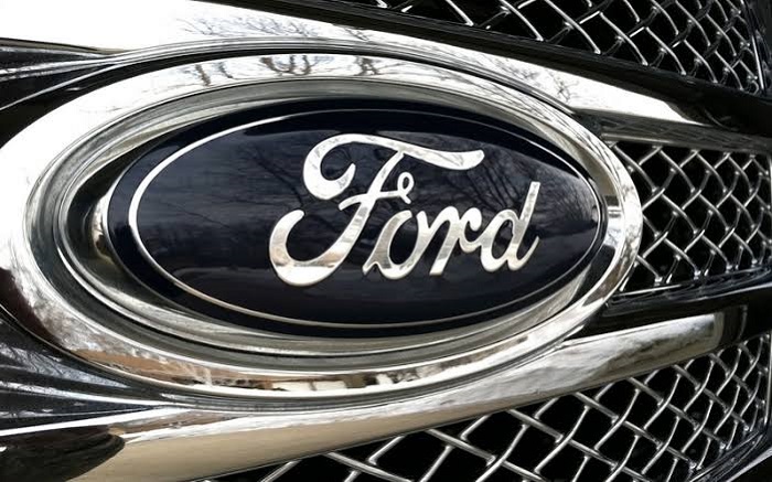
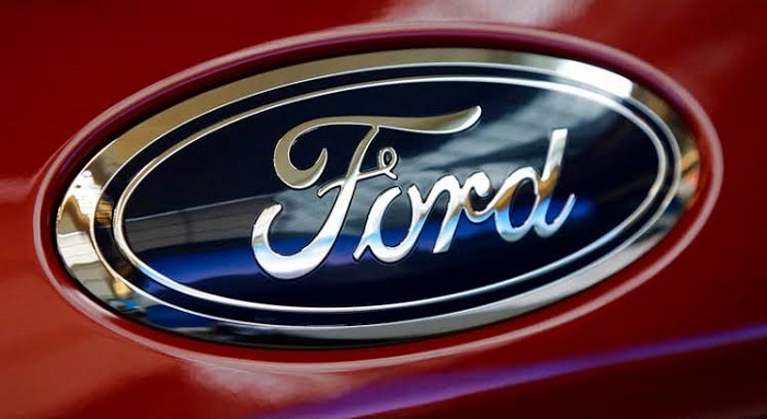
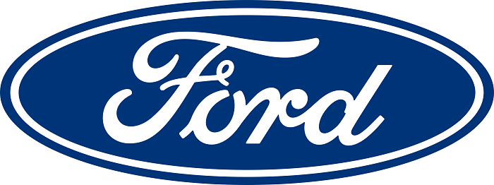
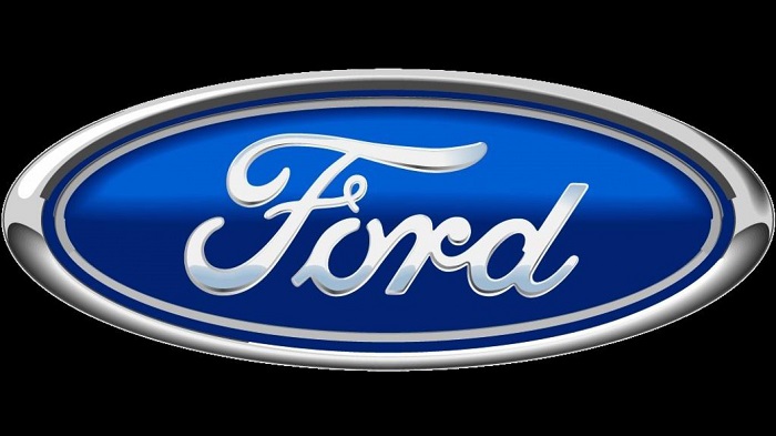
The present Ford logo is very elegant and simple looking. It is considered as one of the best car logos in the world. Its current logo is also known as Centennial Blue Oval that was updated in 2003 on the company’s 100th anniversary. The first logo was made by C. Harold Will.
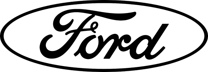
If we look at its design the Ford Logo is an oval figure shape that has different shades of blue and some white colors. The well-known character Henry Ford had his own signature to be embedded into the oval. This company has always been focused on its tradition and had just some minor changes to the logo in its history.
The shape of the Ford Logo
The shape that we see in the logo is oval and this makes it look simple and elegant at the same time. It gives great visual distinctiveness and the Ford symbol really gets your attention.
The Color of the Ford Logo
The Ford logo has used the blue color for quite some time and this brought a lot of recognition in time. The latest change was made in 2003 in order to celebrate Ford’s 100th anniversary. The gradient of shades added had a light blue at the top and a navy blue at the bottom. The letters that were used have a white color and you can also see a white oval line embedded there.
The Font of the Ford Logo
The font that has been used in this logo has been quite consistent and pretty much no modifications were brought to it. It has remained stylish and elegant since it was first created.
The history and evolution of the Ford Logo
What is cool about the Ford emblem is that is has been directly influenced by the development of the company itself. So, we really need to understand how Henry Ford launched and grew the brand from the early 20th century.
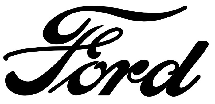
The first car that they made was the Model A and it was introduced in 1903 and it featured an emblem that had a stylized “Ford Motor Company” wording.
1903 – 1909
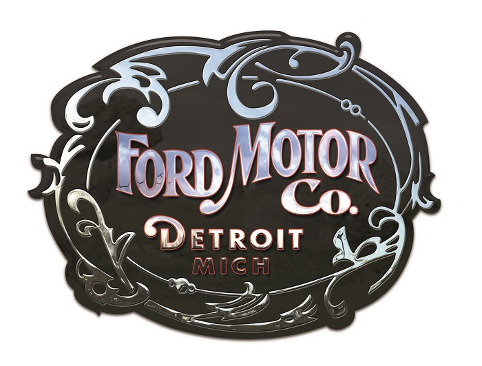
This font was first used for their correspondence before they had it put on the first production car. The designer behind it was C. Harold Will and the art that was included in the logo at that time was very popular.
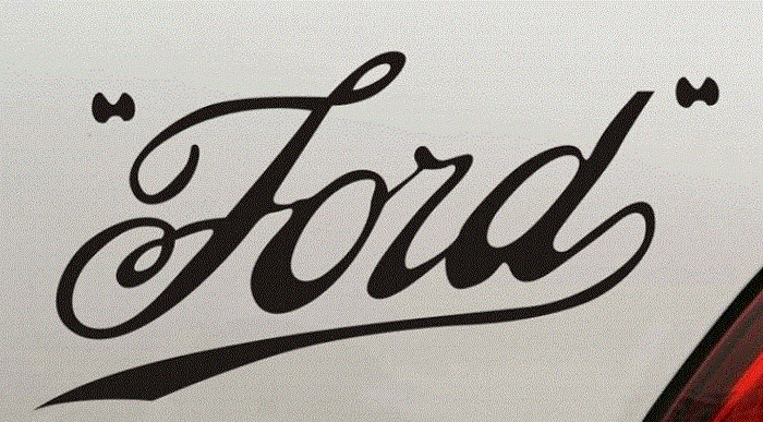
1909 – 1912
The script that has the name of the “script with wings” was used until 1912 when the actual font that we see today on all Ford vehicles was born.
1912
This Ford logo design was not really successful but the brand signature on top of the pyramid was pretty cool. Henry Ford did not like the orange and blue colors so it was removed quite fast.
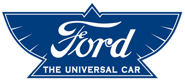
1912 – 1927
The oval shape that was added was first used in 1907 by British agents Perry, Thornton and Schreiber. The oval put Ford as being one of stand points for reliability and economy.
1927 – 1957
After the successful oval shape was introduced quite fast the iconic blue color was adopted.
1957 – 1976
Instead of an oval, Ford went for a couple of decades to a shape that was similar with a lemon. It was used especially on company communications and on the cars, you could see a unique crest.
1976 – present
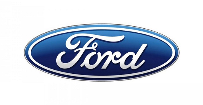
In 1976 the blue oval returned back and remained the shape they use even today. On their 100th anniversary, the Ford logo received a white tint with a smooth 3D shading together with the title of “Centennial Blue Oval”.
Popularity of the Ford logo
In the present day, the Ford Logo still has the well-known blue oval looking more modern due to its silver lining and white hue applied to the lettering. It is simple and elegant and everybody knows it really well. We really do consider it one of the most successful car logos in the world.
The Term “Blue Oval” Started Appearing in Books in 1907.
There is no exact date for when the Blue Oval nickname became popular. With some research, we managed to find the phrase “Blue Oval” appeared in 1907.
Different other ford Logos
Ford Mustang Logo
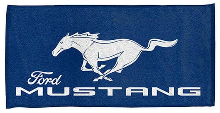
Probably one of the most known cars made by Ford is the Mustang. The logo features a running mustang horse and it is an excellent embodiment of the idea of speed and freedom that is supposed to be the essence of the Ford Mustang cars. For sure this is another Ford logo that looks great and will be remembered through history.
Ford Raptor logo

The Ford Raptor logo is a more script logotype that shows like you just came back from an off-road adventure. Looking at the Raptor vehicle we can consider that the choice they made is quite a cool one.
Ford Focus logo
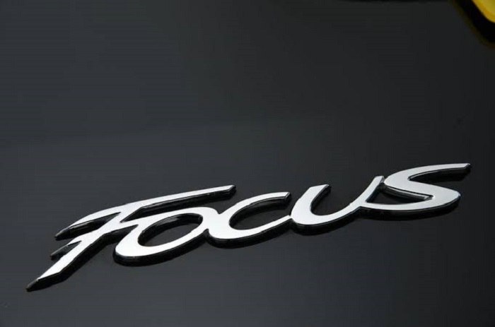
Another Ford symbol that we love is the popular Ford Focus logo that future a beautiful script looking like handwriting. All the letters are joined together like a word that has been written by hand. There is also a Focus logo that has an unusual “f” and “u” together with a badge that featured a generic typeface.
In conclusion, the Ford logo has evolved a lot in time and is certainly one of the most known logos in the car world. It shows how a well-chosen design can last for decades and make a company well-known if so many cultures and countries.
If you enjoyed reading this article on the ford logo, you should read these as well:
- The Amazon logo: Its meaning and the history behind it
- The Pepsi Logo: The old, the new, its meaning and history
- The Disney logo: All there is to know about the Walt Disney brand
The post The Ford logo design and how it was changed again and again appeared first on Design your way.
Source: https://ift.tt/2wXfi3i


No comments:
Post a Comment