Typography is getting more and more attention because the digital world has a huge demand for it. In order to understand the typography world better, we need to understand some basics first. The job of a font is not only to facilitate legibility. It is also about personality, feelings, engagement and many psychological factors.
The Spotify font is a great example of how a brand can take advantage of its typography. Spotify is a company launched in 2006 in Sweden. Its main focus is audio streaming that offers music and podcasts for its listeners. It has some basic features that anybody can use together with a paid subscription.
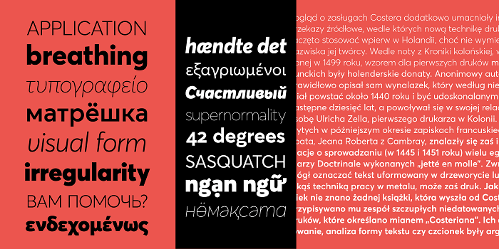
How the Spotify font was created
The Spotify font logo is inspired by the Gotham Medium typeface. Some modifications have been added to the letter i in order to make it more unique. Gotham is a font that was created in 2000 by Tobias Frere Jones. The designer inspired himself from the architectural style that you can see in New York City.
Also, the Gotham font is one of the well-known sans-serif typefaces that we can get. You have to like its bold capital letters that look powerful and solid. It offers four different widths to play with and it also has extended language support.
All the widths have the same weights and they are in both roman and italic. The Gotham font has visually consistent intervals in its weights. To make sure every style has a heavier counterpart a great idea was used. The same degree of emphasis was used.
But as we all know when something gets too popular chances are that you will see it everywhere. This is why designers that want a similar Spotify font but with a different vibe should go for alternatives. We created a list with some of the best ones to use so have a look.
Spotify font options
Montserrat
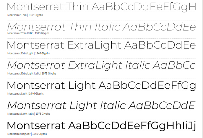
Julieta Ulanovsky is the designer that created this font. She named it after a neighborhood from Buenos Aires where she works. The inspiration for it came from the local architectural signage as we can see in the Spotify font. It has wider letterforms so it can really stand out when you want to use it.
Vision
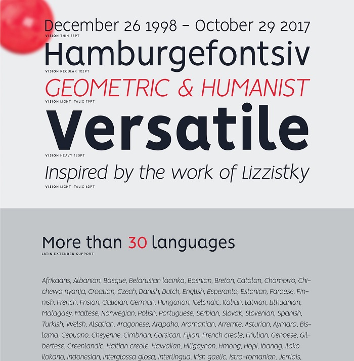
So, if we answered your question of what font does Spotify use now, we reached another alternative that you can try. Vision has a family of 12 fonts that are free. You can use them in commercial and non-commercial work. It uses the same basic letterforms but we can see that have a more rounded shape included.
Raleway
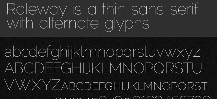
This is a powerful typeface that comes with 18 fonts. It has different weights and you should use it for big display purposes. It’s easy to get and once installed in your computer you can try it out.
Nexa
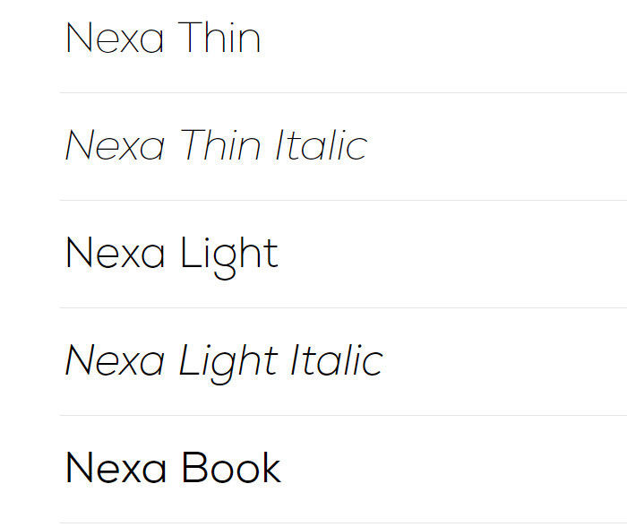
Nexa Light together with Nexa bold can be downloaded for free with no problem. We can see that they are more expressive than other typefaces in the list. You can use them for sure in branding projects and but also other project ideas that you have. Give this Spotify font a try and see if it can be the right alternative.
Spotify Website font
The font that we can see on the Spotify website used Proxima Nova in the past. This is a similar font with Gotham. Many designers don’t know that Proxima Sans was actually launched before Gotham.
As the website was redesigned the new font that they used is the LL Circular. We can see on the site the use of four (upright) weights that come from the popular typeface family that was done by Laurenz Brunner.
The spacing has been tightened even for its text sizes and it really looks nice. Let’s get back to our Spotify font options and see some more.
Proxima Nova
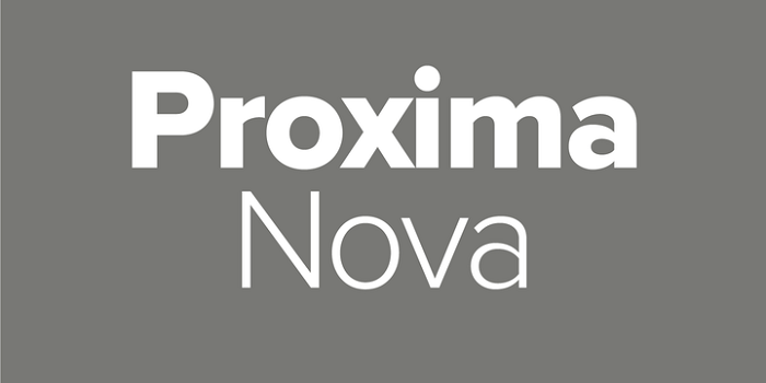
This typeface got a complete redesign. Its original fonts have now been expanded to 48 full-featured OpenType fonts. This means that there is more useful for them and designers can really take advantage.
We can consider this a hybrid typeface that brings proportions with a geometric appearance in one style.
Circular Font
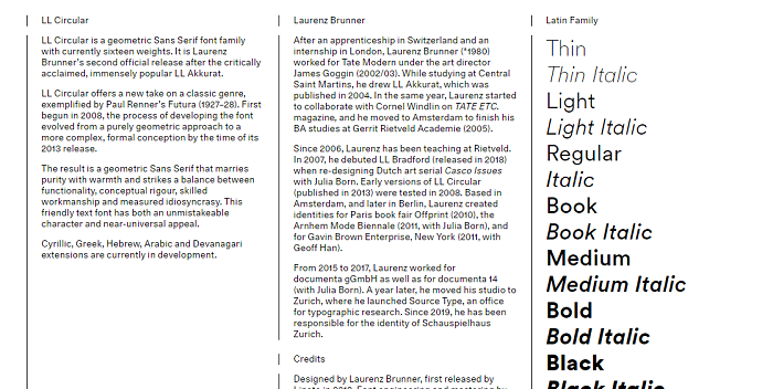
One of the Spotify Logo font options that designers usually consider to be the right choice is the Circular font. As we just mentioned this font is actually used on their website. It was created in 2013.
Its design is based on geometric forms and it has quirks that give it a lot of warmth. The design of its lowercase is very distinctive and it is easy to identify. It is available in four weights so for sure you can adapt it to various works.
Alternatives to Circular
Because Circular also got some popularity we need to consider some options for it as well. If you need some typeface that is similar to this Spotify font that got used in its website here are some ideas. Check them out and make your Spotify typeface choice.
Rubik
Rubik is a one of a kind font that has soft edges and slight squareness. It can be a good alternative and you can download it right away.
Work Sans
This is another Spotify font alternative that is going to be of help. You can see the contrast that can be noticed due to heavier weights. It does have a friendly feel so why not giving it a try?
Effra
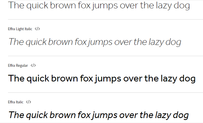
We also liked this typeface, especially because of the curves it has on its letters. If you ignore them and look at the weight of characters it shares some similarity.
Cera Pro
One of the best matches that you can go for is Cera. It has a similar contrast and geometry. Give this Spotify font option a try and then decide if you stick with it.
Sailec
Have a look at this sans-serif typeface that was launched in 2014. They claim it to look neutral but honestly, its shapes are more geometric. You get seven weights from it together with matching italics.
TT Commons
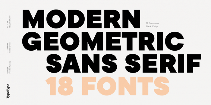
A similar Spotify font that was launched in 2018 is the TT commons. Its design focuses on geometric proportions, tight apertures and low contrast.
Averta
We reached the final font and this is Averta. It has a simplistic design but also elegant at the same time. You can use it for different media and the best way to find that out is by giving this Spotify font option a chance.
If you enjoyed reading this article about the Spotify font, you should read these as well:
- Typography prints: Amazing examples you should check out
- Car Ads: 70 Creative And Clever Print Advertisements
- Need some wedding fonts? Try these options for your print
- The Fortnite font or what font does Fortnite use? (Answered)
The post The Spotify font and what font does Spotify use (Answered) appeared first on Design your way.
Source: https://ift.tt/2RmtDgo


No comments:
Post a Comment