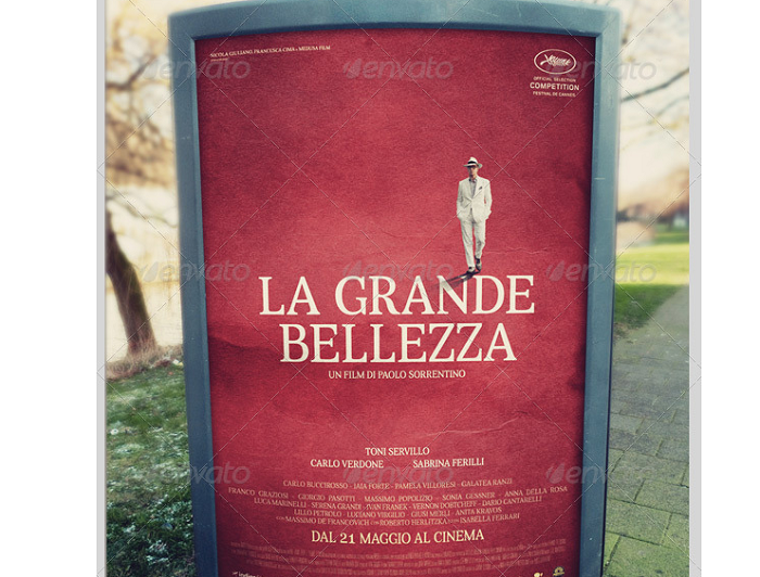
Online Marketing is taking more and more advantage some might think that print advertising is losing. Well if you think that way you should also consider some numbers before you decide that. This is because studies show that more than 55% of all consumers still trust print marketing. So, any flyer mockup has a chance of being used for sure.
We all know that flyers are a great way to get attention to a business. They are even more effective if the people that get the flyer can connect with the business that is being described.
Being a tool that connects the public directly they need to be done really well. You can’t say it’s just a piece of paper. It’s more than that because it speaks through the branding elements of a company.
Using a mockup means that you create your own ideal design before you send it to print. The internet has so many ideas that you can inspire from so take advantage of it. We prepared a few that you can try yourself. See if any of the following can help you out!
Flyer Mockup Examples
Free A4 Flyer Template
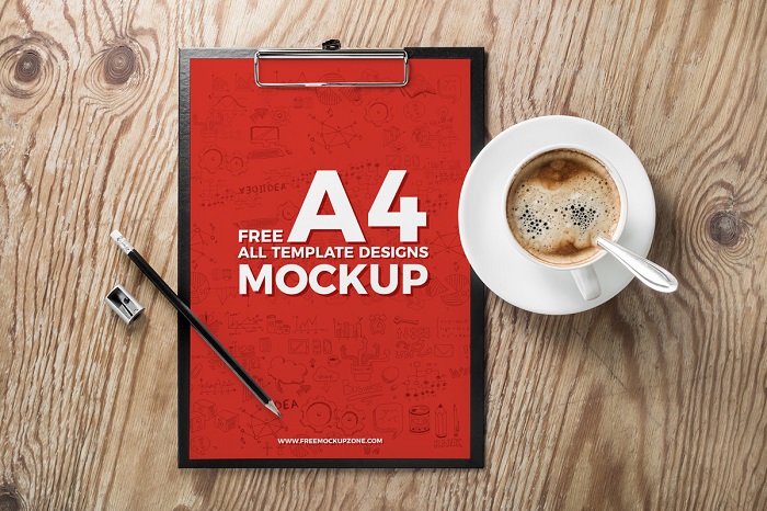
Check this mockup if you need a PSD format one. It can be great to design the flyer ideas that you had in your mind. You can also adapt it to other branding materials that you want to use quite easy. See for yourself and download it now.
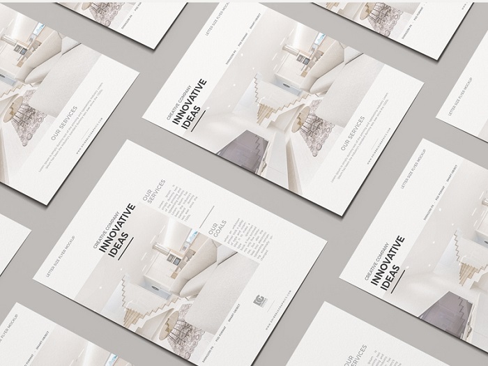
Free 2 Flying Flyer Mockup
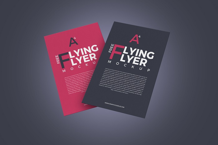
Flyers are simple pages that are designed to make people see certain products and services that are promoted. They are a simple tool used in advertisement and this means there are a lot of flyer mockups available.
This model has all the information sections that you need and it can be edited in no time.
Gravity Psd Paper Mockup
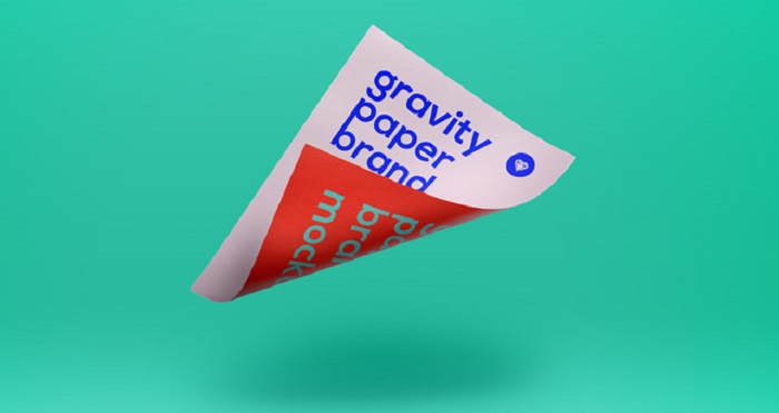
This is a simple and original PSD paper that is going to let you display different designs. You can use it with your own graphics. So, change the colors as you like and start using it.
Mockup of Two Floating DL Flyers
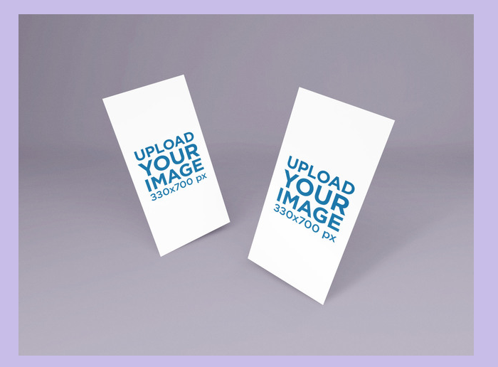
If you are in need of a mockup here is a template that has two floating designs. This means you get two options to get your designs from. The advantage of going for flyer mockups is that you can change them as you want.
A flyer can be a fantastic solution to spread the messages you have. It doesn’t matter if you share them in a mall or on the streets, they can bring real attention to your brand.
Free Hand Carry A4 MockUp PSD
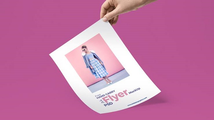
Get this mockup if you want something simple that can work with the designs you have in mind. It’s a flyer mockup PSD so you will need Photoshop to make changes to it. Don’t worry, if you haven’t used the program until now it is not going to be that hard to understand.
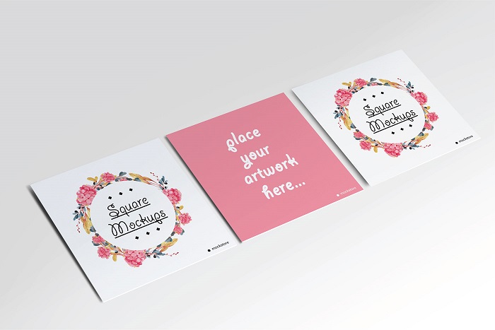
Square Flyer Mockup Set
As you can see in the title this is a mockup that also contains a brochure and catalog design. So, if you need more examples it is even better to download it.
Mockup of a Smiling Woman at a Table Holding an A5 Flyer
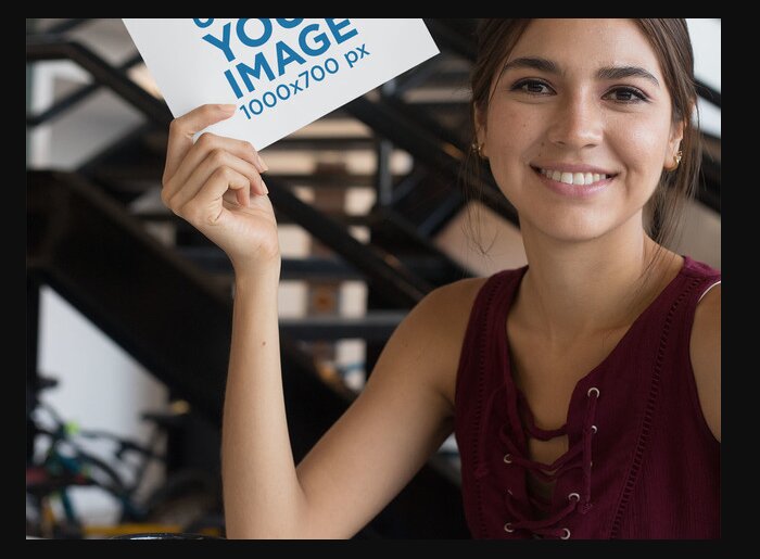
The persons that are sending out your flyer are also important. If they are not smiling and doing a great job people might ignore entirely the information. One idea that you can do before you make a big order of printed flyers is to test them.
After that, you can use free flyer mockups like this one and get them finished. It shouldn’t take too much of your time so have a go at them.
Free Centre Folded Flyer Mockup PSD
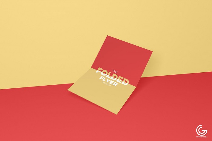
Have a look at this free flyer mockup that has the right mix of shapes and colors. It is made by a professional designer and you will like the style for sure. Just decide how to do you want to use it. The design can be used in your own way at any time.
A4 Flyer Mockup with Little Flowers
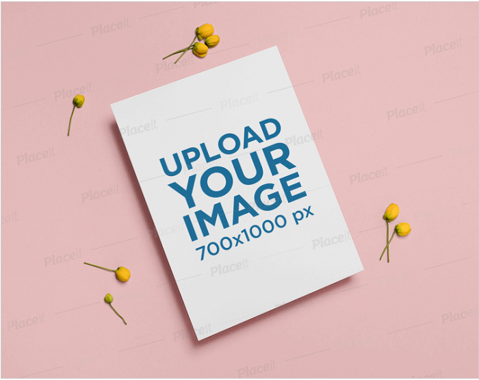
When you get this flyer PSD mockup you will be able to create a realistic design. It has a nice design combining flower elements and nice backgrounds. If you don’t like the colors you can change them at any time together with the text included.
You don’t have to invest a lot of time and you will have the final design ready. Just impress your clients and start attracting new people.
A6 Flyer Mockup Featuring a Smiling Woman with Glasses

In this flyer mockup, you will get a brunette woman that is having a big smile. It is up to you how you want to use this template. The fact is that you can use it for presentations or certain prototypes you have in mind. So, get it on your computer and see what you can do with it.
Outdoor Poster Flyer Mockup Templates
You can buy this flyer mockup directly on graphicriver. It can be used for both posters and flyers. You get 6 mockups to choose from that have smart object included. This means you will be able to change all the images fast and easy.
Flyers Mockup For Presentation
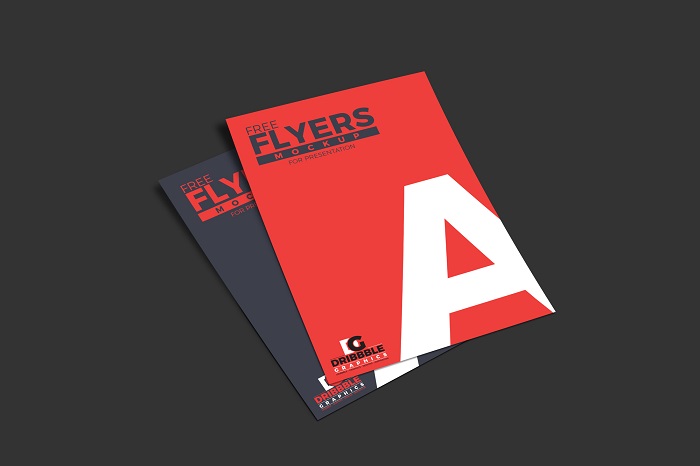
You can show your flyer template designs by using this Flyers Mockup. It is great to be used as a presentation. Just see for yourself and get it on your computer.
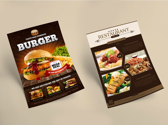
Free Tutti Frutti A4 Flyer Mockup
A nicely done flyer mockup that we really enjoyed is this one. You can give it your own touch before printing it so consider it as a real option.
Free Stylish A4 Flyer Mockup PSD
If you need a professional A4 Flyer Mockup to showcase your flyer design go for this one. It can be exactly what you were looking for.
Square Flyer Mockup Set | Free download
Another flyer mockup free for use is this pack. It includes also a catalog and a brochure design that you can take advantage of. Take advantage of it and see if it can be your new and modern display for your product or service.
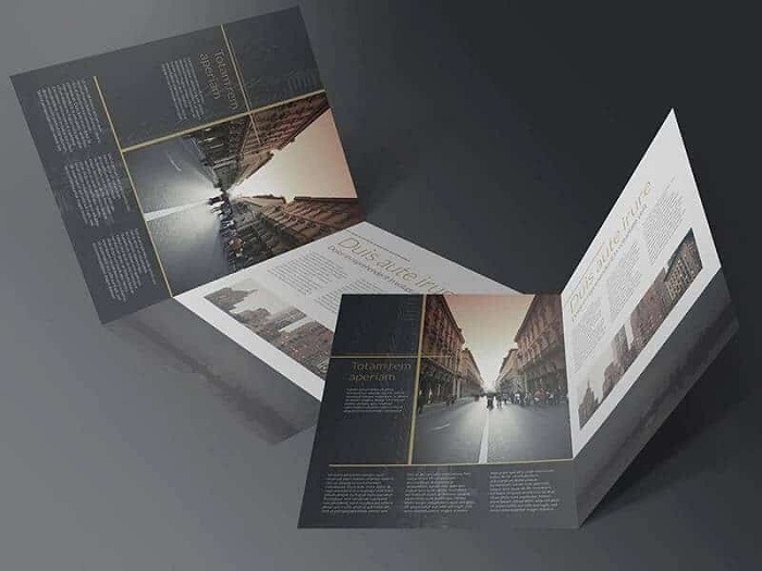
Free Bi-Fold Brochure Mockup
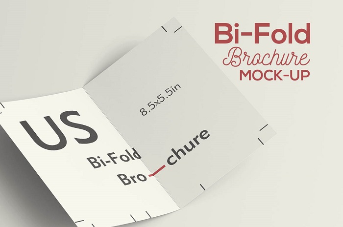
When you need to get a simple flyer mockup this might be exactly what you need. See for yourself and give it a test.
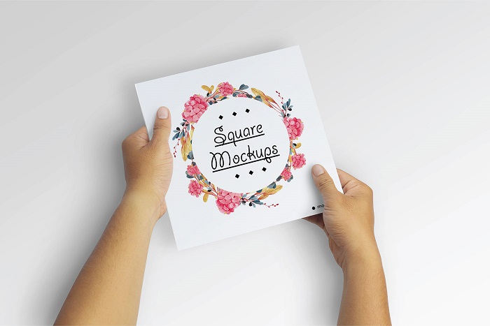
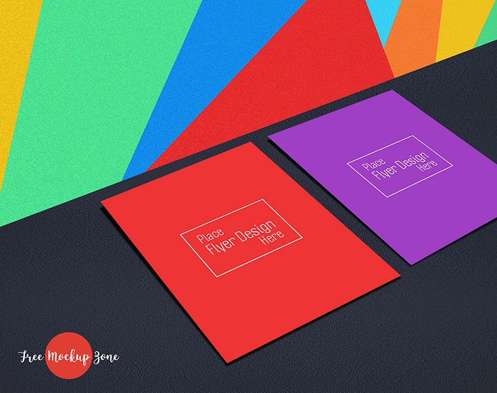
Free Square Flyer Mockup
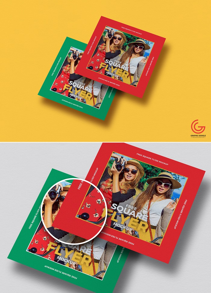
If you want to get some cool graphics from your mockup this can be what you need. This mockup was created using modern trends and a nice color scheme. You can edit it entirely so for sure you can use it in your work.
Free Multipurpose Flyers MockUps Templates Psd
This is a big pack that has different flyer mockup PSD templates. It’s free to use so there is really no reason to stop you from trying it.
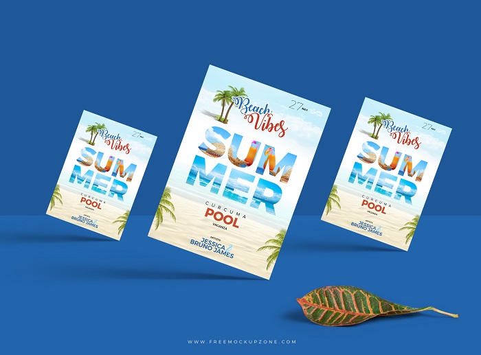
Letter Size Flyer PSD Mockup
A good letter size mockup that is going to fit different projects is this one. IT has many resources and you can obtain a different version of it really fast
Free Half Fold Flyer Mockups
The last flyer mockup we want to talk about is this one. You can use it to show the designs you have in mind for your clients. It’s easy to edit and you will be able to really impress anybody that sees it.
If you enjoyed reading this article about flyer mockup, you should read these as well:
- Logo mockup templates to download and use to present your logos
- How to make a good flyer – modern flyer design inspiration
- Free brochure templates to use for creating your brochure
The post Cool flyer mockup examples you should check out today appeared first on Design your way.
Source: https://ift.tt/2Lbkft8