Each brand needs to pick the right color palette for their logo because this will be the first image that people will relate to when they think of your company. Even if it is just a single color or maybe a few you still need to choose it. Brands use logo color combinations in order to express their values and what they stand for.
Choosing the right one can be a bit tricky even more when you start thinking about the psychology of colors in branding. When you hear the name of a known brand you think about the logo color scheme that the brand has without even realizing. This is why it is important to understand color psychology, it plays an important role when you want yourself to choose the logo color combinations for your own brand.
But before you make a decision let’s check some tips that you can take advantage off so people will know who you are by just looking at the logo you created.
What does color do?
Color brings emotions in our hearts. Depending on the culture that we live and what are our traditions each color has a deep meaning. Yellow is known to evoke friendliness while red is more associated with love. Colors really do tell stories and they help us communicate better our ideas.
How many logo colors do I need?
There is no precise rule for this, on how many colors you need to have in your logo. You can use just one or even ten, it’s all up to you and what you want to bring up using your logo color combinations.
Most logos, however, use three color combinations or two. They combine a primary color and add one or two access colors that offer your logo more dimension while putting the brand entirely on display.
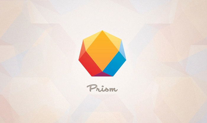
“Look-alike” logo color combinations
![]()
A lot of brands choose their logo color combinations in order to make them look like things. A fancy way to use colors is to give abstract shapes all kinds of colors like blue, or green. Blue will give a more water tone while green a more nature call kind of vibe. People can associate easily color with an element.
Peaceful logo color combinations
You can tone down brighter colors by adding white or creating a subdued pastel variation that is known as tin. Greys and blues work really great together.
Three-Color logo Combinations
All these logo color combinations can be a bit more challenging to use. This is because not all choices can be good ones, so you really need to do some research before you choose the final one that you are going to keep.
Color Terms you should know
Hue vs. Color
Color is a term that helps actually to describe different things like hue, tine, tone, shade by just using a word. For example, Red is a hue but pink is a tint so let’s continue so you understand better everything.
Tints
A tint is created always when white starts to being added. This makes the color lighter when you add white to yellow you get light orange.
Shades
Shade can be done by adding black to a hue so it makes the color darker. For example, if you add black to blue you will get twilight.
Tones
You get a tone by mixing a hue with grey together.
Primary Colors
The three primary colors are red, blue and yellow.
Secondary Colors
If you combine any of the two primary colors you will get the secondary colors. For example, if you combine Red with Blue you get Purple. Red with Yellow gives you orange.
Tertiary Colors
This set of colors that are called tertiary can be obtained when an equal amount of primary color and secondary color that are adjacent to each other on the color wheel get mixed. If a mixture of 50 % yellow and 50 % green get mixed you will get a tertiary color yellow-green.
Warm Colors
Red, yellow and orange bring a warm feeling because they remind us of stuff like the sun or fire.
Cool Colors
Colors like blue or green are cool ones and they give that vibe of water or grass.
Best Logo Color Combinations
Yellow & Red
This bold color combination will get your attention to the center of the logo in which it is used. The powerful red and cool layout of the company name gets out from the happy shade of yellow. It creates a sense of energy and playfulness.
Yellow and Blue
Yellow is a power color that stands out easily. These logo color combinations look playful but they also give the feeling that the company that is behind should be trusted.
Blue and gold
A cool logo is usually a high-contrast one that goes for bold colors. For example, going for bright gold and ice blue can create a cool design.
Black & yellow
If you check the logo for this color combination you will see that you get that feeling of energy and mystery together at the same time.
Navy and Teal
This berry-teal color can have two different effects depending on how you choose to use it. Put teal on a berry background for your logo top pop and lay the dark blue over the teal if you want to calm the tone.
Purple & Pink
Warmth, playfulness is the vibes that you can get by using these colors. If you go for a bright logo you can add energy to it by using pink, for sure it is going to get a lot of attention towards it.
Black and Orange

Black and orange are great for logo color combinations because they give a sense of thrill and energy. They are a great choice for brands that have activities around extreme sports or things like nightclubs.
Deep orange turquoise and navy

This color combination for sure is going to stand out especially if you want to bring back memories to people of sunsets and the sea.
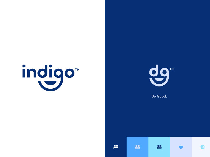
Blue & Green
![]()
Blue and green are most of the time associated with tranquility. They are young colors that can be used for sure in domains like fashion, media and entertainment industries.
Maroon and Peach
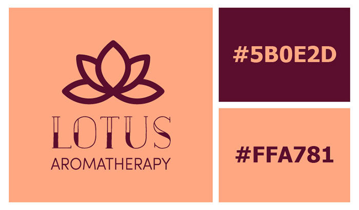
Check theses logo color combinations that is not really seen together often. It brings some classic aspect and for sure you can use them if your business is around home decor or even medicine.
Natural green and brown

Color can help a lot a logo when a brand’s name doesn’t really help you to figure out exactly what they do. These colors are perfect for a green garden or landscaping logos.
Orange & purple

If we continue our list of best logo color combinations, we also discover orange and purple. They work really good with warm peach and they are both elegant and unique. Consider this combination a great choice for fashion, beauty brands.
Deep Purple and Blue
You can’t say you don’t like these colors because they really look great and might be the perfect choice for any cosmetic brand that wants to launch itself.
Navy blue and pink
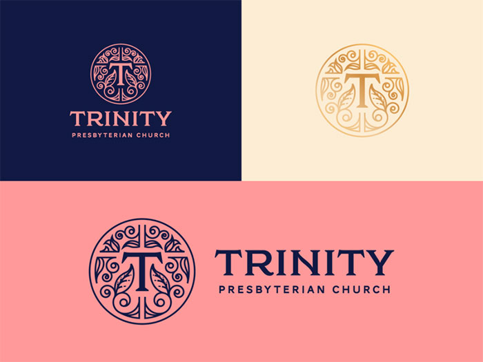
This combination of colors brings a calm vibe and is a great choice if what you want is a more peaceful logo color palette.
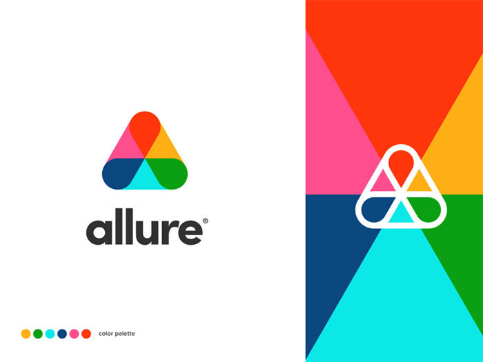
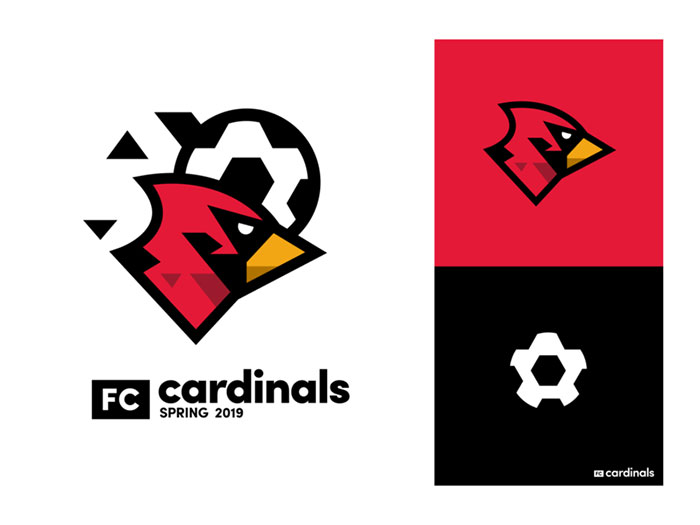
Red, navy, & yellow
![]()
Are you feeling bold? Try an electric trio of colors! The red helps the yellow to stand out and it will give a sense of power and confidence. Use this color combination for an entertainment or restaurant brand.
Light purple and beige
Purples are some of the best choices when you want your logo to stand out. You can’t go wrong with it so make sure to consider it a possible choice.
Blue & Turquoise
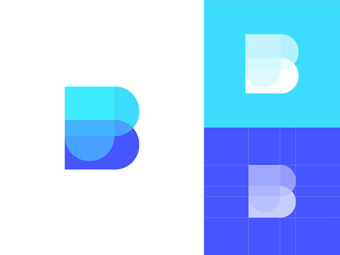
Having so many logo color combinations might mean that you don’t really know when to stop. Try this combination because it is perfect if you want to have a striking duo.
Beige, Orange, Black

For sure these types of logo color combinations are most of the time a good choice for brands that are related to the coffee industry or even the food one.
If you enjoyed reading this article about logo color combinations, you should read these as well:
- Logomark Vs Logotype: Understanding the Difference
- Using an orange color palette and its various shades
- Some logo design ideas that you should use for branding projects
- Logo Design Cost: A look at the logo design prices
- What is a logo and why you need one
The post Logo color combinations that look great and you should try appeared first on Design your way.
Source: https://ift.tt/34ot7mR


No comments:
Post a Comment