How to Create Metal Texture Using Photoshop

Friday, January 31, 2020

These days, Photoshop has become a savior for almost every problem related to photographs and graphics. With the increasing number of solutions to each graphic issue, it is safe to say that every person can handle Photoshop in their little convenient way. To make life easier, here are a few easy ways to create a metal texture using Photoshop.

The metal texture is a straightforward yet effective way to achieve light and shadow in your design. It gives a shiny effect and can extensively be used as accents in logos, typography, websites as well as backgrounds and other graphic projects. In this tutorial, we will learn three different ways to achieve a metallic texture using Adobe Photoshop.

1. Achieving Metal Texture for Background Using Photoshop:

An easy and often used technique to create metal texture using Photoshop, it consists of 6 easy steps, which even a beginner-level artist can achieve. This method works perfectly smooth for every version of Photoshop from CS3 or above.

Let us begin –

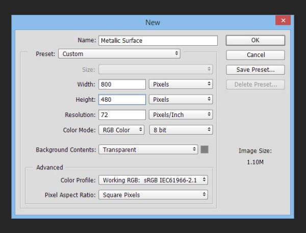
Step 1. Create a Document:

Create a new document on Photoshop for this tutorial, and the document resolution shall be at 800 x 480 pixels.

How to Create Metal Texture Using Photoshop- create a document

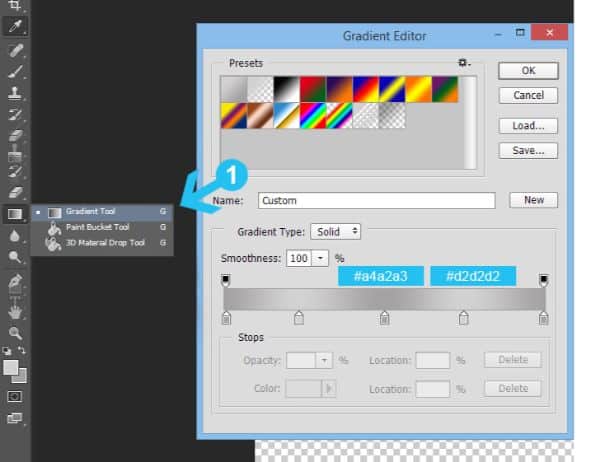
Step 2. Gradient Background:

Picking the Gradient Tool (G) from the toolbox, create a gradient using the colors #a4a2a3 for a darker shade and #d2d2d2 for a lighter one. (IMG. A)

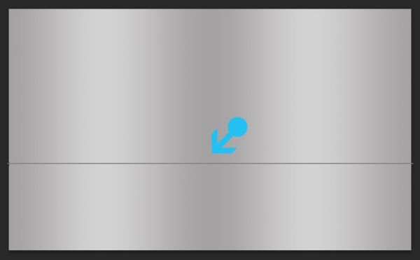
Next, fill the background horizontally. (IMG. B)

A.

How to Create Metal Texture Using Photoshop- create a document- gradient background

B.

gradient background

Step 3. Adding Metallic Texture:

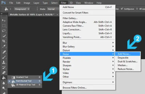
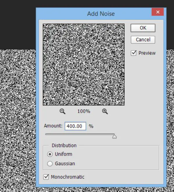
Start with creating a new layer (Shift+Ctrl+N) and fill it with the lighter color #d2d2d2 by using a Paint Bucket tool (G) (IMG.C). To add noise, go to Filter- Noise- Add Noise and keeping the amount up to a proper 400%, change the Distribution to Uniform and check the monochromatic option. (IMG. D)

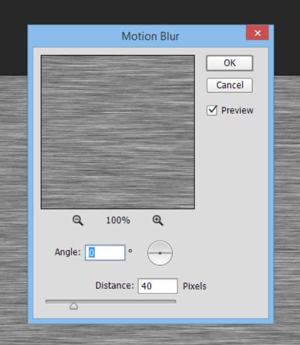
Finally, to merge the texture into one, go to Filter-Blur-Motion blur and set the Angle to 0 and Distance to 40 pixels (IMG. E). Press OK and confirm the filter application.

C. Filling background and adding Noise:

Filling Background

D. Noise Setting:

How to Create Metal Texture Using Photoshop- noise settings

E. Motion Blur Setting:

motion blur setting

Step 4. Refine the Texture:

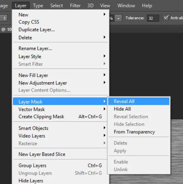
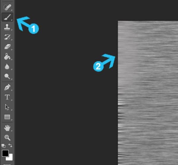
With an active texture layer, go to Layer>Layer Mask>Reveal All and add a layer mask. (IMG.F) Start with a black foreground color (#000000) and pick the massive soft Brush Tool (B) from the toolbox. Select the brush capacity to be between 60-70% and draw over the mask in left and right corners (IMG. G). Follow this step with setting the Layer Blending Mode to Overlay and Opacity to 60% (IMG. H).

F. Add layer mask:

How to Create Metal Texture Using Photoshop- adding layer mask

G. Draw around the left and right corners with 70% visible soft brush:

Draw around the left and right corners with 70% visible soft brush

H. Result:
result

Step 5.  Make use of Noise:

How to Create Metal Texture Using Photoshop- create a document- adding noise

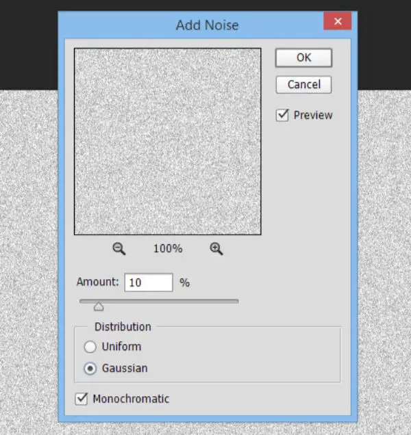
For this, you would have to create another layer and fill it again with #d2d2d2 color using a Paint Bucket Tool (G). Post this, add a noise filter- Filter>Noise>Add Noise at 10%, Gaussian Distribution & monochromatic effect. Following the Noise setting, change the layer blending mode to Linear Burn and Opacity to 10%.

Step 6. Curves:

Curves

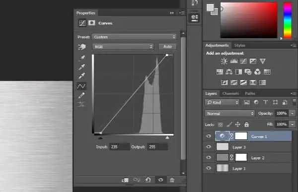
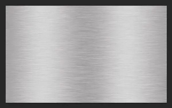
To make the background effect more intense and dramatic, here is an additional step that might create that metallic shadow effect. Go to Layer>New Adjustment Layer>Curves. Set the shadow pointer to the right side and highlight arrow to the left side. In case you have an issue with spotting the curves tab to re-edit the adjustment layer, simply double-click the Curves layer icon.

I. Final Output:

Final result

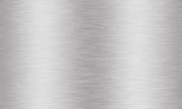
This method is the easiest way to achieve a metal texture using Photoshop when applying it on the background. This method can further be manipulated to get results concerning graphics as well as typography.

Achieving Metal Texture In Typography using Photoshop:

While adding a metal texture to typography might be a slightly advanced technique, it is manageable for beginners as well. With a total of 20 steps, this method is not only lengthy, but it is also editable after being executed until the end as well.

Similar to a few steps from the previous method, this one is slightly different in order of steps and technique. Let us begin with this tutorial –

Step 1. Start with a New Document:

create new document

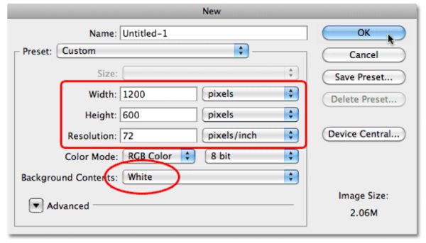
It is a mandate, to start with a larger size document than you would need in case of text, so to begin with, create a new Photoshop document (Ctrl+N for windows and Command+N for Mac) of 1200px width and 600px height, and a ratio of 72px/inch on default. Set the Background Contents option to white. Even though we shall modify it in the next step. Click OK when done, and a new page shall occur.

Step 2. Use black fill for Background:

How to Create Metal Texture Using Photoshop- fill the background with black

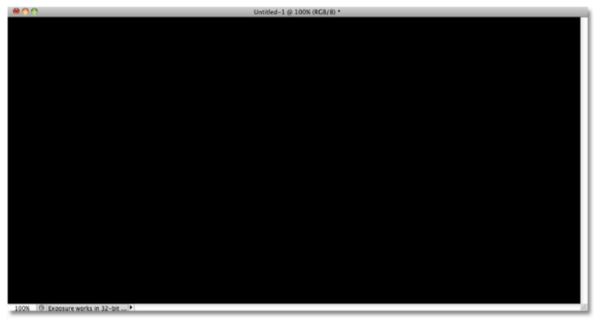
Photoshop’s Foreground and Background colors need to be reset. Do this by pressing D on the keyboard and the Foreground would set to default black. Press Alt with back to fill the canvas with the present Foreground color (Black).

Step 3. Insert a New Blank Layer:

add a new blank layer

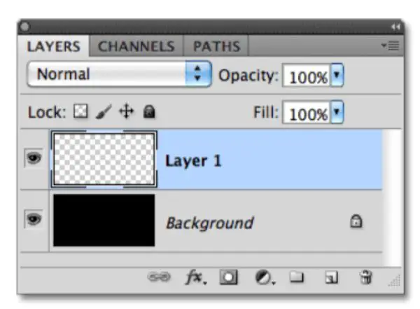
Press the new layer option in the Layer Panel. This would add a new layer with the name Layer 1.

Step 4. Use Grey to Fill Layer:

How to Create Metal Texture Using Photoshop- fill with grey

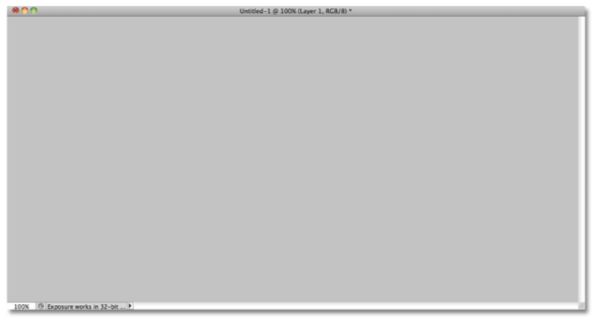
Use the Edit menu and choose ‘Fill’. Once the Fill dropbox opens up, click on the ‘Color’ tab under Use. When you select the ‘Color’ tab, Photoshop would open a Color Picker for you to select a color to fill the new Layer. Choose a lighter shade of grey. The one used for this tutorial is the following shade: 195 for R, G, B. Photoshop would fill the layer with a grey, temporarily hiding out the black Layer beneath.

Step 5. Add Noise:

How to Create Metal Texture Using Photoshop- add noise

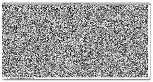
Go to Filter>Noise>Add Noise. Set the amount to 150% and make sure to select Gaussian and Monochromatic options from the dialog box beneath.

Click on OK once you get a result as below.

Step 6. Make use of Motion Blur:

apply motion blur

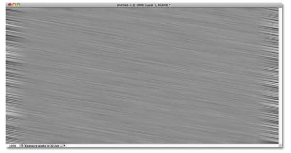
Go to Filer>Blur>Motion Blur. We would be using motion blur for blurring out all the noise that was produced in the earlier frame. Set the Angle to -10 degrees, and increase the Distance to about 200 pixels. Click on OK when done.

This creates a brush effect of metallic texture, as seen below.

Step 7.  Crop the Edges:

crop away the edges

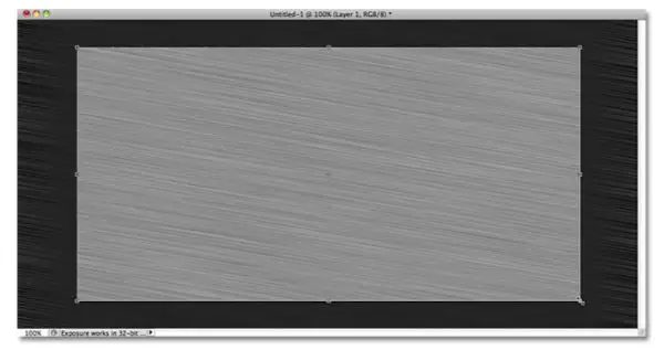
Relating to Step 1, the document must be a tad larger than you need to satisfy the reason that Motion Blur filter has trouble blurring pixels around the edges of a document, which is seen in our document. To rectify this issue, crop away those unwanted areas with the Crop Tool from the Tools panel, or press C. Press Enter once you have dragged and selected the area you wish to keep in your document.

Step 8. Insert Your Text:

add your text

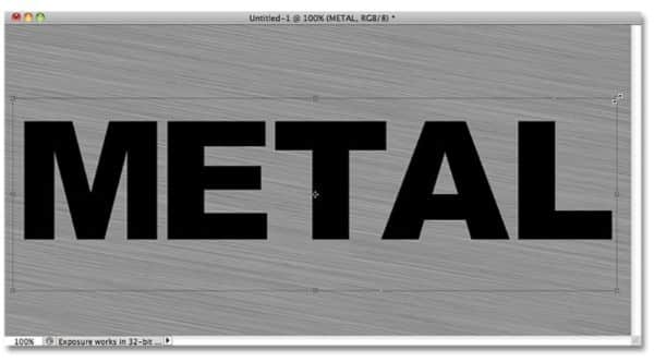
Add text to your document with the Type Tool in the Tools panel of the Photoshop window. Select font as well as size and typeface from the dialog box above.

As you select the text, you can also resize it in two different ways. You can change the font size, or use the free transform tool. The Free Transform tool can be activated from the ‘Edit’ section of the main menu bar. You can use the keyboard shortcuts Cntrl+T (Win). You can easily drag the corner points to the expected size.

To avoid any kind of distortion while expansion or reduction, you can simply accompany the controls with the Shift key. This would expand/reduce your text or shape equally from all sides.

Step 9. Adjust the Text layer beneath the layer of texture:

Move the Text layer beneath the layer of texture

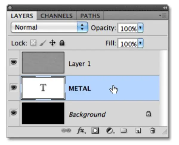
Press the text layer and drag the Layer between the grey texture layer and the background layer. You would notice a highlight bar between the two layers, release the drag of mouse and Photoshop would switch the text layer into place:

Step 10. Make a Clipping Mask:

Create a Clipping Mask

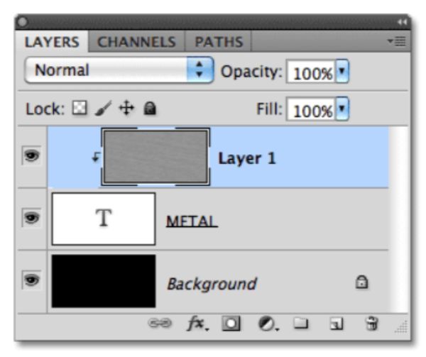
Click on Layer 1 and select it. Then go to the layer menu and chose ‘Clipping Mask’. With this key, layer one would become indented to the right, indicating that it is now clipped to the lower Layer.

You can now see the grey metallic texture through the typography easily.

Step 11. Insert Bevel and Emboss Layer Style:

bevel and emboss

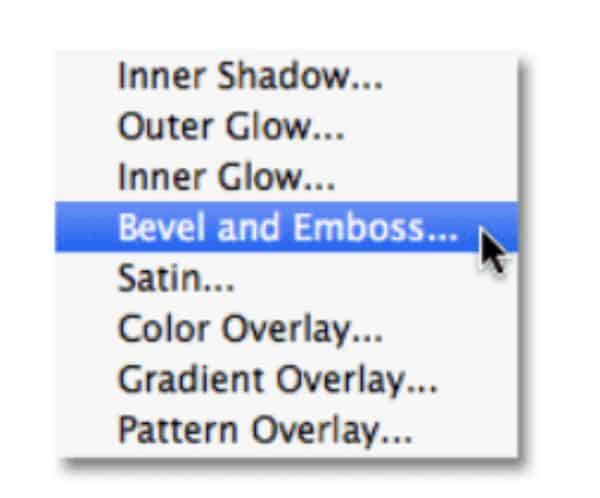
Click on the tiny text ‘ fx’ icon in the Layers panel. This is the layer styles icon. Chose Bevel and Emboss from the list of styles that appear.

A new Photoshop Layer Style dialog box would open up. To set the Bevel and Emboss options, first, change the Technique to Chisel Hard, then increase the size to around 7px. Depth slider must be dragged towards the right to expand it to about 500%. Below, in the shading section, click on the Gloss Contour section:

This will, in turn, open another dialog box where you can select ‘Ring’ from under the dropbox of Presets.

Click OK to exit out of the Gloss Contour Editor to come back to the main Layer Style editor dialog box. Here, check-in the Anti-Aliased checkbox next to the Gloss Contour option. DO NOT close the dialog box yet, and we have one more step to go.

Step 12. Insert Gradient Overlay Layer Style:

add a gradient overlay

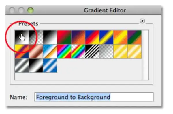
Click directly on the ‘Gradient Overlay’ in the layer style dialog box. Make sure you don’t only check in the box next to it, but click on the words for the editable options to appear.

By default, Photoshop’s Gradient is set according to the current Foreground to Background (Black and White), so to change that, click on the color slider next to Gradient in the dialogue box.

Click on the first option to the left, i.e., Foreground to Background.

Now, close this dialog box and go back to the main Layer Style dialog box. Here, select the Blend Mode as Overlay and set the Opacity to 70%. This adds a shimmering affect to the metal.

Final Result:

Final result

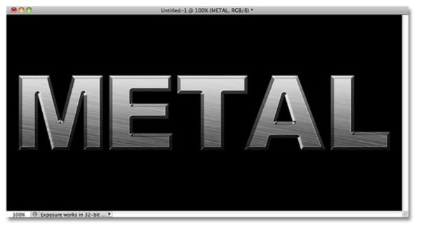
This is the outcome of this tutorial. It is the most basic version of the metallic typography, but more and more overlays can be applied to these set of layers to fine-tune the shiny metal effect. The best part about this method is the text remains editable – in a sense; you can change the fonts, words as well as size of the words and play around with sizes without hampering the metal texture.

These are the two methods that can be used to induce a metal texture using Photoshop in the background as well in Text. These methods can be improvised as per the level of advancement, but barely take 5 minutes once you get the hang of it. You can use a metallic texture on websites, motion graphics, logos, banners and what not! Metal textures can be used for various purposes. Learn how to make the most out of Photoshop experimenting with these metallic textures your other design projects. Metal texture adds a sense of boldness, gives the overall design an edge, and adds character to the overall design. Keep practicing these methods to find out which method suits you best for your purpose. The applications and possibilities are endless when it comes to Photoshop.

The post How to Create Metal Texture Using Photoshop appeared first on Line25.


Source: https://ift.tt/2RIm18B

Design your way

Image files can be saved in different file types and this is because some of them have their own particularities. Understanding which one is the right to use in certain situations might not be all of the time easy. When you are working with images you need to understand really well what you are trying to do.

For example, in the PNG vs JPG discussion, they have both their pros and cons and in order to get the max out of them, they need to be used accordingly. This is because a wrong image format will bring larger files that lead to a slower website and nobody wants this in today’s world of speed and communication.

Images have different sizes and shapes and the two most common ones are PNG and JPG. This is because they are compatible with all the browsers and the needs of the general users.

In order to find out which is the better one to use in the PNG vs JPG dilemma let’s check out more info about each one.

PNG

png-700x342 What's the difference between PNG vs JPG and which is better

The PNG file format was created in the 1990s to be a replacement for the well-known GIF format. Certain limitations of the GIF made the appearance of the PNG one to appear.

The PNG file format has been designed to transfer images on the internet and not really for printing graphics so it does not support non-RGB color spaces like CMYK for example.

What is the advantage of .png is the fact that it offers a lot of variety and transparency levels that mean the PNG background can be completely transparent that is important for PNG logo designs and similar ones? It is also a great choice when we think about pictures that have fade effects.

JPG

jpg-700x350 What's the difference between PNG vs JPG and which is better

JPG is a filetype than has been developed by the Joint Photographic Experts GROUP (JPEG) in order to create a standard for the photographers out there. What JPEG does is to compress image data and it does that reducing sections of images to blocks of pixels.

This image format was made to minimize the file size of photos so they can be easily used in the online.  So, this means that a lot of the pictures that you are going to find online are going to be JPG format.

PNG vs JPG

Many people asked what format is better, PNG or JPG? Although most of us probably sometimes ignore completely this aspect, people that work more often with photos for sure understand even better this aspect.

Similarities and Differences

JPG-v-PNG-700x231 What's the difference between PNG vs JPG and which is better

Png or jpg, that is the question! Both formats support similar levels of color depth and can carry support for metadata, interlacing and color management. However, none of them supports animation, layers or HDR.

What makes PNG and JPG different is the fact that PNG support image transparency but JPEGs do not. More than often color indexing is available for 1-8bit PNGS but is not supported at all in JPEG.

Pictures Containing Text

add-text-700x376 What's the difference between PNG vs JPG and which is better

Sometimes you might want to use pictures that have text and choosing between PNG vs JPG might be a confusing situation. PNGs are better for this type of picture as well for graphics that have fine details.

An important difference between jpg vs png is the fact that if you use JPGs, the contours of the letters together with the fine lines used in graphics will appear less sharp.

Compression

lossy-700x336 What's the difference between PNG vs JPG and which is better

JPG and PNG use different compression methods. JPG uses the DCT-based lossy compression one that decreases quality in order to gain smaller file size and PNG that prioritizes quality and uses a DEFLATE compression algorithm.

The difference between png and jpg is that in PNG the file size is not that easy to adjust and you need a separate program while JPG’s file size can be adjusting easily during saving.

The main attributes of a JPEG image are:

Smaller file size

smaller-size-jpg-700x525 What's the difference between PNG vs JPG and which is better

This is one of the biggest advantages of this JPG images. If you are creating a website using JPG images will always provide you with a faster page load time together with better user experience because the files are small.

If a JPEG file is gets saved the rate of the compression is at 10:1, so if let’s say you have 10MB photo then the save one will have 1MB in size.

Compression creates a loss in quality

blur-700x411 What's the difference between PNG vs JPG and which is better

While reducing size is a great advantage that JPG has it is also a weakness. The algorithm that gets used to compress the JPEG images finds pixels that are more or less in the same color or value. This will lead to a smaller file that has little image degradation but this also means that you lose the entire data once the file gets saved.

The main attributes of a PNG image are:

Larger file size

png-compression-700x359 What's the difference between PNG vs JPG and which is better

One of the reasons that PNG and JPG images have different uses is due to their size. PNG images have a different image compression when they get their size reduces and is different from the JPG one.

Lossless image quality

losslessness-700x525 What's the difference between PNG vs JPG and which is better

THE LZW compression is used when a PNG image is created but this doesn’t result in the quality being damaged. So, what this means is that the image gets saved, edited and opened many times without degrading in time. The difference between jpeg and png is that when they are edited or re-saved, they always compress and lose more information.

Regular Pictures

regular-700x535 What's the difference between PNG vs JPG and which is better

Because the graphics and the images with letters are usually better-looking in the .png file, with the regular photos, the JPG is the option to go for the online because they have a smaller size. If you go for PNGs, they might slow your website quite a lot and this means your users might not be that happy about it.

Transparent Backgrounds

transperant-700x438 What's the difference between PNG vs JPG and which is better

A big difference between .jpg and .png images is that only the .png format can support transparent backgrounds.

Popularity

So png or jpg which one is better to use? PNG has grown quite a lot in popularity because it supports transparency and can be used for certain web designs. However, most of the images that we see on the internet are still JPEGs and this will not change any time soon.

Which Format is Best?

png-working-700x356 What's the difference between PNG vs JPG and which is better

We can say that JPG images are ideal for using them online because they keep the file size down and we don’t get too much quality loss. They are also good when we want to send emails or print artwork at high resolutions.

PNG, on the other hand, are great for web graphics, especially logos and illustrations. They can be resized in small dimensions and this is another plus. The biggest advantage of a png is that the image can be transparent allowing you to put different designs on top of backgrounds with no problem. PNG is also a great choice if you want images that will be edited and saved multiple times.

Summarized Features and Benefit of JPG and PNG

Features and benefits of JPGs:

screenshot-700x345 What's the difference between PNG vs JPG and which is better

  • used for photos
  • the best choice for screenshots of movies or similar content
  • smaller file sizes
  • fast page load time
  • lossy compression
  • editing and re-saving degrades quality but is not noticed if you don’t have a high number of saves

Features and benefits of PNGs:

transperant1-700x554 What's the difference between PNG vs JPG and which is better

  • used for illustrations and other design work
  • great for detailed illustrations
  • images saved on a transparent background can be used better on your website
  • support for colors and grayscale
  • easy to change the colors of PNG files
  • fewer colors that get used lead to a smaller file

In conclusion, the battle between PNG vs JPG has no winner actually. It really depends on your line of work and what you need them for when you are choosing the image extensions that you want to go for.

If you enjoyed reading this article about PNG vs JPG, you should read these as well:

The post What’s the difference between PNG vs JPG and which is better appeared first on Design your way.


Source: https://ift.tt/2uOA9Ej

How to Create a Website Layout Block by Block

Thursday, January 30, 2020

There are many tutorials based on graphic design, and how to play with the elements to create the perfect design. Similarly, creating a website also requires an understanding of certain universal elements a website has. Designing a website requires a sense of visualization and hierarchy to best put these elements in a way that suits the purpose and looks appealing to the end-users. Often, this process can feel quite overwhelming. However, if you make use of the block by block website layout technique, it can be pretty simple.

The block by block website layout divides some aspects of a website into different sections. Then, the coders and developers would create different modules and compile them in various sequences for creating appealing and attractive templates/pages.

By trial and error or by proper planning, using block by block website layout can help you design unique pages that remain true to the niche you are targeting. To keep the brand, uniformity designers often make use of common design elements such as color, typography or other designing elements.

The layout of a website is responsible for giving it the needed structure. Different layouts work for different niches, based on the content and kind of business. The building blocks of the website layout are:

1. Feature Image:

 Block by block website layout- Feature Image

For any business or project that doesn’t require many images, using a feature image layout is a great option. As soon as a user visits the website, the feature image would be the first thing they would see. Feature images are big, bold and unapologetic. It immediately draws visitor’s attention to what it is trying to portray. Using an impressive image here would give the website layout an aesthetic and confident look. After this, the entire image can have understandable text-based content. Such layout is ideal for businesses that have more content to push and lesser visuals.

2. Grid:

Block by block website layout-Grid

Grid is similar to the feature image in some ways. This layout also includes one big graphic area. Below this is a section where there are various separated blocks of different shapes and sizes. Here the user can insert any content they’d like. The content for these blocks can be product images, textual content, blog posts or any other thing. If a brand has much content and a variety of content, this layout helps them showcase it in the best light possible.

3. Power Grid:

powergrid

Power Grid is an enhanced version of the traditional Grid layout. This layout uses many different shapes like rectangles, squares, and also makes use of the difference in area between the various elements in the grid. It is an ideal layout if you are looking for a website for a brand that has a lot of video, text, images and other varieties of content.

4. Fixed Sidebar:

fixed sidebar

For all the previously discussed layouts, the navigation menu is generally situated on the top of the page.  Fixed Sidebar layout sets the navigation to one to the sides of the layout as per the user’s preference. It can also accommodate additional content. This kind of layout is ideal for websites, where you want visitors to have an accessible navigation bar at all times. It would remain on the side of the layout and would be accessible all times for the visitor. This makes it easy for users to move between the various pages of the site without getting lost or spending time to switch to other pages.

5. Responsive Design:

responsive design

This is an essential aspect of website design that you should aim towards, irrespective of what layout you go after. With the change in time, many users have shifted from visiting websites on desktops to using them on their smartphones and tablets. Having a responsive design is a way of assuring that your website has good user experience across multiple devices and browsers. Make sure to thoroughly check the website out for different devices and browsers before you make it live.

Till now, we have understood how to develop the basic framework of any website.  Now this block by block layout needs to be filled with different kinds of content. Some of these essential content types are:

6. Navigation Bar:

navigation bar

Navigation Bar is the essential map-like feature for a website. It helps the visitors understand where they can go and how the content of the website is organized. A well-structured navigation bar should come to any visitor’s rescue that gets lost browsing the website. A navigation bar is not an optional element to have; any websites need to have a navigation bar. The placement of the navigation bar can be on the top of the sides, depending on the use and content layout plan. A general guideline that helps decide between the top layouts versus the side layout is- use the side layout when you have many subpages, as it is more accommodating.

7. Images:

 Block by block website layout - Images

Images have strong visual power and can be a great design element if used correctly. The images can be used for various purposes. They can add support for an idea of your copy to put it through faster, and more efficiently. Photographs have the potential to create an emotional connection with the visitors, which helps increase engagement. If you include an Our Team page, the visitors get to be familiar with the team that adds a sense of credibility and trust. Also using illustrations can show your branding skills, as well as graphics, can help bring focus to the important chunks of your content. Images can be used at many places like featured images for blog posts, as a gallery slider, header images, product pages and author or bio images.

The balance for the images needs to be carefully thought of, overdoing it would cause a cluster effect and too less would make your overall website layout feel less appealing. The focus should always be kept on the content, and the images should add support to the content, not take the visitors attention away from it.

8. Typography:

typography

Just like images are essential for a website to look visually appealing, the text is essential to add value to the overall content you have. However, you can’t be ignorant about how you present your textual content. Making use of useful typography hierarchy can help guide the visitor’s attention to priority content easier. For typography block, the few considerations to be kept in mind are – don’t use too many fonts. Generally, more than two fonts don’t provide value, instead look strenuous to look at.

Another thing to consider is you should keep the typography bold and legible. The text needs to be big enough for the visitors not to have to strain their eyes to read your content. Your font selection should also depend on the niche you are targeting. For instance, Times new roman font is ideal for news related websites. However, it won’t be best for a comic website. Other than these considerations, you need to ensure to organize your text. General formatting that helps plan content better are Headers, subheaders and body.

9. Color:

 Block by block website layout - Color

Color is one of the essential designing elements, whether it is graphical or website design. They usually have an emotional and psychological connection attached to them. For instance, blue is often related to calmness. Hence if you are designing a yoga website, blue could be an excellent color to incorporate in the design.  It is very important to plan a color palette for your brand and use the same color palette or a similar one to guide your website layout design.

Just like typography, you shouldn’t go overboard with colors on a website as well. A general guideline is to keep it to 3 or less. More than that would look like your brand has no focus or identity. Many times, if the brand is such, lack of colors could be more effective. Additionally, you can also try using whitespace for separating different sections of the website and bringing focus on the CTAs and important content portions.

10. Footer:

footer

Footers are natural to be taken for granted by many. It doesn’t seem like a critical section, but it truly is. It is a place where you can include all the important information about your company. Link the relevant pages like About Us and Contact Us. Other than that you should include all important legal details of the brand, terms and services as well as privacy policy. Moreover, the footer should include the brand’s phone number, and a Google map plug-in to reach out to the business.  It is also ideal for you to include social media buttons here.

11. Call to Action:

CTA

An important element of a website is a call to action. CTAs are opportunities for you to drive the engagement and conversions by giving the visitors cues and encouragement to do what you want them to do. There is a variety of CTAs that can be included in a website.  There can be a lead generation CTA where you can ask the user for an email address; then there are forms, read more, sales closing and many more.  The CTAs should be used strategically for grabbing the attention of the visitor. They should be very clear and easy to understand.

12. Pop-ups:

 Popups

Popups aren’t something that adds to the user experience. However, they are still an important effective way of capturing possible leads and increasing database of email-ids of visitors. Having a good database is an effective manner of marketing. There are various kinds of popups that you can make use of, as per your liking and what you feel would be most effective.  Time-pop ups are popups that would keep appearing at specific time intervals, click pop-ups get activated when the user clicks a specific area on the site on the other hand scroll pop-ups would trigger when the user scrolls till a point on the website. There are also entry popups that would load up as soon as the visitor reaches the site and exit popups that show up when a visitor tries leaving your website. All type of popups is different and serves different purposes and goals.

It is very important not to overdo popups or else the visitors would be thrown off and not continue using your site. It has to be blended in the website layout as subtly as possible. As far as the size goes the pop up can take up the entire screen, it can be an overlay in the centre of the screen and also a slide-in box that slides onto the page.

This is the essential block by block website layout making technique that will help a designer focus on the individual elements, creating a synergy between them to create a well-structured website layout. You need to take care of all design aspects and use the elements correctly in the correct hierarchy to match your brand requirements. As a bonus, it will help showcase the brand in the best light possible.

The post How to Create a Website Layout Block by Block appeared first on Web Design Blog | Magazine for Designers.


via https://ift.tt/2RWZpjG
 

The Cash Box Blueprint

Most Reading