Design Resource Box

Friday, May 31, 2013

Call to action is a term that we often come across with and which refers to the fact that elements on a page solicit an action from the user. We interact the most with this notion when we are designing buttons that, evidently, are encouraging the user to perform an action like buying a product or viewing a page.


While some designers do their absolute best to create good call to action buttons, the majority ignores this important element and treats it like any other button on the site. The most that average designers do is make the button attractive and fit into the site design, but that isn’t enough to make them effective.


The call to action button represents the element that makes the user decide between exiting the site and doing something, or, better yet, making the conversion that we are looking for. If you are the guy who usually looks at statistics for bounce rate and conversions, then you must understand this element’s importance.


The actual button is represented by two parts, design and copy, both equally important. I say equally important because it’s what determines the user to do something. The button design is the visual aid for the visitors that tells them where they should click, while the copy tips the balance towards clicking and not closing the site, by telling the visitors why they should click the button.


Good copy increases conversions


First of all, to get the visitors to do something, the text on a CTA button should begin with a verb (n.r.: “get information”, “open an account”) otherwise the button you are creating is not a call to action button, but a regular button.


activecell.com


Secondly, you shouldn’t just use any trigger word, instead try to put yourself in the visitor’s position and ask yourself what you would want to see. Try adding value and relevance to your button if you want to increase your conversions. Instead of using “buy now” which almost seems like the button is ordering you to do it, try “add to cart”, or “get your T-shirt”.


codeguard.com


Position it well within the page


The button will or will not deliver results based on its position. Most of the times, CTA buttons will appear after a big pile of text and info, somehow in a cluttered zone, which is a big mistake made by designers. Try using white space to make the button visible. A button that has white space around it is more visible than one that is between a lot of text and graphical elements. Still, using too much white space could make the button unrelated to the presented content and may harm your results.


prevue.it


Also, it is important to mention that placing the button in the top section of a page can lead to higher conversions because users will surely notice the button or remember it later after they have read the content of the page. Alternatively, you can try putting the button both on the top of the page and at the bottom.


markup-service.com


A neat trick that many designers use is placing a call to action button near testimonials or feature lists in order to stimulate conversions.


Use contrasting colors


getharvest.com


The color of your button can affect its usefulness so it is important that it has a high contrast relative to the elements near it or the background, making it easy for the visitor to notice the button.


disqus.com


This, though, is not a general rule. On large buttons is better to use a color that doesn’t stand out that much in your page design, it already has the size advantage. Making it big and shiny will irritate the user. On smaller buttons, however, using a brighter and more contrasting color is recommended in order to make the button visible.


frontify.com


Don’t use red! In most cultures, red means “stop”. It will be most likely associated with the red traffic light, the “Stop” traffic sign, danger, aggression, something that will surely not intrigue the visitor and most likely you will get a negative feedback.


bidsketch.com


Size is good, but it could backfire


mozilla.org


The size of an element within a site’s layout marks its importance, the larger the element is, the more important it is to the user. Knowing this, you can make call to action buttons bigger to direct the visitors’ attention to it. Even if we don’t realize it, a big button makes itself a priority in our minds.


It is true that it is important for the button to be large enough to stand out as a clickable element on the page, but making it too big may put pressure on the visitors and the call to action will backfire. Testing is still the best solution to know how much is enough and you should try it for better results.


Be careful when using secondary alternative actions


Usually, complex pages have multiple calls for action and you must be careful when designing these. Usually they appear under the form of a “Download” button near a “Buy” one, or “Take the tour” near “Join now”. Differentiating them by color and/or size is vital.


wantful.com


Also, consider that every call to action button you add to the page reduces the impact of the buttons. The visitors’ attention is distributed among these buttons and if one button is more important than the others, and it usually is, then it could lead to fewer conversions. A good advice is not to try to smother your page’s layout with call to action buttons if you want the visitor to be directed towards a certain action.


virb.com


Make the action seem simple and easy


filesharehq.com


Most people are avoiding buttons that make them do unnecessary actions which seem difficult or a waste of time. A good advice for achieving the best results in this situation is to tell the user how much time it will take to perform those actions and what is involved. Transparency is always appreciated by online users.


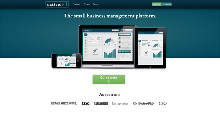
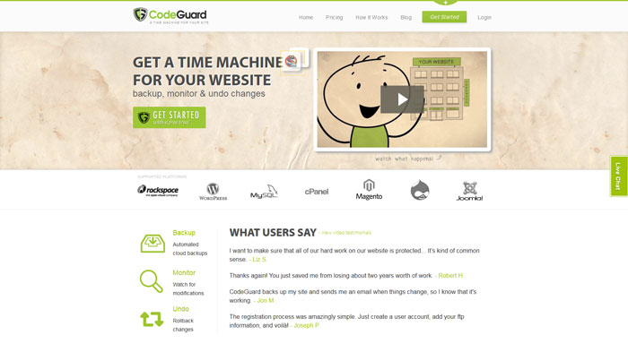
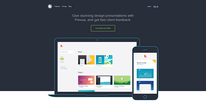
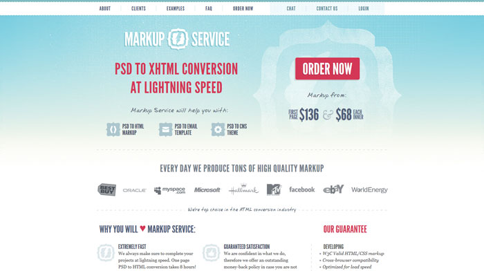
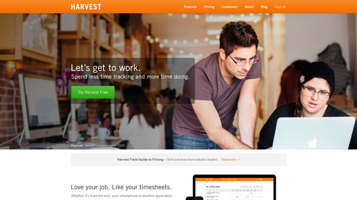
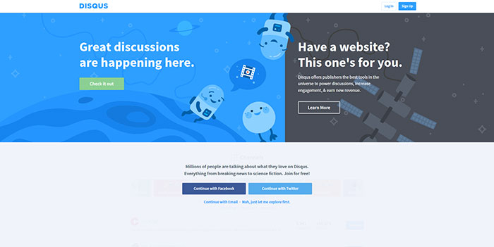
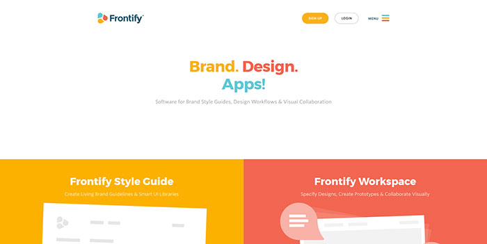
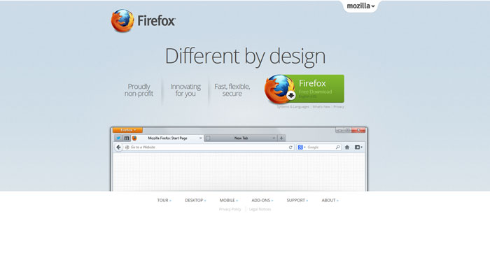
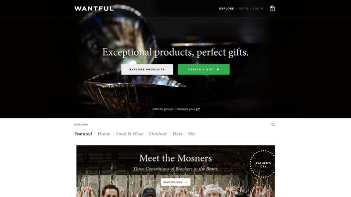
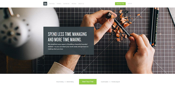
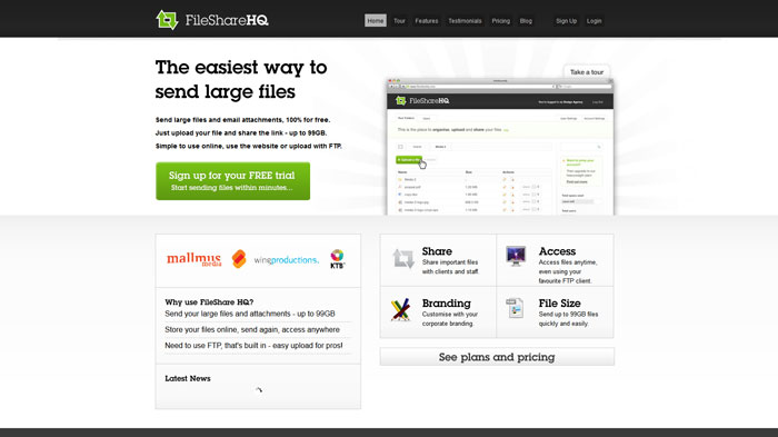
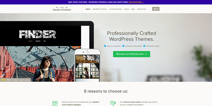
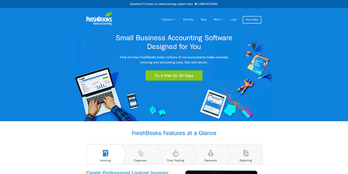
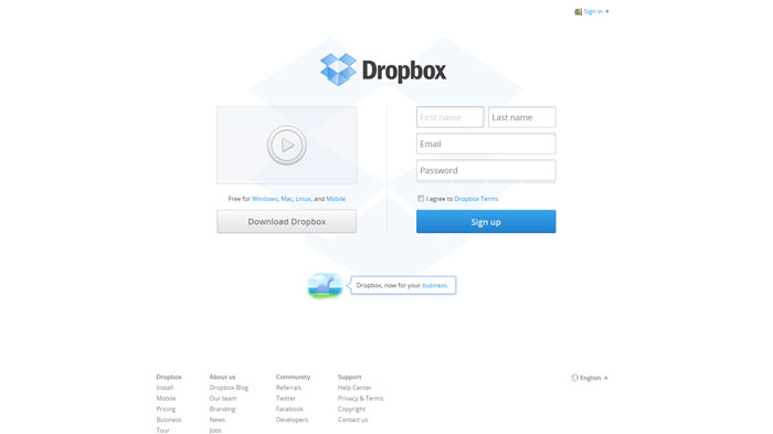
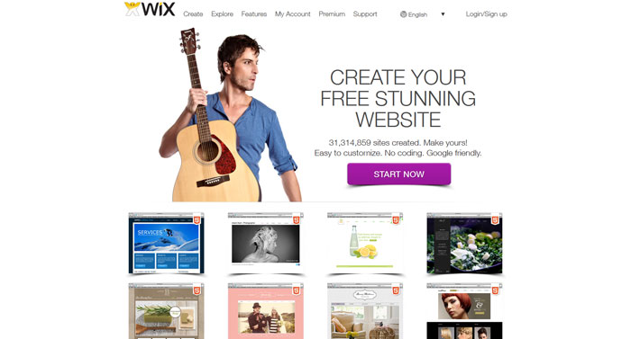
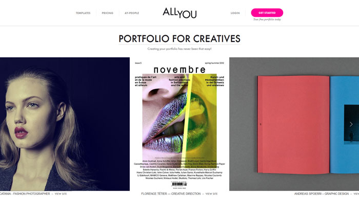
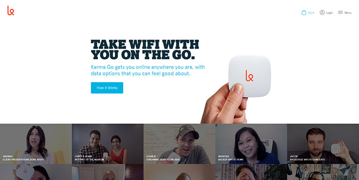
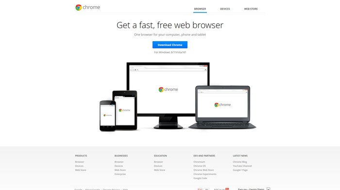
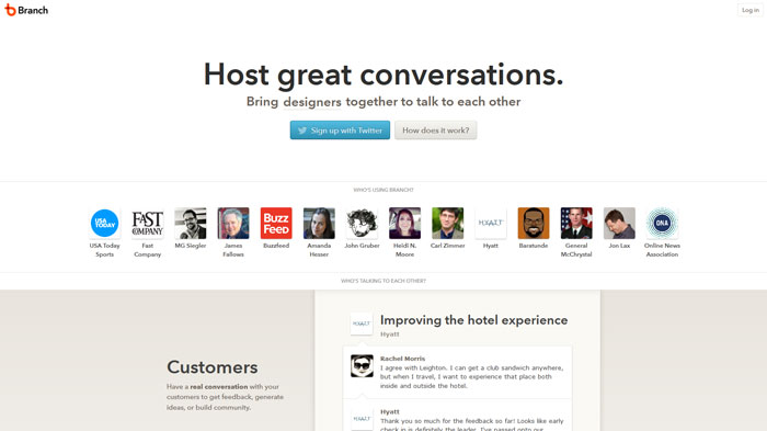
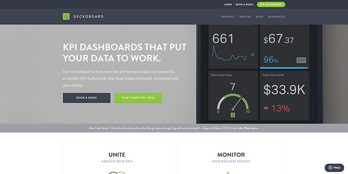
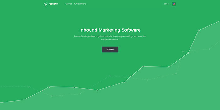
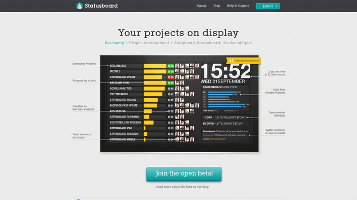
In the following you will see other examples of good call to action buttons. The screenshots are not focused on the buttons so you can have an overall view of the site and notice how the buttons attract your attention, and not the other elements on the page.


thethemefoundry.com


thethemefoundry.com


newrelic.com


newrelic.com


freshbooks.com


freshbooks.com


campaignmonitor.com


campaignmonitor.com


dropbox.com


dropbox.com


wix.com


wix.com


allyou.net


allyou.net


yourkarma.com


yourkarma.com


Chrome


Chrome


branch.com


branch.com


geckoboard.com


geckoboard.com


positionly.com


positionly.com


statusboard.me


statusboard.me


Source: http://feedproxy.google.com/~r/DesignResourceBox/~3/xbl2HIH5rxI/

Design Focus on Social Networking Website Layouts

Thursday, May 30, 2013


Advertise here with BSA


Ever since the early days of MySpace there have been social networking websites getting online with each passing year. The whole world is taken in this craze of social networking, tweeting, blogging, and lots of other similar tech-based activities. I have found that many social networks are utilizing common interaction techniques within their designs.


facebook social networking website homepage


I want to share just a few examples of my insights towards building a usable social network. This means designing a captivating landing page with easy instructions and rules for the users. Profile pages are also a big point in the design critique. You want to make your network as easy to use as possible. This is obviously much simpler said than done, but I am sure all observant designers will pick up quickly and follow suit with their own ideas.


VK


The VK social network has gained a lot of notoriety since the beginning of 2013. The site was originally hosted on a .ru TLD since the network is based over in Russia. However, since relaunching and redesigning the website, we can now see it has a brand new domain name with a lot of extra features.


vk russian social networking website homepage design


My biggest reassurance with VK is their natural Facebook-style design. Now that VK has taken all the good parts and organized a simpler layout, I feel it works a whole lot better. You may not be rushing to sign up for a new profile but the design is a really great aspect of the whole website. All the simple headings, buttons, input fields, and other key areas on the page have been styled in an older Facebook-era fashion.


The reason this works so well is because many people are already familiar with the interface. Homepage feeds and sidebar URL links are all too common within other networks, too. VK has taken these common interface trends and adopted them into their own layout. It provides a flawless example of creativity within a medium of relatability to the user.


N4G


The social gaming news network N4G has not been online for more than a few years. This is a social news website very much like Digg in its heyday. Members can submit gaming articles which are then promoted based on other user’s recommendations. The most popular news will surface onto the front page and drive a stream of traffic onto the website.


What I like in particular is the profile design for each user. Their system ranks members based on points for how active they are, how often they submit news, vote on news, and post comments. All of these points will display on your profile page which is the best location for keeping track of your account. I also like how N4G has adopted the Twitter-style header design image.


n4g social news gaming website layout design


You just upload a specific BG photo and the backend will handle the rest. It lines up perfectly with your account stats and username. Even the sidebar profile menu looks very similar to classic Digg by using a colored-background selected state. If you have never heard of N4G might I recommend signing up for an account, just to see how you feel about the interface features.


Dribbble


Most designers will already know about Dribbble which is a private invite-only design network. I love their homepage and default shots listing because of the subtle box shadow effects. Dribbble’s entire purpose is to showcase the latest design submissions from the userbase. This means shots can be uploaded and shared with anybody around the world.


dribbble design social media interface layout


The design is clean, easy to use, and makes a point of sticking to colors which blend almost perfectly. The pink and dark grey color scheme is a manifest of the pink Dribbble basketball logo icon. Also the dropdown menus from each navigation link provide quick access to the most important pages. This is a great design with some typical common sense notions for user interfaces.


Plurk


One final social networking website is called Plurk and it is not so famous among western audiences. There are still plenty of users from all around the world, yet it provides a strange timeline-style updating system which has drawn in a close-knit dedicated memberbase. Plurks may be shared text, images, videos, or any other form of Internet multimedia.


plurk social networking website layout timeline


The homepage design is reminiscent of an older Twitter layout. You can get the raw feed of the latest user updates made public. Or you can search for the hottest plurk updates over the past day or week. I think all of these basic frontpage user experience effects provide a standard for notional web design. The minimalism of interface elements also makes registration and customization a breeze.


Closing


It is not everyday that somebody is looking to build their own social network. There are plenty of open source CMS solutions, but to maintain the userbase will take a lot of time and effort. Not everybody has this energy to contribute. But I hope this article may shed a bit of insight towards what makes good social networking design. If you have similar thoughts or links to other networks feel free to share with us in the post discussion area below.


Advertise here with BSA


Source: http://designm.ag/design/design-focus-social-network-layouts/

Design Resource Box

Graph and chart tools are very popular among web designers and web developers because clients ask them to be implemented in their dashboards and presentations. FusionCharts offers a lot of charting solutions that you may find useful: column charts, bar charts, pie charts and various other types that can be rendered in 2D or 3D.


Initially when it was launched, FusionCharts offered Flash graphs but since then they evolved beautifully and now there are also Javascript charts and can also be viewed on mobile devices. Actually, at this moment their charts are working on almost every device possible: PCs, Macs, iPads, iPhones or Android devices.


Devices


Using charts is not that easy if you want to use a tool that works and looks good too. FusionCharts does this well and can be implemented easily by a web designer. What it does is it takes all the information that you want in charts and graphs and turns it into interactive charts that can be implemented in CRM applications, in project management applications, social media analytics software or in large-scale BI/ERP applications.


Using their tools is not that difficult too. There are tutorials and extensive documentation that will guide you through every part of the process. You don’t even have to be a techie to figure out how to use them.


One of their products, FusionCharts XT, is a perfect addition to reports, dashboards, surveys, monitors and analytics. Its comprehensive range of chart types with smart reporting capabilities, animations and interactivity are bound to make your apps look stunning and power-packed.


It doesn’t matter if it’s a simple column or pie chart, a combination chart, advanced zoom and scroll charts, or specialized sales and marketing charts, FusionCharts XT covers all your charting requirements. All the charts support interactive options like tooltips, drill-down, exporting as image, PDF, or CSV and JavaScript integration.


Charts


I’ve made an article a while back about chart and graph tools that are available on the web and I was impressed that FusionCharts offered a lot of features. Things like tooltips, clickable legend keys, easy drill-down, effortless zooming and scrolling, one-click chart export and print gives your users all the capabilities they expect from a modern-day business app.


Interactivity


You can use your data with FusionCharts in two ways, with the help of XML or JSON. People are usually running away from XML, but it is extremely easy and well-documented.


JSON or XML


If your data is from a database, you can use the FusionCharts XT API. The application also supports real-time data visualization from an external source.


FusionCharts jQuery plugin


Using the jQuery charts plugin is not difficult at all. As well as with all their products and features, this too is well documented. It requires only 4 simple steps:


  • Download jQuery and FusionCharts Suite XT. Copy the downloaded JavaScript files to the relevant folder in your web application

  • Include jQuery.min.js, FusionCharts.js and FusionCharts.jQueryPlugin.js in your web page

  • Create a
    or a container to hold the chart


  • Use insertFusionCharts(), appendFusionCharts() or prependFusionCharts() method to create the chart instance, and provide attributes like width, height, data format and data object


To be sure that what I’m telling you is not propaganda you can check a comparison between the top Javascript/HTML5 charting libraries.


Competition


Source: http://feedproxy.google.com/~r/DesignResourceBox/~3/2ZY2qRVNXBo/
 

The Cash Box Blueprint

Most Reading