The problem with typography, cause there is a problem, is that web designers don’t know much about it. The only typographical questions that most web designers face is what font they have to use for their design.
The basic issues that a web designers has to solve is choosing the right typeface and manipulating correctly the font size, weight, line height and other rather less important attributes. But that isn’t all.
To be a good web designer you need to have a good understanding of typography and how it works. We started with a few options at our hand, but since font-face was available, that was pretty much solved. However, that didn’t solve the typography problem that designers were facing, because the problem wasn’t the font pool, but its overall font usage on the page.
Legibility
It is important to have a good visual contrast between fonts and also between blocks of text and headlines. The human brain is built in such a way that makes it strong contrast and distinctive patterns attractive for you.
The amount of characters that are in the line is something that most designers ignore. For eligibility purposes, this should be around 65-75 characters. Legibility is the degree to which individual characters in text are understandable or recognizable based on appearance. It is important to take care of this if you want your visitors to read with no difficulty the text that you have on your page.
Typographic hierarchy
Typographic hierarchy is a system that allows you to establish an order of importance with the text that is on your page, allowing the visitors to navigate easily and find what they are looking for. It represents the way that different typefaces, weights and sizes are structuring a page.
To establish typographic hierarchy there are a few things that can use: size, weight, color, position and type contrast. You don’t have to use only one of these, instead try using combinations of them to deliver a better a effect.
The size of the fonts that are on the page should not be randomly chosen. Also, the style and weight are also really important and don’t neglect them by just using just bold and… more bold. The fonts that you can find online also have a lot more weights that you can use like italic, bold italic, thin, or even small caps.
Use white space!
Newbie designers tend to ignore this. I’ve previously talked about white space and I’ll try to keep this as short as possible.
By using white space doesn’t mean that you should do it everywhere and at all costs. Certain elements like the ones that are related should be grouped and have a smaller space between them, while the distance between a group and another should be bigger. Improper spacing will confuse the visitors and it will direct their attention towards something that isn’t a priority.
So, selecting a typeface is the easy part, right?
No. You probably thought this is the easy part of the whole typographic process that involves designing a website, but it isn’t. Selecting a good typeface that is proper for your design is quite difficult.
My personal opinion is that you shouldn’t use only one typeface. I’ve talked about contrast in this article a few likes back and that can easily be done by using two different typefaces and by different I mean serif vs sans-serif, not Comic Sans vs Franklin Gothic.
Using two fonts, one serif and one sans, is one of the easiest ways that you can create typographical contrast while having a cohesive look to the text.
The easiest and most sure way of doing this successfully is by selecting from fonts made by the same designer, because they will most likely have the same strokes and curves. A good example of this is the pair PT Sans and PT Serif.
Be an information designer
Information design is the practice of presenting information in a way that fosters efficient and effective understanding of it. The term is usually used for graphic design for displaying information effectively, but with the continuous evolution of the web, the person who handles this responsibility, the information designer, has expanded his duties to the web also.
It is the information designer’s responsibility to divide, organize interpret the enormous quantity of typography that is on a site in such a way that the visitor will have a good chance of finding what is of interest to him. An information designer should be optimizing the readability, accessibility, usability and overall graphic balance of a site.
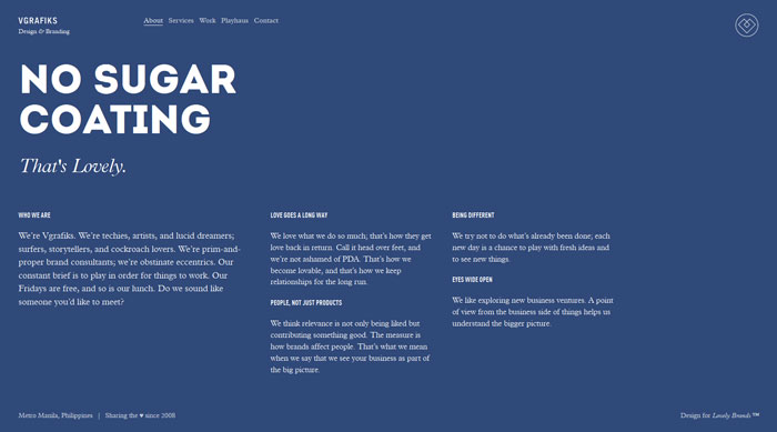
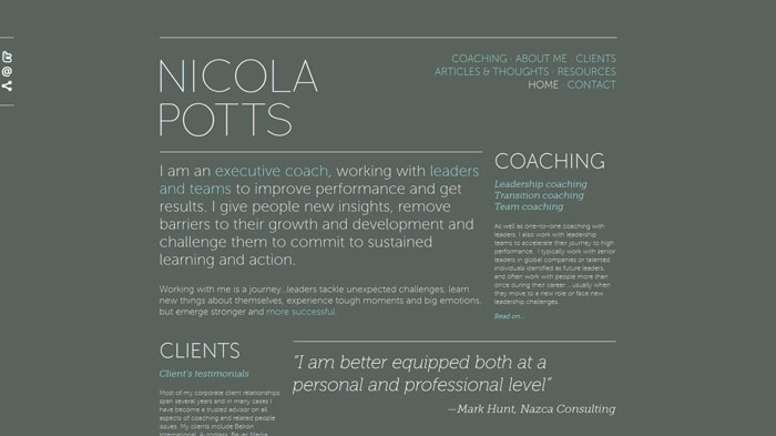
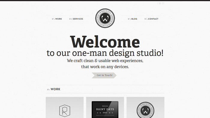
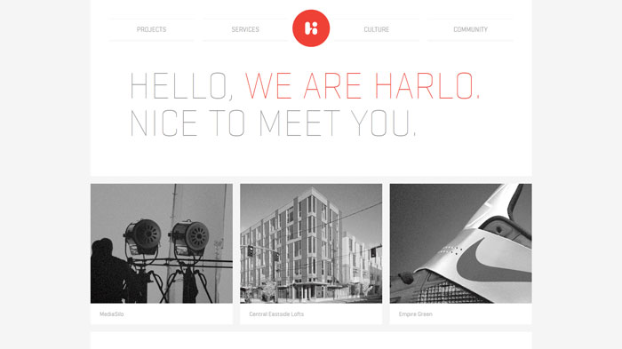
There are web designers who know what good web typography is and what it involves and that can be seen on the projects their working on. A few other examples of good web typography can be seen in this article.
zurb.com
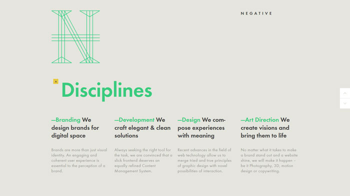
negativelabs.com
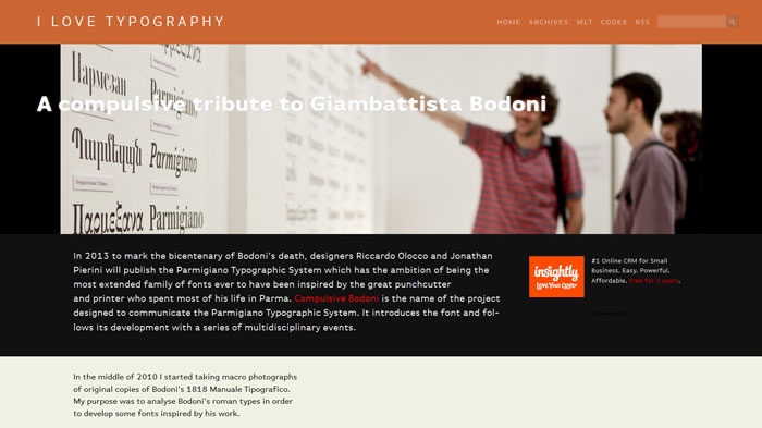
ilovetypography.com
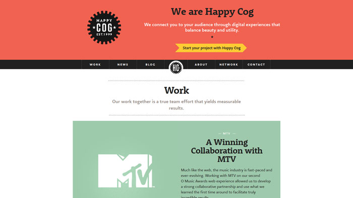
happycog.com
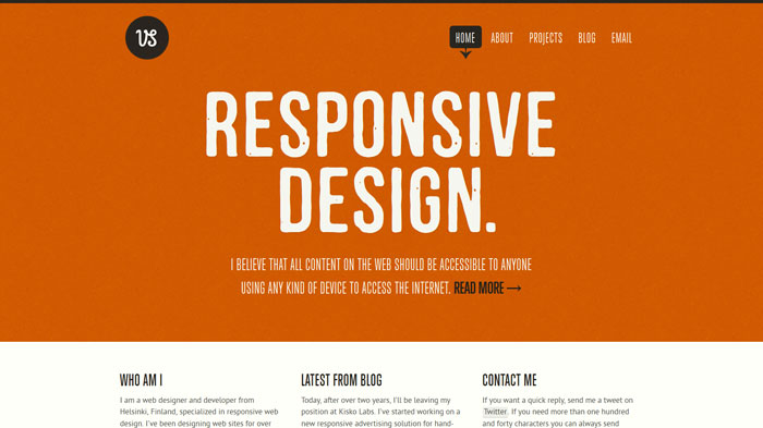
viljamis.com
Source: http://feedproxy.google.com/~r/DesignResourceBox/~3/HNzty94EMaE/


No comments:
Post a Comment