Technology is always evolving and the web design industry is a proof of that. Every once in a while, a new web tech is launched and changes the ways of creating web sites. CSS3 and HTML5 did that a few years back and after that web designers started to modify the way they worked because clients were asking for modern websites.
There are also a lot more reasons than tech advancements in the web industry that make it necessary to redesign constantly. There is also human evolution in terms of web usage, involvement with social media and interaction between the visitors, factors that should be taken into consideration when redesigning.
Designers and design blogs usually get a redesign once a year, or once in two years, but a big redesign can’t be done yearly on huge sites. It is easier to redesign a portfolio or a blog than an ecommerce site that handles a lot of data.
But even if you have to redesign a small or big website, there are a few questions that you need to ask yourself about the site makeover and plan ahead what to do, how to do, and why do it.
The current situation
You will have on your site elements that perform well and others that don’t work at all. You have to check everything in terms of usability and identify what could be improved. Making things user-friendly and usable is a must because your site results depend on the experience that the users have while interacting with the site.
There’s a pretty good old advice: if it ain’t broke, don’t fix it. Don’t mess around with elements of your site that work and deliver you the expected results. Instead, just do a makeover but make sure that there will be the same user experience. The elements that don’t work at all should be repositioned or removed completely.
I’ve seen a couple of redesigns over the years and a few of them have been disastrous. A well planned strategy is a must. Redesigning just for the sake of it is stupid.
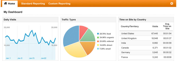
You will have to monitor how your site is used by visitors and how they are interacting with it. Use Google Analytics or CrazyEgg to see what pages are the most visited and what elements are clicked. Also, sales conversions, bounce rate, time on site, keywords and new leads should be documented and compare to what they will be after the redesign.
After documenting everything you will have to plan and determine your goals that you wish to achieve with the upcoming redesign, like increasing the number of visitors, reducing bounce rate, increasing time on site, increasing the number of leads and, most importantly, increasing the amount of sales that your site generates.
The best time to redesign
It is wrong to think that redesigning means only new graphics. The redesign process also involves changing more or less the structure of the site to get a better performance.
- If you are experiencing a drop in traffic and sales, your site design could be responsible. That doesn’t mean that in any case the site’s design is responsible for this, but if everything else works fine, than the design, most likely, is the problem.

- If your website is not responsive, make it responsive. Use tools and resources to create a responsive website. Having a responsive website is a must these days because a lot of people prefer browsing sites on a tablet or phone, when they’re at a coffee shop, in the public transport or at work. (I know I have to redesign my sites, I am aware of that)

- If your site takes a long time to load and there are a lot of elements which burden the structure, you have to make modifications. A good advice would be to use sprites, cache methods and minify your files in the new design.
- Take your customers’ feedback into consideration and if you notice that their feedback is negative, then you will surely have to do things differently. You will see this way directly from your audience which parts of the site are working and which are not.
SEO
SEO is pretty important to everyone because getting found online is not that easy as a regular person might think. Having a good SEO strategy is very important if you want visitors to come to your site through search engines and increase leads, conversions and sales.

The biggest SEO problem when redesigning appears when you move the site from one CMS to another. Why? Because the URLs might change and that’s a really bad things in terms of SEO. You will have to inform the search engines of the new links. Failing to do this will results in a huge drop in traffic and sales. To alert the search engines that you URLs have changes, use 301 redirects.
If your site is already optimized for search engines, keep it that way with all your headings and keywords, if not, optimize your new site design for search engines. Another issue that appears when moving from a CMS to another is the individual page optimization. Be careful not to lose the optimization for each page cause that might give you an incredible amount of headaches.
The curious case of unsolicited designs
A rather easy approach for rookie designers to develop their redesign skills is to redesign big sites. There is quite the controversy around unsolicited redesigns. The problem with these unsolicited designs is that their authors are doing it because they want attention or because they think they can do it better than the companies behind big sites.
While the strategy of getting attention could work and you might get some clients who like your work, the idea that you can do it better it terms of design and usability is rather stupid. Big companies have whole departments of UX designers and architects who perform studies and develop a very good, if not the best strategy for the site.
The reason why I brought this up is because designers have a wrong mentality regarding the unsolicited redesigns that they make. They should make it the way they think and release it so they can get the toughest criticism from UX experts, the advocates, not fans, of the current design and maybe they’ll get lucky and get an explanation from the authors of the current site design. Consider it like making mistakes willfully so that you can learn the proper way of doing designs.
Source: http://feedproxy.google.com/~r/DesignResourceBox/~3/PBsysTMF-EU/


No comments:
Post a Comment