Every year, computer screens are getting wider and wider and the text paragraphs on websites are becoming wider too and difficult to read. It is known that a person is comfortable reading 65-75 characters per line and you would expect people to adopt multiple columns in their layouts, but due to technology limitations multiple column layouts haven’t been implemented in the past.
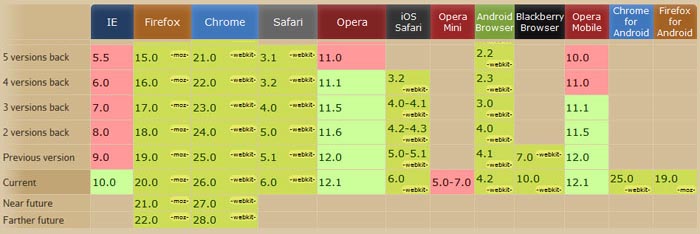
Luckily, technology doesn’t stagnate and the multi column layout is supported right now by the majority of browsers, though not fully supported.
How it looks
For best legibility, typographic manuals suggest that columns should contain roughly 65-75 characters per line. One formula suggests multiplying the point size of the font by 2 to reach how wide a column should be in picas — in effect a column width of 24 ems. Following these guidelines usually results in multiple narrow columns being favored over a single wide column. Historically, books containing predominantly text generally have around 40 lines per column. However, this rule of thumb does not apply to more complex text that contain multiple images or illustrations, footnotes, running heads, folios, and captions.
Column contrast refers to the overall color or greyness established by the column, and can be adjusted in a number of ways. One way is to adjust the relationship between the width and height of the column. Another way is to make adjustments to the typeface, from choosing a specific font, to adjusting weight, style, size and leading. Column contrast can be used to establish hierarchy, to balance the page composition, and to visually activate areas of the page.
The code
.three {
       -moz-column-count: 3;
       -moz-column-gap: 20px;
       -webkit-column-count: 3;
       -webkit-column-gap: 20px;
}
.two {
       -moz-column-count: 2;
       -moz-column-gap: 20px;
       -webkit-column-count: 2;
       -webkit-column-gap: 20px;
        text-align:justify;
}
To apply it simply add the class name:
<p class="three">The incredibly long text here</p>
Or, duh, add the snippet to the desired div’s properties in your CSS file.
Other properties that can be used
       -moz-column-rule: 1px dotted #ccc;
       -webkit-column-rule: 1px dotted #ccc;
       column-rule: 1px dotted #ccc;
This little piece of code adds borders between the columns that you have:
A multi-column element (or multicol element for short) is an element whose ‘column-width’ or ‘column-count’ property is not ‘auto’ and therefore acts as a container for multi-column layout. In the traditional CSS box model, the content of an element is flowed into the content box of the corresponding element. Multi-column layout introduces a new type of container between the content box and the content, namely the column box (or column for short). The content of a multicol element is flowed into its column boxes. Column boxes in a multi-column element are arranged into rows. Like table cells, the column boxes in a row are ordered in the inline direction of the multicol element. The column width is the length of the column box in the inline direction. The column height is the length of the column box in the block direction. All column boxes in a row have the same column width, and all column boxes in a row have the same column height. Within each row in the multi-column element, adjacent column boxes are separated by a column gap, which may contain a column rule. All column gaps in the same row are equal. All column rules in the same row are also equal, if they appear; column rules only appear between columns that both have content.
Fin
People are afraid of this technique, but it is pretty easy to implement and it looks good. It can be used in various ways on a website.
Source: http://feedproxy.google.com/~r/DesignResourceBox/~3/LCf-E9g7Hr8/


No comments:
Post a Comment