Some people think that an online business is easier than an offline one, because there aren’t many costs and you reach a bigger audience than a local one which is limited by its geographical location. This is not actually true. There are advantages on both sides, but there are also disadvantages, depending on your knowledge.
Creating an online business requires a little bit of courage, a lot of vision and even more planning. After you have made a plan for your ecommerce site it is time to actually design it, which isn’t an easy deal. Simply putting a few thumbnails and buy buttons won’t do.
Regular ecommerce websites only convert on average 1-4% of their leads and you don’t want to have an average one, you want to build an ecommerce website that rivals the stats that big sites have (15% conversion).
Making the products visible
The main reason why a visitor leaves the site without actually buying something is due to the lack of usability. This means that making your product visible is one of the most important aspects of your website design.
It is important not only to make your website usable, but make it usable for your audience. There are people who enjoy seeing a lot of details on the website while others just want to be as quick as possible with their purchase, skipping the unnecessary details that others like and directly buy the product.
Showcase the product well
There are a few points that you shouldn’t miss when designing the product page and that could make the visitor buy and not just gaze at the product wishfully.
Firstly, adding a few high quality photos of the product, and not just one is a good start. The best way of showcasing your product is without having other distractions in the photo. You will want to keep the customer focused at the product.
Secondly, adding a reviews section is incredibly useful. Customers care about what other people say about the product. It is well known that social influence is a strong reason for buying a product and you shouldn’t overlook this. Besides being useful to other customers, reviews can also be useful to you. If you have a few negative ones than you should consider solving the problems that those customers have encountered to ensure a better quality of the product.
Thirdly, use the add to cart text for finalizing a deal. There are many studies about call to action buttons and the proper way to name them. One of these studies mentions that using “add to cart” instead of “buy this” is better for conversions.
And last advice on showcasing a product: offer discounts or add it to a deal. Whenever a customer sees the word discount, his brain is on fire. Marketing techniques have always worked when telling the customer that he will get more for less money.
Selling the product
I have always hated online shops that require a lot of unnecessary things from me, it’s like they don’t want my money, but instead they want to keep me on the site as longer as possible. One of these ecommerce flaws is represented by registration. A lot of people are annoyed by this feature and are quitting the website when they see a registration form. Sending money should be easy so if it’s possible, don’t ask for a customer to register in order to buy your products.
Also, like getting help from someone is necessary for some customers so you will want to offer a chat service or a well structured and fast customer service. Even if you build a FAQ, people will still have questions to ask that will not be found there.
Conclusion
At first, before starting to create an ecommerce website, you probably thought that things were easy and you only had to make a quick and simple design to showcase the products, but I hope that after reading this article you changed your opinion and you will actually plan and design the site intelligently taking into account these advices that I’ve given here and the ones that other people might offer regarding ecommerce websites.
In the rest of the article you will see a collection of recent ecommerce websites for inspiration and if you haven’t seen before a few functions that an ecommerce website needs to have and doesn’t, you will surely see them now, even in these examples.
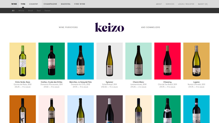
keizo.co.uk
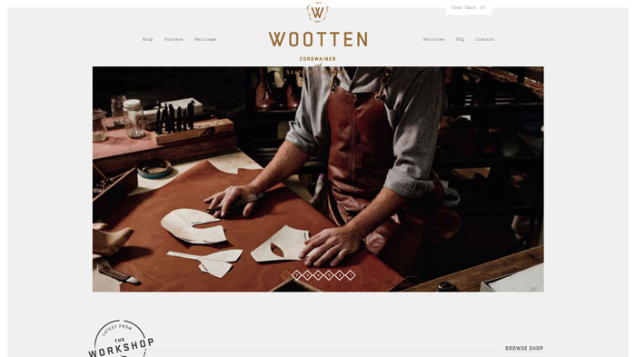
wootten.com.au
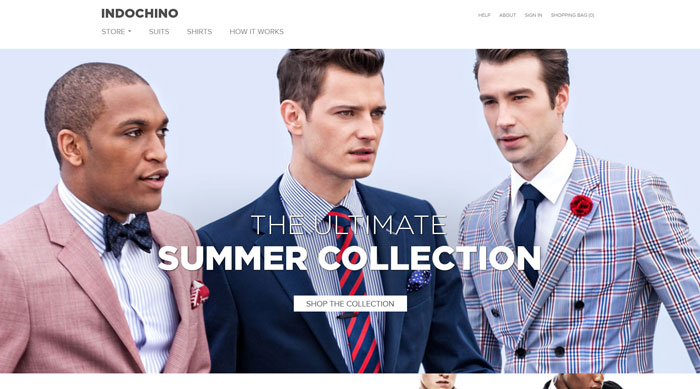
indochino.com
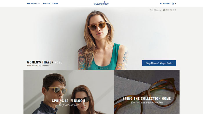
stevenalanoptical.com
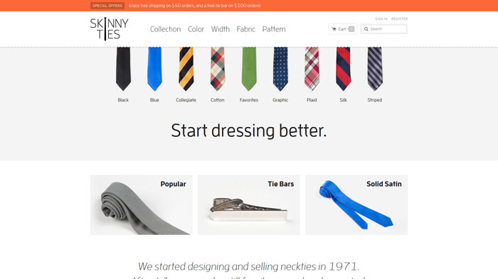
skinnyties.com
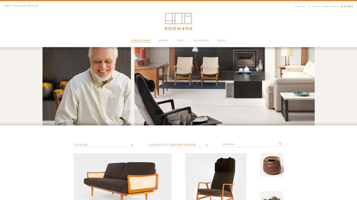
room406.com
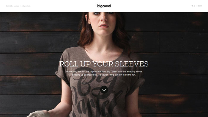
shop.bigcartel.com
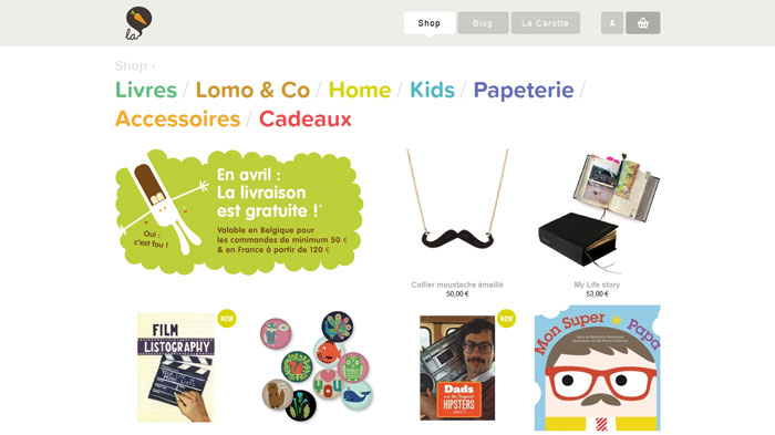
lacarotte.be
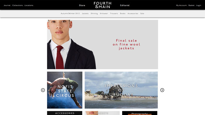
fourthandmain.com
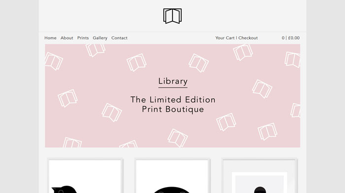
wearelibrary.co.uk
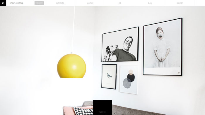
artiitii.com
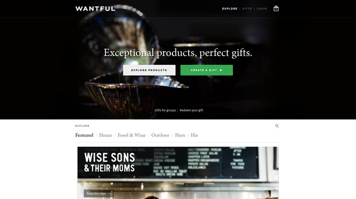
wantful.com
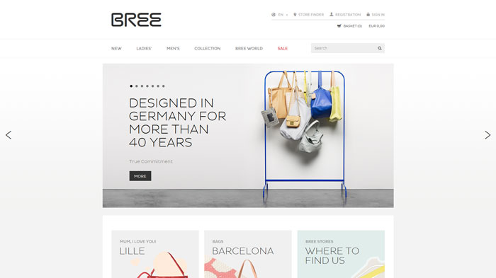
bree.com
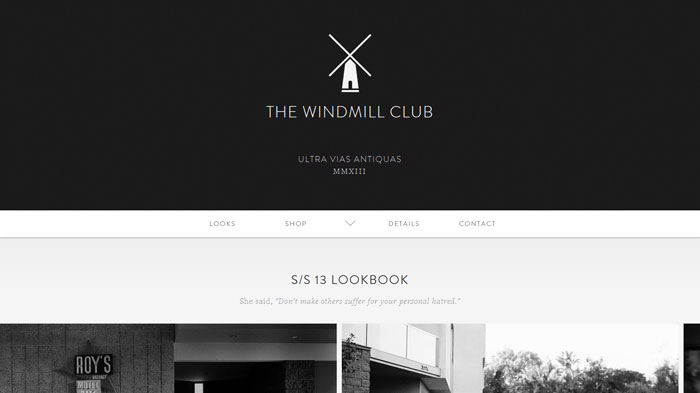
thewclub.com
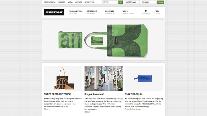
freitag.ch
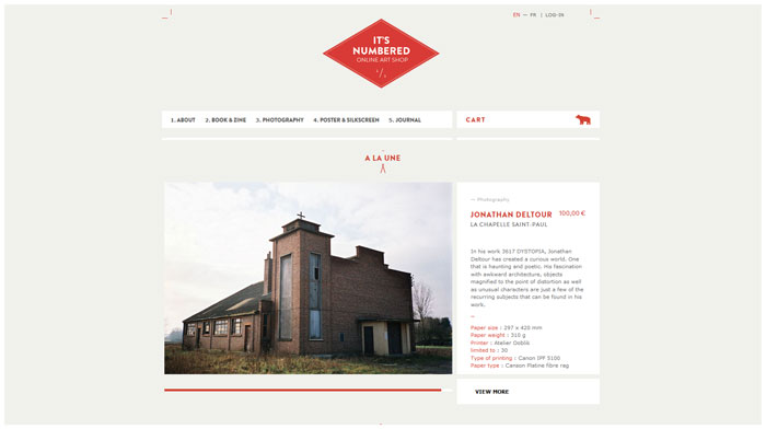
itsnumbered.com
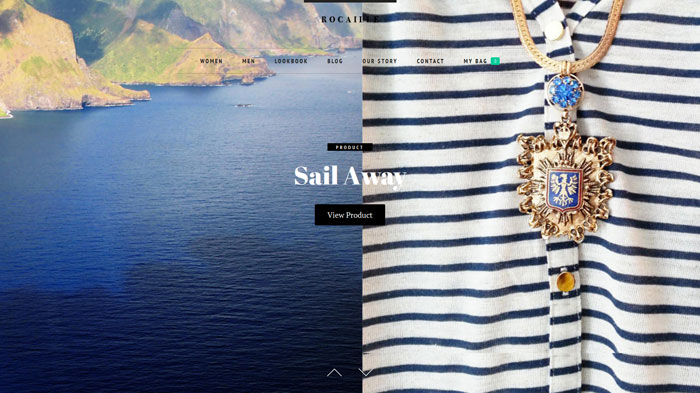
rocaillerocaille.com
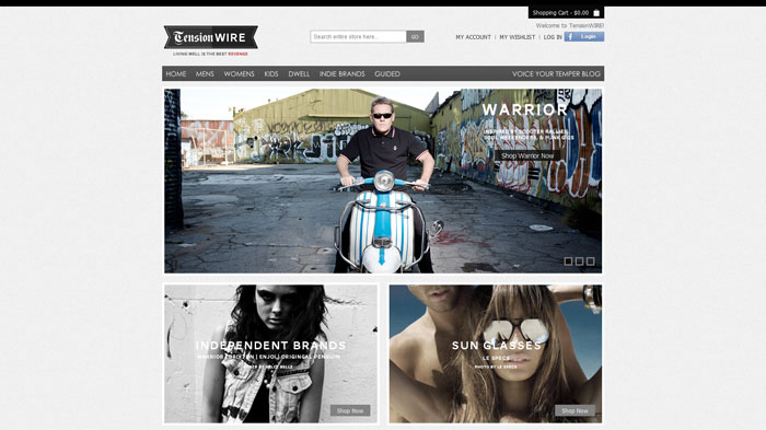
tensionwire.com
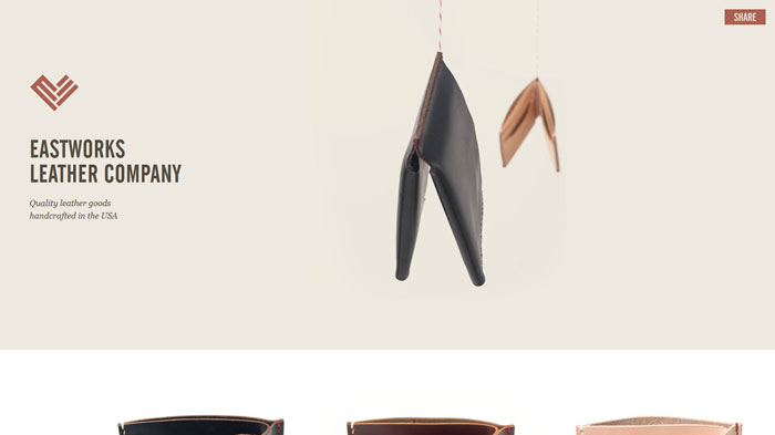
eastworksleather.com
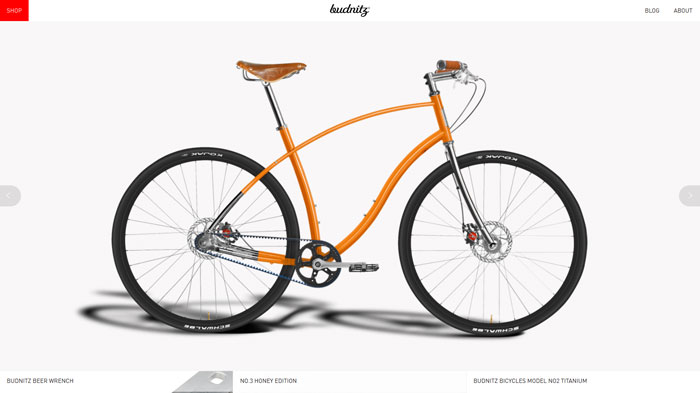
budnitzbicycles.com
thetopproject.com
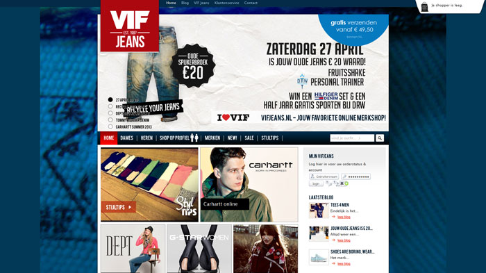
vifjeans.nl
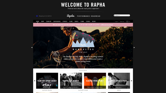
rapha.cc
unitedpixelworkers.com
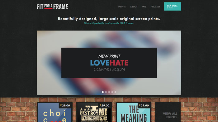
fitforaframe.com
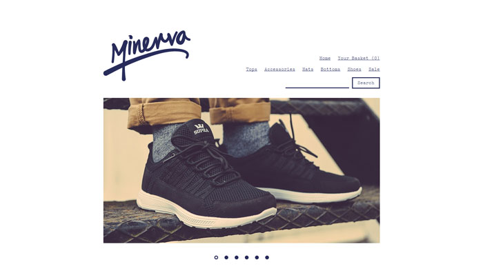
minervastreetwear.com
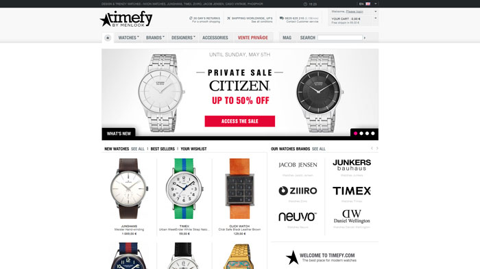
timefy.com
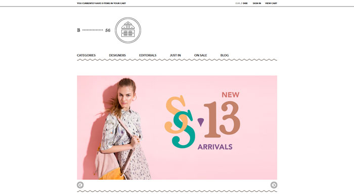
b56store.com
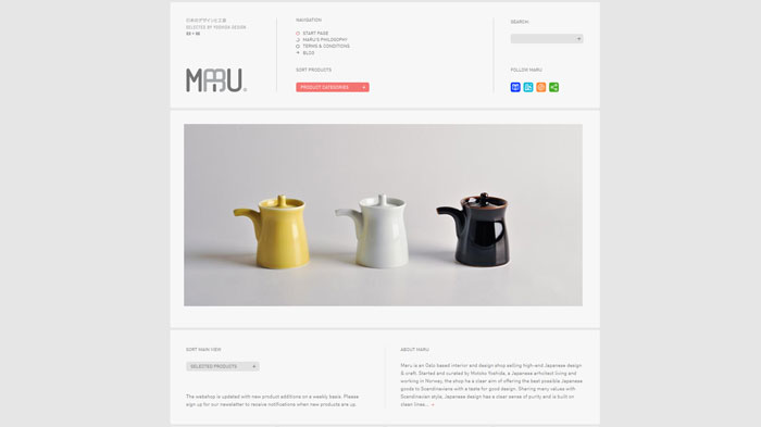
maru.no
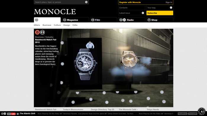
monocle.com
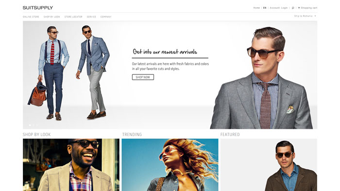
eu.suitsupply.com
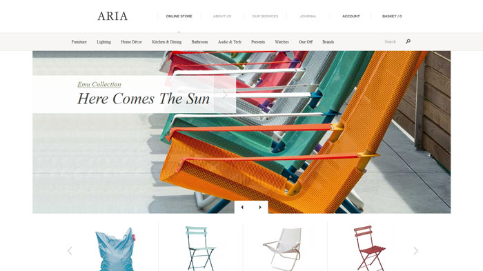
ariashop.co.uk
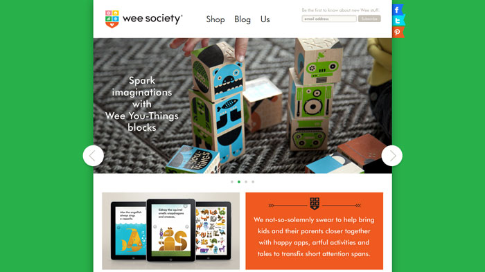
weesociety.com
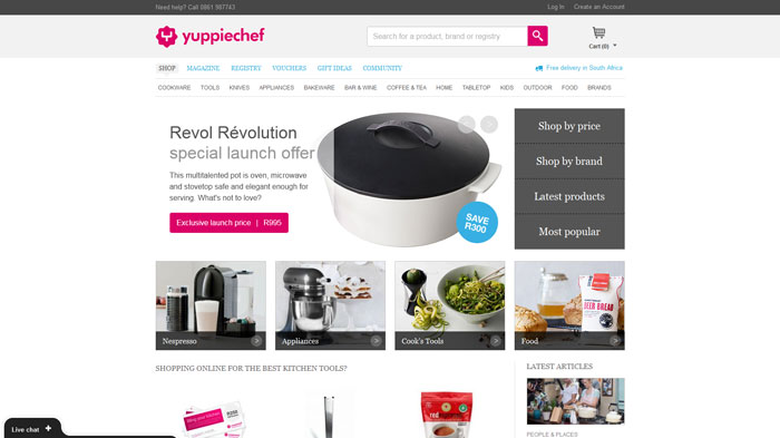
yuppiechef.co.za
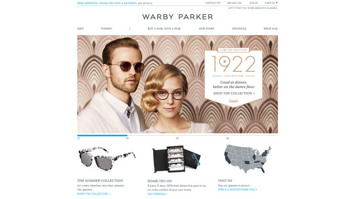
warbyparker.com
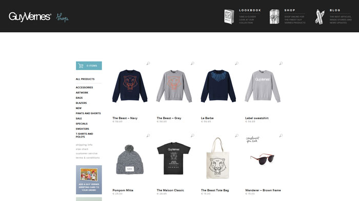
guyvernes.com
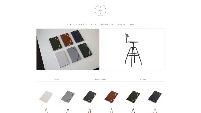
makr.com
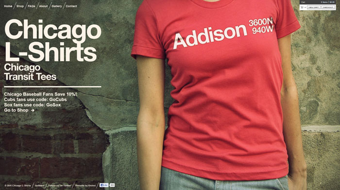
chicagolshirts.com
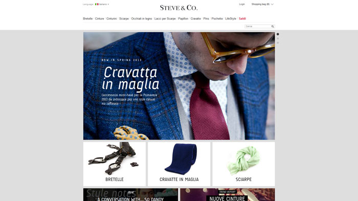
steveandco.com
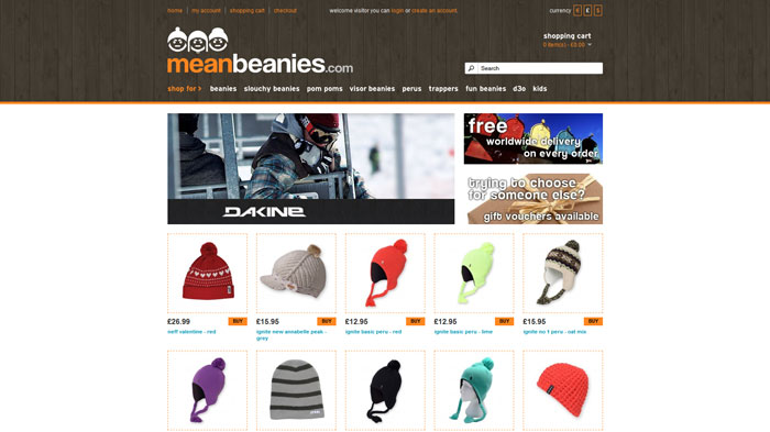
meanbeanies.com
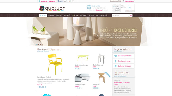
quatuor.be
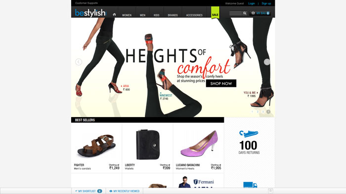
bestylish.com
Source: http://feedproxy.google.com/~r/DesignResourceBox/~3/f-wgYZZ0PGw/


No comments:
Post a Comment