There was a time, not so long ago when a majority of new sites that we were seeing in website showcase galleries were parallax. It was really interesting at first, but like almost any trend, it gets bigger like a bubble and eventually it pops and the trend fades away. This situation happened to parallax scrolling too. It was a big thing and people were insane about it, but… it faded.
The beginning of parallax
Parallax is a displacement or difference in the apparent position of an object viewed along two different lines of sight, and is measured by the angle or semi-angle of inclination between those two lines. Nearby objects have a larger parallax than more distant objects when observed from different positions, so parallax can be used to determine distances.
Even if that sounds a bit formal, it is the definition of parallax and it was used for the first time in 2D video games where the background images would move slower than the foreground images.
Parallax on websites. Entering HTML5 and CSS3
With these two new technologies the parallax effect was possible in web design and since then… designers lost their mind and started adding parallax scrolling to every new presentation site that they’ve had a contract for.
But why was it so popular? Well, trends usually take off because they look and feel good, but there was much more to parallax scrolling that made it intriguing. Most of the times, parallax scrolling is really interesting and scrolling for the next element to appear on the screen makes you feel like you were rewarded.
Besides that, for the authors of a parallax site the credibility increases a lot. Why? People tend to appreciate web designers who can pull off a well designed website. If done the proper way, usability will not be an issue and the site will be impressive and informative at the same time.
However, everything could backfire if you don’t do it properly. Scrolling too much may irritate the visitors and that would make them leave the site before them seeing what you wanted them to see. Also, the usability of the site will implicitly drop really fast.
Most designers never thought they could go wrong with it. After all, what could go wrong with it if everybody likes it?
Why it faded
There are more cons than pros when talking about parallax scrolling, but people ignored it for a while while the parallax scrolling hype was happening.
- For starters, parallax scrolling uses Javascript/jQuery which makes the page load really slow and that disturbs a lot of people. The page load was increased because the Javascript plugin has to manipulate the position of all the elements that are on the page. This would seem like an easy job for a script, wouldn’t it? No. The plugin has to calculate every time a pixel is scrolled on the site which means that there are a lot of calculations while you angrily move your little mouse wheel. After all the smoke and mirrors disappear, parallax remains only an effect that is difficult to implement and also difficult to load on slow internet connections.
- Most of the sites with parallax scrolling don’t work on mobile devices. That’s a real problem and many are trying to overcome this issue, but those people who have managed to make this effect work on mobile devices won’t give it for free and we can only hope one day we will have an open source version of this code.
- Parallax doesn’t go well with SEO. A parallax based site is a one page site and that is a real problem when you want to optimize the site for search engines and you will lose out on meta description and title tags, which are very important.
- Scrolling is interesting until it is not. I don’t mind scrolling on a website and I’m not necessarily an advocate of the idea that everything important must be above the fold, but scrolling like a mad man to see the end of the site is annoying.
Parallax scrolling sites showcase:
islreview.com
gramercyparkhotel.com
teleton.org.co
hexaedro.eu
nasaprospect.com
olszanska.pl
teapot-creation.com
wildbluetech.com
dangelicoguitars.com
glpcreative.com
tedxguc.com
rit.edu/ili
digdog.ru
browserawarenessday.com
fima.lt
figmenta.com
community.saucony.com/kinvara3
bagigia.com
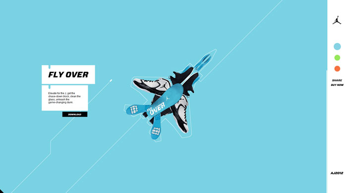
nike.com/jumpman23/aj2012
Source: http://feedproxy.google.com/~r/DesignResourceBox/~3/_Pjb6hUiyWA/





















No comments:
Post a Comment