It’s a good chance that you are visiting this article using a tablet or even your smartphone. The number of people that are accessing the Internet using other devices than the “old” desktop and laptop is constantly increasing. The designers noticed this fact and started to create websites that can be visited on every device, no matter the screen size.
Nowadays, we have responsive websites and the most problems related to the differences between the screens sizes seem to be resolved. It’s clear, a designer should work taking the mobile aspect into account. Well, this transformation created many problems and the design community should quickly adopt the best solutions.
The design community is a very solid and helping one and all the website creators bring their own contribution. As a consequence, we may find websites highlighting the best mobile websites; the creators of these receive exposure while the viewers get inspiration.
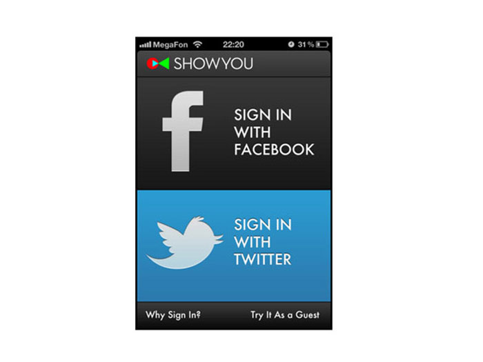
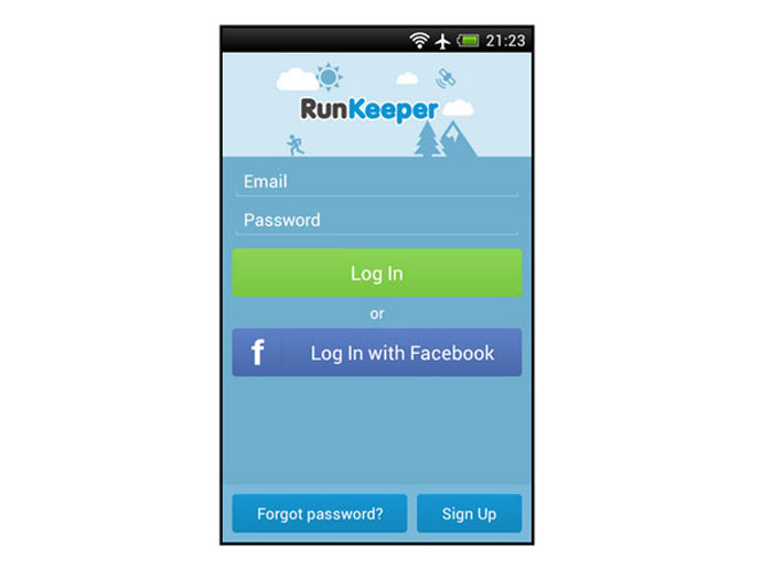
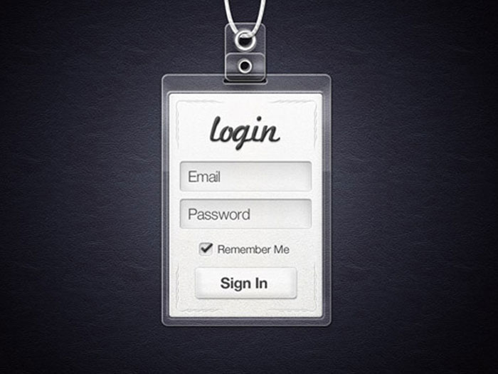
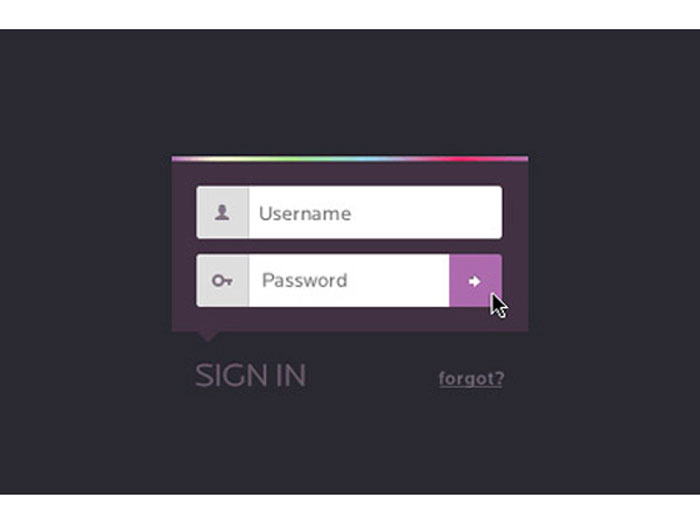
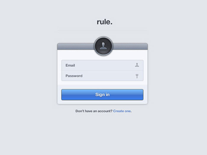
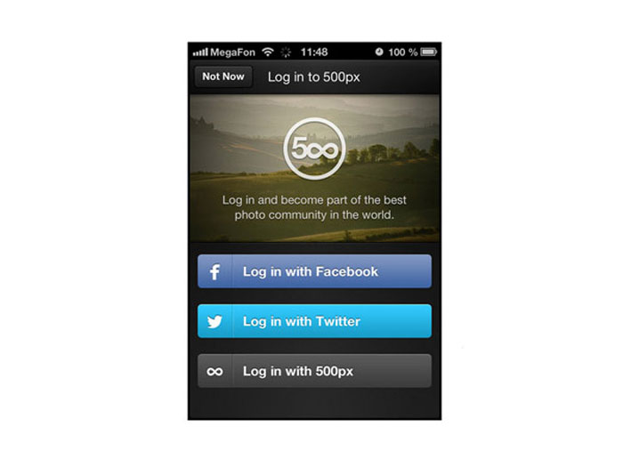
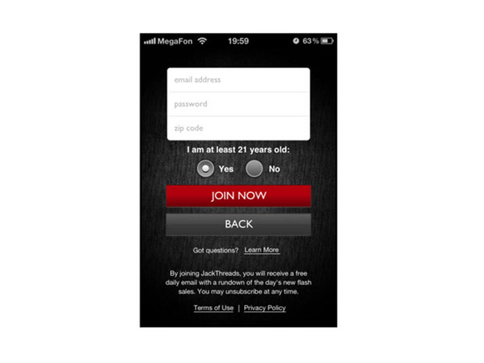
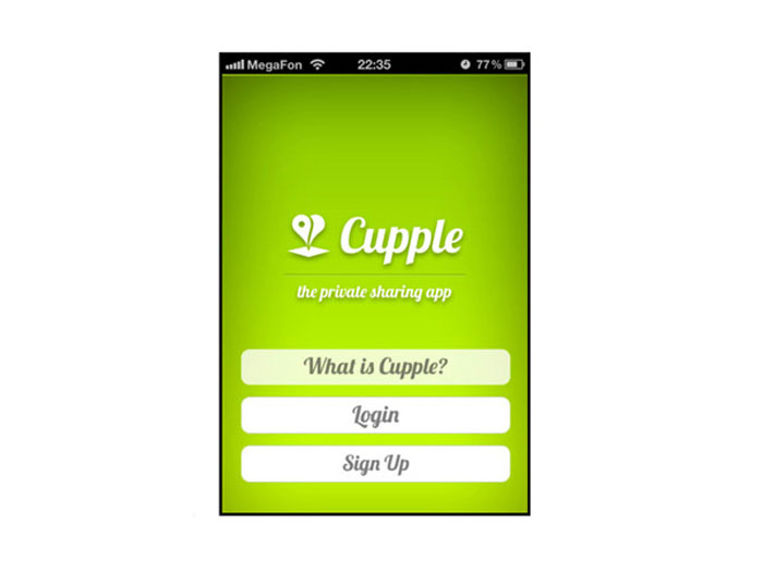
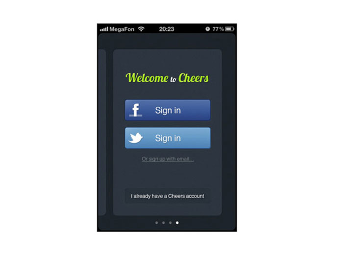
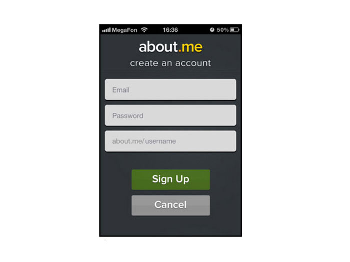
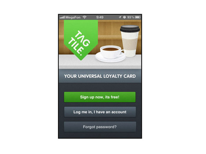
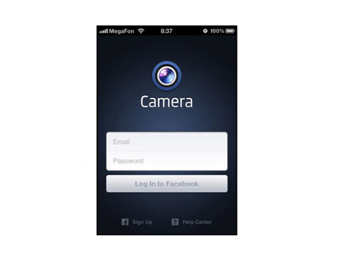
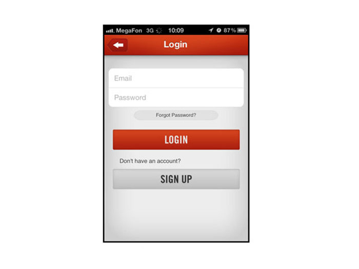
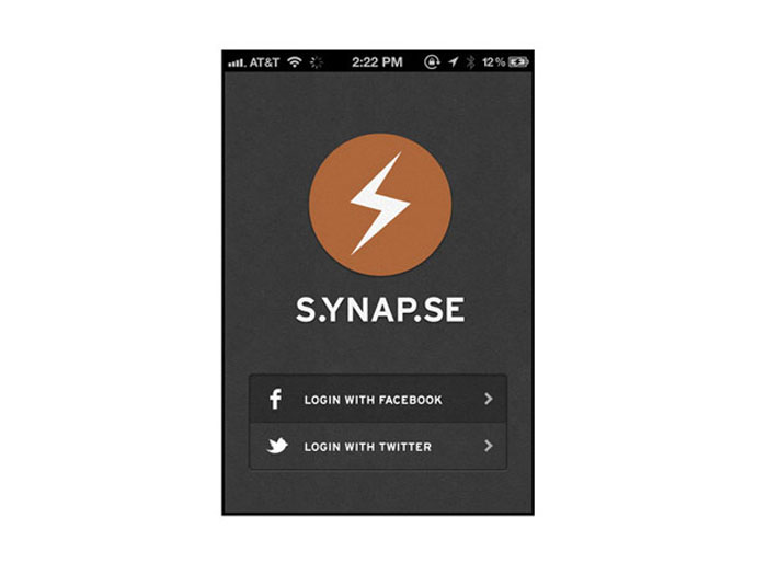
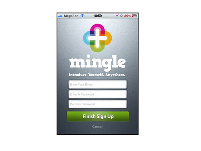
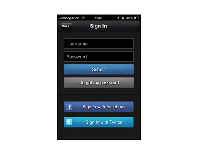
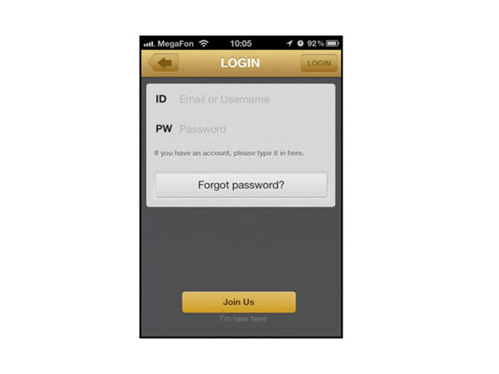
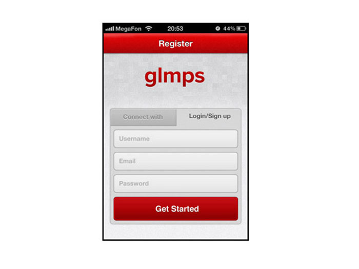
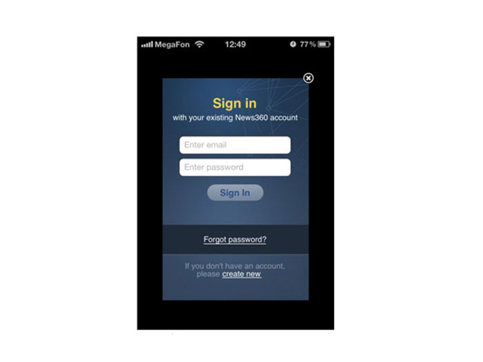
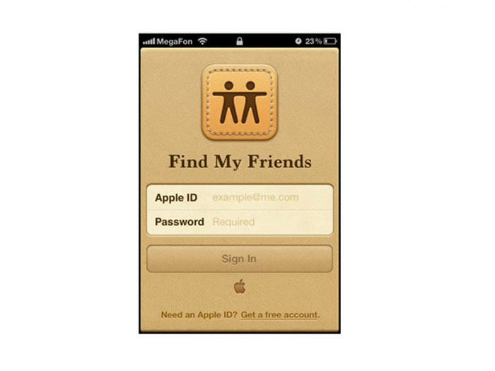
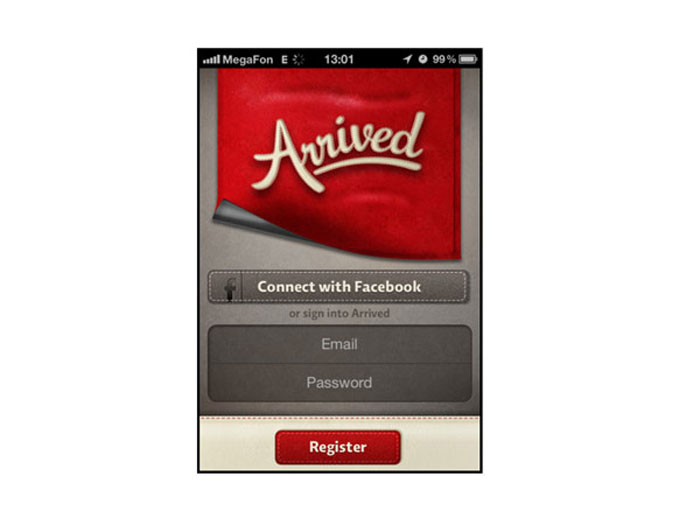
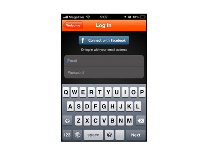
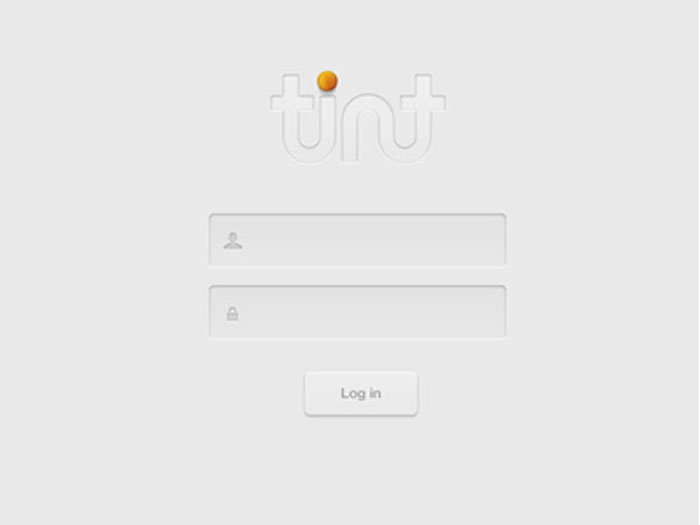
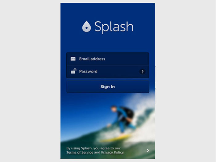
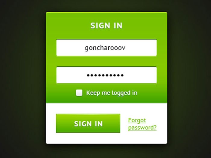
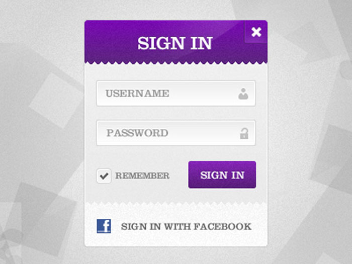
Undoubtedly, the inspiration is capital in creating new websites and we couldn’t ignore this aspect. Here you have a wonderful collection of mobile logins, check each item and apply some techniques from here in your projects. (Pay close attention, is very easy to fall into the trap of “getting too inspired” from a single example).
Having a usable and well designed mobile login is vital in the overall success of a website; it’s redundant to say that a bad login form means client and visitors unsatisfied and many opportunities might be lost in this way.
Author info
Tara Horner writes about graphic design and marketing trends for design contest marketplace DesignCrowd.
Source: http://feedproxy.google.com/~r/DesignResourceBox/~3/h_W-km1RGvs/





1 comment:
Nice post with fantastic information.
Website designing Company in lucknow
Post a Comment