10 Photoshop Tutorials to Create Neon Light Effect in Photoshop

Thursday, April 30, 2020

You might have seen illuminated words or shapes in vibrant color and glow that stands out from the background to create art or amazing themes. This colorful light is neon light that creates a beautiful surrounding. The simplest of the effects look striking, and neon is one such effect. Any kind of background you choose turns out to be beautiful with the neon effect. One of the design elements that is trending now is the neon light effect.

By giving the images neon light effect, you can enhance the elements in the image or of the website. Designers experiment a lot using the trend of neon light effect and give a creative vibe to their images or website. The background and the website get a different look with the neon light effect, and it creates a fantastic effect. There are a lot of different forms that designers use in neon light effect. It is one of the simple ways to attract viewers as the neon light effect stands out from every other design element. There are different ways of creating this effect. We have listed a few tutorials that would help you to create a neon light effect in Photoshop.

For designers, it is essential to learn whatever is trending in the industry. The neon light effect is one of the trending design elements every designer tends to use it in their design. Every designer creates a unique way to give this effect and achieve a distinctive result. We have selected tutorials which differ from each other in terms of technique, quality and time.

Designers have a way to learn the effect by investing a certain amount of time. So, we present tutorials that consume less time for designers who do not want to invest much time as well as lengthy tutorials for those designers who want to give time for their learning process.

Here are 10 tutorials on how to create a neon light effect in Photoshop:

1. Photoshop Tutorial: How to Create a Glowing, Multi-colored NEON Sign

The tutorial is by Blue lighting TV Photoshop. The video tutorial shows how to create beautiful and alluring multicolored neon sign. This video is for fairly advanced designers. The best part of the video tutorial is that the link of the background used in designing is given in the caption. The tutorial makes it easy to download specific link for the background and font, which helps to follow the instructions in the tutorial.

It is sixteen minutes long, which makes it easier for the designers not to spend too much time on a tutorial to learn how to create a neon sign. The tutorial zooms into the functions to create the neon signs that help the designer to follow the visual instructions in a much better way. The voice and quality of the video are incredible.

2.  Neon Light Effect – Colorful Glow Lines Photoshop Tutorial

The video tutorial is by Photoshop Tutorials by Layer Life. The tutorial shows how to create neon light effects on a photo in Photoshop. In this tutorial, there is no voiceover but subtitles for instructions. The visual quality of the video is also excellent, that makes it easier to follow the commands.

It shows from the basic on how to darken the image like it is night and add colorful neon lines to it. There is a piece of light music that keeps you away from distraction. The footer states every instruction that simultaneously runs with the visual. The tutorial is approximately 13 minutes long, which makes it appropriate for a designer not to spend much time and learn to create a neon light effect.

3. Photoshop tutorials-Neon Light Text Effect[Photoshop tutorials]

The tutorial is by Free FX Class. This tutorial helps you to create the neon light text effect. The tutorial shows how to create a Photoshop document, to set up the background, to create text for effect, create the effect, copy the text to the effect, make some adjustments and to create the glow effect.

The ten-minute tutorial helps you to create neon light text which can make your image stand out. The tutorial has no voice-over or subtitles to guide you through. The video guides you thoroughly, which step to follow step by step. The tutorial is an easy way to learn to create a neon light text effect. The video is worth recommending as it has more than half a million views and 40,000 subscribers.

4. How to Create Neon Glow Effect Lights & Objects | Adobe Photoshop

If you are looking for a quick way to learn how to create a neon light effect, this tutorial is perfect for you. Designers struggle a lot for learning new things daily. If you are yet to learn to create neon light effects in Photoshop, then watch this tutorial and get a grip on it. This tutorial shows you a quick way to create neon effects to objects in the image.

The tutorial has more than one lac viewers and more than 34,000 subscribers. Tone Fuentes Anaya presents this tutorial. The video has a voiceover that directs you and guides you through the video. The subtitles are also there for viewers who may find it difficult to follow the voice over.

5. Realistic Neon Light Effect in Photoshop

Sekulic presents this tutorial. The tutorial is a more than 20-minute video that helps you to create a realistic neon light effect in Photoshop. The tutorial has a clear voiceover and subtitles for those who find it difficult to follow the voiceover. With more than 4.5 lakh views for the tutorial, it is the best among all other tutorials. The tutorials have got some best reviews for the quality of the work that it imparts for the designers.

The voiceover makes you feel that he is communicating to you individually. Nemanja has also given the links for downloading the neon fonts. The tutorial explains everything steps by step. From placing the right type of font in the background and adding color to it and later giving the neon effects, seems made easy by this tutorial.

6. Neon Text Effect

The tutorial presents this tutorial to create a neon text effect in the images. If you wish to learn how to create a neon text effect using two kinds of fonts, this is the right tutorial for you. This tutorial ensures you to learn giving neon text effect to the image in a professional way. The twelve-minute tutorial is all about using various functions to achieve the neon text effect. The voiceover for the tutorial is clear.

The tutorial also gives you a specific suggestion if you want to try with any options that would help you achieve a distinct result. The video describes the effect of the functions used on the image, which helps you to understand the use of every procedure. The video has been viewed more than 3 million, and by it, you can have a surety that you have reached the right tutorial.

7. Photoshop tutorial: Easiest Way To Create Neon Light Text Effect in Photoshop

If you are searching for a most straightforward way to create neon light text effect, then you have come across the perfect tutorial. Photoshop tutorial presents this video. By this quick tutorial, you can learn to create neon light text effect quickly. The tutorial would be preferred by many designers who want to learn the neon effect in less time. Without wasting much time, the tutorial only focuses on creating the neon effect. The video has no voice over or any subtitles.

The video is enough for you to follow the steps that would help you to create the desired result. The tutorial has a song in the background. It has more than sixty-five thousand views. The tutorial is also suitable for professional designers who just need to refresh the steps for creating a neon effect.

8. Photoshop Tutorial: Neon Effect + Text

Jehoshebaism Arts presents the tutorial. This tutorial shows how to give neon light effect to an object as well as to text. This 14-minute video would help you to get a grip on creating the neon effect. Mostly all tutorials would help you to create a neon effect to the text, but this tutorial shows how to create a neon effect on other objects in the image and text.

The tutorial has no voiceover to guide through the tutorial but subtitles. The subtitles show the actions to be followed along with shortcut keys that would help you in the future to create the same in less time. A piece of energetic music plays throughout the tutorial. Once you go through the tutorial, you would know the best way and most relaxed way to create a neon effect in your image. What kind of background to use, which shade in the image, would be suitable for the neon effect to look good and more is shown in the tutorial.

9. Neon Glow Lines Effect around Person

The tutorial is about creating neon effects but in a different way. It shows how to create neon glow lines effect around a person. Additionally, the tutorial teaches you something unique from the other tutorial. Moreover, there is no voice-over or music is there in this tutorial. It is a caption guiding you through the video.

The subtitles are clear and leave no option for the viewer to get confused. Every necessary step you need is in the tutorial, which helps even the beginner to understand. The subtitles are crisp and convey to the point making it less ambiguous. The tutorial is 8 minutes but still covers the necessary details to create the neon effect.

10. How to Add a Neon Light Effect to Your Photos in Photoshop

Graphics presents this tutorial on how to add a neon light effect to your photos. The tutorial seems to contradict the usual images or way to create neon light effect and shares a different style. By creating a neon light effect on the photos, the tutorials impart the designers to create contemporary art pieces. The tutorial starts with an introduction and what kind of neon effects are used by various designers.

Designers try to create art pieces by using two different themes and add illuminated words, shapes with a vibrant glow. The tutorial shows how a standard image can be enhanced using a neon effect and illuminate the whole surrounding. The tutorial is 8-minute-long, and at one stretch, a designer can learn the technique of adding a neon light effect to the photo.

If you search for neon on the internet, you could know that it is a huge trend. This neon light effect creates a catchy eye effect which is hard to replace and is popular among the designers to create attractive designs. Neon signs are prevalent in advertising and decorations.

The neon effect used to transform the background and space gives a fantastic look. Initially, the neon signs were associated with bars and motels. This neon effect was widespread to represent the expression uniquely. Be it design or website, and neon light effect works perfectly. Designers search for a unique way to represent the design, and with the neon light effect, they give out a personal touch.

Not only the neon light effects create an eye-catchy effect on the design, but it brings out the retro look back. The designers want something in their design that makes their work stand out from others and also gives them a sense of satisfaction.

The post 10 Photoshop Tutorials to Create Neon Light Effect in Photoshop appeared first on Web Design Blog | Magazine for Designers.


via https://ift.tt/2z1DKRp
18 Tips to Improve Website Design Legibility

Wednesday, April 29, 2020

We all know the importance of website content. Good content is a great marketing tool if it is well optimized, well written and thoroughly researched before writing. But, content is only useful if the reader can read it and the writer can send the point across, because at the end of the day, we write the content for the readers and not just the search engines and the bots.  It is important to have for your website design to be legible.

Good content is not just the text that explains a point well. It is also the text that is easy to read across different screen sizes and resolutions. Users generally consume an aesthetically good looking and well-structured content. Let us see the factors that contribute to good looking and readable content.

1. Font Selection:

Website Design Legibility - Font selection

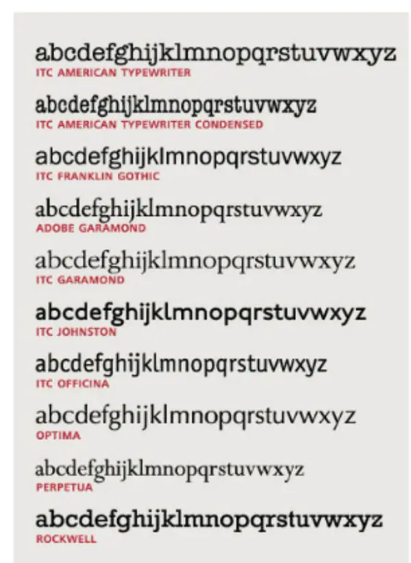
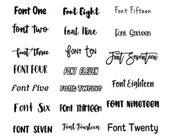
The most basic choice for any content is the font selection. Correctly selected fonts make much difference in website design legibility. Earlier, we did not have much selection amongst the font styles, which left no possibility of choosing the wrong font style. But in this era, we have many choices with the font style selection. So, how to choose the right fonts?

You can choose large, bold fonts to highlight the header. For the rest of the content, the font style should be chosen according to the structure of the content and should remain the same for the rest of the content. For example, if the main header contains five sub-headers, then all those five sub-headers should have a similar font style.

2. Font Size:

Website Design Legibility - font size

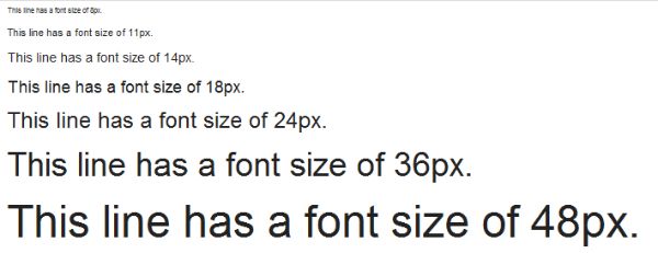
Too large or too small a font size can be scary for a reader who generally skims the content through different screen sizes. Fixed font size designed only for desktop devices may seem too large to fit the mobile phone or tablet screen. Too small font size may be an issue with the old aged person trying to read your content. And too big size may not fit all the screens. Hence, the font size should be optimum, which is easily readable on different screen sizes.

Initially, the font sizes were selected according to the number of pixels. But now the writers and designers use percentages that adjust the font size according to the browser settings of the device.

3. Color Contrast:

Website Design Legibility - color contrast

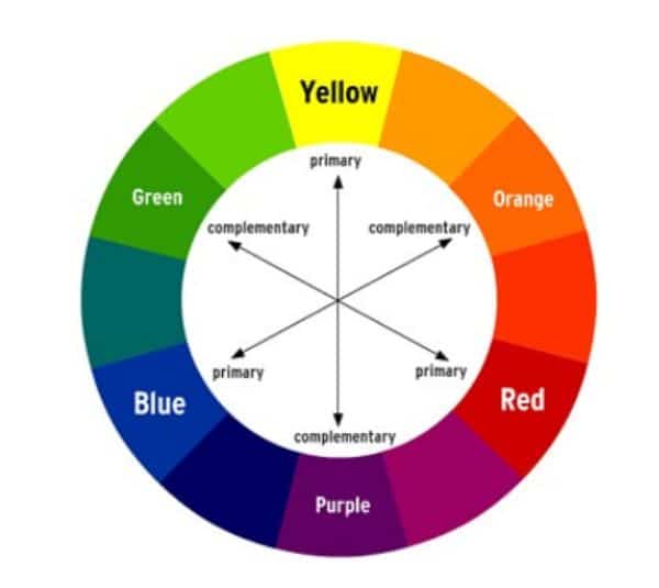
After discussing the font style and size, let us look at the color contrast that developers use. The general idea is to maintain a light backdrop with dark-colored fonts that enable the reader to read the content easily without squinting his or her eyes.This is a charactetstic of good website design legibility. The light-colored background against the dark color font employs psychology that the eyes of the reader are compelled to see and read the content in front of them.

But, if the background is bright-colored like indigo blue and the font color is yellow, black, red or green, it drives the reader away because no one wants to look at such color contrast.

4. Line Length:

Website Design Legibility - line length

Line length is the number of words/characters stuffed in one line before the sentence breaks down and drops the content into the next line. A general tradition is to write 50-60 characters per line for great website design legibility. But, if the line length is too big, the reader may get lost while navigating between the sentences of the content and may find it difficult to read the next line correctly.

There are chances that they may have to scroll right and left to read your content which is not very friendly. Hence, the line length should never be too short or too long. And it should be according to all the devices that your target audience uses.

5. Compact Paragraphs:

compact paragraphs

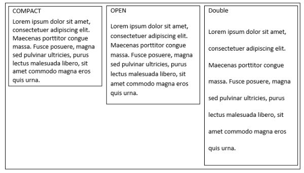
The paragraphs of the content should be short and concise.This allows to improvise the website design legibility. Today’s reader is used to scanning and perusing the content through short paragraphs to find the useful bits and pieces of the information. Longer paragraphs may make the user scroll through the entire content, and the user may leave the page eventually. Hence, a paragraph with 3-4 lines is advisable to use in the content to make it reader-friendly.

6. To-the-point content:

website design legibility- to the point

The content should focus on the topic without beating around the bush. Constant blabbering about the topic may make the reader lose interest because the readers are used to scanning the content to find whatever they need. Hence, the content that talks about exact things are generally preferred than the large thousand-words content.

7. Minimizing the jargon:

website design legibility- avoid jargon

The point of writing the content is to help the reader understand the information you are trying to convey. Heavy technological terms and difficult-to-understand the content language, makes the user feel stupid. Hence, reader-friendly content is the kind of content that helps readers understand the concept that you have thoroughly understood.

8. Formatting and structuring the content:

formating and structuring content

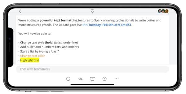
Correctly formatted text is successful in drawing the reader’s attention at the right places and focus points. Focus points are the points that are important things that the reader needs to read, which envelops the underlying meaning of the content.  It helps with website design legibility.

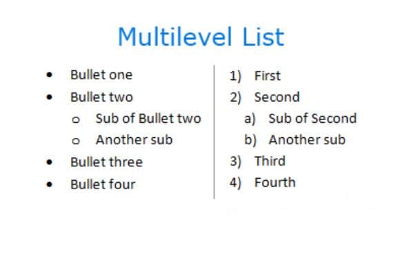
The text should have the correct amount of white spacing that would compel the user to read the content. The text consistency should be maintained at all times. For instance, a bulleted list should have a similar font style and size; the headers should have the same font color, style and size; all the sub-headers should be italicized if the first sub-header is in italics. That helps maintain the flow and the context of the content.

9. Text density:

Website Design Legibility- text density

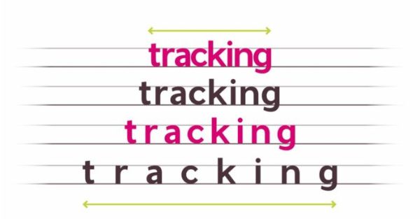
Text density is the number of words arranged in one point of the page area- the more number of words in a specific area, the less readability of the text. The text density is decided upon factors like line-height, font size, character spacing and line spacing. These factors decide the text density and eventually, the appearance of the content. And text density should be maintained throughout the page with the same consistency.

Generally, writers use text highlighting to draw the reader’s attention to a specific point or term. They highlight the text by italicizing them, putting them in a different color, or simply by quoting them under the double-quotes. Not everything but, important words, phrases, or idioms should be highlighted to enhance and draw attention to them.

10. Content Structure:

website design legibility -Content Structure

Even if all the above factors are considered, the content is meaningless if it is not well structured or placed in a certain hierarchy. The structured content looks systematic and well readable. Using a graph for showing the statistics, images or pictures to depict certain points, bulleted lists for enlisting important points, makes the content reader-friendly and easy to navigate.

11. Implementation of Graphics:

implementation of graphics

Web content on any web page requires some kind of graphical representation. Graphics may include static maps, images, videos, audios, icons, and more. But they should be arranged clean and clearly so as to not to interrupt the flow of the content.

Any graphical representation like images, graphs, maps, or videos should be placed into the borders to differentiate the textual content from the graphics systematically. It should be taken care that it is not very heavy sized-graphic, and it does not take much time to load on slow-internet devices.

It should also be taken care of that the image does not bleed out of the boundaries or the screen size. Sometimes, the graphics take so much space that it bleeds out of the visible screen space. This results in the reader having to scroll up and down or sideways.

12. Separators:

seperators

The text should be divided into different sections to enhance the readability for the user. It should also differentiate one group of text from another. Hence, the use of separators becomes imperative to structure the content according to different parameters.

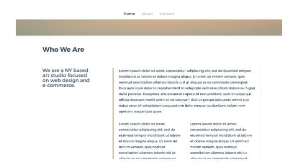
The simplest way to divide and structure the content is through lines. Lines can be used vertically or horizontally to divide the text elements and to draw the hierarchy of the content. The line should be simple and subtle.

Another way to separate the text is by using the boxes. Boxes or text boxes can be used to divide the content according to the sections and the subsections of the content. They can be arranged nicely to allow the reader’s eyes to gauge the flow of the content on the page.

13. Margins:

margins

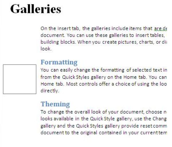
Margin is one of the key elements of the white space domain. Containing text in margins helps the reader draw and maintain focus on the content’s core body within an article.

Margin also helps to differentiate between the content and the rest of the page layout. It should be ensured that the text does not bleed into the layout of the page and the other elements of the page.

14. Typography styling:

typography styling

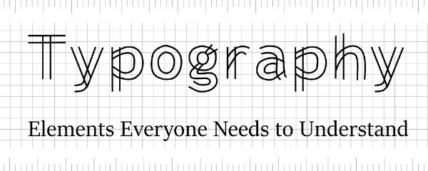
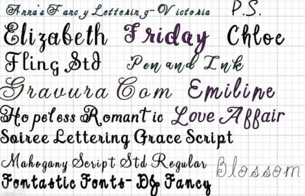
Generally, text against a plain, monochromatic backdrop works the best and has been a tradition for a very long time. But, occasionally, playing around with fancy texts on a fancy background cannot harm as far as the text fonts don’t lose their readability on given screen size. There are so many ways to implement fancy text and experiment with them.

15. Fancy Textual Representation:

All the content written in the same font style can be a bit monotonous, especially if the article is very long. Hence, adding some different font styles for certain kinds of content can add up the zing in the content making it aesthetically attractive to the reader.

For instance, putting headers in different font styles may add the fun element to the content. We could also differentiate the headers and subheaders according to the selection of the fonts. But, the only condition that comes with using the fancy font style is, to use a font style that doesn’t decrease or eliminate the readability of the content in the article.

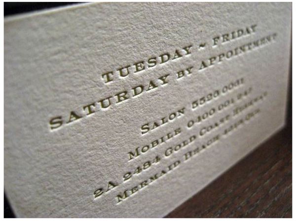
16. Using letterpress styling:

using letterpress styling

Letterpress is used to add depth to certain content on the page. It offers a kind of look to the content where the text in the letterpress looks like it has been embossed. This looks as if the text is pushed in the writing space and has been impressed with it.

It looks clean and helps adjust the flow of the content according to the usage of the letterpress. For instance, to add some quotes from the famous writer, the letterpress can be used to emphasize the importance of the adage as well as to attract the reader’s focus on the adage.

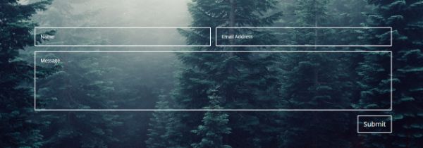
17. Background styling:

background styling

The text readability is enhanced if the background is designed nicely. A good background can make an article look good. It also increases the website design legibility. The background should not be very bright. Otherwise, the reader would have to squint through his mobile screen to read the content.

The background can be plain in some subtle muted colors where the text is readable. It can also be a textured background in muted shades where the focus of the reader is still on the text. The only condition is, the shade of the background and the font color should be decided in such a way that the contrast between the two is maintained.

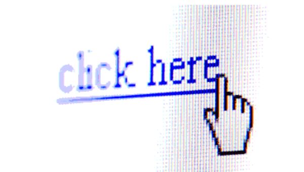
18. Styling the hyperlinks:

styling with hyperlinks

When the articles are too long for a user to read, the links often get washed out in the content of the article. Hence, to make the hyperlinks in the article stand out, they can be styled too. If the hyperlink is in the middle of the content, then it can be put in the bold or can be italicized or underlined.

But if the hyperlink is, for instance, given to a text that is lonely and away from the crowded content, then the hyperlink can be put into the stylized fonts. The color of the hyperlink fonts also can be fixed according to their performance. For example, if the link has not been clicked yet, it should stand out in red fonts. And, if the link has been visited, the link should change its color from red to let’s say purple or dark grey which depicts that the link has been visited once. You can also use a painted background for the links to enhance the readability as well as its aesthetic looks.

After looking at the above points, it is very clear that no matter how nicely written the content is, or how perfectly it is optimized, if it is not readable to the reader, it holds very little value.

The post 18 Tips to Improve Website Design Legibility appeared first on Line25.


Source: https://ift.tt/35knS8L

Design your way

Photoshop is one of the most popular tools for graphic and web designers, and it is a go-to software for many people in this industry because it is simply one of the best pieces of software. It offers plenty of tools for various purposes, too. In this article, we will look at some cool Photoshop splatter brushes you can use.

There are many Photoshop brushes that are useful for many things. Besides, a small action such as changing your brush can entirely change the face of your design, and it is a small and simple adjustment to make. Nowadays, there are many high-quality brushes to use in Photoshop; some are bold, which makes them stand out more, while others are a bit subtler and can be used to keep variety in your design. The brushes that are available today offer a high level of detail for your design and can be used to enhance your image in minutes.

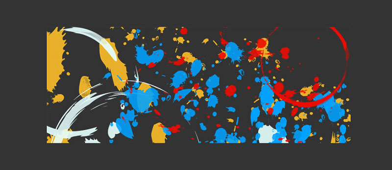
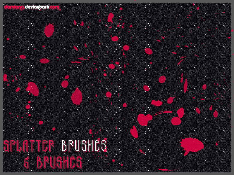
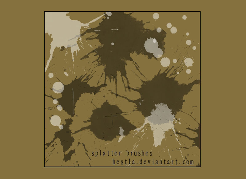
Splatter brushes are one of the more popular ways that brushes can be used today, and you can use them with minimal to no work, thanks to Photoshop splatter brushes. You can achieve different textures with these brushes, which is essential if you are a designer.

Without further ado, let’s take a look at some of the best Photoshop splatter brushes to use in your designs.

Photoshop splatter brushes

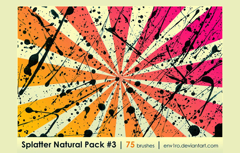
Splatter Natural Pack

Splatter-Natural-Pack Cool Photoshop splatter brushes to use in your designs

The first on the list is the compilation of 75 of natural-looking splatter brushes that you can use for your designs. Keeping variety is crucial, and that is exactly what this package tries to do.

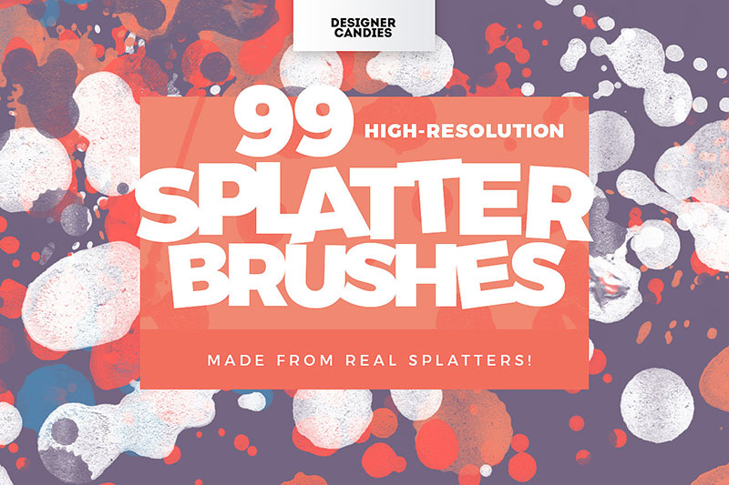
High-Res Splatter Brushes for Photoshop

High-Res-Splatter-Brushes-for-Photoshop Cool Photoshop splatter brushes to use in your designs

These Photoshop splatter brushes are excellent – you can maintain the high resolution with them, and they work in various different designs. There are 99 splatter brushes to choose from, which allows you to have flexibility and also quality for your work.

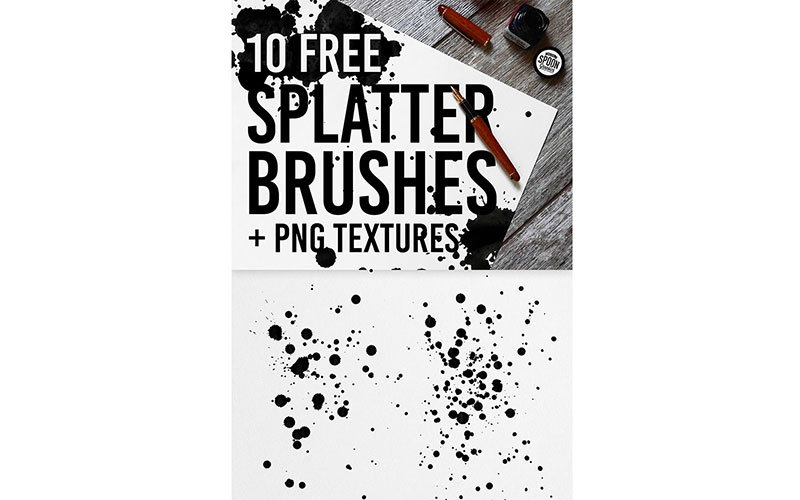
10 Free Ink Splatter Photoshop Brushes and PNG Textures

10-Free-Ink-Splatter-Photoshop-Brushes-and-PNG-Textures-1 Cool Photoshop splatter brushes to use in your designs

There are 10 ink splatter brushes in this package, and all of them are completely free to use. That is great if you are working on a budget, plus they bring plenty of variety to your designs. You can simply download them and use them in Adobe Photoshop. Additionally, there are PNG textures that have transparent backgrounds that you can use.

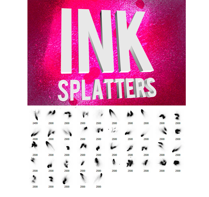
Grungy Ink Splatter Brushes

Grungy-Ink-Splatter-Brushes Cool Photoshop splatter brushes to use in your designs

If you are looking to add some grunge to your designs, there are 45 different Photoshop splatter brushes in this package that can help you achieve that.

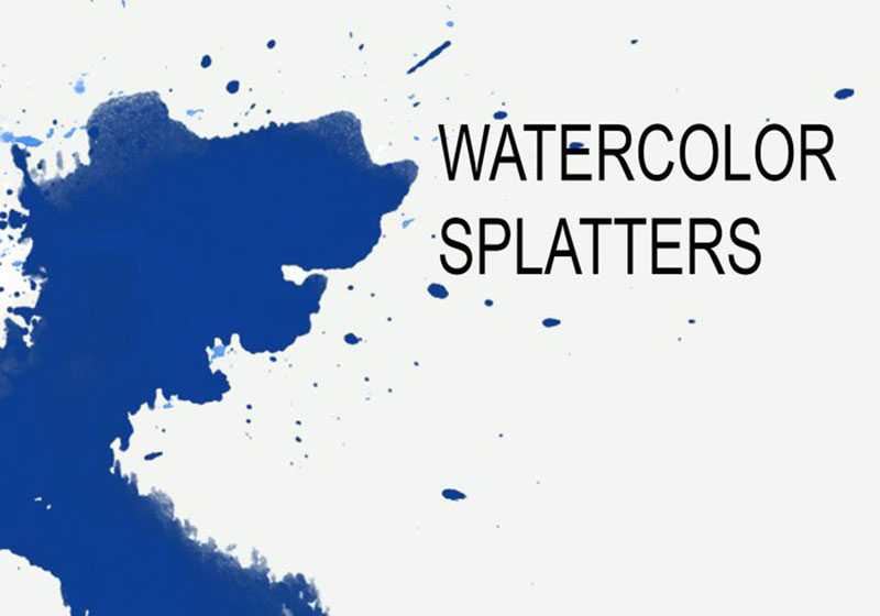
Watercolor Splatter

Watercolor-Splatter Cool Photoshop splatter brushes to use in your designs

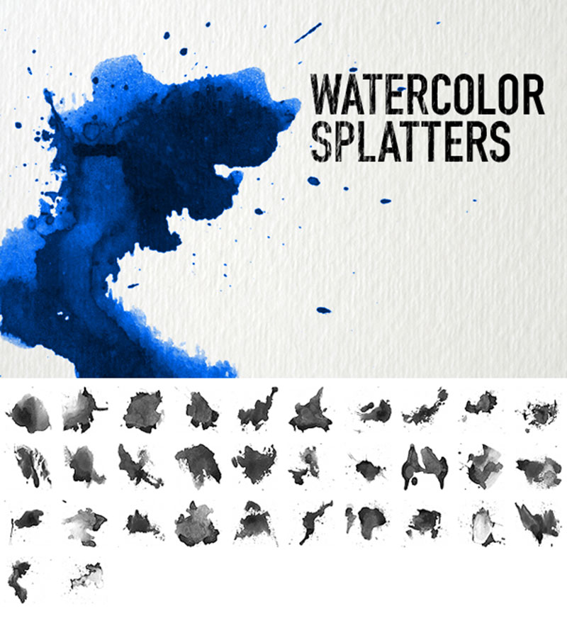
Available for personal and commercial use, these 32 watercolor splatter brushes can be used for your projects without attribution. They will work with Photoshop 7 or later.

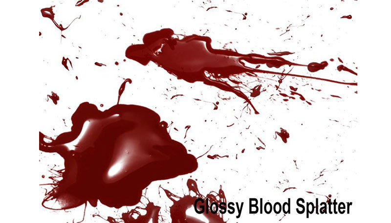
Glossy Blood Splatter

Glossy-Blood-Splatter Cool Photoshop splatter brushes to use in your designs

Add some gloss and blood effects with these splatter brushes. You can download them and use them for your designs now.

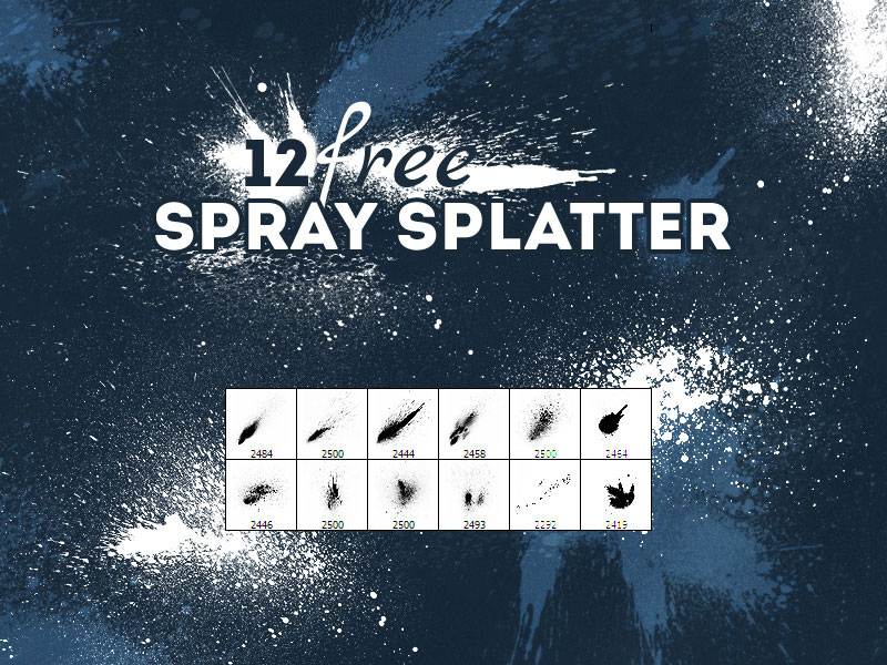
Free Spray Splatter Photoshop brushes

Free-Spray-Splatter-Photoshop-brushes Cool Photoshop splatter brushes to use in your designs

Superb for poster and flyer designs, these spray splatter brushes are an excellent choice if you are looking for that. There are 12 brushes to be had in this package, and they are completely free to use.

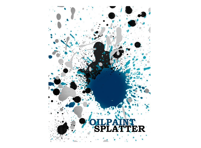
Oil Paint Splatter Brushes

Oil-Paint-Splatter-Brushes Cool Photoshop splatter brushes to use in your designs

If you love oil paint, then you can’t go wrong with these Photoshop splatter brushes. You can use them right now for one of your projects.

Splatter and Watercolour Brushes For Photoshop

Splatter-and-Watercolour-Brushes-For-Photoshop Cool Photoshop splatter brushes to use in your designs

There is a lot included within this package of splatter and watercolour brushes for Photoshop. It contains 3 packages of 21 brushes, and all of them are of a high quality standard. The average size is 2500px or 2200px. Primarily, these brushes are meant for Adobe Photoshop, but they also work for GIMP. As we are focusing on Photoshop, these will work great on the platform. The best thing about these sets is that they can be used completely free for personal and commercial activities.

High Res Splatter Brushes

High-Res-Splatter-Brushes Cool Photoshop splatter brushes to use in your designs

This set of 26 Photoshop splatter brushes offers sizes of up to 2500px, and they can be used for a variety of different projects, including print.

Splatter Brushes

Splatter-Brushes Cool Photoshop splatter brushes to use in your designs

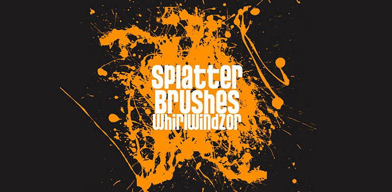
You can download these splatter brushes that are of a high quality, and they are free to use. These will look amazing in your projects.

Watercolor Splatters

Watercolor-Splatters Cool Photoshop splatter brushes to use in your designs

Another set that is completely free to use without attribution, it is a collection of 32 different splatter brushes with high resolutions.

Splatters Stains

Splatters-Stains Cool Photoshop splatter brushes to use in your designs

These 12 splatters and stains are a good way to liven up your design and make it a little bit more exciting and interesting. It is compatible with Photoshop CS3 or above.

Free Splatter Photoshop Brushes

Free-Splatter-Photoshop-Brushes Cool Photoshop splatter brushes to use in your designs

This set of 5 splatter brushes is also free to download, and offer sizes of 800px or higher. It can be used in both Illustrator and Photoshop.

Watercolor Reloaded

Watercolor-Reloaded Cool Photoshop splatter brushes to use in your designs

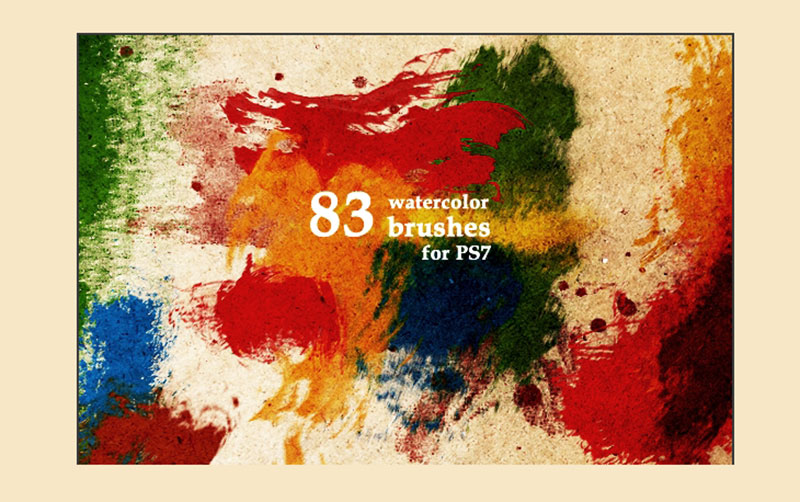
Photoshop 7 or higher is required for these brushes. 83 high-res brushes are included in the package, and they can be used to depict watercolor in a nice way.

Splatter Brush Pack

Splatter-Brush-Pack Cool Photoshop splatter brushes to use in your designs

These 12 splatter brushes are a great way to make your designs interesting. Also, they are free to download and use in your projects now.

T8 Splatter Brush Pack

T8-Splatter-Brush-Pack Cool Photoshop splatter brushes to use in your designs

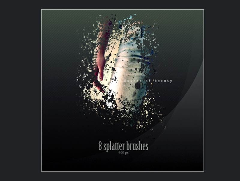
There are 8 Photoshop splatter brushes that can be yours if you decide for this pack, and all of them are free to use. These are all high-quality, so despite the fact that they are free, you can expect a good standard.

Authentic free paint splatter Photoshop brush set

Authentic-free-paint-splatter-Photoshop-brush-set Cool Photoshop splatter brushes to use in your designs

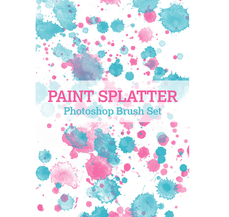
If you are looking for authentic and realistic Photoshop splatter brushes, then this package is surely the one for you. These essential brushes can add realism to your designs, as their high resolutions and realistic displays can take care of that.

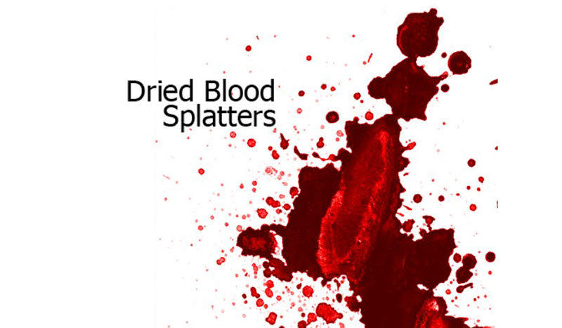
Dried Blood Splatters

Dried-Blood-Splatters Cool Photoshop splatter brushes to use in your designs

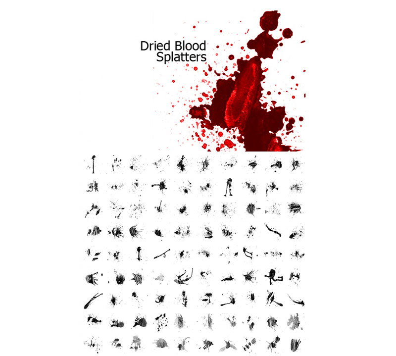
An astonishing set of 117 different splatter brushes that were created by watercolor. You can create blood effects with these brushes, and many of them add color and variety to your designs.

Splatter Brush

Splatter-Brush Cool Photoshop splatter brushes to use in your designs

Take a look at these 13 different splatter brushes that you can use for Photoshop 6 or later. They can add a lot to your projects.

Splat SprayCan Brushes

Splat-SprayCan-Brushes Cool Photoshop splatter brushes to use in your designs

In this package, there are 6 authentic brushes included, and 2 different variations of brushes, which amounts to a total of 8 brushes. Best of all, they can be used completely for free and without credit.

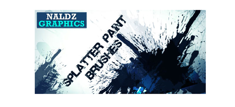
Splatter Paint Photoshop Brushes

Splatter-Paint-Photoshop-Brushes Cool Photoshop splatter brushes to use in your designs

This set of Photoshop splatter brushes contains 7 brushes of a very high quality, and you can download them completely for free. Suitable for Photoshop CS4 or newer.

Dried Blood Splatters Photoshop Brushes

Dried-Blood-Splatters-Photoshop-Brushes Cool Photoshop splatter brushes to use in your designs

Another package of brushes that can be used to create an effect of dried blood, and they were created with watercolor. These beautiful brushes can be used to create blood, and can paint in UV light. There are 117 brushes contained in this package.

44 Splatter Brushes Pack

44-Splatter-Brushes-Pack Cool Photoshop splatter brushes to use in your designs

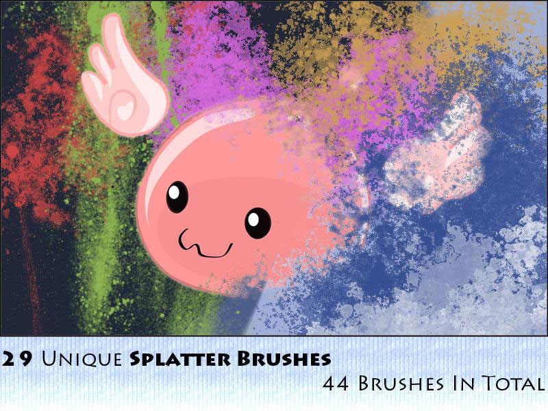
An amazing package of 44 splatter brushes, that can add plenty of variety to your designs. There are 29 clean brushes, and 15 of them use various effects. In total, there are 6 different styles included in these packages, which is amazing for keeping variety in your projects.

Overall, brushes are a simple but effective way to change the face of your designs completely. Splatter brushes are very popular, and some of the sets on this list include some amazing Photoshop splatter brushes you can check out.

If you enjoyed reading this article about Photoshop splatter brushes, you should read these as well:

The post Cool Photoshop splatter brushes to use in your designs appeared first on Design your way.


Source: https://ift.tt/3bN4yUh

10 Best WordPress Child Themes

Tuesday, April 28, 2020

WordPress child themes are themes that take the functionality from another theme which is known as the parent theme. WordPress child themes are used to customize or tweak the existing WordPress theme without having to let go of the ability to upgrade the theme and lose the custom changes. Before child WordPress child themes became widely available, there was a lot of hassle when it came to updating WordPress themes without losing all the custom code changes and custom styling that you had made.

The problem began when a WP theme developer updated their theme, and that theme was now better than your current theme. WordPress users would then have to update the current theme to get the new features. So, it became a difficult choice, whether to update and lose all the custom changes, or not update at all. In a situation of chaos and confusion, to solve this problem, the community and the core WP team created the concept of child theme and parent theme. The child theme in WordPress would derive the features, quality, functionality and the code of the parent theme, yet bring no changes in the child theme which was modified by the end-user.

Deriving functionality granted the users ability to add and modify elements of the parent theme in child theme, and not to lose the ability to update the parent theme. So basically, every WordPress theme can have a child theme, but every WordPress theme may not be a good parent theme. If the WordPress theme has fewer features and functionality, it would not be an ideal parent theme.

Only if the WordPress theme has better functionality and has its filters and action hooks, it can be a good parent theme. Only a better parent theme would enable the developer and designers to create an advanced child theme.

If designer and developers need to speed up the development, then they must use child themes. Using a theme framework reduces the time taken to create a WordPress site. The primary thing about theme framework is that it has numerous customization options, functionality and features which allows you not to code everything. Child themes are created not to lose the ability to update the parent theme when needed. An excellent child theme can have template files as much as the parent theme or more than that. It is also possible that the child theme can have template files which the parent theme doesn’t.

Child themes are for those who continuously keep adding, altering or modifying in the current theme. Child theme is ideal for changing the theme  you use. If the WordPress developer must keep the workflow maintained and create a quality theme, then the child theme helps them with it.

Here are 10 best WordPress Child themes for you to use:

1. Travelador:

WordPress Child Theme - Travelador

Travelador theme is an amazing and one of the best responsive WordPress child themes. This is the best option for the LayersWP framework and the SiteOrigin site builder. It is considered one of the consistent themes which fulfil the full range of website niche beyond the travel.

It comes with multipurpose layout, fully responsive design and several header styles. To make the setup more accessible, the developer has provided import files. The feature of available page builder, the possibility to add custom CSS and customizable widgets the theme proves to be the best choice.

2. Axiom: 

WordPress Child Theme -Axiom

Axiom is an attractive WordPress Child theme. It is ideal for people who want to build a portfolio website. It is also to build the LayersWP framework. The theme has given more importance to the typography and for pixel-perfect design.

With the responsive portfolio grid, the theme allows you to display your best photos and videos. The Axiom theme has a commercial plugin which another plugin doesn’t have, which is supported by WooCommerce. This enables the user to access demo install feature.

3. Outfit:

WordPress Child Theme - Outfit

Outfit theme is best suited for corporate, business and agency website. It is one of the themes built using layers of the WordPress site builder. The theme has multiple layout styles that also includes e-commerce layout.

Outfit theme also has a clean code. The theme has a fully responsive layout and unlimited colors. Outfit theme has an easily customize structure which proves that the theme is the best choice when it comes to the WordPress child theme.

4. Enaa:

WordPress Child Theme - Enaa

Enaa theme has fully responsive layouts, clean and straightforward design. It also has an advanced composer.

Enaa theme has multiple color options for its creative layout and layout. It also has five homepage variations. With all these features, Enaa is one of the best WordPress child themes among the other choices.

5. Dawg:

WordPress Child Theme - Dawg

Dawg is one of the premium child WordPress themes that caters to you and your clients’ needs. Elementor plugin support enables you to edit all the theme pages and their styles fully. You can install the demo with just one click.

Dawg theme is a LayersWP WordPress theme. It is a lightweight and straightforward, structured theme compared to the other themes. It would be a great niche theme for your upcoming website.

6. Dosa:

Dosa

LayersWP framework supports Dosa theme. This theme is suitable for food-related websites and cafes or restaurants. The theme has the best features and layout, which makes the management of the site easy and flawless. It  has a robust reservation system that makes dealing with the reservations, confirmations, custom email messages for customer, cancellation and much easier.

The theme has a food menu list that would help you to create food categories and add different prices for the variety and highlights. The theme has a fully responsive design, PSD templates and Google web fonts too. Premium slider revolutions and Business hours pro plugin that features in the theme help you display the time that your café or restaurants work.

7. Coffeecafe:

Coffeecafe

Coffeecafe is an amazing one page responsive WordPress childtheme. If a designer or developer must create a website for a restaurant, café or bakery. Coffeecafe would be an apt theme. Coffeecafe is a child theme of NovelLite and so it has all the functionalities of the parent theme.

Due to the parent theme it makes easier for the Coffeecafe theme to display the dining menu, daily special, drinks menu through the WooCommerce plugin.

The theme can add restaurant timings, contact number and other information, happy hours through the custom widgets. Coffeecafe theme also has background color option, front page section and parallax effect too.

8. Mist:

Mist

Mist theme is ideal for a business portfolio or marketing websites. It comes with a clean yet modern design. The theme also has a well-written code and is also lightweight, which makes it an ideal theme. Layers WP framework supports the theme. With numerous flexible custom page builder elements in Mist theme makes it one of the best choices amongst other themes. Mist theme has integrated WooCommerce.

The theme has natural color and image selection. The theme includes an options panel that has single and multiple page designs. Extensive documentation is one of the features of the Mist theme, which makes it an ideal choice for a recommendation.

9. Cross:

WordPress Child Theme - cross

Cross theme is supported by LayersWP framework, which has multiple ranges of features and functionality. The theme comes with WooCommerce integrated by default. Cross theme comes with a variety of premade designs. Image selections and natural colors are one of the features that come with the theme.

Cross theme would enable you to transform your website into a full-fledged business selling tool. With the fully responsive design layouts and easy customization, the theme allows them to create a professional as well as a personal website. Creation of theme design is in a way which gives the best user interface and user experience, which keeps the visitors hooked to the site. The cross theme makes sure the users are well directed and has a fantastic experience browsing through your website.

10. JIRO:

JIRO

If you are searching for them that is a mixture of great designs and excellent performance, then JIRO is your answer. The theme is known for the best option control. The JIRO theme based on Layers WP framework has layouts which are clean and has a minimalistic approach. The design in the theme is best with the customization option that comes along with it.

The theme comes with increased layout control which helps you in creating widgets and control your website in a much better way. JIRO theme has an attractive and modern style which ditches the old traditional themes. The theme has a demo content, SEO optimization and three premium WordPress plugins which makes it better than another WordPress child theme.

Why You Should Use WordPress Child Themes

WordPress child themes ensure safe updates. As the child theme derives the features, styles and functionality, it allows bringing changes to the site using child themes without altering the parent theme. You can update the parent theme when a new version arrives as all the changes made are saved in the child theme.

When you use a child theme, it has incredible flexibility with less coding. You can add a new feature or functionality and selectively modify the files and functions without going through other template files. While creating a new theme altogether, you must consider the possible outcome or scenario and code for them. But when you work on the child theme and you miss to write code, then you can always have the functionality of parent theme for backup.

When using child themes, it allows you to have modification and alterations, yet keeping it separate from the parent theme. Using a child theme has a benefit for those who like to customize these files. The website developer adjusts through File Transfer Protocol (FTP). While using a child theme, you don’t have to put in a lot of time while modifying it through FTP.

Using child theme allows you to have faster development as you don’t have to code from the basic as you have parent theme to fall back on for functionality. Coding is a time-consuming task and child theme allows you to make alterations. The changes make the development more cost-effective and efficient for having faster growth opt for using a child theme.

When you need to create similar websites keeping the visual intact, then copy-pasting the files from the child theme is more comfortable and takes less time. You can even use the themes on multiple domains and modify them at once as it is accessible to interchange content like logos, icons and color changes in the WordPress themes.

When you create a theme from the scratch, there are times when a mistake is bound to happen. The error would lead to a lack of functionality and faulty websites. However, having an elegant parent theme ensures backup being effective. Even if you forget to code something while creating a child theme, you won’t have to suffer as the parent theme you are working on has the functionality on which you can fallback. A popular theme framework supports child themes to get going.

In this roundup of 10 excellent child themes for WordPress users, we hope to have given you the best WordPress child theme that has a functional yet amazing website design.

The post 10 Best WordPress Child Themes appeared first on Web Design Blog | Magazine for Designers.


via https://ift.tt/2yPMzOo
 

The Cash Box Blueprint

Most Reading