Each brand has a visual identity and automobile manufacturers focus a lot on their logos. This is also valid for the well-known Hyundai brand that has for sure something behind their logo in order to make people interact better with the brand.
The Hyundai logo has been live for quite some time and it is one of the easiest to spot logos even today. They did a great job at keeping it simple so let’s discover more about this brand and their history.
The History of Hyundai
The Hyundai Motor Company was launched in 1967 and is one of the younger automobile companies on the global market. Despite this, in less than 50 years they managed to do a great job. Their headquarter is based in Seoul, Korea and are in the lead manufacturers because of their sales numbers. The Hyundai logo is a simple one and their customers really appreciate it.
Hyundai business made some smart moves especially when they hired some British engineers that designed their own model Pony. This car was an international success and sales started to come in. After that, with different models launched and Hyundai became one of the most fast-growing companies in this domain.
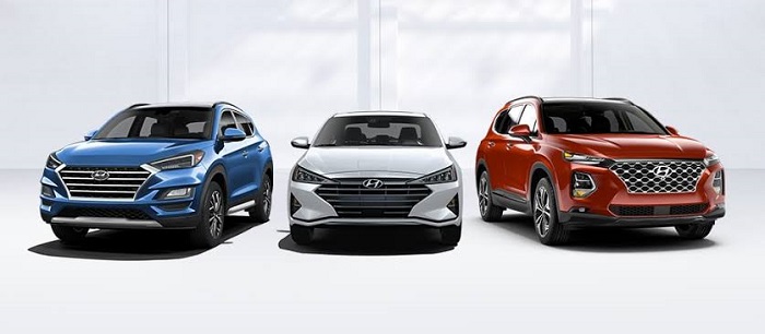
Today they sell different vehicles like SUVs, commercial transport and also hybrid cars. If you didn’t know they own also Kia Motors and the luxury division Genesis Motors.
The meaning of Hyundai
The Hyundai logo comes from the Korean word “hanja” and what they focus on is modernity so the brand has an innovative vibe into their vehicles. They are constantly investing in technology and have six research development offices throughout the world.
The Hyundai Logo
Similar to other Asian companies Hyundai went for a simple nameplate on its cars when they first started producing them. The image of the manufacturer remained neutral for many years but as the business grew it was more and more clear that the Hyundai logo had to be changed so that people would associate it easier with the brand.
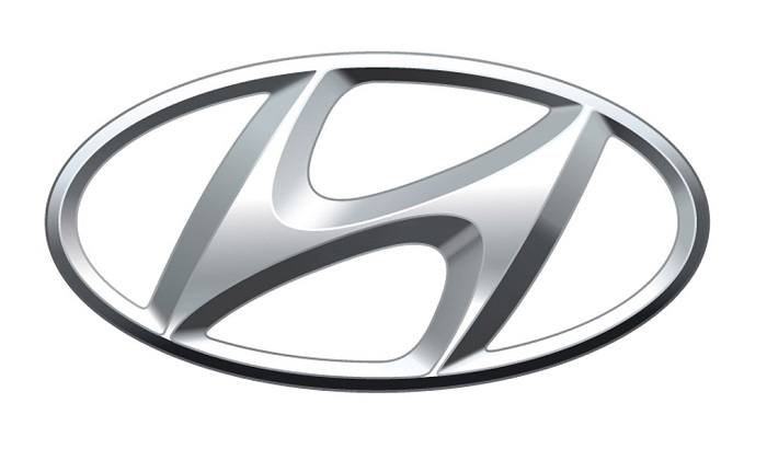
This made the Hyundai designers come up with a simple image, a titled H letter that was embedded into an oval shape. The initial Hyundai logo had a period when it was confused with the Honda one but as time passed and the company became a major player in the automotive world people started to get used to it.
So, the basic H letter that they use in the Hyundai symbol is a bit tilted to the gift side. They did this in order to offer it a smooth impression in order to have an attractive image of the brand.
Hyundai Logo Meaning
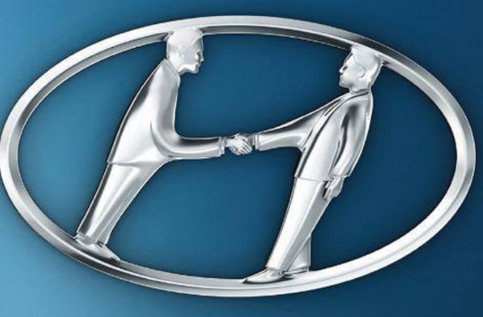
The original Hyundai logo has two meanings. The first is that it acts like a normal H letter that represents the Hyundai brand but it is also the image of two people that are shaking hands together.
For sure the people that are presented in the Hyundai logo are the company and the customer that are together in an agreement. So, what the logo shows is for sure the vision that the company has because it is providing high-quality services and great cars to all its customers.
The Hyundai Logo Description
Its Shape
The shape shows the growth that Hyundai has had in the last years together with the idea of expanding their market outside the Asian continent
The Color
When you see the logo, you will see that the color they used is silver. This color stands for creativity and perfection. The digital format is usually in blue and they did this to show excellence and reliability.
What is cool about the Hyundai logo since its start is that compared with other car brands that changed dramatically over the years this brand remained with its original design.
The Font
The wordmark is done using bold capital letters and the letterforms have their own distinctive look because of the specific combination of sharp and rounded angles. Because the “U” looks like the “N” turned upside down creates an effect of symmetry and shows that the two parts of the wordmark are really not symmetrical.
The History of Hyundai Logo
Hyundai is a South Korean multinational that has its headquarters in Seoul and since 1967 it has been growing a lot. It now has more than 70,000 people in the entire world together with 5,000 dealerships and showrooms.
Hyundai first provided an assembly for Ford Cortina and later one by hiring their own engineers and designers they created a rear-wheel-drive car the Pony. This car was a big success and it was produced till 1990.
This model was proved to be one of the bestselling models and after Hyundai became the brand that they are known today. Further one they also started to make hybrids and SUVs. The brand owns the well-known manufacturer Kia Motors that produces vehicles in Korea.
At first, they did not have a logo and they just used a simple plate but after a few years, as the company expanded, they came with a unique logo that we can see today on all of their cars. Focusing on trustworthiness the designers really did a great job and built a great version for the brand.
The Hyundai logo evolution
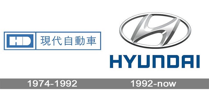
The logo that they are using today hasn’t got that much stuff in common with their predecessor. The Hyundai emblem started to be used in 1974 and the old logo was built around a stylized letter “H” but here it looked different. IT was flat and static lacking the movement effect of the modern logo.
Next to the letter, you could see a small “D” that looks a bit like a shade coming from the “H”. The letters were placed in a black frame that had a rectangular shape. They used it till 1992 when the “H” was introduced again as their logo.
2017 to date
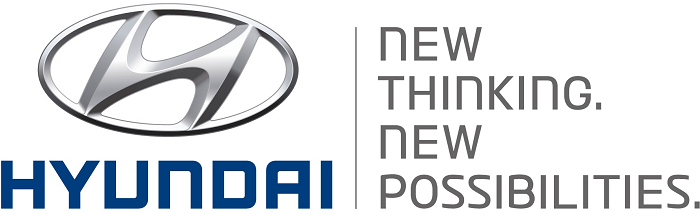
In 2017 the design team of Hyundai made a new global identity. It brought besides the Hyundai logo other elements as well. The changes were subtle but made the logo look better, especially if you check all the advertising, they did start with 2017, 2018 and further.
One of the most important modifications done was around the slogan “New Thinking. New Possibilities.” that disappeared from their logo.
Genesis logo
Compared with other models that they produced; Genesis had a badge of its own. After it was first launched some people claimed that this became a brand of its own. In 2015 Hyundai officially gave Genesis the status of a standalone marque and the Hyundai logo that was on the rear trunk disappeared and left only the Genesis logo.
If you enjoyed reading this article on the Hyundai logo, you should read these as well:
- The Amazon logo: Its meaning and the history behind it
- The Pepsi Logo: The old, the new, its meaning and history
- The Disney logo: All there is to know about the Walt Disney brand
The post The Hyundai logo and the message behind its symbol appeared first on Design your way.
Source: https://ift.tt/3aWuV9Q


No comments:
Post a Comment