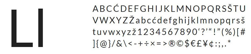
Gotham was one of the pioneers of the new millennium. It was designed by Tobias Frere-Jones, who was inspired by the shapes of the letters he saw during a trip to Manhattan, especially those used for architectural or signage purposes. Thanks to its characteristic American style, it is easy to find fonts similar to Gotham, although the wide list of options can be somewhat intimidating.
However, you should not worry, since this typeface even combines perfectly with its European counterpart thanks to its enormous versatility. This is the main benefit of being a sans-serif letter with defined features, with many options in terms of thicknesses, and with italicized versions for each one.
As we mentioned, this typeface has an origin in the technical designs of the last century. A similar style is Futura font; they are letters that tried to emulate the architectural movements of the 20s, where there was the concept of using only the essential and pure forms to design.
Despite having been created in a difficult time for the world, Gotham typeface managed to prosper, being part of important names such as Coca-Cola, or television programs such as Conan, Saturday Night Live, and even in some government offices such as Georgia’s customer service.
Those who use it describe it as a multipurpose typeface, which works well for both signage and marketing. If you are ready to use it, then consider this list of fonts like Gotham that will help you have a more harmonious design.
Fonts similar to Gotham
Montserrat – An urban signaling alternative
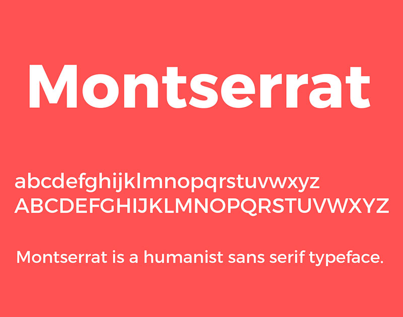
The origin of Monserrat is very similar to that of Gotham. The signs of a neighborhood in Buenos Aires inspired designer JulietaUlanovsky to make this font. In fact, the name of the font is in honor of that place.
The only Monserrat’s problem is that it is not as versatile as Gotham is. Although it has a couple of options in terms of thicknesses (9 in total), it does not have italics, which makes it more difficult to use in formal designs.
Nexa – A distinctive appearance
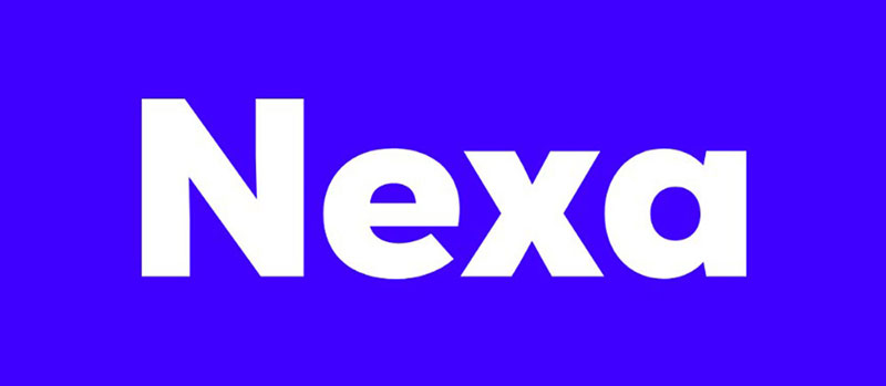
Because the design of this typography is widely inspired by Gotham, it’s easy to make them combine. However, this differs by having a couple of letters with particular shapes. Anyway, because it is free, you can save it in your collection for future use.
MuseoSans – Readability is important
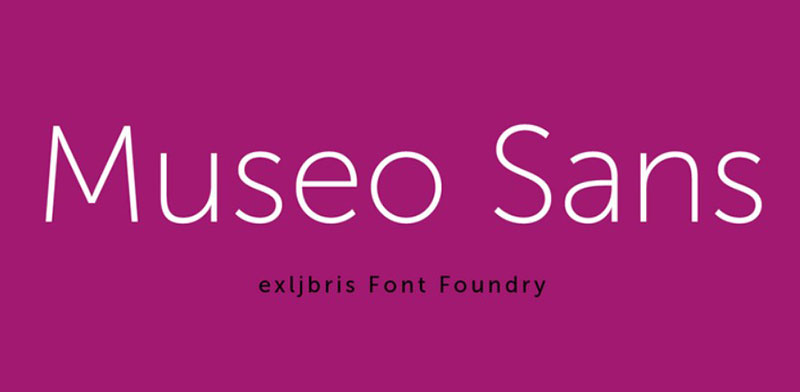
This typeface has two different fonts for free, but if we find it particularly useful in our designs, we can always purchase a Premium package with eight additional variants (each with its corresponding italics).
The greatest Museo Sans’ feature is that, thanks to its geometric pattern, it is an easy-to-read letter, so we can use it as part of the body of the text.
Pier Sans – Inspired by the beach
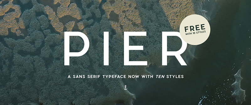
On this occasion, we show you 10 fonts similar to Gotham thanks to all the variants that Pier Sans includes. This letter feels somewhat more modern than Gotham, and its inspiration seems to be more focused in the Miami of the 30s, which gives a more seaside touch that is not found in Manhattan.
Lato – A modern perspective
Although Lato is much more recent (2010), that has not prevented it from being a font similar to Gotham, since it retains the spirit of being a Sans-Serif letter with some circular parts that give it a balance between a serious and casual design.
The letter was a corporate commission, so its use was exclusive. However, Dziedzic, who owned the rights, decided to make it public through Google Fonts.
Raleway – The neo-grotesque style
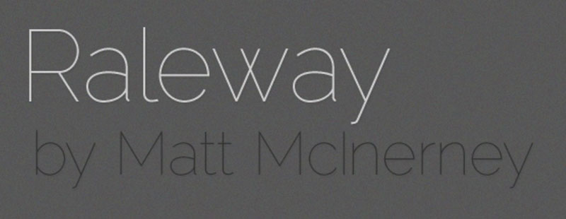
Raleway is a typeface specially adapted for monitors, which will comply with combining with almost any letter we use. The amount of glyphs in the package is immense, including all kinds of ligatures, symbols, old numbers, and even a variant of its letter with a more controlled and symmetrical design.
This Sans-Serif letter comes with 18 weights, each with its corresponding italics, so no matter what we use, we will have the complete Raleway library.
Avenir – The beauty of irregularities
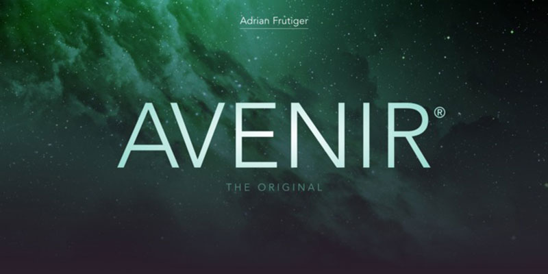
Adrian Frutiger is the designer of this letter whose name in French means “future”. Inspired by another letter that sought to have that modern appearance (Future font), Avenir is a typeface that, despite having a geometric nature, has more organic and human strokes, highlighting the imperfection in the thicknesses used between vertical and horizontal strokes.
Additionally, Avenir has some readability settings, such as an O that is not completely round, which allows it to differ from other similar characters.
Nunito – A more organic design
When it comes to more pleasing letters to look at, Nunito, both in its original version and in subsequent adaptations, stands out as a perfect replacement for Gotham Rounded. The rounded edges of this Sans-Serif letter make it easier to read and create a casual touch.
Although if we are looking for a formal design, we can always use the geometric version called Nunito Sans. The original version has up to 14 styles from which to choose, so it is a letter that works for titles and paragraphs alike.
Vision – For small formats
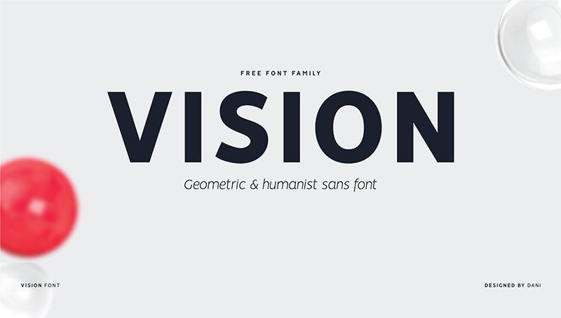
If we want a letter that can be combined with the different Gotham formats and at the same time does not take away its prominence, then Vision is the companion we are looking for.
Vision has thin strokes and less pronounced curves, especially in lowercase letters. This makes it perfect for prints and writings of compact sizes, since it hardly loses details.
Each of the 12 free alternatives has special characters, ligatures, and support for OpenType functions, which automatically adapts to the needs of users.
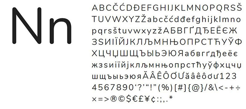
Neuzeit S – For corporate needs
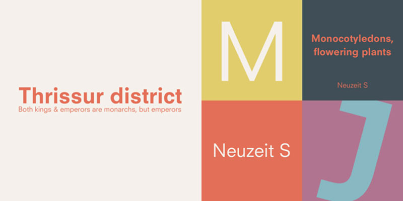
If we talk about fonts similar to Gotham, we cannot miss the entire Neuzeit family. This typeface has been widely used in corporate logos such as Siemens. Neuzeit S is a version that is based on grotesque typography of geometric design, and today it can be seen in different headlines of the Fox News chain as it works perfectly for monitors of any size.
Gothvetica – A curious mix
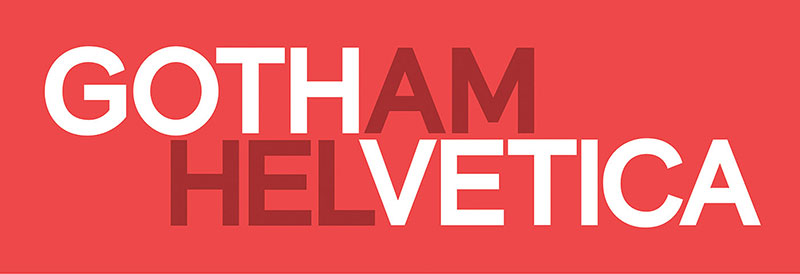
This is a mixture of jobs that could only be born from friends who wanted to laugh at some nonsense. However, the final product has excellent quality (to the surprise of many), and it is still possible to see perfectly the features of Helvetica and Gotham in it. Although we can only use it for non-commercial purposes.
Armitage – To complement the classic American style
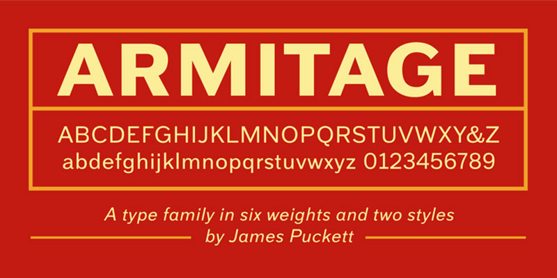
While Gotham is inspired by the last century, Armitage can accompany it because it has a very similar origin date, only this is from the late nineteenth century. As it has six different styles (all with italics), we can adapt it to what we want.
Gothic A1 – For foreign languages
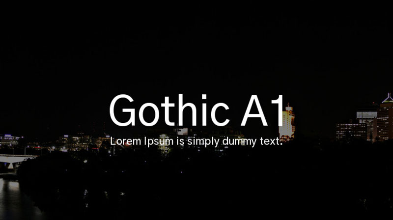
If we need fonts similar to Gotham but with other language support, then we need to install Gothic A1. This typeface has a virtually identical design, but it shines by having glyphs in Korean and Latin.
Foundry Sterling – Moving away from American roots
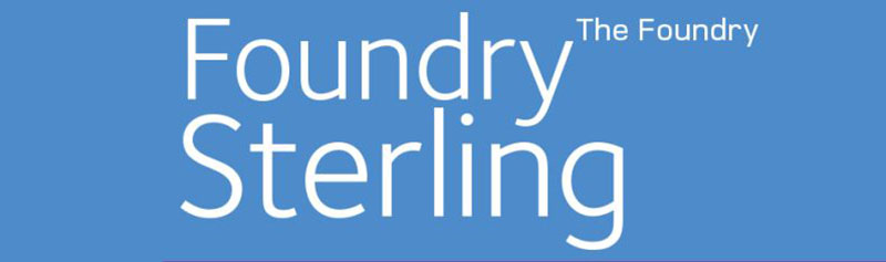
We may rather be looking to distance ourselves from the Manhattan-style that Gotham creates with a contrasting letter. For those cases, Foundry Sterling can stand out, since its inspiration and design reflects the elegant style of England. Likewise, we will enjoy many options in terms of sizes and weights, so it adapts to almost any job.
Kiona – A heavy style
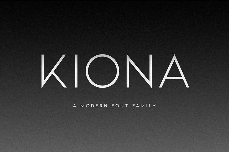
Kiona eliminates almost any additional aesthetic feature to focus exclusively on the diagonal lines of the letters, especially on the K and R. We can get this typeface in its standard variety for free, but other options need to be bought.
Coves – A pattern similar to Gotham
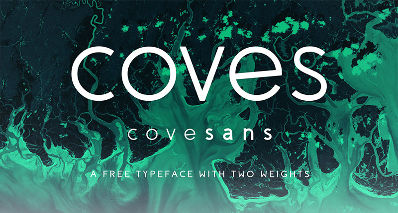
Although it has some differences, it is undeniable that many of Coves’s fonts have Gotham traces. The only problem with this typeface is that its use is restricted for non-commercial purposes unless we pay a license.
If you enjoyed reading this article about fonts similar to Gotham, you should read these as well:
- Font vs typeface, what’s the difference between the two
- Game of Thrones font examples
- Cool feminine fonts to download and use in your projects
The post Fonts similar to Gotham (Free and premium alternatives) appeared first on Design your way.
Source: https://ift.tt/342l3sx


No comments:
Post a Comment