The way we read a printed article and a digital article is very different. While with the paper, we tend to memorize everything we see and then analyze what it wanted to say, on the computer our eyes only perform a superficial reading to try to find the information we seek. That’s why when it comes to websites, it is important to select fonts that are easy to read so that our visitors want to review our content.
Probably at some point, you have had to write a digital project or letter, and you will have noticed that the most used letters are Calibri, Arial or Times New Romans. These are very good for their ease of reading, but they are so common and formal that we can hardly adapt it to designs that are not news pages or encyclopedias.
If we are designing a web page, we must select an easy to read font that matches the general style of the site, and that is also attractive to the readers, which allows them to focus their concentration exclusively on processing what they are reading, and not in trying to decipher an unintelligible paragraph.
This is especially important when we want to attract attention to a product, where we need the customer to know exactly what they are buying.
Let’s see a list with some striking but easy to read fonts that you can use on any page.
Fonts that are easy to read
Merriweather – Classic but modern
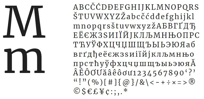
Sometimes the classic forms are the best, and that’s what happens with Merriweather, an easy-to-read typeface that has simply been modernized to work on modern screens. It does not have an overwhelming thickness, but each stroke is well delineated so that they can be differentiated into small sizes.
Calendas Plus – A new year begins
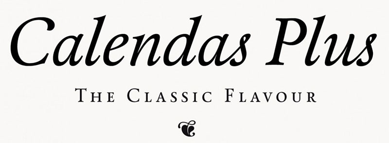
This font was made especially for calendars. It easily adapts to small spaces. It is free, but we can buy a plus package to expand our font’s collection.
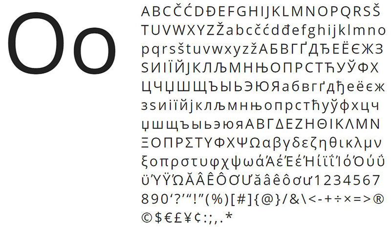
Roboto – Simple curves
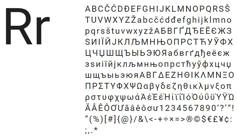
Among the fonts that are easy to read, Roboto is one that stands out by not overloading the letters with unnecessary curves. Also, it includes up to 12 different styles.
Georgia – For long texts
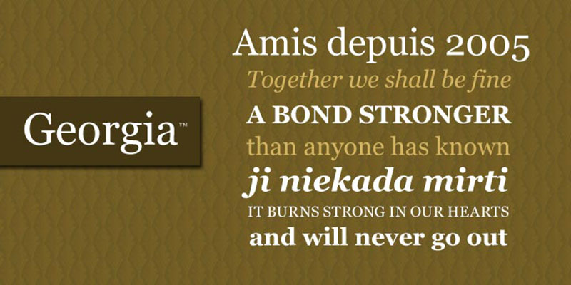
The best font to read large texts is Georgia, basically because it allows us to concentrate a lot of text in tight spaces, all without diminishing visibility. Additionally, it has a professional finish, which makes it perfect for professional and academic uses.
Open Sans – A Google’s famous
Open Sans is the most commonly used letters in Google ads, among other things because of its simple design, which results in the information of a product or site not being overshadowed by the letter.
Montserrat – Wide design
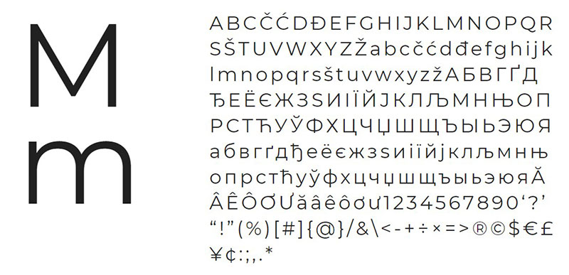
Inspired by the name of the Buenos Aires neighborhood, this Sans-Serif letter is a bit wider than traditional options, but that does not prevent it from keeping the angles perfectly aligned.
Basic Font – For all screens

Thanks to its simple format, Basic Font adapts smoothly to all types of sizes, from large to small. Also, it has a light elegant touch to break its tasteless scheme a bit.
Fritz – Clean details
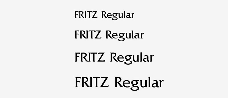
As it does not have square brackets, Fritz shows us a clean and mechanical design. Its thickness is not exaggerated, but it is enough to be able to read it even in lowercase.
Bitter Ht – A nice read
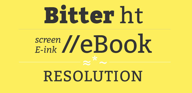
If we look for the easiest font to read on computer, we must find something that was designed from the beginning for it. Such is the case of Bitter Ht, which was made for electronic books, adapting to low-resolution devices.
Adamina – A refined design

Thanks to the asymmetric appearance of this font, different contrasts can be used, creating interesting variations and pleasant transitions for the reader.
Pluto Sans – Nice edges
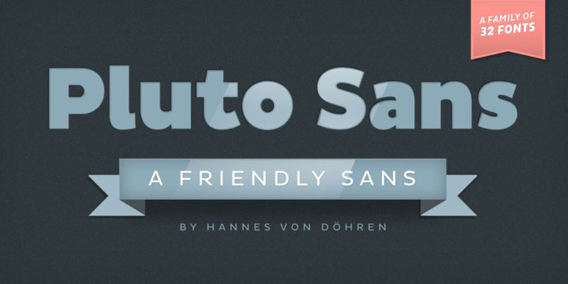
These letters are wide, but they remain perfectly drawn. The package has up to 32 unique styles to choose from, although the basic one is already enough for most users thanks to its elongated design.
D-DIN Font – For design professionals
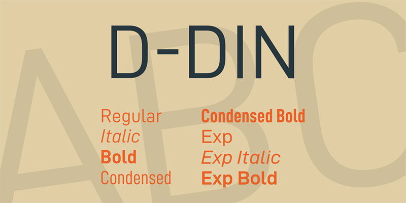
In general, the DIN style is used for technical projects, such as architectural blueprints. It is a letter free of aesthetic details and straight and constant strokes, so it is easy to read regardless of the format where it is written. Now a day, the DIN format is multi-purpose and not only limited to industries.
Cinzel – Remembering the origins
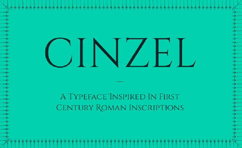
The Roman inscriptions of the first century are a fascinating inspiration for this typography. Square brackets at the ends of the letters, and thin thicknesses that allow them to stand out in their own way.
Lato – Something thicker
Another typeface from Google that maintains a formal design without details. This giant company has a whole album of fonts that are easy to read, and this option with 10 style alternatives is high on the favorites list.
Helvetica – An old acquaintance
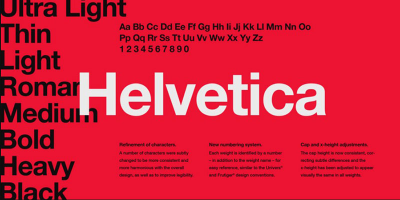
Helvetica is perhaps one of the most readable fonts we can use when designing. This is widely used to highlight headlines or words in logos, as it is easy to see, retains a good touch of elegance, and it’s extravagant enough
Artifika – The power of curves
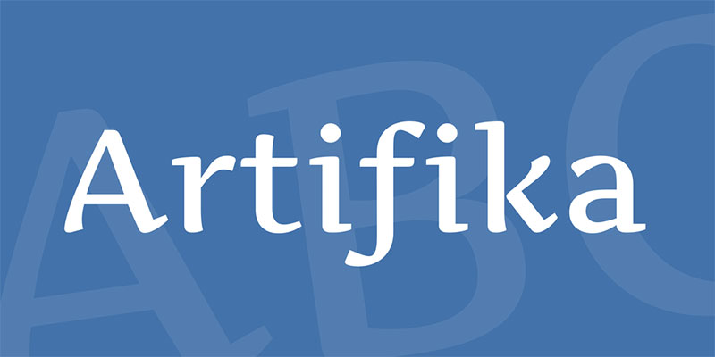
Not only cursive letters look elegant. Artifika demonstrates this by combining a mold letter style with slight angles and curvatures. Besides, this simulates the ink stroke very well by having different thicknesses depending on the direction of the line.
Gymkhana Font – Perfect proportions
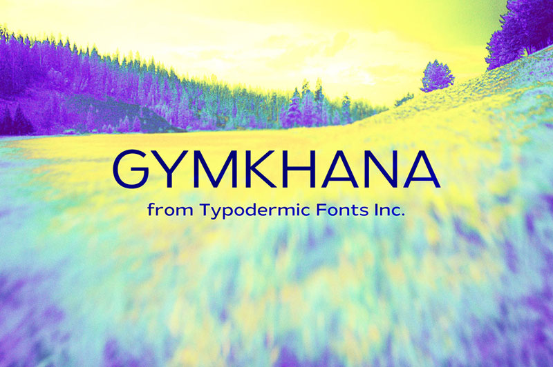
The height and width of this typeface make it one of the most readable fonts available because it can deform freely without losing its essence.
Margot – For every situation
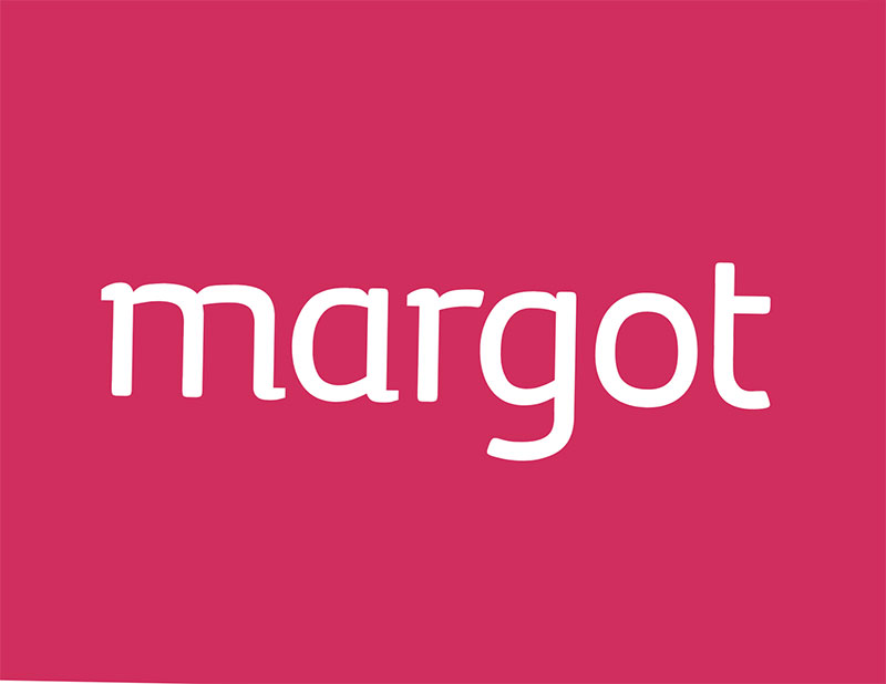
Margot is a typeface that is oriented to large posters, but its readability is so good that it can be used perfectly in small prints.
Verdana – A safe move
Another of the classic fonts that almost everyone knows is Verdana. It is very difficult to make a mistake with it when using it, although many design professionals do not believe that it is an optimal typeface since this does not bring anything bold. An important flaw from a marketing point of view.
Cantata One – High Contrast
Many of the fonts that are easy to read take advantage of having a high contrast that allows them to stand out. Such is the case of Cantata One, which is inspired by handwriting to create a refined letter.
Playfair Display – Demonstrating the power of technology
The Playfair Display design was not possible by hand. Extremely thin lines of high contrast that adapt perfectly to modern monitors and prints.
Medio – A newspaper typography

This letter is not very good when it comes to small writings; on the contrary, it is specially designed for large headlines, which reminds us a lot of that used by newspapers of considerable antiquity.
Franklin Gothic – The important thing is visibility
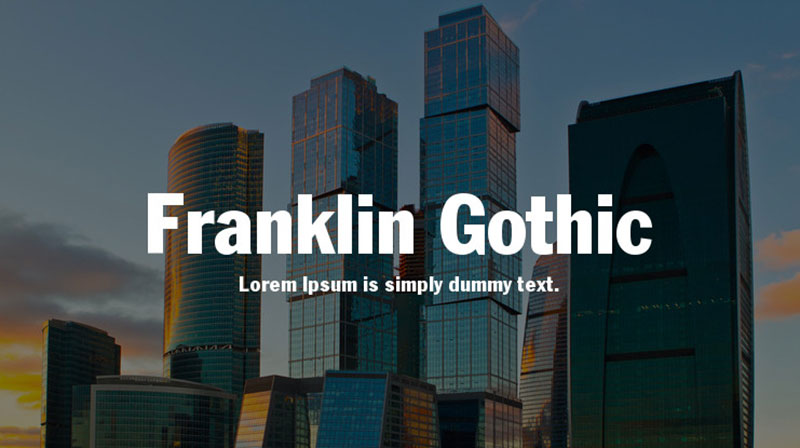
Franklin typography has always been characterized by having a large size, and in this case, with the Gothic variation, we face strokes that are even more prominent. It is not as elegant as other fonts, so it can be used for many jobs.
Minion – Tribute to the Renaissance
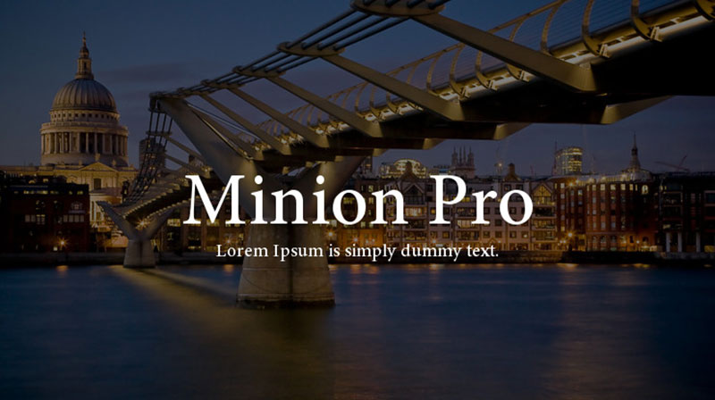
In the Renaissance, everything stood out for overflowing a unique beauty and elegance. This essence has been tried to be captured in a typography of inclined profiles and thin strokes.
Aleo – Subtle Details
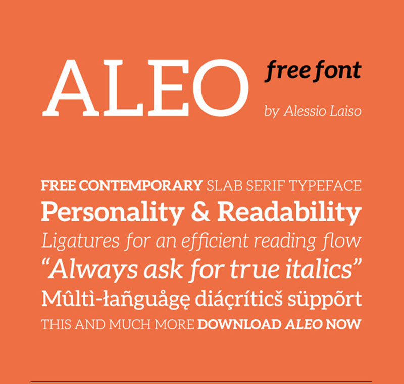
Unless we use it for large texts, not all the beauty of Aleo can be appreciated. Its main feature is slight curvatures focused on the square brackets, but to see them it is best to use it in headlines.
Gabriela – A fantasy book
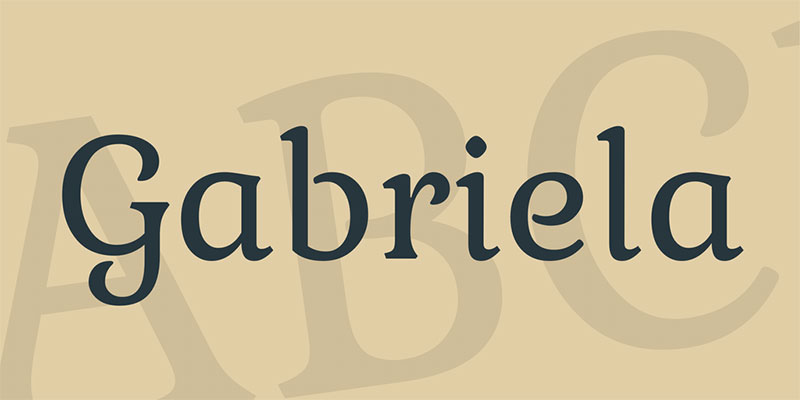
Not all fonts that are easy to read must be tasteless. With enough skill, curves can be perfectly adapted in a readable typeface. Gabriela resembles a design that we would see in a fairy tale, so we can create refined texts or flashy titles.
Source Sans Pro – A slight change
Source Sans is a small change from other Google fonts. It has 12 different styles and is part of the Brackets editor.
FF Tisa – The wonder of the new millennium
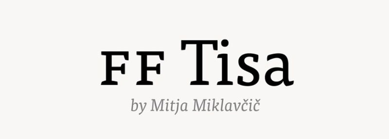
Among the designers, the typography created by MitjaMiklav enjoys great popularity for being aesthetically pleasing and perfect for reading. It has a wide separation between characters and thin and continuous strokes.
Droid Sans – For complex interfaces
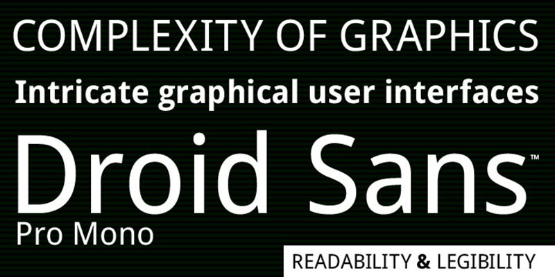
Due to its special height, this typeface is perfect for reading on Smartphones and vertical screens. Also, it adapts to small menus and applications.
With this, we have reviewed some fonts that are easy to read. Remember that, as we said at the beginning, most users will simply read our content superficially, so beyond giving it a nice letter, we must know how to give visibility to our site.
If you enjoyed reading this article about fonts that are easy to read, you should read these as well:
- Steampunk Fonts to Use for Creating A Futuristic Design
- How to Add Fonts to Photoshop In A Few Easy Steps?
- What font does Nike use? The Nike font question Answered
The post A great list of fonts that are easy to read (Must check out) appeared first on Design your way.
Source: https://ift.tt/2KFRhAF


No comments:
Post a Comment