Design your way

Saturday, February 29, 2020

Fonts are important when we want to show the personality of a core value that a brand has. What they do is the make a brand more friendly in the eyes of the audience.

Choosing the right font could be quite challenging sometimes. This is because there are a lot of options to choose from and there is no secret recipe. The Tinder font is a good example of how an app brought such a big change in the social world.

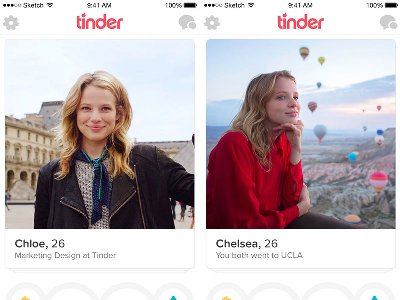
The app was launched in 2012 and in just two years it reached one billion “swipes” per day. For sure it is one of the most used dating apps and users just have to use a swiping motion to interact with it. It allows users to chat if they like each other and they can decide what to do from there.

So, as the app got so popular the Tinder font is also very known now in the world of designers. Let’s find out more details about it.

The Tinder font

57179035910584e73c8bda62 Tinder font. What font does Tinder use (Answered)

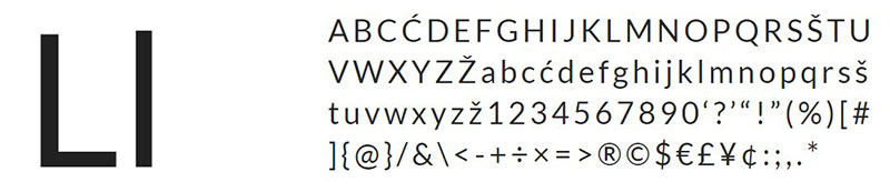
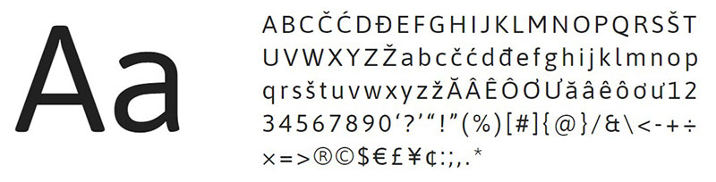
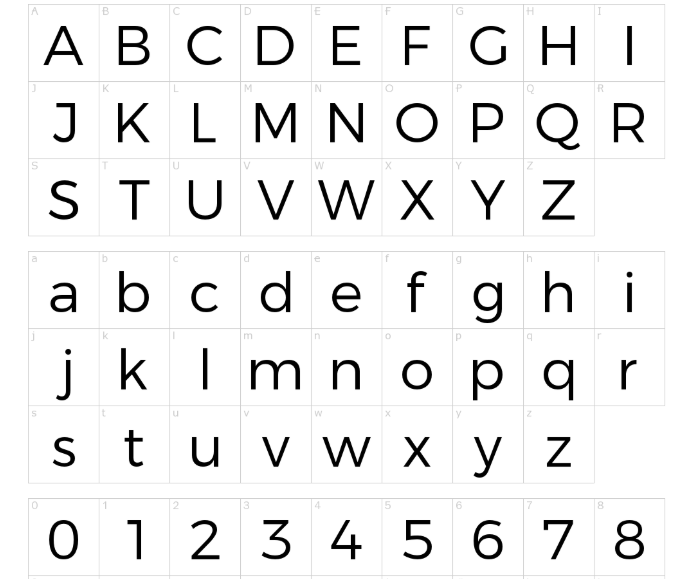
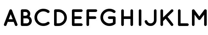
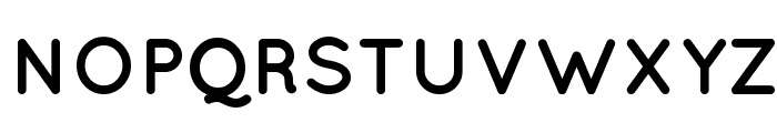
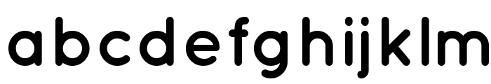
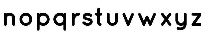
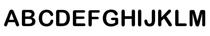
The font used is actually the Gotham Rounded font. This is a version of the well-known Gotham typeface. It has rounded corners that make it warm and friendly compared with the strong and authoritative. It is available in 4 weights. The number is lower compared with the eight weights that are available in the non-rounded version.

The main Gotham Family is a sans-serif typeface. The designer behind it is Tobias Frere Jones and he released it back in 2000. Gotham’s letterforms are inspired by architectural designs from the twentieth century.

It is a very big family that can be used for different kinds of projects. Back in 2007, a rounded version was also added because of a commission from a print magazine. So, this is the short history of the Tinder font.

Tinder font alternatives that you can try
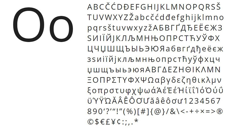
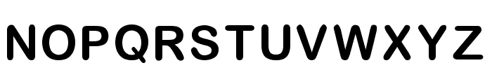
Montserrat

t3-23 Tinder font. What font does Tinder use (Answered)

This Tinder font alternative was designed by Julieta Ulanovsky. She is an Argentinian designer and her inspiration was her own neighborhood from Buenos Aires. Monsterrat is also used by designers when they want something familiar like Gotham and Proxima Nova. But we do consider that it has a more one of a kind typeface compared with the other two.
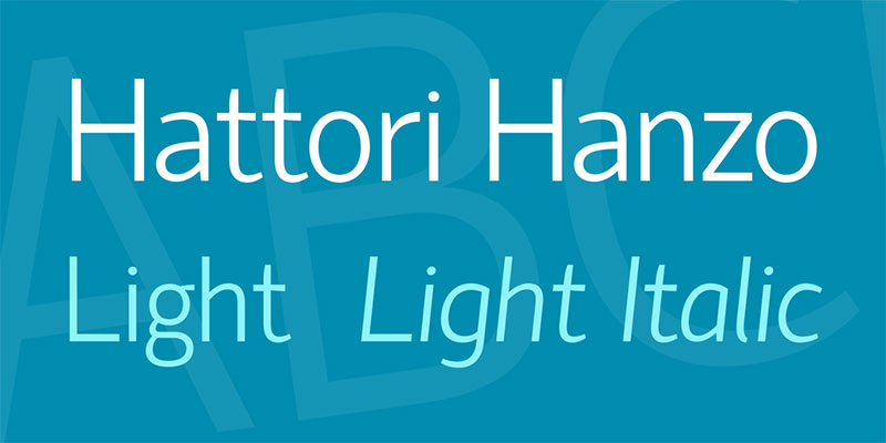
Proxima Nova

t3-24 Tinder font. What font does Tinder use (Answered)

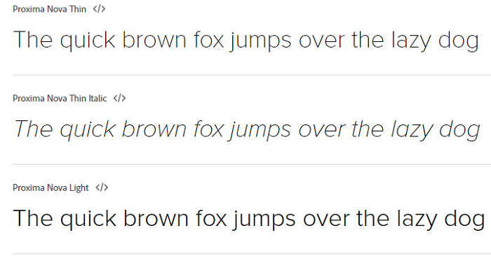
As it was released in 2005 Proxima Nova is still a new font. It gained a lot of popularity and the designer behind is Mark Simonson. Graphic designers consider it a hybrid that has a geometric style together with modern proportions.

As it is so used sometimes you get the feeling that this Tinder font is quite overused. However, there is no denying the fact that it can be an excellent choice. This is for sure the reason why it is so popular.

The font is available in seven weights – thin, light, regular, semibold and black. Each of them has also the italics in small caps styles.
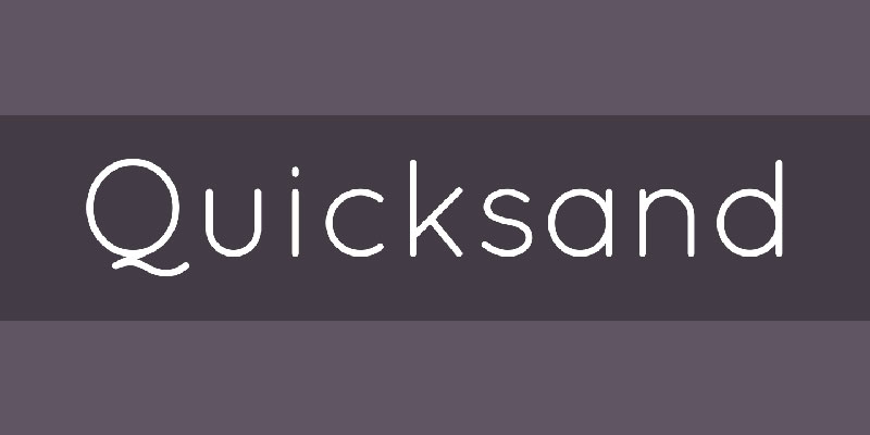
Quicksand Bold font

t3-25 Tinder font. What font does Tinder use (Answered)t4-8 Tinder font. What font does Tinder use (Answered)t5-3 Tinder font. What font does Tinder use (Answered)t6-5 Tinder font. What font does Tinder use (Answered)

If you are still wondering what font tinder uses well the answer is that a similar one to Quicksand. We do like this version because of its geometric-style and clearness. You can use it for sure in logo design projects but also for printing. If you don’t believe us, download it now and see how it is going to look in your designs.

Multicolore font

t4-18 Tinder font. What font does Tinder use (Answered)

Having a Tinder logo font that looks more or less the same is a great advantage. Multicolore really looks similar and it can be used in your design projects right away!

Ebnor Bold font

t1-78 Tinder font. What font does Tinder use (Answered)t3-26 Tinder font. What font does Tinder use (Answered)t4-9 Tinder font. What font does Tinder use (Answered)t5-4 Tinder font. What font does Tinder use (Answered)

Get this Tinder font alternative if you want one that is easy to install. It works great in various design projects.

Nunito-Regular font

t4-13 Tinder font. What font does Tinder use (Answered)

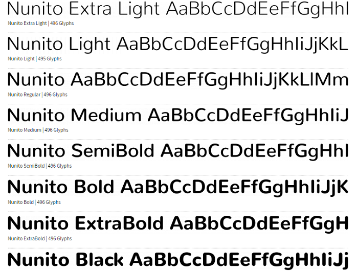
This is another sans serif typeface font that comes with 2 versions to choose from. You will love them both and you will be closer to get a matching flames font like in the Tinder logo.
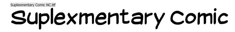
Scramble Mixed font

t1-79 Tinder font. What font does Tinder use (Answered)t3-27 Tinder font. What font does Tinder use (Answered)t4-10 Tinder font. What font does Tinder use (Answered)

A modern looking font that can be spotted easily due to its similarity to the Tinder font. Download it and see for yourself.
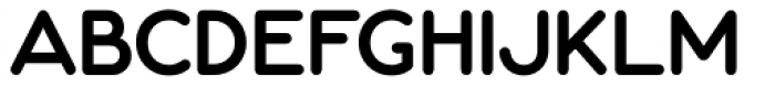
Geogrotesque

t3-29 Tinder font. What font does Tinder use (Answered)

This is a modular font that has a rounded typeface. All of its characters adapt easily to different texts. Because of the rounded style, you feel a warmer appearance coming from it.

It’s easy to install and you shouldn’t waste any time with it. It also has 14 styles together with 7 weights that wait to be used. Go for it right away and see how you can adapt it.

Armitage

t3-28 Tinder font. What font does Tinder use (Answered)

This is a sans-serif typeface that was made by James Puckett. It got launched back in 2010 and the design was inspired by vintage lettering from the nineteenth century!

It has multi-language support together with Greek and Cyrillic. You also get different alternate characters to use. What you will enjoy a lot are also the weights you get with it from think to black.

Proxima Soft

t3-29 Tinder font. What font does Tinder use (Answered)

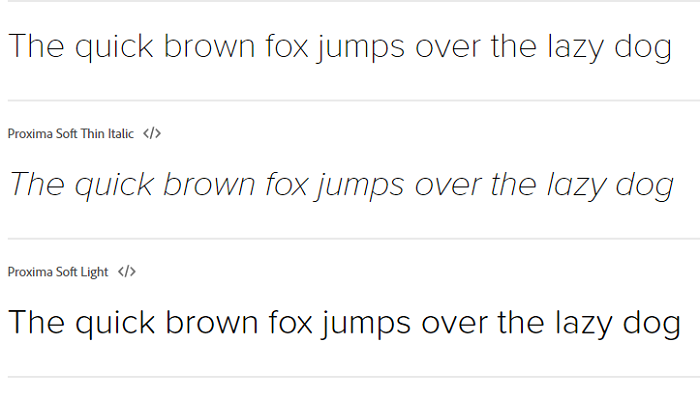
The Proxima Soft is a similar Tinder font that can be used in your projects. You can also combine it with other ones when you want to get a more unique look. It includes Greek and Cyrillic and it also alternates characters that can let you customize it.

Bryant

t4-12 Tinder font. What font does Tinder use (Answered)

Consider Bryan a geometric sans-serif typeface that was created by Eric Olson. If you want to make designs that include similar Tinder font it can be a real option for you to choose.

DIN Round

t3-1-3 Tinder font. What font does Tinder use (Answered)

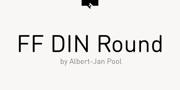
Let’s check this version of Tinder font that seems to be quite good looking. It gives warmth to your designs and it comes in five weights.

Gibson

t4-11 Tinder font. What font does Tinder use (Answered)

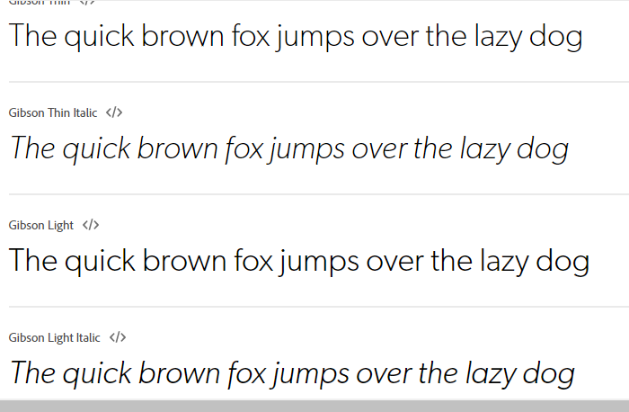
We conclude our Tinder font alternatives with the Gibson. This is a sans-serif typeface that was created in 2011 by Canadian designer Rod McDonald. It includes four weights that are very useful and you can download it at any time.

Ending thoughts on the Tinder font

In conclusion, choosing a Tinder font that is going to do the job for your design is quite easy. Today there are many alternatives that we can play online. Make a shortlist with the ones you prefer and have fun with them.

If you enjoyed reading this article about tinder fonts, you should read these as well:


The post Tinder font. What font does Tinder use (Answered) appeared first on Design your way.


Source: https://ift.tt/3963gCl

Using Website Animation to Improve the User Experience

Friday, February 28, 2020

If you want to be a good designer, it is very important that you’re on top of the trend before it even is a trend.

Having a good sense of what is going to take off is actually key in making a great product, and you’ll be recognized for being one of the first. You will also be praised for the innovative and new approach to common problems.

Originally, animations were treated as an aesthetic, but they’re now a very powerful tool for smoothing user interactions.

And yet, the fundamentals are unchanged, we just have a better implementation thanks to the better technology available.

Creating animations has always been considered as one of the most complex aspects of web design. Many designers (read that as designers-only) are creating the animations in After Effects and then sending them to the dev companies they work with. Not at all surprisingly, many don’t make the cut. We’ll see later why.

What exactly is an animation?

Animations aren’t just for cartoons. You’ll find touches of animation everywhere, from small hover effects to full-screen moving images. It’s trendy, it’s fun, and it’s user-friendly.


Image source

The word actually comes from the Latin word “Anima”, which means “soul”. It is basically an attempt of breathing in life into a static artificial object, something that appeared thousands of years ago when Pygmalion tried to wake up his statue of Galatea.

The animation is actually what happens when you have something that was originally made in 2D or still form, and it’s brought to life and moves in ways that follow the laws of physics.

It’s the way an app icon bounces like a ball while it’s loading or the way a cartoon character walks across your screen. The most important fact? Animation is nowadays ingrained in web design and is actually a great addition to a lot of website elements.

The animation trend

In the field of web design, the animation is something you’ll see more and more every day. The key to it is moderation, because a small, simple animation may be engaging and interesting, and the user won’t even think about it at all.

A large animation, on the other hand, can be used as an interesting visual that pulls you into the design. However, if you mix up too many moving effects, it causes complete chaos.

One effect of the rise of animation is actually the availability of more tools that will vastly improve the UI production workflow, as well as the performance on devices and in browsers.

Animations are actually made using JS and CSS code that won’t overload the site when they’re adding moving elements to it.

Image source

And, even more important, these animations aren’t there just for fun, but they actually improve the user experience. It’s a great tool for web designers that helps them make the website better, and much easier to use.

What makes them trendy is realism. Today’s design landscape has a lot of minimal and flat designs, and users need more cues to tell them what to do.

A few animations can guide them without changing the aesthetic too much. Animations actually help add order and instructions to schemes that may be a bit too simple or may not provide enough direction for users.

In a situation like this, an animation will create a happy medium between usability and stripped-down simplicity. Look at fintech apps, for example. They need to have maximum usability and minimum animations so that they’ll work well for all target audiences. And they’re doing it great.

Why use animations in web design?

Are animations just another thing for designers to play with, just like those banner ads? Or are they a truly essential tool that designers can use, just like they use color, grids and flow?

The primary use of animations is to increase usability. A simple animation can actually be a great guiding tool to help someone understand which button they should click, or where they should go next in a website’s map. Many designers will pair a simple animation with the user tool to click or scroll.

When used correctly, animation can provide valuable feedback to the user. How many times have you filled in a form in an incorrect way, and it shows a message box that highlights your mistakes and tells you how to fix them?

Image source

Well-thought-out motion can guide users and give them context, and you even have the opportunity to surprise the users, making things much more enjoyable and engaging.

In web design, the animation is a motion that is actually very useful if you don’t use it in a purely decorative way. A good UX and UI designer will often use animation in order to improve their whole workflow.

The second use of animations is, obviously, aesthetics. Animations can be used as a great decoration. Oftentimes the goal of animation is purely visual, and that is acceptable to a certain extent.

A decorative animation can help create an emotional connection between the user and the interface. An animation can also spark visual interest, and make sure your users stay engaged with your website for a longer period of time.

Image source

When you’re creating an animation that is purely visual, consider what it should do. Think about what kind of connection you want your user to have.

Should it be fun, or surprising? Do you want to put a bit of unique content that should be shared? Even something that is purely visual should have some kind of goal.

Another reason to use animation is to communicate some kind of function. An animation can be a great tool to show your users how a specific something works in an intuitive way. Don’t do the same mistake that some people have made with the parallax scrolling effect by using it excessively and for no reason.

Animations also help guide the user. Animation isn’t just for animation’s sake, in the end, it’s all about conversion. They can help your users understand the page, and steer them towards a specific place where they should click.

You can use them for revealing information. As an addition to hint at functions, you can also make them a great tool to reveal secondary information.

Image source

For example, you can have a user hover with their mouse over content, and reveal additional options.

And, due to the hover content’s “hidden” default state, this is something that you only want to use for secondary information, and nothing that is actually vital for users that want to navigate your site. Also, keep in mind that hover doesn’t work on a mobile device.

Large vs small animations

When it comes to animations, there are two categories, and they’re fairly easy to understand, you have large and small animations.

Image source

Large animations can be recognized by the scale they have to them. They’re often in video form, with run time, and they fill a pretty significant portion of the screen, reminding of a short movie.

You can use them as a focal point in the complete design, and the user doesn’t really have to perform an action to see the animation in motion.

They tend to be pretty common nowadays, and a good example is a video background. If you have substantial movement, that can also be considered a large animation, such as a drop-down menu that’s full page.

These animations are the first thing you’ll see when you get to a page, and as such, pretty hard to miss.

Small animations, on the contrary, are something you’ll discover only when you begin interacting with the website. They might be hover states, or usability guides or tools.

They’re more of an accent that contributes to the overall aesthetic, instead of being the design’s focus. They aren’t as obvious as large ones, and they offer a more supportive role to the design.

Examples include simple fades or slight changes in sizing. You can think of them as things that you won’t notice as being animated, and they fell pretty natural while adding up to the overall experience.

Designing great animations

There are a few aspects that you should consider when you’re putting together an animation.

  • What are you trying to convey, but you can’t do it only with the UI?
  • What does the user need to understand?
  • What is the absolutely most subtle effect?
  • What are the feelings you want to evoke?
  • Are the UI pieces accessible to screen readers?

Start small

When you’re considering animation more as a design tool instead of a stylistic choice, it’s best if you start small.

Image source

Small, unobtrusive animations will perform better, and a big, flashy animation must absolutely have a purpose, and not only look good.

Another thing you will come to realize is that everything is a character. Sure, this may seem unintuitive at first, but consider a few things. The key to a seamlessly designed website is the website’s ability to empathize with the user.

  • What makes you feel at ease?
  • What is the fastest way to get to the information?
  • What element is the most compelling, and you can place it to direct attention?

Animations should be or should happen, fast

How do we interact with real objects? Sometimes we move slower, sometimes faster. The speed may depend on the size, the task, or whether we’re dealing with an object full of liquid you don’t want to spill.

Generally, we pick and move things around pretty fast, and individual movements may even happen in milliseconds.

This is the same measure we want to use for a user interface animation. If it’s longer people will either lose patience with your product, or their machine, or both.

This is especially true if the product should be used repeatedly because even if the animation is fun and entertaining, it loses the appeal if someone has to see it one too many times.

Occasionally, make things bounce

A physical object will bounce. Some will not be good at it, but anything will bounce if dropped far enough on a hard surface, provided there is not too much air resistance.

Image source

And interacting with UI elements is just like interacting with a small, hard object. When you toss it to one side, it bounces a bit. If you drop it, it bounces a bit.

Therefore, making the animation bounce, especially if it’s been moving vertically, can be helpful when appropriate. Maintaining the illusion is all that matters.

You need to teach the animation to live on its own, as a big part of the process of development, and this can be accomplished in a couple of ways:

  • The animation should move towards being actually informative, guiding the user’s attention and appealing to rational actions.
  • The animation should be designed in the same way the rest of the page is – color palettes, storyboards, and composition, everything should match.
  • The animation needs to follow the branding guidelines, appeal to the users’ emotions, and be a part of a living style guide.

 Things in motion need a bit of time to stop. And, if you set a stationary object into motion, it’ll take a bit of time to speed up. Yay, physics!

So, when you’re making things move, make sure they get a bit of time (of course, in milliseconds), for them to either slow down or speed up. This is known as “easing”, and you will actually find functionality for it built into CSS.

Summary

Animations are important, and a good one will undoubtedly make the user’s experience much better. This can either be in the form of an emotional connection, for example, of just by making the site easier to use.

It’s a design technique that won’t go anywhere anytime soon, as it engages the users even in the most mundane of tasks, adds life to the design, and makes you really stand out above the crowd.

Animations are a core component if you want to make that emotional leap from a usable site to a desirable one.

The post Using Website Animation to Improve the User Experience appeared first on Line25.


Source: https://ift.tt/38c18aS

Design your way

Comic Sans has established itself as a font that is often misused by casual designers and has thus gained a negative reputation sometimes. But under the right conditions, it can be a very functional and useful font. In some cases, it is even used in an ironic way or in a way that it looks harsh. In this article, we will find what the best fonts similar to Comic Sans are.

First designed in 1994 by Vincent Connare, the sans-serif font was made for Microsoft. It was used in the library for Microsoft’s software, and has been an instant hit. Its primary use, or the primary way it was intended to be used was in comics and in cartoons, and it would often appear in speech bubbles.

But why is Comic Sans so revered and popular, despite wearing a negative tag at times? That is primarily because it is so often used (and misused), and it receives negative attention. But casual designers and amateurs absolutely adore it, because it looks like a fun font that can add some friendly character to the project. Many people even want to eradicate it, and campaigns were even formed to do so.

But the font continues to thrive, and it is still a fun and casual font that can be appropriate, although in minimal uses. Here are some of the best fonts similar to Comic Sans that you can use in fun projects.

Fonts Similar to Comic Sans

Open Sans

Opensans-1 Fonts similar to Comic Sans that you can use in fun projects

The friendliness and neutrality of the Open Sans font is something that makes it a very popular choice. It was designed by Steve Matteson, who is the type director of Ascender Corp. Open Sans was and remained one of the more popular fonts that have been used as an alternative font, or on its own. The greatest thing about it is that it has five weights to choose from and the italic versions. It can be an alternative for Comic Sans.

National First Font

national-first Fonts similar to Comic Sans that you can use in fun projects

The National First font is one of the best fonts similar to Comic Sans.

HVD Comic Serif

hvd-comic-seriff Fonts similar to Comic Sans that you can use in fun projects

The HVD Comic Serif has a very easy-going character. It was created as a fun font, and it can be used as an alternative to Comic Sans. The two fonts have a lot in common, most notably their character and the whole vibe around both of the fonts. The slab serif letters are designed to make you relax and to have fun.

It is quite a strong and heavy font, but it does share plenty of similarities with the Comic Sans font. The x-height of the font is slightly above the median, which makes it appear quite heavy.

DK Au Revoir

DK-au-revoir Fonts similar to Comic Sans that you can use in fun projects

This font is certainly full of character. It is a handwritten font that does have a fun character, but can sometimes have a very serious attitude. It includes all the important characters and symbols that are needed for many languages. This font is certainly at its best at larger sizes, especially with sizes above 24 pixels.

Lato

lato Fonts similar to Comic Sans that you can use in fun projects

This font from 2010 was designed by a Polish designer. But it has since exceeded all expectations and has become one of the essential fonts to have in your library. It has semi-rounded details and letters, which gives it a warm feeling, and also it gives feelings of stability and trustworthiness.

Hattori Hanzo Light Italic

hattori-hanzo-font Fonts similar to Comic Sans that you can use in fun projects

This light italic font is also a great alternative for the Comic Sans font.

Laconic

laconic Fonts similar to Comic Sans that you can use in fun projects

This font features the preciseness of an old-style typewriter font with the elegance of modern sans-serifs. This combined makes for a great font with proportional glyphs and exquisite precision.

The great thing is that you get all the weights included in the download. These weights are light, regular, bold and shadow. You can use and combine these weights to create something unique and lightweight, but also very modern.

FF Layout

FF-layout Fonts similar to Comic Sans that you can use in fun projects

1996 was the year that this font was created. GerdWippich designed this font as a more fun font that can also be used as an alternative to Comic Sans. It is certainly best utilized in more festive projects and with a more fun connotation, rather than more serious projects. It has seven various weights that range from light to bold.

Varela Round

varela Fonts similar to Comic Sans that you can use in fun projects

This is the rounded version of the Varela font, which is already a well-known font itself. It has rounded corners and smooth edges, which makes it a good versatile font, as it can work in various sizes. While it is at its strongest for headlines, it is certainly also very useful for printed projects. It has one weight, but that weight is made in such a way that it can be freely used in various different ways. It can work as a headline as well as body text, making it a great alternative for Comic Sans.

Ubuntu

ubuntu-google Fonts similar to Comic Sans that you can use in fun projects

Named after the Linux platform, the Ubuntu font was made with that platform in mind, but it certainly shares some similarities with the Comic Sans font.

COMIC NEUE

k5cjt4s8-1397699852 Fonts similar to Comic Sans that you can use in fun projects

The name of this font suggests a similarity to the Comic Sans font. That is because it actually is quite similar to it, but it has a more modern twist to it, incorporating some of the more modern features. That certainly makes it more appropriate to use in projects, as you can avoid using Comic Sans which can bring onslaught from other designers, and use this font instead.

Quicksand

QUICKSAND Fonts similar to Comic Sans that you can use in fun projects

This font is a display sans-serif font that was designed by Andrew Paglinawan as a font that can be used primarily for display and headings. It has three weights, and the font is heavily influenced also by some geometric sans-serifs that were popular in the early 20th century, especially in the 20s and the 30s. But this font largely improved the features of those fonts, as it has much better legibility and much clearer conveys the text. You can also combine it with another font for better effect.

Asap

asap Fonts similar to Comic Sans that you can use in fun projects

Asap is a good alternative for Comic Sans. The name of the font means “as soon as possible”, and it was created by Pablo Cosgaya in the hope of creating a font with the same glyph width for each and every style, making it a good font to use in various styles without the need of reworking. There are two weights with corresponding italics, which is not a lot, but certainly enough, especially for creating headlines and subheadings. Pairing it with another font makes sense.

Suplexmentary Comic

Suplexmentary-Comic-NC Fonts similar to Comic Sans that you can use in fun projects

Featuring a much wider design than Comic Sans, this font is a good alternative to the original, but it is still one of the better fonts similar to Comic Sans.

Zemke Hand

ITC-Zemke-Hand Fonts similar to Comic Sans that you can use in fun projects

The creator of the font, Deborah Zemke, based this font on her own handwriting, managing to create a very fun and cheerful font. This font is fantastic for being used in various comics and children’s stories, because of its fun character.

Lexia

lexia Fonts similar to Comic Sans that you can use in fun projects

The versatility of this slab-serif is unbeaten on this list. It is one of the more versatile fonts similar to Comic Sans, and that is because of its extended library of weights that you can use. Not only that, but the Lexia font tends to focus on details a lot, which brings a very warm feel to it. That makes it one of the best fonts similar to Comic Sans, and it can be utilized in many ways.

Albus & Friends

albus-friends Fonts similar to Comic Sans that you can use in fun projects

This font is great for dialogue-based stories, as you can add talk bubbles and clouds.

MVB Calliope

MVB-calliope Fonts similar to Comic Sans that you can use in fun projects

Last but not least is the MVB Calliope font, which is a good font to use as an alternative to Comic Sans as it creates a perfectly-flowing rhythm.

If you enjoyed reading this article about fonts similar to Comic Sans, you should read these as well:

The post Fonts similar to Comic Sans that you can use in fun projects appeared first on Design your way.


Source: https://ift.tt/3cfX1Om
 

The Cash Box Blueprint

Most Reading