Every year, there are some fundamental changes or upgrades in design styles. Sometimes, the design trends go ahead of the time and bring in new freshness, or at times, go back in time and recreate certain evergreen trends. Both work perfectly depending on the product and services. Here are some of the major app design trends to follow this year to stay on top of the competition in the market.
1. Brand Consistency is important:
Design is universal, but every design does not work for every brand and especially for apps, as it is a tricky little business. It is important to research your brand and reimagine the mission and vision of your brand before selecting a particular app design, as your design would depict the intention of your brand in society. The app design and specification for a product company would be different compared to a service providing company. The reason being, the end sales are generated by the product sell itself while in the service sector, the end sale is generated through the skills of the people. And, there should be a sure shot difference in the design and marketing of tangible products and intangible skills. If this is mixed up, it can portray the wrong image of your brand in front of your target audience.
2. Ride the sector trends
The best way to come up with a design idea for your app is by brainstorming on the ongoing trends in the market. This will help you attract the attention of new customers and make them download the app without much of marketing efforts. The best reason about going with the trends is that it is temporary, and if it doesn’t work the way you expect, you have a space to change it at your convenience.
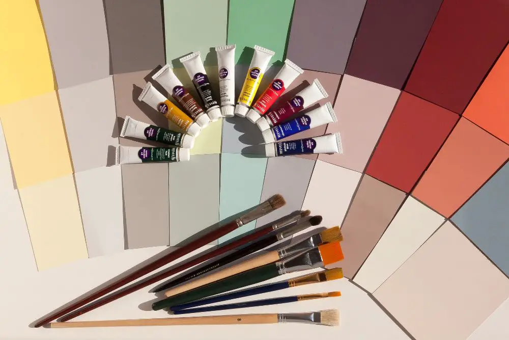
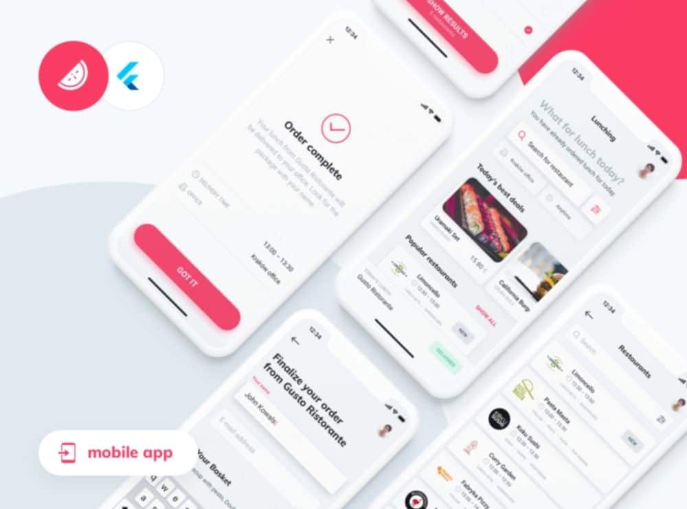
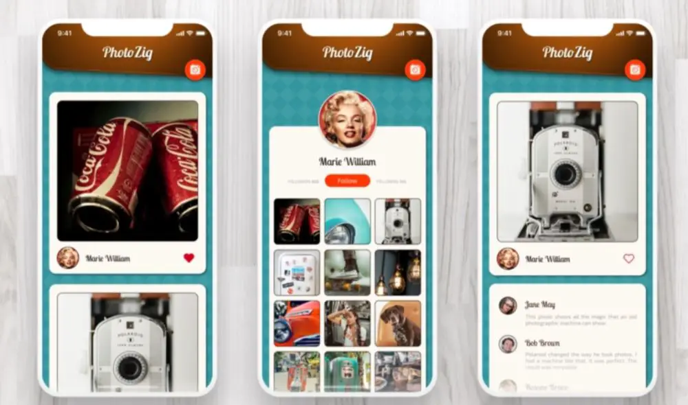
3. Build around the Logo:
![]()
Your logo can be your starting point or base, and every other thing should revolve around it to create a perfect design. The main reason to go about with your logo is that this would fit in the mind of your audience and help them recall your brand as and when they open the app. For instance, Coco-cola and Pepsi, always use their logo and colours for most of their design and branding parts, and for always, it has worked wonders for them.
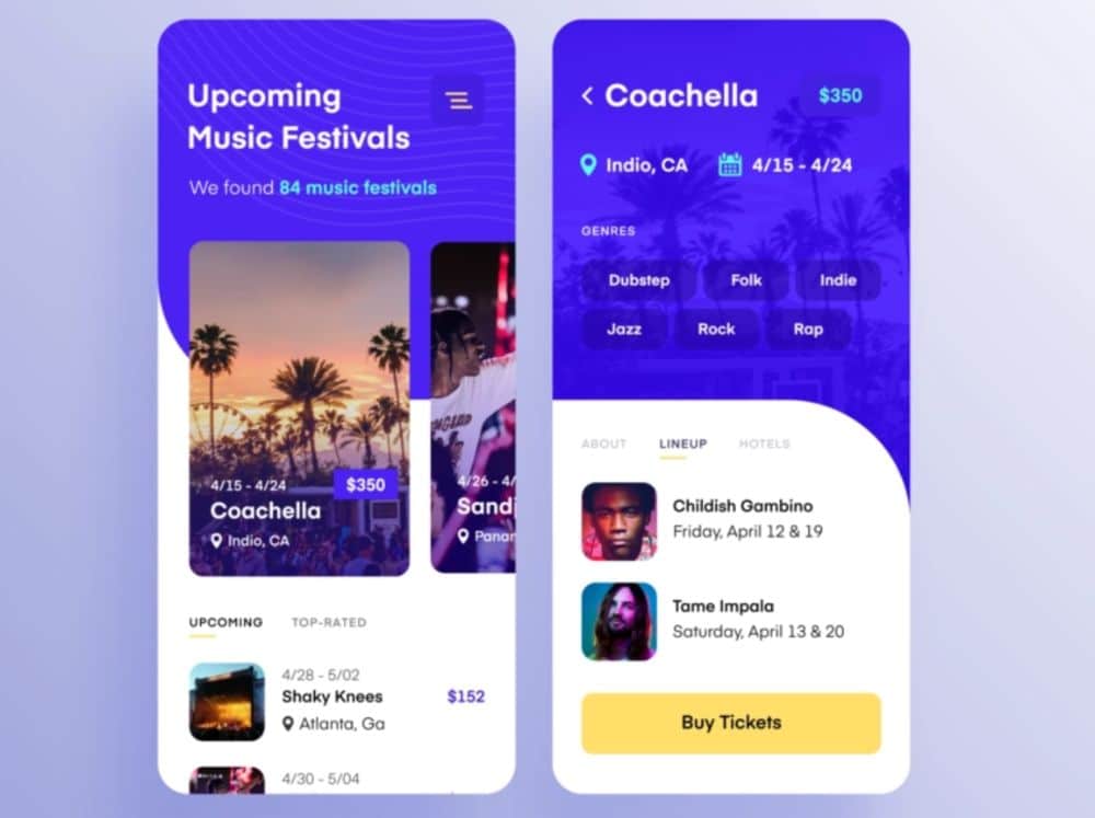
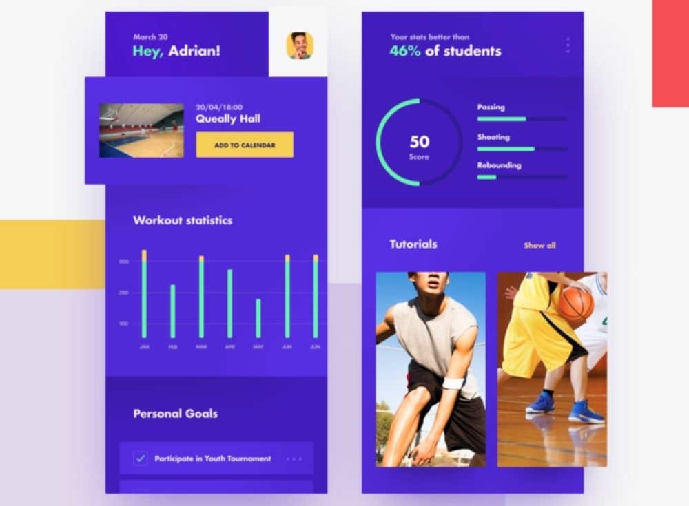
4. Using human portraits to connect
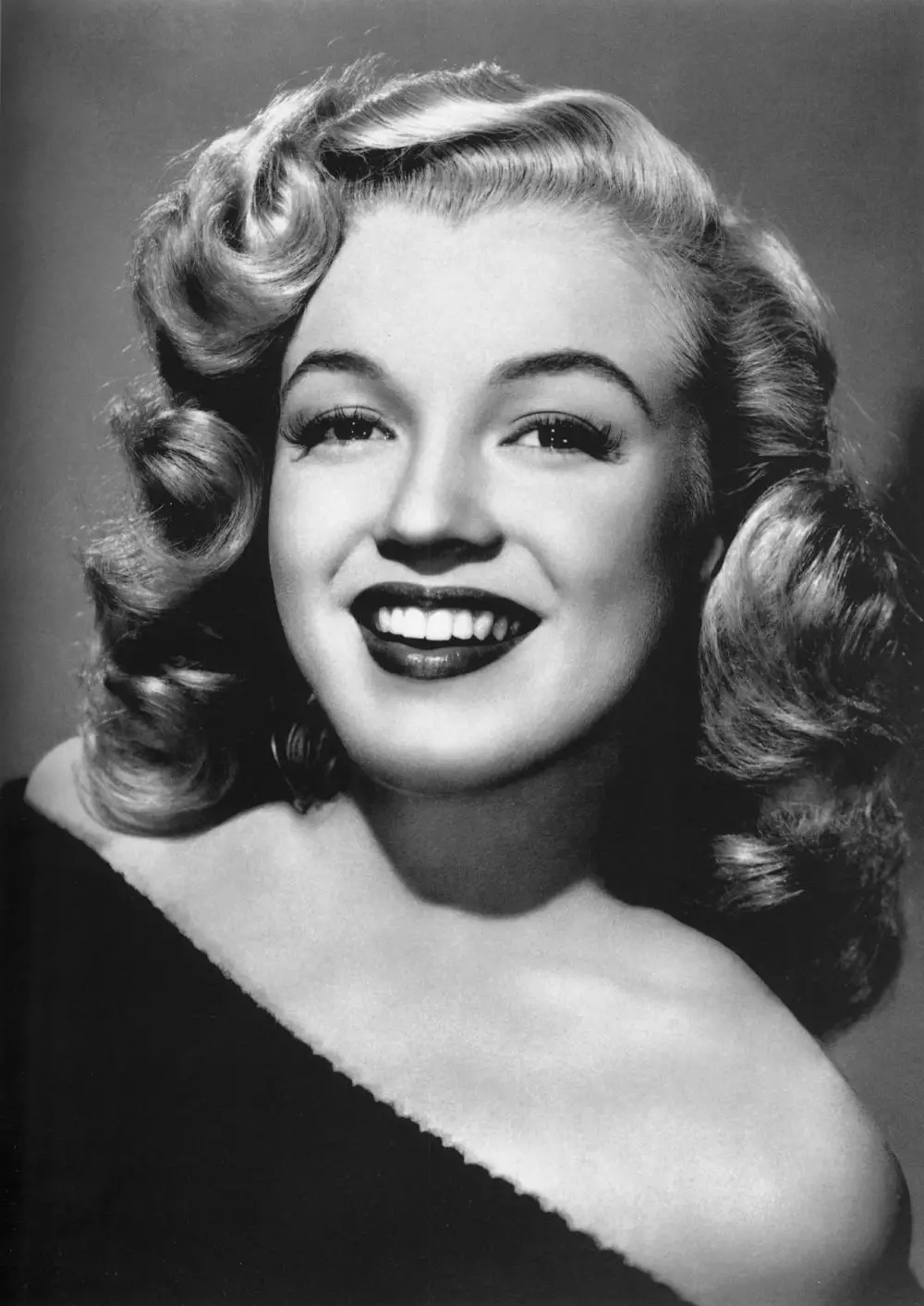
As it is said, the tribe connects the tribe. This is the reason placing real human portraits would help your target audience connect to your product or service in a better way. Portrait photography works best for product companies. Today in the times of automation, human interaction is something everyone is craving for and hence having good human images will provide a very realistic touch to the app and at the same time increase the visual appeal.
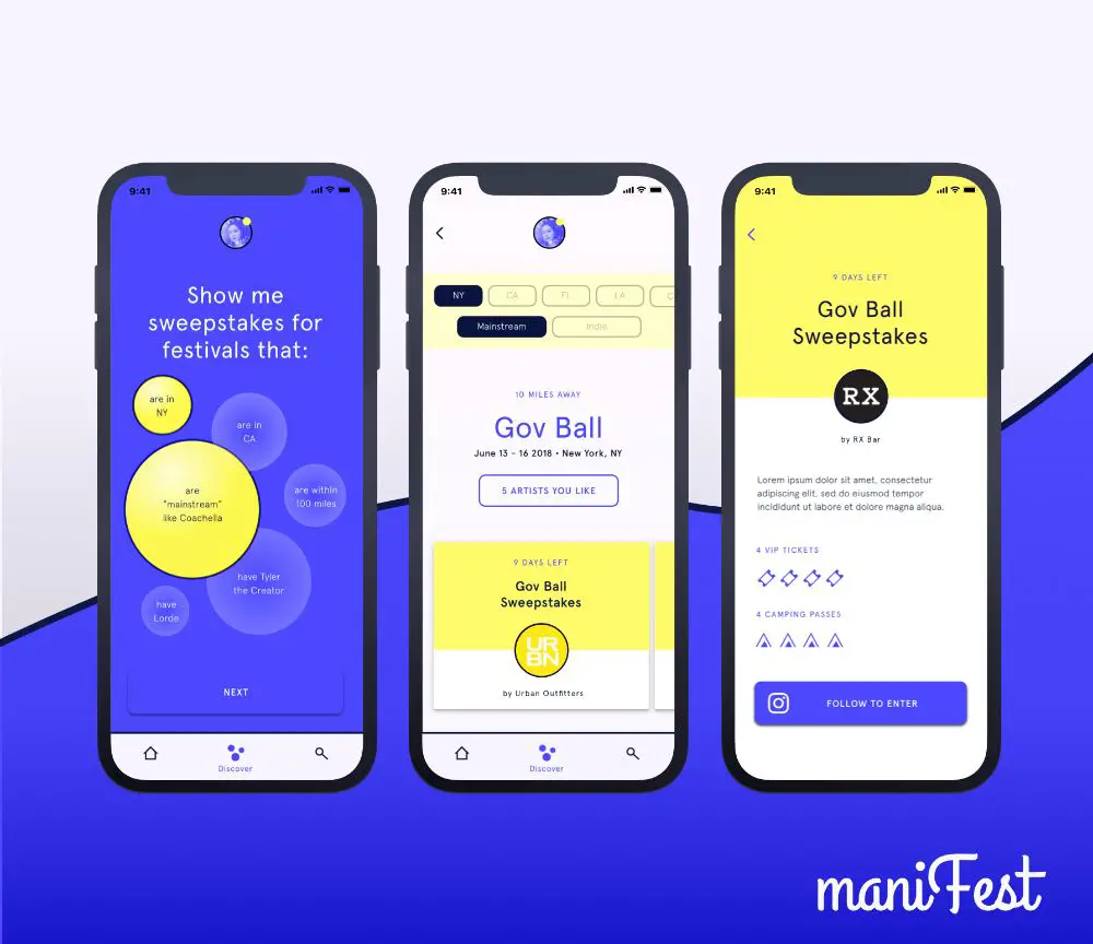
5. Shine with shapes
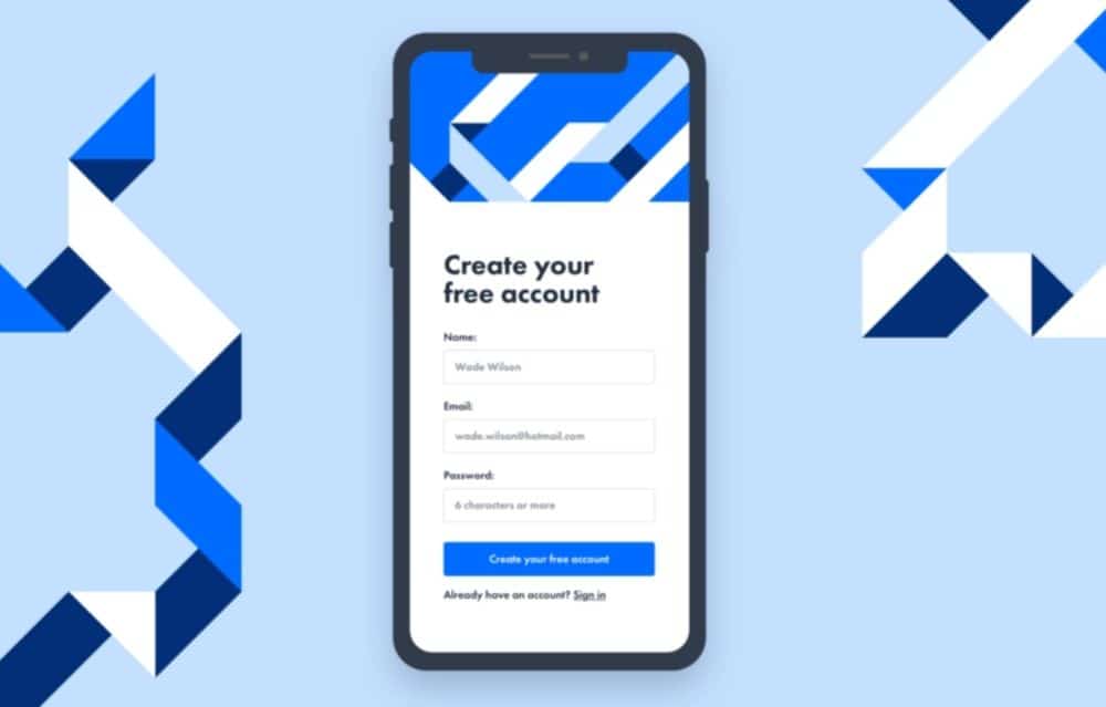
Here, when we talk shapes, it means we are trying to overlap different shapes into a single dimension to create an overall design and outlook of the app. This will add a geometric type look to your design and would go with every upcoming trend, making it cost-effective and time-saving. A beginner designer can make this as it is one of the easiest and basic designs of all time. This trend is observed across the design spectrum. Be it circles, lines or squares, using them in the right manner can give your app a very modern feel.
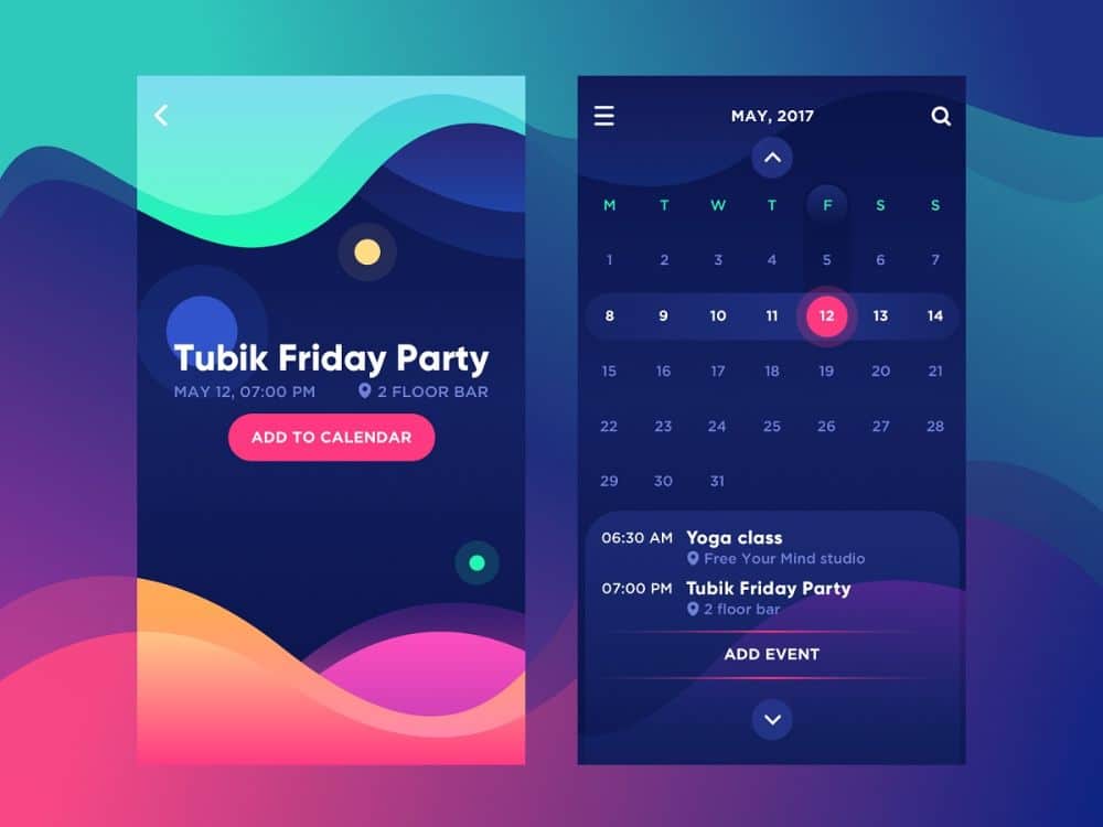
6. Ready, Steady, Motion
Our eyelids move, with everything that moves. This is the reason, a design poster with added motions would grab the attention of the users as well as help them concentrate on it for a longer duration of time. The trick here is to present the text information in a very crisp and creative way that it highlights along with the main motion text. If this is not done correctly, the information would not be received by the user, and there would be fewer chances of sales conversion on the app.
7. Break the Rhythm with Graphics
Graphics can be everything and anything that seems attractive to the eyes of the users. Here, you can either try to use graphics according to your niche or can play around with different graphics. For instance, at times you can play with different layouts in graphics just like we do with the website. However, a new rising trend is to sprinkle graphics where they are least expected. Given the huge rise in the number of apps, the layouts start to become similar, in such a time, it would be a good idea to break the rhythm with shapes or well direction graphics. It is advisable to select the layout of the app in such a way that it is easy for the audience to navigate and reach the end purchasing counter.
8. Dance with the Doodles
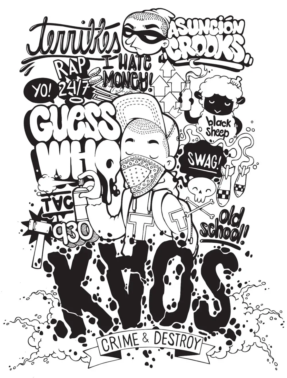
Doodles are fun and catchy to the eyes. It can be used very well when the brand is trying to portray comic content or something casual and informal than the usual. Doodles can also be used to create illustrations. Use of illustration is something which is being opted by a lot of brands given their capacity to narrate the message in a more effective way. If you want to give your app an edge, you can set the algorithm in such a way that the app displays new doodle every single morning, and the theme revolves around it. This will bring in new excitement and variations for the users and would turn up to your app on a regular basis.
9. Variable Fonts in Typography
A variable font is a new concept, and not many brands know about it or use it. Using variable fonts, one can create multiple variations of single font design. The whole concept revolves around the width and weight of the fonts known as axes. This is the best time to adopt such technology before the entrance of multiple players in the market.
10. Keep it blank, Keep it minimal
We are adapting to minimalism lifestyle by seriously working on the concept of – Less is more. Here, we would advise you to go all simple, blank, crisp and anything with associated with the concept of minimum. The trick here is to convey about your brand in the least possible words and least possible graphics. If it can possibly be done and understood in one word, there shouldn’t be the use of two. This will stick your audience to your app for a longer time. The best example for this is the ‘Inshorts’ app which displays the news in 60 words.
11. Jazz with the Black and Neons
Neon became a trend some three to four years down the line, and since then the craze is on. The trick here is, instead of making neon the new black, it is advisable to merge or try the shades on neon on a black surface. It would go a little out of usual but would work wonders in case you are planning to come up with some out of the box designs. Neon is mostly tried on plain white and lighter shade backgrounds, but when tried with core black, it pops up the neon shade and attracts the user’s attention. This design trend is observed in food, masculine products and other such brands.
12. Makes use of Pastels
Pastels are in trend, and as per the graph, they would be in it for a good amount of time. The main reason to go with pastels is that it is not too loud and gaudy as well as on the other hand, not too white and simple. The addon here is that it goes with light as well as dark solid typography colours, leaving a calm and good impression on people’s mind and help them stay longer on the app. This trend is highly observed in apps related to clothes, health and wellness and even cosmetics.
13. Solids last forever
Solids are evergreen. They never go out of fashion as everyone likes to have a homogeneous look. People crave for similarity and solids give them that edge. Solids can be any strong colour which would represent your product or service idea like if you are a corporate bag brand, you can go for blue, brown, maroon, navy blue solids while if you are a school bag or women bag brand, you can go with bright solids like red, pink, orange-yellow etc. This way, you can play along with solids, and it would always work for you. Using solids can allow the use of iconography and other features easily in the app.
14. Retro can still work
The fact- old is gold plays a role here. You can always go retro for any kind of target audience. Retro is relatable to older generations who are into the ’50s and ’60s while it is also a craving for millennials. Retro is attached with senses and makes one feel nostalgic, which ultimately would help your brand to connect to the core emotions of the audience and pick your app over other apps. You can choose your colours, patterns, typography in such a way that it helps you create a retro look.
15. Go for Monochrome
This works, when none other things work. Black and white is a combination which depicts every emotion in a most decent way. Going monochrome would give your userspace to predict and choose a stand for themselves, as in they can decode their own meaning to it, say it be positive or negative. The main advantage here for you is that the information displayed on two contrasting backgrounds, black and white is pursued in the best manner. The background colours and regular and simple so the user would automatically not spend much time on the design and would directly come on the text portion for the information. This you can use when you plainly want the users to focus on the content and not get distracted on any other app.
Anything which comes in trend is somewhere created by someone for the first time. The creation is raw at first and wingless until someone acknowledges and imitates it with positive intentions. If someone had not stepped in, there would be no trend prevailing in the market to adopt for us. Here, instead of imitating other trends and practices in the market, it is advisable to go a little above your limits and try to brainstorm and create your own identity, that others would like to adopt and make it a trend. This will give you first in the industry advantage as well as give you space to experiment in it on an independent basis.
Above are few of the most opted for design trends in 2020. They will not only boost the visual appeal of your application but also help enhance productivity. The focus always needs to be on the User experience as this is key to getting a wide reach for the app. Trends would come and go, its what you do with it during that time, matters. You can adapt some of the above trends as it is or mix-match it up in any way as per your convenience to create a perfect design for your brand.
The post 15 App Design Trends to Follow in 2020 appeared first on Web Design Blog | Magazine for Designers.
via https://ift.tt/37LW6BI


No comments:
Post a Comment