A lot of brands have gained a lot of recognition but not all have a reputation for their quality or luxury features that they bring like the Rolls-Royce logo. This incredible brand has such a cool history and it shows how two men from different backgrounds can be drawn to the industry and create something that the entire world will be impacted by.
The Rolls Royce logo also shows that this car is all about luxury and the company was founded back in 1903 is based in West Sussex England its plant having the name of Goodwood Plant. This plant is the fifth one that Rolls Royce has in the UK. Before that, they already had four in Manchester, London, Derb, and Crewe.
Car logos are not for decoration purposes, they are important visual elements because they represent the brand value and show its history. They are also a way to advertise cars so let’s find out more about the Rolls Royce models.
The history of Rolls Royce
In 1884 Frederick Henry Royce started an electrical and mechanical business. After some years he builds his first car in 1904 and he called it “Royce”. He met Charles Stewart Rolls in a Manchester hotel in May that year and they came up with a deal.
Royce was going to build the cars and Royce was going to sell them. The contract that they signed mentioned that the cars would be called ” Rolls-Royce”.
The Rolls Royce logo
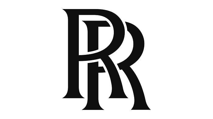
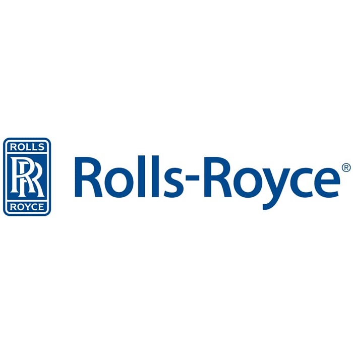
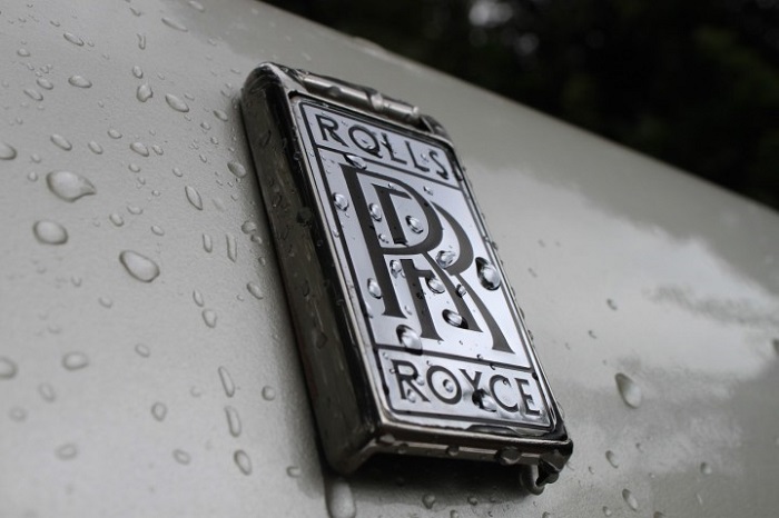
Rolls-Royce logo has a unique symbol that shows the power and strengths of the company. Its logo is for sure one of the most iconic car logos that have been made in our history. The Rolls Royce logo is made out of two Rs or double R that stand for Rolls and Royce the people behind this company.
Having such strong brand name, the logo does indeed look special even if it has a simple minimalist design.
Shape of the Rolls-Royce Symbol
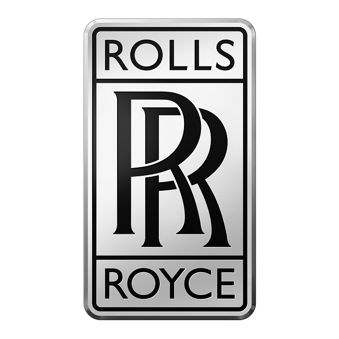
The Rolls Royce symbol has a rectangular form with curved edges. The title of the company is enclosed in the rectangular shape and it brings a realistic look. Its framework possesses three divisions, the first on is in the center and larger and the others are similar in size but smaller.
Near the company name the logo has two “R’s and the lower and upper segments have the name Rolls-Royce together with the 2 “R’s that bring a vivid impression.
Color of the Rolls-Royce Logo
The color of this basic logo is blue. What it stands for are quality and elegance. When this logo gets stamped into the silver medal of the hood of the vehicle it really takes on an industrial appearance. At first, the Rolls Royce logo was made in red but they noticed that sometimes it didn’t really look good with the color of some of their cars.
This is why they decided to go for more neutral black colors on their cars. After the death of Henry Royce in 1934, the logo color was changed quite fast.
The Font
Even though the Rolls Royce logo has some similarities with other classic fonts it is still an original one. The lettering that you see being used has remained completely unchanged. Even if the colors or shapes are altered the custom Rolls Royce font has always been the same.
Influences/Inspiration
The Rolls Royce logo design is heavily influenced by Art Deco and Art Nouveau. They were designed in the early 1900s when Rolls Royce was just starting. They have simple lines and the design is inspired by classic Greek and Egyptian art.
This type of design was quite used until around the 1930s but Rolls Royce still decided to keep the same logo and not make any changes to it.
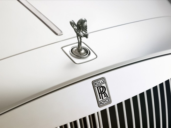
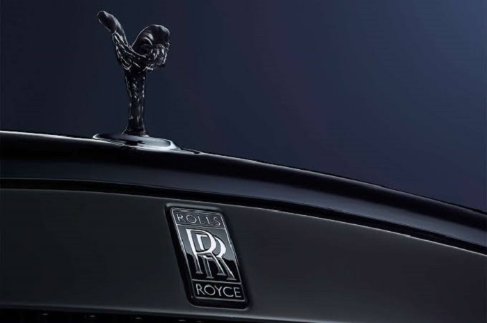
Rolls-Royce – The Spirit of Ecstacy
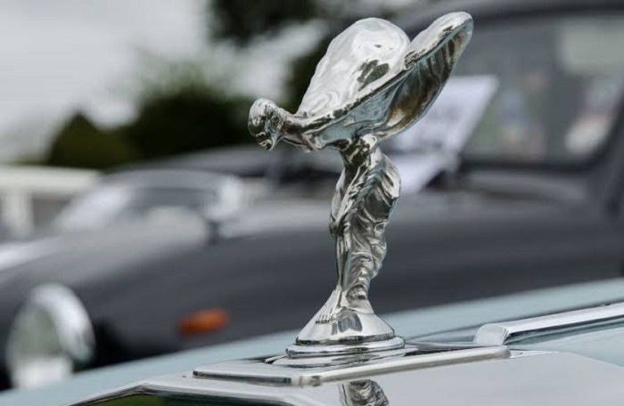
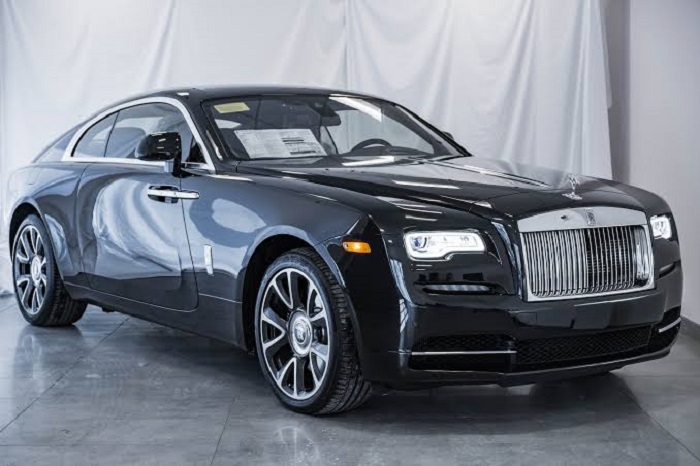
Besides the two R that we see in the logo the cars that belong to this manufacturer are also decorated with the famous Spirit of Ecstasy. It is represented by the figure of a woman inclining forwards with the arms outstretched back from and above her.
This symbol means the spirit of the car brings speed and silence at the same time together with mystery. It is very well-thought.
The Spirit of Ecstacy – Origin
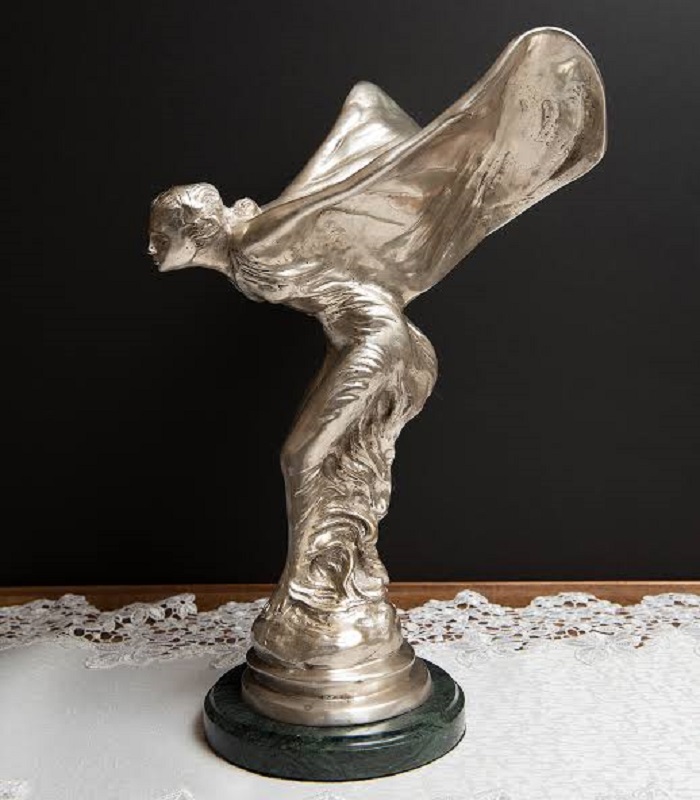
If we check the Rolls Royce history, we also need to understand how the Spirit of Ecstasy became a part of this brand. The first sculpture was created by Charles Sykes for the Silver Ghost that was owned by Lord Montagu.
The model used in the sculpture was Eleanor Velasco Thornton, a young secretary and the lover of Lord Montagu. As the Lord was married and Miss Thornton was under his status, they could have never got married so to celebrate their love this unique hood ornament was requested. This sculpture was changed later on and became “The Spirit of Ecstasy”.
The Rolls-Royce Logo History and changes
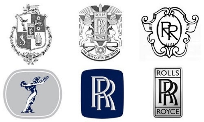
The Rolls Royce logo appeared back in 1907. One myth says that Royce saw an RR on a tablecloth in the restaurant and decided to buy it. The Rolls Royce logo together with “The Spirit of Ecstasy” has been used since 1911 and both emblems are always positioned vertically.
Rolls Royce logo started with red as its first color but got changed to black in 1934. This was done because they realized the red was not performing well on some of their models. The first model that got released in the new color was the Phantom III in 1934.
In 1998 the Rolls Royce motor was sold, BMW wanted to get them but Volkswagen offered more and offered to the owner £430m.
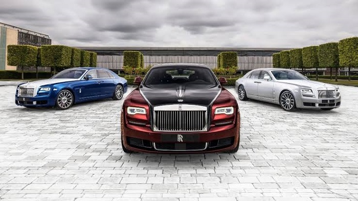
With more than a century of activity and so many Rolls Royce models, we can say this brand set a high bar in the automotive industry. For sure their cars look very different today since the first models but they remained loyal to their brand values.
The Rolls Royce logo has helped this brand to become one of the leading car producers especially if we talk about luxury cars and we can be just excited to see how their future models will look like.
If you enjoyed reading this article on the Rolls Royce logo, you should read these as well:
- Animal logo design ideas and guidelines to create one
- Logo design ideas that you should use for branding projects
- Logo maker app examples to try as an alternative to hiring a designer
The post The Rolls Royce logo (symbol) that was created for the company appeared first on Design your way.
Source: https://ift.tt/2HvqiGK


No comments:
Post a Comment