19 Best Logo Kit Samples

Thursday, January 31, 2019

Logos are the simplest and the most effective way to promote your business. This graphical representation of a brand raises its awareness in the marketplace and are usually used across various documents and print collateral. A well-designed logo usually tells a story that is meaningful and resonates with their audience.

Every brand has a logo, the sheer number of existing logos that are out there can seem overwhelming and can set us on a search to find a graphic that hasn’t been represented before. As humans and as designers we are consuming the same information and working for the same clients, so its only natural to find the logos to look and feel similar in their form and composition. Finding a balance between simplicity and uniqueness seem to be the way of creating and solving this identity paradox.

Your brand matters and to be able to build a great logo, you should be able to build a logo design process that can clearly represent the values and the story of the company. To help, we have summarized some concepts and logo design template kits to build the perfect logo.

1. Minimal Logo Kit

Here is a pack of minimal logo designs with single strokes, clean white spaces, and handwritten fonts. These templates let you choose or re-work pre-made shapes and symbols to adorn your corporate emblem. It includes the -100 Minimal logos, + 20 Minimal logo with Watercolor, + 20 Png File Watercolor background (Wide 2000+ pixel), 100% Vector fully editable, Ai, Eps, PSD files


2. Deer Logo

This logo kit features a deer logo in a variety of ways. You are able to choose one from their diverse collection of background and fills. Different styles can be used to represent your business category and add vibrant color to finalize your design. It includes 4 version in a pack, Live Stoke, don’t outline (file only illustrator in CS5 & EPS CS5), 100% Resizable, 100% Text is editable, the Only free font used, Color is easily changed

3. Vintage Logos 

Use of textured backgrounds can help create a faded/vintage effect. Choose one from the many options from this icon kit and add a text arrangement at the bottom to create a unique graphic. It features 100% vector, Customizable: colors and shape,26 different symbols and Texture included


4. Health expo logo kit

Design a health logo with this logo kit. This kit can be used to create logos for the Health Industry or Event, Fitness or Gymnastic Club, Spa Treatment, Yoga or Meditation Center etc. (general business)

5. Floral Logo Kit

Make a logo with this flower symbol. This file is vector based and can be used with Illustrator.

6. The logo kit

This logo kit can be used on photoshop and illustrator. It is super easy to use and can be customized to fit your needs. It features 32 different animal shapes and can be customized to changes stroke lines, filled shapes and background colors.

7. Vintage themed logo templates

Free vintage logo kit with beautifully crafted free vintage themes.

8. Logo kit template

This free logo kit template lets you create gorgeous labels for branding projects. It is very easy to use. You can create logos with the shapes, brushes and other toolsets or just use pre-made templates that are included in the kit.

9. Botanical logos and illustrations

Logo creation kit bundle is a collection of various logo templates, font families, vector templates and blurred backgrounds. This is a good kit to use if you are looking to hand-made illustrations and textural backgrounds.

10. Logo Creation Kit

You can use this kit on illustrator and photoshop. All of the logos are fully editable and are available in PSD, AI, and EPs formats. It contains about 40+ basic elements, 13 pre-made frames, and about 40+ frames.

11. Feminine logo creator kit

This logo kit has about 14,400 pieces in it and can be used to create fun, and feminine logos. It contains about 240+ decorative elements and 60+ name based text combinations. Use this kit to make feminine logos for women’s businesses like blogging, photography, and graphic design

12. Mandala logo creator kit

Create mandala style logos easily with this kit. You can start by using their pre-made templates or start creating one from scratch. It comes with its own fully narrated video tutorials and illustrator files.

13. Branding and Identity Kit

This kit comes with its one built-in templates and logo files. It includes over 300 elements and 12 pre-made logo templates. It also comes with a variety of graphics like illustrations, patterns, decorative elements and more.

14. Delicate feminine logos

DF Logo design kit allows you to put together your ideal logo in minutes. It contains about 240 elements, frames and other decorative elements that can be used to make the logo. It also comes with a manual on how to use the files with illustrator and Photoshop.


15. Typographic logo creator kit

Typographic logo creator is a logo design tool kit for typographic logo projects. All of the typography fonts and the decorative elements are handmade. The files are editable in both photoshop and illustrator. It contains about 170 Handmade items, 40 Premade base logo typography and 100+ Doodles for logo design.

16. Branding kit for photoshop

Looking to create a design for your brand. Branding kit for photoshop comes with 12 pre-made logo templates that come with its own matching monogram options and logo versions. It also includes a variety of graphics like illustrations, decorative elements,  and patterns.

17. Places to Bee Logo Kit

This is a fun and young logo kit designed for online advertising businesses. It comes as a grayscale & colored version, and 3 file formats.

18. K letter Logo

This kit features a K letter logo. It is built on illustrator and is fully editable. The simplistic shapes with clean vector lines and colored fills create an impactful logo design.


19. Logo Design Kit

Create unique logos with the help of this logo design kit. It comes with 120 pre-made shapes, 60 brushes, and 40 text combinations. Mix and match various elements to create the perfect logo design for your business. It includes 24 brand new Ready to Use Logos, 24 new Brushes, 74 additional Ready to Use Logo Bases and 20 new Text combinations.


The post 19 Best Logo Kit Samples appeared first on Line25.


Source: http://bit.ly/2UtIo07

Design your way

Understanding Color Theory – Essential Guide for Graphic Designers

Wednesday, January 30, 2019

Designers’ choice of color for UI has a great impact on the overall aesthetic and functionality of a site. Color selection is complex and plays an important role in design. There is a lot to color theory — changing the hue or saturation of a color can change the mood and behavior of the user. It takes less 90 seconds for users to make a subconscious judgment about a product and more often than not, that assessment is made based on color alone.

To create a good design, designers should be able to employ colors effectively. To explore this topic further, we will take a look at the color wheel — Understanding colors and how they relate to one another is an important expertise that designers can master and offer to their clients. Make your way through this article to learn more about how different hues, chromas, value, saturation, and tones affect the way we perceive colors. We will also talk about how to create the most effective color palette for your upcoming projects.

Color Wheel


The color wheel shows you different colors and their relationship with each other. The above wheel is based on the RYB model. The color circle is built around primary, secondary and tertiary colors. Primary colors are formed by the combination 3 pigment colors that can’t be formed by the combination of anything whereas secondary and tertiary colors are created by combining primary and secondary respectively.

This schematic way of representing colors was developed by Sir Issac Newton and has since then undergone many transformations. Color wheel still remains one of the best ways to depict colors and see different color combinations.

Color Models

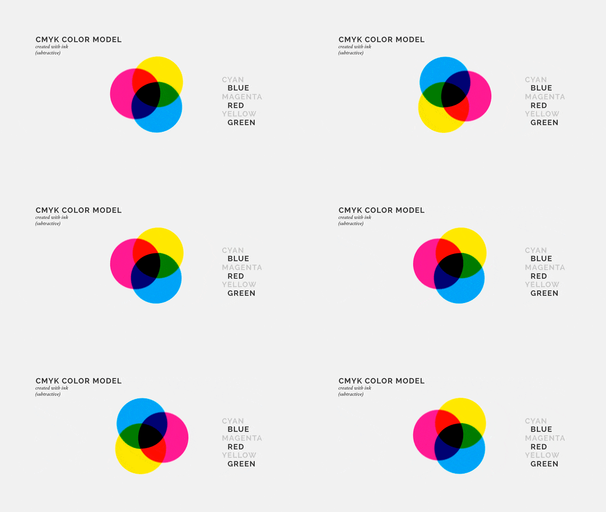
There are two kinds of color models – Additive and Subtractive. The additive color model is used for digital screens while the subtractive color model is based on tangible colors like paint, dyes, and ink. Additive color model aka RGB system is built on primary colors of the spectrum and you are able to combine different colors to create a wide spectrum of colors. Subtractive model, on the other hand, is limited. It is best to convert your files into CMYK format to ensure consistency of colors before printing your final design.

Color Harmony

Color harmony refers to the organization of colors in an orderly and pleasing fashion. When colors are arranged or organized in the right way, viewers feel a sense of calmness and when there is disharmony in design evokes a feeling of chaos and disgust. To be able to arrange colors effectively, designers have to understand different color schemes and how they influence a web application.

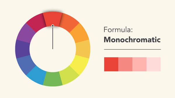
Monochromatic

Monochromatic color schemes are based on a single color with various tones and shades of it. Its easier to create a harmonious design when working with monochromatic color palette because of its limited color choices.

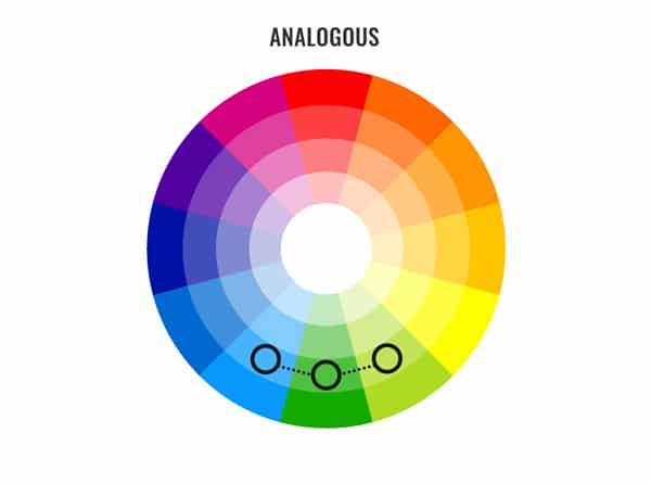
Analogous

Analogous colors are colors that are found right next to each other on the wheel. When using an analogous color palette, designers must be wary of the lack of contrast in their designs. To add contrast, it is better to choose an accent color that will support the overall color scheme of the design.


Complementary

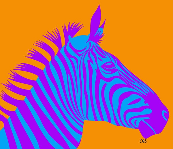
Complementary colors lie on the opposite sides of the color wheel. These high contrast combinations create an eye-catching look but must be handled with care. It is better to use them in smaller sections of the design especially the areas where you would want an element in your design to stand out.

Split Complementary

This color scheme is similar to the previous one. It chooses a base color and two adjacent colors as its complement. This minimizes the harness of the contrast and is ideal for beginners.

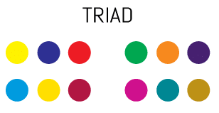
Triad

Triad color scheme refers to three colors in the color wheel that are equidistant from each other. This palette opens up the possibility of using more colors in your design and can be helpful when the design calls for more than two colors. To create a harmonious design, it always helps to work on your color balance. It is recommended to use one dominant color and the other two be accent colors.

Tetradic/ Double Complementary

This color scheme is for more experienced designers. The colors when connected forms a rectangle within the color wheel. The color balance has to be perfect to be able to pull off this scheme in a design. It is difficult to harmonize this design but when done right can be beautiful.

Creating a Color Scheme

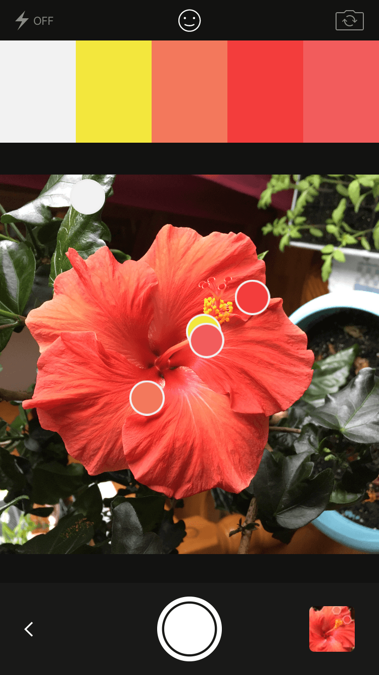
Once you have gained a better understanding of the color wheel and color schemes. You should be able to create your own color palette. When creating a custom palette, it is important to understand how different colors interact with each other. You don’t need to necessarily follow a pre-defined set of rules to create one, but you do have to know the relationship between the colors in your palette. Color palettes do grow and evolve as you build your design but you have to start with a scheme that fits the brand first. Another way to create a palette is to use a photograph. There are many online tools to help you extract colors from an image, Adobe Kuler being one of my personal favorites.

All you have to do is to upload an image and use Kuler to extract specific colors from the photograph. Once you have the colors you need, you can play with the saturation, value, tints, and shade to create a scheme that works for your project.  This can easily be exported to Photoshop and Illustrator using your creative cloud subscription.

Color theory is a science and art of itself. Designers dedicate their entire careers to this field of design and there a lot of unexplored areas within this field. We hope that this article helps you understand the basics of color theory and inform your future design choices.

The post Understanding Color Theory – Essential Guide for Graphic Designers appeared first on Web Design Blog | Magazine for Designers.


via http://bit.ly/2Wvj1Np

An Introduction to Structural Typography

Tuesday, January 29, 2019

Typography plays an important role in design. To communicate a brands message effectively, designers have to spend time understanding the nuances associated with each typeface. There are a lot of variables that can affect the overall readability and legibility of a typeface. Rhythm is one of them. Just like music, text can flow like a symphony or be scrappy and disjointed like a persistent scratchy sound from an old vinyl record. A well-designed text with harmonious rhythm is easier to read than a scrappy one. There are two types of rhythm in typography – horizontal and vertical.

Both affect the overall reading experience. Horizontal rhythm effects readability whereas vertical rhythm effects legibility this, in turn, impacts the overall visual hierarchy. To make the act of reading effortless, designers should pay attention to a set of rules that can help improve the overall reading experience of the user. To help make typography work for you, here are a few practical recommendations that you can use in your projects.

1. Selecting a typeface

Start your project by selecting a typeface. This is an important decision, so make sure to take your time to find one that works for your project. The look and feel of the typeface you chose will have a strong impact on the quality of your design. Once you have chosen a typeface, take the time to learn it. Modern typefaces come with a variety of styles – play with different weights and styles. Once you have mastered the typeface, you should be able to use it in special contexts — like on a button or labels.

2. Use no more than 3 font types at one time

When combining fonts, it is better to stick to 2 or 3 types. If they are all placed in the vicinity of each other, they are going to make your site look busy and unstructured. Font combinations should create a contrast when paired together. Here is an example of a harmonious pairing. The text on the right, however, doesn’t quite work as well as the one of the left. Mostly because the one on the bottom overshadows its counterpart.

3. Font Sizing

Text sizes impact the overall reading experience. When the text is too small, the users have to strain their eye to read. As a result, most of the information will be skipped. When the text is too big, it poses a different set of problems. So set the font size to a comfortable size to ensure maximum readability. Modular scale technique can help you find the best font size for the project you are working on.

4. Horizontal and Vertical Rhythm

Letter spacing can have a huge impact on the legibility of words. When it is not done right, it can have a negative impact on the overall reading experience as it makes it hard to be deciphered by the brain. Kerning aka the space between letters is another issue that makes the words hard to read. To set a vertical rhythm, you have to have a basic rhythmic unit. This is called line height. The block of text needs to visually connect with the text underneath it, this is what we want to achieve with vertical rhythm and visual hierarchy

5. Mind the Gap

The text is easier to read when it is left justified. The vertical edge to the left assists readers in reading the content from left to right. It is also important to look for gaps to avoid having a single word at the bottom.

It is also important to choose a typeface that works well on various devices. Try to avoid cursive scripts that have uneven rounded edges. This makes the text difficult to read on various devices.

6. Define your goals

When you begin a typography project, it is important to establish design goals. By defining goals ahead of time you are able to create a structure with the help of design principles. Design principles are abstract concepts that can help communicate the look and feel of your work. Setting clearly defined boundaries can help you narrow down a typeface from a plethora of typestyles. For example, typography that is clean and modern should look and feel different from a type that is stable and trustworthy. Different typefaces evoke different emotional responses in the user. So when choosing a type, having a clear understanding of the objective will help you find a suitable one.

7. Content Hierarchy

Once you have defined your goal, the next step should be reserved for understanding the content layout and hierarchy. If you have to design and don’t know what the content is, then it is still better to use a readable text than a lorem ipsum placeholder. Go through the copy and layout different instance of every unique type of content.

Picking typography is hard. It helps to lay them out in an artboard matrix to see how different layout combinations look like. Once you have the content layout, take time to look at the different options and compare one to its neighbor and see which one adheres to your brand objectives/principles. This should help you narrow down the typeface that can represent the look and feel you are going for.

Crafting good typography takes practice. Typography should not only be readable, but it should also make you feel. Designers should take the time to master this skill and this is only possible through daily practice. The more typefaces and styles you try out, the more you will understand different combinations and how best to use it in your project. We hope you take this practical guide to make your process better and faster.

The post An Introduction to Structural Typography appeared first on Line25.


Source: http://bit.ly/2Upmif5

Design your way

Do’s and Don’ts of Designing Complex Gradients

Monday, January 28, 2019

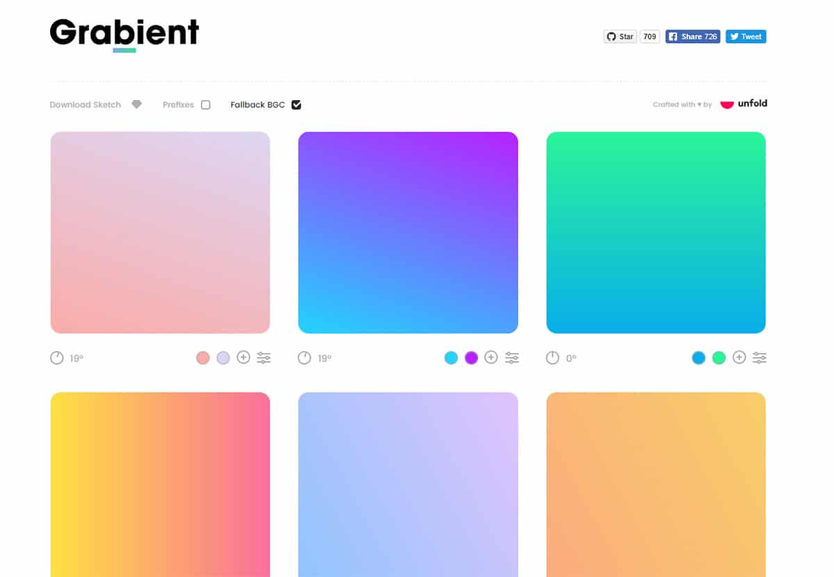
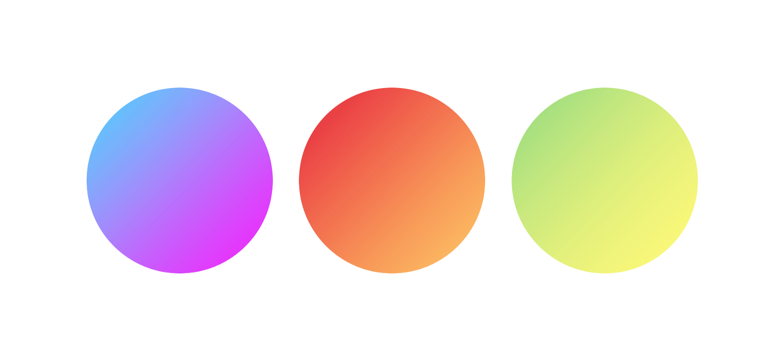
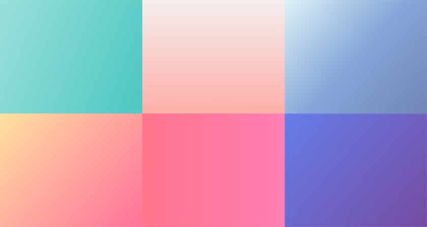
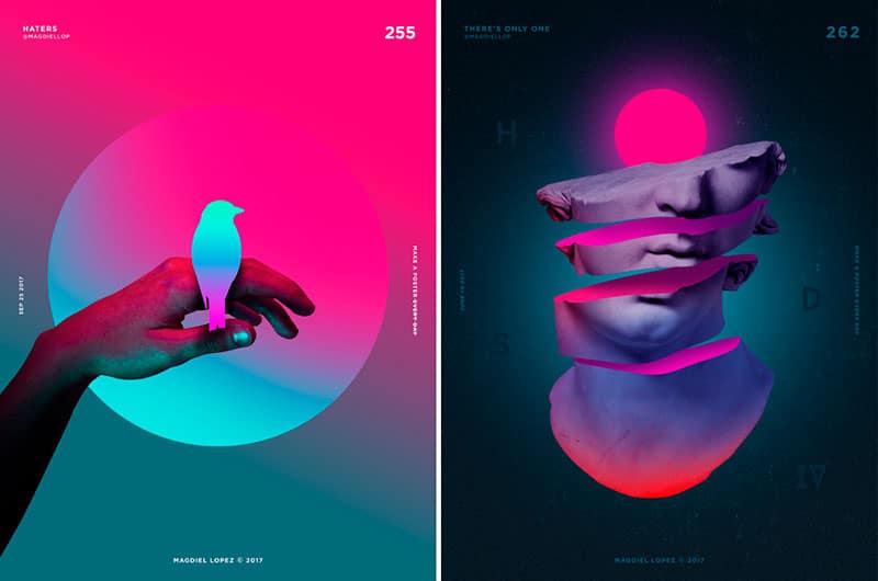
Gradients are a result of blending different colors. These color transitions can add depth to designs that otherwise would seem to look flat. Flat colors are limited and don’t produce the same effect as gradients can. By mixing colors, designers are able to create a color that is unique and refreshing. This scheme can be used to set the tone of a website and elevate the mood of their designs. Gradients can be created by mixing colors from the opposite sides of the spectrum or simply by choosing analogous or monochromatic colors, says the team at 7ninjas.com, a software development company that also specializes in digital product design. These color schemes can be used to create a focal point on a composition. Either way, the result is a color combination that looks and feels different. These eye-catching and vibrant color transitions can help elevate any design.

For designers who use gradients on a regular basis, it helps to know the basic principles which make a gradient usable. Make your way through this article to find out how designers create unique color transitions to help add depth to an otherwise flat design. Please note that these do’s and don’ts are collected from designers that have spent countless hours blending colors, so give yourself some time to master these techniques.

Color Arrangement


If you are looking to create a soft palette, it is best to stick to two or three neutral tones for a smoother gradient. Whereas a fun, funky design would require you mix bold colors and add few extra colors and color stops. Whatever arrangement you choose, understanding the purpose of your design will help you create a harmonious palette that can set the right tone to an otherwise dull design.

Here are a few key points to consider when blending colors.

  • Stick to two or three colors to create a smooth gradient
  • Try not to overload the gradient tab with more than 3 colors.
  • Use less than 3 color stops at a given time
  • Pay attention to the color transitions

Designing Gradients with Complementary Colors


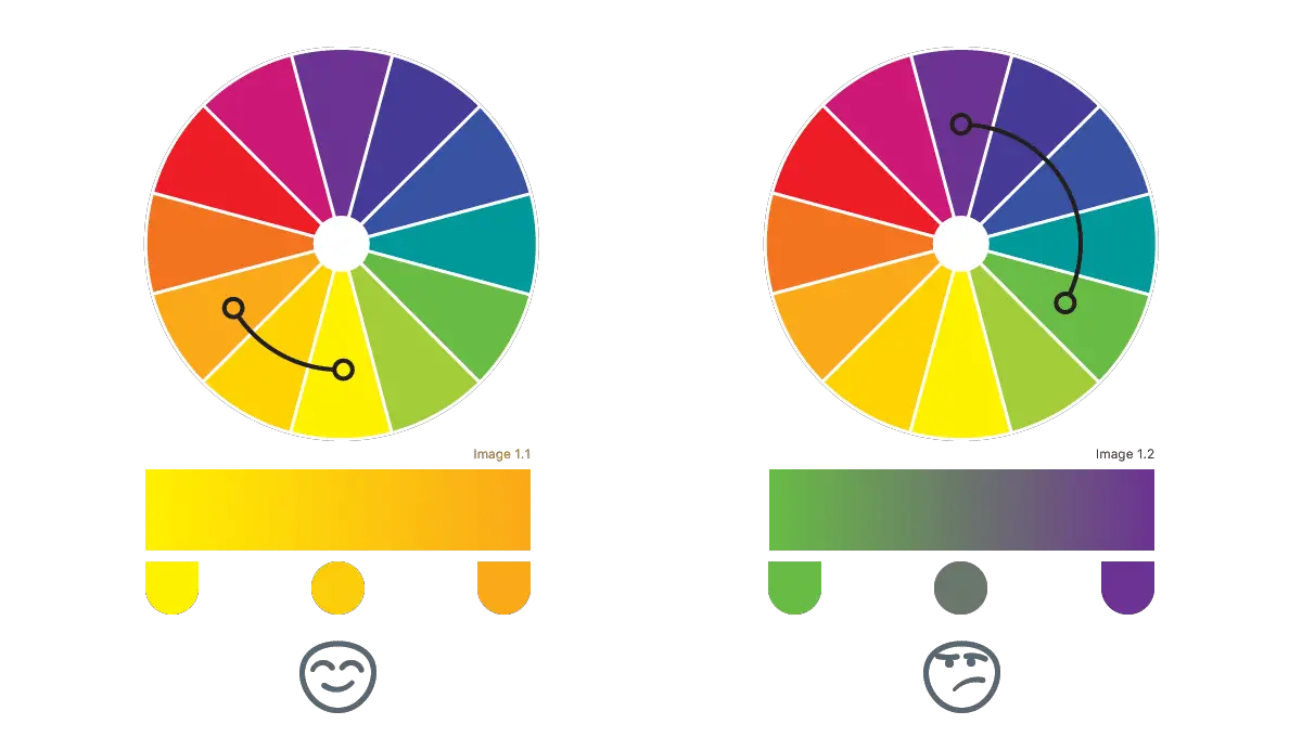
When designing gradients, It is advised to work with colors that work well together. So when working with complementary colors, it would help to learn a bit about color theory. Blending complementary colors can create a pleasant contrast. But more often than not, when creating these color transitions, designers often use only two color stops which leads to an unpleasant grey area in the center of the canvas. This can create a sense of disharmony and make the gradient unpleasant for an eye. You can fix this issue by using a color stop from the color wheel. Here are a few points to consider when working with complementary colors.

  • Work with colors that create a pleasant contrast.
  • Use more than three colors to avoid the greyish area in the center.
  • Add a color stop by choosing a color from the color wheel.

Natural Light Gradient

When designing natural light gradients, it is best to stick to an analogous color palette. Choose the main color and shift towards a lighter color to create a transition. To achieve this result, you can choose the main color and then change the color to a lighter shade or towards lighter yellow hue to create a natural light effect. Make sure to keep the color difference small otherwise it might end up looking disturbing or unnatural.

Things to consider when designing a 3 stop gradient

When designing a monotone or a smooth solid color gradient to the transparent color gradient, make sure to choose the same color for both endpoints – and the transition phase color at the midpoint can be set to 50% opacity.

Using gradients to guide the users through an interface

Gradients can be used to control the user flow in an app or a website. Users eye tends to gravitate towards brighter colors on the screen. So by placing them in specific ways can create a sense of movement within the screen.

Choosing Colors for a gradient

When choosing colors, make sure to pick colors that are close to each other for a smoother gradient. If you end up going for colors that are in the opposite side of the spectrum, they often end up canceling each other’s brightness. Another tip to keep in mind when designing gradients is that bright colors often is more noticeable than the neutral/dark tones. So use brighter tones where you want the users to see and dark transitions to create a sense of shape or a shadow.

Gradient Placement


For gradients to be effective, they have to be placed correctly within a canvas or a screen. Gradients usually have a strong presence, so use your good judgment when using them in your design.

Gradients for Illustrations and logos


You have to be careful when using gradients in illustrations. Line work and gradient overlays don’t go together. They often end up looking out of place and doesn’t create a harmonious overlay. However, using them in the filled or isometric illustration can give it a 3D look and feel.

When using gradients for  B2C or B2B brands, make sure to choose colors that represent the brand. The gradient has to represent the brand’s values and work across  different platforms and devices

We hope that this little guide helps you on your journey to using and designing better gradients. The tips gathered here are a collection of tried and tested ideas from different designers in the industry. If you think we have missed an important trick or an idea, please write to us and we will be happy to share it here.

The post Do’s and Don’ts of Designing Complex Gradients appeared first on Web Design Blog | Magazine for Designers.


via http://bit.ly/2HCANLf
 

The Cash Box Blueprint

Most Reading