Logo colors make a big impact. This is because color speaks to us. From the big splashes of color we create in kindergarten to the fun colors we use at party times, color has meaning.
All people, from young to old enjoy color. We use color to express emotions, create messages and add life to our lives.
If you are communicating a brand message, logo color schemes will make a big impact upon what you communicate. Choosing the best logo color palette for your brand will help you to send out a positive message to your clients, showing them the value of your brand.
When you use color psychology, logo colors can also be used to attract the right clientele. The opposite is also true, which will be very unhelpful for your brand.
color psychology is a great help when designing your business colors. color psychology helps us to understand how color impacts upon our moods or determines our actions. Warm and sunny colors such as yellow cheer us up.
Green color psychology tells a different story. Green is seen to be soothing or relaxing, and is often associated with sustainable brands. How do we understand color psychology when it comes to logo design?
Does the psychology of color always directly translate into logo design? Lauren Labrecque and George Milne in their article Exciting Red and Competent Blue: the importance of color in marketing share that color and brand interlink in a customer’s memory to help create a brand identity. However, a customer may not always make stereotypical assumptions about color when it is used in logo designs.
This article aims to show how business colors work as part of a brand’s identity. By answering the questions below, we’ll guide you on the perfect logo color combinations to use to communicate your brand’s message.
What is the value behind your brand?
Nobody knows what your brand stands for better than you do. A brand often transcends a product, aiming to supply meaning or value to its customers. Before you pick your logo colors, assess the values you wish to communicate. Do you offer creativity, speed, ethics or efficiency? Knowing your values and the messages you send will assist you with selecting your logo color palette. Reds might symbolise boldness or energy while blues may make you appear efficient. Your brand message is important. A company which delivers couriered parcels would send a different message to a home care agency. Once you’ve decided on the personality of your brand, you will have more of an idea what corporate colors to use.
Meaning of colors
color is a powerful predictor of our emotional responses, actions and even attitudes. Specific colors may activate our bodily responses. colors are meaningful in different ways. Some meanings may come from the natural world while others are determined by culture.
People throughout the world give meaning to color. Understanding color means digging deep into our collective psychology. Designers benefit greatly from using color psychology to determine their logo color combinations. Here are some popular meanings you can use when putting together professional colors for your business logo design.
Red’s meaning in logo design
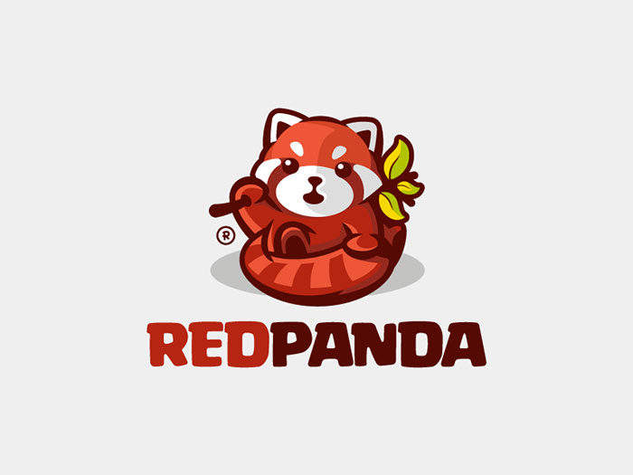
Red is certainly one of the colors that stand out. It is a bold color which demands attention. It is symbolic of love, passion, energy and determination. Many countries use red in their flags. When we see red our blood pressure is raised and we breathing quickens.
Red makes us hungry and moves us into action. The bold, attention grabbing nature of red is appreciated by extroverts as well as males. Many company websites use the attention grabbing nature of red on their websites as a call to action.
As a primary color, red also symbolizes anger, passion, and excitement. As it is so exciting, red makes a great corporate color if your company is young, innovative, exciting or playful. If your company wishes to send a conservative or more subdued message, red will not be the color for you.
What does red communicate about your brand?
 Red shows that your brand is alive, passionate and even powerful. Red is a wise choice for restaurants of food venues as it increases appetite. If your company thrives on impulse buys or fast sales the urgent message given off by red will motivate your clients into action.
Yellow’s meaning in logo design
Yellow is a bright and vibrant color associated with sunshine and happiness. Yellow makes people feel warm and it boosts mental activity. It also generates muscle growth. When people see yellow they begin to feel happy or cheerful.
Yellow is an attention grabbing color but is not good if overused. Babies cry more in yellow rooms and older children can become distracted. When yellow is overused people can become impatient or restless.
However, when yellow is underused, people feel lonely, insecure and may have low self esteem. Yellow is great in logo color combinations but should be used in a very balanced way.
![]()
If you have a brand that radiates warmth, yellow is a great corporate color for you. It will appear comforting and embracing. Youthful brands will also do well to use yellow in their logo color combinations. Yellow can appear playful as well as affordable when used in corporate branding.
What a yellow logo communicates about your brand
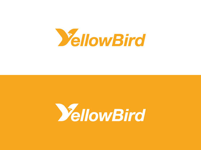
Yellow will offer up a ray of sunshine, portraying your brand as friendly and full of warmth. Your brand will grab attention and offer feelings of joy. When using yellow, use it in a balanced way, and use a shade which is gentle on the eyes.
The psychology of blue as a logo color
![]()
Blue is an abundant color in nature and is often associated with sea or sky. Blue is soothing and has been associated with intuition, imagination, peace or freedom. Blue has also been associated with loyalty, peace, authenticity and intelligence.
It is used widely in as one of the professional colors associated with competence and reliability. As a corporate color logo, blue can appear warm and dynamic or cool and competent. Too much deep blue can appear morose while bright blue adds an innovative touch.

Blue is associated with tranquillity as it relaxes the body. Perhaps this is why blue is associated with peace or relaxation. When blue is used as a logo color it inspires trust. As trustworthy colors, shades of blue are often used in medical logos.
Deeper blues are used as corporate colors as they are associated with competence or professionalism. However, having too much blue in your business color palette can make your company appear lifeless and even cold.
Companies such as IBM, Dell and Intel need to offer reliable products which are trusted by their customers. These companies make use of blue in their logo designs to send a message of reliability. Blue shows that the companies are competent and trustworthy. Car manufacturers such as Ford as well as appliance brand GE also use blue to show how reliable their products are.
What a blue logo shares about your brand

Blue shares that you are competent and trustworthy but non-demanding. Blue inspires trust, calmness, professionalism and healing. Blue is not always the best color for restaurants or companies selling food, however.
Green color psychology for logo designs
 Green is the color of nature, of leaves, plants, grass and new life. As new leaves come out in spring, green is a symbol of new beginnings. Symbolising the end of winter, green is also the color of abundance and has been linked to money, wealth and ambition.
As new life is also green, the color can be linked to a lack of experience. Organic imagery is seen to be soothing and green is no different. Easy on the eye, green is associated with healing and renewal. Our eyes are so used to seeing green everywhere that it makes a great background logo color.
Green is a very peaceful and non demanding color. Green is often seen to be natural or environmental. Brands which focus on rejuvenation, healing, creating a fresh beginning or sustainability often use green within their logo designs. Green is not one of the strong colors which demand attention, so if you are looking for a bold color, green may not be your favourite option.
Green is associated with nature-based companies or sustainable developments but it is not limited to ecology. Companies who produce health products often make use of green to show how natural their foods are as well as the goodness and longevity associated with healthy eating. Green is one of the more popular logo colors.
Purple’s psychology in logo color design
Purple is a mixture of bold red and competent blue. Purple is rarely seen in nature and only usually as an accent color. As a result, purple is seen to be sacred and valuable. Purple has been associated with royalty. It has also been associated with spirituality, luxury and power. Ambition, power and vitality are qualities associated with the color purple. As a mixture of both red and blue, purple is bold and yet it does not overwhelm.
Adding purple as a color in logos will give a touch of luxury or glamour to your design. Purple will appear sophisticated and give a regal feel to your brand. Purple will give a sense of creativity. High end cosmetics companies or fashion brands often use purple as a part of their logo designs. If your brand is nature based or down to earth, purple will not be the color for you.
The Syfy television channel use purple combined with a modern font to show the endless impossibilities and explorations possible in science fiction. Hair design companies have been known to use purple in their logo designs too, showing creativity and an experience of luxury.
What purple communicates as a color in logos?
Purple says that your brand is offers a high end product or a sense of luxury. Purple also symbolises creativity. Clients who wish to appear wealthy will be attracted to a purple logo. Likewise, spiritual clients who enjoy mystery or open minded exploration will also find purple logos attractive.
Black in logo color designs
 Although black is a neutral color, it does not reflect an absence of color. Black is absorbent and non reflective. As a result it appears mysterious. Black is also associated with elegance – think of the little black dress – and with authority. On the darker side, black has been associated with aggression, death and the dark arts.
As a corporate color, black shows sophistication. Black shows power, authority and confidence, but used alone it may appear empty. Black is one of the perfect logo colors to add power or mystery to your logo design. However, you’ll need to use black carefully in order to ensure you put across the message you want. When you include black in your logo design colors, you’ll be drawing on one of the more serious colors. Black is the traditional color associated with professionalism. Brands who use black are expressing a message of authority, respectability and sophistication.
What using black in company logos says about your brand?
If you are using black as a part of your branding message, you aren’t shouting for attention. Instead, you will be implying that your company already has a great reputation. Black is the color of elegant sophistication and authority that is strongly associated with a highly professional brand.
Using brown while designing a business logo
Brown has earthy tones which link it back to nature. As solid, reliable and trustworthy as a tree trunk and as nourishing as the soil, brown creates trust, reliability and unity.
Brown is a relaxing color and is also seen to be one of the trustworthy colors in corporate logo design. Brown is soft and natural, giving it an earthy or grounded appearance. Brown is seen to offer warmth, rustic charm and warmth or approachability.
White’s color meaning in business
Although white is often ignored in logo design, it is a great logo color to take into consideration. As a neutral color, white can be used to add contrast to deeper, darker or more attention grabbing colors.
Designing with white space in mind adds simplicity and elegance to a design. Think of green and white logo designs, where the white enables the green to stand out in contrast to, say blue green logos. White and blue logos create an atmosphere of elegance and freshness.
As a color, white is pure and elegant. Brands who use white in their designs will offer a sense of luxury or sophistication which is hard to beat.
White, as a color which reflects, has been associated with light, innocence, purity, cleanliness and guidance. By using white in your design you will add simplicity and ease. Viewers enjoy uncluttered logos with a great deal of white space. Your logo will appear clean and easy on the eye. This makes white one of the top choices when it comes to logo colors.
Orange in a logo color palette
Orange, that zesty, citrusy color, combines the boldness of red with the warmth of yellow. Filled with vibrancy, orange is a joyful and creative color.
Orange may be as bright and summery or may share the warmth of autumn leaves or winter fires. Orange is associated with compassion, warmth and understanding.
Like red, orange stimulates the appetite, which is why it is often used by restaurants. It also increases mental and physical activity. Orange is gentler or mellow than red but still invites us to action.
Brands who wish to remind us of warmth, joy and vitality often use orange in their logo designs. Travel companies evoke feelings of exploration, happiness and warmth when they use orange in their logo designs. Harley Davidson combines black, white and orange to create a sense of toughness and adventure.
Orange is also a great child friendly color. The vibrant, fizzy color of Fanta appeals to children across the globe, as does the orange spatter logo for Nickelodeon.
What an orange logo says about your brand
Orange logo colors say that a company is warm, friendly and vital. The company will appear to be light hearted but still very confident. Orange offers the warmth of yellow and combines it with the lively appeal of red. Less attention grabbing but with all the warmth, orange makes a great color logo. Orange is one of the fun colors and your logo will reflect this.
Pink’s color meaning in branding
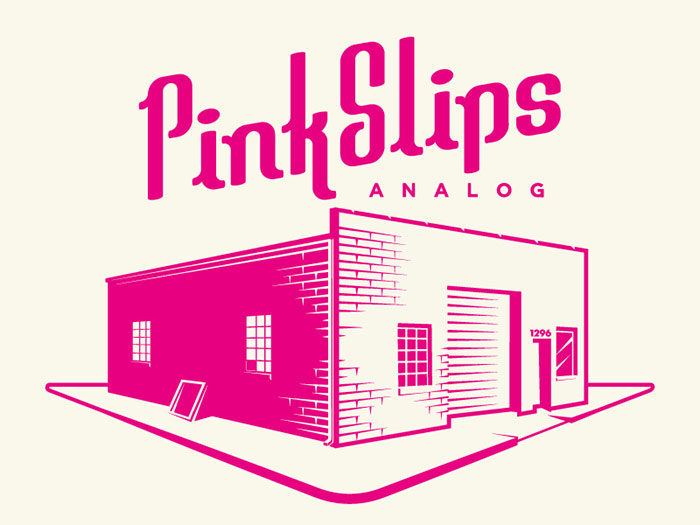
Pink logo colors make great choices for feminine brands. Pink is a combination of red and white and while it is associated with femininity, it is still a very versatile color choice. Pink draws up images of sweetness.
Pink marshmallows, coconut ice, and pink ice cream are associated with sweet treats. Pink is soothing, and has also been associated with sex or sexualities. Pink is associated with warmth and nurturing. It has great appeal to young girls.
What it says when you use pink in logo colors?
![]()
If you are using pink, your brand is probably aimed at women. Your brand will portray a girly image and will appeal to customers who enjoy this look. If pink is used in food logo designs, your brand is probably associated with sweet treats. Overall, pink is associated with femininity, sweetness, and fun.
Using grey in branding design
 A logo color palette that contains grey will appear timeless, intellectual and practical. Grey is one of the most neutral colors used in logo design. It adds a clam, soothing presence when combined with bold colors. Companies like Apple have used grey to portray a sophisticated elegance with great success.
Don’t just pick a single color
The color choices above each add meaning to your business color palette but they do not have to be used alone. You can combine a range of different colors or stick to two colors. Blue and white logos are popular in logo design.
Green and yellow logos combine the warmth and serenity found in nature. Strong colors can be mixed with neutral colors to tone down a logo. There are many different ways of combining colors when designing a logo.
When choosing colors for logos, you could start by combining two or three colors which tell a story about your brand. Give your color schemes meaning. By using logo psychology you will be able to come up with a message for your brand which is original and unique. You will also be able to appeal to the right kinds of customers for your brand.
Feel free to experiment with the mood or image you want to create with your brand. colors can be playful or serious depending on your message. You can combine contrasting colors or those which complement each other. Use your colors persuasively so that you portray the message behind your brand.
Translate the language of color
If you are designing a logo for a globalized brand, look at the meanings of color across different cultures. This will help you to create color schemes for logos that appeal to an international market.
Purple, for example, may be associated with luxury in western countries but is associated with immortality. White, the color of innocence in the west, is symbolic of death in China. Some exploration into multicultural meanings can assist you to create a sensitive design.
Use logo colors to stand out from the competition
A great logo is easily identifiable. When your logo is memorable, your clients will link it with your brand message. Your logo will help your clients to identify your brand and choose your brand over the competition. Logo colors will help your brand to stand out.
Think of the great red and white logo from the Coca-Cola Company which stands apart from the competition, or the blue Ford logo which is easily identifiable for customers. Ford uses blue logo colors to share the reliability of its brand while Land Rover uses green to share its off road and adventurous spirit.
Ending thoughts on logo colors
Following color psychology when choosing logo colors will help you to communicate the message behind your brand. Remember though that colors can have different meanings in different countries.
The shades, tints and hues of a color will add different meanings – with bright blue communicating a dynamic message, for example, while deep navy has a corporate and very serious tone. Color combinations will create new messages which will help to emphasise the value of your brand.
So now it’s up to you. Use your logo colors to create a distinct identity for your brand, and one which attracts your customers. Take time to assess the message you would like to communicate and use your logo color palette to share your message.
By creating the right color message in your logo designs, you will be able to build a relationship with your audience which will make your products easily identifiable for years to come.
If you enjoyed reading this article about logo colors, you should read these as well:
- Logo trends 2019: what you should look out for
- Best free fonts for logos: 72 modern and creative logo fonts
- Animal logo design ideas and guidelines to create one
- Logo design ideas that you should use for branding projects
- Logo maker app examples to try as an alternative to hiring a designer
The post Logo colors and why they’re important appeared first on Design your way.
Source: http://bit.ly/2RmwseO


No comments:
Post a Comment