Following an order when creating web pages is essential to make it attractive to Internet users. Each element must be analyzed, which includes images, colors, and letters. This last section has certain options that are everyone’s favorite, for example, Bodoni font. However, once we have our entire site with this typeface, how can we accompany it? That’s where you need Bodoni font pairing examples in your work.
If you work in the design world, you will know that just having a writing source is not optimal: you need to have several styles that adapt to many possibilities. You also need to have options that can complement each other so that the design is not so monotonous.
Getting these complementary styles doesn’t have to be a nightmare; At least not if you are a user of the Bodoni typeface, since today we bring you a guide with some options that will look spectacular.
For those who do not know it, Bodoni is a typeface dating from 1798. However, it has been modernized to adapt to new technologies, so today it is better to use it for screens. Thanks to its classic style, it can combine perfectly with most of the stylized fonts, like the ones we show you below.
Bodoni font pairing examples
Montserrat – Similarity in contrast
We can always start exploring the most similar options in design, such as Montserrat, which shares the contrast and elegance of the Bodoni font. Due to its similarity in visibility, it is recommended that we use it in sites with a distinguishable background color.
Futura – From Bauhaus’ house
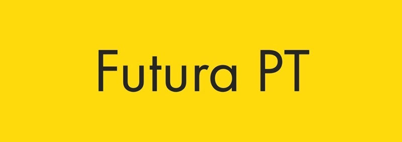
The Bauhaus movement left many contributions to humanity. One of those was this typography designed in 1927 by Paul Renner. Highlight the geometric shapes and give great importance to the circle. In this case, Futura works like in a Bodoni Font pairing thanks to the bold combination of thin and thick strokes.
DIN Font – Technical Experience
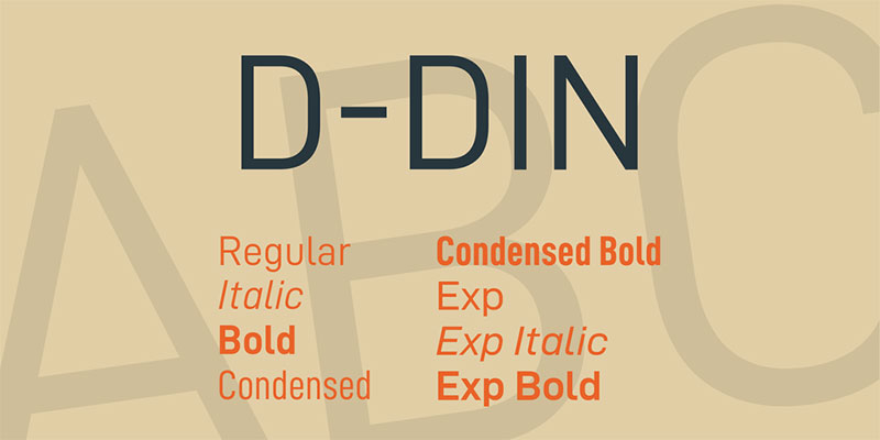
Thanks to the German Institute for Standardization (Deutsches Institut fur Normung, or DIN), we can enjoy this technical letter that works for all types of professional jobs. Its use and classification are within DIN 1451 standards, but in general terms, it is a letter without distracting aesthetic elements.
Its simplicity makes it extremely visible, so it is not only used in industries, but has been extended to posters, signs, and more casual designs.
Source Sans Pro – The interface companion
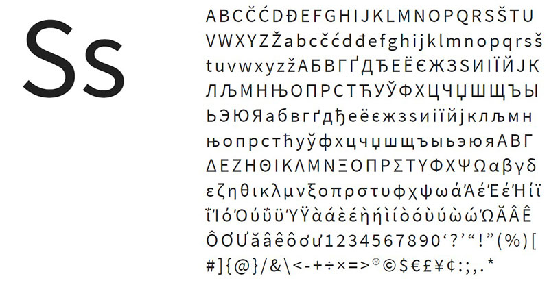
Specially designed to fit the monitors, Source Sans Pro has an elongated style that makes it readable on vertical screens. Unlike Bodoni, this typeface has no problem using thicker strokes.
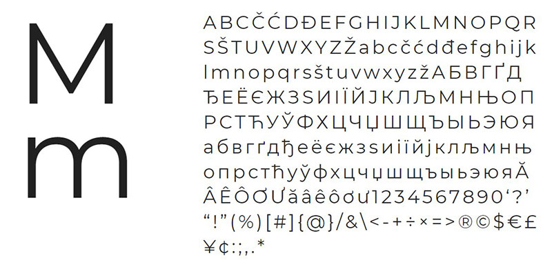
PT Sans – Many contemporary styles
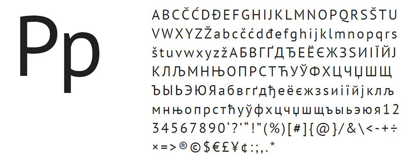
Although not much has happened, the styles of the second half of the twentieth century are very different from what we currently have. As an example, we have this Bodoni pairing that is inspired by a Russian serif letter from a few decades ago. Although it looks slightly modernized, it retains its essence very well. The best thing is that it has eight different styles to choose from.
Avenir – Personal style
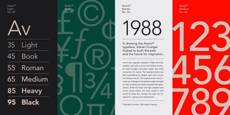
This Bodoni Font pairing was born as a variation of the Futura and Erbar typefaces. It maintains the sans serif style of both but tries to modernize it a bit thanks to the new cultural movements.
Arial – The classic of classics

Working on a computer is knowing about Arial typography. It is a standard for many documents where we do not want any aesthetic detail and a letter of considerable size. It can also be found under the name of Arial MT.
Maven – For any context
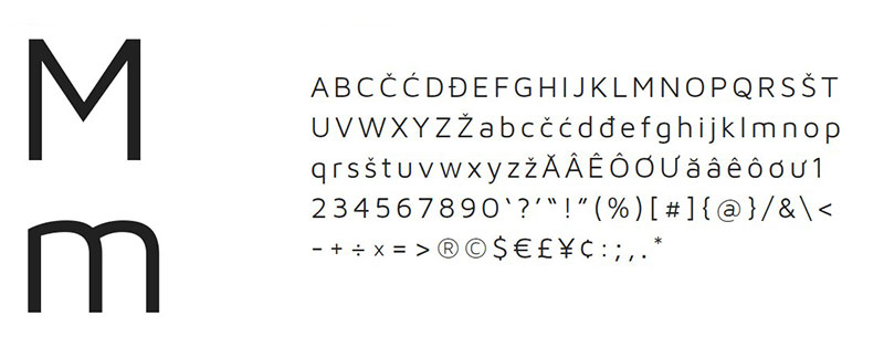
Maven’s nature makes it easily adaptable to many types of letters, from classic designs to more contemporary ones. This is because it is not as rigid as other options, instead, it seeks a mix of features to highlight.
Sentinel – Filling a void
The typeface should adapt to new standards as needs arise. In this case, and based on the existing Clarendon, Sentinel is born, a letter that adds everything that was missing to the original Slab Serif typeface, as are italicized and with wide thicknesses versions.
Trade Gothic – Some variety
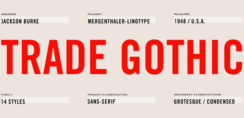
Trade Gothic offers something different when it comes to Sans Serif. They are extra tall letters, with constant thicknesses in each stroke, and pronounced curves where necessary. This letter is widely used for large headlines in magazines and newspapers, but it can also be easily adapted to a digital medium.
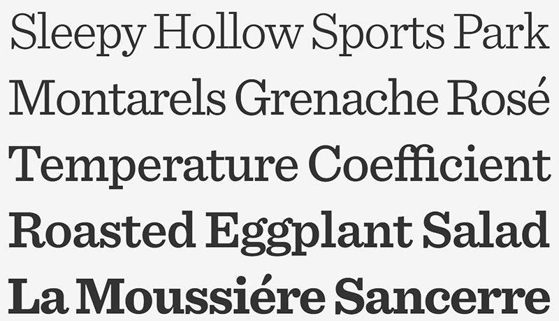
Georgia – Elegance with various styles
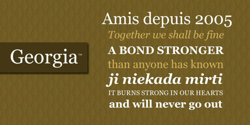
A letter of widespread use is Georgia. It is not specifically created as a Bodoni Font pairing, but generally adapts to almost any context. Georgia is especially useful in subtitles, and since it has a good variety of styles, we will have no problem getting the one we need.
Helvetica – Durable Design
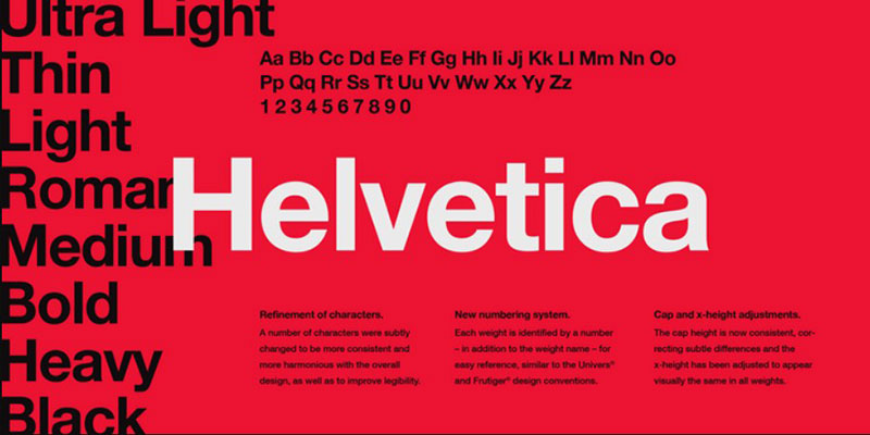
When it comes to advertising, nothing better than the classic Helvetica. Despite having appeared for the first time in 1957, it is still one of the most used for logos, especially because it remains neutral but striking.
Helvetica’s popularity as typography is due to the German and Swiss designers of the 50s and 60s, who used a nineteenth-century font as inspiration.
Neue Haas Grotesk – Recovering history

This is the original version of Helvetica, or at least, an attempt to recover its past. It has undergone some changes over the years, typical of digitalization, as a refinement of the line, but the shapes and locations of the lines have remained.
Iowan Old Style – A simpler time
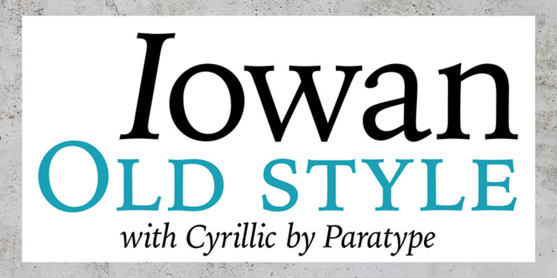
Slight inclinations, many curves, and stylized ends are the main features of this letter designed by John Downer. Additionally, in 2016 a Cyrillic version of the letters was included thanks to the collaboration of Natalia Vasilyeva, so the catalog of possibilities of a letter that has a classic and pleasant appearance was expanded.
Palatino – Professional works
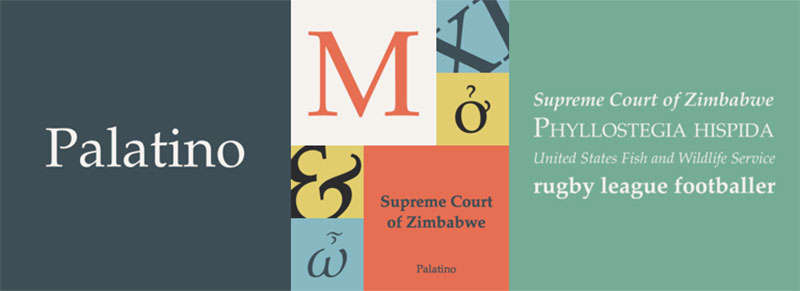
Another recommendation of a Bodoni Font pairing that has considerable time in the world is Palatine. Its original design dates back to the 50s, but recently it was modernized for computers by Professor Zapf, who personally added a good number of additional characters so that it could be used worldwide.
When it comes to professional publications, such as books, pamphlets, catalogs and much more, Palatino is our ideal companion for its elegance.
Sofia – For many languages

We finish this little guide of perfect typefaces to accompany Bodoni with a simple letter, but with many characters. Sofia has a simple geometric pattern, which does not exaggeratedly recharge the lines. We can find it in eight alternatives, including an amazing cursive style.
If you enjoyed reading this article about Bodoni font pairing, you should read these as well:
- The sometimes strange but impressive Gucci ads (Check them out)
- How to create an illustration portfolio that gets you hired in an instant
- The best fonts for print you can pick from this collection
The post Bodoni font pairing examples that look great appeared first on Design your way.
Source: https://ift.tt/2SsT93m


No comments:
Post a Comment