NASA is probably one of the most known space agencies in the world and it has even been mentioned in a lot of movies. It deserves for sure to be known because it also managed to do some of the first breakthroughs in aeronautics and it is considered to be one of the top space agencies because of its missions in the space. Even when we see the NASA logo, we have no problems figuring out the brand behind it.
We have been seeing it for years now and is one of the most popular logos in the domain of aeronautics. The NASA logo is probably one of the key elements of this organization. A lot of people around the world follow all the updates it brings because it is associated with the global scientific superpower status.
If you didn’t know this organization has three different logos. The most used ones are the ones called meatball and seal designs and there is also the third logo, but it is more used in certain circumstances. On top of this, NASA sometimes even makes new emblems for different projects that they have
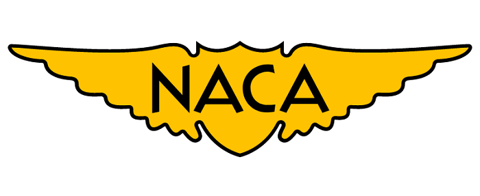
Before NASA there was NACA
NASA also is known as the National Aeronautics and Space Administration was made in 1958 to fight back the Soviet Union’s success, the launch of the first satellite called Sputnik. NASA was derived from the National Advisory Committee on Aeronautics because they had to bring the people from somewhere.
NACA dates back to 1915, and they didn’t have a logo of their own. They used different badges that had eagle wings or a shield to show the military potential of the organization.
In the 1950s these two elements, the shield together with the wings were put together to form an outline that was put around the NACA letters. We can consider that this was one of the inspiration sources for NASA’s present graphics.
The Original Logo
In 1959, the National Advisory Committee on Aeronautics switched in the National Aeronautics and Space Administration, the well-known NASA. The man that was in charge of the creation of the NASA symbol was James Modarelli.
What he did was a standard NASA logo for that period, and it showed for sure that this organization is a space agency but did not show its aspiration for the future.
Every element that we see on all the NASA logos correspond to a certain mission that NASA has set up to do. The round shape, for example, is the NASA symbol for a planet while the starts for sure make you think about space.
The idea of space travel is given by the red chevron together with the orbiting spacecraft. What NASA claims is that this logo is more used to get a military feeling. When Neil Armstrong stepped on the moon more than 50 years ago his suit had this logo that we are talking about.
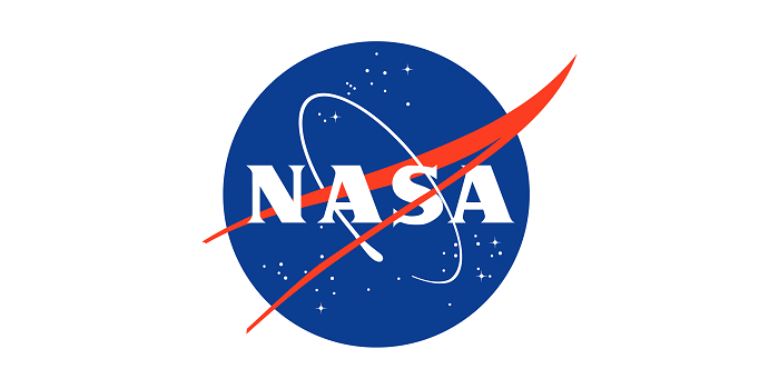
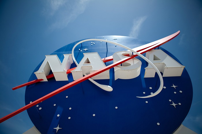
Nasa Meatball
Modarelli was the one that made the NASA logo a bit simpler. He added white lettering and put all the stars and the orbital path in a round field made with blue and red that interconnected with the rest of the design.
Indeed, the blue sphere is the symbol of a planet, the stars are the space and the red foil is the symbol for aeronautics together with the orbiting spacecraft. All of it makes sense but the logo got its “meatball” name later in 1975 when NASA considered that after sending the first man on the moon it’s time to do something even more futuristic.
Nasa Worm – The NASA logotype – 1975-92
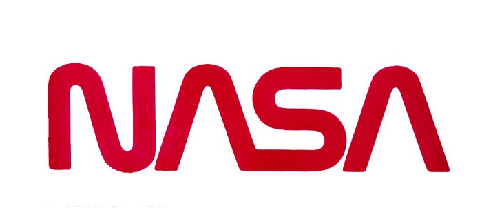
The year 1974 is the year when the controversy began about the NASA meatball logo. The leadership of the organization wanted a more contemporary look and between 1972 and 1981 around 50 agencies of the government searched for identities and made changes together with the Federal Graphics Improvement program.
NASA contacted the design firm Danne & Blackburn from New York to create a modern logo. The logotype that came from this agency was added in 1975. This new logo was sleek and had great visual standards. The NASA logo even won in 1984 Presidential Award for Design of Excellence.
Return of the meatball – 1992 to present
After 17 years all through NASA won the “Award of Design Excellence” by the Presidential Design Awards stopped using that logo and went again for the NASA meatball logo.
Some speculate that because of the Challenger disaster that took place in 1986 and different seatbacks the energy and morale of the people were low, and something was needed to be changed. This combined with pressure from older employees might have led to the change that took place.
No matter the case, the first day when the new administrator Daniel S Goldin took his place in 1992, he made this fast decision to get back the original NASA logo. This move brought a lot of debate and as we suspect the above mentioned might have been the cause of the change.
What does the NASA logo mean: The ‘meatball’ symbol?
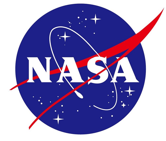
This NASA logo represents the aspects that are the most important for NASA. We already know that the round shape represents a planet, the V-shape represents aeronautics, the stars represent the space and the circular orbit but, in the end, the logo represents the search of man into space.
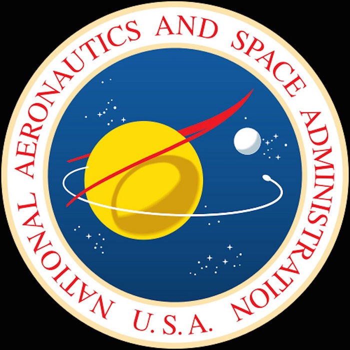
Besides this NASA logo that we all are very familiar with there is also another official symbol that is known as the NASA seal. This NASA emblem is more used in formal events like official ceremonies or different award gatherings. Like its main logo, the seal also contains elements that represent planets, stars and orbit.
The font that is used in the “meatball” logo is a simple bold serif type and each character is capitalized. The colors that are used are red, dark blue and white.
Additional emblems
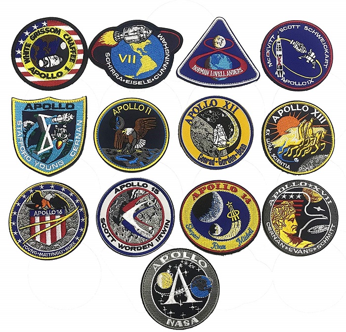
NASA also has a few more emblems that it uses for different occasions. For instance, each space crew has a new NASA logo that reflects the details of their mission and what they are about to do in it.
Designing for the future
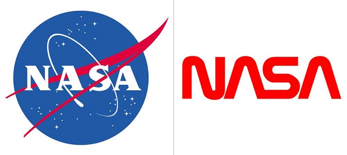
For sure some people prefer more the “worm” design vs the “meatball” one. No matter what is your favorite one we should expect that NASA will bring probably again a change in the future. Just keep in mind that they might surprise us more soon than we can think off but until that happens all that we will be able to do is to focus on the present.
If you enjoyed reading this article about the NASA logo, you should read these as well:
- The Adidas logo: What makes it so special
- Try these pretty fonts for fun and sweet projects
- The Amazon logo: Its meaning and the history behind it
The post The NASA logo and the evolution of the space company’s brand appeared first on Design your way.
Source: https://ift.tt/2xi4m0i


No comments:
Post a Comment