The difference between a regular web designer and a really good one is the attention to details, taking time and being careful when making each and every aspect of the design process. What I’m talking about here is not impressive graphical elements that would steal a visitor’s attention, instead I’m talking about those delicate details of a design element that could enhance the user’s experience.
I know time is important to everyone and it may seem like a waste of it to focus on these little things, but you have to take care of these subtle details especially when creating a project for designers or people with a trained eye. The satisfaction that a visitor receives when he sees one of these details is incredible and your image in his eyes increases tenfold.
For example, look at the globe icon on Facebook. The icon shows a different side of the globe depending on your location.
You might say that Facebook is big company and it affords to do these specific things. If you would say this, it wouldn’t be the smartest thing you have said. One of the reasons it became a big company is that it cares about its visitors and tries to deliver the best experience to its visitors.
Perfection is achieved not when there is nothing more to add, but when there is nothing left to take away
You have to be patient with your work and put every element of your design layout in their place with a specific purpose. Otherwise, if the element has no importance in your design, then you should remove it. Cluttering your design won’t do you any good. On the contrary, it may do more harm so try keeping it simple.
Even if you want to believe it or not, small design elements are noticed subconsciously by the visitor and they influence him in making decisions on the site. A good example of small design element is the attachment icon on Gmail which changes after the first attachment was uploaded.
There are also other details which don’t necessarily focus on design, but on functionality and improving the user experience, like security issues or guidance for the visitor to do the safest decisions on a website, like the registration form on Geeklist which tells you in a more interesting way that you have a weak password.
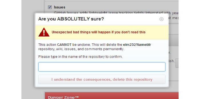
Another similar example is from GitHub where you are asked to type the full repository name to delete it. There are various sites where users tend to have a certain fear for “delete my profile” type of buttons which are stupidly thrown on the layout of the page and you might click it by mistake.
Be a perfectionist
This sounds a little bit elitist, but you have to do your best at every part of the design that you are working on. You will have to recheck the design and position of every element and modify it in such a way that it will improve the user’s experience.
You probably noticed that the words usability and user experience appear a lot when we’re talking about design and it should be no surprise. Website and app designs are all about UX and usability.
We’re not in the year 2000 when visitors responded positively to flashy content. The industry has grown up and the users are tired of the design over functionality issue. What they want are products that are useful and that can deliver what they are looking for.
Another thing that the visitors enjoy is being informed about what’s happening on the screen and about the result of their interactions. For example, when uploading a photo for example, they would like to know in real time how much of it was uploaded.
A plus on credibility
Gaining credibility for your product with these details is a big win and that is important because you design for you visitors and customers, not just for the sake of designing something. Visitors judge your site by evaluating design, copywriting and interactions. While copywriting shouldn’t be your concern, design and interactions are your responsibilities and you must deliver a well thought product if you want to gain more customers or visitors.
Go big or go home
You can build average websites, apps for web and mobile, but what you want for you and for your clients is to build excellent apps that are memorable. This can be done with a lot of work and time invested.
Also, you have to ignore templates. I know using templates is easy and switching the colors and a few fonts from one client to another may work for some designers, but that won’t help you get far, especially because one design doesn’t have the same effect for every client. They most likely target different audiences and different audiences respond differently to various design styles.
Use unique graphics in your designs. Trying to use icons made by other designers on your layouts doesn’t always have the desired effect. There are icon packs built with a lot of attention and which have really neat icons, but most of the times you will find yourself trying various icon packs on your design and you’ll notice that they simply don’t fit well. Creating your own icons in the same style as the overall design of the site is the best solution.
After you think you finished your project inspect every element and make sure everything is in place. If you are uncertain about some elements, don’t be afraid to ask for feedback your colleagues or friends. Don’t be afraid of what they might say. Also, don’t do everything that they comment about your design. If you know you know for sure that you’ve done the right thing by placing an element in a certain zone or if you designed it properly, stick to your design.
In the final part of the article, I left you a few other examples of details that look good and make the user experience better, courtesy of littlebigdetails.com.
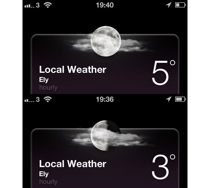
iOS 6 – the night time weather summary shows the correct phase of the moon.
Dropbox – iOS app automatically pauses Camera Upload when the battery is running low.
YouTube – If you navigate away from a video, then immediately return, the player continues where it was left off.
YouTube – Clicking on the “Report” icon on YouTube stops the video if it’s currently playing.
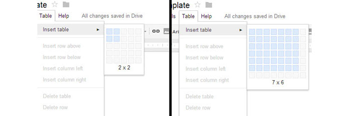
Google Drive – An expanding hover interface allows you to choose the desired amount of rows and columns in a new table.
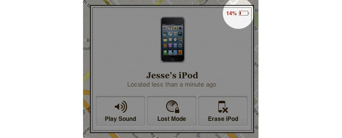
Find My iPhone – When your iOS device has been located, it shows the remaining battery level, so you know if you’re going to lose track of it soon.
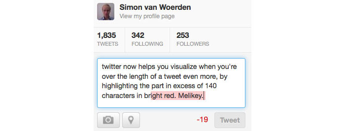
Twitter – Characters exceeding the 140 limit are highlighted in red.
Gmail – Incompatible versions of Internet Explorer show a damaged envelope as the favicon.
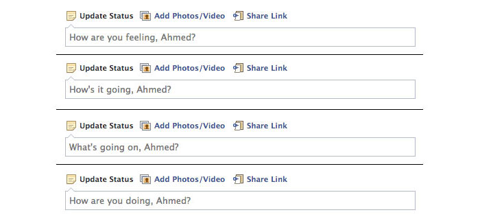
Facebook – The prompt text in the “Update Status” field constantly changes on refresh.
Opera – Tabs that haven’t been viewed yet are indicated by a folded corner.
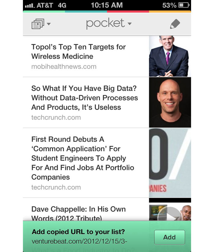
Pocket (iOS) – After copying a URL, opening the Pocket app will automatically prompt you to save the content.
37 Signals – Blog post header text changes with size by dropping non-essential words as the browser viewport gets smaller.
Google Chrome – When dragging the active tab it is always on top of the others, when dragging an inactive tab it moves behind the active one.
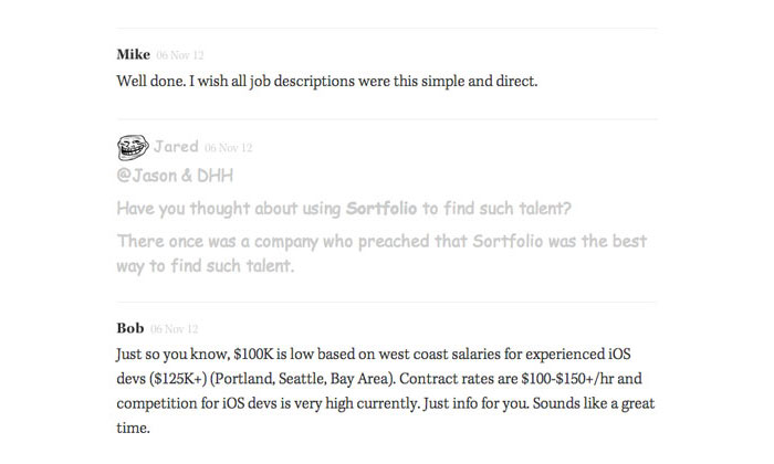
Signal vs. Noise – When a comment is marked as trolling, the comment appears in Comic Sans, lighter color and has a troll face next to the comment author.
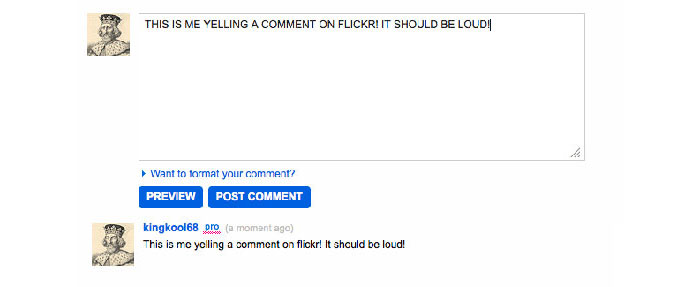
Flickr – When you enter a comment on in all caps, the comment is posted with proper capitalization.
Mailchimp – The logout URL says “see ya later” to the user.
Mixpanel – When changing your password, the field for the current password has an old style key, and the new password has a modern key.
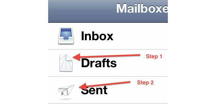
iOS Mail – The icons represent instructions on how to fold a paper airplane.
Facebook – On the mobile app, a notification tells you about new comments while you’re writing a comment.
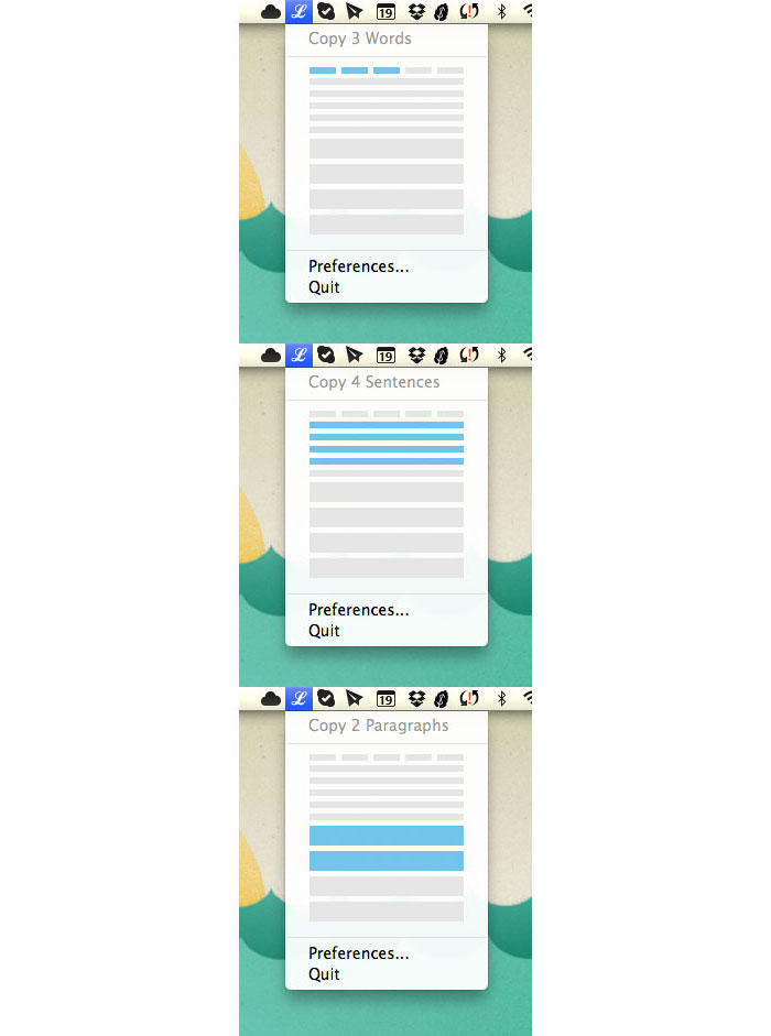
LittleIpsum – Graphical representation for selecting words, sentences, or paragraphs of Lorem Ipsum.
Chocolat – Turns all text into Comic Sans after your trial has expired.
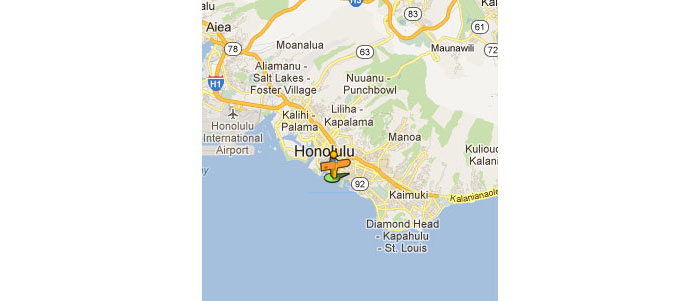
Google Maps – The street view icon on Google Maps has a surfboard and tropical shirt when in Hawaii.
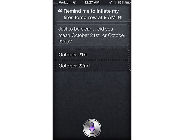
Siri – Confirms what “tomorrow” means, when it is mentioned close to midnight
Dropbox – The dropbox forces developers to test their app before they can release the app in “production” status.
Youtube – The settings icon spins when you change quality of the video until it stabilizes.
theyouway.com – When opening a new tab the page title changes to “♥ Come back luv!”.
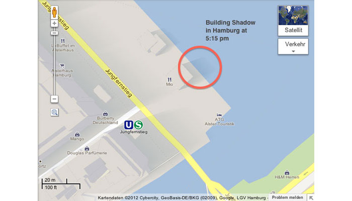
Google MapsGL – The shadows cast by the buildings are relative to the current position of the sun.
Source: http://feedproxy.google.com/~r/DesignResourceBox/~3/pAR7zP8un2E/

















No comments:
Post a Comment