The Cadillac company is an American luxury vehicle maker that is own by General Motors. It is the second oldest American automobile maker and is one of the most known brands in the world. It was launched in 1902 and it got its name from the founder Antoine de la Mothe Cadillac.
The Cadillac logo is a simple one that many people recognize easily and it had some changes in its history so let’s find out more details about it.
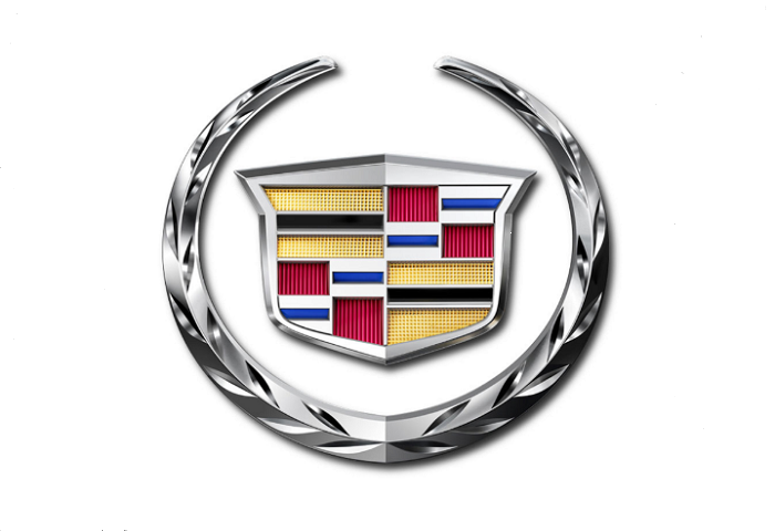
The Cadillac logo
The Cadillac logo has some changes done at certain periods. The first logo had a pearl-topped crown but in the new one these are gone. So, although it had some changes the Cadillac symbol is still very important to them and is an important part of their brand.
Logo Description
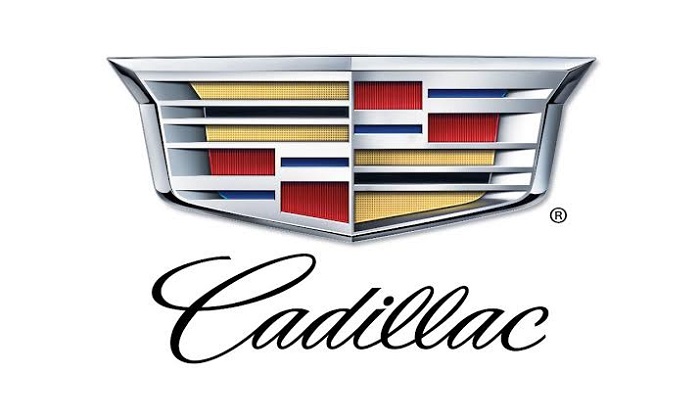
Their present logo has a silver crest that gets split into two together with a thick border. The colors that you can see through the silver lines are gold, red, blue and black. Each block color has a cool gradient that goes well with the entire design.
The shape of the Cadillac symbol
The Cadillac emblem has quite an interesting shape. Its top section is a crown that depicts the six ancient counts of France. On each trip, you can see a pearl that stands for integrity in the royal counts of Toulouse that were one of the cultural centers in medieval Europe.
Since its first design more than one hundred years ago the Cadillac logo indeed has some changes. We can say sure that it still is one of the best and memorable car logos that you will see in the car world.
Colors of the Cadillac Emblem
The colors that you are going to see in its logo are quite diverse from red, blue, black, yellow, silver and white. They stand for passion, creativity and excellence. These are some of the most known values that get associated with the brand. Although each color by itself is going to stand for something different, together they produce this logo.
A lot of designs use silver when they want to get an elegant and sleek vibe. They use gold when they want to show wealth and luxury so basically each color has its own role. In the design process, it is important to choose the right color for your brand and it seems that Cadillac did a great job with this.
Font
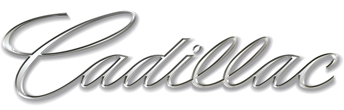
The font that has been being an elegant and simple one similar to a handwritten one. It is quite similar to the font named English 157 that was created by Vladimir Yefimov and is based on calligraphy. If you want you can test it and download it from here.
The Cadillac Logo Meaning
If we are thinking of the meaning the Cadillac logo has you need to know that it actually is a montage of several pieces. The founder wanted to have them all according to his own goal that he had in mind.
The elements that can be seen in the logo are martin heraldic adaption and for a long period of time, they were not changed or modified. The first update about changes appeared in 1999 is the first time after the 1961 changes. There were also some several modifications done both in 2002 and 2014.
Origin and History of the Cadillac Emblem
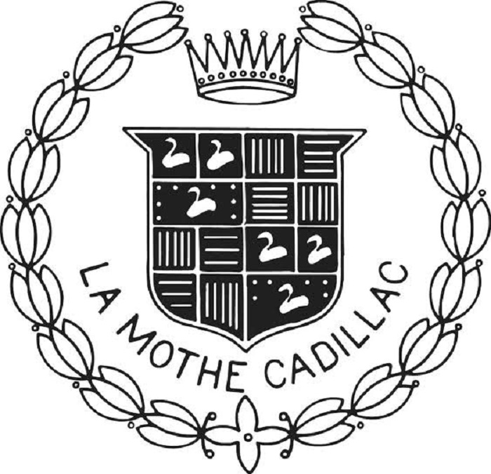
The Cadillac symbol has its origins as the crest of Antoine de la Mothe Cadillac, founder of the city of Detroit. His lineage was tied to French royalty so this means that involuntarily the brand was made centuries even before America was first discovered.
Many believe that Antoine designed the crest himself once he got married in 1687 borrowing the look from Baron Sylvester of Esparbes de Lussan. It might also be true that Antoine invented all of his noble ancestries but we can’t be sure of that.
Evolution of the Cadillac logo
The luxury Cadillac logo has been shown by the brand for more than 100 years now and the logo had around 40 changes in this period but each badge continued to send the same message towards the excellence and elegance of the brand.
Since its acquisition in 1909 by General Motors some elements have remained indeed consistent for the company emblem so let’s see exactly what.
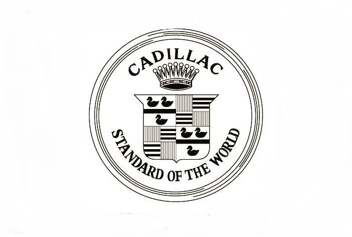
1906
Even though the Cadillac arms were not registered as a trademark until 1906 they were used since 1902. The original emblem that was featured had seven-piked coronet garlanded together with a laurel wreath that was closely based on the registered design.
The company attorney, Newell S. Wright submit the trademark application on 18 August 1905 and the registered number of 54.931 was given on 7 August 1906.
1908
The Cadillac logo design moved slowly to a more graphic visual pattern and also got a slogan that was added.
1920
Between 1916 to 1918, Cadillac had a badge that incorporated the tulip-bulb wreath with the original trademark having nine points on the crown. The crown went back to seven points and it joined the crest in 1920.
1933
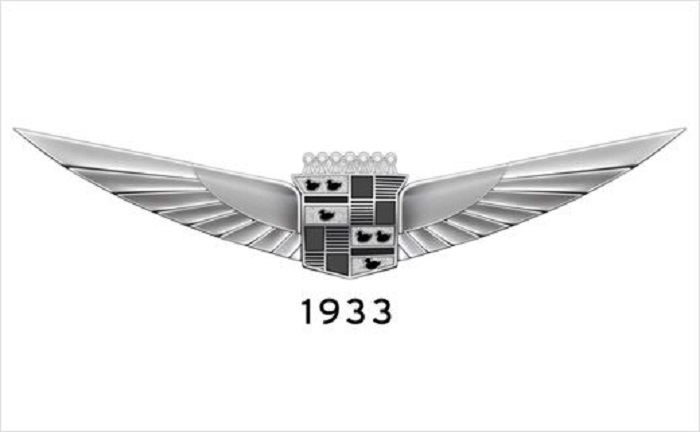
To fit better the new style of the Cadillacs, designers started to use the same elements for the rest of the. models and add the wings. The new design remained unchanged on all of their radiators through the 1935 models.
1947
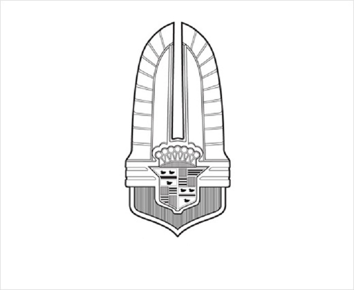
After the war Cadillac brought a new design that evolved in the simple “V” design. The 1947 Cadillac logo is one of the first post-war badges that incorporated the “V”.
1957
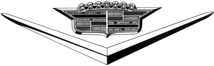
Cadillac moved to a more long, low and wide shape in order to emphasize the pattern that it was advertising at that time. Its crest continued the trend in 1959 until the crown almost disappeared from the top.
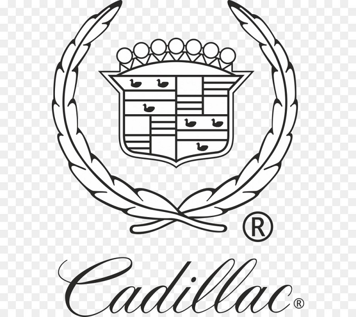
1999 onwards
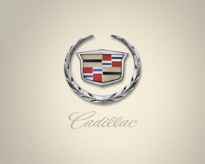
At the start of the 21st century, Cadillac brought a new emblem that represented the first big chance since 1963. They kept the familiar color scheme but Cadillac also said something new about the colors that they were using in order for people to understand better what they stand for.
In conclusion, the Cadillac logo is one of the most known luxury car logos in the world. It’s quite rare for a logo to go to this type of change in its history and still be able to carry on the same brand message and values. It’s really a great one!
If you enjoyed reading this article on the Cadillac logo, you should read these as well:
- The Amazon logo: Its meaning and the history behind it
- The Pepsi Logo: The old, the new, its meaning and history
- The Disney logo: All there is to know about the Walt Disney brand
The post The Cadillac logo (emblem) and how it evolved in the past decades appeared first on Design your way.
Source: https://ift.tt/2RZcp8v


No comments:
Post a Comment