Banking is one of the most important areas that a country can improve and one of the most important staples of modern society. Banks play a major role in establishing the economic strength of a particular country. How do banks relate to graphical design, you might ask? Well, banks have to create a branding image as much as other businesses have to, and this is where bank logos play an important role.
Nowadays, even banks require to have a very strong branding campaign and one that is modern and up to date. Out of date designs and branding might actually play an important role in the customers’ decision of which bank they will choose.
Those who are a bit more aware of that will put a lot of importance on how a bank promotes itself and the branding that it is providing. Nobody really wants to deal with a bank that is out of date and has an image that comes straight out of the 1980s. Bank logos are essential to establish a good branding policy.
And what exactly makes a good bank logo? Well the logo of a company, or in this case, should promote the company for its good qualities. These qualities when it comes to banks are trustworthiness, professionalism, and reliability.
Bank logos have to convey exactly that. And on top of that, they have to look good and modern, while also having carefully chosen colors that fit the image of the bank. Colors are actually quite an important factor for designing a logo – the color choice can tell you a lot about the bank itself.
All in all, bank logos have to be creative and should convey the image of the bank as a trustworthy and reliable one. Let us take a look at some of the logos that do that well.
Best bank logos to inspire you
Bank of America
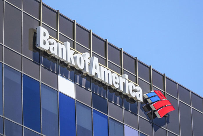
The Bank of America is one of the biggest banks in the USA, but also in the whole world. Its logo plays an important part in the branding that the bank is trying to create. The logo is portrayed in the colors of the American flag, which ensures a patriotic response to it. The colors of the flag portray a farm field. The way this logo is trying to portray the bank is as a patriotic one for hard-working American citizens, and it certainly succeeds in that.
Deutsche Bank Logo
![]()
This bank logo is the definition of simple yet effective. Just because it is so simple does not mean that it has no meaning to it. And that is the beauty of it; it is simple but it still conveys a message to the users that this bank is for stable growth, stability, and reliability. And the blue color also conveys stability and reliability. This is one of the best bank logos out there.
Allan Butson

Another simple logo, but a very sleek and elegant one. This logo represents the Allan Butson bank, and it is meant to portray the bank as a reliable bank for customers with style.
The Merrill Lynch Logo
![]()
This bank logo just screams power. Firstly, because it contains the full name of the bank written in bold, and secondly there is a bull next to it, which is a symbol of strength and power. In financial terms, a bull is someone who is very aggressive in the market and always looking to take the lead, and that is where this logo is aiming at.
Chase Bank Logo
![]()
The logo of the Chase bank is one of those bank logos that try to tell us that the Chase bank is reliable and will allow you the growth through constant cash flow. This is the meaning of the octagonal form that is in the logo – it contains arrows that represent flow, motion, and a square that presents stability. It is also painted in blue and that means reliability.
ING Bank Logo
![]()
This Dutch bank is another one with an animal in their logo. In this case, it is a lion. The lion represents courage, strength, and royalty. Another feature of this logo is the orange color – the orange color is there for multiple reasons. Firstly, it is there because the bank is Dutch and as we know, orange is the color of Holland. And secondly, orange color represents energy, which is what this logo is aiming for.
Barclays Logo
![]()
Barclays is one of the most well-known and trusted banks in the world. The logo of the bank is also one of the best bank logos out there. There is an eagle in the logo in blue color, which projects power and reliability, both of which certainly are features of the bank itself. So we can say that the logo accurately presents the ideals of the Barclays bank.
Citibank Logo
![]()
The Citibank has a long tradition – it was first established in 1812 in New York. It is an American bank, which is why there are blue and red colors in the logo, which represents patriotism. There is also a large arch above the logo which acts as protection – it tries to say to the customers that the bank is secure and will protect them.
TD Bank Logo
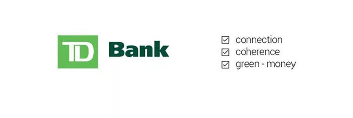
TD bank is another American bank in this list of best bank logos, and the logo represents a safe bank that is also very economical and friendly for the users. The first quality is represented by the square in the logo, and the second by the green color, which also represents money or dollar bills. This bank logo is very elegant and sophisticated.
SocieteGenerale Logo
![]()
Another logo that features a square – a very often used feature in bank logos, which represents security, safety. Two colors fill this square, red and black. Red stands for passion, while black stands for seriousness. Societe Generale is a French bank and is a multinational bank.
UBS Bank Logo
![]()
UBS is a Swiss bank that was established in 1997 and quickly rose up in prominence as one of the best banks in the world. Its logo is a very well designed bank logo. It features three keys next to the UBS letters, written in red. The keys, of course, represent security and tell us that the bank is safe, while the red color displays the bank’s confidence and passion.
Getin Bank Logo
![]()
The Getin bank’s logo is a very modern logo and non-traditional compared to other logos – it sort of breaks the monotony of other logos and is something different. It is in green color and there is an arrow, which conveys that the bank moves forward and is a bank for the future. The whole logo just asks the customer to make an action.
Raiffeisen Bank Logo
![]()
Raiffeisen Bank is one of the largest multinational banks. The bank’s logo stands for security, reliability, and safety as it features a gable cross, which is a symbol for security. It was once known as a symbol of a protected house.
Australia & New Zealand Banking Group (ANZ) Logo

This is the biggest bank in New Zealand and the third biggest in Australia. The logo was rebranded in 2010 and it was rebranded as a part of the company rebranding that was made as a new push forward.
If you enjoyed reading this article about bank logos, you should read these as well:
- Bright colorful logos showcase: Awesome logos to inspire you
- Logo Design Cost: A look at the logo design prices
- Logo colors and why they’re important
The post The best bank logos to check out as inspiration appeared first on Design your way.
Source: https://ift.tt/35mcmJ3


No comments:
Post a Comment