People put their religion as being a core of their identity. Each day millions of people visit a church and according to a US survey, almost 40 % of people go regularly. You can see many churches no matter if we speak about a city or village.
In today’s world as we are more and more digitized even church logos are starting to appear. This is happening more often than before. Logos for sure communicate a professional and personal message without saying a word. This is why even churches started to use them for communication reasons.
Christian organizations know how important it is to communicate their mission. By doing so they attract followers. One of the most known symbols in the world is the Christian cross. This is why when we speak about church logos it’s hard to say one is looking a lot better than the other.
So, in order to understand the diversity of church logos here are some that might inspire you.
Good looking church logos
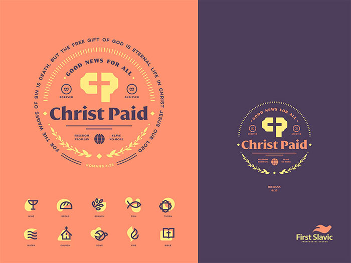
Christ Paid
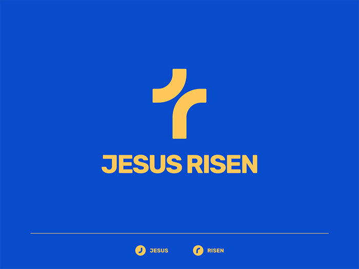
JESUS RISEN
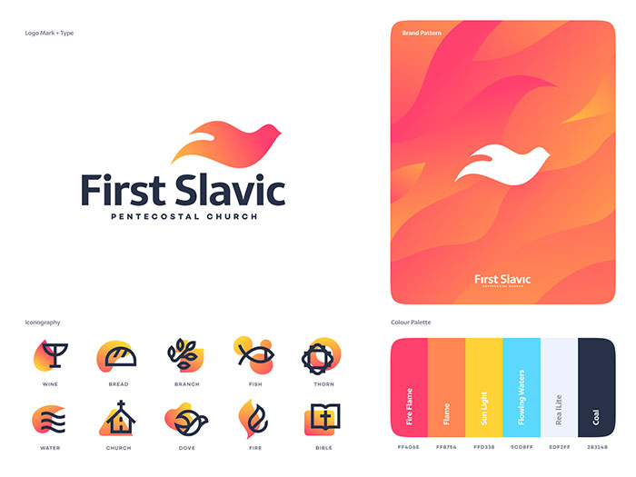
First Slavic Pentecostal Church
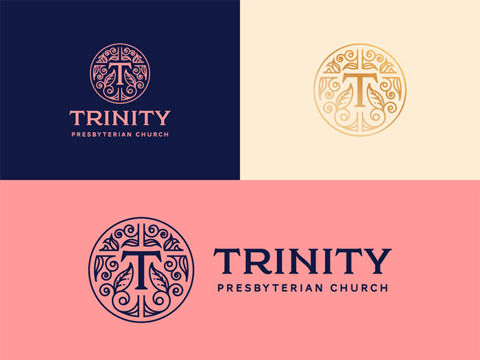
Trinity Presbyterian Church San Diego
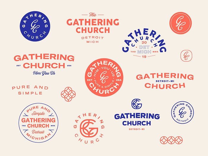
Gathering Church | Artboard
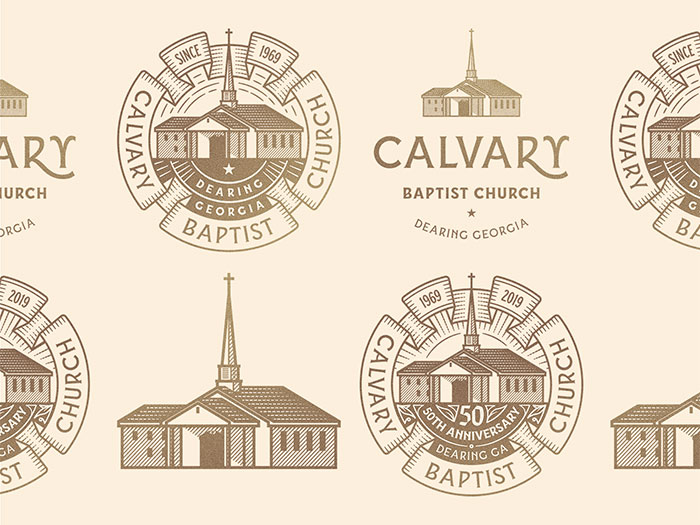
Calvary Baptist Church
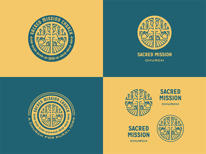
Sacred Mission Church
St. Rita Catholic Community Badge
![]()
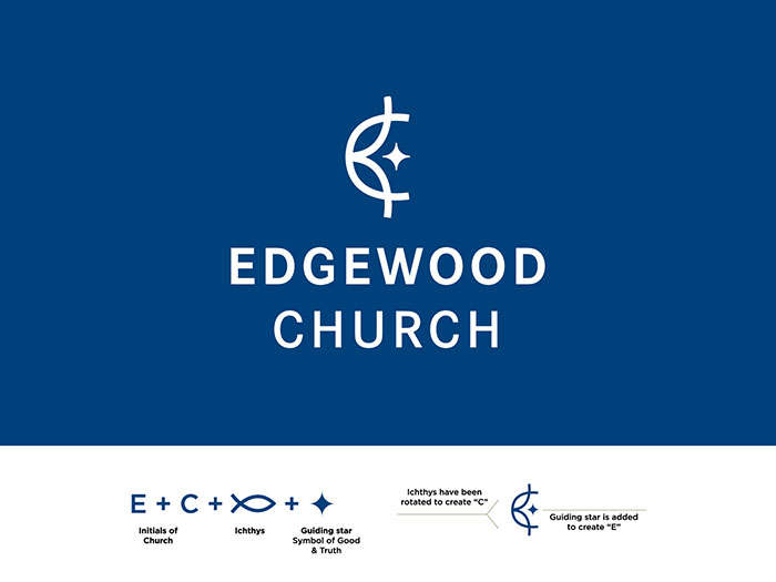
Edgewood Church
Risen Church
Citizens Church
FPCOKC Brand Identity
The Well Church

Elevate
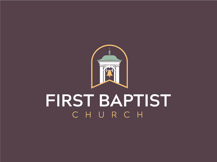
First Baptist Church of Columbus GA – Rebrand
Friedens Kirche Hamburg

This is one of the most creative church logo ideas that you can see. It combines the universal peace symbol to show the idea of a non-violent society that we could live in.
Depozitory
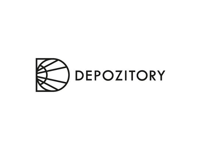
Before being a studio space, it was a church. Later on, during the second world war, it also became a storage house. The details like the arched windows and glass are sure elements that were used in the inspiration phase.
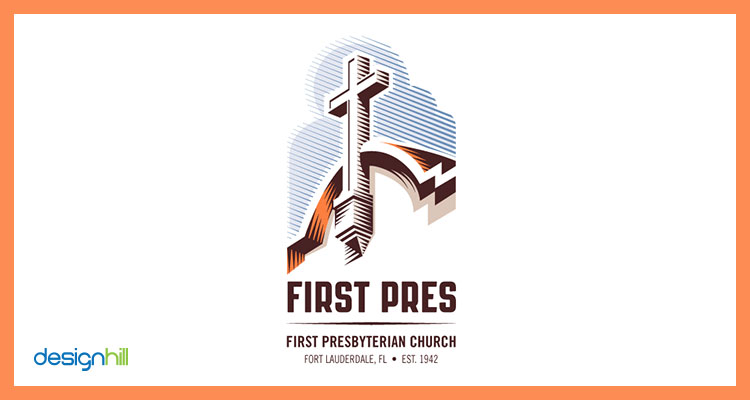
First Press Church Logo
This is a black and white logo that was made with a vintage look. As you can see it has incorporated shades and light elements. In the background, we can see a shadow similar to the shape of a mother. It also has a cross symbol in front.
The idea of the designer was to create church logos that look welcoming. Not only he did this but he also kept the church architecture together with a friendly look.
The Foundry church logo

This organization has a dynamic logo that will impress you when you first see it. It’s one of the best church logos that you can find and you have to like the colors used. The theme behind it was a quote “being poured from God above” and we think it reflects it quite good.
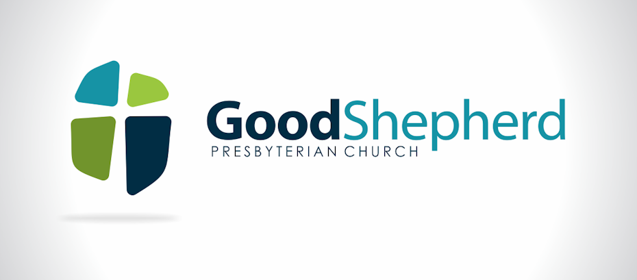
Stylized cross logo – Good shepherd
For sure, the cross is also a depressing symbol in history. This is because it has been an instrument of torture. This is why in some church logos you will see a cheerier outlook. This is usually done using bright colors together with abstracts designs of the cross.
The effect that it gets is it deemphasizes its original purpose. This can be a smart idea on how to link a traditional with a classic symbol.
The Met’s Logo
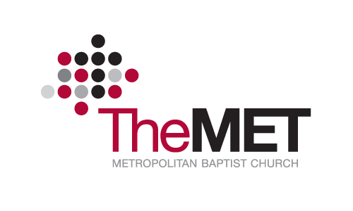
The mission of this organization is to connect people with the real Jesus. As you can see their logo has dots that show the high number of people connecting. It also reflects the suburban living reflected through the asymmetric circle pattern. Their tagline is Live for More and we can really say they did a good job with their church logo design.
The Leaven for Humanae Vitae
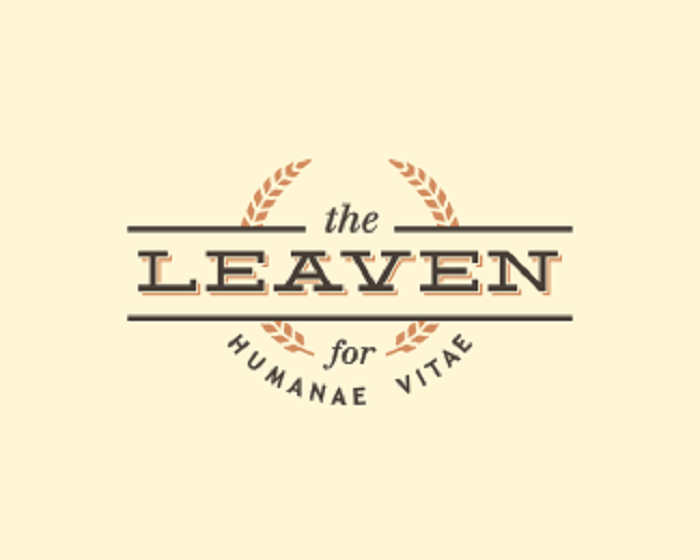
Continuing our list of church logos, we find this design. It was done for a charity that fights for social justice. They help those facing hardship and they believe in human worth and dignity.
Leaven comes from the idea that the more they help and inspire others the more people are going to join and help also. The concept here is to keep the text prominent and still use the wheat stalks as an accent.
First Baptist Spartanburg logo
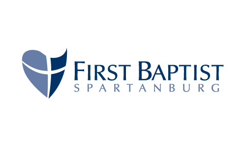
The goal of First Baptist Spartanburg is to encourage living through Christ. As church logos are always focused on empowering this is also what we see in this one. We can see a distinct cross emblem that represents the idea of courage. We can also see a heart shape together with a shield that shows protection and love.
We can consider it one of those modern church logos that really looks ok and gets the attention of people when spotted.
Church In The Hills

Church in the Hills is a church logo that uses geometric shapes a lot. It uses triangles in order to send a message. Because they have peaked on them and are known as being a chief feature in the church architecture.
Blessed Sacrament Catholic Church Logo
![]()
The Catholic Church is known for its over one billion members from the entire world. The logo that we can see here has the image of religious symbols, bread and wine. They symbolize the Lord’s Supper.
They are very important for the Catholic teachings and the fact that we can see them in a logo shows, even more, their importance.
The Grove Church
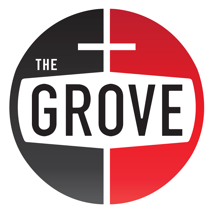
Church logos like this one are quite impressive. This is a redesign of an old identity because the leadership wanted to create a buzz towards the future.
As the community is usually made out of people that value bike trails, markets, and organic foods something had to be done. The end design is nice and it is also tied with other large corporations that have headquarters in town.
The Kingdom Concept of Neartown Logo
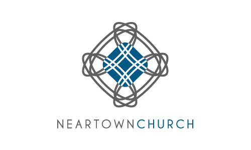
The Kingdom Concept of Neartown is to bring back the whole gospel. They are focusing on young dad’s that are moving into the city. What they want to accomplish is to offer a deep experience of the preaching of Jesus.
Like other church logos, we can see the symmetric design that is unique. The cross it features looks like a symbol of the busy and crowded city life. The beauty of this youth group logo is the fact that it is a reference to the never stopping changes in generations. The color scheme is a more masculine one reflecting their target audience.
Cross and Flame Logo of The United Methodist Church
![]()
Many organizations use their church logos as an impact point. Graphic drawing is something that they go towards together with the presence of textual elements. In a church logo images like this are symbolling. They have a strong message that any viewer will resonate with.
The Methodist Church used the cross together with the flame to show Christ with the Holy Spirit. You can say it is a minimal logo that serves as a reminder for Pentecost. This showcases the descent of the Holy Spirit upon the apostles.
Bible Beach Church

This simple types of church logos still do a good job in standing out. We can see the Cross symbol that was done in a different style. Even though traditional cross symbols are upright this one gives a modern feel to the logo.
Champion Forest Baptist church logo
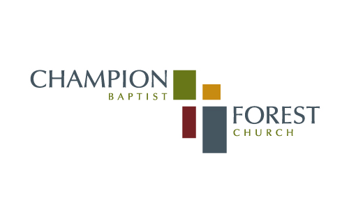
If you were wondering what the mission of CFBC is, now you can find out. Their goal is to have a Christ-centered living lifestyle. They did something smart with their church logo ideas. As you can see there is a cross formed by the white space between the placement of the other elements.
These pieces might not seem to fit but when you see Christ in the center all add up. Because they combined so many elements, we can really see it’s one of those church logos that really stands out.
Hawthorne Gospel Church Logo
![]()
Check this modern logo that was made by the congregation for people in Hawthorne. One thing that you can spot about their logo is how different it is with what people would expect. What we mean is that a religious organization typically has a standard design guide but we can see that some really do different things.
St.Mark Catholic Church

St. Mark’s logo is a wordmark that uses the church name. It has a cross symbol placed in the top part. It’s really not complicated and you have to like the simplicity in it. Two faint colors have been used and the church seems to be happy with what they got.
Church Logos tips
So, we have seen some church logo examples that you can inspire yourself from. Now is the time to start your own. Here are some tips that you can use when you are trying to sketch some ideas out:
- Play around with initials, most of the time you can really get some good designs just by using this.
- Use different images that relate to the church mission. See what you can really use in your logo.
- Understand the mission and value of an organization and add this to your design plan. Maybe they want to attract new people or simply welcome the current members. See exactly what is that they want to achieve.
- There are many colors to choose from and we all heard of how certain colors spark different emotions. Be careful with this, a good place to start is doing your logo in black and white. After that, you can start to play around with different color schemes and see what you get.
- In terms of the font style, you need to go with something that complements the general vibe of the church logos. Maybe you see they are already having some preferences on this. Or even better, you see an opportunity and present some new fonts that they could use. It’s your call!
- When you have some ideas send them out and see what feedback you get on them. This is going to help you speed up the process of getting the final design.
- Avoid clutter, you don’t have to make any complex logo. Focus on one idea and feeling that you want to share with your church logos. This can be done by just pointing out why is that organization special.
If you enjoyed reading this article about church logos, you should read these as well:
- Logo Design Cost: A look at the logo design prices
- Logo colors and why they’re important
- Types of logos that you should master as a graphic designer
The post The best-looking Church logos and tips to make them appeared first on Design your way.
Source: https://ift.tt/35v4PZt


No comments:
Post a Comment