Everybody around the world is familiar with one of the most iconic and well-known shoe brands, Nike. Not only the shoe but its unique and simple Nike symbol. The Nike logo is a perfect example of the importance of visuals that builds brands that are recognized and trustworthy.
There was a time when this Nike emblem was a humble and rather insignificant symbol, but it became a sports symbol that is globally recognized. The Nike swoosh logo is one of the world’s most recognized logos.
It would make sense if I told you that top branding firms or advertising companies collaborated to come up with such a unique logo.
However, that is far from the truth as the Nike Swoosh logo comes from Carolyn Davidson, a graphic designer.
She designed the Nike logo in 1971 for a mere $35. The original Nike logo was called strip, which later changed to Swoosh which is in referral to the Nike fibers used then. In 1972 the Nike Swoosh logo was first seen on the shoes. Then, the logo was still on the shoe’s vamp.
A brief history of Nike
Nike’s story started with two people seven years before it was founded. Philip Knight, who was a track athlete from the University of Oregon, collaborated with his coach Bill Bowerman to design athletic shoes. At the time, he founded a company called Blue Ribbon Shoes who distributed shoes for Onitsuka Tiger, a Japanese brand which is today known as Asics.
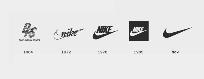
The logo used was a combination of the store’s initials. The Nike brand is headquartered in Washington Country Oregon under the leadership of Phil Knight and Bill Bowerman. Even though they founded the brand in 1964, they changed their name in 1978 from Blue Ribbon Sports to Nike.
Nowadays, over 44,000 employees are employed by Nike across the world. The company has massive assets with a worth of $15 billion. There are over 700 Nike outlets across the globe. Nike sells a wide range of products aside from shoes that also carries this famous Nike logo.
Victory’s Wing

The name Nike has a great history as it is named after an ancient Greek Goddess. According to Greek folklore, it is said that Nike, the Goddess was the reason why warriors won numerous battles for their motherland. Each time they won a battle they used to say, Nike, to each other.
The goddess’ wings are called swoosh and history has it that the wings brought audacity and motivation to warriors when they headed towards the battlefields. Experts like to believe that this was the main reason behind the design of the Swoosh Nike logo.
Who is Carolyn Davidson?

The graphic design student, Carolyn Davidson from Portland State University met Phil Knight in 1969. She was just another poor student looking for ways to earn extra money. Phil Knight was looking for someone to help him to design a logo and he turned to her.
He offered her $2 an hour to help him design a Nike logo. Phil Knight wanted an image or stripe that could come on the side of their athletic shoe. She decided on the Swoosh, which as we know it is a check marked shape which is both fluid and resembles speed and movement.
At the same time is it hinting after the name of the Greek Goddess, Nike, as the image also resembles a wing. Even though Knight was initially unhappy with the logo, he still accepted it and the logo remained. She continued to work for Nike for a few years longer until she decided to work from home.
Small Job, Big Payoff
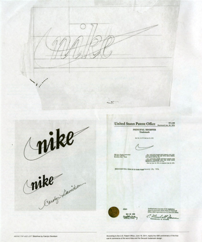
Carolyn Davidson was paid $2 per hour and she billed Phil Knight for 17.5 hours which gave her a paycheck of $35. She continued to work for Nike for four years, and eventually got $1 million and a ring of gold and diamonds in the Swoosh design.
The evolution of the Nike logo
The Nike logo changed and evolved through the years since its inception, despite the simplicity of the original Nike logo.
1971
When Knight first received the Nike logo drawing, he wasn’t impressed, but accepting that it would grow on him in time, chose to use it, nevertheless.
1978
The cursive serif font that was initially used, was replaced by Futura Bold in 1978. It featured a more geometric shape while the E that runs into the Swoosh’ tail was more fluid. Each letter also had varied spacing between them.
1985
![]()
In 1985 the Nike logo was in a red square and used it only for a short period. Major athlete endorsements followed in the mid-eighties with Michael Jordan being the most prominent. The slogan “Just Do It” was introduced by the late 80s
1995
![]()
The lone swoosh was introduced by 1995 and still used today. The Swoosh symbol is meant to be a symbol of athleticism, speed, and high-quality apparel. While it makes a strong argument for utmost simplicity, the Nike logo is one of the world’s most recognizable logos.
The Nike co-founder, Phil Knight wrote a book in 2016 about the amazing and simple history of Nike and its evolution to become a world leader. The book is called Shoe Dog.
Meaning of the Nike Logo
When something moves swiftly past you, it is referred to as the swoosh. It means that it was a fast movement, therefore does the word stand for fast motion, speed and sound. This is why the Nike logo shows fast movement arch.
Main design elements of the Nike logo
The Nike logo is memorable as a swoosh symbol and one of the most uncomplicated designs in the world. This symbol is what the entire brand is based on.
Shape
The shape of the Nike swoosh logo is the Greek Goddess, Nike’s wing or that is what the designer had in mind when she initially drew the logo. She borrowed the mythical shape of a Goddess’ wing from historical and cultural sources to engage the world.
Color
 The swoosh logo has changed color more than once since its design. for many years it was black before the brand color changed to a dull orange. Initially, the original Nike Swoosh logo was red and white.
At the time the company and the designer of the logo decided that red is suitable for joy, passion, and energy while the white of the logo represented charm, purity, and nobility. The color schemes were changed later to have a classier and sleeker logo design.
Font

While the Nike logo is a symbol, the designers often place the Just Do It slogan at the logo’s top. At times you will also see the company name appearing on the logo. The text font used for the writing is elegant and the name always appears in bold.
The font used for the additional wording is a combination of Futura Bold Condensed Oblique that is tweaked a bit. To make the text more visible and distinctive, the k has a slanting to it. Until 1995, the Nike logo was written in Futura bold.
Without a doubt, it is evident that to develop a brand requires research, planning and a lot of thought. However, as seen with Nike, the branding does not need or have to be expensive either. Look at the iconic logo that was designed by a poor student looking for a few dollars and delivering one of the world’s most recognizable and memorable designs.
If you enjoyed reading this article about the Nike logo, you should read these as well:
- The Adidas logo: What makes it so special
- The Disney logo: All there is to know about the Walt Disney brand
- The Batman logo and how it evolved over the years
- The Coca-Cola logo: Over a hundred years of logo evolution
- Learn About The Apple Logo: The Tech Giant’s Branding
The post The Nike logo (symbol) and the history behind its simple design appeared first on Design your way.
Source: https://ift.tt/2H3z3Yz


No comments:
Post a Comment