A website header is one of the first things users see when visiting a website. Depending on how well you design the header on your website, website headers can be really great or really terrible for your branding, user experience, and success of your website. So to keep your users engaged with your website, designers must put together a fantastic website header. Designing a website header that makes your site recognizable and promotes your brand can be a bit challenging. So here are some do’s and don’ts to keep in mind while designing a website header.
Do’s
1. Use Visually Appealing Images:
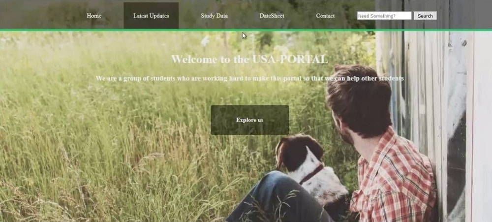
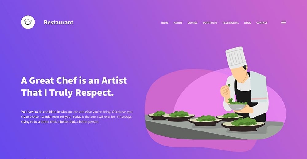
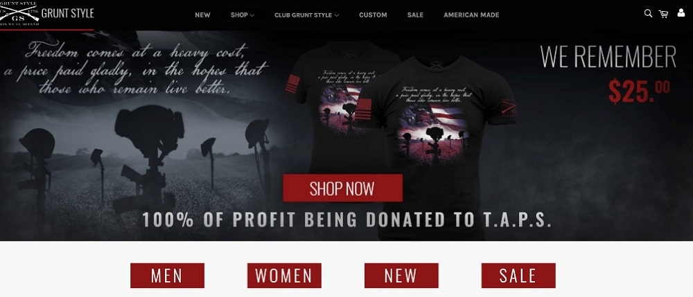
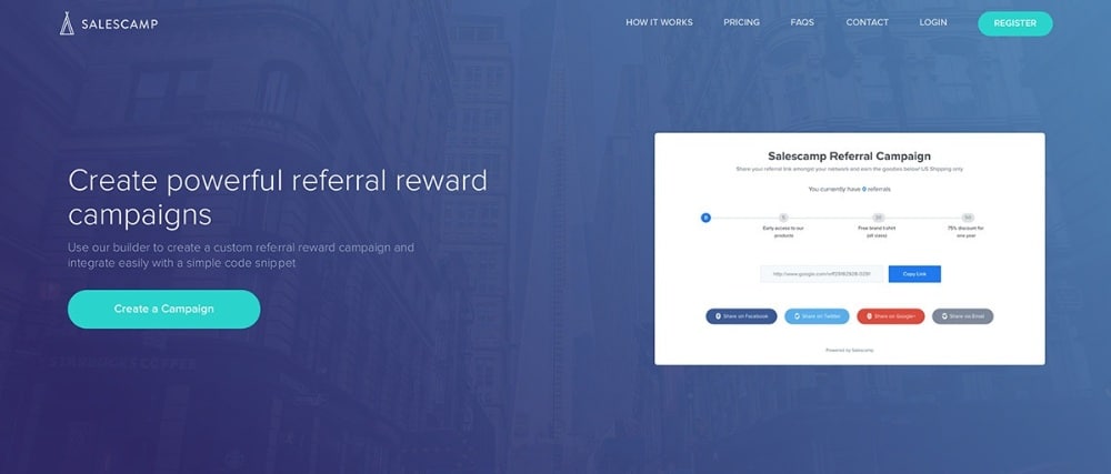
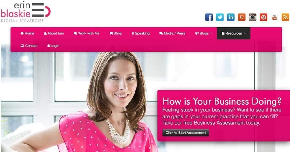
A stunning image makes a great first impression. You can choose a photo, animation, video or some art element to give the users what they want. Whatever element you opt for should be high resolution and provide appropriate contrast with the texts or buttons. You can even use faces if your service or product goes well with it. However, images in the header section aren’t just eye candy. They are the preview for the other content on the page. Visually appealing images, along with other significant elements, make the most of the content. These elements can be anything from the brand identifier, Headline, call to action to navigation elements, and search button.
2. Add a Compelling Message:
The header image is nothing without creative texts that explain the idea of the website. Something like a logo can attract your users to surf the website further. You can even add some content regarding the purpose behind your site and the company’s future goal. According to statistics, an interactive webpage drives 20% more traffic than other non-interactive websites. So, design a header that communicates with the users, helping them feel more comfortable with your website. Using unifying messages that are easy to understand is a good practice. You should always work the design around the primary purpose to make the header design look cohesive. Also, keep in mind to opt for images that display the energy of your brand.
3. Add Navigation Elements as per Need:
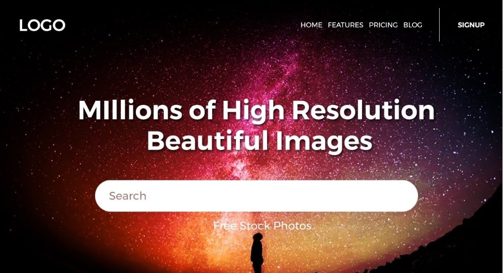
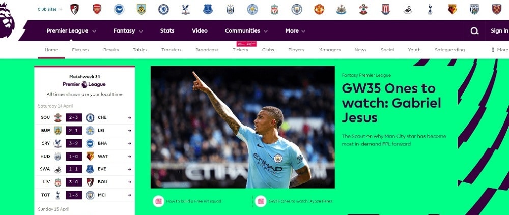
Header and navigation, go hand in hand. In fact, they both belong to one visual concept. You can design a navigation icon that pops out or a full menu navigation bar, but adding something like this is an essential part of creating a proper website header structure. If you want your user to hover easily over the content on your website, you can opt for a sticky navigation icon. This will help your users access the navigation panel even if they get away from the header page. So, adding a navigation panel along with some small bits of text and icons can help you design an interactive header that is appreciated by the users.
4. Keep Reading Patterns in Mind:
Studies have found out that there are three patterns of eye movement, namely F-pattern, Guttenberg Diagram, and Z-pattern. According to F-pattern, users read the top part of the content, then halfway through the page and lastly vertically down in an F-shape. While in the case of the Gutenberg Diagram, there are 4 active zones, starting from two horizontal stop though the top from left to right, then from the top right corner to bottom left corner and then through the bottom. In Z-pattern the eye moves back and forth multiple times in the same way as in Gutenberg Diagram. These reading patterns are used by web-developers to group related data in the visual flow. Reading patterns can be beneficial for designing headers because the users can focus and digest content faster. So, you should place elements according to these reading patterns.
5. Add layers to your design:
The best trick to put all the elements together in a header is to do simple layering. An exceptional header that attracts users has a dominant component along with some supporting design techniques that are built-in simple layers. Layering can not only help you create separate spaces for each element but also help the users focus better visually. Your users will get a better idea about where to start, what deserves the attention, and what can be skimmed over. So, try to add a layer to header design, this might take a while to master but keep trying until you get something that works well with your brand idea.
Don’ts
1. Don’t Fill the Header with Long Texts:
It is easy to go overboard with content in your header because you want to tell your users everything. However, understanding where to stop is crucial for saving the header from looking detailed and stressful. So, try to avoid irrelevant text like your business name, your name or title in your header and instead opt for one simple, compelling tagline to bring out the idea of your website. Also try to avoid using complex words in your text, if possible use simple, readable language.
2. Avoid using too many Elements:
Adding several small elements can drag down the experience of the header. So, eliminate everything that seems unnecessary for a header design. You should only keep the elements that bring out the idea and works well with the header image. Also, try to color coordinate the icons or texts with your header image. This makes the header design look attractive.
3. Don’t get Influenced by other Designers:
You should never blindly follow someone else’s rules and statements for your designing. Instead, you should gather information, do your research, ask different people for advice, and then evaluate strategies yourself. This way, you can design a header that will be the best fit for your business.
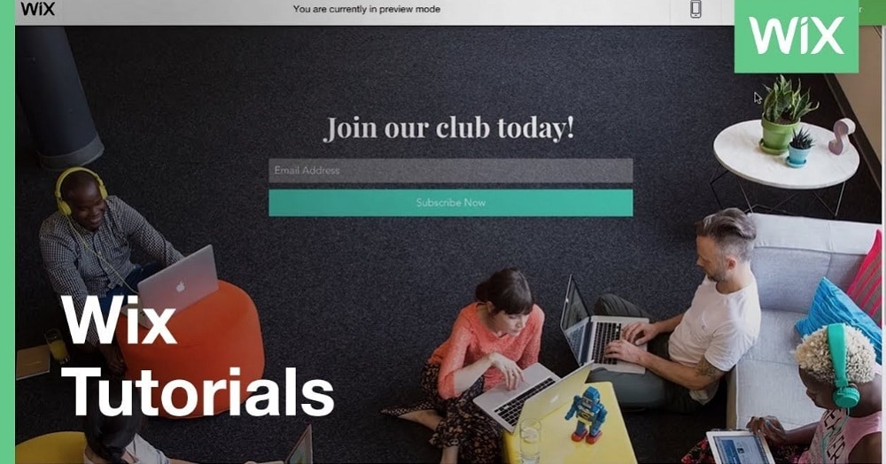
4. Avoid Using the Opt-in Box:
Opt-in boxes were popular in header designs back in 2007. Now that everyone is using the opt-in box, the effectiveness is lost. Also, if not designed correctly, the opt-in box can look desperate. Furthermore, a website opt-in box can look odd if it doesn’t add to the purpose of your website, so try to avoid it.
The header is at the forefront of the design process so you should invest extra time and energy in designing it correctly. However, you should not forget about the content inside your website as it is equally important to give people interesting content so that they keep coming back. You should try to balance both to build a great site.
The post Website Header Design: Do’s and Don’ts appeared first on Web Design Blog | Magazine for Designers.
via https://ift.tt/2Ys4vdC


No comments:
Post a Comment