Coffee is the engine of the world. Almost no one can start the day in this busy news without a cup of this nectar. It empowers us or gives us the courage to wake up. And like every great discovery, there is always the possibility of doing business if we do it right. This is the case of Starbucks, an international chain that sells one of the best coffees in the world. It is impossible not to know the mythical Starbucks logo today, but it did not always have this appearance.
Starbucks was founded last century, more specifically in 1971 in Seattle, United States. Its image has been kept over time, although it is always difficult to maintain a high-quality standard that pleases everyone.

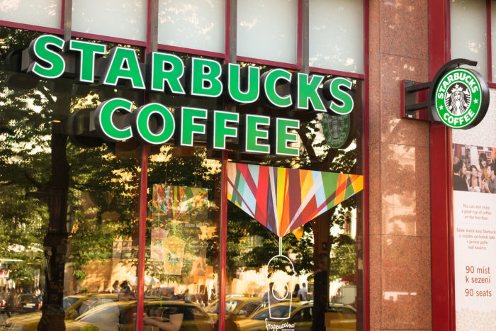
Although the original Starbucks logo is no longer remembered by many, the current one is easily recognizable wherever you are. Every important capital in the world has one of these coffee shops, and thanks to its style as a brand, they become a very familiar place to feel at home.
Of course, as a great company, Starbucks can be a problem for small businesses. But regardless of what they may represent, you have to recognize their achievement. However, let’s face it, we all recognize the company logo, but few know what it means.
Today we will review the history a little to know where this emblematic logo originated and how it has helped the company to position itself as a brand.
Telling the story of Starbucks
In design and advertising, the concept of storytelling has become popular as a way for people to relate to brands by knowing their origin. The best way to do this is for advertising to tell this story. When working with packaging, you have to make the logo visible everywhere in the package, and in this way, you can appreciate its change over time.
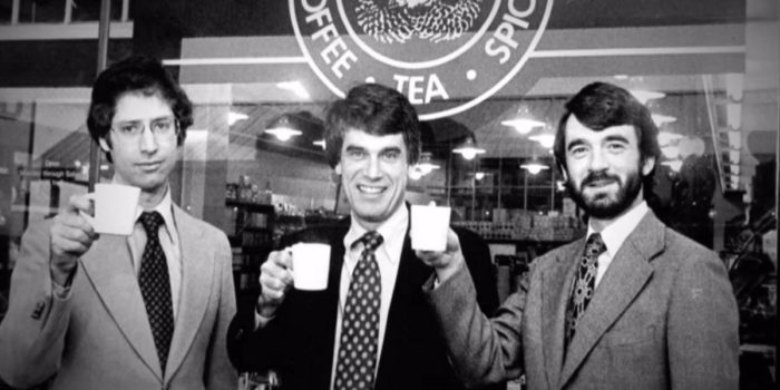
But like every story, it has an origin. Starbucks‘s origin was quite humble. Only three partners, who in their lives had had commercial experiences of this important level, founded it.
Its founders were dedicated to literature, being these Jerry Baldwin (English teacher), Zev Siegel (History teacher) and Gordon Bowker (Writer).
The origin of the name
Originally, Starbucks was not going to be the popular coffee shop we know today. The intention was to sell roasted coffee and little else, all thanks to Alfred Peet who taught the 3 men the secret to roasting it.
However, to start the company, a name was necessary. The inspiration, although somewhat curious, comes from a mining map. It turns out that one of them saw the name of a city, “Starbo”, and with a little ingenuity, ended up deriving in the name Starbucks.
The sale of coffee did not begin until 15 years after the foundation of the company. Starbucks until then only sold coffee beans and gave some free samples for people to taste the coffee resulting from the product they sold.
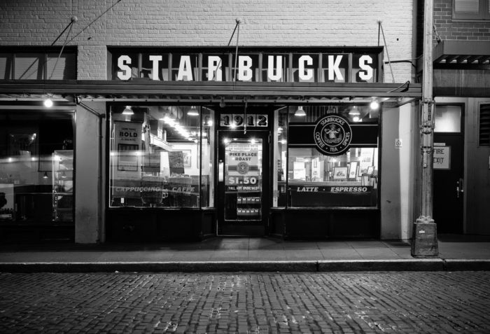
Starbucks in the coffee business
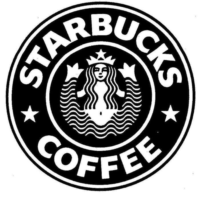
![]()
Beyond its humble origins, the company has managed to reap enormous success, and this is combined with its wonderful logo that has reflected the state of the business during the years.
No company does not have its logo. This visual identification is essential if you want everyone to recognize your brand everywhere. And this concept is quite old, in fact, the first signs of logo date from ancient Greece, when the name of the manufacturer was carved on ceramic decorations.
Starbucks logo meaning is quite mythological. The person in the picture is a two-tailed mermaid. The intention of using a siren is that they attracted sailors to the depths, so they were irresistible.
This was not the only cause to select a siren within the original Starbucks logo. Coincidentally, to the south of the Pacific Ocean, there is an island called Starbucks, where many sailors are said to have perished before the claws of the sirens. Yes, it sounds a bit macabre, but it means that people are attracted to Starbucks coffee, or so it is said.
The popularity behind the logo
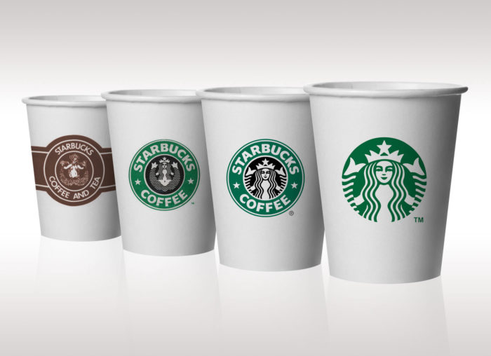
The amount of Starbucks logos that have been seen is not for less and is that every time the brand made a change, it adapted to reflect that evolution. In fact, and following the trend that was being handled at that time, the original logo was vintage and classic, with an appearance that made it related directly to spices and relaxing drinks.
This was changing over time since its popularity in the years grew towards all types of public, which forced them to adapt to a fresher image.
In all this time, the truth is that the siren has not been eliminated. Many say that this is an ingenious advertising movement since by keeping it in the Starbucks logo, the macabre theory that gives it meaning serves to attract the attention of the curious. No matter if it is to criticize, the logo has fulfilled its purpose by making them known it.
The Starbucks logo changes over the years
Throughout all the changes that the Starbucks logo has had, it has always held firm to certain concepts that make it recognizable. Relaxing colors in a two-tone palette with simple shapes make keeping it updated easy.
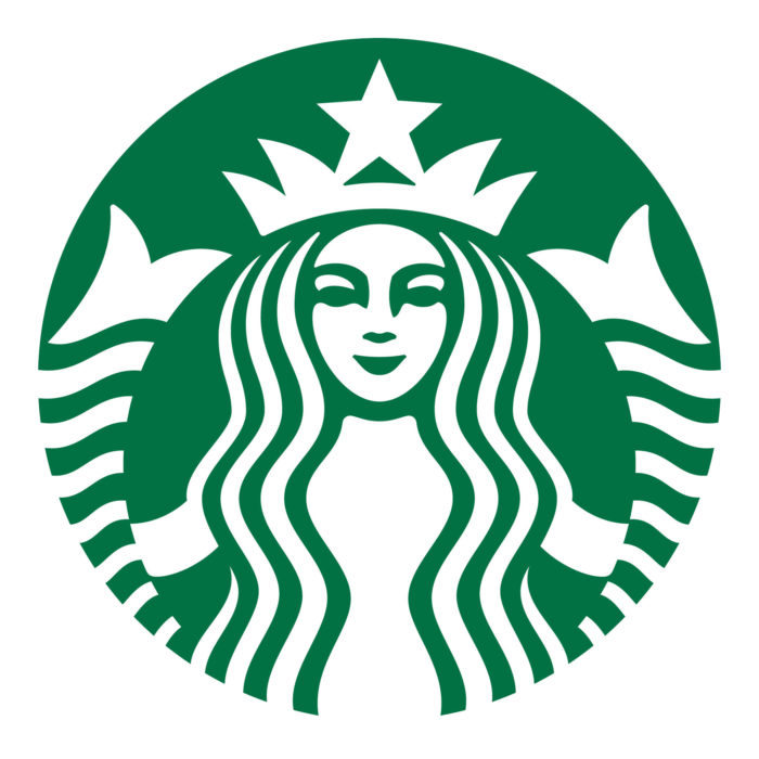
The siren is the main thing; she is enclosed in a circle, all with green and white colors. At least, that’s the way it is today, but let’s look firsthand at the Starbucks logo history.
The origin in 1971
![]()
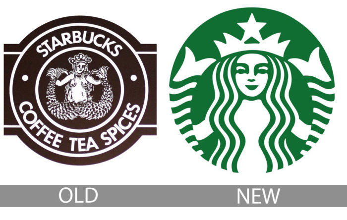
The first logo honored the sale of coffee with a brown color in its entirety. It already presented the two-tailed siren, only in this case she was topless. The circle has been maintained since its conception.
Yes, being uncovered is not the best idea in business, but this wood engraving stayed that way for quite some time. In fact, since the mermaid on its own was quite ambiguous in meaning, the original circle included the words “Starbucks-Coffee-Tea-Spices.”
Like any mermaid, she was refined, so that her dress, at least where it was, was luxurious, like the crown.
Polishing the 1987 logo
Howard Schultz acquired the brand, and with it, the logo was redesigned to make it more universal and appropriate for the masses. The circle and the mermaid were kept, but the breasts were covered by a long hair, the color of the logo was changed from brown to green (and black in the background of the mermaid), and the words that were in the circle were simplified to only “Starbucks Coffee” between 2 stars.
The green color and the stars represented the fresh change the brand was undergoing after the change of ownership, although it was still fully recognizable by the old users.
Retouching in 1992
The third logo was cleaning of elements. The Starbucks mermaid stood with a camera in the foreground of its face, which made the navel disappear. However, this was not enough to eliminate the two tails, which were still visible on the sides of the circle.
The colors and words remained, and this logo would remain intact for many years before being changed again.
From 2011 to the present
Changing to a more current movement that maintains that less is more, the design presented in 2011 (on the 40th anniversary of the brand) served to eliminate the circle that contained the brand name.
Many people disagreed with this change that contributed little to the essence of Starbucks and was strongly criticized by experts.
However, the company, who defended their position, explained all these changes. Before, it was necessary to use the letters to make a name as a brand, so that others could not copy the design of the mermaid. However, this is no longer necessary as it is worldwide recognized.
Another cause that motivated the removal of the writing is that it took up a lot of space, and usually diverted the attention of the siren.
Unraveling the new Starbucks logo

Design students in all parts of the world should know the origin and meaning of this emblematic logo. The analysis that can be done is extensive and is that the work done by Terry Heckler has a reason for being.
The idea occurred to him when he saw an Old Norse engraving from the 16th century, where a two-tailed mermaid was seen. He was responsible for modernizing it, so this old engraving managed to be part of the advertising news.
Shape: The logo has always maintained a circular shape. Before, this circle contained the name of the brand, but today that is history, although its form for the portrait of the mermaid was maintained.
Color: To make it simple, only two colors were used. All the details, as well as the mermaid’s drawing, are in white, which contrasts very well with the green color of the background. Previously, brown had been used to create a relationship with spices, but then it was changed to green to make it fresh.
The mermaid never left
 During all the changes over the years, the brand always kept the siren. Even the name disappeared, but the woman with two tails stayed. Although it is not known exactly why they left it, many believe it was to keep people’s curiosity about the story behind the logo.
Others have a simpler theory that the brand had already settled with it, and it is much more recognizable than what the letters were, so, at the time of changing it, the mermaid stayed, but the letters did not.
No matter the causes of this decision, the important thing is that a logo as eccentric as this managed to make the brand recognized worldwide, which should encourage other companies to use figures with strong meanings.
If you enjoyed reading this article about the Starbucks logo, you should read these as well:
- The Nike logo (symbol) and the history behind its simple design
- Round logos showcase: 23 Circular logos to inspire you
- Designing financial logos: banking, accounting, and finance designs
- The Pepsi Logo: The old, the new, its meaning and history
The post The Starbucks logo and its evolution since it was first created appeared first on Design your way.
Source: https://ift.tt/33I4GAv


No comments:
Post a Comment