We all know that backgrounds on any website play a vital role in how the site comes across to us. Backgrounds have an immense effect on how well or how badly the visitors and their users perceive the website. Before, websites didn’t have backgrounds; the content was put on a plain white background. But as time passed, graphic designers and web designers came up with the plan to introduce backgrounds on websites. It has become a trend to set background colors or images for a perfect website background.
In this blog, we are going to take a look at the tips that you need to keep in mind to design a perfect website background. These tips can make you create a website that gives your visitors an experience that is worth their time. Let us take a look at each tip.
1. Geometric Elements:
There are so many things that you can consider while designing the background for your website. These include animated backgrounds that go well with certain types of website themes. Moreover, it gives your site a touch of the dynamic layout. This kind of design attracts a lot of users to your website, which increases traffic.
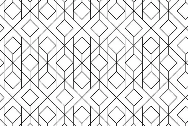
Another way to introduce amazing geometric elements is to add static geometric shapes. These geometric shapes include shapes with angles along with a minimalist color theme that suits the design accurately. This way, it offers your website a contemporary background and makes it visually stunning.
You can also introduce three-dimensional geometric components that have been in the trend in recent times. Moreover, a three-dimensional design wins over any other design because it expresses more than any different design. Also, polygons form in the design when there are geometric lines, and the design resembles sci-fi movies. You can integrate these elements to give your website a high-tech appearance. This makes for perfect website backgrounds especially for a fan fiction website.
2. Background colors:
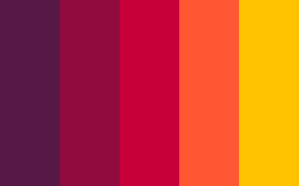
When it comes to using colors, some artists prefer using plain colors like black and white. Certain websites take up some dynamic color patterns that appear exciting and unique, which manages to gain interest among its visitors. Gradually, people have turned to dark website themes that offer a lot of creativity and elegance to the website’s web pages. Most designers have managed to create a passionate design by using light-colored fonts against the dark-colored theme. There are many examples where the site has a black and white color theme, and the designers have successfully managed the website designs.
Moreover, watercolor backgrounds have also been a rage recently, and so many websites are implementing and embracing it. The watercolor backgrounds introduce a sense of depth and creativity in the backgrounds of the website. Such designs can be used when the site is related to arts and creative fields.
3. Gradient colors:

The design trend in 2019 has been the one where the websites and graphics consisted of gradient colors. Gradient colors are the colors where one color gradually and seamlessly blends into another color. In these types of schemes, you cannot find the border between the two colors. You cannot pinpoint the ending of one color and the beginning of the second color. This is how you define the gradient colors. With website backgrounds, you can either use gradient colors as background or overlay the gradient. This overlay can be implemented on the video, image, or other media elements. You can easily create a dynamic gradient background while using the front end tools.
These days, web designers create interesting 404 error pages on the website. These pages not only show the error, but it also shows the user the navigation through the website smartly. This contributes to the improvisation of the overall user experience of the website.
If you want your website to look modern, you should use a red and black color theme that offers your website a trendy appearance. Moreover, a simple gradient color theme also makes a lot of difference in the website’s overall appearance. Using gradients in backgrounds can help you achieve perfect website backgrounds.
4. Using lines:
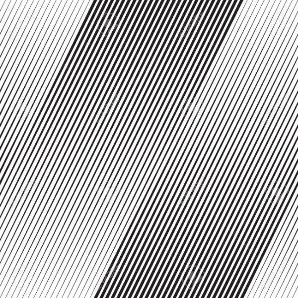
If a designer understands his creativity well, then he can transform a simple line into an object of elegance and beauty, when it comes to designing a background for the website. Particular designers and artists are known for using lines to represent their creativity.
As a designer, you should ask yourself this question. Are you capable enough to work with the lines and create a design out of it that represents creativity? Can you create a website design that comprises of only lines? If you are creative enough, you should create a design that talks only about lines.
5. Using animations:
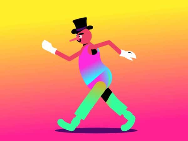
God has given us eyes that are sensitive towards the objects that move in a certain rhythm. The design team is responsible for creating a prototype tool that provides a platform for online collaboration. Certain websites use animation as a background to talk about their products and services. A dynamic background reveals the dynamic nature of the website that you want to target. Designers have an idea in their mind that adding animation to the site as a background can create a better conversion rate of the visitors visiting their website.
Moreover, you can use animation to depict the functions and operations of the company. Animation also can help you represent the services and products your company deals with. You can target the animation as a background to demonstrate so many things about your company.
6. Using Images as background:

Using images as a background to your website has been in trend for a while now. Initially, web designers used simple photographs or watermarked images as a website background. But now, things have changed. These days, web designers use large, high-resolution photos to use them as a background. Moreover, travel websites use large scenic images of landscapes to depict the places where they offer a trip to the client. The travel industry has never grown so fast until recently, and more and more people are coming up with travel websites. Designers are known to use real-life images of landscapes to use them as backgrounds of such sites.
Moreover, you can also use a carousel to depict pictures of beautiful locations and scenic places to engage the user. You can also use liquid effects as far as the travel website is concerned. These liquid effects can work wonders when you use this method effectively to target the user’s attention. It animates the changing places of travel from various places that can engage a user. And hence work as a perfect website background.
7. Applying a textured background:

You can use textures for website design to keep and maintain the visitor’s attention. You can use hand-painted textures, geometric textures, and more to design your website’s backdrop. When it comes to surfaces, there are so many textures that you can use according to the appearance you require and the theme you want to target. Textures can help you achieve the perfect website background.
8. Layering content and body background:
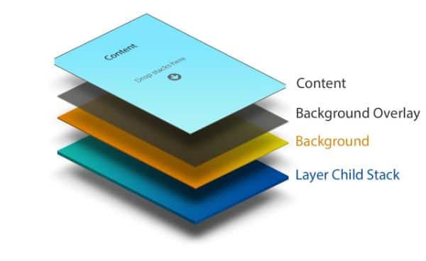
This is a structure where you can have many layers of background. You get to choose a body background, which is layered on the top of the content background. This is one of the many options that target the option of layering. The background can have an image, and you can layer the content on the top of the picture.
With the essential and core background, you can have a solid background, but the headers can have semi-opaque backgrounds. In a design layout, you can have content elements that are separate from each other. A preferred layered structure is where the wrapper and the content have an assigned width background where the bottom layer is spotted easily.
9. Use the graphics in the content area:
When you target a seamless layout with an illustrated wrapper, you should place the graphics beneath the content element. But you can let some of the graphics leak into the content area. This way, you target a design that offers a modern look, as well as something that users find attractive and visually appealing and creates a perfect website background. Hence, as a web designer, you should study certain websites that are perfect examples of such representations.
10. Address the psychology behind the colors:
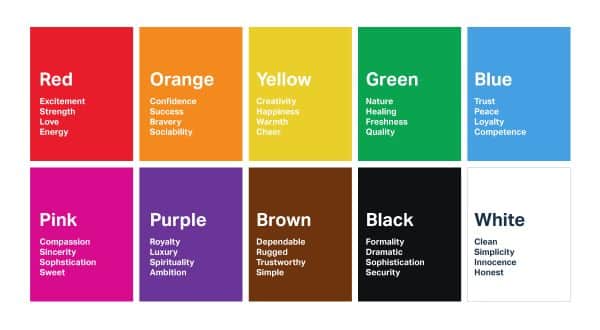
Now that we have seen everything about how a background decides the fate of the website let us see how colors can make or break a website. The colors that we see in our everyday life impact us knowingly or unknowingly. And hence, there is a psychological idea attached to using colors in a certain way and a specific setting. Let us see how each color can affect the designs and how we can use them to gain an impetus:
1. Red:

When we use red, we signify urgency and emergency. If you are targeting to achieve maximum footfalls during a clearance sale that you’re planning, use red. This color can immediately catch the attention of the onlookers when used in the right way in ads. It makes the onlooker eager and pushes him to take some action or do something about it. Moreover, red also puts out the fear of missing out on a customer when he hasn’t done anything about it. Red defines urgency, yet it also talks about jealousy, power, violence, and danger. Hence, it is wise to use the red color in moderation to convey the message along with its purpose.
2. Blue:

When we talk about blue, we indirectly imply dependability, wit, safety, and security. Hence, it is the most used color when there is business talk, or you have to be present in a professional way, especially when the finance section is concerned. The blue color also soothes and relaxes you, hence it is used in the banking, insurance, and cybersecurity sites. This is because blue offers a sense of trust at the highest level. You should also pay close attention while using blue because it also represents sadness and mourning. Soft blue tends to relax your users, hence use it to increase your credibility.
3. White:

White represents peace, purity, and virtue. Moreover, white represents hygiene and a clean environment, which is why it is a perfect website background color for the healthcare sector. White also signifies order, values, and tradition. You can use white to display honesty, and content in black fonts against white backdrop stand out. This can result in a lot of conversions. Certain websites also use black and white themes where they stress heavily on white to give it the air of a newspaper.
4. Black:
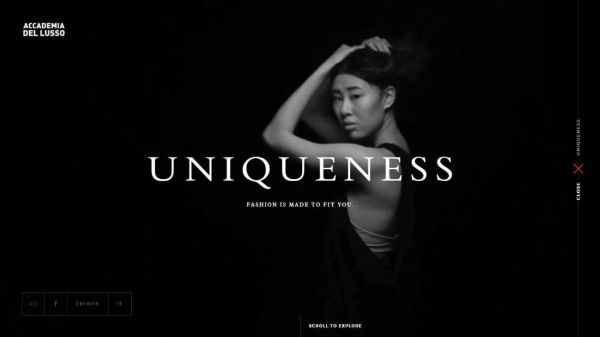
Black represents darkness and death in certain cultures around the world. Yet, black is also associated with elegance and glamour. It also symbolizes power; hence so many luxury products are designed with black outer packing or black colored stuff. Therefore, it is reasonable to use black so that the feel of the product is exceptional. This makes the customer want to be a part of it. Using black can lift the other elements of your web page. The sharp contrast of black with different colors can play well for your website and its conversion rate.
5. Green:

When we see green, we associate it with nature, trees, and leaves. It talks about the summer and activities that we carry out in the outdoors. Green also depicts healthy food items and wellness. Hence, the websites that deal with environmental issues often use green to send their message across the audience. When you use both green and blue, it defines relaxation because it appears soothing to the human eyes. If you want to put your visitors at ease, use green moderately to justify the purpose. Green is also another term for satisfaction, liveliness, and health, so you can use this color to communicate that your product/service is always going to be better.
Conclusion:
If you have analyzed well, individual designs and colors invoke a specific kind of emotion through which a user establishes a connection. And that connection can be anything ranging from your product, service, or your website. Therefore, it is vital to understand what kind of design is required according to the type of service or product that you offer to your audience. This blog talks about all the aspects that you should consider while designing the perfect website background of your website; hence, referring these aspects can help you understand things accurately. And this can lead you to create a website that serves its purpose right.
The post 10 Tips to Design Perfect Website Backgrounds appeared first on Line25.
Source: https://ift.tt/2DisKlm

No comments:
Post a Comment