Login forms have been around since the concept of the website came into existence. And it is a crucial section of any website. The human interaction with login pages has changed with time. Initially, we used to enter the email address or ID and password to log in to the system. Now, we have a Touch ID on the phone, face scan, and other ways to log in to the system. With the design point of view, the login forms had very dull and flat-looking designs. But nowadays, the designers have come up with impressive and out-of-the-box designs full of vibrant colors.
This blog focuses on the impressive login forms that you can explore or draw inspiration from to create a designer login form, as a designer. Let us examine the websites that have some vibrant and stunning login forms at their disposal.
1. Sweet:
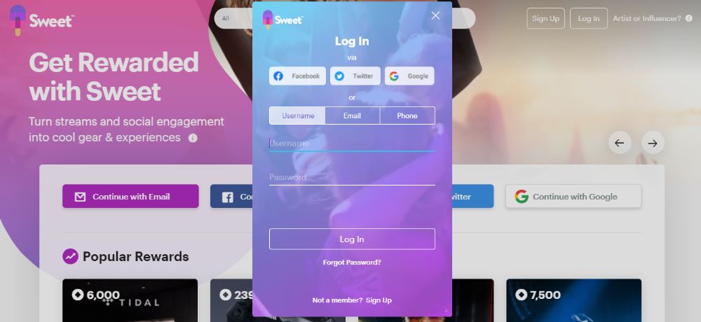
Sweet is a website that deals with influencers and artists. You can be either an artist or an influencer if you are using the site. The website has a color theme that looks similar to an ice cream candy. Moreover, the logo of the website also has an ice cream candy in its formation. The login form of this website is stunning, with the color theme of blue switching gradually towards different shades of purple. You can log in to the website with username, phone number, or email address. It also lets you log in through Facebook, Twitter, and Google if the focus is on any of the input fields, the shade of the underline changes to blue.
2. Zendesk:
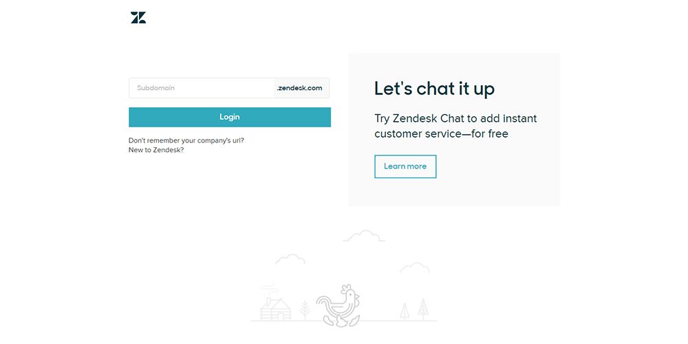
Zendesk is a website that handles customer service and is known to work at customer’s issues. This company is based in California, USA. Their login page is very minimalistic in its design. You can only see the input field where you have to have your subdomain name. There is nothing else to let your attention stray away from the login form. There are other links beneath the login form. But, there is no header and footer links or images on the website. This lets you focus only and only on the logging in the system.
3. Squarespace:
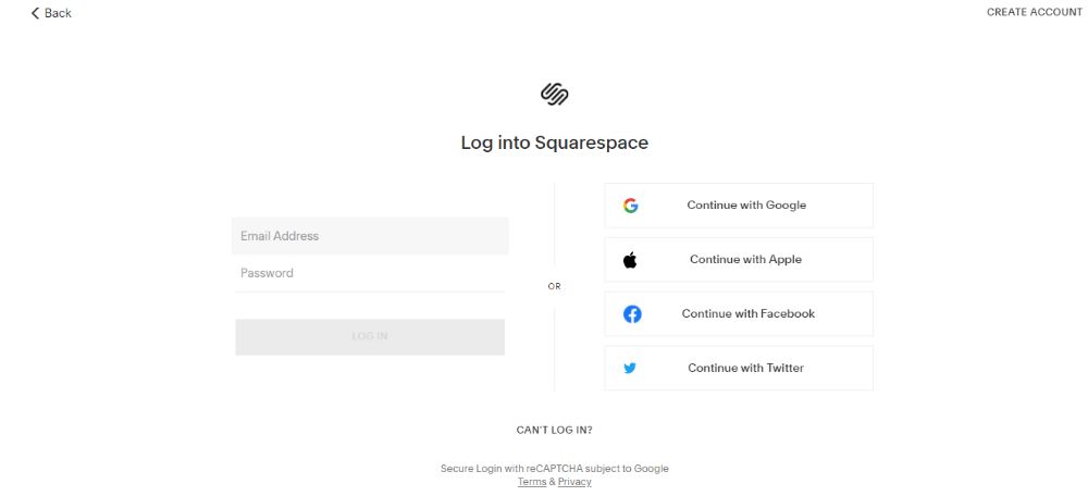
Squarespace is another website that handles digital marketing and has some design templates ready for use. They have a new home page with elaborate designs. But, their login page has a minimalistic design. This login page also doesn’t feature a header and a footer to distract the user from the login process. The input field asks you to enter the email address and the password. Along with that, you can also login using Google, Apple, Facebook, and Twitter accounts. Their login CTA is also simple yet effective.
4. Headway:
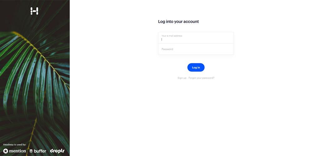
Headway is a website that provides a change-log to keep the customers informed about a particular service or a product. Their entire website is painted in a white-colored theme in the most straightforward design possible. They have an even simpler login page where there are no header or footer details that can distract you. With just an image in the left margin, they have a login page where you can fill your email address and password. You are also allowed to log in with your Google account details. The login page is simple, with a white background and no fancy user interface elements.
5. VSCO:
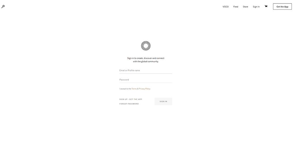
VSCO is a photo editing application with a website under the same name. The site features parallax scrolling and has a new user interface. But, the login form on the website is an all-white form that has a simple design. You can log in through your email address or profile name and the password. The page also lets you go to the VSCO home page, Feed, Sign up page, and the page to download the VSCO application. It only has a logo that represents the community on the top of the login form page.
6. Drip:
Drip is a website that designs things from comics, film, and video and music genres. Like VSCO and Squarespace, the login form of this website is also made with a white-colored theme. On the top, you can spot that they have written: “Login to Kickstarter.” But, Drip is a part of the Kickstarter team. You can log in the website using Kickstarter ID and its password. They also have a forgot-password link along with the login details. You can also login using Facebook login details. As you scroll at the bottom of the page, you can see that Drip is a part of the Kickstarter family. They don’t have any other links going back and forth to different pages of the website. If you want to visit the site, you just have to click on the Drip logo on the top of the login form.
7. Lookback:
Lookback is a website that lets users accomplish various tasks through their application. They have a functional yet straightforward looking login form page. They have written in big, bold letters, “Hey, good to see you again!” Beneath that, they have written “Sign in to get going” in small letters. You can log in to their website through your email address or assigned username and password. They have a green Sign in button that defines their CTA button, and it is easy to notice that the first thing when you open the page. The footer of the page has a few links, but the header remains empty.
8. Paddle:
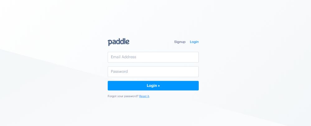
Paddle is a website that doesn’t let you access other parts of the site like other websites allow you. Their login page features the logo of the website along with the login inputs. You can log in to their website using an email address and password. The blue login button has the right shade of blue, attractive enough to catch the user’s attention. Moreover, this blue shade is correct to define the call to action button. You can also reset your password with the link they have provided beneath the login form.
9. Uber:
Uber is a popular cab booking website, and its services are also available in the form of a mobile application. The taxi-booking giant caught the audience by storm immediately after its launch. They have designed different login forms: one for their driver and others for their passengers. Let us take a look at the login form that the website has provided for the drivers. On the top of the login form, you can spot the Uber logo in black. To sign on the site, you have to provide your registered email address. You can give the password on the next page after submitting your email address and press the next button. A signup link is also placed beneath the login form. They have cleverly placed the next button in the dark color, which does not fail to attract attention as you open the page. And as they say, a CTA should always be in a different color. Moreover, the CTA should also be the first to appear in the user’s visual proximity.
10. National Geographic:
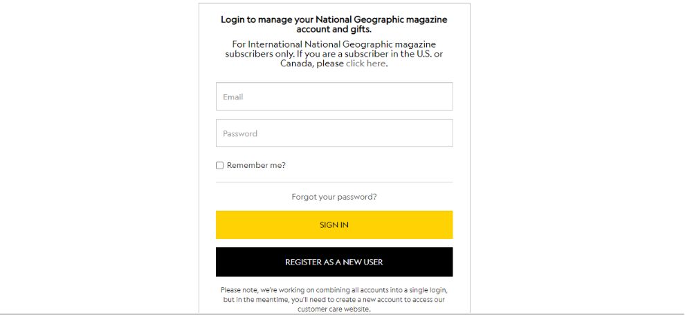
National Geographic is the website that manages the American network for television. It is a joint venture between the Walt Disney Company and the National Geographic Society. Their login page is as unique as their existence. Their sign in page asks for your email address and your password. It has a minimal design with no fancy elements to attract your attention. But they have strategically placed their sign in button in yellow, which also happens to be their CTA. You can register as a new user on the same page by clicking the button in black. The header of the page seems vacant, but the footer features certain links that can take you to certain parts of the website.
11. Medium.com:
Medium.com is a popular website that lets bloggers upload their blogs on the platform. Their website talks about articles and blogs from various domains and niches. But their login page seems to be very interesting. They have not used any attractive CTAs on their login page. Instead, the page appears to have a minimalistic design. You can log in their website using Google, Facebook, Apple, Twitter, and your email address. The versatility of logging on the website is the best part of their login page. You can register with their website by clicking on the create one link. They don’t have any other links in their header and the footer of the page. Just the Terms of Service and Privacy Policy of the website links can be found beneath the login form.
12. The Washington Post:
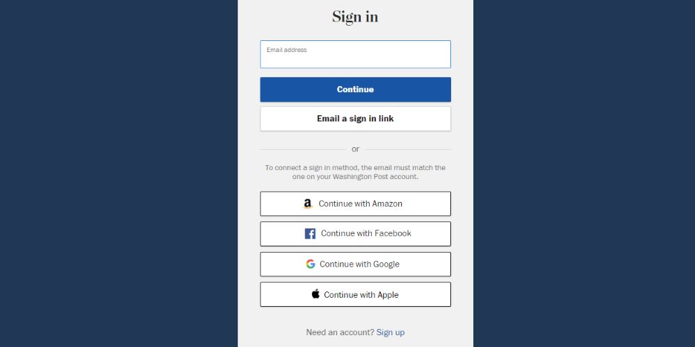
The Washington Post is an American Newspaper that is published on a daily basis in Washington DC, And they have been running the website under the same name, The Washington Post. Coming to their login page, they have designed a straightforward login form with a navy blue background. You can sign in with your email address, or you can choose to sign in through a link sent on your email address. Moreover, it also allows you to login with Amazon, Facebook, Google, and Apple. Beneath the login form, you can also spot the signup link. At the footer of the login page, you can find the links to privacy policy, help and contact pages.
13. Mailchimp:
MailChimp is an American company that handles email marketing and marketing automation services since 2001. As you can see that the website is made with a white background. Similarly, they have designed their login page with a white background, and the login form is strategically placed on the left side of the web page. On the right side, you can spot the information about their latest podcast, The Jump. They have placed their CTA on their login button. You can only log in to their website using your email address and password. It does not allow login through any other social media accounts.
14. Sephora:
Sephora is a French multinational company that deals with world-class cosmetic manufacturers. It features around 3000 cosmetic and personal beauty brands from all over the world. Their website showcases all their products, and the layout of the site has been designed in black and white user interaction elements. The most exciting part of their website is their login page. They don’t have an individual login page. Instead, they have designed a pop-up box that pops out of the page when you click on the sign-in button. Like MailChimp, you require your email address to sign in to their website. You cannot sign in to their website using social media accounts like Facebook, Amazon, and others. They have strategically placed two CTAs in contrasting colors. The sign-in button is in all black while the Create Account button is in white. Both the CTAs are the first to strike your eyes.
15. Diprella:
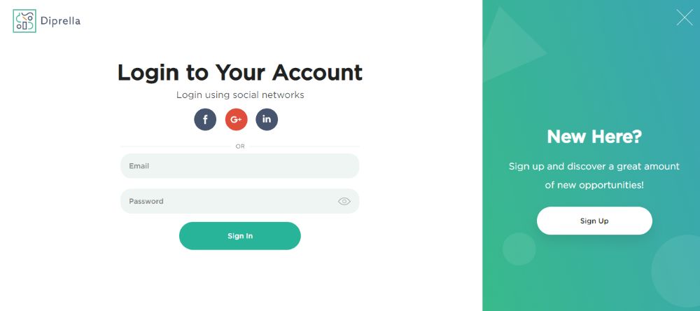
Diprella is a community website that connects all the designers from the globe and lets them share their projects and showcase their designs on the platform. As it is a community of the designers, it has to have a stunning login page. They have created a very creative login page. You can see two screens as you open the login page of the website. On the left side, you can spot the login screen where you can log in through your email ID and password or your social media accounts like Facebook. But if you are a new user, you can click on the sign up button on the right side of the page. As you click the signup button, the login page hides, and the sign up page slides right. They allow the creation of an account for free with specific details they ask you for. The sign up button is disabled unless and until you fill in all the details in the input fields. You can also sign up using social network accounts.
Login pages being an integral part, the designers need to design the pages that attract today’s tech-savvy users. Initially, the layouts were straightforward for the login pages as it was one of the critical points of interaction of the user with the website. But now, the conventions have changed for the better, and it is easy to spot exciting designs all over. This blog captures the login forms that have impressive designs. These designs can be used as inspirational ideas to design the login forms from scratch. While designing the login form, all the care of the CTAs should be taken, and they should be given a beautiful appearance.
via https://ift.tt/34SzstC







No comments:
Post a Comment