Geometry isn’t necessarily everyone’s favourite subject to study in school. However, it is one of the mathematical disciplines with most relevance and purpose in our day to day lives. Geometric shapes are often used to portray certain ideas or a concept in an alluring manner. Most of the websites you would see these days are confined and limited by the flat design layout. The images, presentations, or videos are usually divided into boxes or rectangles. Certain website designers are taking a different approach to the generic flat layout website design and infusing geometric website design, to give their websites more depth and relevance.
The idea of using blank spaces and minimum squares and rectangles for a website to be responsive, is getting obsolete. With so many websites available today, it has become crucial to have a website that stands out from the crowd. A website should be worthy of a second look, and captivate the audience by the sheer creativity and thought behind the website design.
A website designer uses geometric website design for three main purposes –
- Navigation: The lines and shapes are generally used to intuitively guide the users through the website. It leads them to the call to actions and the important sections of the website the website owner wants the audience to focus on.
- Visual effect: There are many promising shapes that can add definition to the website elements, and give the users a new perspective to experience the website in a better way. It helps such websites stand out from the generic websites used by other competitors. Geometric designs are the best way to make a website look visually appealing without overpowering the website design.
- Framing: A geometric shape can be used as a tile to hold important content information such as images that need to be highlighted to the visitors from the rest of the website contents.
Here we present you with 25 extremely eye-catching geometric website designs –
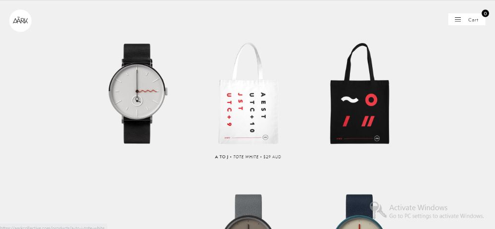
1. Aark Collective:
Ark Collective appears to be a basic e-commerce website that primarily sells watches among some other products. The home page greets you with a flat layout of surreal watches that appear two dimensional and flat. It almost throws the user off on the first go, thinking why they are placed so awkwardly. However, once you hover your mouse over them, you get a side view of the watch that instantly adds depth and character to all the watches. This smooth yet light geometrical transition makes the website stand out from most websites which would upload multiple images of a watch from all angles in a slideshow format. This hover over animation makes the website live and fun to interact with.
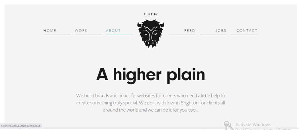
2. Built by buffalo:
Built by buffalo is a really smart website that is very minimal in nature, without a lot of fancy animations or visual effects working for it. It makes use of geometric design by using strictly geometric shapes for their content. They keep switching between circles and hexagons to highlight their content. The entire website uses the same thin line throughout the site to demonstrate a section break. By making use of the same shapes or same line, the web designer introduces synergy between the elements, which makes for a consistent and easy to follow experience for the visitor.
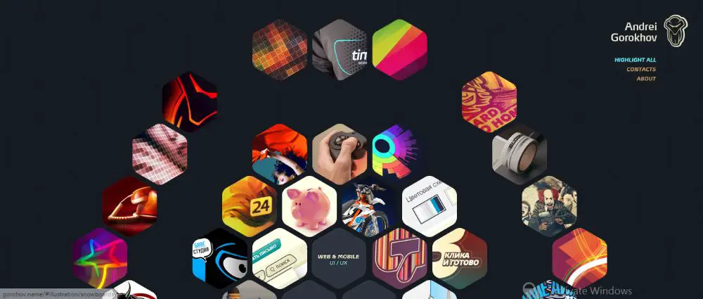
3. Andrei Gorokhov:
Andrei Gorokhov is a great designer who has implemented geometric website design into his portfolio website in the most appealing manner possible. The site has widespread of hexagons. The entire website has adjacent hexagons. When you visit the site you would notice only some of the hexagonal tiles are colored while others aren’t. This is a direct visual cue as to which tiles the website owner wants to check out first, and then move on the others. This basic yet clever approach makes website navigation easier, without being too overwhelming or underwhelming to the audience. When you hover over the faded tiles, they pop up with all colors as well. It is truly a futuristic and appealing website design.
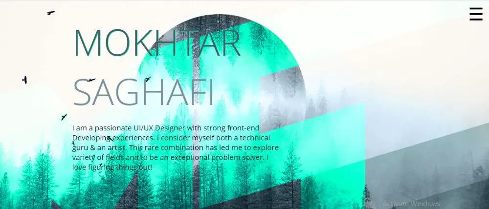
4. Mokhtar Saghafi:
Mokhtar Saghafi is a UI/UX designer. It is no wonder for him to use a different and fresh approach to designing his own website. Mokhtar Saghafi is the first website that uses rhombus as their primary geometric shape and not hexagons or other more frequently used geometric shapes. And it works! The entire site has diagonal lines that change the color of the element in background when you scroll down the site. The tiles are rhombus in shape, and have used some nifty animations when you hover over each card. There is a side tray which covers all the breadcrumbs, and when you click on it splits the page diagonally where you can access ‘Home’, ‘All Works’ and other such breadcrumbs. The design looks sharp yet effective. The responsiveness and the loading time of the site is also impressive considering the graphical and animation elements used in the site.
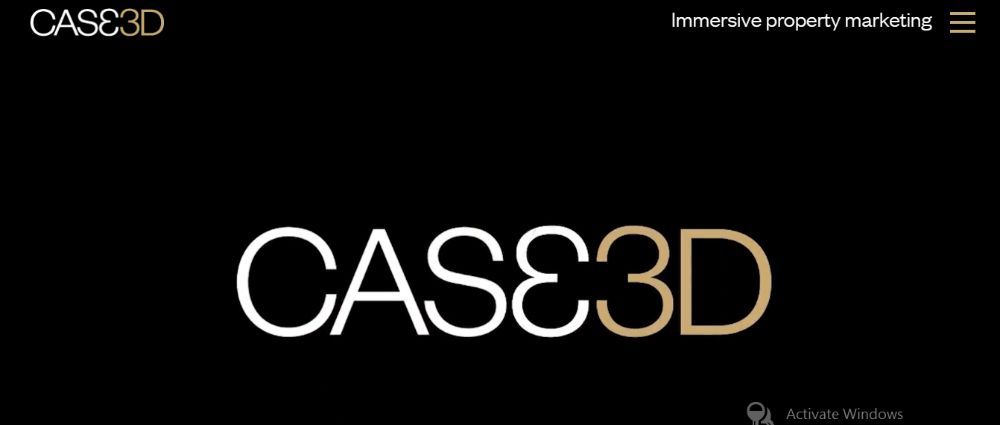
5. Case3D:
Case3D is a company that works for architectural spaces and real estate. You probably don’t even need to hear us mention it if you visit their website. They truly have used the geometric shapes and geometric website design elements to show that they mean business. The website utilizes some heavy geometric elements within it. Instead of relying much on website transitions to use geometric design, the website utilizes a lot of geometric shapes drawn in a way to keep the visitor engaged. The way they present their work highlights their proficiency in the field which automatically impresses their potential clients.
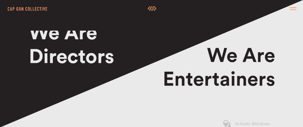
6. Cap Gun Collective:
Split screens used to be the freshest way to escape the regular square and rectangle layouts for website design, however, overtime they started getting repetitive and monotonous too. Cap gun collective introduced split screens in their website in a fresh and more alluring manner. Their website is divided into two halves diagonally, which draws two distinctive triangles on the website. The split screen design technique helps highlight their contrasting yet complimenting services. They use hexagonal shapes for introducing the team, by placing each member’s image inside a hexagonal shape instead of square or circles.
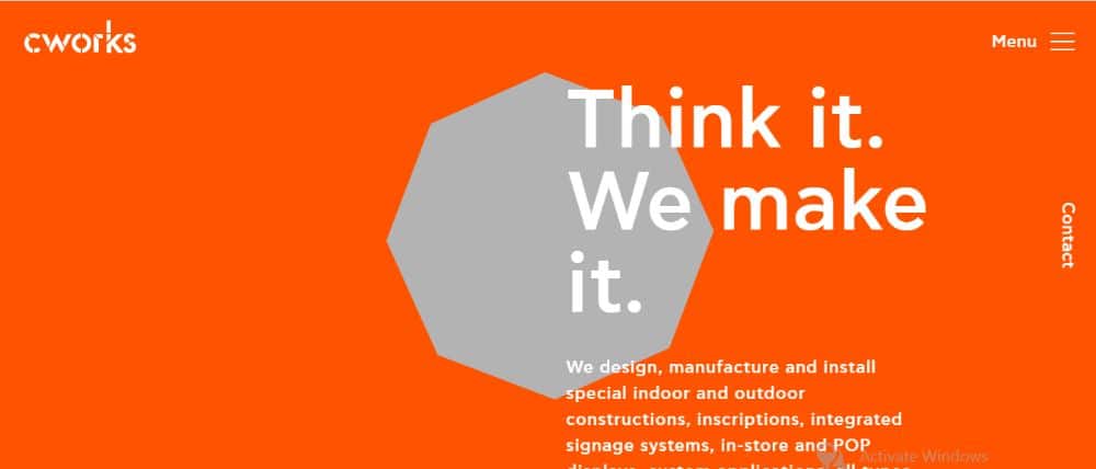
7. Cworks:
Cworks is one of the freshest website that uses geometric website design in a subtle yet innovative manner. It leverages the triangle in the background that stands out in contrast to the monotone orange canvas on the website. This contrast naturally draws the visitors attention to the triangle in the centre of the page. It doesn’t end there. You would think you have one static triangle drawing your attention to the centre of the page, but it is actually an unobtrusive focal point that keeps changing shapes into different geometrical shapes which looks even more impressive. As you keep scrolling down the shape moves to the right or the left and the color code of the website keeps changing, which keeps the user interface and experience fresh.
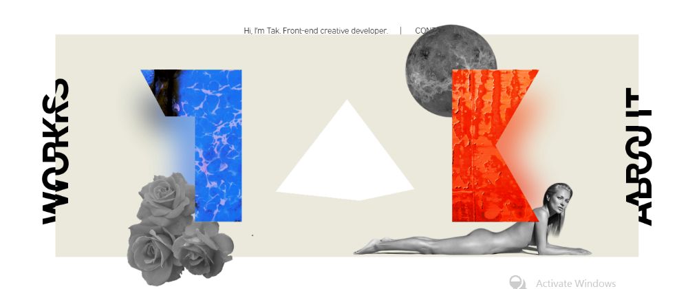
8. Takeshi Old:
Takeshi Old has a very unique experience in store for its visitors. The website loads with a basic rotating triangle that takes up the centre space in the website as a pyramid once the website is loaded. At first you would see many design elements that seem like they’re floating on top of each other. The left and right section of the website has one word each that is split in half and not easy to read. When you hover the mouse over to either of the texts, that text gets solved and reads works (left) and about (right). You would also notice as you hover over the mid-section of the website all the elements move along with your cursor creating an alluring parallax effect that makes all the objects appear to be 3D.
9. Huru:
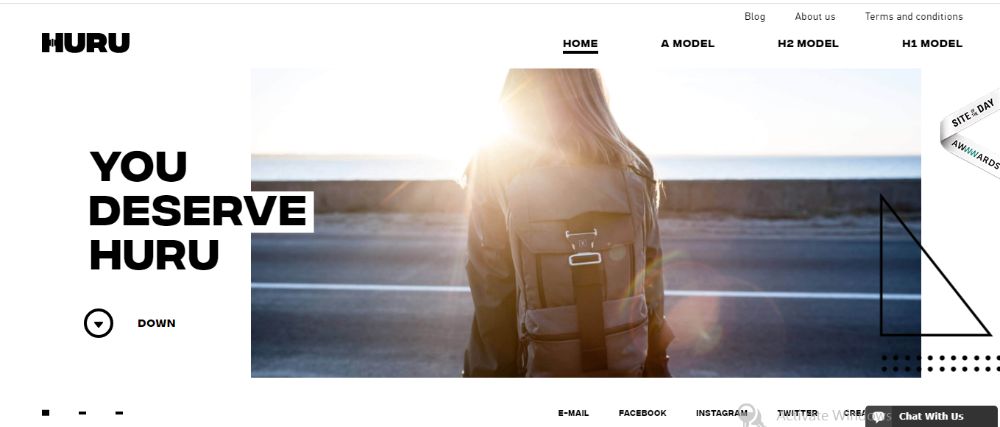
Huru uses triangles in their entire glory. They make use of the classic right angled triangles with ultra-thin lines with enough room between the elements for it to not be overwhelming. The triangle is an integral part of Huru’s aesthetic which compliments the other decorative details well. It acts as an additional layer of interface and also contributes to the symmetrical balance of the website. It mirrors the letters to the left.
10. NKI:
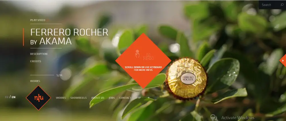
NKI is an interesting website for a post-production studio that specialises in 2D/3D animation, VFX and other such cool services. When you load the site you are greeter by their logo that is inside a hexagon. Once the site loads, the hexagon provides details about how to use the website for the best experience. It allows the user to either scroll in and out to browse through the website, or even use the up, down, left and right arrows to navigate through the site, which is fresh and welcomed. When you scroll out enough the website gets divided into many tiles in the background, of all which are projects the company has worked upon. Now if you hover you mouse on the right the tiles would keep moving to the right to show more and more work done by the company without you having to scroll over them. Similarly if you go up, it would scroll up, down and left respectively. When you click on one of the tile to see the project you would see two triangular pointers on either side of the project that when you click on takes you the previous or the next project in line. You can also use your left and right arrow keys to move around which makes the user experience promising.
11. Mystaticself:
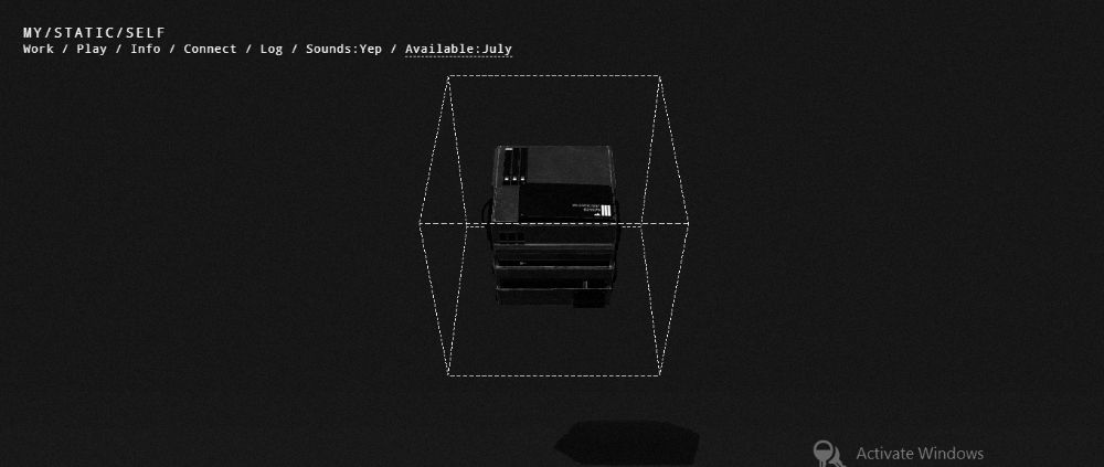
This website has the potential to be leave its visitor in awe with its futuristic geometric design. When you open the website you would be greeted with what appears to be pile of files laying top of each other in the centre of the website. They are surrounded by a dotted line cube and the entire shape feels like its levitating, with the drop shadow they have added below the shape. The shape also keeps giving out random glitch effects when idle, which keeps the site interesting. When you hover to different files from the files, the shape of the dotted cube expands and surrounds the selected layer in a much wider cube. When you hover over to the one below the top one the shape also follows and so on. Each player represents the breadcrumbs that are also available horizontally for easy navigation. When you press one of the breadcrumbs the site seems to go through a quick glitch process and the background color changes and relevant tabs pop up regarding that breadcrumb. This mix and match of geometry with glitch makes the website intriguing and keeps the visitors attention locked even if they aren’t doing much on the site. The sound effects are also very cinematic and contribute to the engaging experience.
These were the 11 extremely eye-catching geometric website designs that you can take inspiration from. All these websites have made use of the geometric shapes and effects in different yet efficient ways. The advantage of using geometric design is that it doesn’t overpower your website design or purpose, but compliments it well, if you plan it out efficiently. Make sure to use such elements to enhance the websites appearance and experience for the visitors.
via https://ift.tt/2DlFCHf

No comments:
Post a Comment