Logos are a great way to see how a brand shows to the world what it stands for and what is its history. The Skoda logo, for example, shows you the history of one of the oldest in the game of automotive brands.
Skoda is a big car company from the Czech Republic. Currently, it is selling over 1 million vehicles each year. The brand is originated from the Laurin & Klement brand that started to build cars in 1895. After that, they were acquired by Skoda Works, an industrial conglomerate that was founded in 1859. From there they continued to produce cars under the Skoda name.
It became the leading Czechoslovak car by 1939 and it was forced to serve the military in the second world war. After the war, they got back to designing successful models most of them being rear-engine.
The Meaning Of SKODA
What is funny about the Skoda logo is that if you check for its meanings when you type it with a capital S it means “Too bad!” and if you type a lower-case “s” the meaning is “damage”.
However, the origins of the name come from its founder Emil Skoda that created military equipment to help the Austro-Hungarian empire stay united at the end of the 19th century. After that, he joined the work of Laurin and Klement and in 1924 started to work on the famous brand that we know today.
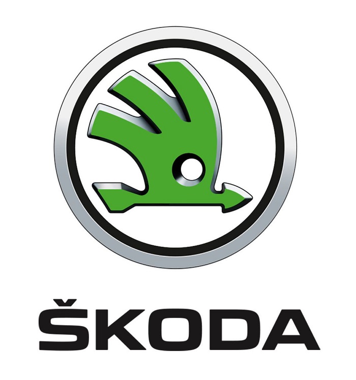
The Skoda logo

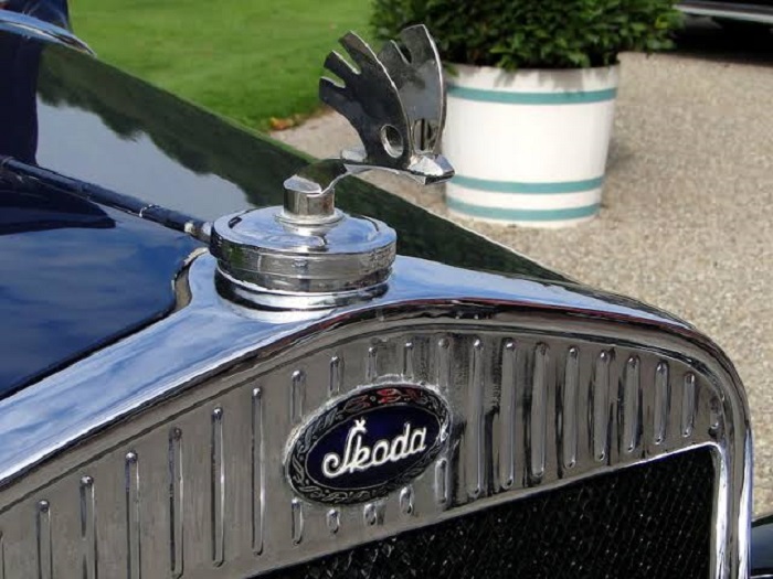
The slogan that they have “Simply Clever” can be also seen in the Skoda logo. It has a winged arrow with three feathers. The arrow is there to show the speed and the wings are there to show the progress. The circle was created to show the 100 years of tradition that this brand has.
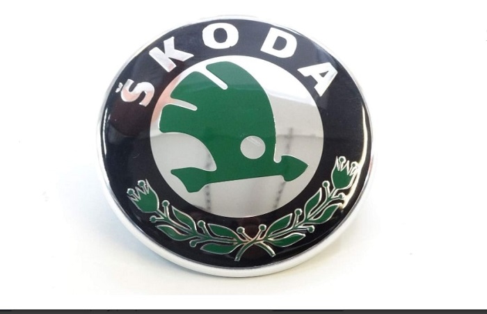
The current Skoda symbol was introduced in 2011 and it represents an old winged arrow that is designed in green colors. It has a white background and is embedded in black and silver 3D circles.
Besides some small color adjustments and trimming elements that logo has not really changed since its initial design back in 1926 so it is quite a widely recognizable car logo in Europe.
The shape of the Skoda Symbol

The main element that we see in the Skoda emblem is what is inside the circle. We are talking about the arrow that is facing the right direction. Some designers say that the logo is similar to an Indian headdress that has feathers. The main idea is that the shape of the Skoda logo shows their ambition for constant improvement and development.
The Color of the Skoda Logo
The Skoda logo is known due to its green color because that is the main tone that is used in the central figure. However, this was brought only in 1990 and it represented the company new start that they had in the automotive world. It’s a fresh approach to car manufacturing and also signals an environmental concern.
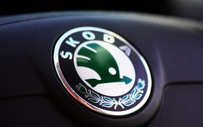
Green is their corporate color but the emblems that go on their cars are designed on a black background to bring a more simple and elegant style.
The Font
The font that was used in Skoda is similar to the classical calligraphy. It has been placed in the center of the logo and it attracted special attention thanks to its restraint and dignity. The letters are connected with each other in a single calligraphic design. This shows that the brand is focused on its products from all perspective.
The Skoda Logo Meaning
The Skoda logo shows the technological progress that this brand is bringing into the world. The Skoda company has more than 100 years of tradition, that is covered with green and it’s showing to people the focus towards renewable resources and environmental protection.
The History and Evolution of the SKODA logo
The Skoda logo is a very original one and it has kept the tradition of the brand since its start. Having a modern design their logo shows a lot of versatility compared with other car logos.
Throughout its history, the Skoda emblem had some changes. The updates always brought dynamism in the company logo and also to their cars that they were producing at that time.
Slavia Logo (1895 – 1905)
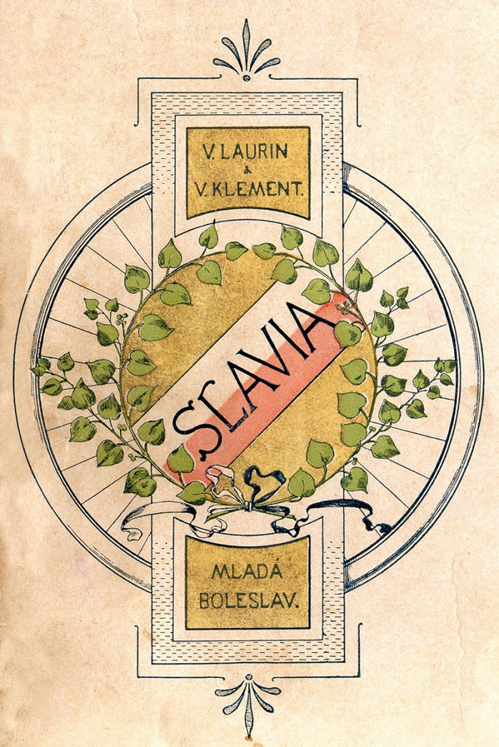
The Slavia brand was producing bicycles and motorcycles so the first logo is actually a bicycle wheel with some linden leaves around it, a symbol of Slavic nations. Later on, the logo had also the names of the founders and seat of the company.
L&K Logo (1905 – 1925)
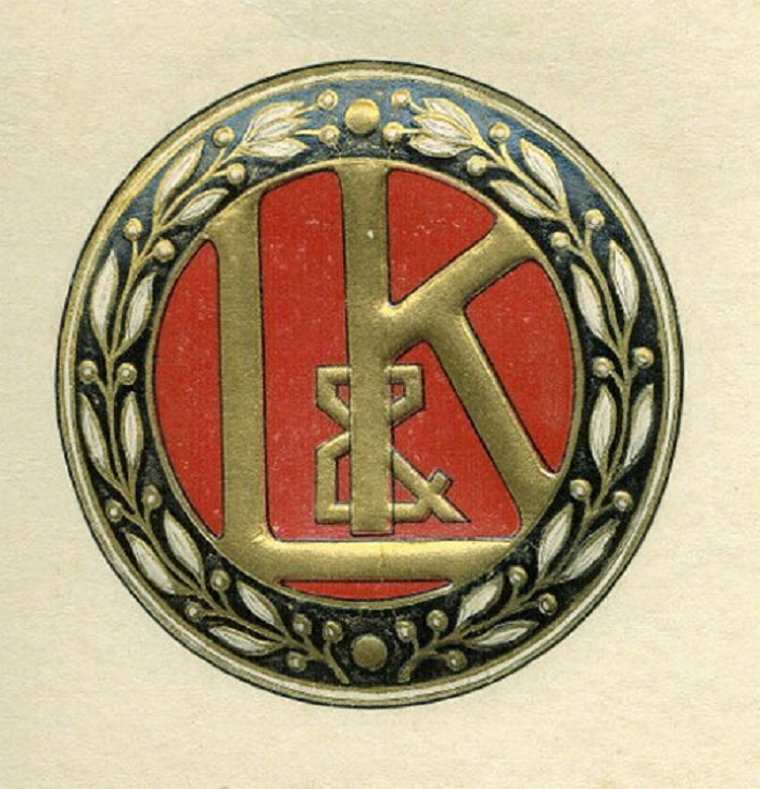
Their focus towards cars began at the turn of the 20th century with their first model called Voiturette. In order to mark this transition, the company received a new logo using the Art Nouveau style that was very popular at that time. This logo design lasted for almost 25 years.
Skoda Logo ( 1926 – 1933)
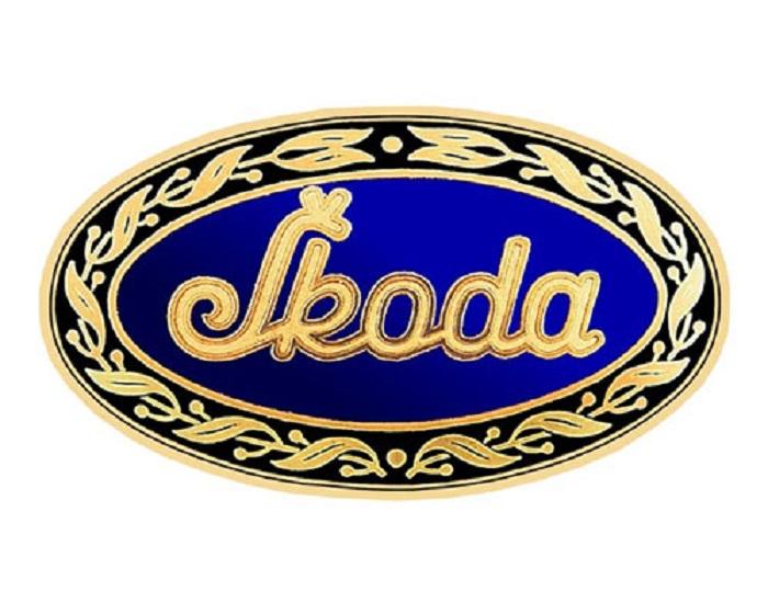
From 1926 cars were produced in Mlada Boleslav under the Skoda brand. Although they had a completely different brand name, the design shows continuity with its forerunner.
The Skoda logo has a new oval shape in this version.
1926 – 1990

This was the period of the famous “winged arrow” that was firstly used in 1926. Its origin is not exactly known but the idea that the Indian wearing a five-feathered headdress has been used a few times into the media and been attributed to the commercial director Tomas Maglic.
1993: Hello, Volkswagen!

In 1991 Volkswagen took over Skoda and they did a change for the logo as well. They switch the blue with green and the circle was made bigger so that the inscription “SKODA AUTO” could be typed in. The first model that had this logo was the SKODA FELICIA, the first vehicle of the Volkswagen era
1999-2011

The black and green logo started to be used in 1999 and gave Skoda more originality due to its black that marked the hundred-year tradition and the green focusing on environmental protection.
2011 – 2016
In this period the Skoda Logo had some new features added. The winged arrow logo had a new spectrum of colors to make it more distinct than before.
Since 2016

The new Skoda logo has its core in “Driven by Inventiveness. Clever Ideas – Since 1895”, that represents the unflagging drive of Skoda to its customers and the needs that they have.
The redesign also shows a close connection to the VW group and looks modern and fresh on their cars as well.
If you enjoyed reading this article on the Skoda logo, you should read these as well:
- Animal logo design ideas and guidelines to create one
- Logo design ideas that you should use for branding projects
- Logo maker app examples to try as an alternative to hiring a designer
The post The Skoda logo and how it changed over the years appeared first on Design your way.
Source: https://ift.tt/3fjB94T


No comments:
Post a Comment