Color theory is considered science by many people and while it is complicated, it is not impossible to comprehend it and to master its knowledge. It is important for web designers to learn how colors affect individuals or groups of people, what psychological effects are behind each color and tone, because color is as valuable for a site as usability and user experience are.
It looks very bad when a good site design has awful colors and it looks worse when you are the designer behind it so be very careful when choosing your color palette.
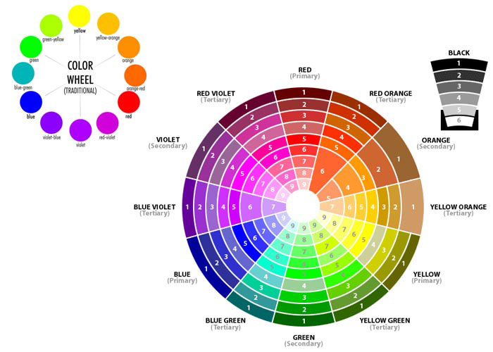
Color theory is a set of guidelines or principles that can be used to create harmonious color combinations that can be applied to every aspect of design. These ideas are represented through various diagrams, color wheels, triangles and even charts that are helping designers understand how colors interact, how to select and combine colors and how to construct pleasing and effective palettes.
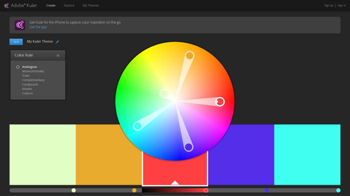
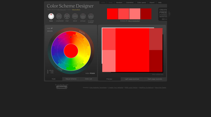
The best tool for visualizing color relationships is the color wheel. This wheel can be seen in various forms from the traditional version that is constructed with just a few colors to the complex ones that are incorporating many color variations.
Color schemes
Although I will be criticized for skipping the basics, it is better to skip writing about why RGB is for web and CMYK is for print and other similar notions. Instead, I will jump directly to things that not everyone knows. For example, color schemes.
In color theory, a color scheme is the choice of colors used in design for a range of media. For example, the use of a white background with black text is an example of a basic and commonly default color scheme in web design.
Color schemes are used to create style and appeal. Colors that create an aesthetic feeling when used together will commonly accompany each other in color schemes. A basic color scheme will use two colors that look appealing together.
Monochromatic
A monochromatic color scheme consists of different shades and tints of one single color. These color schemes are easy to get right and can be very effective, soothing and authoritative.
Analogous

Analogous colors are colors that are adjacent to each other on the color wheel. The combination of these colors gives a bright effect in the area where they are used. These colors have similar light ray wavelengths, so they are easiest on the eye.
Complementary
Complementary color schemes are created with colors that are opposite to each other on the color wheel, such as blue and orange, red and green, purple and yellow. These have a more energetic feel, making the colors look more vibrant and strong.
Split-analogous

Such a color scheme includes a main color and the two colors one space away from it on each side of the color wheel.
Split-complementary
This color scheme is possible when you use two colors adjacent to the complimentary color of your base color. The contrast is toned down, providing a more sophisticated combination.
Triadic

These are created by three equally spaced colors on the wheel, like red, blue, green or orange, purple, green. Triads with primary colors are garish, but secondary and tertiary triads provide a softer contrast.
The meaning of colors
The human eyes and bran experience color in many ways, physically, mentally and emotionally. This means that color themselves have meanings, which may be different from one culture to another.
Red

Red is a stimulating and exciting color, often being associated with passion, power, but also with anger and violence. It has the physical effect on people of raising blood pressure and respiration rates. It is often used on warning signs to show danger, but it also suggests strength determination and boldness.

In web design, red can be a very powerful color, but if not used properly or used more than necessary it can have an overwhelming effect, especially if it’s a bright red.
It has some specific meanings in different cultures. For example in most parts of Africa it is used to indicate death and mourning, in France is associated with masculinity, in Asia with marriage, prosperity and happiness.
Yellow

Everybody considers yellow the most energizing color from the color wheel. It is associated mostly with the sun and its shine, transmitting warmth and happiness. You will see it mostly on website that are targeting children because it attracts their attention easily. However, it is also associated with deceit and cowardice. Strangely enough, it is also associated with hope as well as with danger.

It is important not to mess up when designing for clients who are from various parts of the world. This is why you should know that yellow is associated in Buddhist cultures with priests, in Egypt and Burma it signifies mourning, in India it is the symbol of merchants and farmers, in Hindu cultures it is used to celebrate the festival of spring and in Japan it is used to show courage.
Blue
The most common elements of our lives that are blue are the sea and the sky and it is used to represent calmness and responsibility. On the internet it is mostly used on sites who want to transmit that they have a solid background and they are reliable.

In most parts of the world, blue is considered a masculine color, but be careful when using it in China, because it is mostly used there for little girls. Also, in Iran it is the color of mourning.
Green

Green is almost always associated with positiveness and it can give users the feeling of calm and optimism. However, it can also represent envy or jealousy. This color can have a balancing and harmonizing effect, being very stable. Its best usage is in websites that are related to nature, wealth and stability. Lighter shades of green, like light green or lime, are used to express growth, relaxation, healing and success.
Green is very important to some cultures. For example, by Islamic people it is associated with paradise, while the Irish are associating their whole country and the very popular St. Patrick day with this color.
Orange

Orange, as well as yellow, is a very energetic and vibrant color. It is a more balanced and less overwhelming color than red, being friendly and inviting. The reason why orange is used by hunters and highway workers is to attract attention and it can be used in web design with the same purpose.

Purple
Purple has been associated since forever with nobility so you will mostly see it on sites related to wealth. It signifies creativity, imagination, but it is also a color used for romantic scenes.
It is a delicate color in some cultures, in Latin America being the color that indicates death. The same thing applies to Thailand where it is worn by widows who are mourning their husbands, while in Japan it represents ceremony, enlightenment and arrogance.
Neutral colors

Neutral colors like black, gray and white are used in various forms in designs, mostly to allow brighter colors to have a better impact. Black is used to suggest power, authority, sophistication, elegance, mystery, while white is associated with perfection, virtue, innocence, lightness and truth. Most of the times, these two will be found on websites along with grey to provide an equilibrium between them.
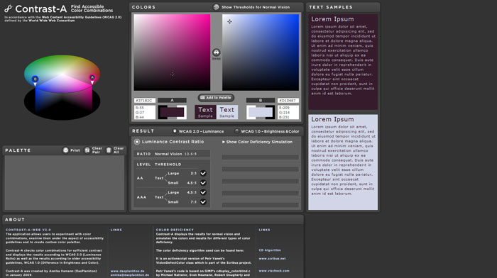
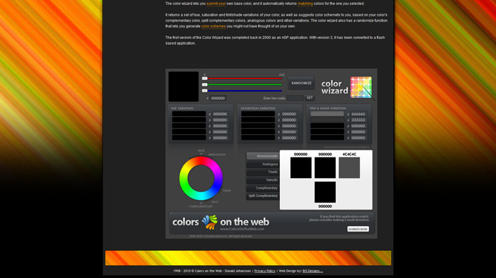
Color scheme generators
Most of the times, it’s easier to use a color palette generator than picking the colors manually from a color wheel. There are numerous color generator tools, but I found that only a few do the actual job that most designers are looking for. Here are a few examples of color generators that you can use.
Sphere: Color Theory Visualizer 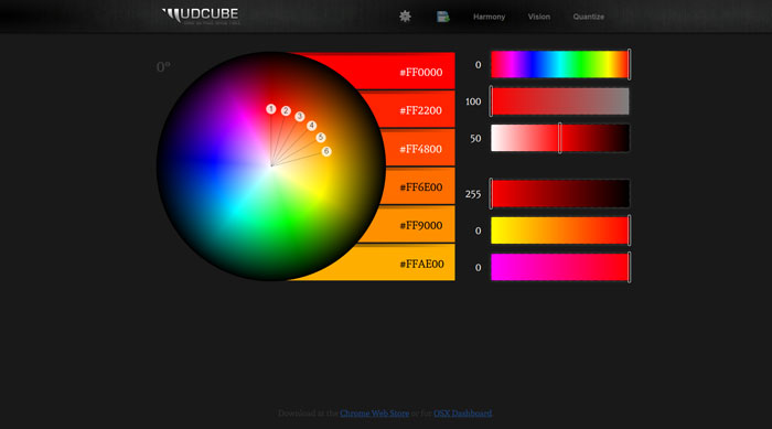
Source: http://feedproxy.google.com/~r/DesignResourceBox/~3/q0hVyBU_j8Y/

No comments:
Post a Comment